Retired Document
Important: This document may not represent best practices for current development. Links to downloads and other resources may no longer be valid.
Getting Started With WebObjects Builder
WebObjects Builder is a graphical tool for creating web components for WebObjects applications. A web component represents a webpage or part of a webpage—typically, webpages that contain dynamic content. Web components are HTML-based—therefore, they are used only by web applications—you do not use WebObjects Builder if you are developing other types of WebObjects applications such as web services and Java Client applications. For example, a web service application created using the Direct To Web Services Application template in Xcode does not generate HTML.
WebObjects Builder is not a complete integrated development environment (IDE) either. You use Xcode to manage the rest of your WebObjects project files, and use Xcode to build and test your application. Read Xcode 2.2 User Guide if you are not familiar with Xcode.
Before editing your web component, you should be familiar with the layout of the web component window and common functions and features, such as setting preferences, opening the inspector, and switching between editing modes. WebObjects also provides a wealth of elements and prebuilt components you use to construct your web component. It helps to understand the breadth, organization and location of these windows, menus, and controls before you begin editing your component.
Creating Web Components
There are several ways to create web components—some web components are created automatically for you and others you can create manually.
Typically, standard web components, like Main.wo, MenuHeader.wo and PageWrapper.wo, are created for you by the Xcode assistant when you select a WebObjects template. The Main component represents the first page displayed by your web application. The MenuHeader and PageWrapper components are specific to Direct to Web applications. For example, you edit the PageWrapper component to add or remove information from every webpage—this component is a wrapper for every page in your application.
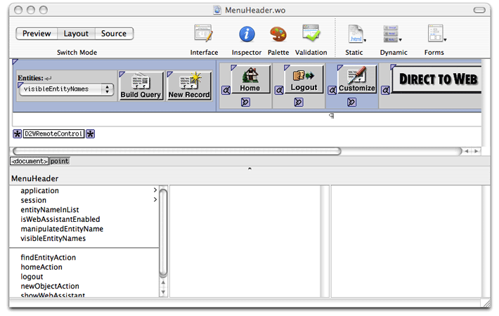
Follow the steps in WebObjects Web Applications Programming Guide to create a Xcode project using one of the web application templates. Double-click any of the web components that appear in the Web Components group in Xcode to launch WebObjects Builder. For example, double-click the MenuHeader.wo file in a Direct to Web application to open it as shown in Figure 1-1.
To create a new component and add it to your existing Xcode project, follow these steps:
Launch WebObjects Builder, located in the
/Developer/Applications/WebObjectsfolder.Choose File > New to create a new web component.
A blank web component window appears.
Choose File > Save to save the component.
Enter a filename and location—for example, your project directory.
Click "Save as."
A panel appears asking if you want to add the web component to the open Xcode project.
Click Yes.
The new component is added to the Web Components group in your Xcode project.
The rest of this chapter explains the layout of the web component window and the main WebObjects Builder menus and buttons.
Editing Modes
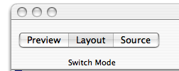
When you open a web component, WebObjects Builder displays it in a component window, similar to the window shown in Figure 1-1. The component window has a toolbar at the top and panes below that depend on the editing mode you select. Use the buttons in the upper-left corner of the component window, shown in Figure 1-2, to switch among the following edit modes: Preview, Layout, and Source mode.
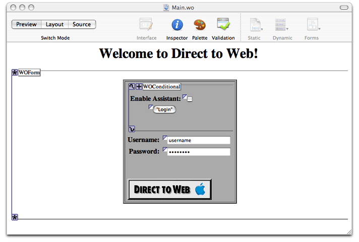
Preview Mode
The Preview mode shows a visual representation of your component. This view displays an approximation of what the user sees in the browser and is not editable. The elements are collapsed as much as possible and bindings are not displayed. Figure 1-3 shows the Preview mode of a Direct to Web component.
Layout Mode
The Layout mode shows an editable visual representation of your component, including its dynamic elements. The visual representation is similar to that of the preview mode except that elements are expanded and bindings are displayed as shown in Figure 1-4.
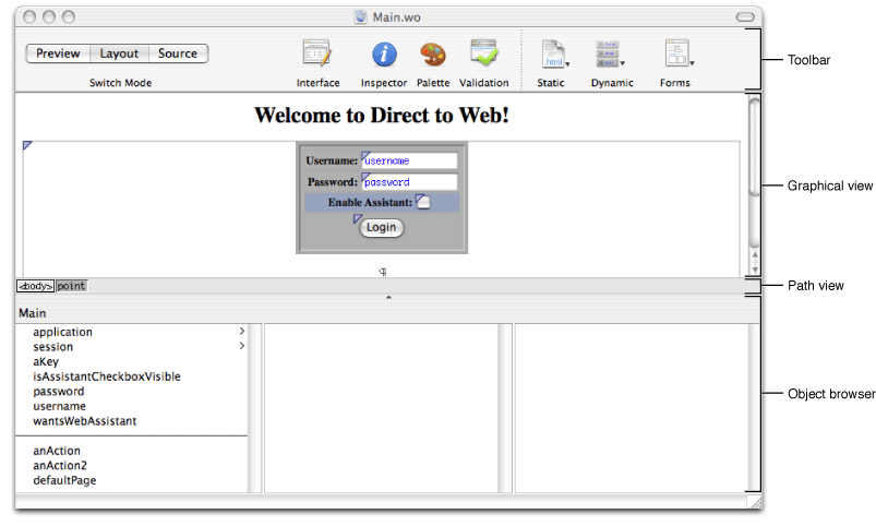
When you select Layout, you create your component's appearance graphically in the upper pane of the component window called the graphical view. The browser at the bottom of the window, called the object browser, displays variables and methods you use to bind elements to your application objects.
The path view, which is visible in the Layout mode only, lies between the two panes. It displays the element path to the selected element. Any element can be contained in a hierarchy of several levels of elements and can in turn contain other elements. For example, the main component is typically enclosed by an HTML <body> element tag, which is the top level of the hierarchy. You can click an element in the path view to select it in the graphical view.
Source Mode
The Source mode allows you to view and edit your HTML source file directly as shown in Figure 1-5.

When you select Source, the HTML source for your component (the .html file) is displayed in the upper pane and the text of your declarations (the .wod file) is displayed in the bottom pane. Both panes are editable views. You can enter any HTML code in the upper-pane HTML source editor. For example, you can include HTML elements that are not directly supported by WebObjects Builder's layout tools. You can also add elements using the toolbar and menus.
When you add elements in the Layout mode, their corresponding HTML tags appear in this HTML source file.
The Toolbar
The toolbar at the top of the component window contains additional buttons and menus as shown in Figure 1-6.
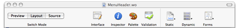
The first four buttons on the toolbar to the right of the Switch Mode buttons perform specific tasks and open additional tools. Some of the menu equivalents for these buttons are in the Window menu (where you can find the keyboard equivalents too).
The Interface button contains menu items that modify the interface of your component's Java source. You use this menu to add variables and actions to your component.
The Inspector button opens the inspector window, which allows you to set properties of the selected element.
You use the inspector window to set both HTML and dynamic element attributes. You can open the inspector window by selecting an element in either Layout or Source mode and clicking the Inspector button, or choosing Window > Inspector. The Inspector window is unique for each element but has some common controls. For example, Figure 1-7 shows the inspector for a WOString element. Read Inspecting Elements for more information on inspectors and editing elements.
Figure 1-7 The WOString Binding Inspector 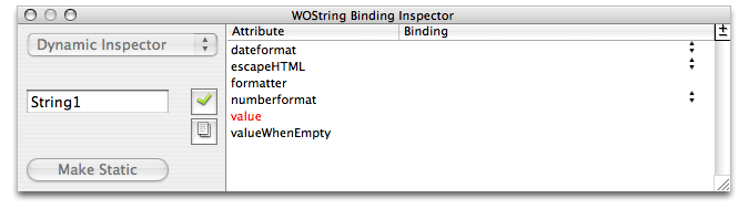
The Palette button opens the Palette window, which contains additional elements and components that you use to construct your web component as shown in Figure 1-8. You can also open the Palette window by choosing Window > Palette.
WebObjects Builder contains some standard palettes including palettes containing components specifically for Direct to Web and Java Client. There's also a JavaScript palette containing various flyover and panel components. You can also create your own palettes and add them to the Palette window. Read Working With Palettes for more information on this.
Figure 1-8 The Palette window 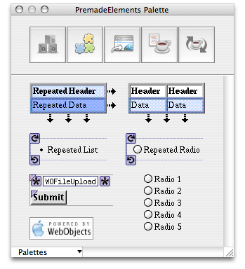
The Validation button opens the Validation window, which displays any binding validation errors on the page. Read Validating for more information on validating your web component.
The next three buttons on the toolbar are convenience pop-up menus for adding elements to your component—you can also add the elements using the menus in the menu bar which have the same names.
The Static pop-up menu contains common static HTML elements.
Read Working With Static Elements for how to use static elements.
The Dynamic pop-up menu contains dynamic HTML elements that are WebObjects-specific.
Some of these elements are concrete—have HTML counterparts—and others are abstract, such as WOConditional. Read Working With Dynamic Elements for details on these elements.
The Forms pop-up menu contains dynamic elements that you typically use in a form—a user interface that obtains information from the user and contains a submit button.
Read Using Dynamic Form Elements for details on using form elements.
Optionally, you can use the Elements & Components window to add elements to your component with a single click as described in The Elements & Components Window.
The Elements & Components Window
The Elements & Components window, shown in Figure 1-9, provides a convenient, single-click approach to adding elements to your component.
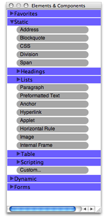
The Elements & Components window contains an outline view with folders for each type of element: Static, Dynamic, and Forms. You click to the left of a folder name to reveal its contents. The folders contain the same elements that are available in the pop-up menus on the toolbar and the element menus on the menu bar.
However, using the Elements & Components window, you click on an element name once to add it to your component. The element is added at the insertion point in either the Layout or Source mode. All of the same editing rules that apply to selecting elements from the menus apply to the Elements & Components window. Read Editing Components for details on these editing rules.
Just drag elements from the Static, Dynamic, and Forms folders to the Favorites folder. You can use the Favorites folder at the top of the window to quickly locate frequently used elements.
The Preferences Window
There are many ways to customize the views and behavior of WebObjects Builder. Choose Preferences from the application menu to open the Preferences window as show in Figure 1-10.
The preferences window has three panes:
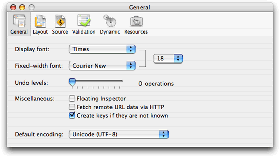
General preferences apply to the entire application and include preferences for setting display font, undo, and encoding attributes.
Layout preferences affect the appearance of the graphical view in Layout mode. Use these preferences to set colors and turn graphical tags on and off. Read Changing the Appearance of the Graphical Editorfor details on these preferences.
Source preferences affect the appearance of the HTML source editor, HTML source generation, and text editor containing the .
wodfile. Read Changing the Appearance of the HTML Source Editor for details on the Fonts & Colors preferences, Reformatting HTML for details on the HTML Generation preferences, and Changing the Appearance of the WOD Text Editor for details on the Dynamic Element Definitions preferences.Validation preferences affect the behavior of the validation functions. Read Validating for more information on validation and these preferences.
Dynamic preferences apply to the graphical view in the Layout mode. Read Setting Dynamic Element Preferencesto learn more about using dynamic elements.
Resources preferences apply to files that you import into your web component. Read Adding Elements From the File Systemfor details on these preferences.
The Menu Bar
There are menu and keyboard equivalents, located on the menu bar, for the toolbar buttons, toolbar pop-up menus and the Elements & Components window described earlier in the chapter. The toolbar and Elements & Components window are designed for your convenience. Optionally, you can use the menus on the menu bar.
The menu bar also contains the typical File, Edit, Window, and Help menus. (Power users may wish to memorize the keyboard equivalents for some of these menu items.) These are the menus in the WebObjects Builder menu bar:
The File menu contains commands for creating and opening web components. Read Creating Web Components for details on using this menu.
The Edit menu contains typical menu items for undo, cut, copy and paste, searching, and spell checking. You can also use this menu to edit your source and switch between views. Read Modifying the Web Component Interface for details on the Edit Source submenu.
The Format menu contains menu items to format text, tables, and frames. Read Editing Text in Layout Mode, Editing Tables, and Editing Frames for details on using these menu items.
The Static menu is equivalent to the Static pop-up menu on the toolbar. The same elements are also available in the Elements & Components window. Read Working With Static Elements for how to use static elements.
The Dynamic menu is equivalent to the Dynamic pop-up menu on the toolbar. The same elements are also available in the Elements & Components window. Read Working With Dynamic Elements for details on these elements.
The Forms menu is equivalent to the Forms pop-up menu on the toolbar. The same elements are also available in the Elements & Components window. Read Using Dynamic Form Elements for details on using form elements.
The Window menu contains commands for opening the tools and windows described in this chapter.
Use the Help menu to access WebObjects Builder documentation.
Copyright © 2005 Apple Computer, Inc. All Rights Reserved. Terms of Use | Privacy Policy | Updated: 2005-11-09