Retired Document
Important: This document may not represent best practices for current development. Links to downloads and other resources may no longer be valid.
Common Features of the Xcode Design Tools
Although the class and data modeling tools are different, and have different purposes, they share common functionality and usage patterns. Both employ a browser that you can use to navigate the class or entity hierarchy, to view the properties of an individual class or entity or the properties of a collection of classes and entities, and to inspect attributes of a property. Both tools also have a diagram view that you can use to visualize their contents.
The diagram and browser views have different roles. The diagram view is typically best when you need a high-level overview of the project . The browser view gives you more detailed information , and it can be especially useful in data models when, for example, you want to edit several attributes simultaneously. When you have large collections of classes or entities, you can minimize the information shown in the diagram (for example, just class names and inheritance relationship lines) and get the detailed information from browser . The diagram view offers a variety of different configurations, so you can tailor your view to any need. Figure 10-1 shows the class browser and a class hierarchy diagram.

The Diagram View
The diagram view contains two important elements, rounded rectangles, which represent nodes, and lines. Class diagrams may also contain annotations (described in Class Modeling With Xcode Design Tools).
Diagram Elements
The diagram view contains two important elements, “roundtangles” and lines. Class diagrams may also contain annotations (described in the Class Modeling With Xcode Design Tools).
Nodes
Nodes are the base elements in the model. In the class model, they are classes, categories, and protocols (interfaces in Java); in the data model they are entities.
A node may be split into three sections: The title bar containing the name of the element (including the namespace or package for C++/Java), and two compartments. The compartments show attributes and relationships in data models and properties (instance variables) and operations (methods or member functions) in class models (see Figure 10-3).
Lines
The semantic meaning of a line is different in the class and data models, and it further depends on whether the line is solid or dashed, what sort of arrowhead is present, and what objects it connects. In class diagrams, you can only edit lines to or from annotations—they are created automatically based on the inheritance hierarchies defined by the code in your project.
Diagram Tools
The diagram view provides several tools, whose function should be familiar from other drawing packages. You select the tools from the palette in the bottom-left corner of the diagram view, shown in Figure 10-2.

Arrow
You use the arrow tool to make selections and to move and resize graphic elements.
Text (Class Diagrams Only)
You use the text tool to annotate diagrams in a class model. To edit text in the text area, simply double click inside the element. You can use the Formatting menu, Font panel, Colors panel and so on to format the text as you wish. You can use the line tool to connect a text area to a specific class.
Line
You use the line tool to add a relationship in data model or to connect a comment to a specific class in a class model. To connect two elements, select the line tool, then drag from one end of the connection to the element at the other end. Note that in a data model, when you are establishing a relationship, you must make the connection from the source to the destination of the relationship.
Magnifying Glass
You use the magnifying tool to zoom into part of the diagram, or, by holding down the Option key, to zoom out . See Zoom for other ways to zoom. To effect the zoom, you select the tool, then click inside the diagram.
Hand
You use the hand tool to move the diagram if its bounds extend beyond the current view.
Roll-Up and Expansion
You can display a node and the compartments within it in a variety of ways:
Rolled up, so that just the name of the class or entity is showing. This gives the most compact representation, with maximum information density in the diagram. (In Figure 10-3 the NSDocument node is rolled up.)
Compartment titles showing. The titles are Attributes and Relationships in the data model, Properties and Operations in the class model. This gives a compact representation, but with easy access to detail .
Compartments expanded. All the information in a compartment is visible but at the cost of screen real estate. (In Figure 10-3 the properties compartment of MyDocument is expanded, but the opertations compartment is not.)

To roll up or roll down the node, use Design > Roll Up Compartments or Design > Roll Down Compartments respectively. To hide or expose compartment information, you use the disclosure triangle within a compartment, or Design > Expand Compartments or Design > Collapse Compartments .
Layout
There are a number of options for moving and resizing elements; you can also constrain the way the elements can be moved and resized, and even prevent them from being moved and resized at all. Furthermore, you can zoom into and out of the diagram, and arrange the page layout as you wish.
Moving and Resizing Shapes
You can rearrange elements in a diagram to suit your needs—lines that join elements are updated appropriately. Use the arrow tool to select an element, and then simply drag it. You can move all the elements in the current selection (see Multiple Selection) in the same way.
When you select a shape, “handles” appear around its edges (as shown in Figure 10-4). You can drag the handles to resize the shape as you wish.

You can also automatically resize elements in several ways, using the Design > Diagram > Size menu: Make Same Width and Make Same Height resize the selected elements appropriately; Size to Fit resizes the selected elements so that they fully enclose their contents with minimal padding.
Alignment and Grid
You can use a variety of options to automatically align selected elements and to help you keep elements aligned . You can use the menu items in the Design > Diagram > Alignment menu to perform a number of operations, aligning specified edges or centers of a selection and aligning a selection in a row or column.
You can also use a grid to help keep elements aligned. By default, the diagram view displays a background grid, and move and resize operations are snapped to it. Using the Design > Diagram menu, you can turn the grid display on and off; you can also independently turn the snap-to-grid feature on and off.
Automatic Layout
The class modeler provides two ways to automatically lay out elements in a diagram, force-directed layout and hierarchical layout. You access them using the Design > Automatic Layout menu.
With hierarchical layout , parent elements are typically at the top of the diagram, children at the bottom. This gives a generally horizontal layout, and is generally better for deep hierarchies.
The force-directed layout tends to produce circular arrangements, with commonly referenced classes in the middle. This is usually better for shallow hierarchies. Note that the force-directed layout can take unbounded time to calculate—it is not recommended for very large collections.
You can apply the automatic layout feature just to selected items or to the whole diagram. The layout respects the current size of elements in the selection. If you expand or contract a node, then perform automatic layout again, the result is different from what it was prior to the change in size .
Locking
You can lock individual graphic elements in place using Design > Diagram > Lock, or the Lock contextual menu. If you subsequently apply automatic layout, locked elements are unaffected. To unlock an item, use Design > Diagram > Unlock, or the Unlock contextual menu.
Zoom
You can zoom into and out of the diagram in three different ways:
Use the Design > Diagram menu to zoom in, out, and to fit.
Use the pop-up menu to select a percentage zoom.
Use the magnifying glass tool (click to zoom in, Option-click to zoom out).
Page Layout
If you move diagram elements outside the current diagram bounds (whether directly, or through applying automatic layout, or by unhiding elements), the page area automatically expands. Conversely, if you remove elements such that a page is left blank, the page area automatically contracts.
You can adjust the size of a page using the File > Page Setup menu. The page layout adjusts automatically to accommodate a change in page size.
Multiple Selection
You can use multiple selection in the diagram view to move a collection of elements in a flotilla drag, or for roll-up, expand all, and so on. You can make multiple selection in several ways:
You can select a single element, then hold down the Shift key and click additional elements. Unselected elements are added to the current selection; selected elements are removed from the current selection.
You can drag the background of the diagram to create a selection rectangle. Elements whose boundaries intersect with this rectangle are selected.
You can select classes or entities in the browser—the browser selection and diagram selection are kept synchronized.
You can use Edit > Select All to select all elements in the diagram. Note that for items in the Diagram menu, clicking on the background (rather than a drawn element) is the equivalent of selecting all, but may be faster.
Colors and Fonts
The diagram view provides default coloring for various elements . By default, all text is black, and the title bar and outline of drawing elements are colored. In the data model the color is the same for all entities.
You change the background color of the title bar and color of the outline of elements by dropping a color swatch from the Color panel onto the element. You change the other color settings, and the font used for the title, property, and operations text, using the Appearance pane of the Info window (inspector). You can also select multiple elements and change their color and text settings simultaneously, as shown in Figure 10-5.
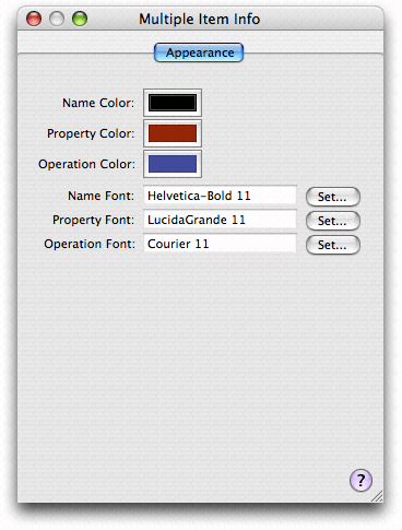
You can also change the default settings for the entire model using the Appearance pane—see Info Window.
The Browser View
The browser view gives you a different perspective on the whole of your model (note that all classes are shown in the browser view, even if they are hidden in the diagram view). It has three separate parts: two table view panes—the class/entity pane and the properties pane—and the detail pane. You can resize a pane by dragging the vertical divider. You can also hide a pane by resizing its width to zero—to hide the detail pane you must drag the divider on its left side most of the way to the right past its minimum size.

Table View Panes
The left-most pane displays and allows you to edit information about the classes or entities that are in the model. The middle pane displays and allows you to edit information about the properties of the currently selected class or entity. If you make a multiple selection in the class/entity table, the properties table shows the union of all properties of the selection.
As with most table views, you can rearrange and re-sort the columns. You rearrange the columns simply by dragging a header cell; you can change the sort order by clicking in header cells.
You can choose which columns to see by Control clicking table header cells to display a pop-up list that you can use to toggle the display of columns (see Figure 10-7). If you have a multiple selection, Show All Columns means that only the set of columns common to all members of the selection may be displayed, otherwise you get a specific set (dependent upon what you have selected).

You can also choose which properties are shown by clicking the “v” button to the left of the horizontal scroll bar in the property table. This again displays a pop-up list that you can use to toggle the visibility of properties and operations, as shown in Figure 10-8.

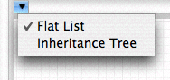
Finally, you can display the class/entity list as a flat list or as an inheritance hierarchy. Click the “v” button to the left of the horizontal scroll bar to choose the view option you want as shown in Figure 10-9.
Detail Pane
The detail pane displays detailed information about whatever was last selected in either the entity/class or the property table. If you make a multiple selection, the editor shows the best representation it can of the union of the selected items. If you’re using the data modeling tool, this makes it easy to apply changes to a number of entities or properties simultaneously.
Info Window
The Info Window (inspector) is different for data and class models . Both have Appearance panes and the class browser has a General pane with visibility settings and a Tracking pane —see Indexing and Tracking). You can use the Appearance pane to set default colors and fonts for element names, properties, and operations. Figure 10-10 shows an Appearance pane with custom settings.
Workflow
The Xcode design tools offer a wide range of options and features to ease your workflow, from automatic page creation and deletion in the diagram view, to multiple selection editing in the browser. In addition, it is possible to add to the toolbar shortcuts for actions such as Add Entity, Attribute, and Quick Model.
Model Files
The usual way you create a new model file is with the File > New File command and the New File Assistant, shown in Figure 10-11.

For class models, you can also create a quick model from the currently selected items using the Design > Class Model > Quick Model command (see Creating a Quick Model).
Models are considered integral to the project , so you should typically add new class and data models to the project . The exceptions are quick models. Since they are initially considered temporary, you do not have to add them to the project immediately. If you decide to save a quick model, you can add it to the project at a later time. A data model, on the other hand, is a runtime resource (it is compiled, and deployed as part of application), and you should add new data models not only to the project, but also to the relevant target.
You might find it useful to create several different class models in your project. Each model may present subsets of the data in different ways. Each gives a its own perspective on the project, so may be useful for different situations.
Navigation
You can use the browser and diagram views in conjunction for navigation—the selection in the two views is kept synchronized, so if you make a selection in the browser, the same item is selected in the diagram, and vice-versa.
If you want to see a large model in the diagram view, you can maximize the viewable area of a diagram in the main project window by hiding the toolbar, the navigation bar, the status bar, the Favorites bar, and the browser.
If you have a large class diagram, there are two strategies you can use to aid navigation. First, you can type to select classes or entities. As you type characters, the alphabetically “topmost” class or entity whose name has the prefix you typed is selected. Second, you can use the pop-up menu at the top of the document pane. The pop-up shows a list of elements . When you select an item from the pop-up menu (see Figure 10-12), the corresponding element is selected in the diagram and brought into view. This feature may be particularly useful if the browser is hidden.

The browser view, however, is useful when you have a large class diagram with all compartments rolled up, and you want to see more details about a given class, but don’t want to make the diagram bigger. The browser also shows more information than is available in the diagram (parameters, return types and so on).
Contextual Menus
Most menu-based commands are also available from contextual menus associated with the relevant user interface element. You can Control-click a node for immediate access to operations that apply to it or its context, for example to expand compartments, or navigate to documentation. You can Control-click the diagram background to perform operations related both to the visual representation and (in the data model) to the model itself. For example, you can hide grid lines, zoom, set the alignment of drawing elements, and add entities.
Copyright © 2004, 2006 Apple Computer, Inc. All Rights Reserved. Terms of Use | Privacy Policy | Updated: 2006-11-07