Designing an Expanded Ad Unit
Using iAd Producer
iAd Producer is a powerful tool available to you to use in the design and customization of your ad. From mocking up your initial design concept to uploading your ad to the iAd test server, iAd Producer gives you access to a large variety of objects, behaviors, and animations all of which are built from the same web technologies you can use to create your own custom assets.
iAd Producer also includes a library of iAd Blueprints, templates which feature a variety of popular features and baked in best practices that you can use to get your ad built and live very quickly.
For a quick introduction to iAd Producer, see iAd Producer Tutorial. For detailed information about using iAd Producer to design and create an ad, see iAd Producer User Guide.
Designing an Effective and Engaging Ad
See What Users See
Before you begin designing your ad, walk through the ad unit life cycle and understand exactly what users experience. By entering your ad, users are giving you the opportunity to provide an experience they will love. Seize this opportunity and provide amazing, media-rich content that can be viewed in a couple of minutes. This content should include calls to action for users that further your brand’s key objectives.
Making a Great First Impression
Your ad’s banner or audio with slate gives users a first impression of your ad and is your opportunity to motivate them to launch your ad experience. In iAd-enabled apps, banners appear in the app’s UI when and where it makes sense in the context of the user’s experience. In Radio on Apple Music, audio with slates appear during the listening experience.
For specifics on the different types of banners available, see Guide to Advertising within Radio on Apple Music and the App Network.
Entering the Expanded Ad Unit Experience
When a user taps your banner, the ad unit transition provides a simple, brief visual connection between your banner and your splash page or core ad unit.
The default slide transition slides a blank, solid-colored background into place from the bottom of the screen, completely covering the application. You can specify the color of this background. The background is then replaced with your splash page or core ad unit.
The slide transition is appropriate for both standard and full-screen banner ads.
Building Anticipation
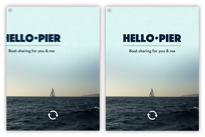
Always keep in mind that a user’s attention is won or lost within the first five seconds of your ad. The longer users have to wait, the more likely they are to drop off, therefore it is imperative to get the user engaging with your ad experience as soon as possible. To keep users engaged while your core ad unit loads, you can include a splash page in your ad.
To perform well, the splash page should be simple—but that doesn’t mean it should be bland or lifeless. If a splash page fails to engage users right away, they might leave before seeing the primary ad content.
A good splash page attracts the user’s interest while maintaining their desire to see the primary ad content. In addition to creating attractive graphics, you can use custom fonts along with CSS animations and transforms to enliven your splash page and add interactivity.
For example, if your ad has engagement through gameplay as the primary objective, you could use the splash page to display a brief set of instructions before leading the user into the game experience.
Whatever your ad’s primary objective may be, use the splash page as a brief, eye-catching introduction, propelling them forward, excited to engage.
Be sure to avoid putting too much content into your splash page. For specific size and performance recommendations, see Expanded Ad Unit Specifications.
Make Every User Interaction Obvious
Even if you create an amazing, immersive ad, your users won’t experience it if they can’t figure out how to use it. In addition to following the user interaction guidance provided by iOS Human Interface Guidelines, make sure that your users see everything your ad has to offer by designing according to the following guidelines.
The freedom provided by HTML, CSS, and JavaScript lets you create exciting, nontraditional user interfaces for your ad. Doing so, however, has the potential to create a confusing experience for your users.
If users can interact with an element in your ad that doesn’t look like a traditional user interface element (such as a button), you must provide a cue to the user about its function. For example:
Add an icon or text that explains how to use the element.
Add a highlight or glow effect to the element.
Add a subtle animation to the element, such as a wiggle.
Give the element a 3D, rounded appearance.
The interactive elements of your ad should be large enough to detect user interactions without requiring users to make overly precise gestures. On a Retina HD display, interactive elements should have a minimum tappable area of 132 x 132 pixels so that users can tap them comfortably.
Your ad should provide immediate feedback whenever users interact with an element. Otherwise, users might not know that their interaction was successful and might believe that the ad is being unresponsive. Non-interactive elements in your ad should not appear to be interactive. Users might mistake this non-interactivity for unresponsiveness and close your ad.
If your ad includes a gallery of images or other assets, the gallery’s navigation mechanism should indicate the total number of items in the gallery and the user’s current position within the gallery.
The interactivity of an element should be obvious to the user. For example, a user should know where a menu item will take him or her. The path should be clear.
Make It Easy for Users to Keep Interacting
As often as possible, users should be able to interact with your core ad unit. Users who have no access to another form of interaction still have access to the ad’s Close button, and they are more likely to use it when they don’t perceive any obvious alternatives.
Make sure users can return to your ad’s main view (that is, the root view) at all times. If some portion of your ad’s content does not appeal to a given user for whatever reason, the user should be able to quickly navigate to the remainder of your ad’s content. If users become stuck in a particular view, they have no choice but to close your ad.
Because users might choose to close your ad at any time, place your most important section first.
Deliver an Amazing Experience
The core ad unit represents the main part of your users’ ad experience. It is your opportunity to delight users with media-rich, emotional content. It provides a wide variety of content across several views, which are analogous to different pages on a website. As a simple example, one view could embed a map that displays nearby store locations, while another view could show a video.
In order to engage the user quickly, your core ad unit’s first page should direct them to the most important objective first. Whatever you want the user to do, get them engaged immediately.
Providing some form of navigation that lets the user switch between your different views is highly recommended. This navigation should be easy to use and intuitive.
Your navigation menu (along with all of the core ad unit’s content) can take any form you can imagine; it doesn’t have to adhere to a rigid structure. Make sure the user can find your objectives easily and get there quickly.

Keep The Experience Engaging
Because expanded ad units are structured in much the same way as a small web site, it can do almost anything that’s possible in Safari on iOS. In addition, your ad can take advantage of some native features of an iOS-based device. Your ad should strive to match native apps in terms of both usability and functionality. If it doesn’t, users are more likely to exit your ad and return to their app.
Try Using Page Transitions
You can choose a transition that users will see when one page disappears and another appears. Uniformity throughout the ad is important to create a cohesive experience. A distinctive transition can be used to create a purposeful animation. The recommended duration time for most transitions is 0.5 seconds. The default page transition within iAd Producer is a 0.5 second fade, but other transition effects may look better with a different duration.
Animate Objects
You can animate objects by applying an animation or style to the object. These actions define how an object or its style properties should change over time after an event occurs (such as a page appearing). Multiple animations are able to take place concurrently or in a sequenced order. A moderate amount of animation is recommended to create an enjoyable user experience; excessive animation can be distracting from the ad’s KPI’s and brand. The default time for an animation is 1 second with a 0 second delay upon initial Page Appear. This may be varied as appropriate to design and intended UX.
Keep These iPad Considerations in Mind
The process for developing ads for iPad is nearly identical to the process for developing ads for other iOS-based devices; however, if you are developing an ad for iPad, keep the following special considerations in mind:
The ad you create for iPad must be tailored specifically to the iPad experience. You can use many of the same assets that you use in the ad you create for other iOS-based devices, but the presentation and layout of those assets should take full advantage of the substantial screen real estate available on iPad.
User behavior is different as well on an iPad. Whereas most people carry their iPhones with them everywhere, iPad users are more likely to be at home or in the office on a high-speed Wi-Fi connection. This speed increase generally means that iPad users will get farther into the ad in a shorter time.
The resolution and aspect ratio of the iPad screen differ from those of other iOS-based devices. Consequently, the required dimensions for banners and video assets are different.
Make sure that you use font types and sizes that are appropriate for the device. A user should not have to struggle to read your text. To be sure your ad is legible, test it on a device.
Copyright © 2015 Apple Inc. All Rights Reserved. Terms of Use | Privacy Policy | Updated: 2015-10-29