

Content Views
Content views display custom app content. Because the look of most content views is not provided by the system, visual changes in iOS 7 have almost no effect on them. The main exception is the grouped-style table view, which has a significantly changed default appearance in iOS 7.
Activity
An activity represents a system-provided or custom feature that can act on the currently selected content. Users can access these features in the system-provided activity view controller that appears when they tap the Share button.
System-provided activities can use either of two icon styles:
A style that looks like a fully rendered app icon, such as the Mail icon shown below
A style that looks similar to a bar button item, such as the Copy and Print icons shown below
Third-party features always use the second style.

To offer a service within your app, create a simple, streamlined template image that represents it and a short title that describes it. Follow these guidelines to create a template image that looks good in the activity view controller:
Use black or white with appropriate alpha transparency.
Don’t include a drop shadow.
Use anti-aliasing.
Center an activity template image in an area that measures about 70 x 70 pixels (high resolution).
Collection View
A collection view manages an ordered collection of items and presents them in a customizable layout.
In iOS 7, collection views support custom animated transitions between layouts. To learn more, see UICollectionViewTransitionLayout Class Reference.
Photos uses collection views to display groups of photos and support transitions between them.
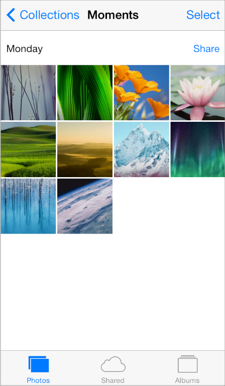
Image View
An image view displays a single image or an animated series of images.
In iOS 7, UIImageView includes the tintColor property. When the image view contains a template image—that is, an image that specifies the UIImageRenderingModeAlwaysTemplate rendering mode—tintColor is applied to the image.
Map View
A map view presents geographical data and supports most of the features provided by the built-in Maps app.
Photos uses a map view to help users view location information for a photo.

In iOS 7, use the new MKOverlayRenderer class to create an overlay to draw on top of a map view.
To add a 3D appearance to a map view, assign a camera object—that is, an instance of MKMapCamera—to a map view’s camera property. To learn more, see MKMapView Class Reference.
Page View Controller
A page view controller manages multipage content using either a scrolling or page-curl transition style.
In iOS 7, use the pageViewControllerPreferredInterfaceOrientationForPresentation and pageViewControllerSupportedInterfaceOrientations methods to specify preferred and supported orientations, respectively.
Below, you can see the default appearance of a page view controller in iOS 7 Simulator:

Popover (iPad Only)
A popover is a transient view that can be revealed when people tap a control or an onscreen area.
In iOS 7, the popover background is a white blur, which means that the background of the popover’s content view can be transparent. A table view inside a popover automatically uses a translucent appearance; custom content inside a popover should use a translucent appearance.
iOS 7
iOS 6

Scroll View
A scroll view helps people see content that is larger than the scroll view’s boundaries.
The only visual difference in the scroll view between iOS 7 and iOS 6 is the appearance of the scroller.
iOS 7
iOS 6

In iOS 7, you can manage scroll view insets yourself by using the automaticallyAdjustsScrollViewInsets property of UIViewController.
Split View Controller (iPad Only)
A split view controller is a full-screen view controller that manages the presentation of two side-by-side view controllers.
The appearance of a split view controller is provided by the views of its child view controllers, which may be affected by the iOS 7 UI.
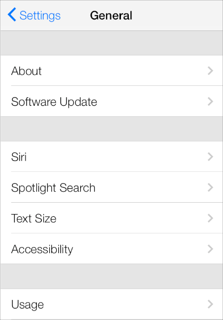
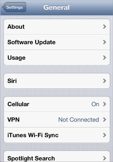
Table View
A table view presents data in a single-column list of multiple rows.
iOS 7 introduces several changes to the appearances of both plain and grouped table views.
iOS 7 (grouped table)
iOS 6 (grouped table)
Feature |
Appearance in iOS 7 |
|---|---|
Cell separator (both styles) |
Separators in iOS 7 are thinner, narrower, and lighter in color than separators in iOS 6. By default, the separator is inset from the left edge of the table view. * |
Section index (plain style) |
By default, the section index includes a translucent white background (use the |
Header and footer text (both styles) |
By default, headers display text using all capital letters; footers display text using sentence-style capitalization.
You can use a custom |
Cell group (grouped style) |
Each group extends the full width of the screen. |
Cell selection appearance (both styles) |
Noninverted content is displayed on a subtle gray background. |
Background appearance (grouped style) |
The background is a solid light gray. |
* If every cell in a table contains an image view of the same size, by default iOS vertically aligns the leading edge of all separators. In a table that mixes text-only cells with cells that contain image views, you can use the separatorInset property to ensure that the separators are vertically aligned.
Table-view elements also have a different appearance in iOS 7.
Table-view element |
Appearance in iOS 7 |
Appearance in iOS 6 |
|---|---|---|
Checkmark |
|
|
Disclosure indicator |
|
|
Detail Disclosure button |
|
|
Row reorder |
|
|
Row insert |
|
|
Delete button control |
|
|
Delete button |
|
|
Text View
A text view accepts and displays multiple lines of text.
Be sure to use the UIFont method preferredFontForTextStyle to get the text for display in a text view.
Web View
A web view is a region that can display rich HTML content.
In iOS 7, UIWebView supports displaying content in a paginated layout.
Copyright © 2018 Apple Inc. All rights reserved. Terms of Use | Privacy Policy | Updated: 2016-03-22