Animating With Keyframes
Safari supports two types of CSS animation: transition animations and keyframe animations. To simply animate changes in CSS properties whenever those properties change, you should probably use an animated transition (see Animating CSS Transitions).
To create complex animations—such as a bumblebee’s flight or a change that starts and stops or repeats indefinitely—or to trigger animations under arbitrary conditions using JavaScript, use keyframe animations.
Keyframe animations include the following features:
Choose any number of CSS properties to change and define points along a timeline that have specific states.
Animation between two defined points is automatic but can be guided by specifying a timing function.
You trigger keyframe animations explicitly.
Keyframe animations can be set to repeat a finite number of times or to repeat indefinitely, proceeding in the same direction each time, or alternating forward and backward.
Keyframe animations can be paused and resumed.
All of the elements in a class can be animated as part of a single animation.
When a keyframe animation completes, an animated element returns to its original CSS style. You can override this behavior, however, and make the final animation state persistent. You can also change an element’s style when the animation ends by installing a JavaScript listener function for the webkitAnimationEnd event.
Create stunning effects by combining animation with 2D and 3D transforms. For example, Figure 6-1 shows an animation of text elements in 3D space. See the PosterCircle sample code project for the complete source code for this example.
Keyframe animation is a W3C draft. See http://dev.w3.org/csswg/css3-animations/.
Creating a Keyframe Animation
A keyframe animation has—at minimum—a name, a duration, and one or more keyframes. A keyframe is a CSS rule consisting of a set of properties and values associated with a point in time.
To create a keyframe animation, perform the following steps:
Create a named set of keyframes in CSS using the
@-webkit-keyframesrule. The set must include at least one keyframe.Set the
-webkit-animation-durationproperty to a positive, nonzero value.Set the
-webkit-animation-nameproperty to the name of the set of keyframes.
The following example defines a single keyframe in a set named glow. The keyframe specifies a blue background color. The example defines the div:hover pseudoclass as having the animation name glow and the animation duration of 1s. When the user hovers over or touches any div element, it turns blue for one second.
Listing 6-1 Simple keyframe animation
<html> |
<head> |
<title>Blue Glow</title> |
<style> |
@-webkit-keyframes glow { |
0% { background-color: blue; } |
100% { background-color: blue; } |
} |
div:hover { |
-webkit-animation-name: glow; |
-webkit-animation-duration: 1s; |
} |
</style> |
</head> |
<body> |
<div> <p>Hover turns me briefly blue.</p> |
</div> |
<div> <p>Me too.</p> |
</div> |
</body> |
</html |
Creating Keyframes
Keyframes are specified in CSS using the @-webkit-keyframes rule. The rule consists of the @-webkit-keyframes keyword, followed by the animation name then by a series of style rules for each keyframe. The style rules are grouped in blocks surrounded by braces, and each is preceded by a relative point in time (typically a percentage of the animation’s duration).
Any number of CSS properties can be specified by the style rules.
Listing 6-2 shows a set of keyframes where the animation is named wobble-glow and the keyframes move an element back and forth while changing its background color over time. The left property animates back and forth between 75px and 150px, while the background color cycles between red, white, and blue.
Listing 6-2 Declaring keyframes
@-webkit-keyframes wobble-glow { |
0% { left: 100px; background: red;} |
40% { left: 150px; background: white;} |
60% { left: 75px; background: blue;} |
100% { left: 100px; background: red;}} |
} |
The relative point in time is given either as a percentage of the animation’s duration or by the keywords from or to . For example, 0% specifies the start of an animation, 50% is halfway through an animation, and 100% is the end of an animation. The from keyword is equivalent to 0% and the to keyword is equivalent to 100%. When the animation executes, it transitions smoothly from one state to the next in increasing order, from 0% to 100%.
One of the CSS properties that you can specify in a keyframe is -webkit-animation-timing-function. This property specifies the rate of change for the animation from the current keyframe to the next keyframe. For details, see Animation Timing Functions.
Setting Animation Properties
You typically set keyframe animation properties by defining a CSS class or pseudoclass, but you can also set the animation properties by using the HTML style attribute in an HTML tag or by setting the style property of an element using JavaScript.
You must set the -webkit-animation-duration and -webkit-animation-name properties in order to see an animation. You can also set the following animation properties:
-webkit-animation-iteration-count—Sets the number of times to repeat the animation. The default value is1. Can be set to an integer value or toinfinite.-webkit-animation-direction—Causes repeating animation to either proceed in the same direction each time or to alternate directions. Can be set tonormal(default) oralternate. If set toalternate, the animation goes forward and backward—from 0% to 100% and from 100% to 0%—on alternate iterations. Thewebkit-animation-iteration-countvalue must be greater than one1 for this property to have any effect.-webkit-animation-play-state—Pauses or resumes an animation. Set this property topausedto pause and orrunning(default) to continue the animation.-webkit-animation-delay—The time to wait between triggering the animation and beginning the animation (default is0s).-webkit-animation-timing-function—The default timing function to use between keyframes. You can override this property on a per-keyframe basis by specifying additional timing functions within keyframes.-webkit-animation-fill-mode—Causes the animation to change an element’s style before or after the animation runs.By default, an element’s style is unchanged by a keyframe animation, both before and after the animation runs.
If set to
forwards, the end state of the animation is persistent.If set to
backwards, the beginning state of the animation is applied during the delay before starting the animation.If set to
both, bothbackwardsandforwardsare specified.
Animation Timing Functions
Animation timing functions control an animation's rate of change. A timing function is a mathematical function that provides a smooth curve or path for the rate of change. Specify a timing function using the -webkit-animation-timing-function property. Include the timing function property in a keyframe to specify how to transition from that keyframe to the next. Specify a default timing function to use between all pairs of keyframes by setting the timing function property for an element or a class.
The timing function determines the speed of an animation from the current to the next keyframe. You can specify one of the predefined timing functions:
ease(default)ease-inease-outease-in-outlinear
You can also specify cubic-bezier as the animation timing function. The cubic Bezier curve is defined by four control points, as illustrated in Figure 6-2. The first control point is always (0,0) and the last control point is (1,1), so you specify the two intermediate control points of the curve.
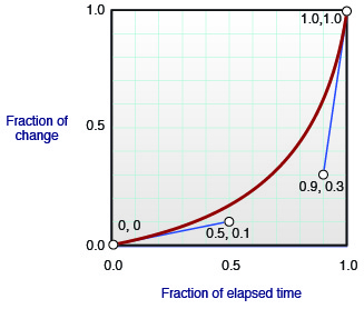
The control points are specified as x,y coordinates, where x is a fraction of the duration between keyframes and y is a fraction of the change in properties.
For example, the following line of code sets the second point to (0.5, 0.1) and the third point to (0.9, 0.3) using the cubic-bezier function:
-webkit-animation-timing-function: cubic-bezier(0.5, 0.1, 0.9, 0.3); |
This example causes the animation to begin very slowly, completing only 10% of the change after 50% of the animation and 30% of the change after 90% of the animation. Since the function always ends at the point (1,1), the rest of the animation goes very quickly.
Starting Animations
Once a set of keyframes is created, an animation is triggered when the following conditions are met:
An element’s
animation-nameproperty is set to the name of the group of keyframes.The element’s
animation-durationproperty has been set to a positive nonzero value.The element’s
animation-play-stateproperty is not set topaused.
Consequently, there are several ways to trigger an animation. Here are a few of the most common methods:
Setting the class name at runtime—Set up the animation as part of an unassigned CSS class, then use JavaScript to assign that class to an object by setting the object’s
classNameproperty at runtime.Setting the animation name at runtime—Set up the animation using an element’s CSS class definition without specifying the animation name, then trigger the animation by setting the element’s
style.webkitAnimationNameproperty in JavaScript or by setting-webkit-animation-nameproperty through a CSS pseudoclass.Setting the animation play state at runtime—Set up the animation using an element’s CSS class definition while specifying the animation state as
paused, then trigger the animation by setting the element’sstyle.webkitPlayStateproperty torunningin JavaScript or setting-webkit-animation-play-stateproperty torunningthrough a CSS pseudoclass.Starting out running—For an animation that runs when the page loads, set up the animation as part of a CSS class that includes at least one HTML element.
Listing 6-3 is an example that shows how to apply an animation to an element when the user clicks it.
Listing 6-3 Starting an animation
<html> |
<head> |
<title>animated div</title> |
<style> |
// slide right, then diagonally down and right |
@-webkit-keyframes slide { |
0% {top: 0%; left: 0%;} |
50% {top: 0%; left 50%;} |
100% {top: 100%; left: 90%;} |
} |
// animate over 2s, repeat animation 4 times, back and forth, with linear timing |
.div-slide { |
position: relative; |
-webkit-animation-name: slide; |
-webkit-animation-duration: 2s; |
-webkit-animation-timing-function: linear; |
-webkit-animation-iteration-count: 4; |
-webkit-animation-direction: alternate; |
} |
</style> |
</head> |
<body> |
<div onclick="this.className='div-slide';"> |
<P>Click to slide right and down, then back.</p> |
</div> |
</body> |
</html> |
Controlling Animation Using JavaScript
Control a CSS animation using JavaScript either by changing an element’s className property or by changing an element’s animation style properties individually. One thing to remember is that the JavaScript name for a property is not always the same as the CSS name. Compound names in CSS typically contain dashes, but in JavaScript the dash is the subtraction operator, so JavaScript names omit the dash. Compound names in JavaScript usually capitalize the first character of each word after the first word; so if a CSS name were -extension-foo-bar, the JavaScript name would usually be extensionFooBar.
As an example, to set the CSS property -webkit-animation-play-state from JavaScript, set the element’s style.webkitAnimationPlayState property.
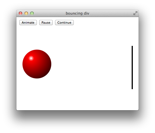
Listing 6-4 creates three buttons and a round div element with a radial gradient background. The first button animates the div element by changing its class name. The second and third buttons pause and continue the animation by setting the div element’s style.webkitAnimationPlayState property. Figure 6-3 illustrates the result.
Listing 6-4 Pausing and continuing an animation
<html> |
<head> |
<title>bouncing div</title> |
<style> |
@-webkit-keyframes bounce { |
0% {top: 100px; left: 1px; -webkit-animate-timing-function: ease-in;} |
25% {top: 150px; left: 76px; -webkit-animate-timing-function: ease-out;} |
50% {top: 100px; left: 151px -webkit-animate-timing-function: ease-in;} |
75% {top: 150px; left: 226px -webkit-animate-timing-function: ease-out;} |
100% {top:100px; left: 301px;} |
} |
.bounce { |
-webkit-animation-name: bounce; |
-webkit-animation-duration: 2s; |
-webkit-animation-timing-function: linear; |
-webkit-animation-iteration-count: infinite; |
-webkit-animation-direction: alternate; |
} |
</style> |
</head> |
<body> |
<input type="button" value="Animate" onclick= |
"document.getElementById('ball').className='bounce';"> |
<input type="button" value="Pause" onclick= |
"document.getElementById('ball').style.webkitAnimationPlayState='paused';"> |
<input type="button" value="Continue" onclick= |
"document.getElementById('ball').style.webkitAnimationPlayState='running';"> |
<p> |
<div id="ball" style="position:absolute; top: 100px; left: 10px; |
height:100px; width:100px; border-radius:50px; |
background:-webkit-radial-gradient(30% 30%, white, red 10%, black);;"> |
</div> |
<div style="position:absolute; left: 400px; top: 100px; |
height: 150px; background: black;"><p> |
</div> |
</body> |
</html> |
Handling Animation Events
Three animation-related events are available through the DOM event system:
webkitAnimationStart—Sent when the animation begins (after any specified delay).webkitAnimationIteration—Sent at the end of each iteration.webkitAnimationEnd—Sent after the final iteration.
Note that when the final iteration in a series completes, it triggers both a webkitAnimationIteration and a webkitAnimationEnd event.
Each of these events has three significant properties:
The
event.targetproperty is the object being animated.The
event.animationNameproperty is the name of the animation that generated the event.The
event.elapsedTimeproperty is the length of time the animation has been running. Elapsed time does not include any time the animation was in the paused play state, nor does it include any specified delay time.
As an example of event handling, Listing 6-5 creates three colored balls (round div elements) that roll away and disappear when clicked. The balls are given a class name that includes animation but begins with the animation play state set to paused; an onclick handler in each ball sets the play state for that element to running. The example adds an event listener for webkitAnimationEnd events on the body element. When a webkitAnimationEnd event occurs, the listener function removes the animated element by changing the element’s style.display property to none.
Listing 6-5 Handling animation events
<html> |
<head> |
<title>rolling divs</title> |
<style> |
@-webkit-keyframes roll { |
0% {left: 1%; } |
100% {left: 90%;} |
} |
.ball { |
position:absolute; left: 3px; |
height:50px; width:50px; border-radius:25px; |
-webkit-animation-name: roll; |
-webkit-animation-duration: 2s; |
-webkit-animation-timing-function: linear; |
-webkit-animation-play-state: paused; |
} |
</style> |
<script type="text/javascript"> |
function goAway(event) { |
event.target.style.display="none"; |
} |
</script> |
</head> |
<body onload="document.body.addEventListener('webkitAnimationEnd', goAway, false);"> |
Click the colored balls to make them roll away: |
<div class="ball" |
style="top:50px; background-color: red;" |
onclick="this.style.webkitAnimationPlayState = 'running';"> |
</div> |
<div class="ball" |
style="top:105px; background-color: green;" |
onclick="this.style.webkitAnimationPlayState = 'running';"> |
</div> |
<div class="ball" |
style="top:160px; background-color: blue;" |
onclick="this.style.webkitAnimationPlayState = 'running';"> |
</div> |
</body> |
</html> |
Copyright © 2016 Apple Inc. All Rights Reserved. Terms of Use | Privacy Policy | Updated: 2016-10-27