Using Masks
A mask is a two-dimensional shape that acts as an overlay on an element and clips the element visually or renders portions of the element transparent or translucent. A mask consists of an image or a gradient that contains an alpha channel; where the alpha value of the mask is 0, the underlying element is transparent, or masked out; where the alpha value is 1, the underlying element displays normally; where the alpha value is between 0 and 1, the underlying element is proportionally transparent. Only the alpha values of the mask are used; any other color values are ignored.
An element’s mask applies to its children and their descendants. The children and descendants may also have masks, in which case the masks are stacked. The transparent areas of a masked element reveal the underlying webpage contents, which may also contain masked elements; these masks too are stacked. The final image is rendered after concatenating all the masks in the stack, tiling and stretching them as specified.
When a mask is applied to an element, both the contents and background of the element are masked. A mask may be applied to the entire element or it may exclude either the border or the combined border and padding.
Using an Image as a Mask
To apply a mask using an image, first create a .png or .svg image that contains an alpha channel. Pass the URL of this image into either the -webkit-mask-image property or the -webkit-mask-box-image property. The -webkit-mask-image property uses the native size of the mask image. The -webkit-mask-box-image property scales the mask image to meet the edges of the element.
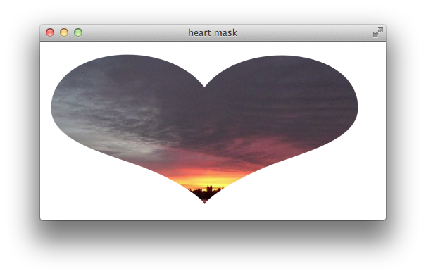
If the image used as a mask consists of an opaque shape on a transparent background, the mask acts as a “cookie cutter” to clip an element in the shape of the mask. For example, the following snippet applies a heart-shaped mask to an image. Figure 2-1 shows the result.
<img src="sunrise.png" style="-webkit-mask-box-image: url(heartmask.png);" > |
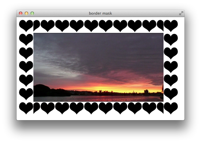
The -webkit-mask-box-image property takes optional arguments that work like the -webkit-border-image parameters. You can specify offsets into the mask image to slice it into top, right, bottom, and left images, applying the mask slices, stretched or repeated, to the edges of an element. For example, the following snippet uses a 50-pixel heart-shaped mask and adds a 50-pixel border to the image. The snippet also adds parameters to the -webkit-mask-box-image property, setting the slice size to the whole mask image and specifying repeat both horizontally and vertically. Figure 2-2 shows the result.
<img src="sunrise.png" style= "border:50px solid black; |
-webkit-mask-box-image: url(heartmask.png) 50 50 50 50 repeat repeat;" > |
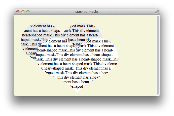
As mentioned previously, you can mask any HTML element, and you can concatenate masks by inheritance and by stacking masked elements. For example, Listing 2-1 creates a pair of masked div elements, each of which contains a paragraph element. The example positions the second div element so that it partly overlaps the first div element. The paragraph elements are masked by their parent div elements, and the two masks are stacked. The result is shown in Figure 2-3.
Listing 2-1 Stacking masked elements
<html> |
<head> <title>stacked masks</title> |
</head> |
<body style="background:beige;"> |
<div style="position:absolute; left:20px; top:20px; background:#e9e9e9; width:240; |
-webkit-mask-box-image: url(heartmask.png);"> |
<p>This div element has a heart-shaped mask.This div element has a heart-shaped mask.This |
div element has a heart-shaped mask.This div element has a heart-shaped mask.This div element |
has a heart-shaped mask.This div element has a heart-shaped mask.This div element has a heart- |
shaped mask.This div element has a heart-shaped mask. |
</p> |
</div> |
<div style="position:absolute; left:80px; top:80px; background:white; width:240; |
-webkit-mask-box-image: url(heartmask.png);"> |
<p>This div element has a heart-shaped mask.This div element has a heart-shaped mask.This |
div element has a heart-shaped mask.This div element has a heart-shaped mask.This div element |
has a heart-shaped mask.This div element has a heart-shaped mask.This div element has a heart- |
shaped mask.This div element has a heart-shaped mask. |
</p> |
</div> |
</body> |
</html> |
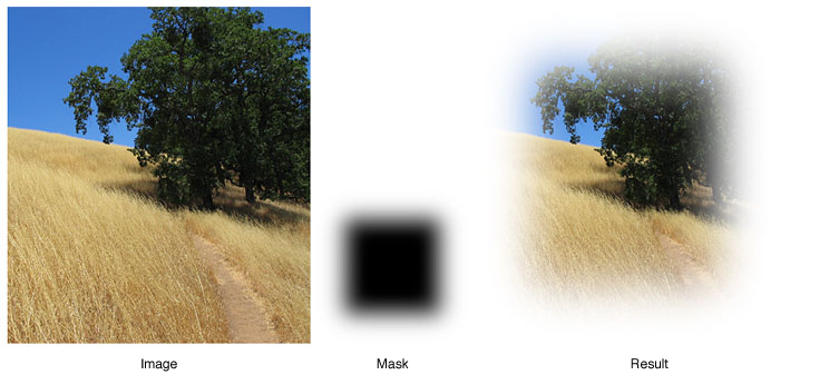
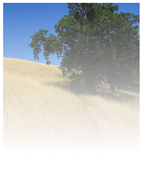
You can use a mask to fade an element gradually into the background by including semitransparent pixels in the mask. For example, the following snippet applies a mask image with a solid center and increasingly transparent edges to the image of a field. The -webkit-mask-box-image property is used, so the mask is scaled to fit the img element. The result is shown in Figure 2-4.
<img src="field.jpg" style="-webkit-mask-box-image: url(mask.png);"> |
Using a Gradient as a Mask
Because gradients can be used in place of any image, a gradient can be passed as a mask. The following snippet defines a gradient that goes from opaque to transparent as a mask for an img element. The result is shown in Figure 2-5.
<img src="field.png" style="-webkit-mask-box-image: |
-webkit-linear-gradient(black, transparent);"> |
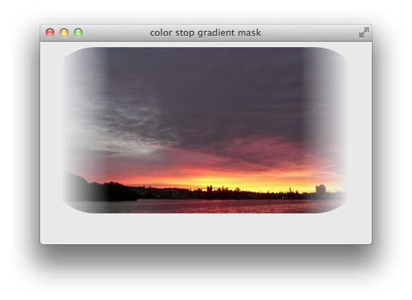
The example just given goes from opaque to transparent over the height of the image, but you can use different gradient parameters to achieve different effects. The following snippet creates a gradient from left to right and uses color stops to fade an image sharply at the edges, as shown in Figure 2-6. Notice that the image’s border radius works in concert with the mask.
<img src="sunrise.png" |
style="border-radius: 70px; |
-webkit-mask-box-image: |
-webkit-linear-gradient( |
left,transparent, transparent 5%, white 20%, white 80%, transparent 95%);"> |
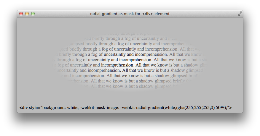
You can apply a gradient mask to any HTML element, not just images. For example, the following snippet creates a radial gradient as a mask for a div element containing several paragraphs of text. The result is shown in Figure 2-7.
<div style="background: white; padding: 20px; |
-webkit-mask-box-image: -webkit-radial-gradient(white,transparent 50%);"> |
For more about gradients, see Using Gradients.
Working with WebKit Mask Properties
You can use either the -webkit-mask-image or the -webkit-mask-box-image property to assign a mask to an element. The -webkit-mask-box-image property scales the mask to fit the element by default, while the -webkit-mask-image property uses the mask image’s native size.
The -webkit-mask-box-image property accepts optional parameters that enable it to act like a border image (for details, see Figure 2-5).
There is also a set of properties that you can use to modify the behavior of the -webkit-mask-image property, including:
-webkit-mask-clip—Causes the mask to apply to the whole element, only the padding and content, or only the content. Set toborder-box(default),padding-box, orcontent-box.-webkit-mask-origin—Sets the origin of the mask to the upper left corner of the element’s border, padding, or content box. Set toborder(default),padding, orcontent.-webkit-mask-position—Anchors the upper-left corner of the mask at the specified offset from the origin. Accepts an x-offset and a y-offset.-webkit-mask-repeat—Controls how the mask is tiled to cover the element. Accepts an x-repeat and a y-repeat parameter. Both parameters can be set torepeat,space,round, orno-repeat. The specifics are the same as for thebackground-repeatproperty (see http://www.w3.org/TR/css3-background/#the-background-repeat).-webkit-mask-size—Controls how the mask is sized to cover the element. The specifics are the same as for thebackground-sizeproperty (see http://www.w3.org/TR/css3-background/#the-background-size).
The properties that apply to webkit-mask-image are analogous to the CSS3 background properties. See http://www.w3.org/TR/css3-background/#backgrounds for details.
Copyright © 2016 Apple Inc. All Rights Reserved. Terms of Use | Privacy Policy | Updated: 2016-10-27