Using the Flow Layout
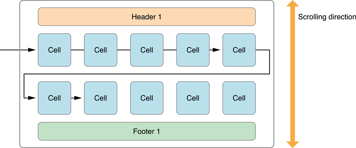
You can arrange items in your collection views using a concrete layout object, the UICollectionViewFlowLayout class. The flow layout implements a line-based breaking layout, which means that the layout object places cells on a linear path and fits as many cells along that line as it can. When the layout object runs out of room on the current line, it creates a new line and continues the layout process there. Figure 3-1 shows what this looks like for a flow layout that scrolls vertically. In this case, lines are laid out horizontally with each new line positioned below the previous line. The cells in a single section can be optionally surrounded with section header and section footer views.
You can use the flow layout to implement grids, but you can also use it for much more. The idea of a linear layout can be applied to many different designs. For example, rather than having a grid of items, you can adjust the spacing to create a single line of items along the scrolling dimension. Items can also be different sizes, which yields something more asymmetrical than a traditional grid but that still has a linear flow to it. There are many possibilities.
You can configure the flow layout either programmatically or using Interface Builder in Xcode. The steps for configuring the flow layout are as follows:
Create a flow layout object and assign it to your collection view.
Configure the width and height of cells.
Set the spacing options (as needed) for the lines and items.
If you want section headers or section footers, specify their size.
Set the scroll direction for the layout.
Customizing the Flow Layout Attributes
The flow layout object exposes several properties for configuring the appearance of your content. When set, these properties are applied to all items equally in the layout. For example, setting the cell size using the itemSize property of the flow layout object causes all cells to have the same size.
If you want to vary the spacing or size of items dynamically, you can do so using the methods of the UICollectionViewDelegateFlowLayout protocol. You implement these methods on the same delegate object you assigned to the collection view itself. If a given method exists, the flow layout object calls that method instead of using the fixed value it has. Your implementation must then return appropriate values for all of the items in the collection view.
Specifying the Size of Items in the Flow Layout
If all of the items in the collection view are the same size, assign the appropriate width and height values to the itemSize property of the flow layout object. (Always specify the size of items in points.) This is the fastest way to configure the layout object for content whose size does not vary.
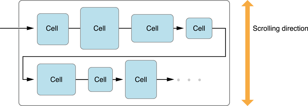
If you want to specify different sizes for your cells, you must implement the collectionView:layout:sizeForItemAtIndexPath: method on the collection view delegate. You can use the provided index path information to return the size of the corresponding item. During layout, the flow layout object centers items vertically on the same line, as shown in Figure 3-2. The overall height or width of the line is then determined by the largest item in that dimension.
Specifying the Space Between Items and Lines
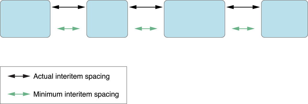
Using the flow layout, you can specify the minimum spacing between items on the same line and the minimum spacing between successive lines. Keep in mind that the spacing you provide is only the minimum spacing. Because of how it lays out content, the flow layout object may increase the spacing between items to a value greater than the one you specified. The layout object may similarly increase the actual line-spacing when the items being laid out are different sizes.
During layout, the flow layout object adds items to the current line until there is not enough space left to fit an entire item. If the line is just big enough to fit an integral number of items with no extra space, then the space between the items would be equal to the minimum spacing. If there is extra space at the end of the line, the layout object increases the interitem spacing until the items fit evenly within the line boundaries, as shown in Figure 3-3. Increasing the spacing improves the overall look of the items and prevents large gaps at the end of each line.
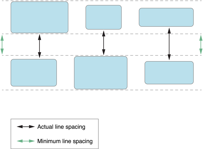
For interline spacing, the flow layout object uses the same technique that it does for inter-item spacing. If all items are the same size, the flow layout is able to respect the minimum line spacing value absolutely and all items in one line appear to be spaced evenly from the items in the next line. If the items are of different sizes, the actual spacing between individual items can vary.
Figure 3-4 demonstrates what happens with the minimum line spacing when items are of different sizes. With differently sized items, the flow layout object picks the item from each line whose dimension in the scrolling direction is the largest. For example, in a vertically scrolling layout, it looks for the item in each line with the greatest height. It then sets the spacing between those items to the minimum value. If the items are on different parts of the line, as shown in the figure, the actual line spacing appears to be greater than the minimum.
As with other flow layout attributes, you can use fixed spacing values or vary the values dynamically. Line and item spacing is handled on a section-by-section basis. Thus, the line and interitem spacing is the same for all of the items in a given section but may vary between sections. You set the spacing statically using the minimumLineSpacing and minimumInteritemSpacing properties of the flow layout object or using the collectionView:layout:minimumLineSpacingForSectionAtIndex: and collectionView:layout:minimumInteritemSpacingForSectionAtIndex: methods of your collection view delegate.
Using Section Insets to Tweak the Margins of Your Content
Section insets are a way to adjust the space available for laying out cells. You can use insets to insert space after a section’s header view and before its footer view. You can also use insets to insert space around the sides of the content. Figure 3-5 demonstrates how insets affect some content in a vertically scrolling flow layout.
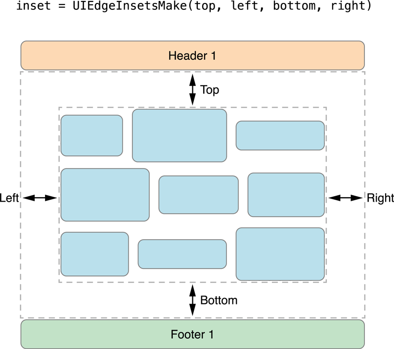
Because insets reduce the amount of space available for laying out cells, you can use them to limit the number of cells in a given line. Specifying insets in the nonscrolling direction is one way to constrict the space for each line. If you combine that information with an appropriate cell size, you can control the number of cells on each line.
Knowing When to Subclass the Flow Layout
Although you can use the flow layout very effectively without subclassing, there are still times when you might need to subclass to get the behavior you need. Table 3-1 lists some of the scenarios for which subclassing UICollectionViewFlowLayout is necessary to achieve the desired effect.
Scenario | Subclassing tips |
|---|---|
You want to add new supplementary or decoration views to your layout | The standard flow layout class supports only section header and section footer views and no decoration views. To support additional supplementary and decoration views, you need to override the following methods at a minimum:
In your For information about providing attributes for views during layout, see Creating Layout Attributes and Providing Layout Attributes for Items in a Given Rectangle. |
You want to tweak the layout attributes being returned by the flow layout | Override the For in-depth dicussions of what these methods entail, see Creating Layout Attributes and Providing Layout Attributes for Items in a Given Rectangle. |
You want to add new layout attributes for your cells and views | Create a custom subclass of Subclass You should also override the |
You want to specify initial or final locations for items being inserted or deleted | By default, a simple fade animation is created for items being inserted or deleted. To create custom animations, you must override some or all of the following methods:
In your implementations of these methods, specify the attributes you want each view to have prior to being inserted or after they are removed. The flow layout object uses the attributes you provide to animate the insertions and deletions. If you override these methods, it is also recommended that you override the For more information about how insertions and deletions work, see Making Insertion and Deletion Animations More Interesting. |
There are also instances in which the right thing to do is to create a custom layout from scratch. Before you decide to do this, take the time to consider whether or not it is really necessary. The flow layout provides a lot of customizable behavior that is appropriate for many different kinds of layouts, and because it is provided to you, it is easy to use and contains numerous optimizations to make it efficient. However, all this is not to say that you should never create a custom layout, because there are circumstances in which doing so make absolute sense. The flow layout limits the scroll direction to one direction, so if your layout contains content that stretches farther than the bounds of the screen in both directions, a custom layout makes more sense to implement. Creating a custom layout is the right decision if your layout is not a grid or a line-based breaking layout, as described above, or if the items within your layout move so frequently that subclassing the flow layout is more compicated than creating your own.
For more on creating a custom layout, see Creating Custom Layouts.
Copyright © 2014 Apple Inc. All Rights Reserved. Terms of Use | Privacy Policy | Updated: 2014-07-15