|
What are Swing Client Properties?Swing Client Properties enable you to set component specific properties on any JComponent descended object. Client properties are implemented by two methods on javax.swing.JComponent, putClientProperty(java.lang.Object, java.lang.Object) and getClientProperty(java.lang.Object). Conceptually, client properties are key-value pairs that are associated with a particular JComponent. These properties can be used for many different purposes, as it is not required for a JComponent to have any knowledge of what any particular property means. As of J2SE 5.0 on Mac OS X 10.5, a number of client properties let you use Cocoa-style controls without adopting Apple specific classes, or writing other code that interferes with your application's behavior on other platforms. Using Client PropertiesSmall and Mini controlsYou can use the JComponent.sizeVariant property to hint that the given JComponent should take on a Small or Miniature appearance. Listing 1 demonstrates how to set the the Size variant. Listing 1: Setting the Size Variant
public static void setSizeSmall(JComponent component) {
  component.putClientProperty("JComponent.sizeVariant", "small");
}

public static void setSizeMini(JComponent component) {
  component.putClientProperty("JComponent.sizeVariant", "mini");
}
Note: It is also possible to explicitly request that your controls be Regular sized, and to do so you simply pass "regular" as the client property value. For more information see the reference for JComponent.sizeVariant. The results of this for some common controls are shown in Table 1. Table 1: Examples of JComponent.sizeVariant.
Note: Table 1 only shows a small sample of the controls that support size variants. As of Mac OS X 10.5, JLabel, JButton, JToggleButton, JCheckBox, JRadioButton, JComboBox, JProgressBar, JSlider, JTextField, and JSpinner support this property. For more information see the reference for JComponent.sizeVariant Button stylesThrough client properties you can create standard push buttons in the various styles available in Mac OS X 10.5. Table 2 shows how to create each of these button styles and what they look like. Table 2: What they look like
For more information see JButton.buttonType. For examples of making segmented buttons, see Segmented button styles. Segmented button stylesCreating segmented buttons through client properties allows you to treat them exactly as you would standard Java buttons. In order to get the full Mac OS X appearance these buttons will need to be laid out such that they abut each other. If you also want radio button-like behavior then the buttons should also be placed in a ButtonGroup. Listing 2 shows how you can create each of these button styles and Table 3 shows what they look like. Listing 2: Creating Segmented Buttons
// Create a Layout component that will ensure the buttons abut each other
public static JComponent createLayoutComponent(List<JButton> segmentButtons) {
  Box layoutBox = Box.createHorizontalBox();
  for(JButton button : segmentButtons) {
    layoutBox.add(button);
  }
  return layoutBox;
}

public static JButton createSegmentButton(String style, String position, ButtonGroup buttonGrp) {
  JButton button = new JButton();
  button.putClientProperty("JButton.buttonType", style);
  button.putClientProperty("JButton.segmentPosition", position);
  buttonGrp.add(button);
  return button;
}

// Bottleneck for creating the buttons for the button group
pubic static List<JButton> createSegmentButtonsWithStyle(int numButtons, ButtonGroup buttonGrp, String style){
  // Allocate a list of JButtons
  List<JButton> buttons = new ArrayList<JButton>();
  if(numButtons == 1) {
    // If 1 button is requested, then it gets the "only" segment position
    buttons.add(createSegmentButton(style, "only", buttonGrp));
  } else {
    // If more than 1 button is requested, then
    // the first one gets "first" the last one gets "last" and the rest get "middle"
    buttons.add(createSegmentButton(style, "first", buttonGrp));
    for(int i = 0; i < buttons.size() - 2; ++i) {
      buttons.add(createSegmentButton(style, "middle", buttonGrp));
    }
    buttons.add(createSegmentButton(style, "last", buttonGrp));
  }
  return buttons;
}

// Convenience methods that pass in the correct button style for each segmented button style
public static List<JButton> createSegmentedButtons(int numButtons, ButtonGroup buttonGroup) {
  return createSegmentButtonsWithStyle(numButtons, buttonGroup, "segmented");
}

public static List<JButton> createSegmentedRoundRectButtons(int numButtons, ButtonGroup buttonGroup) {
  return createSegmentButtonsWithStyle(numButtons, buttonGroup, "segmentedRoundRect");
}

public static List<JButton> createSegmentedCapsuleButtons(int numButtons, ButtonGroup buttonGroup) {
  return createSegmentButtonsWithStyle(numButtons, buttonGroup, "segmentedCapsule");
}

public static List<JButton> createSegmentedTexturedButtons(int numButtons, ButtonGroup buttonGroup) {
  return createSegmentButtonsWithStyle(numButtons, buttonGroup, "segmentedTextured");
}
Table 3: What they look like
Simple TouchesYou can easily make a standard JTextField appear as a Mac OS X Search box by using the JTextField.variant property. You can further adorn the JTextField to include a menu and action listeners. For more information on these properties, see JTextField.Search.FindPopup, JTextField.Search.FindAction and JTextField.Search.CancelAction. Table 4 shows what the search box looks like. You can create a circular indeterminate JProgressBar by using the JProgressBar.style property. Table 4 shows how you can create this style and what it looks like. JComboBoxes can be modified to have squared off edges using the JComboBox.isSquare property, and can take on the appearance of a Mac OS X pop-down menu via the JComboBox.isPopDown property. Table 4 shows how you can create this style and what it looks like. Table 4: What they look like
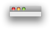
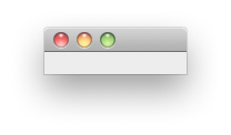
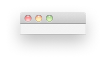
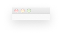
Window styles and featuresUsing client properties you can customize your Java windows much like native Mac OS X applications can. Some of these properties and their effects are demonstrated below. WARNING: Many of these properties require a heavyweight peer to have been created, and as such do not apply to JInternalFrames or Applets. Setting these client properties on instances of a JRootPane that does not have a heavy weight peer set will result in those changes being ignored Given a variable "jRootPane" the Table 5 demonstrates the effects of various property changes on the corresponding window. Table 5: What they do
Other properties must be set before the heavyweight peer is created. The heavyweight peer is created once addNotify() has been called for the component, and after which changes to these properties have no further effect. Table 6 demonstrates these properties. Table 6: What they do
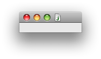
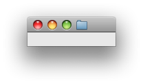
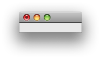
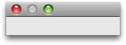
Note: A window with the "Window.style" property set to "small" looks like a floating window, but to make it float above all others you must additionally call setAlwaysOnTop(true) Available PropertiesThe following properties are available as of J2SE 5.0 on Mac OS X 10.5. All properties are safely ignored by earlier versions of Java and earlier versions of Mac OS X. IMPORTANT: The typical behavior of the corresponding JComponent should be expected for entries where a default value is not specified. JComponent.sizeVariantType: String Allowed Values: "regular", "small", "mini" Default Value: "regular" Applies to: JLabel, JButton, JToggleButton, JCheckBox, JRadioButton, JComboBox, JProgressBar, JSlider, JTextField, JSpinner This property alters the components font size and appearance to provide a small or miniature variant of the control. JButton.buttonTypeType: String Allowed Values: "square", "gradient", "bevel", "textured", "roundRect", "recessed", "help", "segmented", "segmentedRoundRect", "segmentedCapsule", "segmentedTextured", "segmentedGradient" Applies to: JButton and subclasses This property alters the visual style of the button. WARNING: The "help" style is not designed to accommodate text or icons. Specifying this style produces the standard Mac OS X help button. IMPORTANT: Segmented styles must be accompanied by the appropriate JButton.segmentPosition client property in order to get the correct visual appearance. JButton.segmentPositionType: String Allowed Values: "first", "middle", "last", "only" Applies to: JButton and subclasses where the JButton.buttonType property has been set to "segmented", "segmentedRoundRect", "segmentedCapsule", or "segmentedTextured". This property determines the orientation of a segmented button as it should appear as part of a single contiguous control. Buttons with a segmented type should be added to the same ButtonGroup if radio-button like behavior is desired, and should be placed in a LayoutManager that ensures that their edges will abut each other horizontally to get the correct final apperance. JComboBox.isPopDownType: Boolean Allowed Values: Boolean.TRUE, Boolean.FALSE Applies to: JComboBox This property alters the JComboBox's style to specify if it is intended to be a pop-down or a pop-up control. Pop-downs should be used when the user is expected to choose an action from the pop-down menu. Pop-ups should be used when the user is expected to make a choice from the pop-up menu that does not cause an action like a button would. Pop-up menus always appear over the pop-up control, whereas pop-down menus always appear below the pop-down control. JComboBox.isSquareType: Boolean Allowed Values: Boolean.TRUE, Boolean.FALSE Applies to: JComboBox This property changes the appearance of a JComboBox to have squared off edges. JProgressBar.styleType: String Allowed Values: "circular" Applies to: JProgressBar This proper changes any indeterminate JProgressBar into a small circular spinning indeterminate progress indicator. JTableHeader.selectedColumnType: Number Applies to: JTableHeader This property allows you to highlight the currently selected column of a JTable. The value should be set to the index of the column in the data model that you wish to be selected. JTableHeader.sortDirectionType: String Allowed Values: "ascending", "decending", null Default Value: null This property will put a small triangular sort indicator point up (decending) or down (ascending) in the selected column. Setting this property to null will clear the sort indicator. This property has no effect if JTableHeader.selectedColumn has not been specified. Note: The incorrect spelling "decending" for this properties allowed values is correct. Using the correctly spelled "descending" will have no effect in J2SE 5.0 on Mac OS X 10.5.0 JTextField.variantType: String Allowed Values: "search" Applies to: JTextField This property changes the text field into a search field. For additional functionality see the optional JTextField.Search.FindPopup, JTextField.Search.FindAction and JTextField.Search.CancelAction properties. JTextField.Search.FindPopupType: JPopupMenu Allowed Values: Any JPopupMenu Applies to: JTextField with the JTextField.variant property set to "search" Setting this property attaches the provided JPopupMenu to the search control, and alters the icon to represent that there is a popup menu. Requires the JTextField.variant to be set to "search". JTextField.Search.FindActionType: ActionListener Allowed Values: Any ActionListener Applies to: JTextField with the JTextField.variant property set to "search" Setting this property will trigger the provided ActionListener when the "find icon" in the search field is clicked. Requires the JTextField.variant to be set to "search". JTextField.Search.CancelActionType: ActionListener Allowed Values: Any ActionListener Applies to: JTextField with the JTextField.variant property set to "search" Setting this property will trigger the provided ActionListener when the "cancel icon" in the search field is clicked. Requires the JTextField.variant to be set to "search". Note: The cancel icon is only present when there is text in the search field. Window.documentModifiedType: Boolean Allowed Values: Boolean.TRUE, Boolean.FALSE Default Value: Boolean.FALSE Applies to: JRootPane, JInternalFrame This property adds the document dirty mark in the close button of the window. This is used to indicate that the document window has unsaved content, and attempts to close the window will request that the user save the document or discard changes. Window.documentFileType: java.io.File Allowed Values: Any Applies to: JRootPane This property adds a document proxy icon to the title bar of the window. This icon is the effective representation of the document that can be dragged and dropped into the Finder or the Dock. Command-clicking on the title will present the full path to the document in a popup. The proxy icon in the title bar will have the icon of document as presented by LaunchServices in the Finder or Open and Save dialog boxes. This property can be changed at anytime throughout the lifetime of the window. Using this property from an untrusted applet or WebStart application will result in a security exception as these types of applications do not have access to the file system. WARNING: This property only applies to JRootPanes that have a heavyweight peer. Window.styleType: String Allowed Values: "small" Applies to: JRootPane This property determines if the window has a Utility-style title bar. In order to make this window style also float above all others you must additionally call setAlwaysOnTop(true). Windows that have both the "small" style and are set to always be on top will automatically hide themselves when your application is no longer frontmost. This is similar to how native applications behave. WARNING: This property must be set before the heavyweight peer for the Window is created. Once addNotify() has been called on the component, causing creation of the heavyweight peer, changing this property has no effect. Window.alphaType: Float Allowed Values: Any value from 0.0 to 1.0 inclusive Default Value: 1.0 Applies to: JRootPane This property sets the opacity for the whole window and can be changed throughout the lifetime of the window. WARNING: This property only applies to JRootPanes that have a heavyweight peer. Window.shadowType: Boolean Allowed Values: Boolean.TRUE, Boolean.FALSE Default Value: Boolean.TRUE Applies to: JRootPane This property determines if the window has a shadow. WARNING: This property must be set before the heavyweight peer for the Window is created. Once addNotify() has been called on the component, causing creation of the heavyweight peer, changing this property has no effect. apple.awt.windowShadow.revalidateNowType: Object Allowed Values: Any Applies to JRootPane Changing the value of this property causes the window's shadow to be recomputed based on the current window shape. The values used are inconsequential, as long as the new value is different from the current value. This property uses equals() to compare the equality of the two objects involved. WARNING: This property only applies to JRootPanes that have a heavyweight peer. IMPORTANT: This property requires the Window.shadow property to be explicitly set to Boolean.TRUE apple.awt.brushMetalLookType: Boolean Allowed Values: Boolean.TRUE, Boolean.FALSE Default Value: Undefined Applies to: JRootPane This property determines if the window should use the Brushed Metal texture. This client property overrides the corresponding system property, which determines its default value. WARNING: This property must be set before the heavyweight peer for the Window is created. Once addNotify() has been called on the component, causing creation of the heavyweight peer, changing this property has no effect. apple.awt.draggableWindowBackgroundType: Boolean Allowed Values: Boolean.TRUE, Boolean.FALSE Default Value: Boolean.FALSE Applies to: JRootPane Setting this property to Boolean.TRUE allows dragging of the Window via mouse-down on any part of the window that is not a heavyweight control. This client property overrides the system property. WARNING: This property must be set before the heavyweight peer for the Window is created. Once addNotify() has been called on the component, causing creation of the heavyweight peer, changing this property has no effect. apple.awt.delayWindowOrderingType: Boolean Allowed Values: Boolean.TRUE, Boolean.FALSE Default Value: Boolean.FALSE Applies to: JRootPane This property determines if the window comes to front immediately during a drag and drop operation. If set to true, drag operations do not bring the window forward. The default value causes the window to be brought forward immediately. WARNING: This property must be set before the heavyweight peer for the Window is created. Once addNotify() has been called on the component, causing creation of the heavyweight peer, changing this property has no effect. Properties available by componentTable 7: Properties available by component. Document Revision History
|