Making Your iOS App Accessible
To be accessible, an iPhone application must supply information about its user interface elements to VoiceOver users. At a high level, this means you should make sure that:
Every user interface element with which users can interact is accessible. This includes elements that merely supply information, such as static text, as well as controls that perform actions.
All accessible elements supply accurate and helpful information.
In addition to these fundamentals, there are also a few things you can do to enhance a VoiceOver user’s experience with table views and to make sure dynamic elements in your application are always accessible.
Make User Interface Elements Accessible
As mentioned in Accessibility and VoiceOver a user interface element is accessible if it reports itself as an accessibility element. Although being accessible is not enough to make a user interface element useful to VoiceOver users, it represents the first step in the process of making your application accessible.
As stated in iOS Accessibility API and Tools, standard UIKit controls and views are automatically accessible. If you use only standard UIKit controls, you probably don’t have to do much additional work to make sure your application is accessible. In this case, your next step is to ensure that the default attribute information supplied by these controls makes sense in your application. To learn how to do this, see Supply Accurate and Helpful Attribute Information.
If you create custom views that display information or with which users need to interact, you must ensure the accessibility of these views yourself. After you’ve done this, you need to make sure these views supply accessibility information that helps people use them (see Supply Accurate and Helpful Attribute Information).
From the perspective of accessibility, a custom view is either an individual view or a container view. An individual view does not contain any other views that need to be accessible. For example, a custom subclass of UIControl that displays an icon and behaves like a button does not contain any other elements with which the user can interact, apart from the button itself. Read Make Custom Individual Views Accessible to learn how to make an individual view accessible.
A container view, on the other hand, contains other elements with which users can interact. For example, in a custom subclass of UIView that performs its own drawing of geometric shapes, the shapes represent elements with which users can interact, and which are distinct from the container view. Such separate elements within a container view are not automatically accessible (because they are not subclasses of UIView) and do not provide any accessibility information. To learn how to make the contents of a container view accessible, read Make the Contents of Custom Container Views Accessible.
Make Custom Individual Views Accessible
If your application contains a custom individual view with which users need to interact, you must make the view accessible. (Recall that an individual view is a view containing no other views with which users interact.)
In addition to using Interface Builder to make a custom individual view accessible, there are two programmatic ways to do this. One way is to set your custom view’s accessibility status in the code that instantiates it. The following code snippet shows how to do this:
@implementation MyCustomViewController |
- (id)init |
{ |
_view = [[[MyCustomView alloc] initWithFrame:CGRectZero] autorelease]; |
[_view setIsAccessibilityElement:YES]; |
/* Set attributes here. */ |
} |
Another way is to implement the isAccessibilityElement method of the UIAccessibility protocol in the implementation of your custom subclass. The following code snippet shows how to do this:
@implementation MyCustomView |
/* Implement attribute methods here. */ |
- (BOOL)isAccessibilityElement |
{ |
return YES; |
} |
Make the Contents of Custom Container Views Accessible
If your application displays a custom view that contains other elements with which users interact, you need to make the contained elements separately accessible. At the same time, you need to make sure that the container view itself is not accessible. The reason is that users interact with the contents of the container, not with the container itself.
To accomplish this, your custom container view should implement the UIAccessibilityContainer protocol. This protocol defines methods that make the contained elements available in an array.
The following code snippet shows the partial implementation of a custom container view. Note that this container view creates the array of accessible elements only when methods of the UIAccessibilityContainer protocol are called. As a result, if iPhone accessibility is not currently active, the array is not created.
Listing 2-1 Make the contents of a custom container view accessible as separate accessibility elements
@implementation MultiFacetedView |
- (NSArray *)accessibleElements |
{ |
if ( _accessibleElements != nil ) |
{ |
return _accessibleElements; |
} |
_accessibleElements = [[NSMutableArray alloc] init]; |
/* Create an accessibility element to represent the first contained element and initialize it as a component of MultiFacetedView. */ |
UIAccessibilityElement *element1 = [[[UIAccessibilityElement alloc] initWithAccessibilityContainer:self] autorelease]; |
/* Set attributes of the first contained element here. */ |
[_accessibleElements addObject:element1]; |
/* Perform similar steps for the second contained element. */ |
UIAccessibilityElement *element2 = [[[UIAccessibilityElement alloc] initWithAccessibilityContainer:self] autorelease]; |
/* Set attributes of the second contained element here. */ |
[_accessibleElements addObject:element2]; |
return _accessibleElements; |
} |
/* The container itself is not accessible, so MultiFacetedView should return NO in isAccessiblityElement. */ |
- (BOOL)isAccessibilityElement |
{ |
return NO; |
} |
/* The following methods are implementations of UIAccessibilityContainer protocol methods. */ |
- (NSInteger)accessibilityElementCount |
{ |
return [[self accessibleElements] count]; |
} |
- (id)accessibilityElementAtIndex:(NSInteger)index |
{ |
return [[self accessibleElements] objectAtIndex:index]; |
} |
- (NSInteger)indexOfAccessibilityElement:(id)element |
{ |
return [[self accessibleElements] indexOfObject:element]; |
} |
@end |
Supply Accurate and Helpful Attribute Information
There are two parts to the process of supplying attribute information for accessible elements:
Crafting concise, accurate, and helpful information
Ensuring that the accessible elements in your application report that content correctly
If you use custom views, you must supply all appropriate attribute information for them. For guidance, see Crafting Useful Labels and Hints, Guidelines for Creating Hints, and Identifying Appropriate Traits.
Even if you use only standard UIKit controls and views, you might find that some of the default attribute information they supply could be enhanced to make more sense in the context of your application. For more information, see Enhancing Default Attribute Information.
If you need to supply or change accessibility attributes on either standard or custom UI elements, you can do so either in Interface Builder (see Defining Custom Attribute Information in Interface Builder) or programmatically (see Defining Custom Attribute Information Programmatically).
Enhancing Default Attribute Information
As part of the built-in accessibility of standard UIKit controls and views, iOS also provides default attribute information that describes these elements to VoiceOver users. In most cases, this information is appropriate for applications that use the standard controls and views. However, there might be times when supplying custom attribute information can enhance a VoiceOver user’s experience with your application:
If you use a standard UIKit control or view that displays a system-provided icon or title, first make sure you’re using it in accordance with its intended purpose (see iOS Human Interface Guidelines for more information). Then, decide whether the default label attribute accurately conveys the result of using that control or view in your application. If not, consider providing a hint attribute.
For example, if you place an Add button in your navigation bar by using the system-provided Add (+) icon in a
UIBarButtonItemobject, you get the default label attribute, Add, automatically. If it’s always obvious which item the user is adding when they activate this button, there’s no need to provide a hint attribute. But if there might be confusion, you should consider providing a custom hint that describes the result of using that control in your application, such as "Adds an account" or "Adds a comment."If you display a custom icon or image in a standard UIKit view, such as a
UIButtonobject, you need to supply a custom label attribute that describes it.
Crafting Useful Labels and Hints
When VoiceOver users run your application, they rely on the descriptions VoiceOver speaks to understand what your application does and how to use it. Because these descriptions represent the bulk of the VoiceOver user’s experience with your application it’s essential that they be as accurate and helpful as possible. The guidelines in this section help you create labels and hints that will make your application easy and enjoyable for people with disabilities to use.
Guidelines for Creating Labels
The label attribute identifies the user interface element. Every accessible user interface element, standard and custom, must supply content for the label attribute.
A good way to determine what a label should convey is to think about what a sighted user infers about your application just by looking at it. If you’ve designed a good user interface, sighted users should know what a control or view does in the current application context by reading its title or understanding its icon. This is the information you need to make available to VoiceOver users in the label attribute.
If you provide a custom control or view, or if you display a custom icon in a standard control or view, you need to provide a label that:
Very briefly describes the element. Ideally, the label consists of a single word, such as Add, Play, Delete, Search, Favorites, or Volume.
Strive to design your application so that a single word identifies an element and makes its usage obvious in the current context. Sometimes, however, it might be necessary to use a brief phrase to properly identify an element. When this is the case, create a very short phrase, such as “Play music,” “Add name,” or “Add to event.”
Does not include the type of the control or view. The type information is contained in the traits attribute of the element and should never be repeated in the label.
For example, if you include the control type in the label of an Add button, VoiceOver users hear “Add button button” every time they access that control. This experience would quickly become annoying and might motivate users to stop using your application.
Begins with a capitalized word. This helps VoiceOver read the label with the appropriate inflection.
Does not end with a period. The label is not a sentence and therefore should not end with a period.
Is localized. Be sure to make your application available to as wide an audience as possible by localizing all strings, including accessibility attribute strings. In general, VoiceOver speaks in the language that the user specifies in International settings.
Guidelines for Creating Hints
The hint attribute describes the results of performing an action on a control or view. You should provide a hint only when the results of an action are not obvious from the element’s label.
For example, if you provide a Play button in your application, the context in which the button appears should make it easy for users to understand what happens when they tap it. However, if you allow users to play a song by tapping the song title in a list, you might want to provide a hint that describes this result. The reason is that the label of the list item describes the item itself (in this case, the song title), not what happens when a user taps it.
If the results of a user’s action on a control or view are not clearly implied by its label, create a hint that:
Very briefly describes the results. Even though few controls and views need hints, strive to make the hints you do need to provide as brief as possible. Doing so decreases the amount of time users must spend listening before they can use the element.
That said, however, avoid sacrificing clarity and good grammar for brevity. For example, changing “Adds a city” to “Adds city” does not significantly decrease the length of the hint, but does make it sound awkward and a bit less clear.
Begins with a verb and omits the subject. Be sure to use the third-person singular declarative form of a verb, such as “Plays,” and not the imperative, such as “Play.” You want to avoid using the imperative, because using it can make the hint sound like a command. For example, you don’t want to tell users to “Play the song”; instead, you want to tell users that tapping the element “Plays the song.”
To help you find the right word, imagine that you’re describing the use of a control to a friend. You might say something like “Tapping this control plays the song.” Often, you can use the second phrase in such a sentence (in this case, “Plays the song”) as a hint.
Begins with a capitalized word and ends with a period. Even though a hint is a phrase, not a sentence, ending the hint with a period helps VoiceOver speak it with the appropriate inflection.
Does not include the name of the action or gesture. A hint does not tell users how to perform the action, it tells users what will happen when that action occurs. Therefore, do not create hints such as “Tap to play the song,” “Tapping purchases the item,” or “Swipe to delete the item.”
This is especially important because VoiceOver users can use VoiceOver-specific gestures to interact with elements in your application. If you name a different gesture in a hint, it would be very confusing.
Does not include the name of the control or view. The user gets this information from the label attribute, so you should not repeat it in the hint. Therefore, do not create hints such as “Save saves your edits” or “Back returns to the previous screen.”
Does not include the type of the control or view. The user already knows whether, for example, the control or view behaves like a button or a search field, because this information is available in the element’s traits attribute. Therefore, do not create hints such as “Button that adds a name” or “Slider that controls the scale.”
Is localized. As with accessibility labels, hints should be available in the user’s preferred language.
Identifying Appropriate Traits
The traits attribute contains one or more individual traits that, taken together, describe the behavior of an accessible user interface element. Because some individual traits can be combined to describe a single element, the element’s behavior can be precisely characterized.
A standard UIKit control, such as a button or text field, provides default content in the traits attribute. If you use only standard UIKit controls in your application (and do not customize their behavior in any way), you do not have to make any changes to the traits attribute of these controls.
If you customize the behavior of a standard control, you might need to combine a new trait with the control’s default traits. If you create a custom control or view, you need to provide content for the element’s traits attribute.
The UI Accessibility programming interface defines 12 individual traits, some of which can be combined. Some traits characterize an element by identifying its behavior with the behavior of a particular type of control (such as a button) or type of object (such as an image). Other traits characterize an element by describing a specific behavior the element can exhibit, such the ability to play sound.
You use the following traits to characterize elements in your application:
Button
Link
Search Field
Keyboard Key
Static Text
Image
Plays Sound
Selected
Summary Element
Updates Frequently
Not Enabled
None
In general, traits that correspond to controls can successfully be combined with traits that describe behaviors. For example, you might combine the Button trait with the Plays Sound trait to characterize a custom control that behaves like a button and plays sound when it is tapped.
For the most part, you should consider the traits that correspond to particular controls, specifically, the Button, Link, Search Field, and Keyboard Key traits, to be mutually exclusive. That is, you should not use more than one of these traits to characterize an element in your application. Instead, think about which one of these four traits corresponds most closely to the element in your application. Then, if your element has additional behaviors, you can combine the first trait with one of the behavioral traits.
For example, suppose you display an image in your application that responds to a user’s tap by opening a link in Safari on iPhone. You could characterize this element by combining the Image and Link traits. Another example is a keyboard key that modifies other keyboard keys when it is tapped. You could characterize this element by combining the Keyboard Key and Selected traits.
To see some examples of how traits characterize controls, you can use Accessibility Inspector to see the default traits that are set on the standard controls. For information on how to use Accessibility Inspector, read Debug Accessibility in iOS Simulator with the Accessibility Inspector.
Defining Custom Attribute Information in Interface Builder
When you install iOS SDK 3.0, you get a version of Interface Builder that includes features that help you make your application accessible. If your application contains standard UIKit controls and views, you might be able to do all your accessibility work in Interface Builder.
Using Interface Builder, you can set an element’s accessibility status and provide custom content for the label, hint, and traits attributes. To do this, select the user interface element in your nib file and open the Identity inspector. Reveal the Accessibility section in the inspector and you should see something like Figure 2-1:
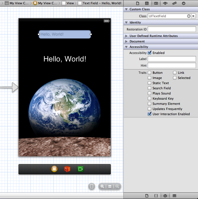
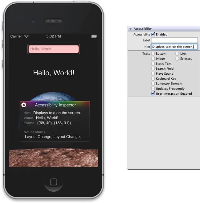
As you can see in Figure 2-1, the standard text field used in the nib file is accessible by default and includes default information for the label, hint, and traits attributes. (Note that, for a text field that displays placeholder text, the default label is the placeholder text.) You can change any of these default values by supplying new information in the Identify inspector, as shown in Figure 2-2. (Figure 2-2 also shows how Accessibility Inspector displays the accessibility information for the text field. See Debug Accessibility in iOS Simulator with the Accessibility Inspector to learn about Accessibility Inspector.)
Defining Custom Attribute Information Programmatically
If you prefer, you can supply custom information for attributes programmatically. You might want to do this if you’re not using Interface Builder at all or if you generate your views in code instead of using Interface Builder.
As described in Make Custom Individual Views Accessible, you can set accessibility information in the implementation of your view subclass or in the code that instantiates the view. Both techniques are valid, but there is one reason why you might want to implement attribute methods in your subclass instead of setting attributes in the instantiation code: If your view displays data that is dynamic or that changes frequently, such as the time of day, you should implement the subclass methods to return fresh data as needed. For those situations, if you only set attributes when you instantiate the subclass, the returned data is likely to be out of date.
The code snippets in this section build on those in Make Custom Individual Views Accessible, by including some of the attribute-specific methods. For example, if you want to implement accessibility methods in your subclass, you would write code similar to that in Listing 2-2.
Listing 2-2 Providing attribute information in a custom subclass implementation
@implementation MyCustomView |
- (BOOL)isAccessibilityElement |
{ |
return YES; |
} |
- (NSString *)accessibilityLabel |
{ |
return NSLocalizedString(@"MyCustomView.label", nil); |
} |
/* This custom view behaves like a button. */ |
- (UIAccessibilityTraits)accessibilityTraits |
{ |
return UIAccessibilityTraitButton; |
} |
- (NSString *)accessibilityHint |
{ |
return NSLocalizedString(@"MyCustomView.hint", nil); |
} |
@end |
If you want to use the property-setting methods of the UIAccessibility protocol in the code that instantiates your custom view, you can write code similar to that in Listing 2-3.
Listing 2-3 Providing attribute information in the code that instantiates a custom subclass object
@implementation MyCustomViewController |
- (id)init |
{ |
_view = [[MyCustomView alloc] initWithFrame:CGRectZero]; |
[_view setIsAccessibilityElement:YES]; |
[_view setAccessibilityTraits:UIAccessibilityTraitButton]; |
[_view setAccessibilityLabel:NSLocalizedString(@"view.label", nil)]; |
[_view setAccessibilityHint:NSLocalizedString(@"view.hint", nil)]; |
} |
Enhance the Accessibility of Table Views
If your application displays a table view in which each cell contains items other than (or in addition to) text, there are a few things you can do to make it more accessible. Similarly, if your table view displays more than one piece of information per row, you can enhance a VoiceOver user’s experience by aggregating the information in a single, easy-to-understand label.
If the table cells in your application contain a mix of different elements, determine whether users interact with each cell as a unit, or with individual elements inside the cell. If users need to access individual elements inside the cell, you should:
Make each individual element accessible separately.
Make sure the table cell itself is not accessible.
Succinctly describe the overall contents of the cell and use this description for the label attribute of the cell. Note that, in this case, the label is considered to be one of the accessible elements within the cell.
You’ve probably recognized that a table cell that contains multiple items, such as text and controls, fits the criteria of a container view, as defined by the UI Accessibility programming interface. However, you do not have to identify the cell as a container view or implement any of the methods of the UIAccessibilityContainer protocol, because the table cell is automatically designated as a container.
If your table contains cells that provide information in discrete chunks, you should consider combining the information from these chunks in the label attribute. When you do this, VoiceOver users can get the meaning of the cell’s contents with one gesture, instead of having to access each piece of information separately.
A good example of how this can work is in the built-in Stocks application. Instead of providing the company name, current stock price, and change in price as separate strings, Stocks combines this information in the label, which might sound like this: “Apple Inc., $432.39, up 1.3%." Notice the commas in this label. When you combine discrete pieces of information in this way, you can use commas to tell VoiceOver to pause briefly between phrases, making it easier for users to understand the information.
Here’s a code snippet that shows how to combine the information in the labels of two separate elements into a single label that describes both:
@implementation CurrentWeather |
/* This is a view that provides weather information. It contains a city subview and a temperature subview, each of which provides a separate label. */ |
- (NSString *)accessibilityLabel |
{ |
NSString *weatherCityLabel = [self.weatherCity accessibilityLabel]; |
NSString *weatherTempLabel = [self.weatherTemp accessibilityLabel]; |
/* Combine the city and temperature information so that VoiceOver users can get the weather information with one gesture. */ |
return [NSString stringWithFormat:@"%@, %@", weatherCityLabel, weatherTempLabel]; |
} |
@end |
Make Dynamic Elements Accessible
If user interface elements in your application can change dynamically, you need to make sure that the accessibility information they supply is accurate and up-to-date. You also need to send notifications when changes occur in the layout of application screens, so that VoiceOver can help users navigate the new layout. The UI Accessibility programming interface provides two notification types you can use when these kinds of changes occur on the screen. (To learn about these notifications, see "Notifications” in UIAccessibility Protocol Reference.)
If user interface elements can be in different states depending on other conditions in your application, you need to add logic to your code that returns the correct accessibility information for each state an element can be in. Because these changes can occur as the result of user actions, it’s best to add this logic to a subclass’s implementation, not to the code that instantiates the subclass.
The following code shows how to handle dynamic state changes and how to send a notification when a screen layout changes. The code represents the implementation of a UIView subclass that behaves like a custom keyboard key. The key’s accessibility label changes depending on whether the instance represents a letter or other type of character, and on whether a shift key is currently selected. The key also returns different accessibility traits, depending on what type of keyboard key it represents and whether it is currently selected. Note that the code in Listing 2-4 assumes that there are a number of methods that query the state of the keyboard.
Listing 2-4 Returning the correct accessibility information for the current conditions and sending a layout-change notification
@implementation BigKey |
- (NSString *)accessibilityLabel |
{ |
NSString *keyLabel = [_keyLabel accessibilityLabel]; |
if ( [self isLetterKey] ) |
{ |
if ( [self isShifted] ) |
{ |
return [keyLabel uppercaseString]; |
} |
else |
{ |
return [keyLabel lowercaseString]; |
} |
} |
else |
{ |
return keyLabel; |
} |
} |
- (UIAccessibilityTraits)accessibilityTraits |
{ |
UIAccessibilityTraits traits = [super accessibilityTraits] | UIAccessibilityTraitKeyboardKey; |
/* If this is the shift key and it's selected, users need to know that shift is currently in effect. */ |
if ( [self isShiftKey] && [self isSelected] ) |
{ |
traits |= UIAccessibilityTraitSelected; |
} |
return traits; |
} |
- (void)keyboardChangedToNumbers |
{ |
/* Code to perform the change to a number keyboard here. */ |
/* Send a notification of this change to the screen layout. */ |
UIAccessibilityPostNotification(UIAccessibilityLayoutChangedNotification, nil); |
} |
@end |
Make Nontextual Data Accessible
Sometimes your application displays data that’s not automatically compatible with the way accessibility works. For example, if you display an image, you should provide a description of it in its accessibility label so that VoiceOver users can understand the information the image conveys. Or, if you provide information in a graphical way, such as a rating system that displays stars, you should make sure the accessibility label conveys the meaning behind the graphical representation.
The following code snippet uses the example of a custom view that draws the number of stars that corresponds to the rating of an item. The code shows how this view returns an appropriate accessibility label, depending on how many stars it draws.
@implementation RatingView |
/* Other subclass implementation code here. */ |
- (NSString *)accessibilityLabel |
{ |
/* _starCount is an instance variable that contains how many stars to draw. */ |
NSInteger starCount = _starCount; |
if ( starCount == 1 ) |
{ |
ratingString = NSLocalizedString(@"rating.singular.label", nil); // here, ratingString is "star" |
} |
else |
{ |
ratingString = NSLocalizedString(@"rating.plural.label", nil); // here, ratingString is "stars" |
} |
return [NSString stringWithFormat:@"%d %@", starCount, ratingString]; |
} |
@end |
Copyright © 2012 Apple Inc. All Rights Reserved. Terms of Use | Privacy Policy | Updated: 2012-02-16