

Controls
Controls are UI elements that users either view (to get information) or interact with (to perform an action). All iOS 7 controls have an updated appearance, and most of them also have different metrics.
Because UIControl inherits from UIView, you can use a control’s tintColor property to tint the control. For more information about tinting views, see Using Tint Color.
By default, system-provided controls support system-defined animations and appearance changes that indicate highlighted and selected states.
Date Picker
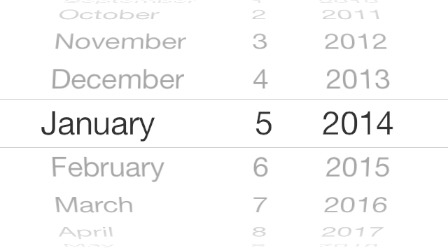
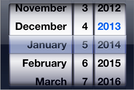
A date picker displays components of date and time, such as minutes, hours, days, and years.
The overall size of a date picker is the same in iOS 7 as it is in iOS 6.
iOS 7
iOS 6
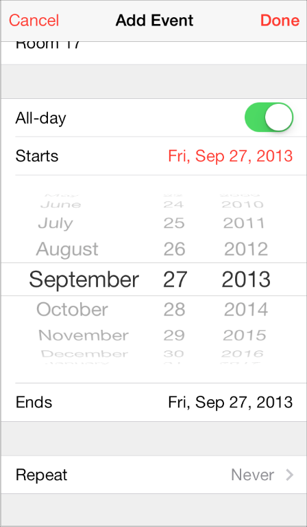
iOS 7 apps tend to embed date pickers within the content instead of displaying them in a different view. For example, Calendar dynamically expands a table row to let users specify a time without leaving the event-creation view:
Contact Add Button
A Contact Add button—that is, a UIButton object of type UIButtonTypeContactAdd—lets users add a contact’s information to a text field or other text-based view.
The size and appearance of a Contact Add button have changed in iOS 7.
iOS 7
iOS 6
Detail Disclosure Button
A Detail Disclosure button—that is, a UIButton object of type UIButtonTypeDetailDisclosure—reveals additional details or functionality related to an item in a table or other view. In iOS 7, a Detail Disclosure button uses the same symbol as the Info button.
The size and appearance of a Detail Disclosure button has changed in iOS 7:
iOS 7
iOS 6
When a Detail Disclosure button appears in a table row, tapping elsewhere in the row doesn’t activate the button; instead, it selects the row item or triggers app-defined behavior.
Info Button
An Info button—that is, a UIButton object of type UIButtonTypeInfoLight or UIButtonTypeInfoDark—reveals configuration details about an app, sometimes on the back of the current view. In iOS 7, an Info button uses the same symbol as a Detail Disclosure button.
The size and appearance of an Info button have changed in iOS 7.
iOS 7
iOS 6 (shown in Weather)
Label
A label displays static text.
By default a label uses the system font, so it looks different in iOS 7 than it does in iOS 6.
iOS 7
iOS 6
Be sure to use the UIFont method preferredFontForTextStyle to get the text for display in a label.
Page Control
A page control indicates how many views are open and which one is currently visible.
The size and appearance of a page control have changed in iOS 7.
iOS 7 (control shown in Weather)
iOS 6 (control shown in Weather)
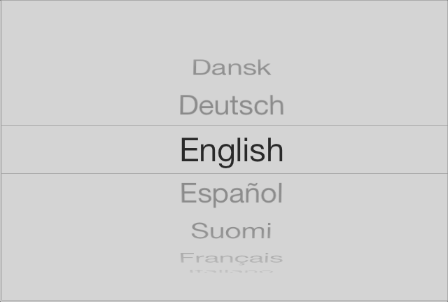
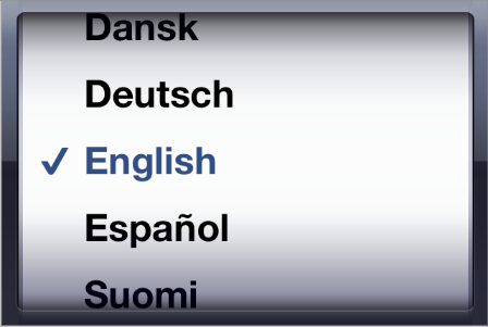
Picker
A picker displays a set of values from which a user can choose.
The overall size of a picker is the same in iOS 7 as it is in iOS 6; its appearance and behavior in iOS 7 are similar to the appearance and behavior of a date picker.
iOS 7
iOS 6
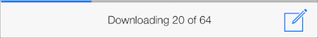
Progress View
A progress view shows the progress of a task or process that has a known duration.
The size and appearance of a progress view—shown here in the Mail toolbar—have changed in iOS 7.
iOS 7
iOS 6
If you currently use the trackTintColor property to specify a tint for a progress view’s track, the track continues to use this tint in iOS 7. If you set trackTintColor to nil, the track uses the tint of its parent.
Refresh Control
A refresh control performs a user-initiated content refresh, typically in a table.
The size and appearance of a refresh control have changed in iOS 7.
iOS 7
iOS 6
Rounded Rectangle Button
The rounded rectangle button is deprecated in iOS 7. Instead, use a system button—that is, a UIButton object of type UIButtonTypeSystem.
iOS 7 system buttons don’t include a bezel or a background appearance. A system button can contain a graphical symbol or a text title, and it can specify a tint color or receive its parent’s color.
If you need to display a button that includes a bezel, use a button of type UIButtonTypeCustom and supply a custom background image.
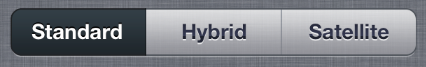
Segmented Control
A segmented control is a linear set of segments, in which each segment functions as a button that can display a different view.
The size and appearance of the segmented control have changed in iOS 7.
iOS 7
iOS 6
In iOS 7, the segmented control uses a single style, and the segmentedControlStyle property is unused.
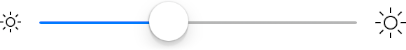
Slider
A slider lets users make adjustments to a value or process throughout a range of allowed values.
The size and appearance of the slider have changed in iOS 7.
iOS 7
iOS 6
iOS 7 continues to use the tints you specify for the minimum and maximum track images and for the thumb, using the properties minimumTrackTintColor, maximumTrackTintColor, and thumbTintColor. If you set the minimumTrackColor property to nil, the area uses the tint of its parent; if you set the maximumTrackTintColor or thumbTintColor properties to nil, both areas use their default color.
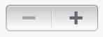
Stepper
A stepper increases or decreases a value by a constant amount.
The size and appearance of the stepper have changed in iOS 7.
iOS 7
iOS 6
In iOS 7, by default, a stepper treats custom increment and decrement images as template images.
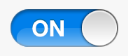
Switch
A switch presents two mutually exclusive choices or states (typically used only in table views).
The size and appearance of the switch have changed in iOS 7.
iOS 7
iOS 6
iOS 7 continues to use the tints you specify for the on and off—or disabled—states and for the thumb, using the properties onTintColor, tintColor, and thumbTintColor.
In iOS 7, by default, custom on and off images are ignored.
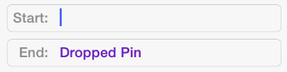
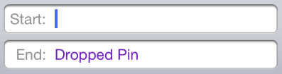
Text Field
A text field accepts a single line of user input.
The size and appearance of the text field have changed in iOS 7.
iOS 7 (two text fields shown in Maps)
iOS 6 (two text fields shown in Maps)
Be sure to use the UIFont method preferredFontForTextStyle to get the text for display in a text view.
Copyright © 2018 Apple Inc. All rights reserved. Terms of Use | Privacy Policy | Updated: 2016-03-22