Behind the Design: Duolingo
June 5, 2023

What makes Duolingo such an engaging way to learn a language? The answer is hiding in plain sight. “The secret to Duolingo is that we’re not an education company. We’re a fun and motivation company,” says Ryan Sims, VP of design. “Fun is the most important part of the work we do.”
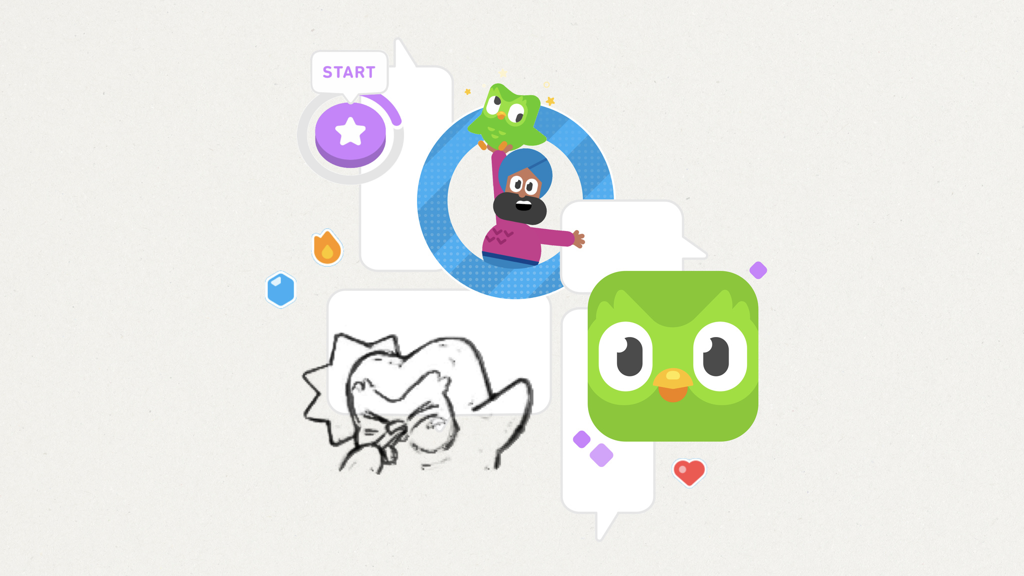
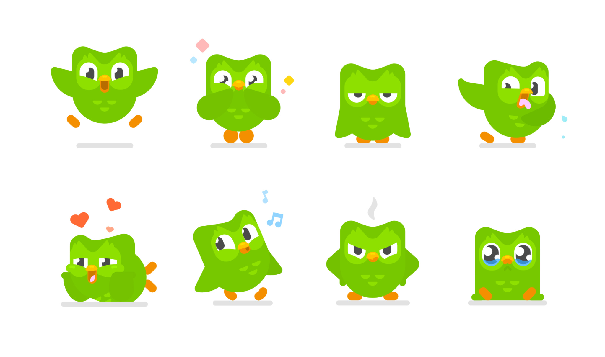
More than a decade since its launch, Duolingo continues to boast best-in-class design, great interactions, and an easy-to-follow UI. It’s filled with fun touches, like gamified lessons, hilarious characters, and a learning path that leans on actual conversations. And then there’s Duo, the famously tenacious owl mascot who achieved viral notoriety for his skill at encouraging people to extend their learning streaks. The app has figured out how to make a daily language lesson feel not like classwork but a joy.

This past year, Duolingo launched a major learning path redesign. In previous versions, it focused on a main screen — known as “the tree” — that let people explore numerous routes. “Two people could spend the same number of hours doing the same number of lessons, but end up in different places,” says Sims. Today, all Duolingo users follow a single route. “We call it ‘the path,’” says Sims. “It was a complete reboot of our product strategy.”
The path redesign coincided with another important update: animations for Duolingo’s wonderful cast of characters. There’s Lily, a perpetually unimpressed teen with a dismissive slow-clap; Oscar, a dramatic teacher who takes his job very seriously; and Eddy, a fitness buff with an enthusiasm for just about everything. Their subtle animations when people get something right are a reward in themselves. “A lot of that character interaction was informed by seeing how people connected with Duo,” says Sims.
The secret to Duolingo is that we’re not an education company. We’re a fun and motivation company.
Ryan Sims, Duolingo VP of design
Filling the app with memorable personalities required world-building — a process not often found in language apps. “It’s such a gigantic task,” says Sims, “and it really just started with our head of art, Greg Hartman, who began drawing characters and saying, ‘Wouldn’t it be cool if you encountered the same people through the entire experience?’” And of course, there’s a team of experts on hand to make sure every character’s story is consistent. “There are quite a few people whose job is to help write these stories and make sure they don’t contradict each other,” says Sims, with a laugh.

Duolingo’s approach under the hood may have changed, but the sense of fun is still front and center.
The lessons are brisk and breezy, emphasizing the building blocks of language through repeated phrases and sentences. And it’s all designed not just to attract learners, but to get them to stick around through quick lessons, compelling rewards, and unapologetic encouragement to keep their streaks alive. “You learn a language to connect to another human. That’s all it comes down to,” says Sims. “That’s why we’re passionate about teaching folks to speak new languages — because it brings everyone together.”
Behind the Design is a series that explores design practices and philosophies from each of the winners of the Apple Design Awards. In each story, we go behind the screens with the developers and designers of these award-winning apps and games to discover how they brought their remarkable creations to life.