Retired Document
Important: This document is retired. Use the information in View Controller Programming Guide for iOS instead.
iPad-Specific Controllers
Because the iPad has a different form factor than iPhone and iPod touch devices, it also has a couple of special controller objects for presenting content in that form factor. Developers of iPad applications are encouraged to use these controllers whenever possible. If you are developing a universal application, though, be sure not to create and use these controllers when your application is running on an iPhone or iPod touch.
Popovers
Although not actually a view controller itself, the UIPopoverController class manages the presentation of view controllers. You use a popover controller object to present content using a popover, which is a visual layer that floats above your application’s window. Popovers provide a lightweight way to present or gather information from the user and are commonly used in the following situations:
To display information about an object on the screen.
To manage frequently accessed tools or configuration options
To present a list of actions to perform on objects inside one of your views
To present one pane from a split view controller when the device is in a portrait orientation
The use of a popover for the preceding actions is less intrusive and cumbersome than a modal view. In iPad applications, modal views should be reserved for situations where you require the user to explicitly accept or cancel some action or information. For example, you would use a modal view to ask the user for a password that granted access to the rest of your application. For most other cases, you would use a popover instead. The advantage of popovers is that they do not cover the entire screen and can be dismissed by simply tapping outside the popover view. Thus, they are an excellent choice in situations where user interactions with your content are not required but provide information or additional features for the user.
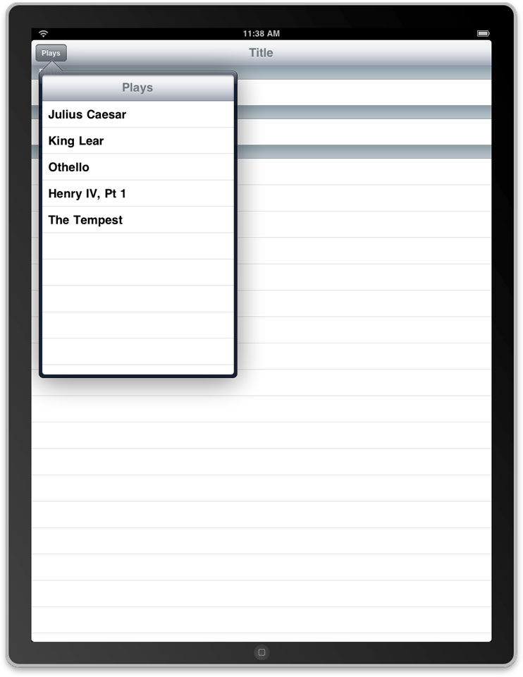
Figure 5-1 shows an example of a popover used to display a pane from a split view interface. Selecting a play from the popover causes the application’s main view to display information about that play. (For more information about creating a split view interface, see Split View Controller.)
Creating and Presenting a Popover
The content of a popover is derived from a view controller object that you provide. Popovers are capable of presenting most types of view controllers, including custom view controllers, table view controllers, navigation controllers, and even tab bar controllers. When you are ready to present that view controller in a popover, do the following:
Create an instance of the
UIPopoverControllerclass and initialize it with your view controller object.Specify the size of the popover, which you can do in one of two ways:
Assign a value to the
contentSizeForViewInPopoverproperty of the view controller you want to display in the popover.Assign a value to the
popoverContentSizeproperty of the popover controller itself.
(Optional) Assign a delegate to the popover. For more information about the responsibilities of the delegate, see container view controller.
Present the popover.
When you present a popover, you associate it with a particular portion of your user interface. Popovers are commonly associated with toolbar buttons, so the presentPopoverFromBarButtonItem:permittedArrowDirections:animated: method is a convenient way to present popovers from your application’s toolbar. You can also associate a popover with a particular part of one of your views using the presentPopoverFromRect:inView:permittedArrowDirections:animated: method.
The popover normally derives its initial size from the contentSizeForViewInPopover property of the view controller being presented. The default size stored in this property is 320 pixels wide by 1100 pixels high. You can customize the default value by assigning a new value to the contentSizeForViewInPopover property. Alternatively, you can assign a value to the popoverContentSize property of the popover controller itself. If you change the view controller displayed by a popover, any custom size information you put in the popoverContentSize property is replaced by the size of the new view controller. Changes to the content view controller or its size while the popover is visible are automatically animated. You can also change the size (with or without animations) using the setPopoverContentSize:animated: method.
Listing 5-1 shows a simple action method that presents a popover in response to user taps in a toolbar button. The popover is stored in a property (defined by the owning class) that retains the popover object. The size of the popover is set to the size of the view controller’s view, but the two need not be the same. Of course, if the two are not the same, you must use a scroll view to ensure the user can see all of the popover’s contents.
Listing 5-1 Presenting a popover
- (IBAction)toolbarItemTapped:(id)sender |
{ |
MyCustomViewController* content = [[MyCustomViewController alloc] init]; |
UIPopoverController* aPopover = [[UIPopoverController alloc] |
initWithContentViewController:content]; |
aPopover.delegate = self; |
[content release]; |
// Store the popover in a custom property for later use. |
self.popoverController = aPopover; |
[aPopover release]; |
[self.popoverController presentPopoverFromBarButtonItem:sender |
permittedArrowDirections:UIPopoverArrowDirectionAny animated:YES]; |
} |
Popovers are dismissed automatically when the user taps outside the popover view. Taps within the popover do not cause it to be automatically dismissed, but you can dismiss it programmatically using the dismissPopoverAnimated: method. You might do this when the user selects an item in your view controller’s content or performs some action that warrants the removal of the popover from the screen. If you do dismiss the popover programmatically, you need to store a reference to the popover controller object in a place where your view controller can access it. The system does not provide a reference to the currently active popover controller.
Implementing a Popover Delegate
When a popover is dismissed due to user taps outside the popover view, the popover automatically notifies its delegate of the action. If you provide a delegate, you can use this object to prevent the dismissal of the popover or perform additional actions in response to the dismissal. The popoverControllerShouldDismissPopover: delegate method lets you control whether the popover should actually be dismissed. If your delegate does not implement the method, or if your implementation returns YES, the controller dismisses the popover and sends a popoverControllerDidDismissPopover: message to the delegate.
In most situations, you should not need to override the popoverControllerShouldDismissPopover: method at all. The method is provided for situations where dismissing the popover might cause problems for your application. Rather than returning NO from this method, though, it is better to avoid designs that require keeping the popover alive. For example, it might be better to present your content modally and force the user to enter the required information or accept or cancel the changes.
By the time the popoverControllerDidDismissPopover: method of your delegate is called, the popover itself has been removed from the screen. At this point, it is safe to release the popover controller if you do not plan to use it again. You can also use this message to refresh your user interface or update your application’s state.
Tips for Managing Popovers in Your Application
Consider the following when writing popover-related code for your application:
Dismissing a popover programmatically requires a pointer to the popover controller. The only way to get such a pointer is to store it yourself, typically in the content view controller. This ensures that the content view controller is able to dismiss the popover in response to appropriate user actions.
Popover controllers can be reused, so cache popover controllers rather than creating new ones from scratch. Popover controllers are very malleable and so you can specify a different view controller and configuration options each time you use them.
When presenting a popover, specify the
UIPopoverArrowDirectionAnyconstant for the permitted arrow direction whenever possible. Specifying this constant gives the UIKit the maximum flexibility in positioning and sizing the popover. If you specify a limited set of permitted arrow directions, the popover controller may have to shrink the size of your popover before displaying it.
Split View Controller
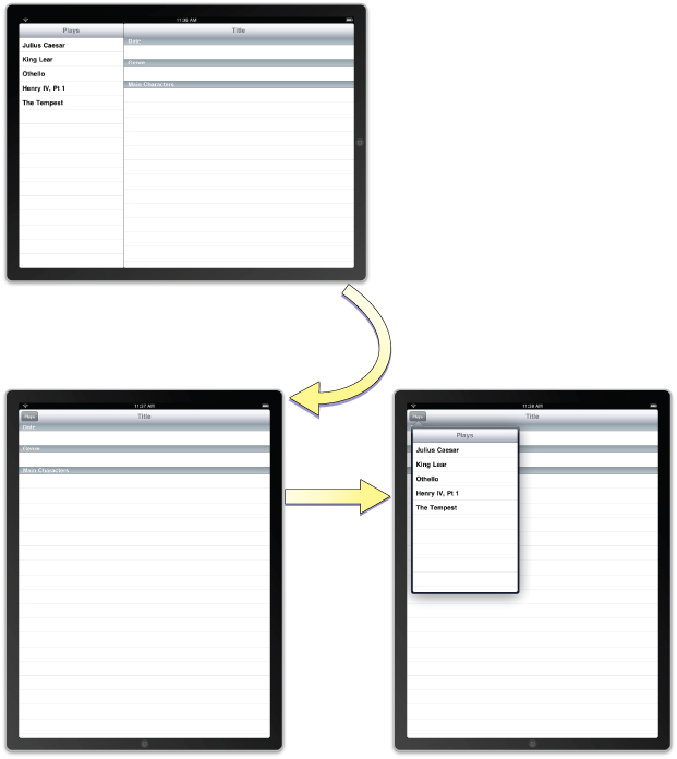
The UISplitViewController class is a container view controller that manages two panes of information. The first pane has a fixed width of 320 points and a height that matches the visible window height. The second pane fills the remaining space. In a landscape orientation, the split view controller presents the two panes side-by-side with a small divider separating them. In a portrait orientation, the split view controller shows only the second, larger pane and provides a toolbar button for displaying the first pane using a popover, as shown in Figure 5-2
The panes of a split-view interface contain content that is managed by view controllers you provide. Because the panes contain application-specific content, it is up to you to manage interactions between the two view controllers. However, rotations and other system-related behaviors are managed by the split view controller itself.
A split view controller must always be the root of any interface you create. In other words, you must always install the view from aUISplitViewController object as the root view of your application’s window. The panes of your split-view interface may then contain navigation controllers, tab bar controllers, or any other type of view controller you need to implement your interface.
The easiest way to integrate a split view controller into your application is to start from a new project. The Split View-based Application template in Xcode provides a good starting point for building an interface that incorporates a split view controller. Everything you need to implement the split view interface is already provided. All you have to do is modify the array of view controllers to present your custom content. The process for modifying these view controllers is virtually identical to the process used in iPhone applications. The only difference is that you now have more screen space available for displaying your detail-related content. However, you can also integrate split view controllers into your existing interfaces, as described in More view controller.
Adding a Split View Controller in Interface Builder
If you do not want to start with the Split View-based Application template project, you can still add a split view controller to your user interface. The library in Interface Builder includes a split view controller object that you can add to your existing nib files. When adding a split view controller, you typically add it to your application’s main nib file. This is because the split view is usually inserted as the top-level view of your application’s window and therefore needs to be loaded at launch time.
To add a split view controller to your application’s main nib file:
Open your application’s main nib file.
Drag a split view controller object to the nib file window.
The split view controller object includes generic view controllers for the two panes.
Add an outlet for the split view controller in your application delegate object and connect that outlet to the split view controller object.
In the
application:didFinishLaunchingWithOptions:method of your application delegate, install the split view controller’s view as the main view of the window:[window addSubview:mySplitViewController.view];
For each of the split view controller’s contained view controllers:
Use the Identity inspector to set the class name of the view controller.
In the Attributes inspector, set the name of the nib file containing the view controller’s view.
The contents of the two view controllers you embed in the split view are your responsibility. You configure these view controllers just as you would configure any other view controllers in your application. Setting the class and nib names is all you have to do in your application’s main nib file. The rest of the configuration is dependent on the type of view controller. For example, for navigation and tab bar controllers, you may need to specify additional view controller information.
Creating a Split View Controller Programmatically
To create a split view controller programmatically, create a new instance of the UISplitViewController class and assign view controllers to its two properties. Because its contents are built on-the-fly from the view controllers you provide, you do not have to specify a nib file when creating a split view controller. Therefore, you can just use the init method to initialize it. Listing 5-2 shows an example of how to create and configure a split view interface at launch time. You would replace the first and second view controllers with the custom view controller objects that present your application’s content. The window variable is assumed to be an outlet that points to the window loaded from your application’s main nib file.
Listing 5-2 Creating a split view controller programmatically
- (BOOL)application:(UIApplication *)application didFinishLaunchingWithOptions:(NSDictionary *)launchOptions |
{ |
MyFirstViewController* firstVC = [[[MyFirstViewController alloc] |
initWithNibName:@"FirstNib" bundle:nil] autorelease]; |
MySecondViewController* secondVC = [[[MySecondViewController alloc] |
initWithNibName:@"SecondNib" bundle:nil] autorelease]; |
UISplitViewController* splitVC = [[UISplitViewController alloc] init]; |
splitVC.viewControllers = [NSArray arrayWithObjects:firstVC, secondVC, nil]; |
[window addSubview:splitVC.view]; |
[window makeKeyAndVisible]; |
return YES; |
} |
Supporting Orientation Changes in a Split View
A split view controller relies on its two view controllers to determine whether interface orientation changes should be made. If one or both of the view controllers do not support the new orientation, no change is made. This is true even in portrait mode, where the first view controller is not displayed. Therefore, you must override the shouldAutorotateToInterfaceOrientation: method for both view controllers and return YES for all supported orientations.
When an orientation change occurs, the split view controller automatically handles most of the rotation behaviors. Specifically, the split view controller automatically hides the first view controller in its viewControllers array when rotating to a portrait orientation and shows it when rotating to a landscape orientation.
If you want to display the first view controller when in portrait orientations, you do so using a delegate object. When rotating to a portrait orientation, the split-view controller provides its delegate with a button that, when tapped, shows the first pane in a popover. All your application has to do is add this button to your application’s toolbar in the delegate’s splitViewController:willHideViewController:withBarButtonItem:forPopoverController: method and remove the button in the splitViewController:willShowViewController:invalidatingBarButtonItem: method. Listing 5-3 shows the implementations of these methods provided by the Split-View based application template. These methods are implemented by the detail view controller, which manages the contents of the split-view controller’s second pane.
Listing 5-3 Adding and removing the toolbar button in response to split view orientation changes
// Called when rotating to a portrait orientation. |
- (void)splitViewController: (UISplitViewController*)svc willHideViewController:(UIViewController *)aViewController withBarButtonItem:(UIBarButtonItem*)barButtonItem forPopoverController: (UIPopoverController*)pc |
{ |
barButtonItem.title = @"Root List"; |
NSMutableArray *items = [[toolbar items] mutableCopy]; |
[items insertObject:barButtonItem atIndex:0]; |
[toolbar setItems:items animated:YES]; |
[items release]; |
self.popoverController = pc; |
} |
// Called when the view is shown again in the split view, invalidating the button and popover controller. |
- (void)splitViewController: (UISplitViewController*)svc willShowViewController:(UIViewController *)aViewController invalidatingBarButtonItem:(UIBarButtonItem *)barButtonItem { |
NSMutableArray *items = [[toolbar items] mutableCopy]; |
[items removeObjectAtIndex:0]; |
[toolbar setItems:items animated:YES]; |
[items release]; |
self.popoverController = nil; |
} |
Copyright © 2013 Apple Inc. All Rights Reserved. Terms of Use | Privacy Policy | Updated: 2013-09-18