Navigation Controllers
A navigation controller manages a stack of view controllers to provide a drill-down interface for hierarchical content. The view hierarchy of a navigation controller is self contained. It is composed of views that the navigation controller manages directly and views that are managed by content view controllers you provide. Each content view controller manages a distinct view hierarchy, and the navigation controller coordinates the navigation between these view hierarchies.
Although a navigation interface consists mostly of your custom content, there are still places where your code must interact directly with the navigation controller object. In addition to telling the navigation controller when to display a new view, you are responsible for configuring the navigation bar—the view at the top of the screen that provides context about the user’s place in the navigation hierarchy. You can also provide items for a toolbar that is managed by the navigation controller.
This chapter describes how you configure and use navigation controllers in your app. For information about ways in which you can combine navigation controllers with other types of view controller objects, see Combined View Controller Interfaces.
Anatomy of a Navigation Interface
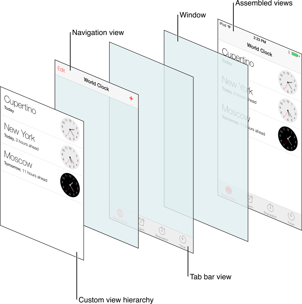
A navigation controller’s primary job is to manage the presentation of your content view controllers, and it is also responsible for presenting some custom views of its own. Specifically, it presents a navigation bar, which contains a back button and some buttons you can customize. A navigation controller can also optionally present a navigation toolbar view and populate it with custom buttons.
Figure 1-1 shows a navigation interface. The navigation view in this figure is the view stored in the navigation controller’s view property. All of the other views in the interface are part of an opaque view hierarchy managed by the navigation controller.
Although the navigation bar and toolbar are customizable views, you must never modify the views in the navigation hierarchy directly. The only way to customize these views is through methods of the UINavigationController and UIViewController classes. For information on how to customize the contents of the navigation bar, see Customizing the Navigation Bar Appearance. For information about how to display and configure custom toolbar items in a navigation interface, see Displaying a Navigation Toolbar.
The Objects of a Navigation Interface
A navigation controller uses several objects to implement the navigation interface. You are responsible for providing some of these objects and the rest are created by the navigation controller itself. Specifically, you are responsible for providing the view controllers with the content you want to present. If you want to respond to notifications from the navigation controller, you can also provide a delegate object. The navigation controller creates the views—such as the navigation bar and toolbar—that are used for the navigation interface, and it is responsible for managing those views. Figure 1-2 shows the relationship between the navigation controller and these key objects.
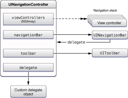
For navigation bar and toolbar objects associated with a navigation controller, you can only customize some aspects of their appearance and behavior. The navigation controller alone is responsible for configuring and displaying them. In addition, a navigation controller object automatically assigns itself as the delegate of its UINavigationBar object and prevents other objects from changing that relationship.
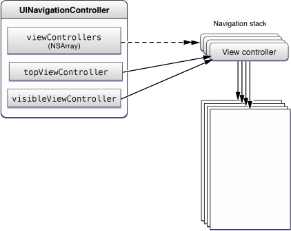
You can modify the delegate and the other view controllers on the navigation stack. The navigation stack is a last-in, first-out collection of custom view controller objects that is managed by the navigation controller. The first item added to the stack becomes the root view controller and is never popped off the stack. Additional items can be added to the stack using the methods of the UINavigationController class.
Figure 1-3 shows the relevant relationships between the navigation controller and the objects on the navigation stack. (Note that the top view controller and the visible view controller are are not necessarily the same. For example, if you present a view controller modally, the value of the visibleViewController property changes to reflect the modal view controller that was presented, but the topViewController property does not change.)
The navigation controller’s primary responsibility is to respond to user actions by pushing new content view controllers onto the stack or popping content view controllers off of the stack. Each view controller you push on the navigation stack is responsible for presenting some portion of your app’s data. Typically, when the user selects an item in the currently visible view, you set up a view controller that has the details for that item and push it onto the navigation stack. For example, when the user selects a photo album in the Photos app, the app pushes a view controller that displays the photos in that album.
This process follows a simple design pattern—each content view controller in the stack configures and pushes the content view controller that is on top of it in the stack. You should avoid making a view controller depend on being pushed onto the stack by an instance of a specific class. Instead, to pass data back down the stack while popping view controllers, set the view controller that is lower in the stack as a delegate of the one that is above it in the stack.
In most cases, you do not have to pop view controllers off the stack programmatically. Instead, the navigation controller provides a back button on the navigation bar that pops the topmost view controller automatically when the user taps it.
For more information about how to customize the navigation bar, see Customizing the Navigation Bar Appearance. For information about pushing view controllers onto the navigation stack (and removing them later), see Modifying the Navigation Stack. For information on how to customize the contents of the toolbar, see Displaying a Navigation Toolbar.
Creating a Navigation Interface
When you create a navigation interface, you need to decide how you intend to use a navigation interface. Because it imposes an overarching organization on your data, you should only use it in these specific ways:
Install it directly as a window’s root view controller.
Install it as the view controller of a tab in a tab bar interface.
Install it as one of the two root view controllers in a split view interface. (iPad only)
Present it modally from another view controller.
Display it from a popover. (iPad only)
In the first three scenarios, the navigation controller provides a crucial part of your basic interface and stays in place until the app exits. The last two scenarios reflect a more temporary use for navigation controllers, in which case the process for using the navigation controller is identical to the process for other content view controllers. The only difference is that the navigation controller continues to provide additional navigation features not available with a single content view controller. Although the following sections focus on how you create the more permanent types of navigation interface, most of the customization steps and general information apply to all navigation controllers, regardless of how you intend to use them.
Defining the Content View Controllers for a Navigation Interface
Every navigation interface has one level of data that represents the root level.This level is the starting point of your interface. For example, the Photos app displays the list of available photo albums at the root level of its data hierarchy. Selecting a photo album then displays the photos in that album and selecting a photo shows a larger version of the photo.
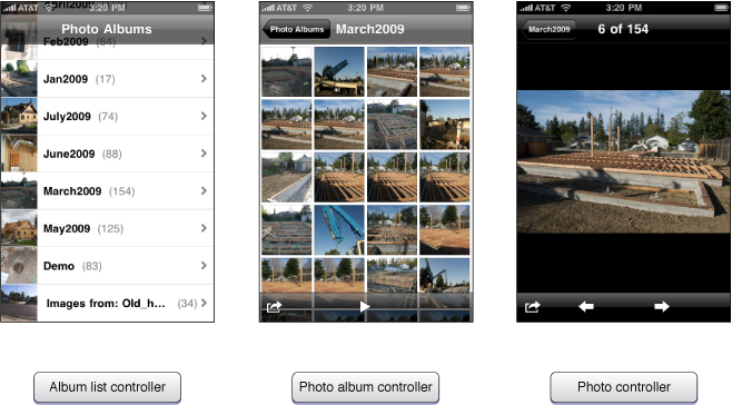
To implement a navigation interface, you must decide what data to present at each level of your data hierarchy. For each level, you must provide a content view controller to manage and present the data at that level. If the presentation at multiple levels is the same, you can create multiple instances of the same view controller class and configure each one to manage its own set of data. For example, the Photos app has three distinct presentation types, as shown in Figure 1-4, so it would need to use three distinct view controller classes.
Each content view controller must provide a way for the user to navigate to the next level of the data hierarchy, except for view controllers managing leaf data. A view controller that displays a list of items can use taps in a given table cell to display the next level of data. For example, when a user selects a photo album from the top-level list, the Photos app creates a new photo album view controller. The new view controller is initialized with enough information about the album for it to present the relevant photos.
For general information and guidance on defining custom view controllers, see Creating Custom Content View Controllers in View Controller Programming Guide for iOS.
Creating a Navigation Interface Using a Storyboard
If you are creating a new Xcode project, the Master-Detail Application template gives you a navigation controller in the storyboard, set as the first scene.
To create a navigation controller in a storyboard, do the following:
Drag a navigation controller from the library.
Interface Builder creates a navigation controller and a view controller, and it creates a relationship between them. This relationship identifies the newly created view controller as the root view controller of the navigation controller.
Display it as the first view controller by selecting the option Is Initial View Controller in the Attributes inspector (or present the view controller in your user interface in another way.)
Creating a Navigation Interface Programmatically
If you prefer to create a navigation controller programmatically, you may do so from any appropriate point in your code. For example, if the navigation controller provides the root view for your app window, you could create the navigation controller in the applicationDidFinishLaunching: method of your application delegate.
When creating a navigation controller, you must do the following:
Create the root view controller for the navigation interface.
This object is the top-level view controller in the navigation stack. The navigation bar displays no back button when its view is displayed and the view controller cannot be popped from the navigation stack.
Create the navigation controller, initializing it using the
initWithRootViewController:method.Set the navigation controller as the root view controller of your window (or otherwise present it in your interface).
Listing 1-1 shows a simple implementation of the applicationDidFinishLaunching: method that creates a navigation controller and sets it as the root view controller of the app’s main window. The navigationController and window variables are member variables of the application delegate and the MyRootViewController class is a custom view controller class. When the window for this example is displayed, the navigation interface presents the view for the root view controller in the navigation interface.
Listing 1-1 Creating a navigation controller programmatically
- (void)applicationDidFinishLaunching:(UIApplication *)application |
{ |
UIViewController *myViewController = [[MyViewController alloc] init]; |
navigationController = [[UINavigationController alloc] |
initWithRootViewController:myViewController]; |
window = [[UIWindow alloc] initWithFrame:[[UIScreen mainScreen] bounds]]; |
window.rootViewController = navigationController; |
[window makeKeyAndVisible]; |
} |
Adopting a Full-Screen Layout for Navigation Views
Typically, a navigation interface displays your custom content in the gap between the bottom of the navigation bar and the top of the toolbar or tab bar (see Figure 1-1). However, a view controller can ask that its view be displayed with a full-screen layout instead. In a full-screen layout, the content view is configured to underlap the navigation bar, status bar, and toolbar as appropriate. This arrangement lets you maximize the visible amount of content for the user and is useful for photo displays or other places where you might want more space.
When determining whether a view should be sized to fill all or most of the screen, a navigation controller considers several factors, including the following:
Is the underlying window (or parent view) sized to fill the entire screen bounds?
Is the navigation bar configured to be translucent?
Is the navigation toolbar (if used) configured to be translucent?
Is the underlying view controller’s
wantsFullScreenLayoutproperty set toYES?
Each of these factors is used to determine the final size of the custom view. The order of the items in the preceding list also reflects the precedence by which each factor is considered. The window size is the first limiting factor; if your app’s main window (or the containing parent view in the case of a modally presented view controller) does not span the screen, the views it contains cannot do so either. Similarly, if the navigation bar or toolbar are visible but not translucent, it does not matter if the view controller wants its view to be displayed using a full-screen layout. The navigation controller never displays content under an opaque navigation bar.
If you are creating a navigation interface and want your custom content to span most or all of the screen, here are the steps you should take:
Configure the frame of your custom view to fill the screen bounds.
Be sure to configure the autoresizing attributes of your view as well. The autoresizing attributes ensure that if your view needs to be resized, it adjusts its content accordingly. Alternatively, when your view is resized, you can call the
setNeedsLayoutmethod of your view to indicate that the position of its subviews should be adjusted.To underlap the navigation bar, set the
translucentproperty of your navigation controller toYES.To underlap an optional toolbar, set the
translucentproperty of the toolbar toYES.To underlap the status bar, set the
wantsFullScreenLayoutproperty of your view controller toYES.
When presenting your navigation interface, the window or view to which you add your navigation view must also be sized appropriately. If your app uses a navigation controller as its primary interface, then your main window should be sized to match the screen dimensions. In other words, you should set its size to match the bounds property of the UIScreen class (instead of the applicationFrame property). In fact, for a navigation interface, it is usually better to create your window with the full-screen bounds in all situations because the navigation controller adjusts the size of its views to accommodate the status bar automatically anyway.
If you are presenting a navigation controller modally, the content presented by that navigation controller is limited by the view controller doing the presenting. If that view controller does not want to underlap the status bar, then the modally presented navigation controller is not going to be allowed to underlap the status bar either. In other words, the parent view always has some influence over how its modally presented views are displayed.
For additional information on how to configure the interface to support full-screen layout, see Creating Custom Content View Controllers in View Controller Programming Guide for iOS.
Modifying the Navigation Stack
You are responsible for creating the objects that reside on the navigation stack. When initializing a navigation controller object, you must provide a content view controller to display the root content of your data hierarchy. You can add or remove view controllers programmatically or in response to user interactions. The navigation controller class provides several options for managing the contents of the navigation stack. These options cover the various scenarios you are likely to encounter in your app. Table 1-1 lists these scenarios and how you respond to them.
Scenario | Description |
|---|---|
Display the next level of hierarchical data. | When the user selects an item displayed by the topmost view controller, you can use a segue or the |
Back up one level in the hierarchy. | The navigation controller usually provides a back button to remove the topmost view controller from the stack and return to the previous screen. You can also remove the topmost view controller programmatically using the |
Restore the navigation stack to a previous state. | When your app launches, you can use the In order to restore your app to a previous state, you must first save enough state information to recreate the needed view controllers. When the user quits your app, you would need to save some markers or other information indicating the user’s position in your data hierarchy. At the next launch time, you would then read this state information and use it to recreate the needed view controllers before calling the You can also use this method to jump to an arbitrary location in your data hierarchy. Jumping to an arbitrary location can easily cause confusion, however, so you should take special care to communicate what is happening clearly to the user. |
Return the user to the root view controller. | To return to the top of your navigation interface, use the |
Back up an arbitrary number of levels in the hierarchy. | To back up more than one level at a time, use the |
When you animate the pushing or popping of view controllers, the navigation controller automatically creates animations that make the most sense. For example, if you pop multiple view controllers off the stack using the popToViewController:animated: method, the navigation controller uses an animation only for the topmost view controller. All other intermediate view controllers are dismissed without an animation. If you push or pop an item using an animation, you must wait until the animation is complete before you attempt to push or pop another view controller.
Monitoring Changes to the Navigation Stack
Whenever you push or pop a view controller, the navigation controller sends messages to the affected view controllers. The navigation controller also sends messages to its delegate when its stack changes. Figure 1-5 shows the sequence of events that occurs during a push or pop operation and the corresponding messages that are sent to your custom objects at each stage. The new view controller reflects the view controller that is about to become the topmost view controller on the stack.
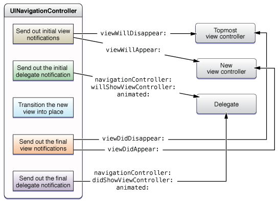
You can use the methods of the navigation controller’s delegate to coordinate between content view controllers, for example to update state that is shared between them. If you push or pop multiple view controllers at once, only the view controller that was visible and the view controller that is about to become visible have the method called. The intermediate view controllers do not have the method called, unless the chaining happens inside a callback (for example, if your implementation of viewWillAppear: calls pushViewController:animated:).
You can use the isMovingToParentViewController and isMovingFromParentViewController methods of UIViewController to determine if a view controller is appearing or disappearing as a result of a push or a pop.
Customizing the Navigation Bar Appearance
A navigation bar is a view that manages the controls in a navigation interface, and it takes on a special role when managed by a navigation controller object. To ensure consistency, and to reduce the amount of work needed to build navigation interfaces, each navigation controller object creates its own navigation bar and takes on most of the responsibility for managing that bar’s content. As needed, the navigation controller interacts with other objects (like your content view controllers) to help in this process.
Configuring the Navigation Item Object
The structure of a navigation bar is similar to the structure of a navigation controller in many ways. Like a navigation controller, a navigation bar is a container for content that is provided by other objects. In the case of a navigation bar, the content is provided by one or more UINavigationItem objects, which are stored using a stack data structure known as the navigation item stack. Each navigation item provides a complete set of views and content to be displayed in the navigation bar.
Figure 1-6 shows some of the key objects related to a navigation bar at runtime. The owner of the navigation bar (whether it is a navigation controller or your custom code) is responsible for pushing items onto the stack and popping them off as needed. In order to provide proper navigation, the navigation bar maintains pointers to select objects in the stack. Although most of the navigation bar’s content is obtained from the topmost navigation item, a pointer to the back item is maintained so that a back button (with the title of the preceding item) can be created.
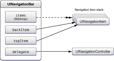
In a navigation interface, each content view controller in the navigation stack provides a navigation item as the value of its navigationItem property. The navigation stack and the navigation item stack are always parallel: for each content view controller on the navigation stack, its navigation item is in the same position in the navigation item stack.
A navigation bar places items in three primary positions: left, right, and center. Table 1-2 lists the properties of the UINavigationItem class that are used to configure each of these positions. When configuring a navigation item for use with a navigation controller, be aware that custom controls in some positions may be ignored in favor of the expected controls. The description of each position includes information about how your custom objects are used.
Position | Property | Description |
|---|---|---|
Left | In a navigation interface, the navigation controller assigns a Back button to the left position by default. To get the default Back button provided by the navigation controller, get the value of the To assign a custom button or view to the left position, and thereby replace the default Back button, assign a | |
Center | In a navigation interface, the navigation controller displays a custom view with the title of your content view controller by default. You can replace this view as desired with your own custom view. If you do not provide a custom title view, the navigation bar displays a custom view with the navigation item’s title string. Or, if the navigation item doesn’t provide a title, the navigation bar uses the view controller’s title. | |
Right | This position is empty by default. It is typically used to place buttons for editing or modifying the current screen. You can also place custom views here by wrapping the view in a |
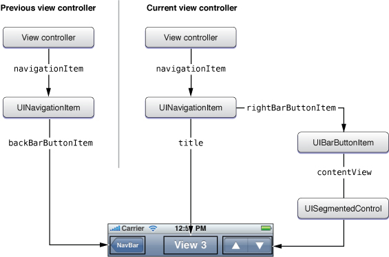
Figure 1-7 shows how the contents of the navigation bar are assembled for a navigation interface. The navigation item associated with the current view controller provides the content for the center and right positions of the navigation bar. The navigation item for the previous view controller provides the content for the left position. Although the left and right items require you to specify a UIBarButtonItem object, you can wrap a view in a bar button item as shown in the figure. If you do not provide a custom title view, the navigation item creates one for you using the title of the current view controller.
Showing and Hiding the Navigation Bar
When a navigation bar is used in conjunction with a navigation controller, you always use the setNavigationBarHidden:animated: method of UINavigationController to show and hide the navigation bar. You must never hide the navigation bar by modifying the UINavigationBar object’s hidden property directly. In addition to showing or hiding the bar, using the navigation controller method gives you more sophisticated behaviors for free. Specifically, if a view controller shows or hides the navigation bar in its viewWillAppear: method, the navigation controller animates the appearance or disappearance of the bar to coincide with the appearance of the new view controller.
Because the user needs the back button on the navigation bar to navigate back to the previous screen, you should never hide the navigation bar without giving the user some way to get back to the previous screen. The most common way to provide navigation support is to intercept touch events and use them to toggle the visibility of the navigation bar. For example, the Photos app does this when a single image is displayed full screen. You could also detect swipe gestures and use them to pop the current view controller off the stack, but this behavior is less discoverable than simply toggling the navigation bar’s visibility.
Modifying the Navigation Bar Object Directly
In a navigation interface, a navigation controller owns its UINavigationBar object and is responsible for managing it. It is not permissible to change the navigation bar object or modify its bounds, frame, or alpha values directly. However, there are a few properties that you can modify, including the following:
barStylepropertytranslucentpropertytintColorproperty
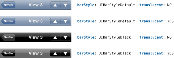
Figure 1-8 shows how the barStyle and translucent properties affect the appearance of the navigation bar. For translucent styles, it is worth noting that if the main view of the underlying view controller is a scroll view, the navigation bar automatically adjusts the content inset value to allow content to scroll out from under the navigation bar. It does not make this adjustment for other types of views.
If you want to show or hide the entire navigation bar, you should similarly use the setNavigationBarHidden:animated: method of the navigation controller rather than modify the navigation bar directly. For more information about showing and hiding the navigation bar, see Showing and Hiding the Navigation Bar.
Using Custom Buttons and Views as Navigation Items
To customize the appearance of the navigation bar for a specific view controller, modify the attributes of its associated UINavigationItem object. You can get the navigation item for a view controller from its navigationItem property. The view controller does not create its navigation item until you request it, so you should ask for this object only if you plan to install the view controller in a navigation interface.
If you choose not to modify the navigation item for your view controller, the navigation item provides a set of default objects that should suffice in many situations. Any customizations you make take precedence over the default objects.
For the topmost view controller, the item that is displayed on the left side of the navigation bar is determined using the following rules:
If you assign a custom bar button item to the
leftBarButtonItemproperty of the topmost view controller’s navigation item, that item is given the highest preference.If you do not provide a custom bar button item and the navigation item of the view controller one level down on the navigation stack has a valid item in its
backBarButtonItemproperty, the navigation bar displays that item.If a bar button item is not specified by either of the view controllers, a default back button is used and its title is set to the value of the title property of the previous view controller—that is, the view controller one level down on the navigation stack. (If the topmost view controller is the root view controller, no default back button is displayed.)
For the topmost view controller, the item that is displayed in the center of the navigation bar is determined using the following rules:
If you assign a custom view to the
titleViewproperty of the topmost view controller’s navigation item, the navigation bar displays that view.If no custom title view is set, the navigation bar displays a custom view containing the view controller’s title. The string for this view is obtained from the
titleproperty of the view controller’s navigation item. If the value of that property isnil, the string from thetitleproperty of the view controller itself is used.
For the topmost view controller, the item that is displayed on the right side of the navigation bar is determined using the following rules:
If the new top-level view controller has a custom right bar button item, that item is displayed. To specify a custom right bar button item, set the
rightBarButtonItemproperty of the navigation item.If no custom right bar button item is specified, the navigation bar displays nothing on the right side of the bar.
To add custom prompt text above the navigation bar controls, assign a value to the prompt property of the navigation item.
Figure 1-9 shows various navigation bar configurations, including several that use custom views and prompts. The navigation bars in this figure are from the sample project NavBar: Customizing UINavigationBar's appearance.
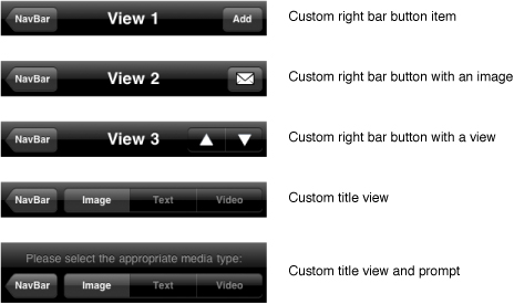
Listing 1-2 shows the code from the NavBar app that would be required to create the third navigation bar in Figure 1-9, which is the navigation bar containing the right bar button item with a custom view. Because it is in the right position on the navigation bar, you must wrap the custom view with a UIBarButtonItem object before assigning it to the rightBarButtonItem property.
Listing 1-2 Creating custom bar button items
// View 3 - Custom right bar button with a view |
UISegmentedControl *segmentedControl = [[UISegmentedControl alloc] initWithItems: |
[NSArray arrayWithObjects: |
[UIImage imageNamed:@"up.png"], |
[UIImage imageNamed:@"down.png"], |
nil]]; |
[segmentedControl addTarget:self action:@selector(segmentAction:) forControlEvents:UIControlEventValueChanged]; |
segmentedControl.frame = CGRectMake(0, 0, 90, kCustomButtonHeight); |
segmentedControl.segmentedControlStyle = UISegmentedControlStyleBar; |
segmentedControl.momentary = YES; |
defaultTintColor = segmentedControl.tintColor; // Keep track if this if you need it later. |
UIBarButtonItem *segmentBarItem = [[UIBarButtonItem alloc] initWithCustomView:segmentedControl]; |
self.navigationItem.rightBarButtonItem = segmentBarItem; |
Configuring your view controller’s navigation item programmatically is the most common approach for most apps. Although you could create bar button items using Interface Builder, it is often much simpler to create them programmatically. You should create the items in the viewDidLoad method of your view controller.
Using Edit and Done Buttons
Views that support in-place editing can include a special type of button in their navigation bar that allows the user to toggle back and forth between display and edit modes. The editButtonItem method of UIViewController returns a preconfigured button that when pressed toggles between an Edit and Done button and calls the view controller’s setEditing:animated: method with appropriate values. To add this button to your view controller’s navigation bar, you would use code similar to the following:
myViewController.navigationItem.rightBarButtonItem = [myViewController editButtonItem]; |
If you include this button in your navigation bar, you must also override your view controller’s setEditing:animated: method and use it to adjust your view hierarchy. For more information on implementing this method, see Creating Custom Content View Controllers in View Controller Programming Guide for iOS.
Displaying a Navigation Toolbar
In iOS 3.0 and later, a navigation interface can display a toolbar and populate it with items provided by the currently visible view controller. The toolbar itself is managed by the navigation controller object. Supporting a toolbar at this level is necessary in order to create smooth transitions between screens. When the topmost view controller on the navigation stack changes, the navigation controller animates changes between different sets of toolbar items. It also creates smooth animations in cases where you want to toggle the visibility of the toolbar for a specific view controller.
To configure a toolbar for your navigation interface, you must do the following:
Show the toolbar by setting the
toolbarHiddenproperty of the navigation controller object toNO.Assign an array of
UIBarButtonItemobjects to thetoolbarItemsproperty of each of your content view controllers, as described in Specifying the Toolbar Items.If you do not want to show a toolbar for a particular content view controller, you can hide the toolbar as described in Showing and Hiding the Toolbar.
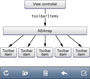
Figure 1-10 shows an example of how the objects you associate with your content view controller are reflected in the toolbar. Items are displayed in the toolbar in the same order they are provided in the array. The array can include all types of bar button items, including fixed and flexible space items, system button items, or any custom button items you provide. In this example, the five items are all button items from the Mail app.
Specifying the Toolbar Items
When configuring bar button items, remember to associate an appropriate target and action with the button. The target and action information is what you use to respond to taps in the toolbar. In most cases, the target should be the view controller itself, since it is responsible for providing the toolbar items. Figure 1-11 shows a sample toolbar with a centered segmented control.
To specify the toolbar items using a storyboard:
Drag a toolbar from the library.
Add two flexible space bar button items to the toolbar, by dragging them from the library.
Add a segmented control from the library, between the flexible space bar buttons, by dragging it from the library.
Use the Inspector to configure the segmented control.

Listing 1-3 shows the code needed to specify the toolbar items programmatically. You would implement the method in your view controller and call it at initialization time.
Listing 1-3 Configuring a toolbar with a centered segmented control
- (void)configureToolbarItems |
{ |
UIBarButtonItem *flexibleSpaceButtonItem = [[UIBarButtonItem alloc] |
initWithBarButtonSystemItem:UIBarButtonSystemItemFlexibleSpace |
target:nil action:nil]; |
// Create and configure the segmented control |
UISegmentedControl *sortToggle = [[UISegmentedControl alloc] |
initWithItems:[NSArray arrayWithObjects:@"Ascending", |
@"Descending", nil]]; |
sortToggle.segmentedControlStyle = UISegmentedControlStyleBar; |
sortToggle.selectedSegmentIndex = 0; |
[sortToggle addTarget:self action:@selector(toggleSorting:) |
forControlEvents:UIControlEventValueChanged]; |
// Create the bar button item for the segmented control |
UIBarButtonItem *sortToggleButtonItem = [[UIBarButtonItem alloc] |
initWithCustomView:sortToggle]; |
// Set our toolbar items |
self.toolbarItems = [NSArray arrayWithObjects: |
flexibleSpaceButtonItem, |
sortToggleButtonItem, |
flexibleSpaceButtonItem, |
nil]; |
} |
In addition to setting toolbar items during initialization, a view controller can also change its existing set of toolbar items dynamically using the setToolbarItems:animated: method. This method is useful for situations where you want to update the toolbar commands to reflect some other user action. For example, you could use it to implement a set of hierarchical toolbar items, whereby tapping a button on the toolbar displays a set of related child buttons.
Showing and Hiding the Toolbar
To hide the toolbar for a specific view controller, set the hidesBottomBarWhenPushed property of that view controller to YES. When the navigation controller encounters a view controller with this property set to YES, it generates an appropriate transition animation whenever the view controller is pushed onto (or removed from) the navigation stack.
If you want to hide the toolbar sometimes (but not always), you can call the setToolbarHidden:animated: method of the navigation controller at any time. A common way to use this method is to combine it with a call to the setNavigationBarHidden:animated: method to create a temporary full-screen view. For example, the Photos app toggles the visibility of both bars when it is displaying a single photo and the user taps the screen.
Copyright © 2014 Apple Inc. All Rights Reserved. Terms of Use | Privacy Policy | Updated: 2014-11-15