-
将 Swift Charts 扩展成三维图表
了解如何使用 Chart3D 将你的 2D Swift Charts 转换为三维图表,从全新角度直观呈现你的数据集。绘制 3D 数据图表,以可视化方式显示数学表面,并对摄像头、材质等各种因素进行自定,让你的 3D 图表更加清晰直观、赏心悦目。
为了充分从这个讲座中获益,我们建议你先熟悉一下如何创建 2D Swift Charts。章节
资源
相关视频
WWDC24
WWDC22
-
搜索此视频…
大家好 我叫 Mike 是 System Experience 团队的工程师 今天 我想介绍 Swift Charts 中 一项令人兴奋的新功能 Swift Charts 是一个框架 用于创建易懂且精美的图表
图表在 Apple 各个平台上广泛应用 例如 在“天气”中查看气温
在“设置”中显示电池使用情况 在“数学笔记”中绘制数学函数图
借助 Swift Charts 中提供的 基础组件 你可以使用各种组件来创建 2D 图表 例如轴标记、 标签和线图
现在 数据图变立体了! 在 iOS、macOS 和 visionOS 26 中 Swift Charts 现在支持 3D 图表 没错 现在你可以让用户从全新视角 探索和理解数据集
在这个讲座中 我将展示如何 将一组 2D 图表转换为三维图表 使用的是 3D 绘图功能 我将介绍如何使用曲面图 来绘制三维数学函数图 最后 我将介绍自定义图表的方法 使图表更直观、更赏心悦目 不过 我要先宣布一件重要的事
我喜欢企鹅!
事实上我最喜欢的一个数据集 包含了南极洲帕尔默群岛上 数百只企鹅的测量数据
这些数据包括每只企鹅的喙长、 鳍状肢长和体重
并按企鹅的种类分组 帽带企鹅、
巴布亚企鹅和阿德利企鹅
我将使用 Swift Charts 从这些数据中挖掘洞见 并展示如何通过 3D 绘图 直观地展现 不同企鹅种类之间的差异
所以 我在这里创建了一个 2D 图表 来展示企鹅的鳍状肢长度 和体重之间的关系 PointMark 用于绘制 每只企鹅的鳍状肢长度和体重 foregroundStyle 则根据种类为数据点着色 并在角落创建图例
非常棒 Swift Charts 使 构建图表变得轻而易举 这张图表显示 帽带企鹅和阿德利企鹅 具有相似的鳍状肢长度和体重 而巴布亚企鹅的鳍状肢更长 体重也更重
企鹅数据集还包括喙长 所以我还制作了一张图表来绘制 喙长和体重
这张图表显示 帽带企鹅和 巴布亚企鹅的喙长相似 而阿德利企鹅的喙更短
最后我制作了一张 喙长和鳍状肢长度的图表 看起来喙较长的企鹅 往往鳍状肢也较长
这些 2D 图表都很棒 每一张图表都能够很好地洞察 两个属性之间的关系
然而 Swift Charts 现在可以 将这些图表提升到新的水平 只需要制作一张图表来 囊括所有这些数据
这称为 Chart3D Chart3D 延续了 2D 图表中 用户熟悉的概念 比如散点图 并将它们完整地引入 3D 视图
要使用 3D 图表 我需要将 Chart 更改为 Chart3D
PointMark 在 Chart3D 中同样适用 而且现在还可设置 Z 值 这里我使用 Beak Length
同样 我会将 ZAxisLabel 设置为 Beak Length这就好了!
只需几行代码和 Chart3D 我就能立即以有趣且 可交互的方式来展示企鹅种类的差异
我可以通过简单的手势 将图表旋转到精确的角度 这样就能看到三个数据簇
我还可以从侧面查看图表 一次对比两个属性 效果类似于 2D 图表视图
3D 图表非常适合用于数据形状 比精确值更重要的情况 当数据本身是三维的 尤其是表示 3D 空间中的物理位置时 这是非常自然的情况
此外 交互性是理解 三维数据集的关键 因此 只有当交互能增强 App 的体验时 才应考虑使用 3D 图表 说到数据集的最佳表示方式 2D 和 3D 之间的选择 不是非黑即白的
PointMarks、RuleMarks 和 RectangleMarks 都已针对 3D 图表进行了更新 现在 Chart3D 独有的 是 SurfacePlot
接下来 我将深入探讨 SurfacePlot 的工作原理
SurfacePlot 是 LinePlot 的 三维扩展 它绘制一个数学曲面 包含最多两个三维变量
新的 SurfacePlot API 与 LinePlot API 类似
它接受一个闭包 这个闭包接收并返回双精度浮点数
在闭包中输入数学表达式后 SurfacePlot 计算不同 X 和 Z 值 的表达式 并创建计算出的 Y 值的连续曲面 这些曲面可复杂可简单 完全由你决定
要进一步了解通过 LinePlot API 绘制的函数图 观看 WWDC24 讲座“Swift Charts: 矢量图与函数图”
你知道吗? 现在我再次查看企鹅数据集时 发现企鹅的喙长和鳍状肢长度 与体重之间似乎存在线性关系 这似乎是一个合理的猜测 但我不想凭空想象 我可以使用 SurfacePlot 来显示 数据的线性回归
我定义了一个 LinearRegression 类 它根据独立的 x 和 z 变量 来估算 y 值 更具体地说 我将线性回归设置为 根据鳍状肢长度和喙长 估算企鹅的体重
然后 这个线性回归 被用于 SurfacePlot 中 将估算的体重值绘制为连续曲面
太好了! 这些数据似乎确实存在线性关系 SurfacePlot 显示鳍状肢长度和体重 呈正相关 喙长和体重之间 也存在轻微的正相关关系
现在 我将介绍一些 自定 Chart3D 样式和行为的好方法
之前在与企鹅数据集交互时 我注意到改变图表的角度 也会改变数据的外观
这个角度非常适合显示数据点簇 而这个角度则非常适合显示线性关系
这些角度称为图表的姿态
选择一个能够良好呈现数据的 初始姿态非常重要
对于事先不知道值的动态数据 尝试选择一个适用于这个类型的 典型数据集的初始姿态
要调整图表的姿态 使用 Chart3DPose 修饰符 它接受一个 Chart3DPose
我可以将姿态设置为特定值 例如 front
也可以定义自定姿态 这个构造器接受两个参数: 一个是 azimuth 用于左右旋转图表
另一个是 inclination 用于上下倾斜图表
接下来 请注意图表后面的点 与图表前面的点大小相同
这样可以更轻松地比较 数据点在图表中的大小和距离 不用考虑深度
从侧面查看图表时也很棒 因为它有效地将 3D 图表 转换为 2D 图表
这称为正交相机投影
Chart3D 提供两种相机投影: 正交投影 这是默认行为 和透视投影 使用透视投影时 较远的数据点显得较小 平行线会相交 这可以提供沉浸式体验 有助于增强深度感知
设置相机投影使用 chart3DCameraProjection 修饰符
SurfacePlots 也有一些 用于曲面样式的自定义选项
ForegroundStyle 接受渐变 比如 LinearGradient 或 EllipticalGradient 它还支持两个新值:heightBased 根据点所在处的曲面高度 为曲面上的点着色
和 normalBased 根据点所在处的曲面角度 为曲面上的点着色
Chart3D 还提供许多其他修饰符 其中一些可能与 2D 图表中的类似 使用这些修饰符可以自定曲面样式、 PointMark 符号、 图表域和轴标记 或选择行为
通过将这些视图修饰符与 PointMark、RuleMark、RectangleMark 和 SurfacePlot 结合使用 可以绘制出各种有趣的图表 这只是冰山一角
此外 3D 图表在 Apple Vision Pro 上既好用又美观 它与三维数据集简直是天生一对!
以上就是 Swift Charts 即将推出的 一些全新 3D 功能
一旦你确定 3D 是数据 的理想呈现方式 不妨尝试使用 Chart3D 进行绘图 为图表带来新的深度 并使用 Swift Charts 的自定义 API 设计你自己的易懂且精美的图表
要了解将 Swift Charts 融入 App 中的最佳实践 请观看 WWDC22 讲座 “利用图表设计 App 体验”
感谢观看我迫不及待地想看看 你将带入三维世界 的精彩图表
-
-
2:03 - A scatterplot of a penguin's flipper length and weight
// A scatterplot of a penguin's flipper length and weight import SwiftUI import Charts struct PenguinChart: View { var body: some View { Chart(penguins) { penguin in PointMark( x: .value("Flipper Length", penguin.flipperLength), y: .value("Weight", penguin.weight) ) .foregroundStyle(by: .value("Species", penguin.species)) } .chartXAxisLabel("Flipper Length (mm)") .chartYAxisLabel("Weight (kg)") .chartXScale(domain: 160...240) .chartYScale(domain: 2...7) .chartXAxis { AxisMarks(values: [160, 180, 200, 220, 240]) { AxisTick() AxisGridLine() AxisValueLabel() } } .chartYAxis { AxisMarks(values: [2, 3, 4, 5, 6, 7]) { AxisTick() AxisGridLine() AxisValueLabel() } } } } -
2:39 - A scatterplot of a penguin's beak length and weight
// A scatterplot of a penguin's beak length and weight import SwiftUI import Charts struct PenguinChart: View { var body: some View { Chart(penguins) { penguin in PointMark( x: .value("Beak Length", penguin.beakLength), y: .value("Weight", penguin.weight) ) .foregroundStyle(by: .value("Species", penguin.species)) } .chartXAxisLabel("Beak Length (mm)") .chartYAxisLabel("Weight (kg)") .chartXScale(domain: 30...60) .chartYScale(domain: 2...7) .chartXAxis { AxisMarks(values: [30, 40, 50, 60]) { AxisTick() AxisGridLine() AxisValueLabel() } } .chartYAxis { AxisMarks(values: [2, 3, 4, 5, 6, 7]) { AxisTick() AxisGridLine() AxisValueLabel() } } } } -
2:51 - A scatterplot of a penguin's beak length and flipper length
// A scatterplot of a penguin's beak length and flipper length import SwiftUI import Charts struct PenguinChart: View { var body: some View { Chart(penguins) { penguin in PointMark( x: .value("Beak Length", penguin.beakLength), y: .value("Flipper Length", penguin.flipperLength) ) .foregroundStyle(by: .value("Species", penguin.species)) } .chartXAxisLabel("Beak Length (mm)") .chartYAxisLabel("Flipper Length (mm)") .chartXScale(domain: 30...60) .chartYScale(domain: 160...240) .chartXAxis { AxisMarks(values: [30, 40, 50, 60]) { AxisTick() AxisGridLine() AxisValueLabel() } } .chartYAxis { AxisMarks(values: [160, 180, 200, 220, 240]) { AxisTick() AxisGridLine() AxisValueLabel() } } } } -
3:28 - A scatterplot of a penguin's flipper length, beak length, and weight
// A scatterplot of a penguin's flipper length, beak length, and weight import SwiftUI import Charts struct PenguinChart: View { var body: some View { Chart3D(penguins) { penguin in PointMark( x: .value("Flipper Length", penguin.flipperLength), y: .value("Weight", penguin.weight), z: .value("Beak Length", penguin.beakLength) ) .foregroundStyle(by: .value("Species", penguin.species)) } .chartXAxisLabel("Flipper Length (mm)") .chartYAxisLabel("Weight (kg)") .chartZAxisLabel("Beak Length (mm)") .chartXScale(domain: 160...240, range: -0.5...0.5) .chartYScale(domain: 2...7, range: -0.5...0.5) .chartZScale(domain: 30...60, range: -0.5...0.5) .chartXAxis { AxisMarks(values: [160, 180, 200, 220, 240]) { AxisTick() AxisGridLine() AxisValueLabel() } } .chartYAxis { AxisMarks(values: [2, 3, 4, 5, 6, 7]) { AxisTick() AxisGridLine() AxisValueLabel() } } .chartZAxis { AxisMarks(values: [30, 40, 50, 60]) { AxisTick() AxisGridLine() AxisValueLabel() } } } } -
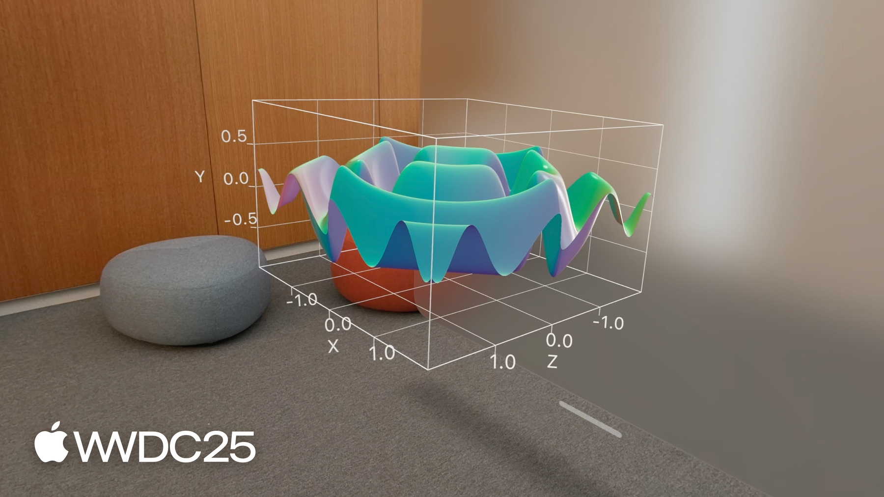
5:19 - A surface plot showing mathematical functions (x * z)
// A surface plot showing mathematical functions import SwiftUI import Charts var SurfacePlotChart: View { var body: some View { Chart3D { SurfacePlot(x: "X", y: "Y", z: "Z") { x, z in // (Double, Double) -> Double x * z } } } } -
5:43 - A surface plot showing mathematical functions
// A surface plot showing mathematical functions import SwiftUI import Charts var SurfacePlotChart: View { var body: some View { Chart3D { SurfacePlot(x: "X", y: "Y", z: "Z") { x, z in // (Double, Double) -> Double (sin(5 * x) + sin(5 * z)) / 2 } } } } -
5:46 - A surface plot showing mathematical functions (-z)
// A surface plot showing mathematical functions import SwiftUI import Charts var SurfacePlotChart: View { var body: some View { Chart3D { SurfacePlot(x: "X", y: "Y", z: "Z") { x, z in // (Double, Double) -> Double -z } } } } -
6:19 - Present a linear regression of the penguin data
// Present a linear regression of the penguin data import SwiftUI import Charts import CreateML import TabularData final class LinearRegression: Sendable { let regressor: MLLinearRegressor init<Data: RandomAccessCollection>( _ data: Data, x xPath: KeyPath<Data.Element, Double>, y yPath: KeyPath<Data.Element, Double>, z zPath: KeyPath<Data.Element, Double> ) { let x = Column(name: "X", contents: data.map { $0[keyPath: xPath] }) let y = Column(name: "Y", contents: data.map { $0[keyPath: yPath] }) let z = Column(name: "Z", contents: data.map { $0[keyPath: zPath] }) let data = DataFrame(columns: [x, y, z].map { $0.eraseToAnyColumn() }) regressor = try! MLLinearRegressor(trainingData: data, targetColumn: "Y") } func callAsFunction(_ x: Double, _ z: Double) -> Double { let x = Column(name: "X", contents: [x]) let z = Column(name: "Z", contents: [z]) let data = DataFrame(columns: [x, z].map { $0.eraseToAnyColumn() }) return (try? regressor.predictions(from: data))?.first as? Double ?? .nan } } let linearRegression = LinearRegression( penguins, x: \.flipperLength, y: \.weight, z: \.beakLength ) struct PenguinChart: some View { var body: some View { Chart3D { ForEach(penguins) { penguin in PointMark( x: .value("Flipper Length", penguin.flipperLength), y: .value("Weight", penguin.weight), z: .value("Beak Length", penguin.beakLength), ) .foregroundStyle(by: .value("Species", penguin.species)) } SurfacePlot(x: "Flipper Length", y: "Weight", z: "Beak Length") { flipperLength, beakLength in linearRegression(flipperLength, beakLength) } .foregroundStyle(.gray) } .chartXAxisLabel("Flipper Length (mm)") .chartYAxisLabel("Weight (kg)") .chartZAxisLabel("Beak Length (mm)") .chartXScale(domain: 160...240, range: -0.5...0.5) .chartYScale(domain: 2...7, range: -0.5...0.5) .chartZScale(domain: 30...60, range: -0.5...0.5) .chartXAxis { AxisMarks(values: [160, 180, 200, 220, 240]) { AxisTick() AxisGridLine() AxisValueLabel() } } .chartYAxis { AxisMarks(values: [2, 3, 4, 5, 6, 7]) { AxisTick() AxisGridLine() AxisValueLabel() } } .chartZAxis { AxisMarks(values: [30, 40, 50, 60]) { AxisTick() AxisGridLine() AxisValueLabel() } } } } -
7:50 - Adjust the initial chart pose (Default)
// Adjust the initial chart pose import SwiftUI import Charts struct PenguinChart: View { @State var pose: Chart3DPose = .default var body: some View { Chart3D(penguins) { penguin in PointMark( x: .value("Flipper Length", penguin.flipperLength), y: .value("Weight", penguin.weight), z: .value("Beak Length", penguin.beakLength) ) .foregroundStyle(by: .value("Species", penguin.species)) } .chart3DPose($pose) .chartXAxisLabel("Flipper Length (mm)") .chartYAxisLabel("Weight (kg)") .chartZAxisLabel("Beak Length (mm)") .chartXScale(domain: 160...240, range: -0.5...0.5) .chartYScale(domain: 2...7, range: -0.5...0.5) .chartZScale(domain: 30...60, range: -0.5...0.5) .chartXAxis { AxisMarks(values: [160, 180, 200, 220, 240]) { AxisTick() AxisGridLine() AxisValueLabel() } } .chartYAxis { AxisMarks(values: [2, 3, 4, 5, 6, 7]) { AxisTick() AxisGridLine() AxisValueLabel() } } .chartZAxis { AxisMarks(values: [30, 40, 50, 60]) { AxisTick() AxisGridLine() AxisValueLabel() } } } } -
8:02 - Adjust the initial chart pose (Front)
// Adjust the initial chart pose import SwiftUI import Charts struct PenguinChart: View { @State var pose: Chart3DPose = .front var body: some View { Chart3D(penguins) { penguin in PointMark( x: .value("Flipper Length", penguin.flipperLength), y: .value("Weight", penguin.weight), z: .value("Beak Length", penguin.beakLength) ) .foregroundStyle(by: .value("Species", penguin.species)) } .chart3DPose($pose) .chartXAxisLabel("Flipper Length (mm)") .chartYAxisLabel("Weight (kg)") .chartZAxisLabel("Beak Length (mm)") .chartXScale(domain: 160...240, range: -0.5...0.5) .chartYScale(domain: 2...7, range: -0.5...0.5) .chartZScale(domain: 30...60, range: -0.5...0.5) .chartXAxis { AxisMarks(values: [160, 180, 200, 220, 240]) { AxisTick() AxisGridLine() AxisValueLabel() } } .chartYAxis { AxisMarks(values: [2, 3, 4, 5, 6, 7]) { AxisTick() AxisGridLine() AxisValueLabel() } } .chartZAxis { AxisMarks(values: [30, 40, 50, 60]) { AxisTick() AxisGridLine() AxisValueLabel() } } } } -
8:09 - Adjust the initial chart pose (Custom)
// Adjust the initial chart pose import SwiftUI import Charts struct PenguinChart: View { @State var pose = Chart3DPose( azimuth: .degrees(20), inclination: .degrees(7) ) var body: some View { Chart3D(penguins) { penguin in PointMark( x: .value("Flipper Length", penguin.flipperLength), y: .value("Weight", penguin.weight), z: .value("Beak Length", penguin.beakLength) ) .foregroundStyle(by: .value("Species", penguin.species)) } .chart3DPose($pose) .chartXAxisLabel("Flipper Length (mm)") .chartYAxisLabel("Weight (kg)") .chartZAxisLabel("Beak Length (mm)") .chartXScale(domain: 160...240, range: -0.5...0.5) .chartYScale(domain: 2...7, range: -0.5...0.5) .chartZScale(domain: 30...60, range: -0.5...0.5) .chartXAxis { AxisMarks(values: [160, 180, 200, 220, 240]) { AxisTick() AxisGridLine() AxisValueLabel() } } .chartYAxis { AxisMarks(values: [2, 3, 4, 5, 6, 7]) { AxisTick() AxisGridLine() AxisValueLabel() } } .chartZAxis { AxisMarks(values: [30, 40, 50, 60]) { AxisTick() AxisGridLine() AxisValueLabel() } } } } -
9:15 - Adjust the initial chart pose and camera projection
// Adjust the initial chart pose and camera projection import SwiftUI import Charts struct PenguinChart: View { @State var pose = Chart3DPose( azimuth: .degrees(20), inclination: .degrees(7) ) var body: some View { Chart3D(penguins) { penguin in PointMark( x: .value("Flipper Length", penguin.flipperLength), y: .value("Weight", penguin.weight), z: .value("Beak Length", penguin.beakLength) ) .foregroundStyle(by: .value("Species", penguin.species)) } .chart3DPose($pose) .chart3DCameraProjection(.perspective) .chartXAxisLabel("Flipper Length (mm)") .chartYAxisLabel("Weight (kg)") .chartZAxisLabel("Beak Length (mm)") .chartXScale(domain: 160...240, range: -0.5...0.5) .chartYScale(domain: 2...7, range: -0.5...0.5) .chartZScale(domain: 30...60, range: -0.5...0.5) .chartXAxis { AxisMarks(values: [160, 180, 200, 220, 240]) { AxisTick() AxisGridLine() AxisValueLabel() } } .chartYAxis { AxisMarks(values: [2, 3, 4, 5, 6, 7]) { AxisTick() AxisGridLine() AxisValueLabel() } } .chartZAxis { AxisMarks(values: [30, 40, 50, 60]) { AxisTick() AxisGridLine() AxisValueLabel() } } } } -
9:24 - Customize the surface styles for a sinc function
// Customize the surface styles for a sinc function import SwiftUI import Charts struct SurfacePlotChart: View { var body: some View { Chart3D { SurfacePlot(x: "X", y: "Y", z: "Z") { x, z in let h = hypot(x, z) return sin(h) / h } } .chartXScale(domain: -10...10, range: -0.5...0.5) .chartZScale(domain: -10...10, range: -0.5...0.5) .chartYScale(domain: -0.23...1, range: -0.5...0.5) } } -
9:29 - Customize the surface styles for a sinc function (EllipticalGradient)
// Customize the surface styles for a sinc function import SwiftUI import Charts struct SurfacePlotChart: View { var body: some View { Chart3D { SurfacePlot(x: "X", y: "Y", z: "Z") { x, z in let h = hypot(x, z) return sin(h) / h } .foregroundStyle(EllipticalGradient(colors: [.red, .orange, .yellow, .green, .blue, .indigo, .purple])) } .chartXScale(domain: -10...10, range: -0.5...0.5) .chartZScale(domain: -10...10, range: -0.5...0.5) .chartYScale(domain: -0.23...1, range: -0.5...0.5) } } -
9:38 - Customize the surface styles for a sinc function (heightBased)
// Customize the surface styles for a sinc function import SwiftUI import Charts struct SurfacePlotChart: View { var body: some View { Chart3D { SurfacePlot(x: "X", y: "Y", z: "Z") { x, z in let h = hypot(x, z) return sin(h) / h } .foregroundStyle(.heightBased) } .chartXScale(domain: -10...10, range: -0.5...0.5) .chartZScale(domain: -10...10, range: -0.5...0.5) .chartYScale(domain: -0.23...1, range: -0.5...0.5) } } -
9:47 - Customize the surface styles for a sinc function (normalBased)
// Customize the surface styles for a sinc function

import SwiftUI
import Charts

struct SurfacePlotChart: View {
  var body: some View {
    Chart3D {
      SurfacePlot(x: "X", y: "Y", z: "Z") { x, z in
        let h = hypot(x, z)
        return sin(h) / h
      }
      .foregroundStyle(.normalBased)
    }
    .chartXScale(domain: -10...10, range: -0.5...0.5)
    .chartZScale(domain: -10...10, range: -0.5...0.5)
    .chartYScale(domain: -0.23...1, range: -0.5...0.5)
  }
}
-
-
- 0:00 - 简介
Swift Charts 在 iOS、macOS 和 visionOS 26 中支持 3D 图表。你可以创建 3D 可视化图形,帮助用户从全新视角探索数据。
- 1:54 - 绘制 3D 图表
创建 3D 图表的方式与构建 2D 图表类似。了解如何通过一个 3D 图表呈现 2D 图表的多个不同视角。使用 PointMark 和 Chart3D 构建一个 3D 散点图。3D 图表是交互式的,用户可以旋转图表,以显示不同的洞察信息,例如数据簇。许多用于 2D 图表的标记类型已经过重新设计,适用于 3D 图表。
- 5:05 - 呈现图表
SurfacePlot 可在 3D 空间中绘制两个变量的函数,生成连续的曲面图形。你可以提供一个以 x 和 z 为自变量、计算 y 值的表达式。生成的曲面可以是简单的平面,也可以是更复杂且具有独特形状的几何结构。
- 7:03 - 自定
Swift Charts 提供多个修饰符,用于自定 3D 图表的外观。使用 chart3DPose 修饰符可设置图表的观察角度。使用 chart3DCameraProjection 修饰符可指定图表的 3D 行为。SurfacePlot 现也支持全新的前景样式选项。你可以根据曲面上某一点的倾斜角度或相对高度,动态调整这些点的颜色。这些技术,加上许多源自 2D 图表的修饰符,可用于打造美观而个性化的 3D 图表。