-
CSS Grid Lanes 알아보기
다양한 형태와 크기의 콘텐츠를 수용할 수 있는 적응형 웹 레이아웃을 빌드하세요. Grid Lanes를 사용하여 간단한 CSS로 다양한 형태의 요소를 깔끔하고 유연한 디자인으로 배열하는 방법을 살펴보세요. 또한 흐름 허용치가 레이아웃을 유연하게 유지하면서 접근성을 향상하는 데 어떻게 도움이 되는지 알아보세요.
챕터
- 0:00 - 소개
- 1:35 - CSS Flexbox 및 Grid
- 2:45 - CSS Grid Lanes
- 3:55 - Grid Lanes 컨테이너 구축
- 4:31 - 벽돌 변형 구현
- 4:49 - 다양한 레이아웃 시도
- 5:40 - 개별 항목 제어
- 7:05 - 흐름 허용 오차
- 8:46 - 웹 인스펙터
- 9:20 - 다음 단계
리소스
- WebKit.org - CSS Grid Lanes Field Guide
- WebKit.org – Report issues to the WebKit open-source project
- Submit feedback
관련 비디오
WWDC26
-
비디오 검색…
안녕하세요, 저는 Brandon입니다. Safari 팀의 엔지니어입니다. 오늘은 CSS Grid Lanes를 소개하게 되어 기쁩니다. 웹을 위한 새로운 레이아웃 모드입니다. 어떤 크기의 항목이든 사용 가능한 공간에 자연스럽게 흘러들어가는 디자인을 원했다면, 단 몇 줄의 CSS로 그것을 만드는 방법을 보여드리겠습니다.
이 패턴은 이미 다른 이름으로 알고 계실 수 있습니다: 메이슨리 레이아웃입니다. 폭포를 생각해보세요 — 콘텐츠가 열 안에서 자연스럽게 페이지 아래로 흘러내려가고, 각 항목이 이전 항목 아래 자리를 잡습니다. 방향을 뒤집으면 벽돌 벽이 되어 항목이 행을 따라 페이지 가로로 흘러갑니다. 그리고 가장 좋은 점은: 기다릴 필요가 없다는 것입니다. Grid Lanes는 오늘 Safari 26.4에서 사용 가능하며, 다른 브라우저에서는 플래그 뒤에 있습니다. 이 레이아웃을 직접 만들어보려 했다면, 쉽지 않다는 것을 아실 겁니다. 아마도 JavaScript 라이브러리를 찾게 되었거나, 플로트나 Flexbox로 임시방편을 쓰셨을 텐데 거의 작동하지만 — 안 될 때도 있죠. CSS Grid Lanes는 바로 이를 위해 만들어졌습니다. Grid Lanes를 이해하려면 조금 더 넓게 보는 것이 좋습니다. 레이아웃 모드가 실제로 무엇을 하는지 생각해 보세요. 모든 레이아웃 모드는 동일한 두 가지 질문에 답합니다: 항목이 어디로 가는지, 그리고 얼마나 많은 공간을 차지하는지? Flexbox와 Grid는 각각 이 질문에 다르게 답합니다. Grid Lanes는 그 사이 어딘가에 위치한 새로운 모드입니다. 제가 말하는 것이 무엇인지 설명하겠습니다:
예를 들어 Flexbox는 하나의 축을 제공하고, 그 축을 따라 흘러가는 단일 레인의 항목들을 제공합니다. 항목이 줄 바꿈 될 때 동일한 방향으로 계속 흘러갑니다. 행 또는 열로 그 방향을 선택하면, 항목들이 하나씩 배치됩니다. 열로 전환하면, 동일한 규칙이 적용됩니다 — 항목들이 위에서 아래로 흘러가며 다음 열로 줄 바꿈됩니다.
Grid는 다른 방식을 취합니다. Flexbox가 하나의 축을 제공하는 반면, Grid는 두 축인 열과 행을 제공합니다. Grid는 항목들을 그 트랙의 교차점에 있는 셀에 배치합니다. 하지만 항목들이 서로 다른 종횡비를 가질 때, 짧은 항목이 셀을 채우지 못해 큰 빈 공간이 생깁니다. 이제 이 상자들이 이미지라면, 실제로 세 가지 옵션밖에 없습니다. 모두 좋지 않습니다. 각 이미지를 셀에 맞게 늘릴 수 있지만, 그러면 이미지가 왜곡됩니다. 또는 확대해서 공간을 채울 수 있지만, 그러면 이미지가 컨테이너의 경계를 벗어나게 됩니다.
이미지를 잘라낼 수도 있지만, 중요한 정보를 잃을 위험이 있습니다. 그것이 바로 Grid Lanes가 등장하는 이유입니다. Grid와 Flex 사이에 위치합니다. Grid처럼 두 가지 차원을 구조화하는 대신, 하나만 구조화하고 나머지는 자유롭게 둡니다. 하지만 단일 레인으로 흘러가다 페이지 아래로 줄 바꿈되는 Flex와는 달리, Grid Lanes는 콘텐츠를 여러 레인에 걸쳐 분배합니다.
결과는 촘촘하게 쌓인 엇갈린 레이아웃입니다. 각 항목의 자연스러운 비율을 보존합니다. 항목들은 하나씩 배치되고, 각각은 가장 위에 가깝게 남아있는 열에 착지합니다. 그래서 먼저 들어온 항목들이 위에 있고, 나중 항목들이 아래를 채웁니다. 지금까지는 모두 이미지였습니다. 하지만 Grid Lanes는 까다롭지 않습니다. 어떤 종류의 콘텐츠와도 작동합니다. 텍스트를 추가해 보세요. 각 블록은 열에 맞게 줄 바꿈되고, 브라우저가 높이를 알아서 조절합니다. 헤드라인처럼 특별히 눈에 띄어야 할 것이 있다면, 열에 걸쳐 확장할 수 있습니다.
무엇을 바꾸든 상관없습니다 - 다른 형태, 다른 크기, 또는 완전히 다른 디자인. Grid Lanes가 처리합니다. 이제 Grid Lanes가 무엇을 할 수 있는지 보았습니다. 이제 만들어 봅시다. 새로운 display 타입인 grid-lanes부터 시작합니다. 그런 다음 열을 정의합니다. grid-template-columns는 트랙의 수를 설정하고 각 트랙의 너비를 결정합니다. 여기에서 fr 단위를 보실 수 있습니다. fr은 '분수 단위'를 의미합니다. 브라우저가 컨테이너의 사용 가능한 공간을 가져와 분수로 나누도록 지시합니다. 따라서 이 코드는 공간을 나누어, 세 개의 동일한 분수로, 모두 동일한 크기의 세 열을 만들라는 의미입니다. Grid와 마찬가지로 10px의 간격을 추가합니다.
이것을 벽돌 벽으로 바꾸고 싶으신가요? 열을 행으로 교체하기만 하면 됩니다.
grid-template-columns 속성을 grid-template-rows로 교체하면 레이아웃이 벽돌 벽으로 바뀌는 것을 볼 수 있습니다. 한 가지 주의할 점: 방향은 하나만 선택할 수 있습니다 - 둘 다는 안 됩니다. 이것이 세 줄의 CSS로 된 Grid Lanes입니다. 하지만 그 세 줄은 예상보다 더 많은 제어를 제공합니다. 무슨 뜻인지 보여드리겠습니다. 세 개의 동일한 열로 시작합니다. 하지만 열들이 동일할 필요는 없습니다. 여기서 가운데 열은 왼쪽과 오른쪽 열의 두 배의 공간을 차지합니다. 이제, 직접 열의 수를 선택하는 대신, 브라우저가 결정하게 합니다. auto-fill은 들어맞는 만큼 많은 열을 생성합니다. minmax()는 각 열이 최소 200 픽셀이어야 한다고 설정하지만, 공간을 채우기 위해 확장할 수 있습니다. 같은 아이디어를 적용하되, 좁은 열과 넓은 열이 반복되는 패턴으로 합니다. 솔직히 제가 가장 좋아하는 점은 할 수 있는 것들이 얼마나 많은지입니다. 단 몇 줄의 CSS로요. 탐색하다 보면 여러분도 놀라게 될 것입니다.
이것이 레이아웃입니다. 하지만 Grid Lanes는 개별 항목도 형태를 조정할 수 있게 해줍니다. 간단한 grid-lanes 컨테이너로 다시 시작해 봅시다. 3개의 동일한 크기의 열을 갖추고 있습니다. 주황색 항목에 더 많은 공간을 주고 싶습니다. Grid Lanes에서는 이미 Grid에 존재하는 속성들을 사용하여 할 수 있습니다. grid-column: span 2;로 항목이 두 열에 걸쳐 늘어나고, 나머지 레이아웃이 그에 맞게 조정됩니다. 또는 원하는 곳에 정확하게 배치할 수 있습니다. 여기서 항목을 열 2에서 시작하여 열 2와 3에 걸치도록 설정합니다. 열 배치는 제어할 수 있지만 행은 제어할 수 없습니다. Grid Lanes가 행을 결정합니다. 두 열에 걸쳐 있는 레시피 카드로 항목 중 하나를 만들었습니다. 카드 안에는 이미지와 텍스트가 있으며, 어느 것도 Grid Lanes 레이아웃에 참여하지 않습니다.
카드에 display: grid-lanes와 grid-template-columns: subgrid를 추가하면, 카드의 내용이 부모 레이아웃에 자체 항목으로 합류합니다. 이미지는 한 열을 차지하고 텍스트는 다른 열을 차지하며, 각각 내용에 맞게 크기가 조정됩니다. 원하는 방식으로 중첩할 수 있습니다. Grid Lanes 컨테이너 안에 일반 Grid를 넣거나, 그 반대도 가능합니다. 이미 알고 있는 동일한 도구와 구문이 그대로 적용되어, Grid Lanes가 완벽하게 맞아 들어갑니다. Grid Lanes는 각 항목을 가장 짧은 열에 배치합니다. 대부분의 경우 그것은 좋아 보입니다. 하지만 때로는… 완전히 맞지 않는 느낌이 들 수 있습니다. 그것이 바로 flow tolerance가 등장하는 이유입니다. 브라우저는 보통 다음 항목을 위해 가장 짧은 열을 선택합니다. Flow tolerance는 그 규칙을 느슨하게 하거나 조이는 다이얼입니다. 설명해 드리겠습니다. 이 레이아웃을 보면, 한 행에 있는 두 항목이 거의 같은 높이지만, 딱 그렇지는 않습니다. 두 번째 항목이 항목 1보다 몇 픽셀 더 짧습니다. 그것은 항목 2 아래 공간이 컨테이너 상단에 더 가까움을 의미하고, 따라서 두 번째 열이 브라우저가 다음 항목을 배치할 위치이며, 항목 4가 첫 번째 열을 채울 것입니다.
이로 인해 첫 번째 행의 항목 레이아웃이 왼쪽에서 오른쪽으로, 마지막 행에서는 오른쪽에서 왼쪽으로 진행됩니다. 탭 순서와 콘텐츠가 시각적으로 표시되는 방식의 차이가 사람들의 접근성에 영향을 미치고 혼란스러운 경험을 만들 수 있습니다. 이제 flow-tolerance를 켜봅니다. 두 열에 두 항목으로 돌아왔지만, flow-tolerance가 규칙을 변경합니다. 각 새 항목에 대해 브라우저는 동일한 질문을 합니다: 더 높은 열이 더 짧은 열에 flow-tolerance를 더한 것보다 작은가? 항목 3의 경우, 그렇습니다 - 간격이 허용 범위 내에 있으므로, 열 1을 채웁니다. 하지만 이제 열 1이 더 높아집니다. 항목 4의 경우, 간격이 너무 커서 무시할 수 없으므로, 더 짧은 열인 열 2로 떨어집니다. 기본적으로 Grid Lanes는 1em의 flow-tolerance를 사용합니다.
콘텐츠에 맞는 것을 찾기 위해 다양한 flow-tolerance 값을 시도해 보세요.
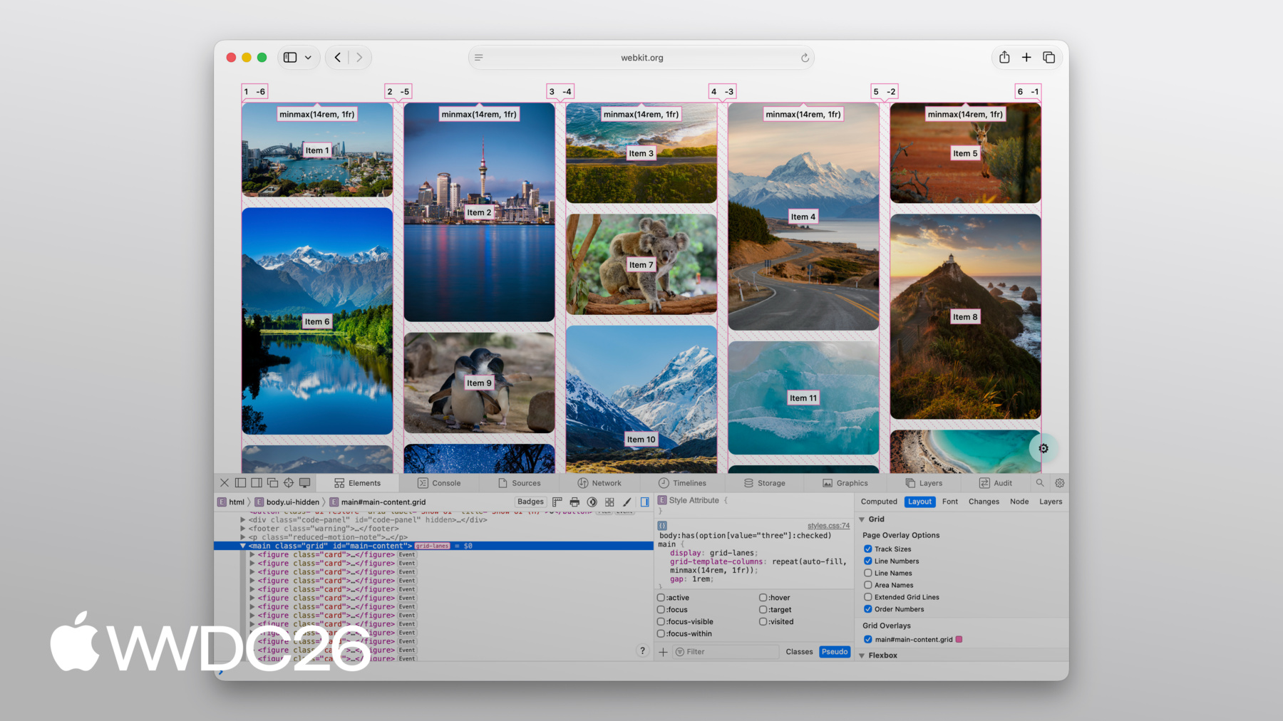
Flow-tolerance는 콘텐츠에 잘 맞을 때 훌륭하지만, 브라우저에 유연성을 주는 것의 반대 측면은 때때로 결과가 예상과 다를 수 있다는 것입니다. 그런 일이 발생하면, Web Inspector를 열어 무슨 일이 일어나는지 확인하세요. 좋은 소식은 Web Inspector가 Grid Lanes를 완전히 지원한다는 것입니다. 열과 행을 표시하는 선을 볼 수 있습니다. 각 항목 위에 순서 번호가 투영되어, 항목이 정확히 어떻게 배치되는지 볼 수 있습니다.
항목 사이의 간격도 그려줍니다. 오버레이를 켜는 것만으로 그 모든 것을 볼 수 있습니다.
CSS Grid Lanes는 이전에 JavaScript가 필요했던 레이아웃을 단 몇 줄의 CSS로 만들어 줍니다. Grid에서 이미 알고 있는 것들을 기반으로 하며, 반대가 아닌 여러분의 콘텐츠에 맞게 적응합니다. 웹 플랫폼에 훌륭한 추가입니다. 여러분이 무엇을 만들지 기대됩니다. WebKit 팀이 만든 Grid Lanes Field Guide를 확인해보세요. 자세한 안내와 인터랙티브 데모를 제공합니다. 오늘 다룬 모든 속성을 실험해볼 수 있습니다. 자신의 프로젝트에서 grid-lanes를 사용해 보세요. Safari 26.4부터 사용 가능했으며, 이미지가 많은 레이아웃에 접근하는 방식을 진정으로 바꿀 수 있다고 생각합니다. 피드백을 공유해주세요. grid-lanes가 여러분에게 어떻게 작동하는지 듣고 싶습니다. 그리고 다음에 보고 싶은 것도요. Safari에 추가되는 다른 모든 기능에 대해 알아보려면 반드시 확인해보세요. "Safari 27을 위한 WebKit의 새로운 기능" 시청해 주셔서 감사하고 즐거운 WWDC 되세요!
-
-
3:58 - Create a Grid Lanes Container
.container { display: grid-lanes; } -
4:02 - Create a Grid Lanes Container
.container { display: grid-lanes; grid-template-columns: repeat(3, 1fr); } -
4:26 - Create a Grid Lanes Container
.container { display: grid-lanes; grid-template-columns: repeat(3, 1fr); gap: 10px; } -
4:33 - Implement a Brick Variation
.container { display: grid-lanes; grid-template-columns: repeat(3, 1fr); gap: 10px; } -
4:36 - Implement a Brick Variation
.container { display: grid-lanes; grid-template-rows: repeat(3, 1fr); gap: 10px; } -
4:58 - Experiment with different layouts
.container { display: grid-lanes; grid-template-columns: 1fr 1fr 1fr; gap: 10px; } -
5:02 - Experiment with different layouts
.container { display: grid-lanes; grid-template-columns: 1fr 2fr 1fr; gap: 10px; } -
5:10 - Experiment with different layouts
.container { display: grid-lanes; grid-template-columns: repeat(auto-fill, minmax(200px, 1fr)); gap: 10px; } -
5:24 - Experiment with different layouts
.container { display: grid-lanes; grid-template-columns: repeat(auto-fill, minmax(8rem, 1fr) minmax(14rem, 2fr); gap: 10px; } -
5:45 - Control Individual Items
.container { display: grid-lanes; grid-template-columns: 1fr 1fr 1fr; gap: 10px; } -
5:59 - Control Individual Items
.container { display: grid-lanes; grid-template-columns: 1fr 1fr 1fr; gap: 10px; } .item { grid-column: span 2; } -
6:07 - Control Individual Items
.container { display: grid-lanes; grid-template-columns: 1fr 1fr 1fr; gap: 10px; } .item { grid-column: 2 / span 2; } -
6:22 - Integrate Subgrid
.container { display: grid-lanes; grid-template-columns: 1fr 1fr 1fr; gap: 10px; } .item { grid-column: span 2; } -
6:34 - Integrate Subgrid
.container { display: grid-lanes; grid-template-columns: 1fr 1fr 1fr; gap: 10px; } .item { display: grid-lanes; grid-template-columns: subgrid; grid-column: span 2; } -
6:48 - Integrate Subgrid
.container { display: grid-lanes; grid-template-columns: 1fr 1fr 1fr; gap: 10px; } .item { display: grid; grid-template-columns: subgrid; grid-column: span 2; } -
8:37 - Improve item positioning
.container { display: grid-lanes; grid-template-columns: 1fr 1fr; gap: 10px; flow-tolerance: normal; } -
8:41 - Improve item positioning
.container {
	display: grid-lanes;
  grid-template-columns: 1fr 1fr;
  gap: 10px;
  flow-tolerance: 2.1em;
}
-