

-
Raise the bar with iPhone Duo
Discover how to adapt your navigation, toolbars, and tab bars for the unique displays of iPhone Duo. Explore the design principles behind the new bar layout, and learn how to configure custom view representations and manage overflow to build powerful, responsive apps.
章节
- 0:00 - Introduction
- 0:28 - Why bars move to the side
- 1:29 - Agenda
- 2:00 - Opt in to vertical bars
- 3:09 - Understand the shared bar region
- 4:29 - Order items in a vertical bar
- 5:56 - Prepare toolbar content
- 8:00 - Control the axis of an item
- 9:00 - Prefer symbol-only items
- 10:07 - Adapt custom views
- 11:40 - Manage the overflow menu
- 13:10 - Prioritize item visibility
- 14:21 - When to opt out
- 14:53 - Next steps
资源
相关视频
Tech Talks
WWDC26
WWDC25
-
搜索此视频…
-
-
2:24 - Use system container toolbars
// SwiftUI var body: some View { NavigationStack { ContentView() .toolbar { ToolbarItem(placement: .bottomBar) { ... } } } } -
2:39 - Prefer navigation controllers over custom bars
// UIKit — content from a custom UIToolbar won't be considered. // Prefer UINavigationController and UITabBarController, // which manage their own bars. let toolbar = UIToolbar() toolbar.items = [...] -
5:00 - Place a back or close button
// SwiftUI .toolbar { ToolbarItem(placement: .cancellationAction) { ... } } // UIKit navigationItem.leftItemsSupplementBackButton = false navigationItem.leadingItemGroups = [UIBarButtonItemGroup(...)] -
5:24 - Pin prominent actions to the trailing edge
// SwiftUI .toolbar { ToolbarItem(placement: .topBarPinnedTrailing) { ... } } // UIKit navigationItem.pinnedTrailingGroup = UIBarButtonItemGroup(...) -
8:08 - Set a preferred axis for a custom view
// SwiftUI var body: some View { ContentView() .toolbar { ToolbarItem { ProfileView() } .axisBehavior(.verticalPreferred) } } // UIKit let item = UIBarButtonItem(customView: ProfileView()) item.axisBehavior = .verticalPreferred -
8:36 - Keep an item on the horizontal axis
// SwiftUI var body: some View { ContentView() .toolbar { ToolbarItem { SelectOrDoneButton() } .axisBehavior(.horizontalOnly) } } // UIKit item.axisBehavior = .horizontalOnly -
8:52 - Allow a custom view to go vertical
// SwiftUI var body: some View { ContentView() .toolbar { ToolbarItem { CompassView() } .axisBehavior(.verticalPreferred) } } // UIKit let item = UIBarButtonItem(customView: CompassView()) item.axisBehavior = .verticalPreferred -
9:27 - Use a badge instead of inline text
// SwiftUI var body: some View { ContentView() .toolbar { ToolbarItem(...) { InboxButton() .badge(7) } } } // UIKit let item = UIBarButtonItem(...) item.badge = .count(7) -
10:36 - Read the vertical bar edge
// SwiftUI struct ContentView: View { @Environment(\.toolbarVerticalEdge) var edge var body: some View { switch edge { ... } } } // UIKit switch traitCollection.verticalBarEdge { ... } -
12:23 - Configure toolbar compression behavior
// SwiftUI var body: some View { TabView { Tab("Recents", systemImage: "clock") { ContentView() .toolbarVerticalCompressionBehavior(.prefersToolbarItems) } } } // UIKit navigationItem.verticalBarCompressionBehavior = .prefersBarItems -
12:43 - Consolidate actions into the overflow menu
// SwiftUI var body: some View { ContentView() .toolbar { ToolbarOverflowMenu { Button("Scan") { ... } Button("Connect") { ... } } } } // UIKit navigationItem.additionalOverflowItems = UIDeferredMenuElement({ provider in provider(self.persistentOverflowItems()) }) -
13:21 - Set item visibility priority
// SwiftUI var body: some View { ContentView() .toolbar { ToolbarItem { Button(...) { ... } } .visibilityPriority(.high) } } // UIKit let item = UIBarButtonItem(...) item.visibilityPriority = .high -
14:47 - Disable the vertical bar
// SwiftUI
var body: some View {
    NavigationStack {
        ContentView()
            .toolbarVerticalBehavior(.disabled)
    }
}

// UIKit
class MyViewController: UIViewController {
    override var preferredVerticalBarBehavior: UIVerticalBarBehavior {
        .disabled
    }
}
-
-
- 0:00 - Introduction
Anna from UI Frameworks and Maria, a Human Interface Designer on Apple's design system, introduce how to raise the bar for your app's bars on iPhone Duo.
- 0:28 - Why bars move to the side
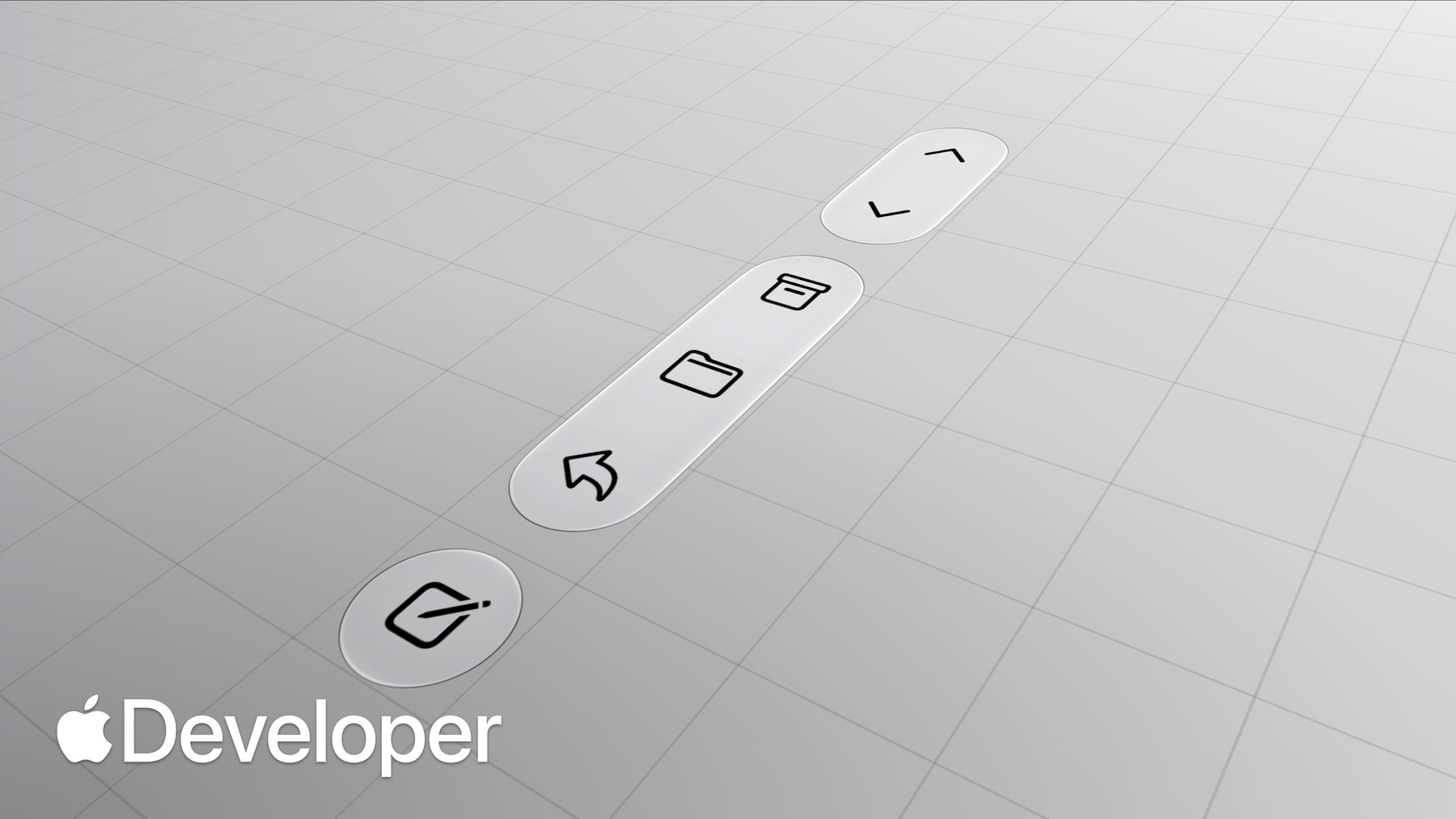
iPhone Duo's wider aspect ratio gives apps more horizontal space. Controls that normally sit at the top and bottom move to the side, preserving vertical space for content and putting controls within easier reach. Their position stays consistent on the inner display in landscape, and returns to a familiar horizontal layout in portrait.
- 1:29 - Agenda
An overview of what's ahead: orienting bars to a vertical axis, item ordering and how it interacts with containers, tailoring toolbar content for a vertical axis, and managing the overflow menu.
- 2:00 - Opt in to vertical bars
Rebuild your app against the latest SDKs, then use bars provided by navigation containers. In SwiftUI, pair the toolbar modifier with NavigationStack or NavigationSplitView. In UIKit, prefer UINavigationController and UITabBarController over custom UIToolbar, UINavigationBar, or UITabBar instances, whose content isn't considered.
- 3:09 - Understand the shared bar region
Navigation, toolbar, and tab bar controls coexist in a shared region — imagine rotating them 90 degrees into a vertical stack. In split views, only the detail column participates and inspectors don't get their own bar. Sheets behave differently per display, and because the bar is aligned with the hardware it stays on the same side in right-to-left languages.
- 4:29 - Order items in a vertical bar
Keep controls associated with their container and audit your existing configuration. Reserve the top for primary navigation like back or close, followed by prominent actions such as done. Use the cancellation action placement in SwiftUI, or a leading item with leftItemSupplementsBackButton set to false in UIKit. Place prominent actions with topBarPinnedTrailing or pinnedTrailingGroup.
- 5:56 - Prepare toolbar content
Vertical bars have a fixed width and flexible item height, making them better suited to symbol-only items. You still specify the same icon and title, but the system now also considers whether content suits a vertical or horizontal axis: items with an icon go vertical, while text-only items stay horizontal. Always provide a title, since the system uses it in overflow menus and expanded forms.
- 8:00 - Control the axis of an item
The new AxisBehavior API adjusts the system's default placement. Keep related items on the same axis — an item that transitions between a symbol and text, like a custom select button, should use the horizontal-only behavior. Custom or complex views stay horizontal by default; set the vertical-preferred behavior when your view does support a vertical representation.
- 9:00 - Prefer symbol-only items
Minimize title-only items and custom views showing both text and an image so more content can go vertical. A badge can turn a text-and-symbol item into a symbol-only one — adopt the badge API added in iOS 26. Ask whether the text merely reinforces the symbol or carries standalone information; keep controls like a cart button showing a dollar amount in the horizontal bar.
- 10:07 - Adapt custom views
Custom views need to either fit the bar's fixed width or have a vertically adapted layout, and some metrics may need adjusting. Read the toolbarVerticalEdge environment property or trait to detect a vertical bar. Vertical bars have no scroll edge effect by default but do get a background when reduce transparency is enabled. Flexible spacers are zero size vertically, while fixed spacers respect their minimum.
- 11:40 - Manage the overflow menu
Items overflow more often on the outer display in landscape, or when competing UI like the keyboard appears. Decide whether your toolbar items or tab bar stay visible longer — toolbars compress first by default, suiting navigation-focused experiences, while task-oriented apps may compress the tab bar. Consolidate any custom overflow into the system menu with ToolbarOverflowMenu or additionalOverflowItems, and reserve the ellipsis for overflow only.
- 13:10 - Prioritize item visibility
Items overflow from bottom to top by default, but visibility priority gives fine-grained control. Assign high, low, or custom priorities using the visibilityPriority APIs, starting with groups and then items within them. Frequently used actions like Compose or New Note should be among the last to overflow, and controls conveying status such as badged items should remain visible to preserve glanceability.
- 14:21 - When to opt out
Most apps are good candidates for vertical bars, but a single-page app with a bottom-heavy layout like Calculator may let content expand better horizontally, and a sheet with only one control such as a close button may not warrant the reduced space. Use the toolbarVerticalBehavior and preferredVerticalBar behavior APIs to disable it.
- 14:53 - Next steps
Build your app with the latest SDKs, audit your bars for the new design, update custom items so they're ready to be placed vertically, and assign overflow priorities so the system can adapt.