Behind the Design: (Not Boring) Habits
August 29, 2022
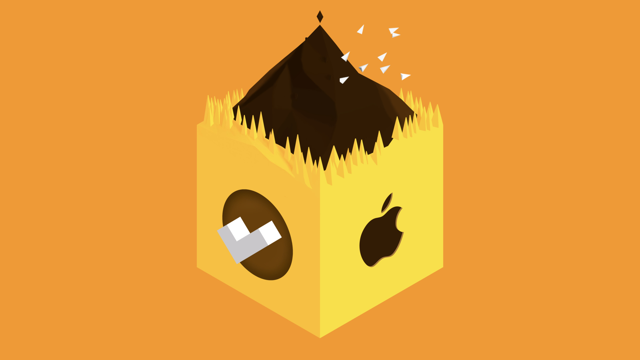
Few things are more emotionally gratifying than checking something off a to-do list (well, for some of us, anyway).
But if that sort of thing pleases you currently, wait until you get a load of the (Not Boring) Habits approach. The app’s checkbox is no mere tappable square — it's an interactive event replete with explosive 3D animations, custom sounds, and playful haptics, all designed to make you feel less like you marked off a task and more like you landed on the moon.
“We went all out,” says Andy Allen, the app's developer. “There was a lot of room to wrap something special around that box.”
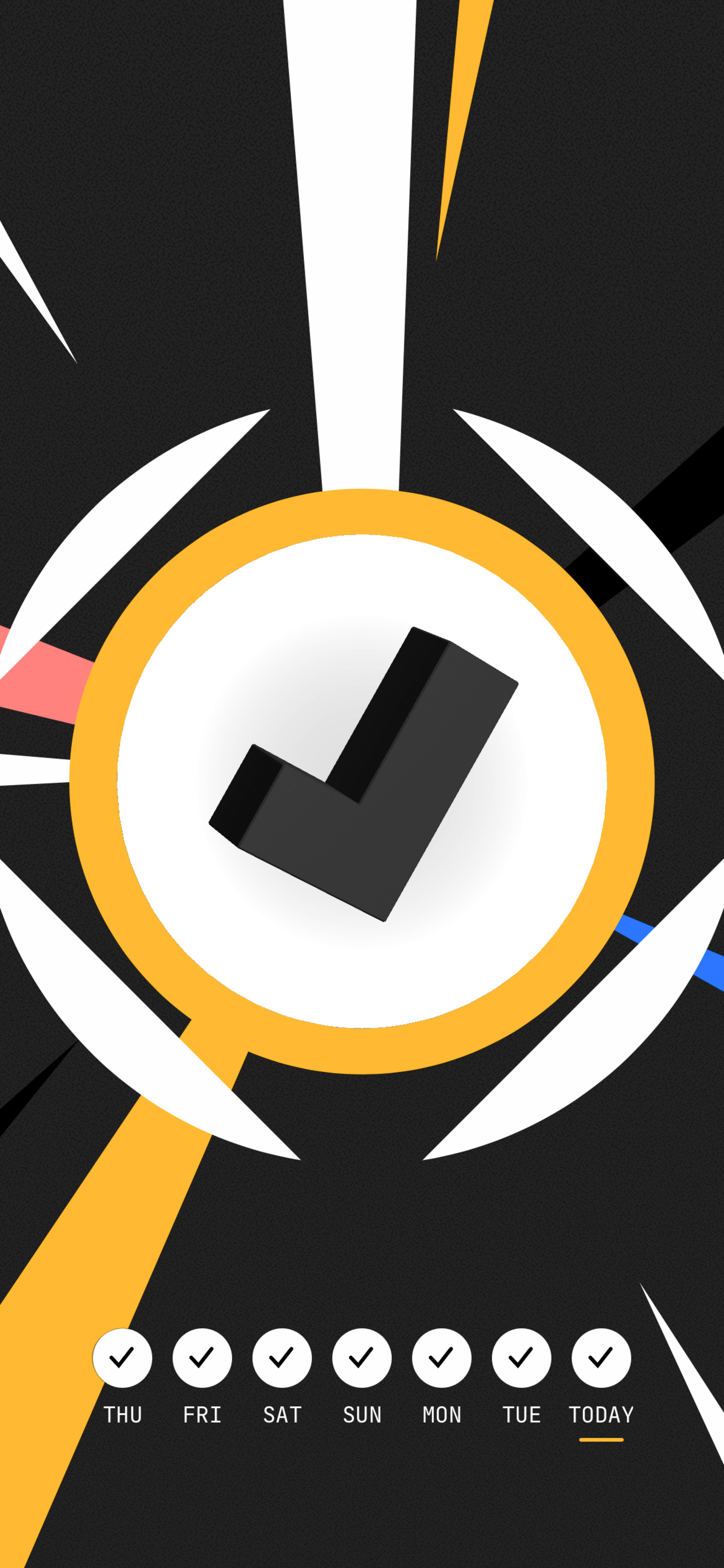
The mighty checkbox of (Not Boring) Habits is an experience in and of itself. “We went all out,” says Andy Allen.
Magically transforming everyday events into bold, brash experiences is the driving philosophy around the (Not Boring) suite of apps from Andy Works, the studio founded by Allen and Mark Dawson. Like its siblings Weather, Calculator, and Timer, (Not Boring) Habits wildly amplifies a pretty mild-mannered category, tearing down the traditional approach in favor of eye-popping aesthetics, zingy haptics, spiffy 3D animations, and plenty of the delight and fun that nabbed the app its 2022 Apple Design Award.
“It’s about adding something extra,” says Allen. “You can write a to-do list on a piece of paper and it works just the same, right?” If strict practicality is your goal, the app ecosystem is swimming in weather apps and habit trackers, and Allen is the first to admit that (Not Boring) apps aren’t for everyone. “But,” he says with a smile, ”they’re definitely really for some people.”
'A joyful and maybe surprising ritual’
In the summer of 1970, the painter John Baldessari, who’d been working for nearly two decades, decided he’d had quite enough. He collected all the paintings he’d made between May 1953 and March 1966 that were in his possession, broke them into pieces, brought them to a San Diego mortuary, and lit them all on fire. One year later, he created a lithograph called I Will Not Make Any More Boring Art, consisting entirely of that single phrase, written over and over like he’d gotten in trouble with the teacher.
Allen was taken with the blaze of glory — particularly the notion of a hard break with the past. He’d studied filmmaking and worked for years as an animator, but gradually found himself drawn more to the “personal connections” possible with apps — especially in the nascent age of mobile development. One of his first apps was the hit drawing experience Paper, which won he and his FiftyThree studio an Apple Design Award in 2012.
“There was such a spirit of experimentation back then,” Allen says. “Today, and often for the right reasons, patterns and systems have been built up, and it’s certainly easier to build now. But what if we built software that embodied some of those experimental values, that tried to differentiate not purely on functionality but also design? Every day you look at the weather, or a clock, or a list of stuff to do. Why not make that a joyful — and maybe surprising — ritual?”
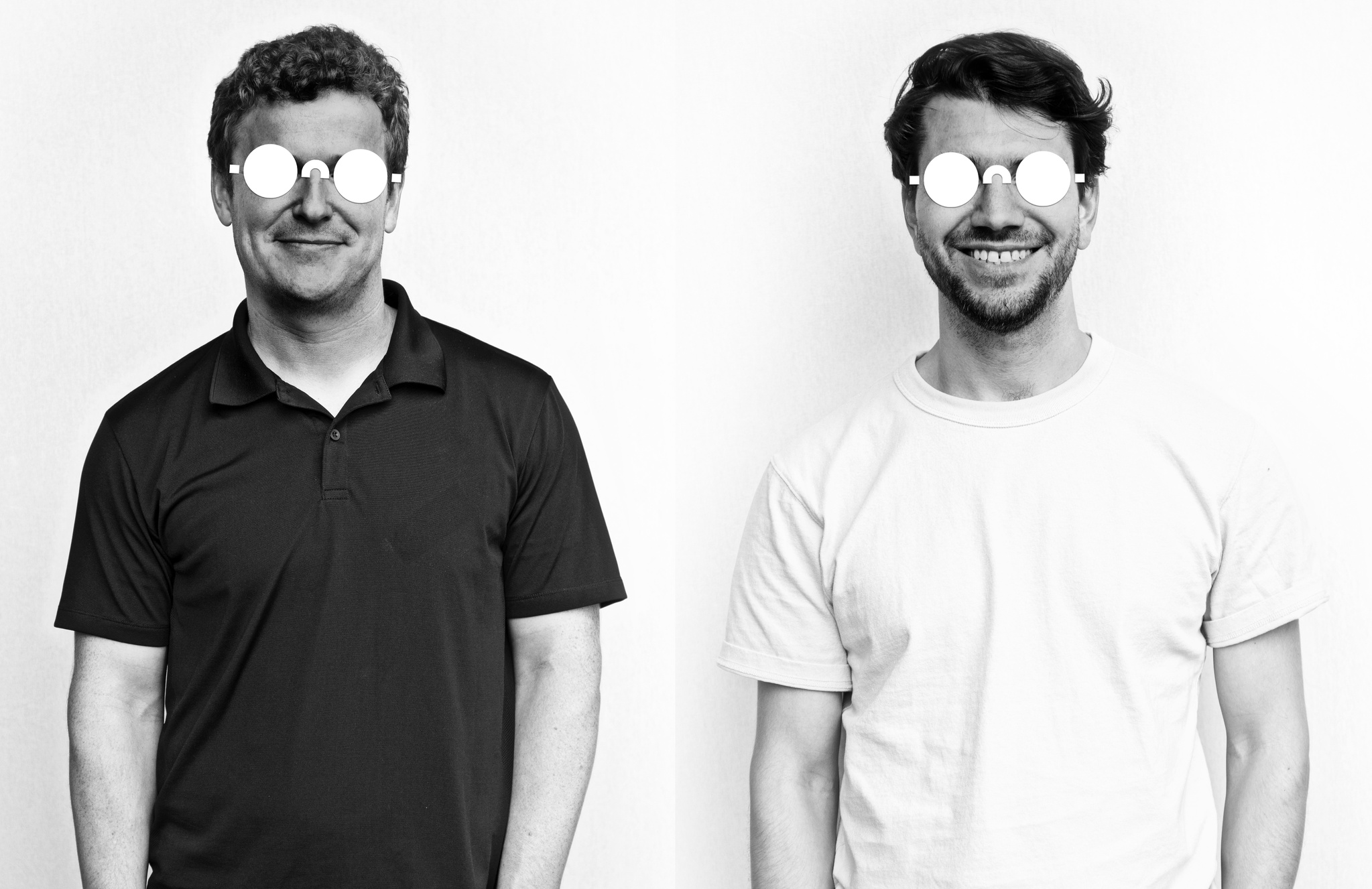
Andy Works co-founders Mark Dawson and Andy Allen model the company's official logo.
This philosophy wasn’t just a design approach; it was a function of the company's size. “There’s only two of us,” Dawson says. “Big teams will always have more features than we do — we just can’t compete there. But design is difficult to copy. You can have your own style. You can make it beautiful. And that’s something we can do while still having an opinionated feature set.”
Big teams will always have more features than we do — we just can’t compete there. But design is difficult to copy.
Mark Dawson, Andy Works co-founder
To create Habits, they started by rebranding the habit tracker. “We consider it a habit builder,” says Allen. “We try to think about it as loving the journey of creating a new habit.”
They cast that journey as an actual, well — journey — with its roots in the mythic hero quest, taking someone through dark forests and over looming mountains en route to a preordained destiny. Habits is predicated on research that indicates it takes 66 days to build a new habit; in certain ways, it’s a video game with 66 levels.
“It’s always felt a little weird that games are seen as separate in the product design world,” Allen says. “You’ll hear people referencing movies or architecture, but it’s like, ‘Well, what about this incredibly rich domain of creativity that’s super-adjacent to what we’re doing?’ Why does work have to be over here and fun over there?”
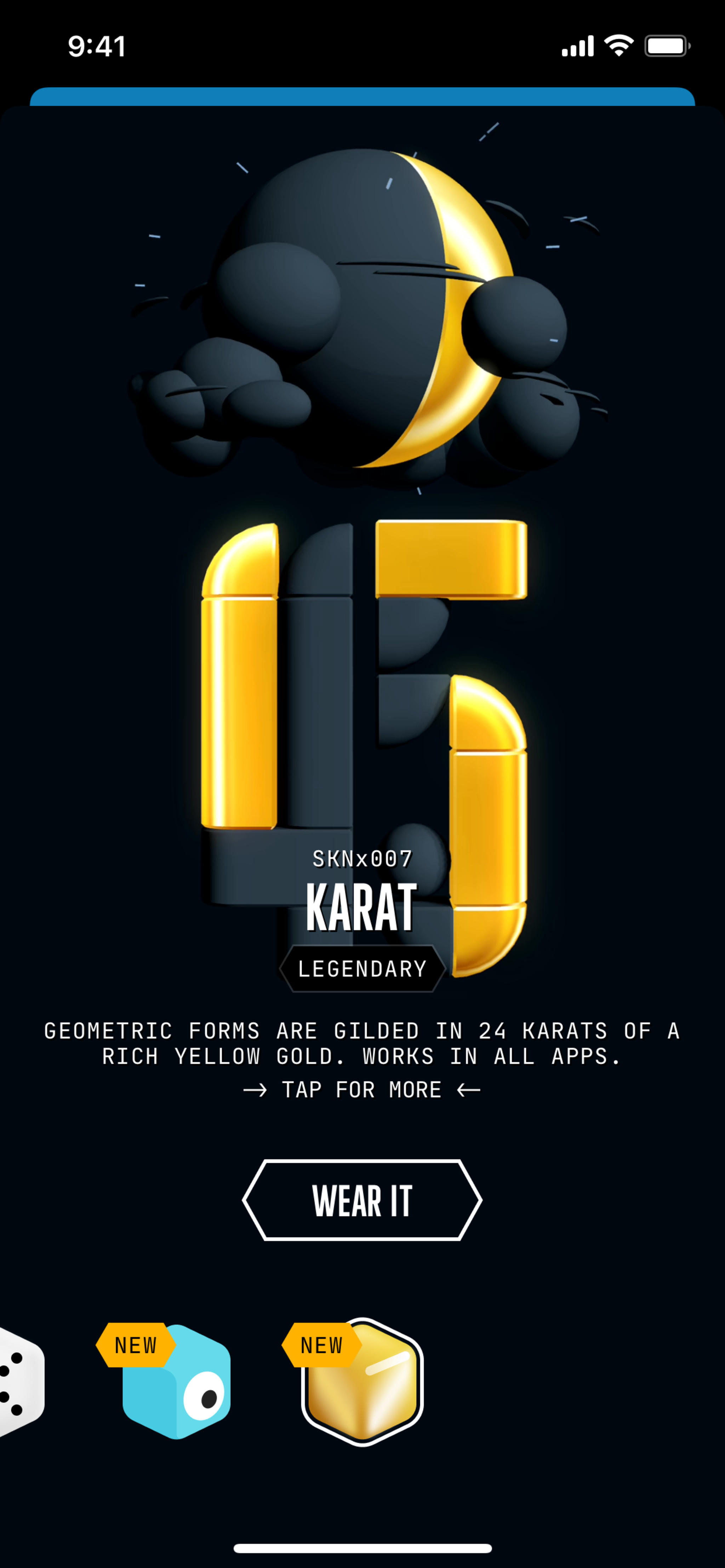
To Allen, design is a way of life. “Every day you look at the weather, or a clock, or a list of stuff to do. Why not make that a joyful and maybe surprising ritual?”
Besides, what’s a really good way to convince someone to do a job? Turn it into a game. “My daughter and I were playing Wilmot’s Warehouse, where you’re literally organizing things in a warehouse,” Allen laughs. “But it’s a game! It has a goal and challenges you! Lots of fun, basic principles can be applied to utility apps in the very same way, but for whatever reason, I just haven’t seen it. A big thing with (Not Boring) was breaking down the barrier between apps, utilities, and games.”
'Fairly off-the-shelf'
(Not Boring) Habits required the nifty zing of its brand, but it also needed to be a lightweight, quick-launching, scannable daily utility app. And the road to get there was about as traditional as it gets.
The app’s 3D animations are authored in the open-source modeling tool Blender, built in SceneKit — which Allen chose for its easy integration with Apple tools — and tied together with UIKit and SwiftUI views. “Most of [our] standard controls are fairly off-the-shelf, which makes things very simple and predictable,” says Allen. “We didn’t have to rethink how a button or a popover works. And SceneKit’s interfaces with UIKit and standard UI controls make it all feel more seamless, like one environment,” he says.
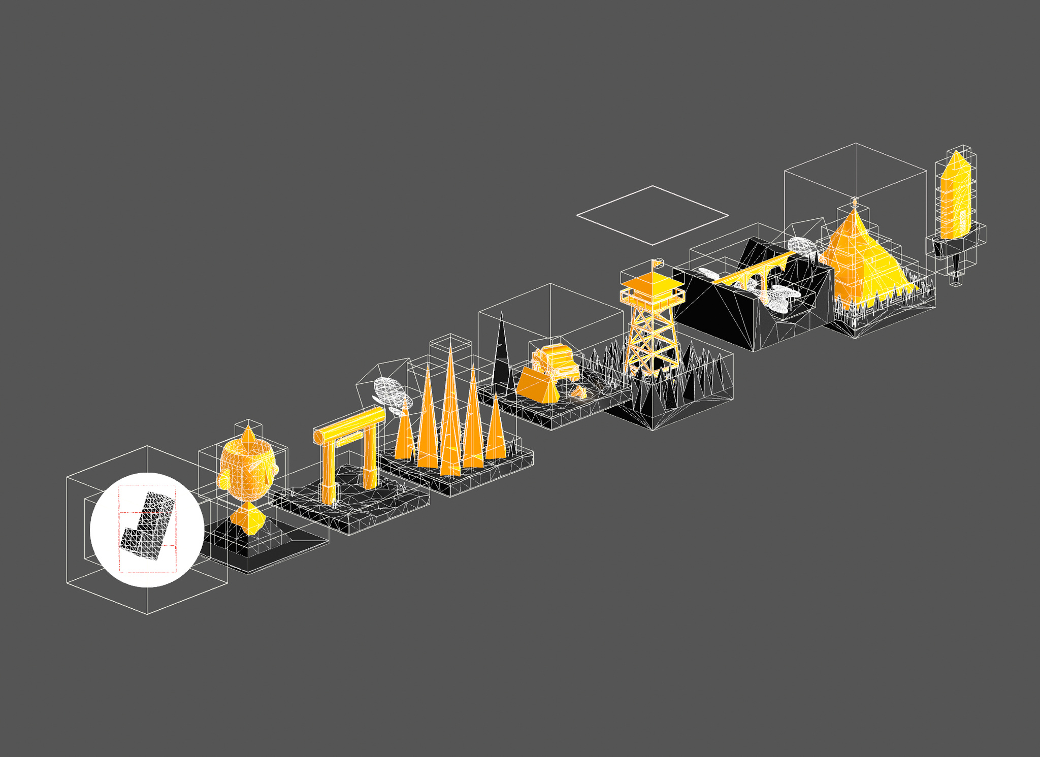
The levels of your habit-building journey, seen here in prototype form.
Part of Allen’s goal with building Habits was proving that such a visual experience could be built with the basics. “We chose [Blender] because we wanted to prove out a possible pipeline that didn’t require people to spend thousands of dollars on 3D software and then spend months trying to figure out how it worked,” Allen says. “We wanted to show how you could build custom, rich experiences with off-the-shelf pieces. The pipeline didn’t really exist; we had to piece it together. But once we got it working, things rolled fairly quickly.” He’s not kidding: (Not Boring) Habits was developed in all of two months.
This brings us back to the checkbox. The gonzo version of the box in the app is result of a complex, iterative design strategy that went like this: Add stuff, keep adding stuff, and follow with the inclusion of — you guessed it — yet more stuff. Here again, Allen drew from the world of gaming.
“Game designers are amazing at taking very simple inputs — like a one-button press — and turning into something much bigger,” says Allen. “The same button can feel like you’re tiptoeing around or smashing something with a sledgehammer. That was our idea: How do we take principles and techniques from games — the haptics and sounds and particle animations — and apply them to something as basic as a checkbox?”
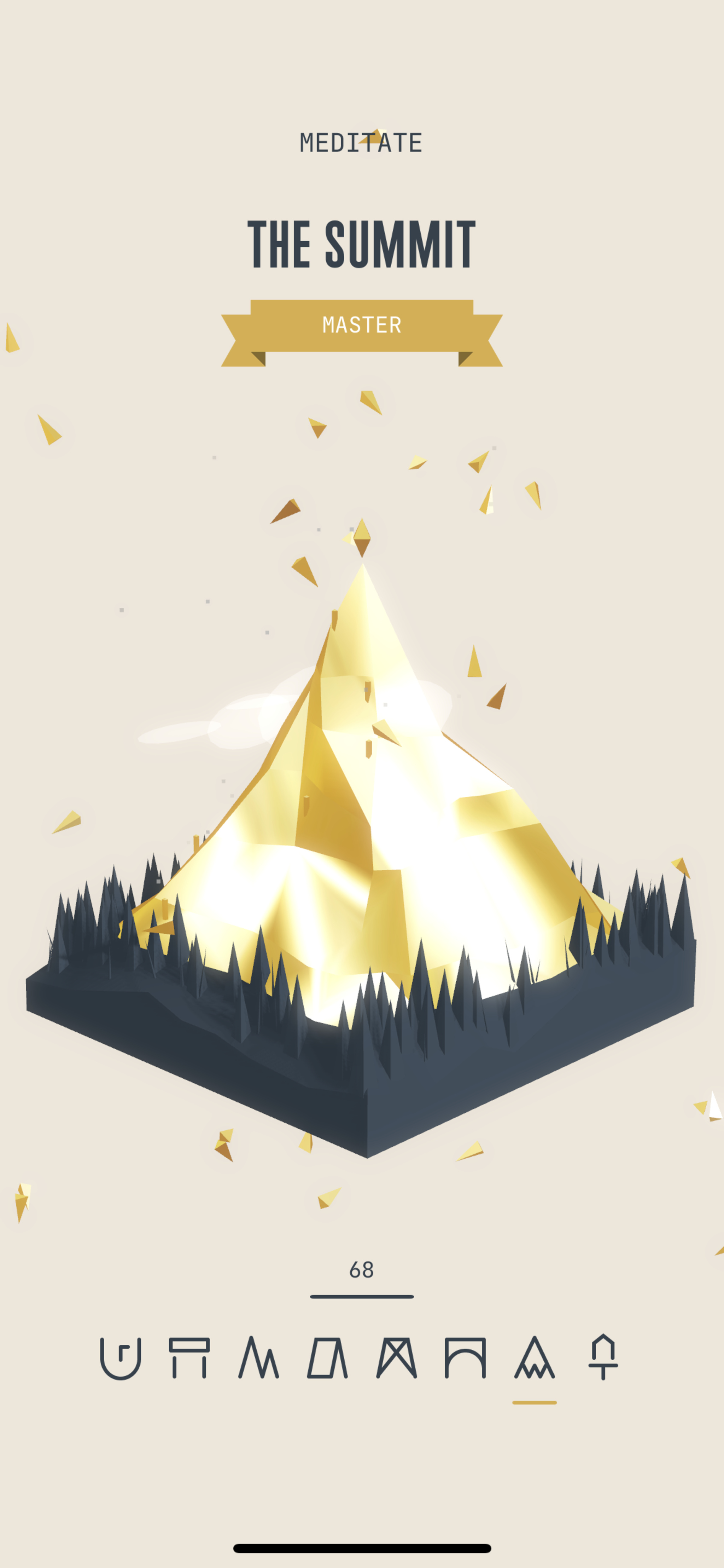
“A big thing with (Not Boring) Habits was breaking down the barrier between apps, utilties and games,” says Allen.
In contrast with his history (“There was some real tension there with my minimalist graphic design background,” he laughs), the checkbox was an exercise in more. In fact, the more Allen added, the more he felt closer to his desired feeling. “Experiences on our phones are still trapped behind a screen,” he says, ”so you have to put in what’s taken away, and so you have to intentionally layer and layer and push and push.“
For instance, the Habits checkbox can’t merely be ticked; you have to intentionally press on the screen for longer than you might think to trigger the animation. “It’s a very big, gross interaction,” he says. “But after prototyping, we found we had to make it much more intentional; we needed feedback that told you you needed to keep holding." Then came the iterations, sounds, and custom haptics to make it feel like more of an explosion. “There were thousands of iterations,” he laughs. “I’d do something and think, ‘OK, this is way over the top and I’m gonna do it anyway.’ And then I put it in and it’s like, ‘You know, it’s not that bad!’”
I don’t want to live in a perfectly white-walled museum all the time. I want to live where there’s richness and texture and fun.
Andy Allen, Andy Works co-founder
The language of gaming gave him much more room to play. “There’s an understanding of how much feedback you should get from a game, and honestly, the bar is pretty high. We added maybe six or seven things in the checkbox, but most games probably have two or three times that for any one interaction.” In other words, sometimes you have to get loud. “Look, minimalism is a fun place to visit for me, but it’s not somewhere I want to live,” he laughs. “I love visiting an art gallery. But I don’t want to live in a perfectly white-walled museum all the time. I want to live where there’s richness and texture and fun.”
Pushing 'the language of product design'
As the saying goes, (Not Boring) is more than an app; it’s a lifestyle. “It’s tricky sometimes to communicate that you’re trying to sell someone on design,” says Dawson. “A lot of people might say, ‘Oh I don’t want to pay for that.’ But maybe it gives you new experiences — or maybe you just want to open your app and feel good.”
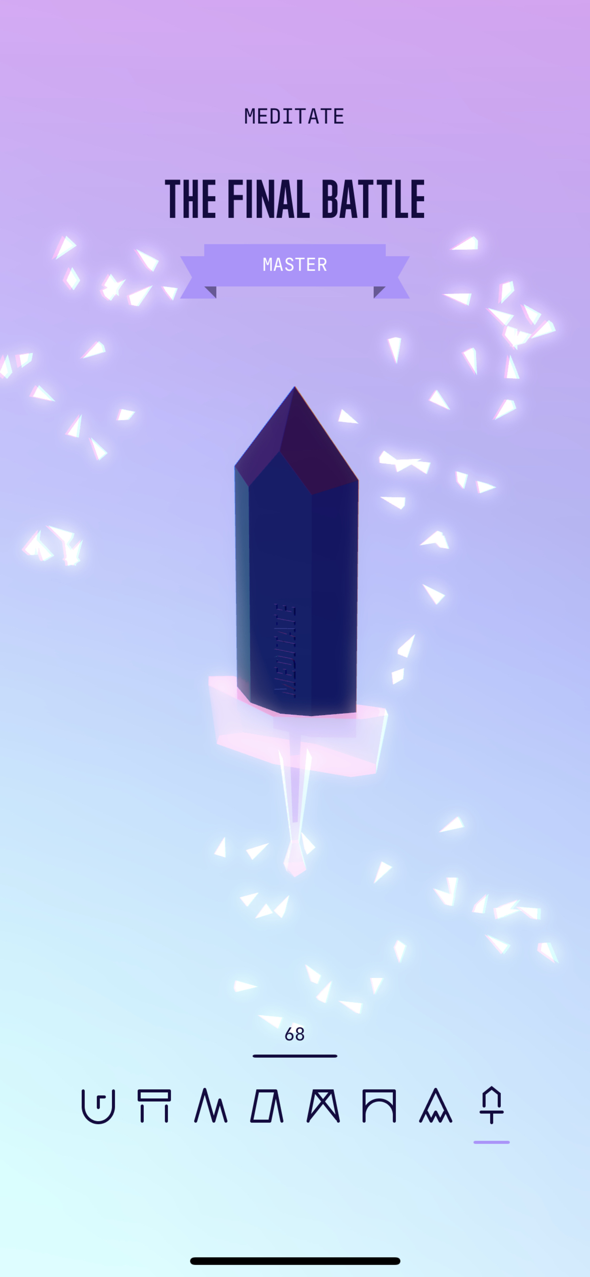
Win the final battle and your new habit is complete.
In the short term, Allen and Dawson are hoping for an elevated experience; in the long term, they wouldn’t mind a wholesale design revolution. “Our primary goal is to inspire other app creators to be more adventurous, to push the language of product design,” says Allen. “There’s been a coalescence over the last few years about what product should look like, and some of that is for the better, sure. But I believe we need people who want to explore new territory and find new patterns. There’s so much space with apps to connect with people in their daily lives; I’d love to see a world where we’re all immersed in amazing, interesting ideas.”
Learn more about (Not Boring) Habits
Download (Not Boring) Habits from the App Store
Behind the Design is a weekly series that explores design practices and philosophies from each of the 12 winners of the 2022 Apple Design Awards. In each story, we go behind the screens with the developers and designers of these award-winning apps and games to discover how they brought their remarkable creations to life.