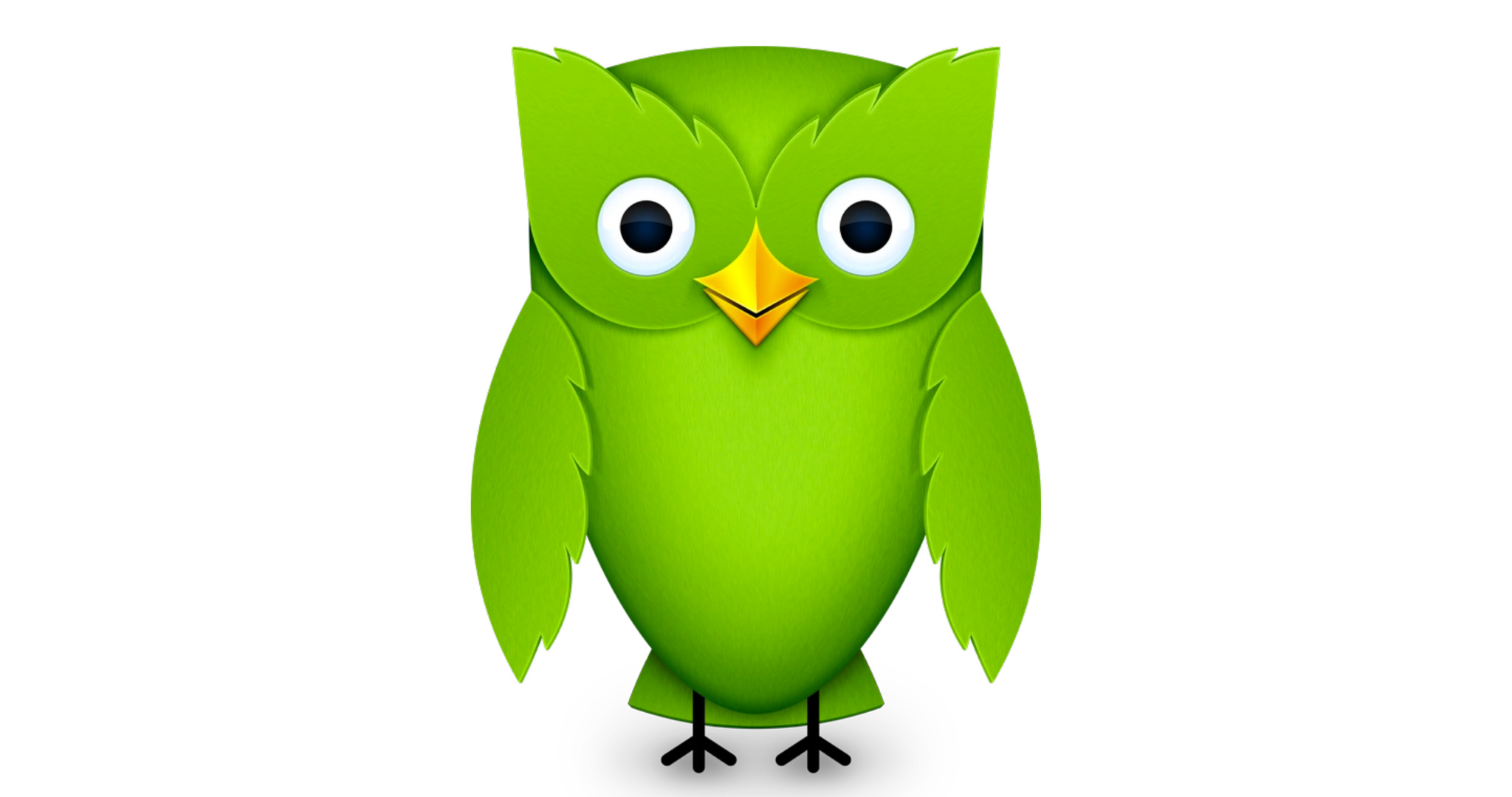
The evolution of the Duolingo owl
October 26, 2020

Duolingo is the planet’s most popular language-learning app with more than 300 million users completing upwards of 7 billion (with a “b”) exercises every month.
There are lots of reasons for that. Duolingo has kept its lessons snack-size and is constantly adding new languages.
But credit is also due to the app’s avian mascot, Duo. The lively green owl has been with the company since its 2012 launch and in recent years has become the means by which Duolingo encourages you to complete your lessons — sometimes memorably.

Duo through the years: 2011, 2012, 2014, and 2018.
“There’s that famous/infamous email that has Duo crying” if you don’t study, says art director Greg Hartman. And that spawned a meme.
“People meme-ified Duo as this thing that will hunt you down if you don’t do your Spanish lesson for the day,” says VP of design Ryan Sims.
Playing right along, the team responded with an April Fools’ Day video that featured an IRL version of Duo reminding users about their lessons...with comically unsettling results.
To get a little more insight about how this all happened, the App Store team talked to Hartman, Sims, and head of design Tyler Murphy about Duo’s delightful history.
2011 (original Duo)
Hartman: “When the company started, [founder] Luis von Ahn was adamant about having a mascot. Legend has it that green was chosen because our CPO didn’t like green. It was kind of a joke.”

The original 2011-era Duo included some not-so-subtle typography.
2012
Murphy: “When iOS 7 came out, we redesigned our app and needed a fully executed 3D Duo. And got this kind of creepier textured version.”

Duo’s first redesign came in 2012 and gave him real eyes and a prominent beak.
2014
Murphy: “In my first couple years, the product was having a bit of an identity crisis. We had gamified elements like hearts and coins, but then you’d get a photo of an orange to learn the word ‘orange.’ It didn’t feel like something you’d see in a game, so in 2014 we made a design decision to illustrate everything. And we made a conscious choice to embrace the gamified identity of Duo.”

This edition of Duo significantly increased the cute factor.
2018
Murphy: “This was part of a visual refresh of the whole app. Previously, we had two versions of this owl all over the place: happy state and crying state. He didn’t have the full spectrum of emotions like you’d see in a videogame. He wasn’t really a fleshed-out character. Duo was closer to the Twitter bird, where you only see him in one version, posture, and expression.
“So this Duo is designed to be more easily animated. We’re using very simple geometry. His wings are just half circles hiding behind the body. And when you do a turnaround, or look at him from the side, he’s very predictable as far as what his shape is. He’s more or less a cylinder with wings, and that made the animation and illustration time go down drastically. I think our animators really appreciated that. And now we can put him in more places throughout the app.”

The current version of Duo.
Originally published on the App Store.