Behind the Design: Procreate
July 18, 2022
Procreate needs little introduction. For more than a decade, the world-class design app has served anyone looking to create high-caliber art: pro designers, calligraphers, influencers, schools making prom flyers, and pretty much everyone in between. Its ubiquity is equally matched by industry praise — in 2022, Procreate became the rare app to take home a second Apple Design Award, bookending its initial win back in 2013.
“For that to happen again is humbling and disorienting and hugely energizing,” said Claire d’Este, Procreate chief product officer. “I feel like there’s now a fire for us to keep pushing harder.”
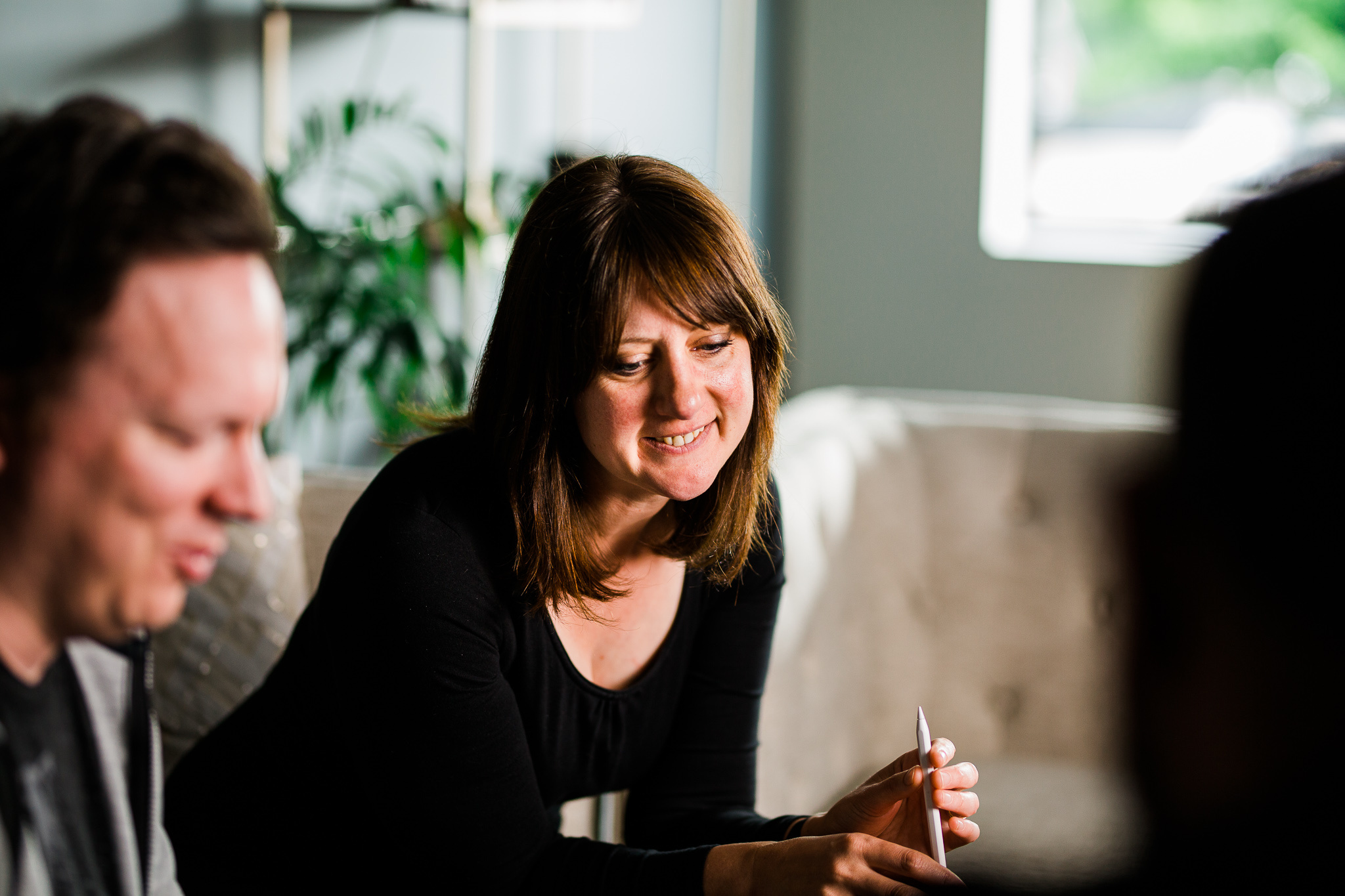
“We’ve always tried to keep the barrier to entry low,” says Claire d’Este, Procreate chief product officer.
Procreate’s latest win came in the Inclusivity category; judges called out how the app expanded its accessibility support by adding features like motion filtering and color description notifications — all atop Procreate's existing support for options like VoiceOver, Dynamic Type, and AssistiveTouch. Such additions are part of the natural evolution of an app that’s well into its second decade, but they also speak to the app’s guiding principle: Art is for everyone.
“It’s not just a poster on a wall,” says Procreate CEO and co-founder James Cuda from Hobart, Tasmania, where the app’s 60-member team is based. “It’s a human condition to want to create. We’re trying to amplify that. And as the app grows, we want people to grow with it.”

James Cuda, Procreate CEO and co-founder, says his design approach is to “get in there, roll my sleeves up, and have a bit of a mess.”
Accessibility has been a Procreate priority since the app’s launch back in March 2011. “We’ve always tried to keep the barrier to entry low and have a friendly first experience,” says d’Este. “You can jump in and start drawing and it doesn't feel at all intimidating.”
The app is also localized in 16 languages, though it refrains from using words as labels wherever possible so that it can remain easy to use in non-localized regions. “Iconography is a universal language,” says Cuda.
‘It must have been so simple!'
To add the motion filtering and color description notification features, Cuda, d’Este, and the Procreate team stuck with an intricate and well-honed design strategy that’s served them for years: Do it and find out what happens. “We're sort of more like musicians than designers,” says Cuda. “We go into a room, huddle around, and hammer things out.”
That approach has served Cuda his whole life. “I’ve always been a hacker,” he laughs. “I like to just get in there, roll my sleeves up, and have a bit of a mess.” For the most part, that means no wireframes, no sketches, and not a lot of overthinking.
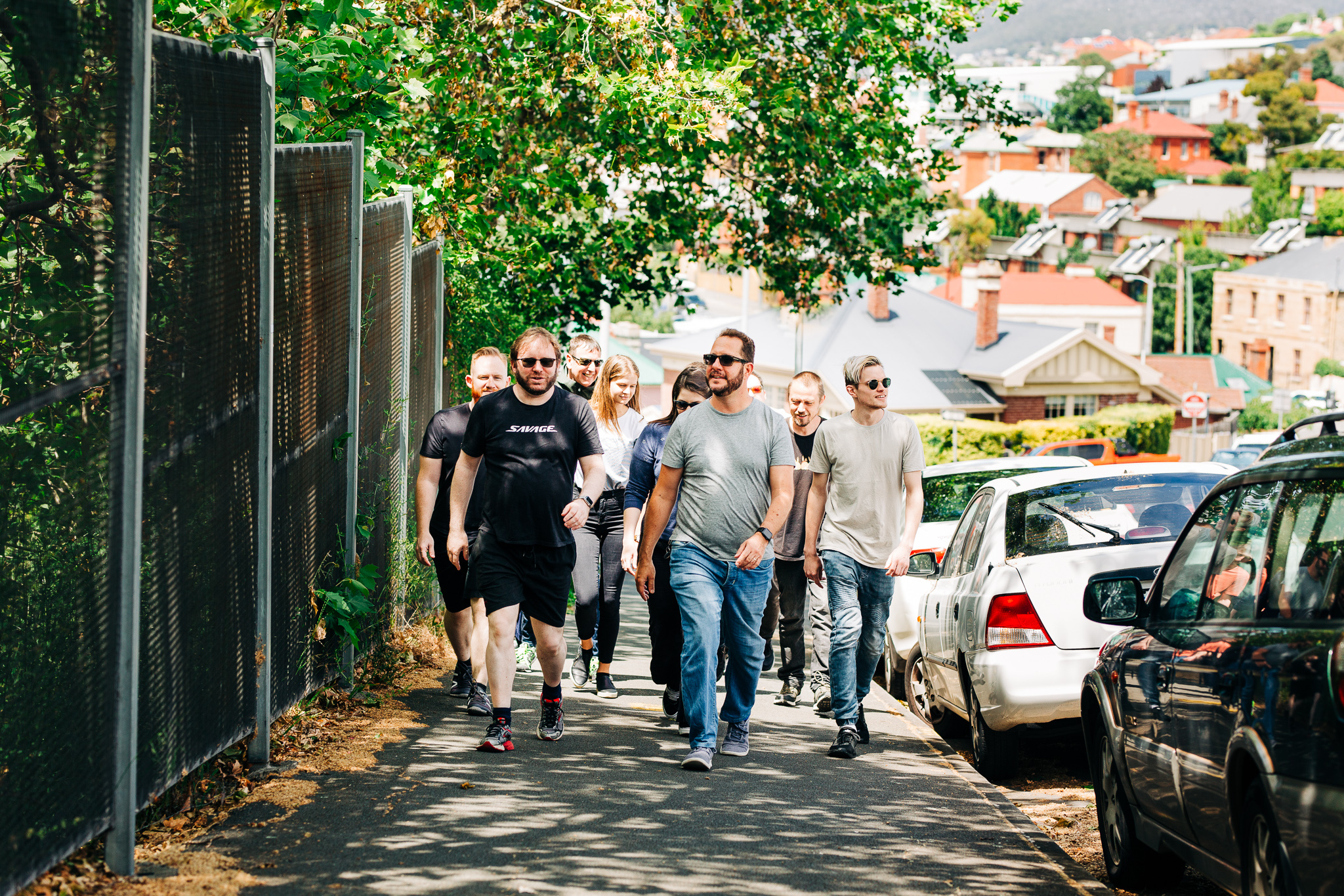
Cuda and the Procreate team take a stroll through their Tasmanian home base.
“I did more mind-mapping back in the early days,” he says, “but personally I got muddled in that process because it’s such an abstract way of looking at things. The customer doesn’t see a wireframe; they see a product, and it’s much more meaningful when they can interact with that product. I just always found it easier to create pixel-perfect mockups — and Claire is great at hacking out quick examples of experience flows.”
To illustrate, Cuda shares the tale of Quick Shape, a Procreate feature that helps people draw perfect circles and other shapes. For quite a while, customers had been asking for analog tools — rules, protractors, and the like — but the Procreate team resisted the addition of buttons and menus. “We thought, ‘Well, people don’t really need more accessories, they’re just trying to draw a circle.’ So we devised a gesture. When you draw your circle or shape, you just hold it and the app figures out what you’re trying to draw.”
We always want to add more functionality, but we don't want the app to become overburdened.
Claire d'Este, Procreate chief product officer
It was an elegant fix that fit right into the app’s existing interface — no extra buttons or menu dives required. “That was one of those really good breakthroughs,” Cuda shares. “It’s very intuitive, but it’s not conventional.”
Even with their slightly unorthodox approach to brainstorming and creation, Procreate’s UI and features still go through hundreds of iterations — Quick Shape took nearly three years to ship inside the app. “Making something simple is really complex,” says Cuda. “The beauty of the product is its accessibility.”
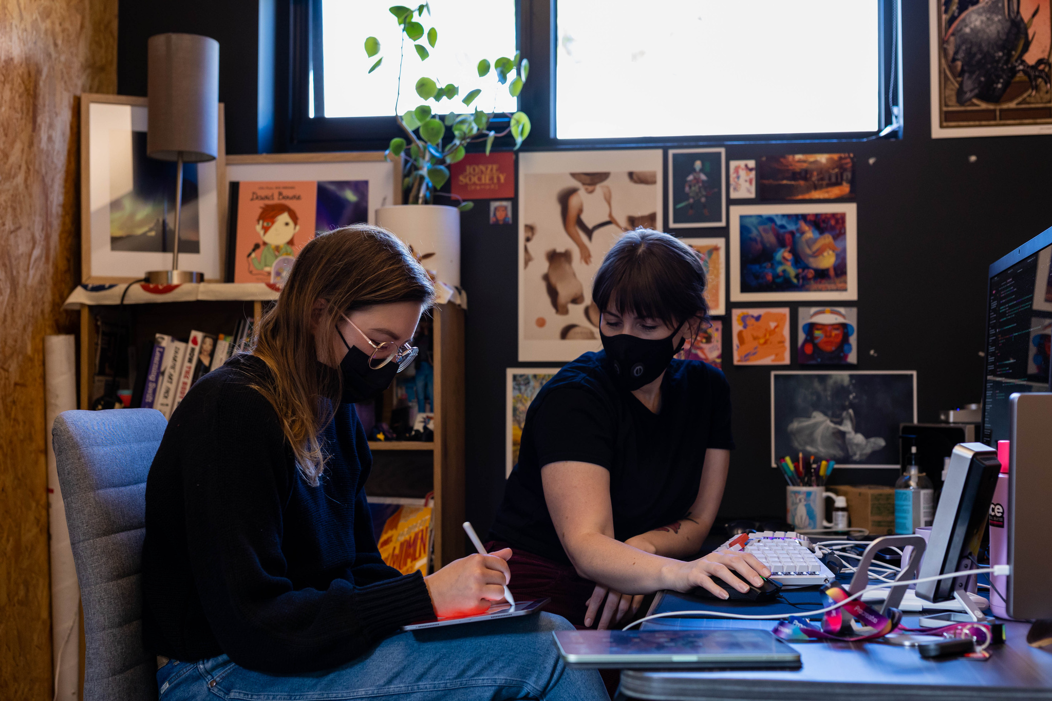
d’Este and the Procreate team like to surround themselves with inspiration.
The challenge is to maintain that accessibility while growing with the times. “We always want to add more functionality, but we don't want the app to become overburdened,” says d’Este. “The challenge is always: How do we keep that simplicity and those low barriers — but still give everyone the power they need to solve the problems they have?”
'It feels like magic'
The idea for motion filtering — an expanded version of the app’s Stabilization feature and one of the features that propelled the app to its ADA win — followed all those paths, and a few more. “If the customer is experiencing any kind of shakes or tremors as they're creating, we filter those out so the customer creates a beautifully perfect line, just like they intended,” says Cuda. “It feels like magic.”
But it didn’t entirely start that way. The team first began exploring the idea through the app’s existing Streamline feature, which designers and calligraphers use to create beautiful, curved strokes. “We thought, ‘Why don’t we start there? Why don’t we turn up all the dials and see if it works for people who have any kind of tremors or motion issues?” says Cuda.
There was just one problem: It didn’t work very well. “We had to scrap what we did and go back to the drawing board.”
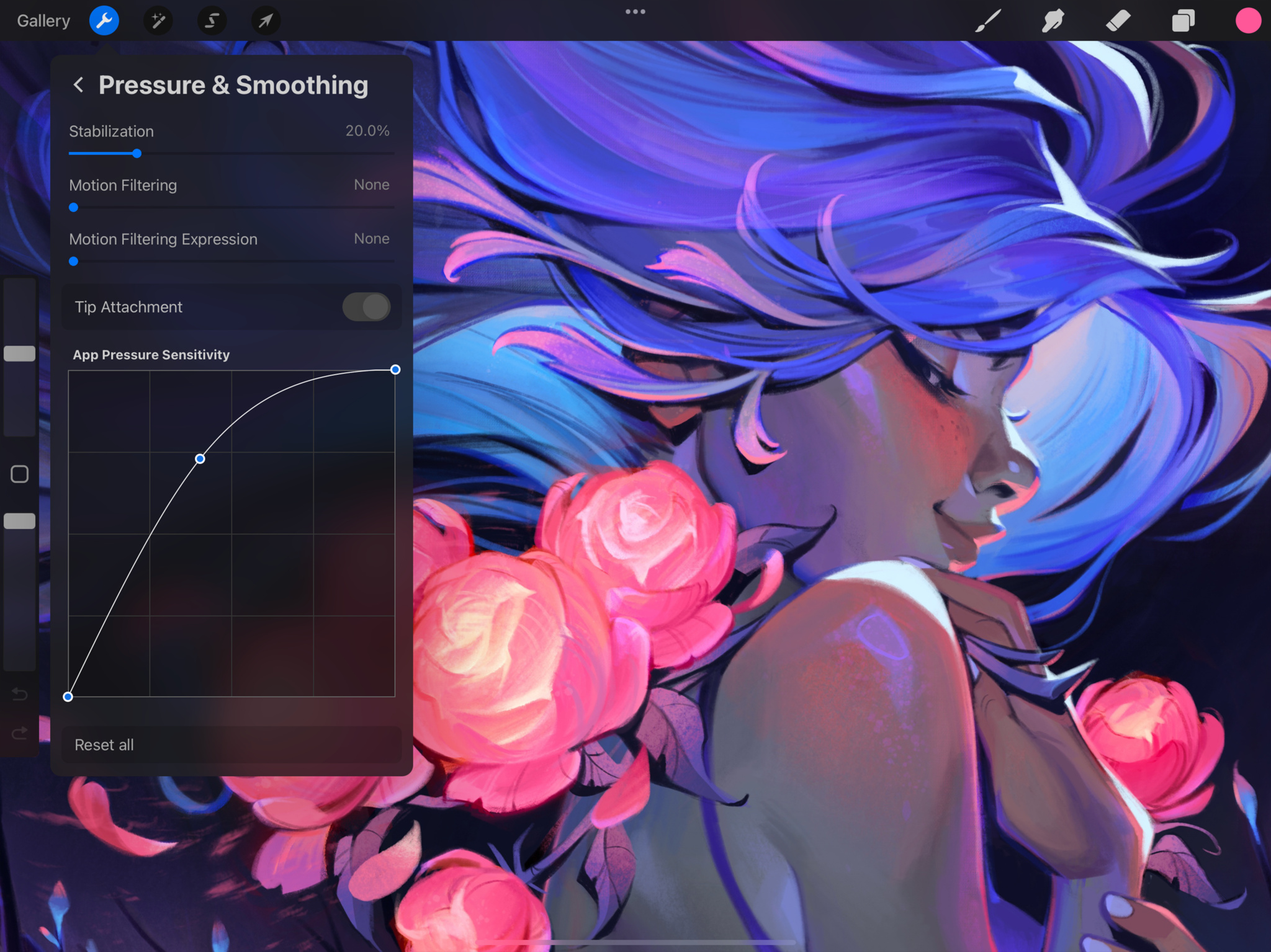
Procreate’s motion filtering tool — found in the Pressure and Smoothing menu — was a big part of the app's Apple Design Award win for inclusivity.
The winning concept came from Lloyd Bottomley, the app’s first engineer and currently the company’s chief research officer. “He said, ‘What if we use something like audio signal processing? That essentially modulates the peaks and troughs of audio. Can we use that in a different way to smooth out the strokes?’”
Bottomley worked for weeks, maybe months. “It was a long process!” laughs Cuda. “But when I saw the demo actually working, I remember grabbing a Pencil and seeing if I could disrupt it,” says Cuda. He couldn’t.
The foundation was there, and the team got together to start riffing on it. “We were all drawing with him, so we were able to add comments like, ‘OK, so at this particular pressure level, could we smooth it out to this degree?’ and such. It sounds so ephemeral. But it was a really lovely kind of back and forth that got us there.”
It’s also something that can be used by anyone. “It started out trying to help a certain demographic,” says Cuda, “but it’s great for everyone. I turned it on for almost everything I did.”
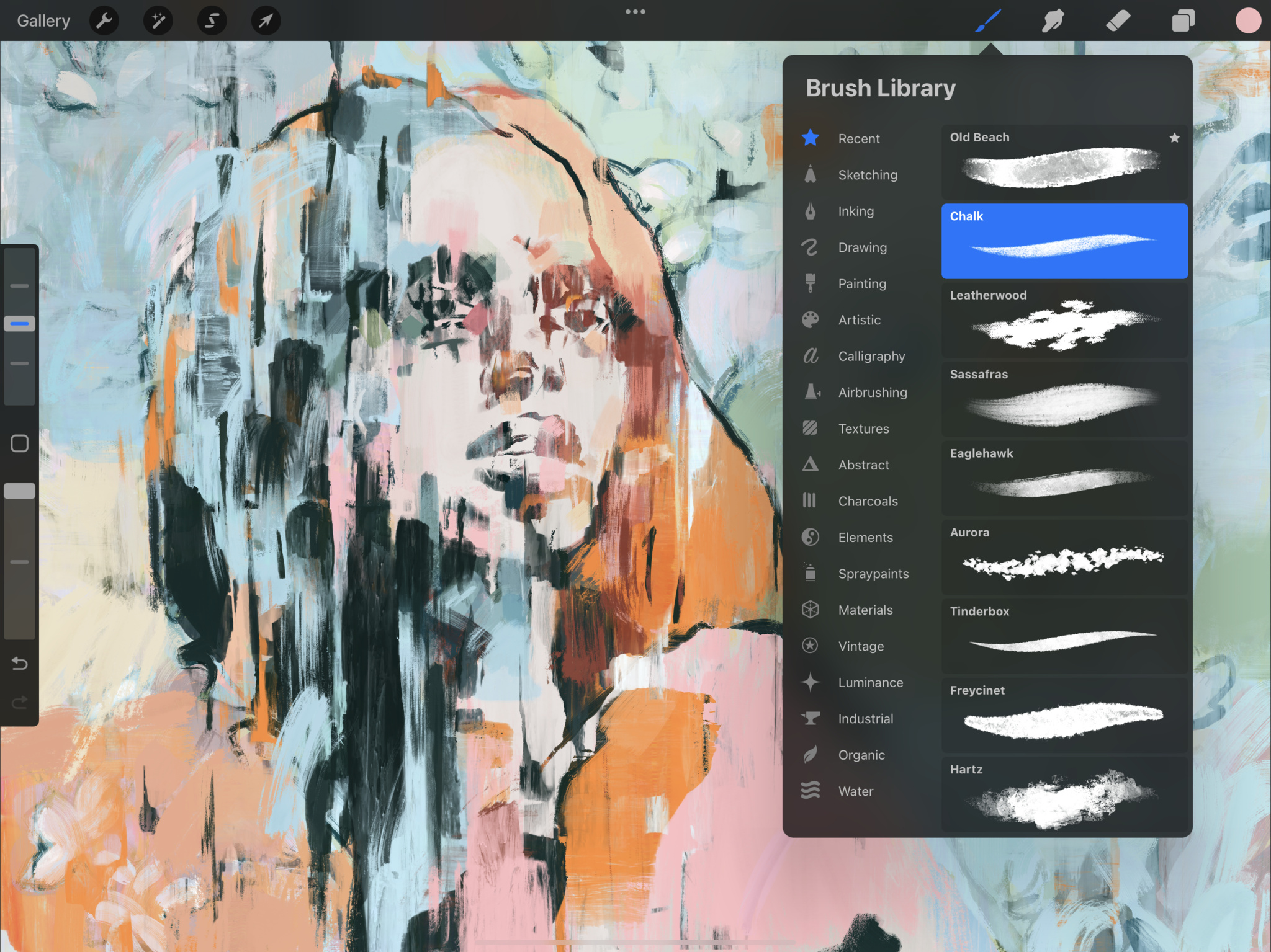
The app’s brush library offers something for artists of all stripes.
In the end, the feature not only represented a cool technological achievement but also tied fundamentally into the app’s mission. “When we talk about ‘Art is for everyone,’ we think: Well, does this appeal to everyone? Does it work for everybody?” says Cuda. “I think a lot of people think design is the wallpaper that you put up once you build something, or even a blanket term for making anything visual. But it’s really about solving problems. It’s about interfacing with machines in a very human way.”
Download Procreate from the App Store
Behind the Design is a weekly series that explores design practices and philosophies from each of the 12 winners of the 2022 Apple Design Awards. In each story, we go behind the screens with the developers and designers of these award-winning apps and games to discover how they brought their remarkable creations to life.