Spotlight on: The Dynamic Island
October 28, 2022
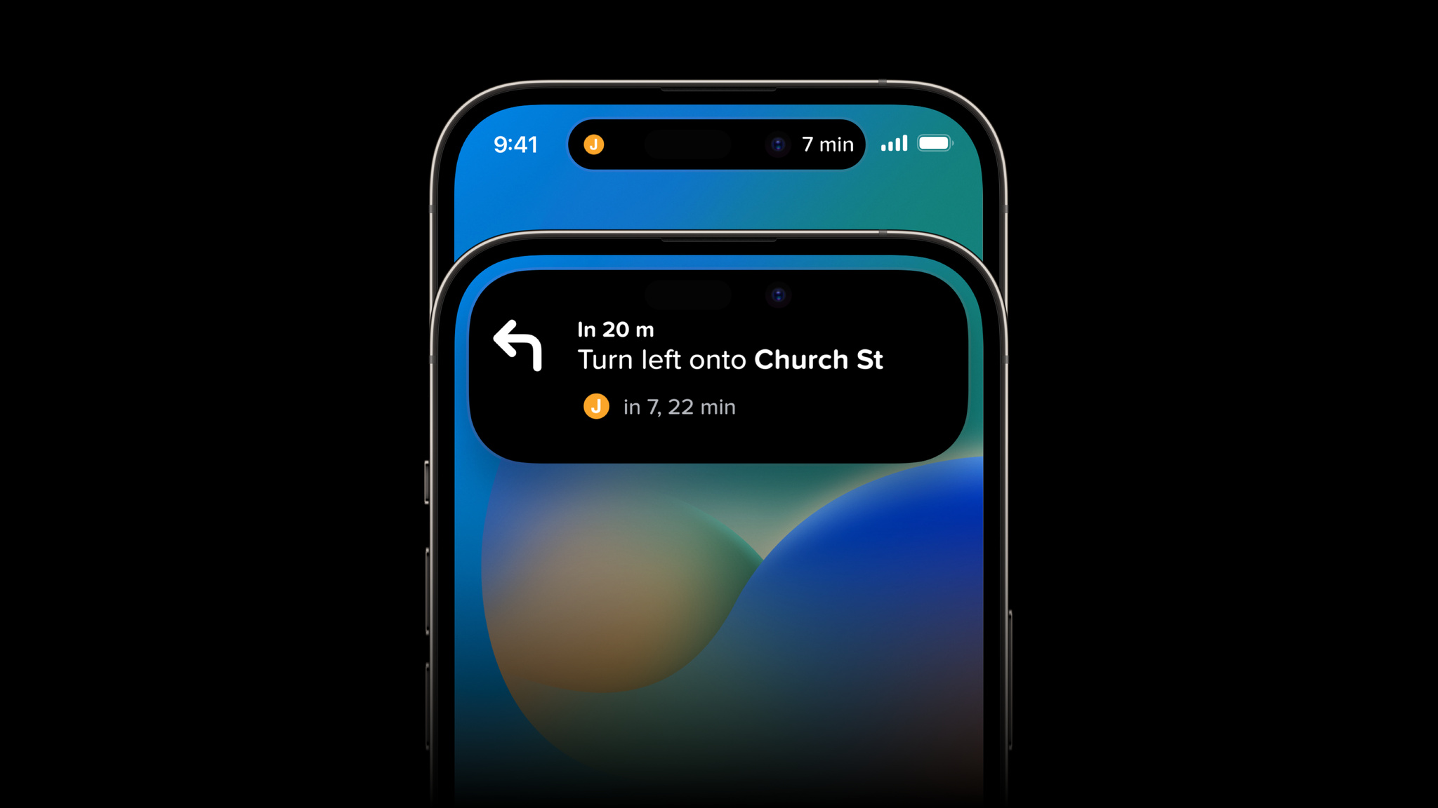
Shape-shifting animations. Effervescent effects. And a downright playful name. “I genuinely wasn’t expecting [the Dynamic Island],” says Christian Selig, developer of popular Reddit client Apollo. “That’s what blew me away: It’s just not something that’s been around.”
The feature brings liveliness — and Live Activities — to the status bar on iPhone 14 Pro and iPhone 14 Pro Max, transforming notifications, alerts, and activities into a fluid and interactive piece of animation. Whether tracking a delivery, following the game, or checking the status of an upcoming flight, the Dynamic Island helps keep people up to date without distraction.
“(The Dynamic Island is) perfect for us,” says Ryan Jones, developer of the travel-tracking app Flighty. “For travel, which can make you stress about missing something, it offers easy background reassurance.”
We caught up with five developers — including Selig and Jones — to learn how they’re designing and building for Live Activities and the Dynamic Island.
Citymapper: ‘It’s what we’ve been dreaming about for years’
If you’re an app that wants to help people move around a city, it’s hard to overstate the power of live updating in the Dynamic Island. “Live Activities changes everything here,” says Victor Wang, head of product for route-planning app Citymapper. “It’s what we’ve been dreaming about for years, and it’s a big step toward our vision of being a personal assistant in your pocket.”
For Citymapper, the Dynamic Island is less about transit and more about comfort. On iPhone 14 Pro and iPhone 14 Pro Max, the app’s signature GO feature — which helpfully lays out the path of your entire journey or commute — uses the Dynamic Island in place of notifications or simply checking the app.
It offers a single live-updating view that communicates key information: how long you’ll have to wait for the next bus, how many more stops until you disembark, and when you need to get off the train or bus (and, by association, your phone). “[The Dynamic Island] will show a countdown so you can understand, ‘OK the bus will be here in 10 minutes — now 5 — now 2,” says Wang. “Our hope is that you’ll feel more comfortable waiting.”
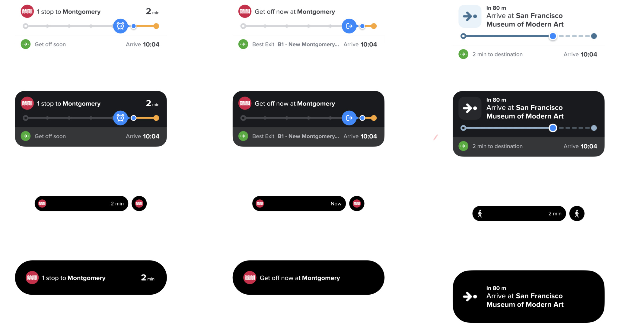
Citymapper’s Dynamic Island shifts based on where you are in your journey, in this case on your train (left), at your stop (center), and walking to your destination (right).
iOS designer Jason Hibbs shares that the Citymapper team initially thought Live Activities would function as an enhanced set of notifications. “But we’re actually able to say not just ‘Turn left,’ but also ‘Here’s how many minutes you have until the bus arrives.’”
Live Activities can help you feel more on top of things.
Victor Wang, Citymapper
Citymapper breaks each trip into four phases: walking to a stop, waiting at a stop, riding, and then walking to your destination. In each phase, Dynamic Island will show a small icon — like a bus, train, or walking person — with a countdown to your next destination or transfer. The team discarded other ideas in pursuit of that simplicity — eschewing, among other things, turn-by-turn directions. “We didn’t want it to get in your way,” says Wang. “The idea is that you can still read or play your game or do whatever you’re doing.”
In short, you can do anything you like — save for worry about your trip. “Live Activities can help you feel more on top of things,” says Wang. “You can plan better and have sufficient confidence for the next step.”
Download Citymapper from the App Store
Apollo for Reddit: ‘It’s kind of hard not to go wild’
When he first learned about the Dynamic Island, Christian Selig pounced. “The way the engineers built the APIs, it’s kind of hard not to go wild,” Selig laughs. “It’s like you write four lines and the widgets are done. It’s pretty magical.”
Ideas for Apollo, his Reddit client, came almost immediately: “Say a new episode comes out, and you’re following a subreddit and reacting with other fans,” Selig says. “The Dynamic Island will auto-refresh and show you new content and comments as they come in.”
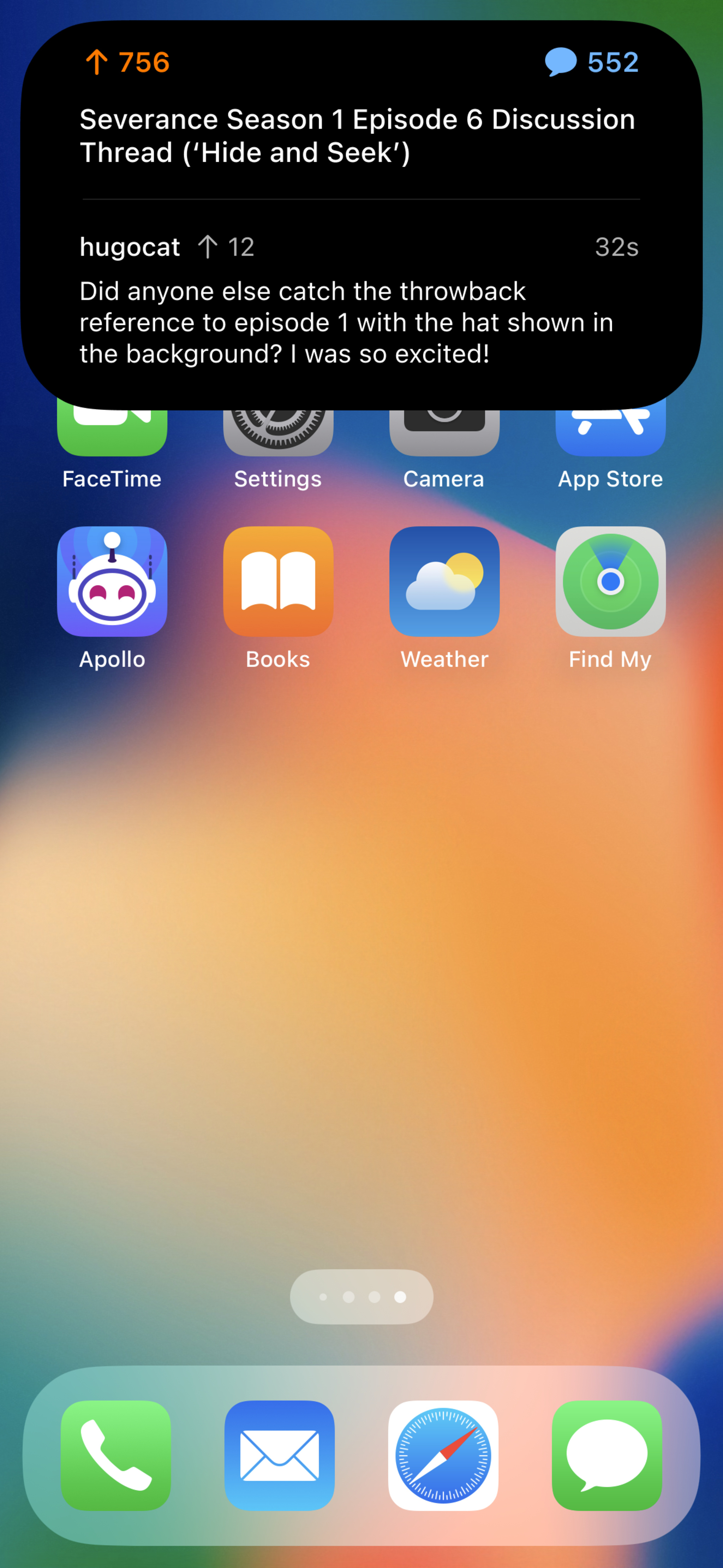
Apollo’s Dynamic Island shows new content and comments — like fun Easter eggs in TV shows — as they come in.
If so moved, you could stream the show in one app while tracking new posts on the subreddit through updates in the Dynamic Island. “In compact presentation, you’ll see the current number of comments. When you go to (the expanded presentation), you’ll see high-performing comments — like if someone caught a reference you missed.”
Outside of the Dynamic Island, Apollo’s Live Activities are robust as well: You can keep tabs on what’s trending, follow your Reddit karma, and — this is true — track the actual physical distance you’ve scrolled in Apollo (measured in feet, miles, or by the Eiffel tower). “This has been one of the more fun experiences I've had doing iOS development in quite a while,” Selig says, “and it’s a fun job, so that says a lot.”
Download Apollo for Reddit from the App Store
SmartGym: ‘I had to focus on staying out of the way’
SmartGym's Matt Abras sees the Dynamic Island more as a coach than a static feature: His app is exploring something that displays both your current workout and the rests between each set — so you know when it’s time to get back to work.
“It’s easy to be distracted by your phone during rests, right? A 30- or 45-second break can become a few minutes,” Abras says. “This is way better than getting a notification that says, ‘Hey, rest ended.’”
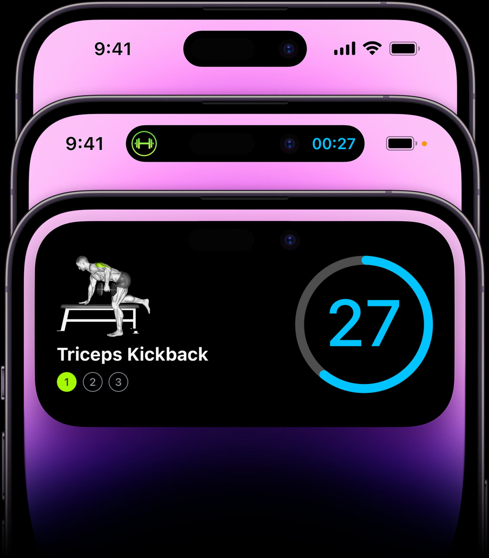
SmartGym’s Dynamic Island shows the type and duration of your current workout — and prepares you for your next one.
Abras went through a number of iterations when designing Live Activities for SmartGym. He’d initially tried using the Dynamic Island to display heart rate and calories during a workout, but it felt superfluous. “In order to track health data, you need Apple Watch, which is already showing that information,” he says. “What’s really important to show at that time? Health metrics? A large countdown? How many sets you’ve done and how many you have left? There’s a lot of potential information.”
What’s really important to show at that time?
Matt Abras, SmartGym
Instead, Abras refocused, using the Dynamic Island to share metrics and reps. “When someone’s working out, they need to do what they need to do without realizing the app is there,” he says. “I had to focus on staying out of the way.”
How did he keep that balance between practicality and invisibility? “It’s all about taste,” he says, with a smile.
Flighty: ‘We really have to shine when things go awry’
Apps can easily take advantage of the Dynamic Island to quickly spotlight a single nugget of key information. When it came to Flighty, however, Ryan Jones wanted to tackle a slightly more daunting project: showcasing multiple nuggets of information — departure times, gate changes, baggage claim numbers, and the like — that could all change on the fly.
Flighty is at its best when dealing with such “IRROPS” — the industry abbreviation for irregular operations. “We really have to shine when things go awry,” says Jones. But that meant accounting for every thunderstorm, equipment delay, or late plane into Dallas.
“People want different data points [like]… what time is a flight leaving, where is it leaving from, how long until you land,” says Jones. But this information is almost always time-dependent; after your flight departs, for example, you likely won’t need information about your departure gate.
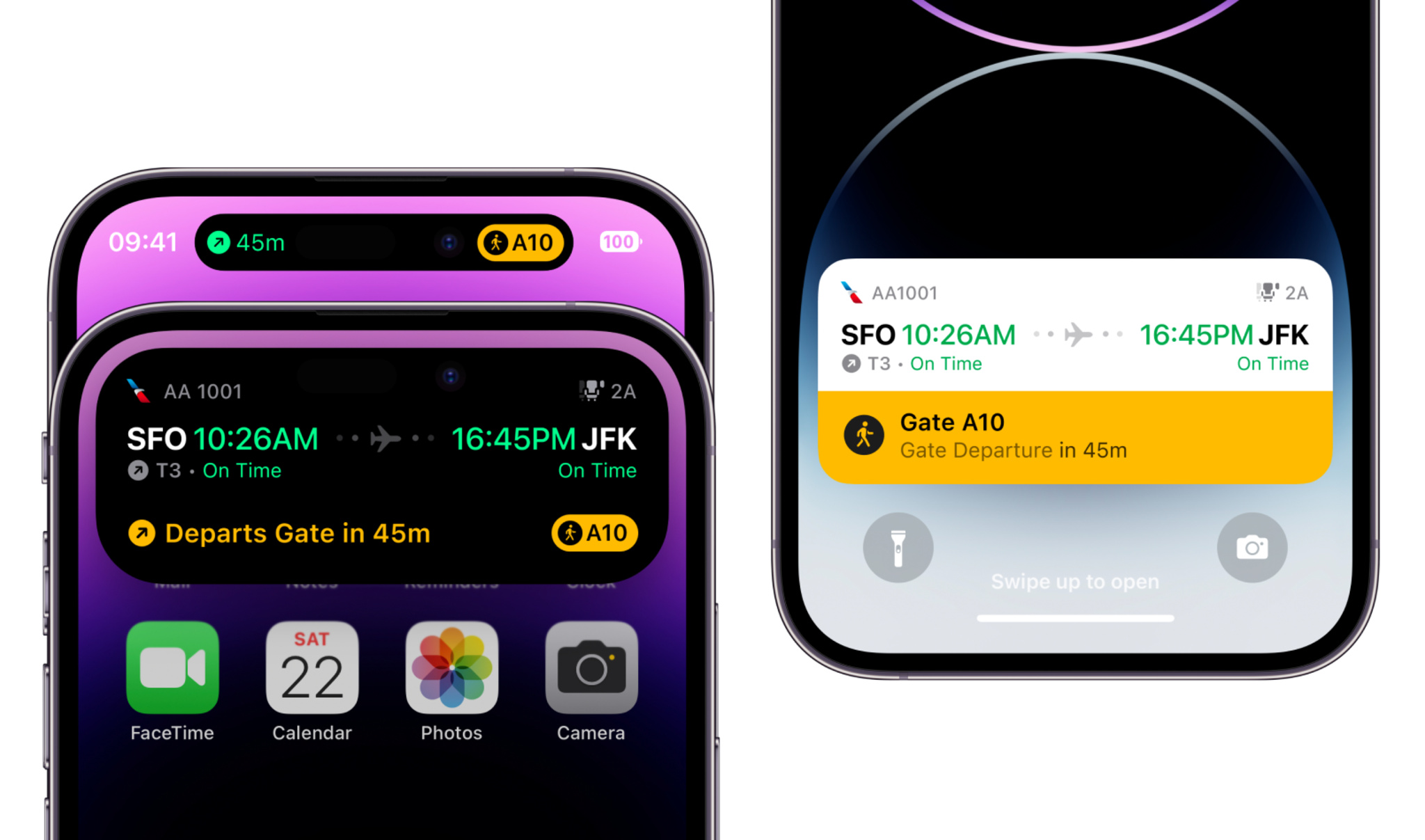
Flighty’s Live Activity in the Dynamic Island (left) and on the Lock Screen (right) make the best-in-class travel app more useful than ever.
After exploring a few possibilities for the Dynamic Island and Live Activities, Jones and the team decided to make the information within the Dynamic Island — well — dynamic. Before your gate departure, for example, Flighty’s information within the Dynamic Island will operate like a departure sign at a big airport. “That’s our real-world analogy,” Jones says. “Those signs have one line per flight, and that’s a good guiding light — they’ve had 50 years of figuring out what’s important.”
In addition to the unpredictable nature of travel, Jones and team must also account for how every single person will, at some point, lose their connection. “Whenever [someone] takes off, we have to assume that we won’t see them again until they land,” says Jones.
The solve: Once a plane pushes back, Flighty is ready to go offline at any minute. From that point on, the Dynamic Island switches over to flight progress bars and counters; the minimal presentation is a simple circular chart that tracks your flight’s duration.
No matter where someone is in their flight, the Dynamic Island can help them feel confident and comfortable in their travel routine. “That’s a big change from ‘I’ve gotta be listening for notifications all the time,’” Jones says. And it’s one that Flighty welcomes.
Download Flighty from the App Store
Wakeout: ‘Like a healthy work coach’
Workout-anywhere app Wakeout encourages regular breaks during the day — not only for brief bursts of aerobic exercise, but also for pauses to reduce eye strain, grab a sip of water, or simply clear your mind. “It’s all about: How can we help people break up their sedentary moments but stay in their flow states?” says developer Pedro Wunderlich.
Many of these activities take as little as 15 seconds, making the Dynamic Island a reliable resource for helping people using the app. “I want to find the teams behind the Dynamic Island and Live Activities and ask, ‘Were you thinking of us? Is this a love letter?’” he laughs.
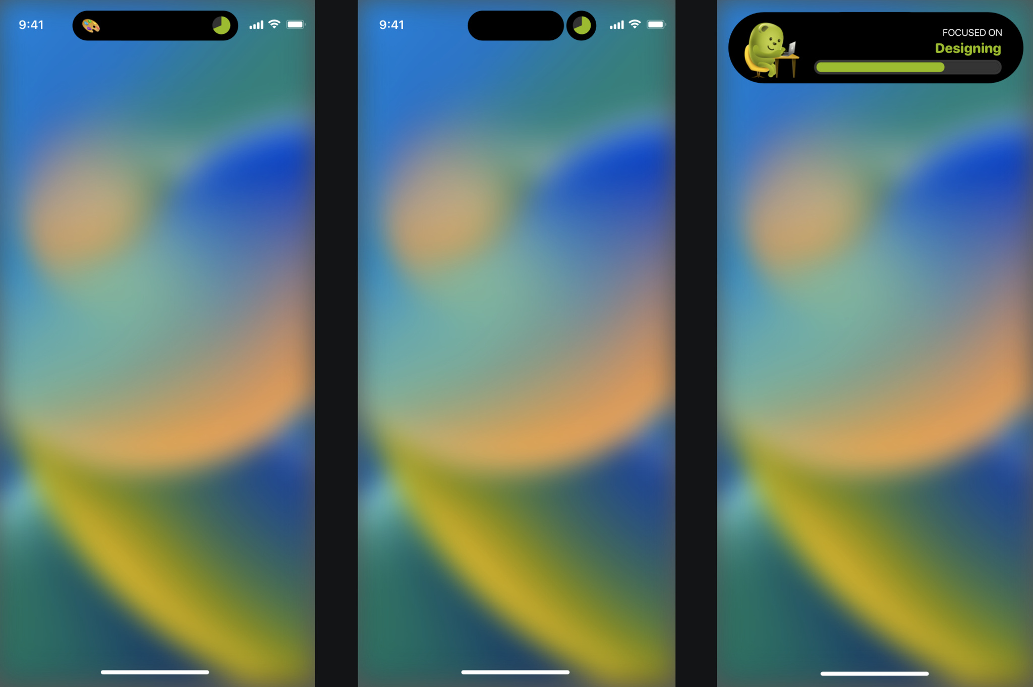
Wakeout's Dynamic Island nudges you to exercise and encourages you to focus.
Wakeout has long used push notifications, but the ActivityKit framework in iOS 16 gave Wunderlich a new way to help people stay on top of their routines. “Our customers have actually told us they want more notifications, not fewer,” says Wunderlich. “We hear, ‘Wakeout is really helpful, but only if it interrupts me.’ So Live Activities is what our customers have been asking for without knowing it.”
When designing for the Dynamic Island, Wunderlich kept both tiny tasks and longer aerobic breaks in mind. “[It’s] such a great way to maintain a presence and let people know when it’s a good time to hydrate, move, close your eyes for 30 seconds, and do all these healthy little breaks that add up.”
For smaller pauses, Wakeout’s compact presentation in the Dynamic Island shows a countdown along with a small icon (like a water bottle) to remind you about your next task. If that upcoming rest is a brief one and you’re locked into what you’re doing, you can ignore the countdown with no consequence; the alert will simply slip away “like a ship in the night,” says Wunderlich.
It’s all about: How can we help people break up their sedentary routines but stay in their flow states?
Pedro Wunderlich, Wakeout
But if the break is major and there’s a walk, squats, or a set of pushups in your future, the Dynamic Island will spur you to action more insistently. “An actual exercise break — which is Wakeout’s speciality — does stop that timer. Our customers generally do 45-minute focus sessions, so that’s the limit of the sedentary period. After that, we say, ‘OK, it’s time to move your neck, move your shoulders, or stand up.’”
Wunderlich considers the two approaches entirely separate. “The healthy moments are passive; if you don’t pay attention, they dismiss themselves,” he says. “The exercise break is more of a big state change on screen.”
It’s notifications versus interruptions, or reminders versus celebrations. But they all tie back into Wakeout’s goal to keep you firmly on a healthy track throughout your day. “We’re shifting our focus toward healthy work in a more holistic way,” Wunderlich says. “Wakeout has become almost like a healthy work coach.”
Download Wakeout from the App Store
