Behind the Design: Odio
August 1, 2022

Max Frimout is an audio engineer for Odio, and it’s his job to transport you and your ears to a different world.
From his home studio in the Netherlands — stocked with keyboards, instruments, and a tangle of wires and boards more suited to a ‘50s B-movie than a cutting-edge audio app — Frimout creates the inventive 3D soundscapes that helped Odio secure its 2022 Apple Design Award.
“I want to create a different sensation in the space around me,” says Frimout. “Sometimes that can be airy and comforting; sometimes it’s way sweeter than I am, or more melodic than I imagine. In the end, it has to be interesting — but also easy to ignore.”

With Odio, you can immerse yourself in an existing soundscape, or customize one to your liking by moving each element around your head.
Like Frimout, Odio strikes a perfect balance between cutting-edge tech and artistic resolve. The app employs a mesmerizing mix of Spatial Audio and head-tracked audio to conjure up its chill AR soundscapes, which can be everything from a rushing forest waterfall to a buzzy digital atmosphere. “Turn on your soundscape, put in your AirPods, and you’re there,” says the app’s designer, Roger Kemp.
But you’re no passive listener in these realistic realms: You can manipulate every soundscape within the app through a clever system of sliders that help you reposition sonic elements — like a babbling river, dreamy whale song, or wash of digital static — around your head. Want the waterfall behind you? Just slide the arc backward. Want to hear the crisp, calming sizzle of Frimout’s digital artistry above all else? Bring that arc control to the center.
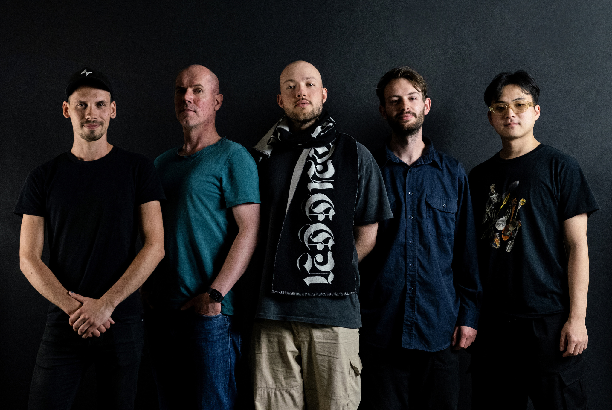
The Odio team (from left): Mees Boeijen, Roger Kemp, Max Frimout, Rutger Schimmel, and Joon Kwak.
Odio is geared to two different audiences, says Kemp, who co-founded Volst, the app’s Netherlands-based studio. “We have people who say, ‘I just want to zone out, get into the flow, or sleep better… But we also have creators who want to make this their own.”
From the very beginning, Volst sought to make Odio work well for both groups. “We try to make it so everybody, with a little effort, can work on the app,” says Kemp. “The bare essence is basically a blank canvas where the artist and listener can do whatever they want with a soundscape.”
‘That was the easy part’
Kemp didn’t start out as a designer. He initially went to school for architecture in the Netherlands, then spent the ‘90s building websites and CD-ROMs — where he found a shocking number of similarities. “You navigate through a building, and you navigate through a website or an app,” he says. “You have an entrance and an exit. You have different rooms, views, and features. It’s the same with an app.”
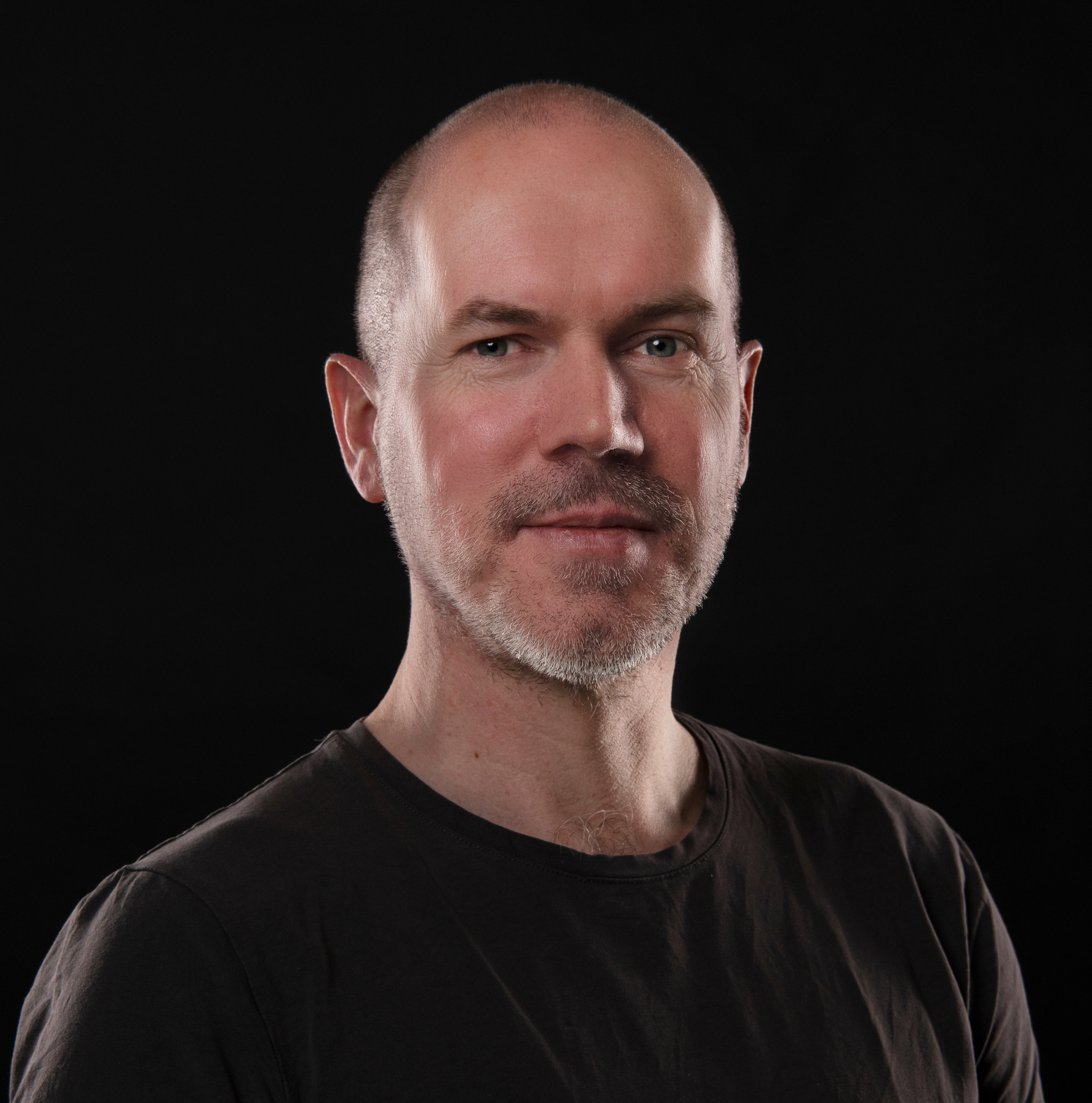
“There’s a lot of overlap between architecture and software development,” says Volst founder Roger Kemp.
Kemp spent eight years in the Bay Area before returning to the Netherlands to explore a career as a freelancer. “A lot of it was fun, but some major projects got really frustrating,” he says. “I wanted to work on something meaningful, and after a while I thought, ‘I might as well put all this energy into my own company.’”
Odio was partly the product of serendipitous timing. Joon Kwak, a design student from South Korea who had created a spatialized sound app in Unity for his graduation project, reached out to Kemp for a consultation. “We’d been looking for projects in the visual audio realm, and we loved it. Within two or three weeks, we had a working concept demo of a spatial environment where you could move sounds around.” Kemp stops to laugh. “That was the easy part.”
We thought, ‘What if we have musicians compose their own environments?’
Roger Kemp, Volst founder
The hard part was all the other apps doing the same thing. “We thought, ‘If this is so easy, there must be other apps like it.’ And there were!” says Kemp. “That’s when Max came along and said, ‘OK, how do we make something really special out of this?”
Frimout, who knew Kemp and others from the local nightlife scene, had the idea to focus less on nature sounds — the chirping birds, crackling fires, and rushing winds that tend to populate ambient sound apps — and put the emphasis instead on human creativity. “We thought, ‘What if we have musicians compose their own environments?’ Why not create a new platform for artists to publish their work?” says Kemp. “That’s when it all clicked.”

Frimout says his soundscapes have to be both interesting and “easy to ignore.”
Frimout already had a bit of experience with spatialized audio. In addition to his music work, he’s studying electroacoustic composition at the Institute of Sonology in the Hague. Appropriately enough, he spoke with us from what he calls the “most advanced wavefield synthesis system in the world,” surrounded by boxes that contain 26 tweeters and two subwoofers — a massive setup designed to recreate big spaces in a smaller one. The place is full of archaeological recording equipment too — it has its roots in a Philips lab that played home to early experiments with electronic music.
Frimout, one of the app’s five composers, begins creating his Odio soundscapes on instruments or analog equipment in a manner that’s not too different from his day (well, night) job. Start with a base, create a mood, build on it, patch it all together. The only difference: the 3D configuration.
That patching is done in Logic Pro, with which he can position the channels in real time and test the results on his AirPods Max. “That’s how I look around to see how it feels three-dimensionally,” he says, rotating his head around for emphasis, “and it’s where I start to play around.” The results are effects and flourishes with names like “synthetic water,” “moving chords,” and “filtered drone,” all of which can be muted, amplified, or rotated as the user sees fit.
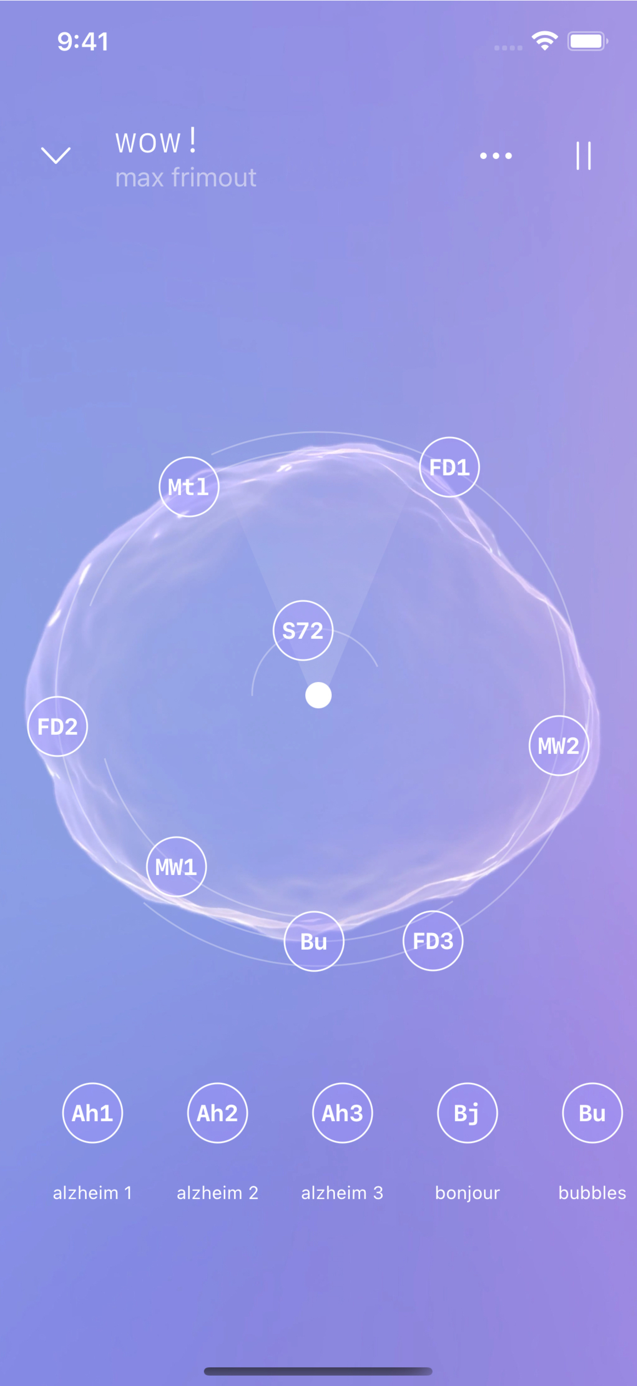
Frimout created his “Wow!” soundscape in Logic Pro — and tested the results on his AirPods Max.
Inspiration comes from anywhere. Listen close and you can hear analog touches — like Frimout’s largely unrecognizable harp, Heartbreak. (“It’s just three chordal structures,” he says with a laugh, “but they’ve been processed and processed and processed.” ) The Institute is full of vintage equipment from the ‘50s, ’60s, and ‘70s that can be used to conjure up abstract, weirdly nostalgic riffs and fuzzes and sounds. “I like to take some of these ideas from the past and translate them,” he says. “Basically, I fiddle around until I hear something I like.”
The ‘complete package’
The app is also a visual feast, with each soundscape accompanied by ever-shifting original art and cutting-edge visuals inspired by something as analog as it gets — the humble album cover. “They’re small books!” Kemp says. “With all their artwork and lyrics, they were a complete package. We thought, ‘Well, why not approach it that way? Why not have a visual artist work with a composer to create that complete package?’”
The final design — like every Odio soundscape and feature — is the result of significant back and forth, a strategy Kemp calls “ping-ponging the design.” “We’ll work on something for a few days, then take it to the whole team for a critique,” he says. Sometimes it takes one step; sometimes it can be four or five. “But in the end,” he says, “we get a result everybody likes.”
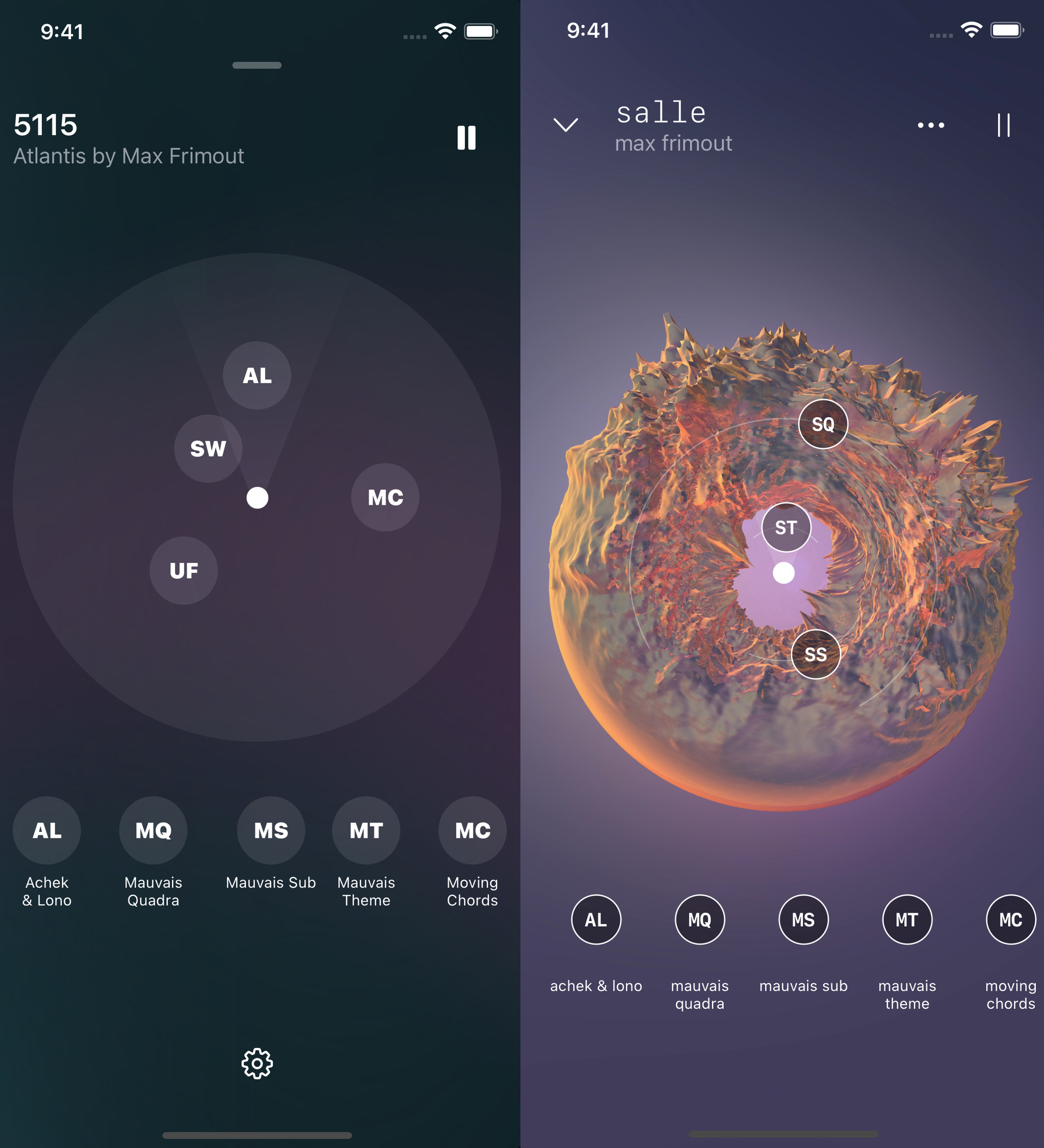
The prototype for the soundscape “Atlantis” (left) and the finished version (right).
To be fair, Kemp wasn’t initially sold on that approach. “I thought this would be really hard!” he says. “People could be critiquing your work before it’s even finished. But we’ve found that it speeds up the procress tremendously. And we’ve been doing it now for three or four years.”
Odio publishes new soundscapes every month; their artist roster includes composers from Germany, Korea, and elsewhere. The plan is to keep expanding — partly because that’s what Kemp is cut out to do.
“The most challenging part of design for me is knowing when to stop, when to leave something alone and stop tinkering with it,” he says. “I always think, ‘Maybe if I change the color or stroke width, it’ll be better. But at a certain point you have to stop because the project is done. It’s published.”
He pauses to laugh. “But I still go back to designs and try to tinker. And the team tells me, “No! Don’t do it! It’s done!”
Download Odio from the App Store
Behind the Design is a weekly series that explores design practices and philosophies from each of the 12 winners of the 2022 Apple Design Awards. In each story, we go behind the screens with the developers and designers of these award-winning apps and games to discover how they brought their remarkable creations to life.