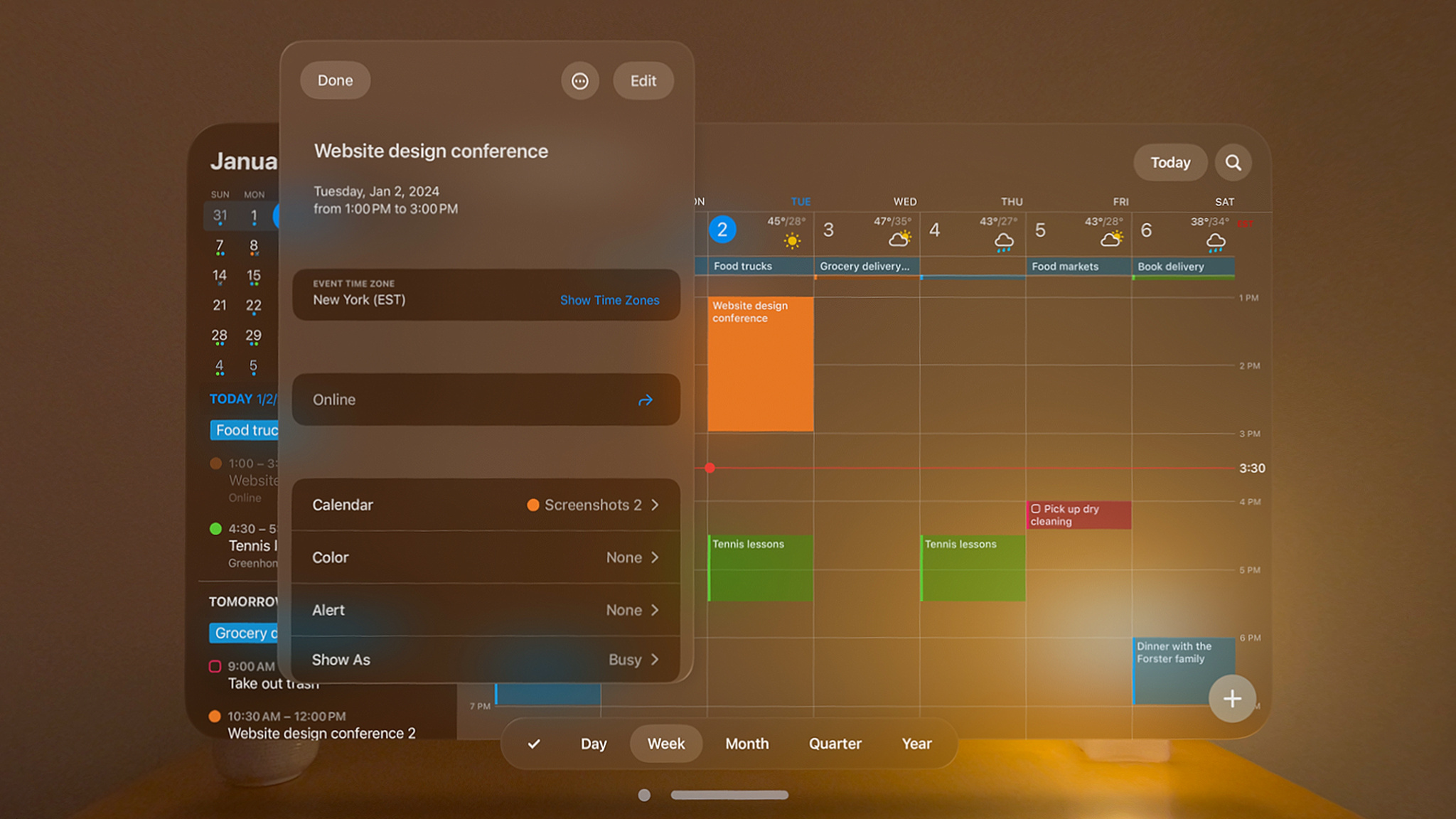
“The best version we’ve ever made”: Fantastical comes to Apple Vision Pro
February 8, 2024

The best-in-class calendar app Fantastical has more than a decade of history, a shelf full of awards, and plenty of well-organized fans on iPad, iPhone, Mac, and Apple Watch. Yet Michael Simmons, CEO and lead product designer for Flexibits, the company behind Fantastical, says the Apple Vision Pro app is “the best version we’ve ever made.” We asked Simmons about what he’s learned while building for visionOS, his experiences visiting the developer labs, and what advice he’d give fellow developers bringing their apps to Vision Pro.
What was your initial approach to bringing Fantastical from iPad to Apple Vision Pro?
The first thing we did was look at the platform to see if a calendar app made sense. We thought: “Could we do something here that’s truly an improvement?” When the answer was yes, we moved on to, “OK, what are the possibilities?” And of course, visionOS gives you unlimited possibilities. You’re not confined to borders; you have the full canvas of the world to create on.
We wanted to take advantage of that infinite canvas. But we also needed to make sure Fantastical felt right at home in visionOS. People want to feel like there’s a human behind the design — especially in our case, where some customers have been with us for almost 13 years. There’s a legacy there, and an expectation that what you’ll see will feel connected to what we’ve done for more than a decade.
I play guitar, so to me it felt like learning an instrument.
Michael Simmons, CEO and lead product designer for Flexibits
In the end, it all felt truly seamless, so much so that once Fantastical was finished, we immediately said, “Well, let’s do [the company’s contacts app] Cardhop too!”
Was there a moment when you realized, “We’ve really got something here”?
It happened as instantly as it could. I play guitar, so to me it felt like learning an instrument. One day it just clicks — the songs, the notes, the patterns — and feels like second nature. For me, it felt like those movies where a musical prodigy feels the music flowing out of them.
How did you approach designing for visionOS?
We focused a lot on legibility of the fonts, buttons, and other screen elements. The opaque background didn’t play well with elements from other operating systems, for example, so we tweaked it. We stayed consistent with design language, used system-provided colors as much as possible, built using mainly UIKit, and used SwiftUI for ornaments and other fancy Vision Pro elements. It’s incredible how great the app looked without us needing to rewrite a bunch of code.
How long did the process take?
It was five months from first experiencing the device to submitting a beautiful app. Essentially, that meant three months to ramp up — check out the UI, explore what was doable, and learn the tools and frameworks — and two more months to polish, refine, and test. That’s crazy fast! And once we had that domain knowledge, we were able to do Cardhop in two months. So I’d say if you have an iPad app and that knowledge, it takes just months to create a Apple Vision Pro version of your app.
What advice would you give to other developers looking to bring their iPhone or iPad apps to Apple Vision Pro?
Make sure your app is appropriate for the platform. Look at the device — all of its abilities and possibilities — and think about how your app would feel with unlimited real estate. And if your app makes sense — and most apps do make sense — and you’re already developing for iPad, iPhone, or Mac, it’s a no-brainer to bring it to Apple Vision Pro.