Spotlight on: Apple Pencil hover
December 16, 2022
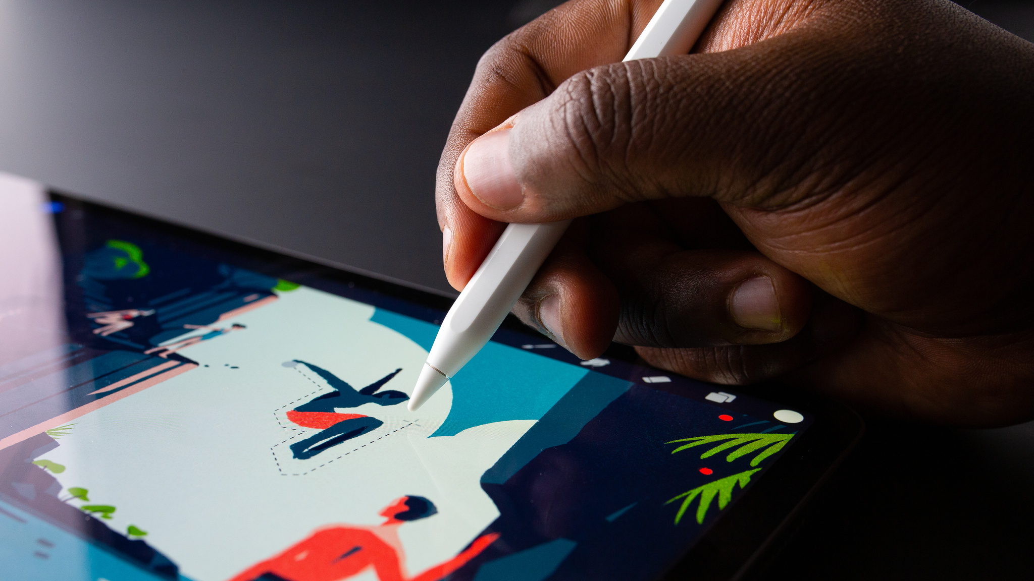
When it comes to designing creative interactions, the Procreate team knows how to get the job done.
The illustration app kicked off in 2011 with touch-based controls — "just five fingers of input," says CEO James Cuda — and won a rare pair of Apple Design Awards over the next decade for their innovative approaches to digital drawing, sketching, and painting.
While finger painting remains a core part of the app, Apple Pencil has become a significant part of Procreate's story. Apple Pencil gives artists customization and control of their line width and opacity, stroke style, and quick-access controls. And with the introduction of Apple Pencil hover, the Procreate team is investing even more heavily in the stylus. “It’s truly made a profound impact in our design phase,” says Cuda.
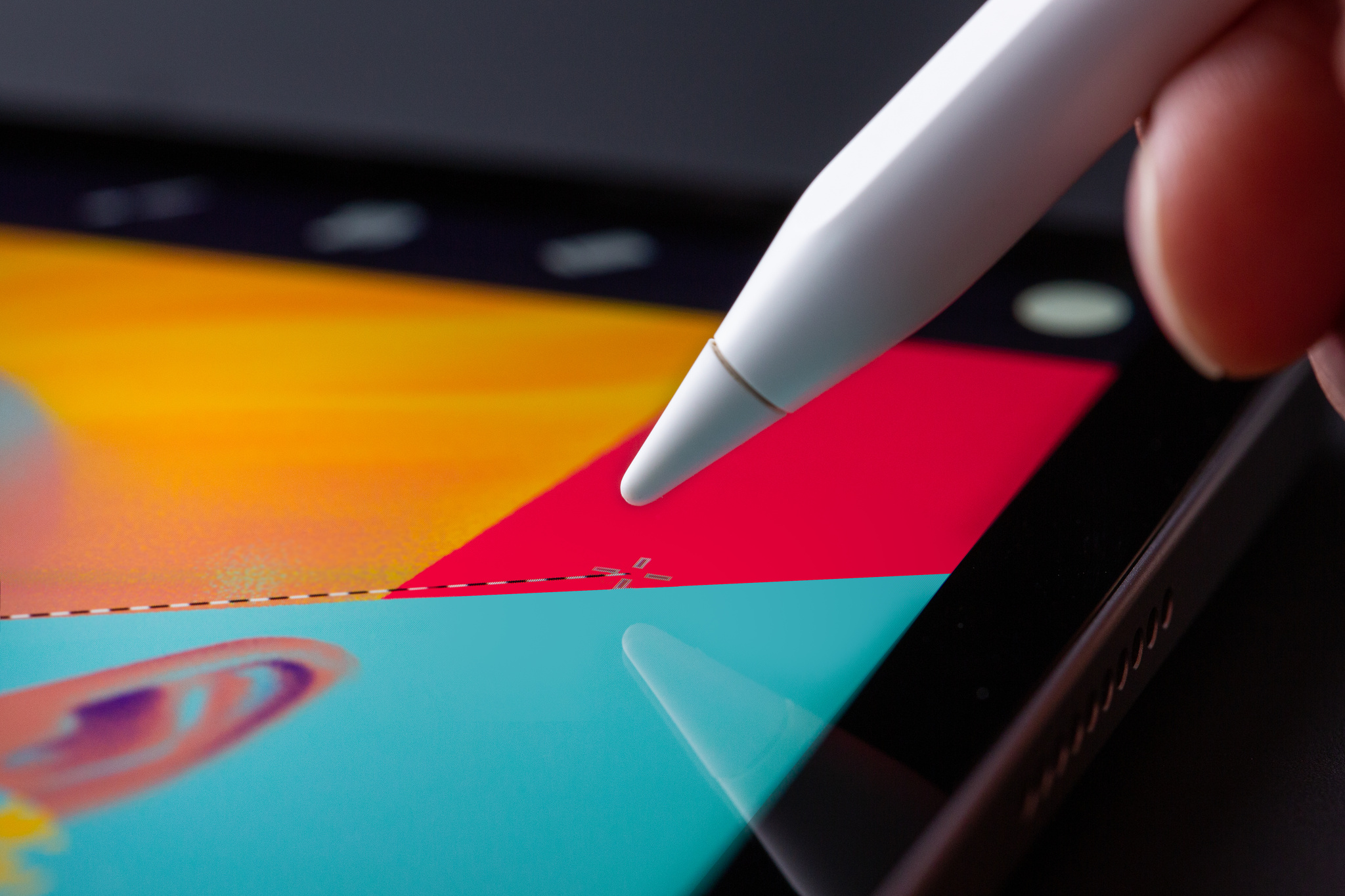
Hover over your canvas, and X marks the spot.
As with pretty much any other digital or analog drawing tool, Apple Pencil operates on the X and Y axes of a canvas, requiring direct input from the stylus nib to draw a line or select a tool. The second-generation Apple Pencil also adds support for direct input along the side of the stylus — which gives developers an option to add shortcuts within their apps. Now, Apple Pencil hover is bringing tool and previewing shortcuts into an entirely new dimension. (The Z-axis, specifically.)
“[It's] a whole new layer of interaction," says Cuda. “Everything springs to life as your Apple Pencil comes near.”
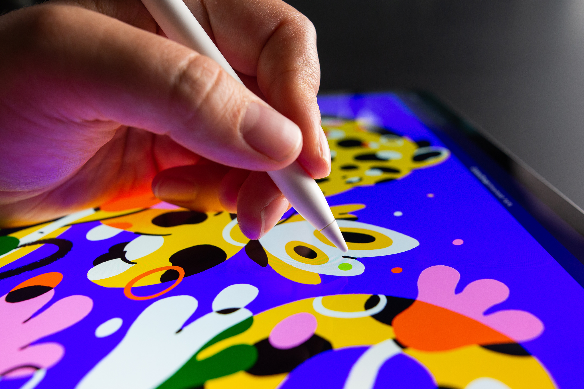
With ColorDrop, you can precisely preview your colors before tapping your canvas.
Apple Pencil hover activates when the nib is up to 12 mm above the display on iPad Pro with the M2 chip. Developers can customize what the feature does within their app, including offering tool variations, menu selection, and even previewing lines themselves — so artists can draw, sketch, and color with even greater control. "The ability to not make a commitment or damage the artwork is transformative," Cuda says.
And the feature's functionality is only half the fun. “It makes everything feel so playful,” says Claire d’Este, Procreate’s chief product officer. “I find myself rolling up and down menus just to see it responding. There’s something so nice about everything lighting up as I’m thinking about what to do next.”
The ability to not make a commitment or damage the artwork is transformative.
James Cuda, Procreate CEO
The Procreate team has hidden these sorts of playful moments throughout the entire app. In the gallery view, hovering over thumbnails expands the image or previews animations. Tools like the color picker or menu buttons react as you move across them. And then, of course, there's the canvas.
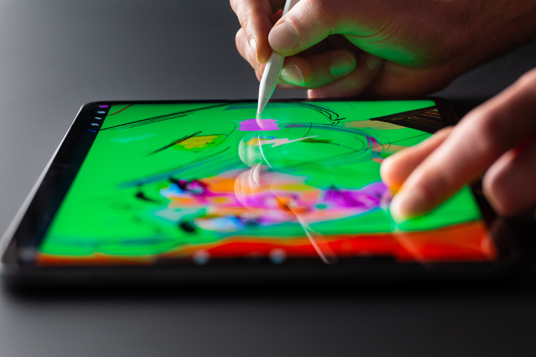
With your iPad on a desk or table, hover works in conjunction with Multi-Touch capabilities.
‘Your mind starts racing’
"There are two phases with something like this,” says Procreate chief technology officer Lloyd Bottomley. “The first is the initial, ‘Wow, this is cool.’ But then your mind starts racing because you’re trying to think of all the things you could do with it.”
With so many possibilities open to them, the Procreate team had to approach each idea with care and scrutiny to ensure they were aiding and improving design and creation workflows rather than hindering them. “We’re obsessed with keeping people focused on that point of interaction,” Bottomley says.
One area that proved surprisingly challenging: the brush cursor. “Honestly, we thought we'd have just one design through the entire brush library," says Cuda. “The problem was there's not one singular representation of that hover mark, because our brushes can do anything — you can have brushes inside brushes; you can have brushes that move across each other. To represent all that in a hover state was really challenging.”
We're obsessed with keeping people focused on that point of interaction.
Lloyd Bottomley, Procreate chief technology officer
After a few weeks of back and forth, the team landed on a solution: customizable cursors that change with different brushes. “We needed to move away from that idea of ‘one thing to rule them all’ to a series of settings that could get us there,” says Cuda. “Now, all the brush-makers out there can customize what their hover state will look like.”
A second target was the app's ColorDrop feature, which instantly fills a section of your artwork when you drag and drop a color on it, paint-by-numbers style. Using Apple Pencil hover, people can preview of what the artwork will look like before committing to a color, speeding up the process dramatically. "If you’re doing inking — comic book art, for instance — it’s huge,” says d’Este.
If you’re doing inking — comic book art, for instance — it’s huge.
Claire d’Este, Procreate chief product officer
It’s also a timely example of how a small change can make a massive improvement in an artistic workflow. “Those kinds of interactions take a surprising amount of time,” says Bottomley. “Even moving your arm across the screen takes time. Now you barely have to move.”
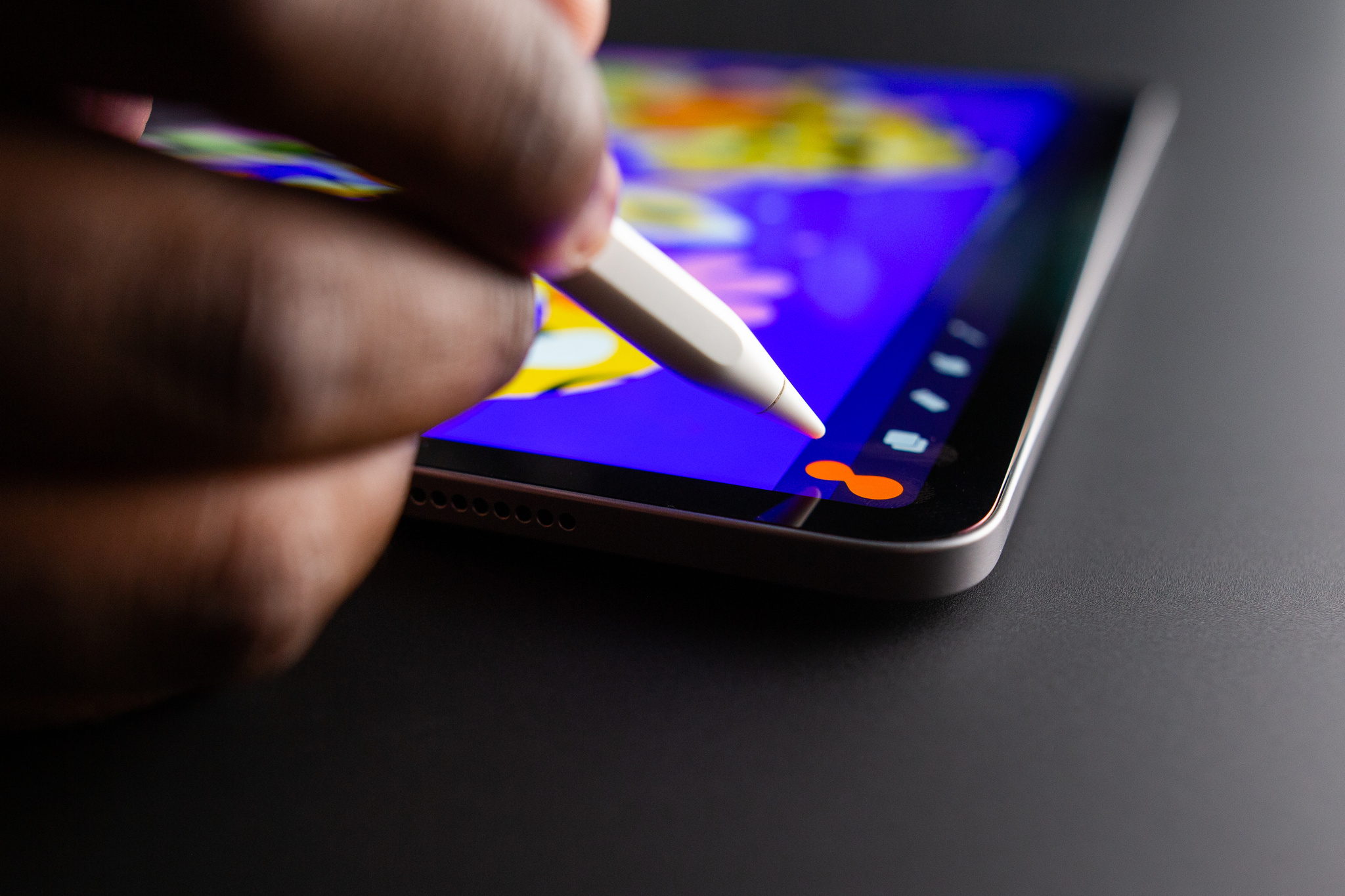
Hover over your color, then drop it on your canvas.
The saga of the sliders
While the Procreate team delighted in improving interactions for brush cursors and ColorDrop, they had a much bigger problem they hoped Apple Pencil hover would solve: a little piece of UI that had been bothering the team since the app's very first days.
“Our goal is to put absolute focus on the artist’s content,” says Cuda. Procreate's interface has long championed minimalistic tool windows and intuitive gestures like tap-to-undo to keep the canvas clear for the work. But they hit a proverbial artistic wall when trying to build UI for repetitive interactions like adjusting brush size or opacity.
Iterations came and went; the pair tried variations on pinching and zooming and tapping and holding, but nothing felt properly connected to the rest of the Procreate experience. “We ditched it all,” says Bottomley, “and went with that very conventional set of sliders you see on the left hand side of the screen.”
The sliders were functional. They were intuitive enough. But whenever the team thought about features they really liked about the app, the sliders were conspicuously absent — until Apple Pencil hover. “Once hover was announced, we realized we could work with Multi-Touch like we couldn’t before,” says Cuda.
With Apple Pencil hover, could they at last kill the sidebar? “We developed a gesture we thought would be just so ubiquitous and approachable,” says Cuda. “The idea was you would use two fingers to pinch and zoom while you’ve got hover up, so you could clearly see where your brush is and how it changes in size before you mark the screen. We were convinced it would be the way of the future.”
And then they began testing.
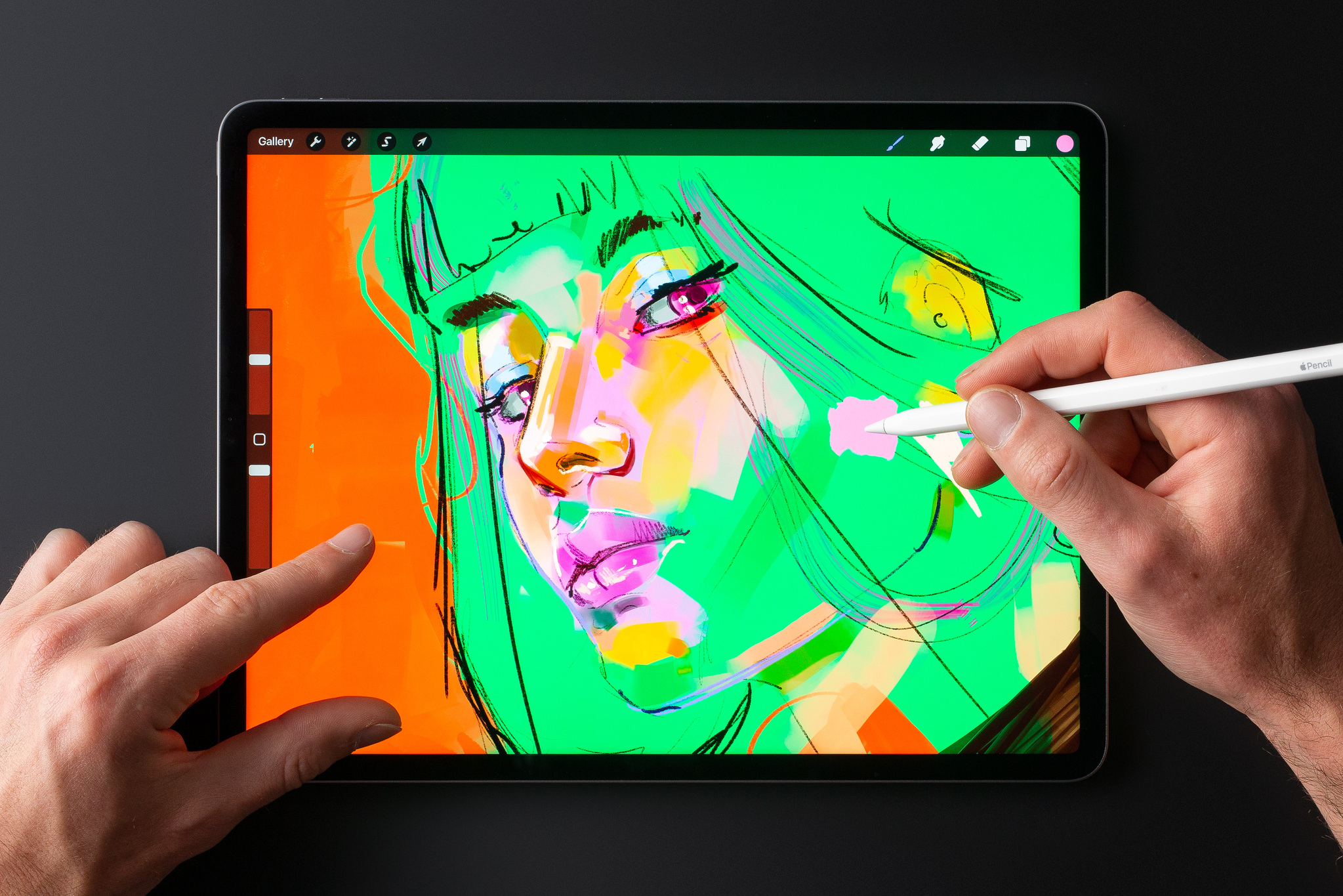
Place iPad on a surface to use hover with MultiTouch gestures…
"We realized we were wrong as soon as we put it in practice," says Cuda. The gesture worked brilliantly when iPad was sitting on a table or against a stand — a common-enough use case — but anyone using the tablet on a couch had a different experience. "You’re clutching the device with two hands," he says. "And as soon as you pinch and hover, the device is no longer, uh, in your clutches.”
We had to put our egos aside and go, ‘OK, maybe we were wrong.’
James Cuda, Procreate CEO
The challenge was enough to send the team back to the drawing board. “The gesture is useful; it’s just not the singular interface methodology were hoping to create,” says Cuda. “We had to put our egos aside and go, ‘OK, maybe we were wrong.’ And we had to think about what was best for the customer.”
For customers holding the device, it meant the return of the sliders. “We’re keeping them for mobile drawing,” Cuda says. “On a desk or stand, when you’ve got both hands free, the sidebar goes away and we get exactly what we wanted. So it was a wild ride for a couple of weeks making those calls.”
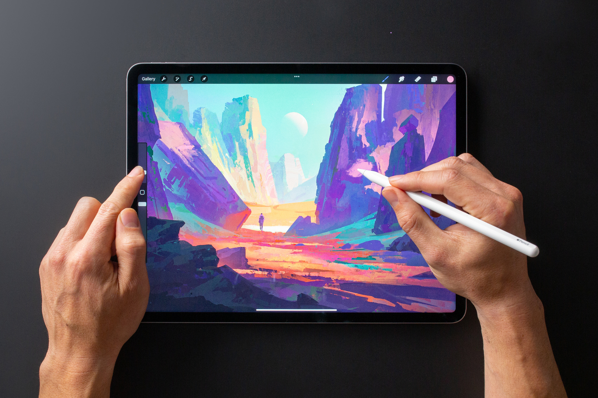
… or use the sliders on the edge of the screen.
‘It’s hard to go back’
People using iPad Pro with the M2 chip and the second-generation Apple Pencil, can explore Procreate's Apple Pencil hover features now. But Cuda and the team are focused strongly on the future, regarding hover as an important new tool in the shed — enough so that Cuda says it already “solves a bunch of things” in regards to upcoming projects.
“It doesn’t feel like we’re tapping into a technology but creating a natural extension of what you could already do,” d’Este says. “Once you’ve experienced this, it’s hard to go back.”