Behind the Design: Afterplace
June 5, 2023

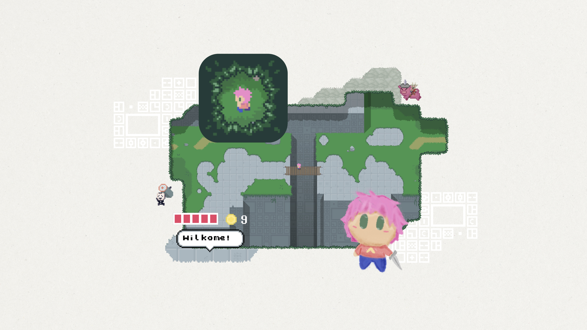
At first glance, Evan Kice’s Afterplace appears to have time-traveled from the late 1980s. It’s a 2D top-down pixelated adventure game full of blocky characters, blippy music, and retro typefaces. If you were ever into the games of the era — and Kice very much was — it feels like a delightful visit from an old friend.
“I grew up on those games,” says Kice. “I was always carrying them around. And I was also the kind of kid who’d look at a manhole cover and think, ‘That is definitely the entrance to a dungeon.’”
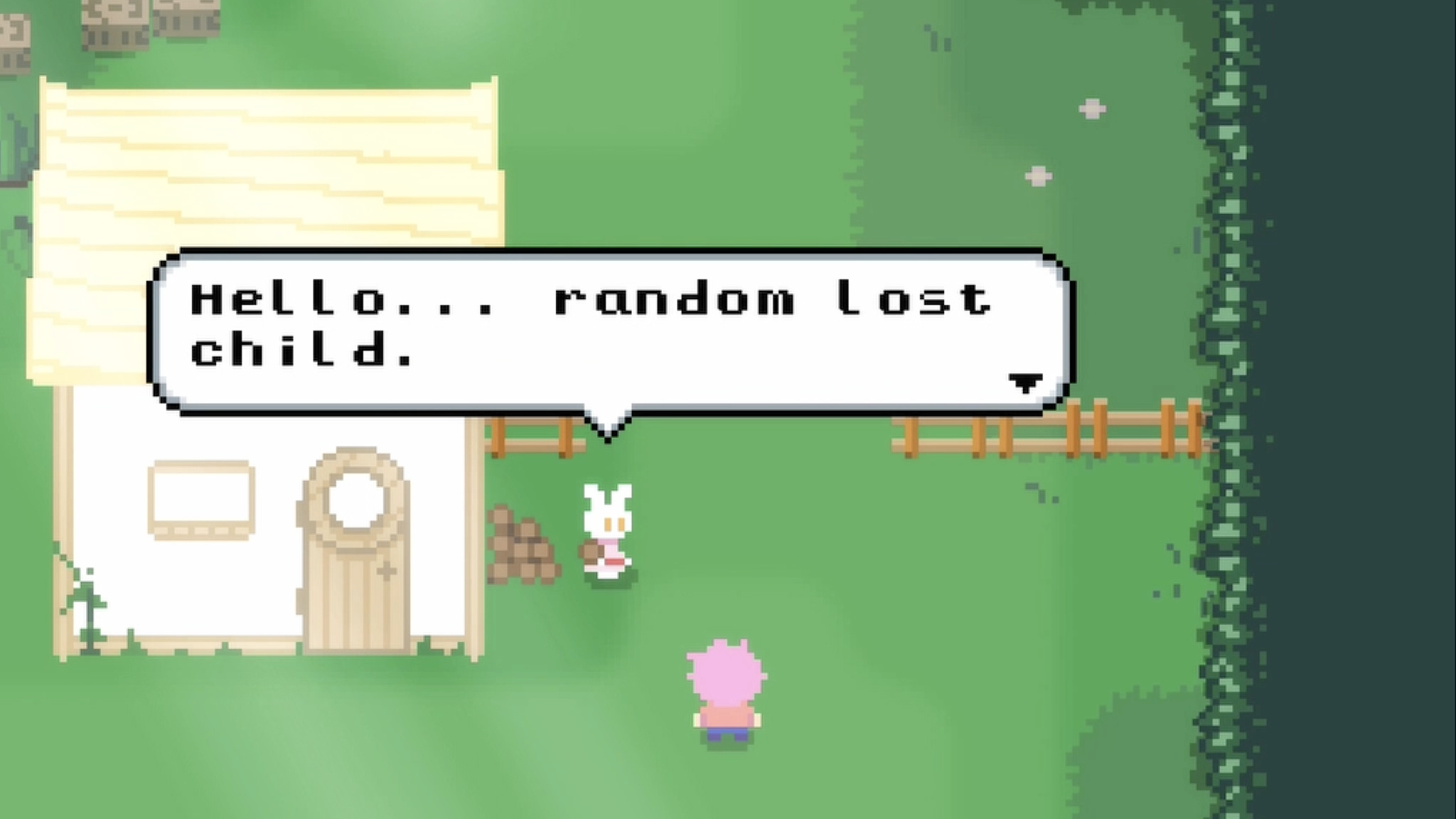
Yet for all its nostalgia, Afterplace is a decidedly modern game too. It’s fast, fluid, incredibly easy to pick up, and features a surprisingly huge map. Its characters look like 1989 but talk like 2023, especially the sarcastic vending machine that dispenses random jokes and the friendly rabbit that provides advice. (For instance: “If you think something’s going to attack you, don’t be there anymore. Like, move away.”)

Afterplace is filled with memorable characters, like the friendly rabbit that dispenses helpful advice.
It’s especially impressive when you realize that Kice is the game’s sole designer, developer, and artist. He began making video games at age 11, studied software engineering in college, and took a few game design courses. But mostly, he taught himself along the way. “Honestly, I just watched a lot of tutorials,” he says. “YouTube is how I learned art, sound, music, and basically everything that wasn’t programming or game design.”

Evan Kice, Afterplace
The game is also brilliantly designed for mobile, with one-finger controls that make it easy to explore. Tap to interact with an object or slash your way out of trouble. Or tap and drag anywhere on the screen to move around. In fact, one of Kice’s earliest design decisions was to lean on touch screen interaction paradigms instead of drawing controls on screen. “I was never a fan of virtual buttons or d-pads,” says Kice. “I’ve played a lot of those kinds of games, and often ended up going a direction I didn’t want to go. And I personally enjoyed being able to play with one thumb while standing in line somewhere.”
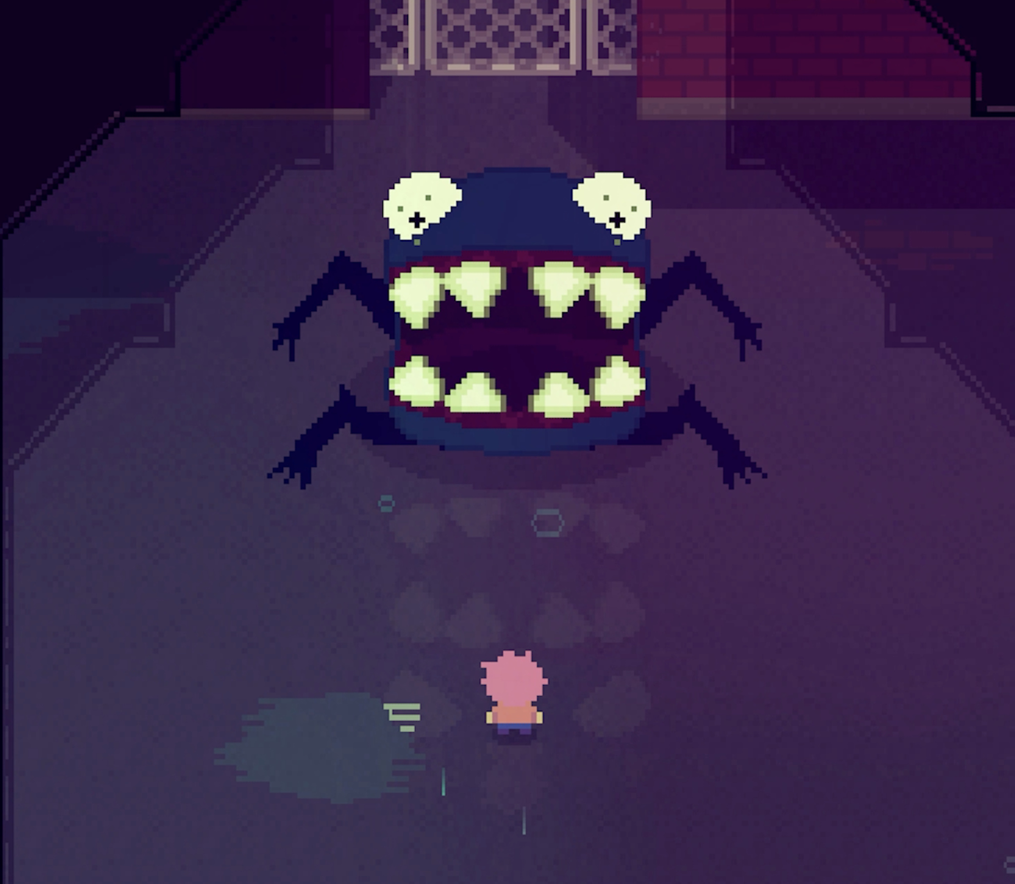
That drive for simplicity also informed the interactions between hero and enemy. “Some games have simple enemies but a complex you,” he says. “Afterplace has a simple you but complex enemies. Whenever you walk up to something, you have to say, ‘What is this guy gonna do? I gotta figure this out.’ That’s your whole job. You’re not worried about doing double backflips because you’re too busy trying not to get smashed in the face.”

Afterplace’s huge map is packed with forests, towns, and scary monsters.
Enemies lurk everywhere in Afterplace’s massive worlds. Levels stretch out in all directions; what looks like a humble library is secretly a multilevel maze. “I always loved it when a game just kept going,” says Kice. “I was fascinated by the idea that a game could hold an entire country.”
I was never a fan of virtual buttons or d-pads. And I personally enjoyed being able to play with one thumb while standing in line somewhere.
Evan Kice, Afterplace creator
He was also fascinated by vintage heroes and villains. “All the characters in Afterplace are the same resolution as the characters in my favorite childhood games,” he says. “I really, really loved those characters. But they were just static images; they faced four directions and had a blank stare on them. As a kid, I would think, ‘I would love it if they did anything more than stand in place and say one line of dialogue.” Inspired, he challenged himself on Afterplace to see how expressive that vintage resolution could be. “Turns out they’re pretty expressive!” he laughs.

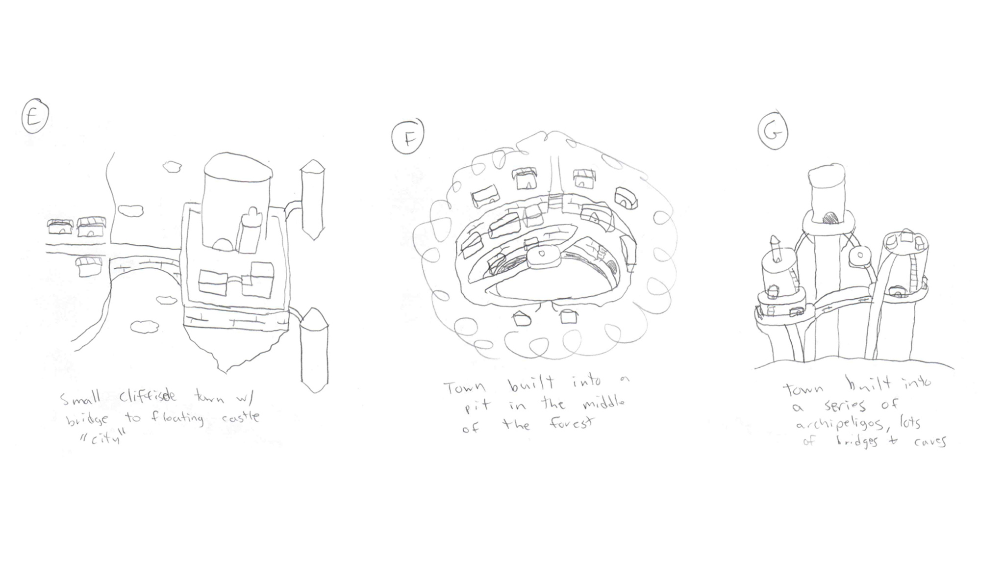
Evan Kice’s early Afterplace sketches show the beginnings of his game’s expansive world.
Afterplace’s expressiveness comes through in its clever dialogue, like the character who encourages players to be more strategic in their attacks by saying, “You wouldn’t imagine how many dunderheads just keep swingin’ away at a monster.” The game’s music — which Kice wrote and performed — starts in an 8-bit style but expands to become more orchestral later on, a trick he picked up from the game Undertale. “If you start out the game with a retro sound, then later break out the string quartet or horror violins, it has a lot more impact,” he says. “The rest of the game has maybe three melodies in it. I’ll pretend that’s because I’m a cool designer using leitmotifs, but it’s actually the maximum number of melodies I could think of.”

A rendering of Clover, one of Afterplace’s many memorable characters.
Never a fan of intro cutscenes, Kice designed Afterplace’s onboarding to get players right into the action. “I love story in games, but I almost always skip those introductions. I’m just not invested yet," he says.
Afterplace also features a bevy of accessibility options that let players adjust text scaling, camera shake amount, contrast, and more. There’s even an invincibility mode, if players are really having trouble with those monsters. It’s all part of a strategy to appeal to anyone, regardless of their video game history — if they have one at all.
I love story in games, but I almost always skip those introductions.
Evan Kice, Afterplace creator
“Afterplace is very niche," he says. It’s for people who maybe don’t play games on mobile. But if it helps bring more people into gaming, I think that’s great.”
Behind the Design is a series that explores design practices and philosophies from each of the winners of the Apple Design Awards. In each story, we go behind the screens with the developers and designers of these award-winning apps and games to discover how they brought their remarkable creations to life.