Behind the Design: Pok Pok Playroom
August 9, 2021

When the husband-and-wife team of Esther Huybreghts and Mathijs Demaeght first began dreaming up Pok Pok Playroom, they made a solemn vow: parents shouldn't need to mute the app in a restaurant.
“We didn’t want media and jingles and jangles that get stuck in your head,” Huybreghts laughs. “We wanted a quieter experience.”
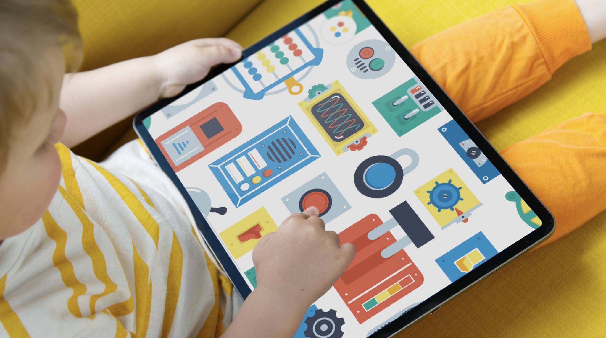
To the delight of dining parents everywhere, they got it: Their inventive children’s sandbox is a quiet feast for little senses. There are switches to flip, gears to grind, blobs to plop together, and bells to ring — and those are just a handful of the animations designed to make the app feel like a tactile, handmade toy.

Huybreughts and Demaeght began their careers in the film and game design worlds before finding work with the independent Canadian studio Snowman (creators and producers of titles like Alto’s Odyssey and Alto’s Adventure as well as Where Cards Fall and Skate City for Apple Arcade). The duo began pondering developing an app for young children after they struggled to find the right kind of experience for their own kids. “We didn’t want anything loud and overstimulating,” Huybreughts says. “We wanted something quieter and educational, and we really didn’t find anything that checked all those boxes.”
Instead, they decided to try and check those boxes themselves, building Pok Pok Playroom on the side with frequent input from the duo’s own in-house play-testers before eventually joining forces with their employers at Snowman. (The Snowman team loved the spirit of the app so much that they spun out a separate company, Pok Pok, focusing solely on educational children’s entertainment.)

Huybreghts and Demaeght carefully designed the app’s digital toybox atmosphere to both fire up children’s minds and leave space for them to fill in details with their own imaginations. “Kids develop differently, and everyone who plays Pok Pok approaches it with a different mindset,” says Huybreghts. “That’s the wonderful quality of open-ended play. There’s something new to discover every time.”
To perfect the app’s handcrafted look, Huybreghts dove back into her own art and animation history. “I’ve been drawing my whole life,” she says, “but it’s always been more on the sketchy side. Give me a pencil and a napkin and I’m happy,” she laughs.
Huybreghts struggled to find Pok Pok’s look for some time, long enough that her husband stepped in to issue a nautical challenge. “Mathijs held up this toy boat that was lying around our living room among the millions of other toys and said, ‘OK, Esther, stop stressing about it. Use only these three colors: red, yellow and blue.”

As a lifelong creative, Huybreghts was duly horrified. “I was like, ‘I can’t do that!’” she laughs. “How would I even draw a tree?”
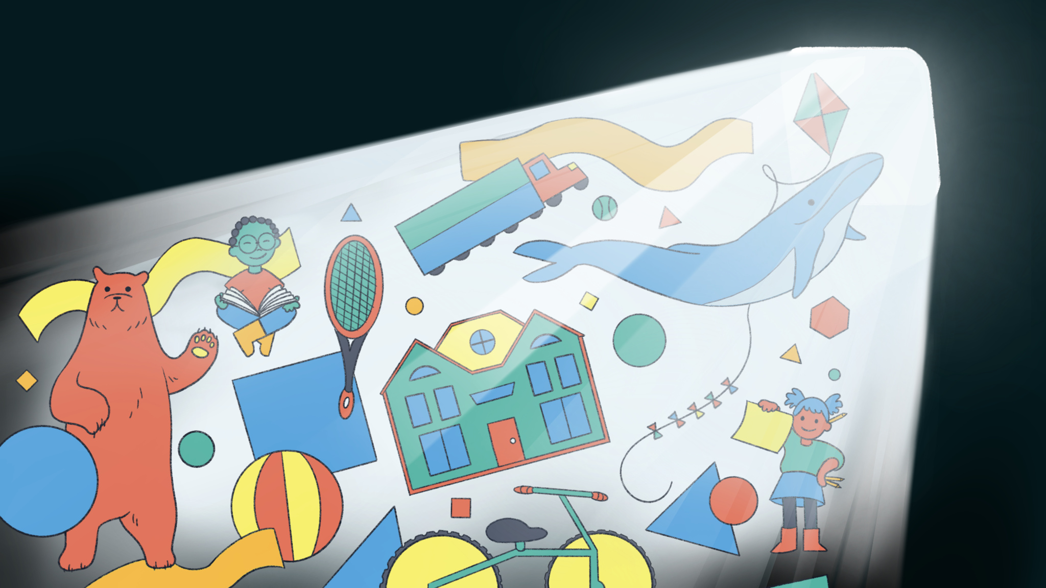
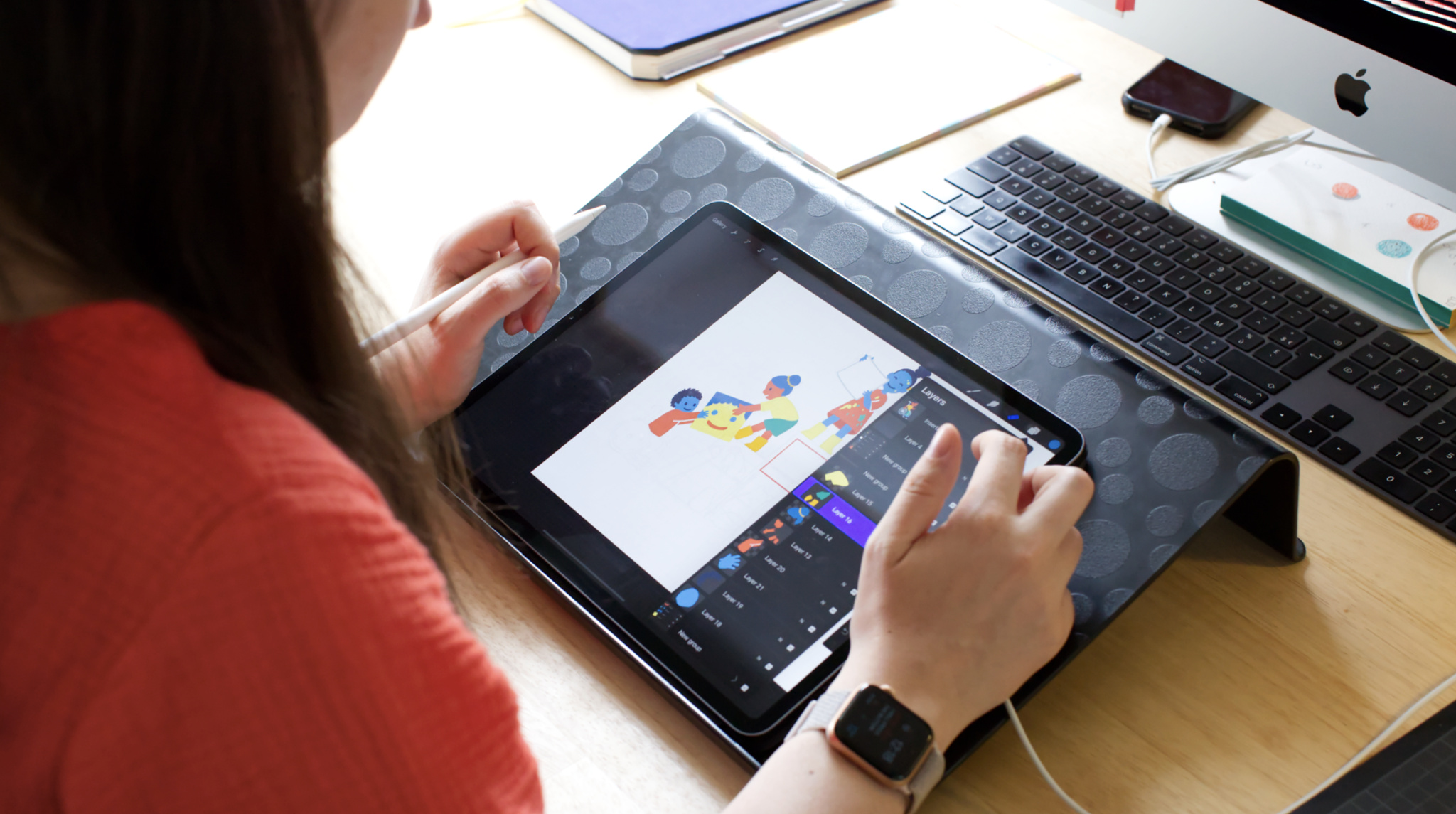
But the little boat (and its guidelines) proved inspiring. The new strategy — a mix of free play with friendly guidelines — also gave her room to experiment. “I didn’t want the artwork to be perfect, because that would mean I’d have to animate everything perfectly. The rule was that everything could jitter a little bit, which took a lot of the pressure off me. Making everything too clean and too nice would have been too much work, especially since it was often just me drawing with one hand with a baby in the other.” (Fun fact: All of Pok Pok’s designs began as iPad sketches.)
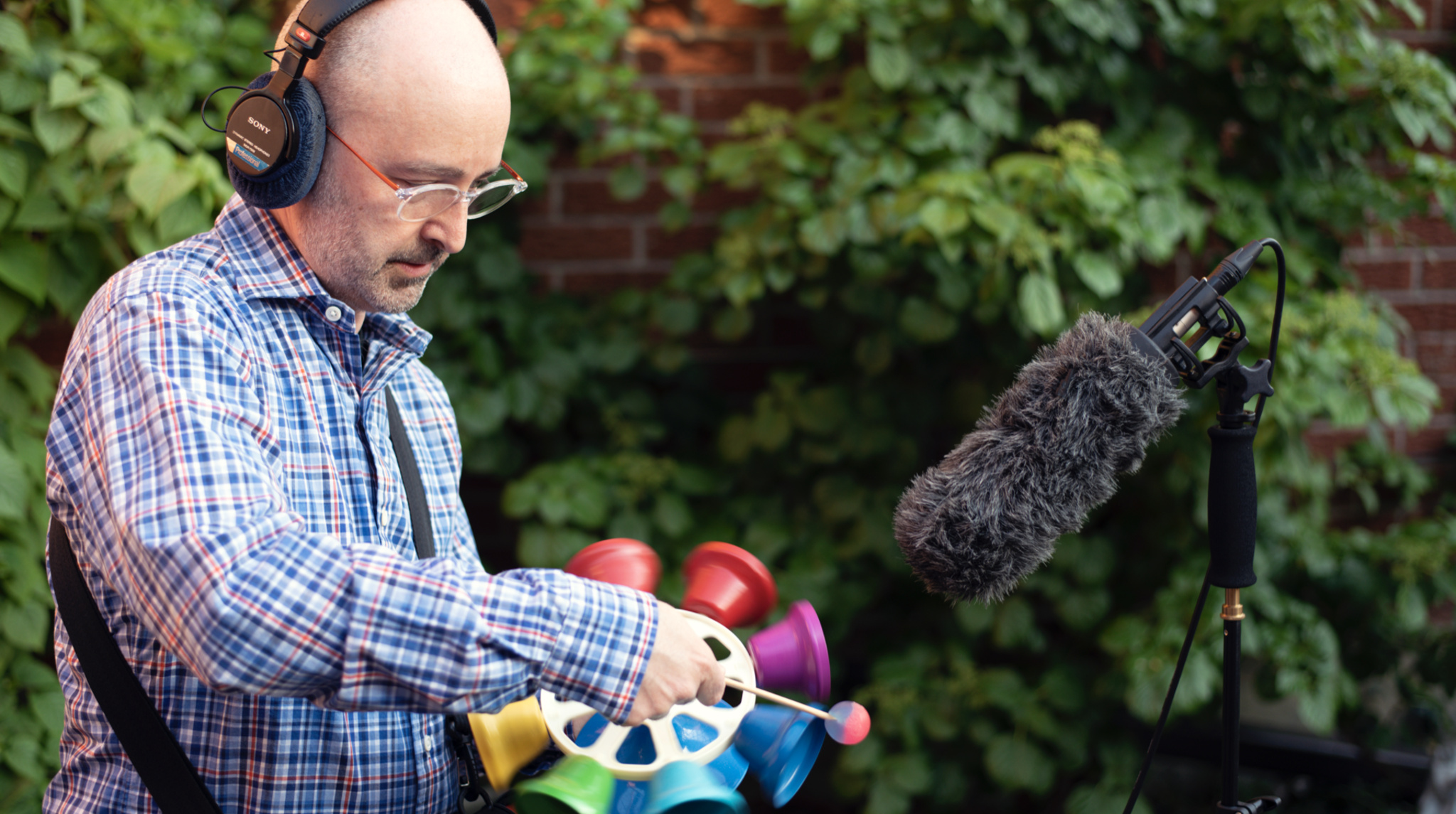
With the visuals in motion, the challenge of matching audio fell to sound designer Matt Miller, who ended up recording every sound in the playroom: all the sloshing mops, sizzling grills, and wordless dialogue. “The idea was to create calming sounds,” says Miller, “something that could be heard a number of times without becoming fatiguing.”

Initially, Miller and Demaeght wanted to use a small number of real-world objects, but they quickly realized that the app’s thousands of animations required a broader arsenal of sounds — so Miller went on a hunt. “I got wooden blocks, pots from the kitchen, stuff I bought at a local thrift store,” Miller says, pointing to a boxes of “Foley objects” in the background of his home studio. “I’d just walk into a music store and start pinging on things.”
His biggest challenge came in the app’s “musical blobs” section, an abstract playspace of movable shapes not unlike that lava lamp you had in college. “We wanted to do something musical,” Huybreghts says, “but every kids’ app that musical has a figurative aspect, where it’s a person or animal singing or using visual recognizable instruments.”
The answer lay in the abstract. “A musical blob is a completely new idea,” Miller says. “A lot has to come together for that to work.” For instance: The color blue is always a C, while circles (the simplest of shapes) are represented by a single sine wave (the simplest of sounds). “There needs to be a consistency.”

Miller also found room for a little play, however: One of his favorite effects involves a dung beetle that raises its back legs and rolls the dung away. “That rolling sound is just me rolling over the edges of a soup can,” he says with a laugh. “When we can be literal, we’re literal. But it’s fun to throw curveballs too.”
In a way, Pok Pok Playroom is a curveball of its own, something that stands out by virtue of its simplicity. “We’re people, we’re not computers building this,” says Huybreghts. “It’s not vector art. It’s all hand-drawn and hand-animated. We’re not a giant, polished company. You can really see everyone’s impression, everyone’s mark, on every single thing they make in the app.”