Behind the Design: Looom
July 3, 2020
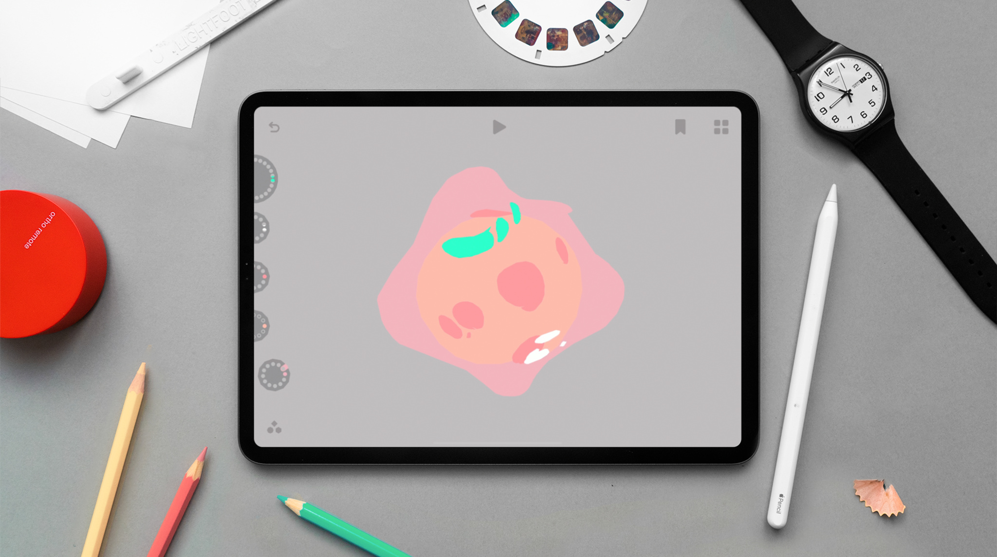
Bringing art to life through drawn animation requires creativity. Imagination. Artistry. And a whole lot of time. Each frame needs to be painstakingly sketched, iterating ever-so- slightly from the previous drawing, before adding any sort of additional flair like colors or backgrounds. It’s often a difficult area to explore — and that’s exactly what Eran Hilleli and Finn Ericson were looking to fix.
Their app, Looom, reimagines animation for the iPad age: It’s “a very playful take,” Hilleli says. It builds off looping and flipbook animation techniques, helping people weave together visuals, time, and rhythms into beautiful repeating animations. Hilleli, who lives in Tel Aviv, Israel, was a visual artist who’d studied animation and filmmaking and was working with students on looping animations when the idea for Looom first surfaced.
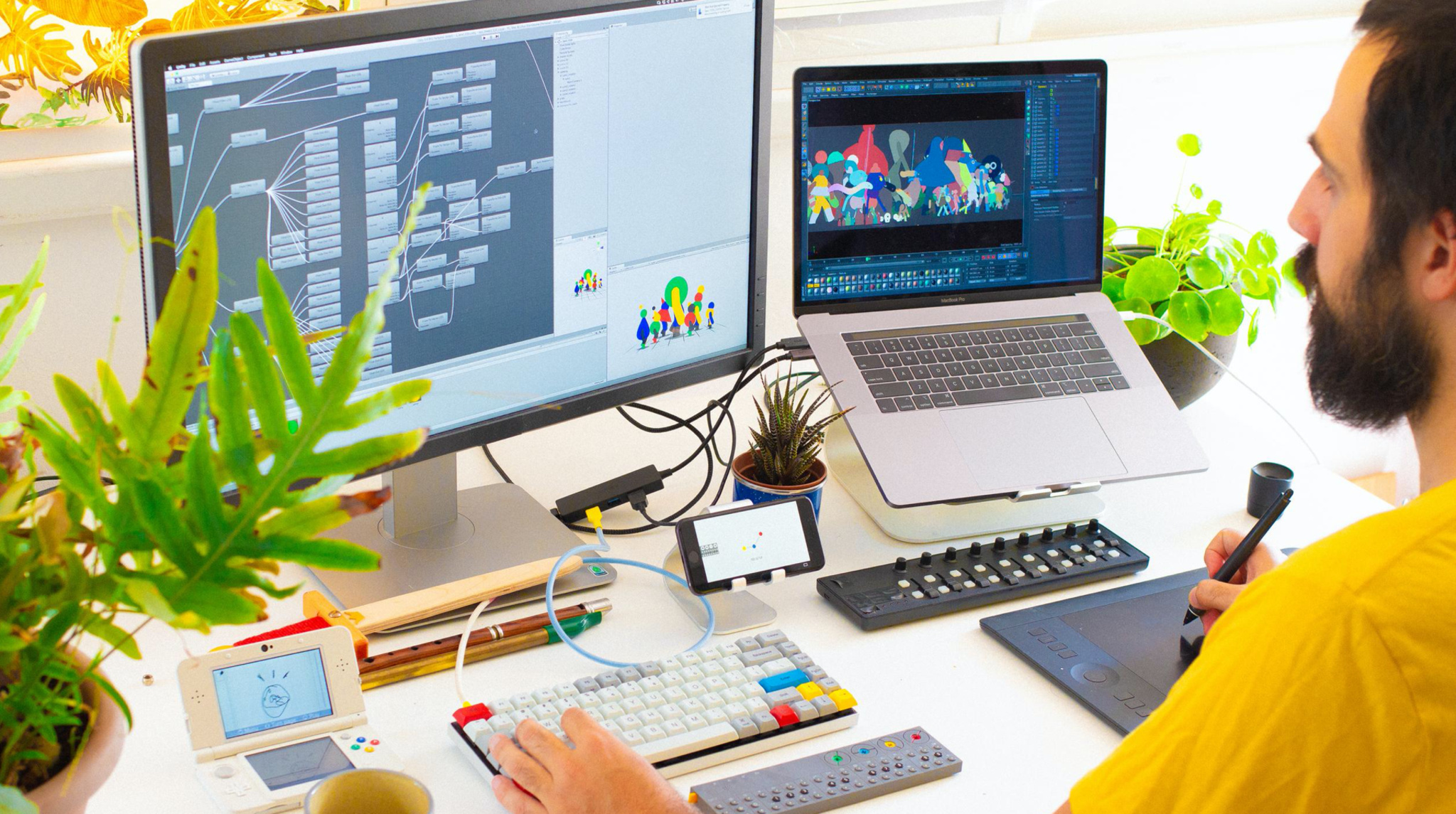
Eran Hilleli is based in Tel Aviv, Israel.
When animating loops, you create a series of frames that begin and end in the same place. More complex forms of looping also involve “weaving” loops together — animating another series of drawings on top of the existing loop to create more complex pieces. Woven loops can be beautiful, but they’re technically challenging, requiring frame duplication and prep work throughout the process. “While teaching students this technique, I started noticing... how our line of thought is cut and how we act while we try to do it,” Hilleli says. “What happens if we make that smoother?”
This thought stayed with Hilleli until he met Finn Ericson during a project. Based in Stockholm, Sweden, Ericson came from the world of music, math, and programming. “We got to know each other and started planning all sorts of little adventures,” Hilleli says, including Looom. Shortly after, they founded iorama studios to begin work on the app.
First and foremost was exploring how to bring the creative energy of animation closer to the process itself. They envisioned a tool that played off the idea of woven loops, allowing people to build sophisticated animations within minutes, all while staying connected to their creativity. “The flow first — experience first,” Hilleli says. “That is the core of the design thought of Looom.”
Central to that flow was landing on the right hardware for such a project. Existing digital tools for drawn animation involved bulky desktop experiences with multiple peripherals. For Looom, Hilleli knew they needed a different approach. “I always imagined something more like a small synthesizer for animation,” Hilleli says. “You could play around, but still create things of essence — it wouldn't be dumbed down too much.”
They found the portability and flexibility they needed in iPad, incorporating both touch interactions and Apple Pencil as they designed the app’s unique interface and interactions. Hilleli and Ericson realized early on that a fixed position control for frame selection wouldn’t work for Looom — even if well-designed, it would still require animators to stop their work to switch to a specific frame.
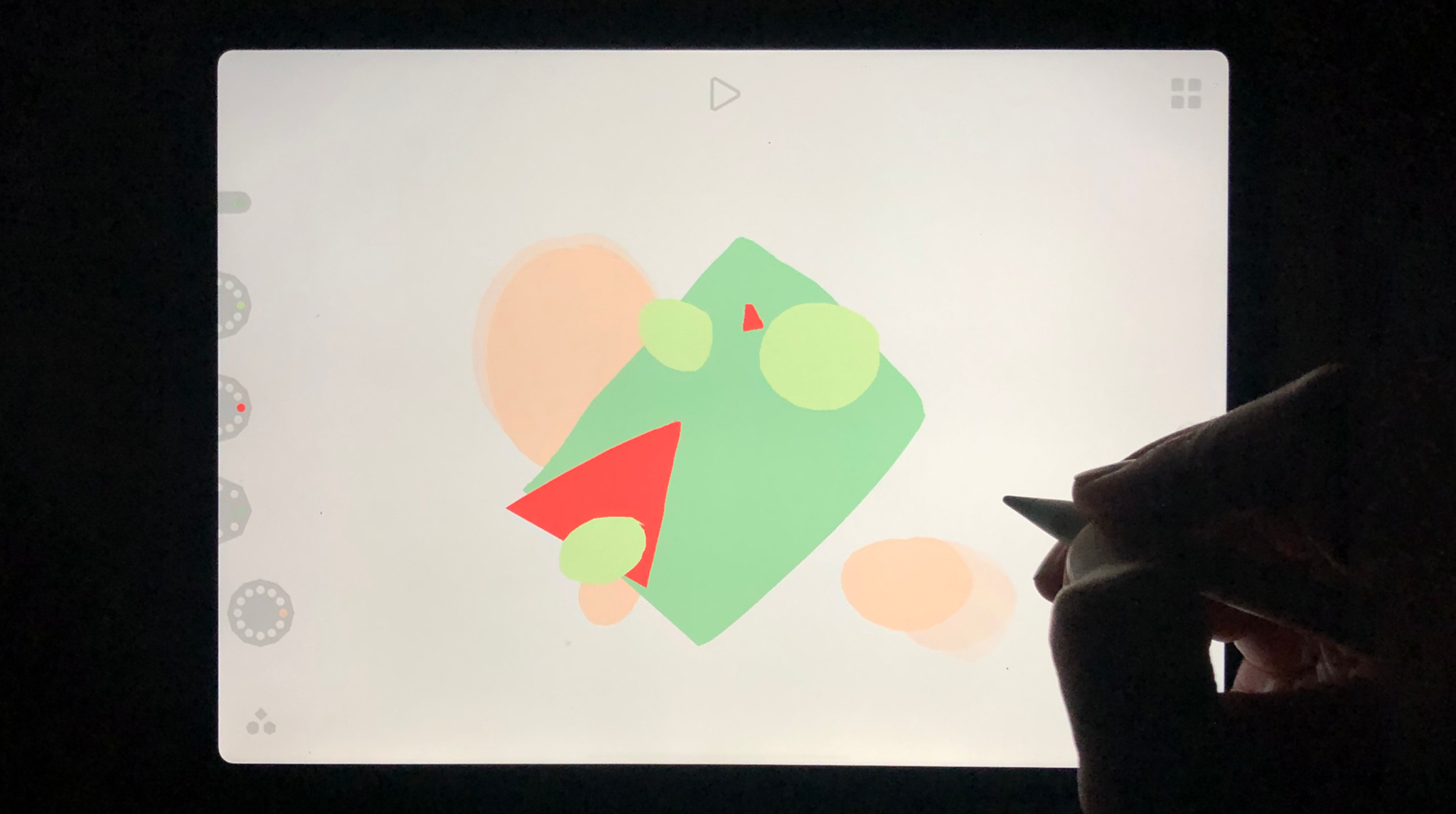
People can interact with Looom using Apple Pencil, touch, or other controllers.
Instead, they let people focus on the drawing experience with Apple Pencil, using their free hand to control timing through touch gestures. “It reminded us of almost like how you interact with a saxophone,” he says of the tactile multi-hand experience.
Hilleli frequently refers to Looom as more instrument than tool — it’s not just a place to complete animation work, but part of the experience and journey itself. “We sometimes say it feels like a toy, but secretly, it's not really,” he confides. “That’s the relationship with playfulness and the creative ability of it.”
That feeling of play and creativity helps make Looom accessible to everyone — children, adults, casual animation buffs, and professional animators alike. First-time animators and casual users can pick up Looom and create animations within minutes. Children can freely explore the app on their own. Although Looom is not a replacement for production tools, seasoned designers and animators use the app to play with new ideas and get their creative juices flowing.
And the app’s interface is intentionally approachable, with icons and elements that echo a hand-drawn look. They’re kept to the edges of the screen, dedicating the majority of Looom’s real estate to the animation canvas, and provide the controls needed without bulky menus or complex controls. Collectively, they create a coherent visual style without competing with someone’s animation. That’s in part, Hilleli notes, why there are no accent colors in the app — to keep the focus on the canvas and the animation itself.
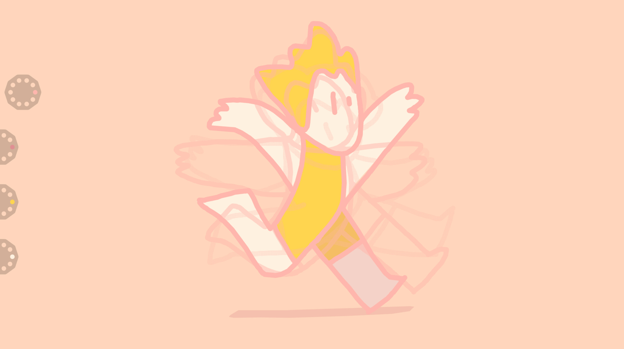
Looom offers a great experience for first-time and experienced animators.
“It’s really important, when you have a creation tool, that the tool doesn't get in the way of your flow of the creative process,” he says. “Looom allows the creator to stay focused on the animation, on the colors, and just really get immersed in the experience of creation, instead of having to be, like, "Where's that button? Where's that control? Do I need to move these things out of the way?"
While there are many more complex animation concepts that Hilleli and Ericson could incorporate, their first priority is the app’s usability. “We’re not trying to shy away from features,” Hilleli says. “But we don’t want to hurt the flow of the tool. It shouldn’t be able to do everything.”
Like the interface of the app, Looom’s logo also went though many iterations before it was finalized. In this case, inspiration came from an unexpected direction: Swedish culture.
The Moomins are a family of characters from a beloved series of children’s stories by Swedish author Tove Jansson. Hilleli was watching an animated version of the series and saw a particularly beautiful shot of clouds flying towards the viewer on a blue sky. He was charmed by the simplicity and beauty of the simple shapes, and decided to play with the cloud form and shape it into what eventually became the Looom logo. “Sometimes, we let weird coincidence lead the way,” Hilleli says.
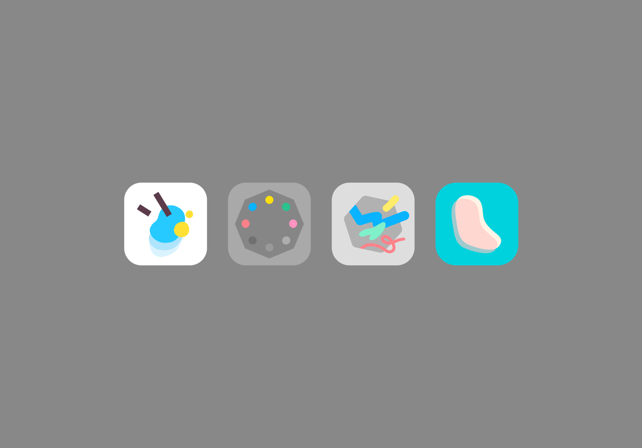
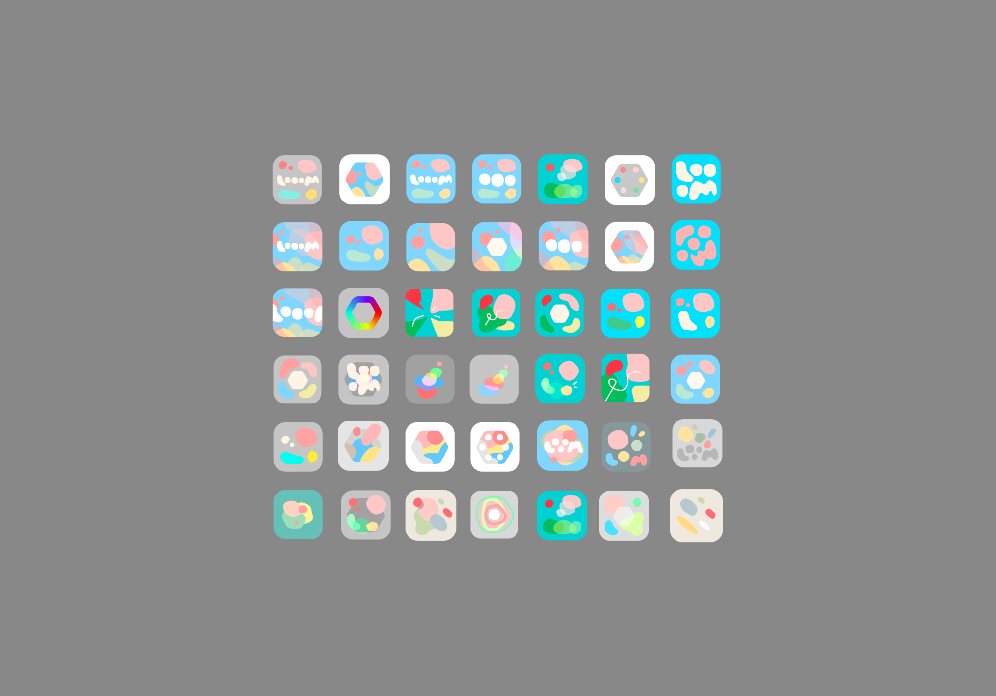
Looom’s final icon was inspired by the simplicity and beauty of cloud formations.
Looom is Hilleli and Ericson’s first app together, and winning an Apple Design Award was unexpected for them both. “It's amazing,” Hilleli says. “We have put so much love into this thing. We don't necessarily come from the app developer world, but we just wanted to make this... and having Apple recognize this so quickly is incredible.”
Hilleli’s advice for fellow app developers working on their next big thing? Don’t plan it all out in advance. “It's really great to let a small sapling grow,” he says. “Let that inform you into places or decisions that you didn't even imagine.”
Download Looom from the App Store
Behind the Design is a series that explores design practices and philosophies from each of the winners of the Apple Design Awards. In each story, we go behind the screens with the developers and designers of these award-winning apps and games to discover how they brought their remarkable creations to life.