-
Obtén información sobre CSS Grid Lanes
Crea diseños web adaptables que se ajusten a contenidos de todo tipo y tamaño. Descubre cómo Grid Lanes te permite organizar elementos de diferentes formas en diseños limpios y flexibles con un sencillo CSS. Además, descubre cómo la tolerancia al flujo te ayuda a mejorar la accesibilidad sin perder la flexibilidad de tus diseños.
Capítulos
- 0:00 - Introducción
- 1:35 - CSS Flexbox y Grid
- 2:45 - CSS Grid Lanes
- 3:55 - Crea un contenedor de Grid Lanes
- 4:31 - Implementa la variación de patrón de ladrillo
- 4:49 - Experimenta con diferentes diseños
- 5:40 - Controla cada elemento individualmente
- 7:05 - Tolerancia de flujo
- 8:46 - Inspector web
- 9:20 - Próximos pasos
Recursos
- WebKit.org - CSS Grid Lanes Field Guide
- WebKit.org – Report issues to the WebKit open-source project
- Submit feedback
Videos relacionados
WWDC26
-
Buscar este video…
-
-
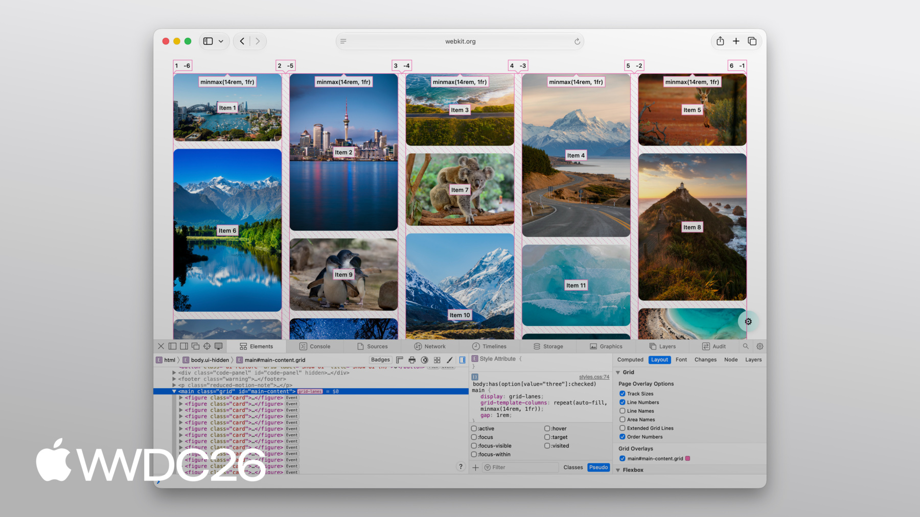
3:58 - Create a Grid Lanes Container
.container { display: grid-lanes; } -
4:02 - Create a Grid Lanes Container
.container { display: grid-lanes; grid-template-columns: repeat(3, 1fr); } -
4:26 - Create a Grid Lanes Container
.container { display: grid-lanes; grid-template-columns: repeat(3, 1fr); gap: 10px; } -
4:33 - Implement a Brick Variation
.container { display: grid-lanes; grid-template-columns: repeat(3, 1fr); gap: 10px; } -
4:36 - Implement a Brick Variation
.container { display: grid-lanes; grid-template-rows: repeat(3, 1fr); gap: 10px; } -
4:58 - Experiment with different layouts
.container { display: grid-lanes; grid-template-columns: 1fr 1fr 1fr; gap: 10px; } -
5:02 - Experiment with different layouts
.container { display: grid-lanes; grid-template-columns: 1fr 2fr 1fr; gap: 10px; } -
5:10 - Experiment with different layouts
.container { display: grid-lanes; grid-template-columns: repeat(auto-fill, minmax(200px, 1fr)); gap: 10px; } -
5:24 - Experiment with different layouts
.container { display: grid-lanes; grid-template-columns: repeat(auto-fill, minmax(8rem, 1fr) minmax(14rem, 2fr); gap: 10px; } -
5:45 - Control Individual Items
.container { display: grid-lanes; grid-template-columns: 1fr 1fr 1fr; gap: 10px; } -
5:59 - Control Individual Items
.container { display: grid-lanes; grid-template-columns: 1fr 1fr 1fr; gap: 10px; } .item { grid-column: span 2; } -
6:07 - Control Individual Items
.container { display: grid-lanes; grid-template-columns: 1fr 1fr 1fr; gap: 10px; } .item { grid-column: 2 / span 2; } -
6:22 - Integrate Subgrid
.container { display: grid-lanes; grid-template-columns: 1fr 1fr 1fr; gap: 10px; } .item { grid-column: span 2; } -
6:34 - Integrate Subgrid
.container { display: grid-lanes; grid-template-columns: 1fr 1fr 1fr; gap: 10px; } .item { display: grid-lanes; grid-template-columns: subgrid; grid-column: span 2; } -
6:48 - Integrate Subgrid
.container { display: grid-lanes; grid-template-columns: 1fr 1fr 1fr; gap: 10px; } .item { display: grid; grid-template-columns: subgrid; grid-column: span 2; } -
8:37 - Improve item positioning
.container { display: grid-lanes; grid-template-columns: 1fr 1fr; gap: 10px; flow-tolerance: normal; } -
8:41 - Improve item positioning
.container {
	display: grid-lanes;
  grid-template-columns: 1fr 1fr;
  gap: 10px;
  flow-tolerance: 2.1em;
}
-