Behind the Design: Darkroom
August 14, 2020

Photography has become an uniquely accessible art: Anyone with a mobile device like iPhone or iPad can capture a bit of beauty from their everyday lives, no training or expertise necessary. It offers us the chance to preserve snippets of time in digital form — a daughter’s 5th birthday, a musky August evening in the height of summer — and, if desired, edit them to provide the photographer’s distinct perspective before saving or sharing with the waiting world.
Majd Taby, founder and CEO of Darkroom, found himself captivated by iPhone’s potential as camera, editor, and publisher early on. He joined Instagram in the early 2010s, and fell hard for mobile photography. After a few years, he’d amassed a veritable collection of photography apps for his own artistic explorations — but found himself frequently frustrated by the workflow.
“I was doing the same thing over and over and over and over [for each image],” Taby says. “Each [app] was doing one thing very well, but it was nonetheless doing one thing — and I had to do four things for each photo.”
During a hike in Norway in 2014, Taby started dreaming up the perfect editing tool for mobile photography — an end-to-end photo editing and management solution that was mobile-only and optimized for the entire image lifecycle without needless imports, exports, or workflow muddling. “I wanted to build something that would allow me to express myself consistently with a consistent aesthetic without doing a lot of work,” he says.

Taby left Instagram to found his own studio, Bergen (named after the Norwegian city where it all began), and began working on the app that would become Darkroom. While he planned for the end product to offer a hefty array of features, Taby was determined to keep the app feeling fresh and accessible to anyone on their photography journey. “There was a quote that I kept saying to myself like a mantra,” Taby says. "’We are trying to make photo editing as easy as photo browsing.’”
That meant prioritizing a simple workflow for images. Rather than force someone to duplicate, import, or export images from their photo library, they would be able to work directly with their photos, preview them, and save or discard changes with a few taps. Early on, the team would even measure taps per action in various mobile photography apps, and find ways to simplify comparable tasks in Darkroom.
“Speed ends up being the DNA of everything we do,” Taby says. “We wanted photographers... to forget that they're in an app doing photo editing and to just think of the stories that they're trying to tell.”
Our philosophy is that good design is also obvious design. Because obvious design means that it's fast to learn, because it's obvious. It means it's easy to use, because it's obvious. It means you've started with the simplest, most straightforward approach to a problem rather than complicating it. And so making sure that we don't focus on form on its own, but form in the service of function and vice versa.
Majd Taby, Darkroom founder
This focus on workflow has reverberated through the app’s core design since Darkroom’s initial 2015 release. “The design kind of just fell out of functionality constraints that we had,” says Taby. “Our aim is for everything to be easy for everybody — which is impossible — but an aspiration we hold ourselves to.”
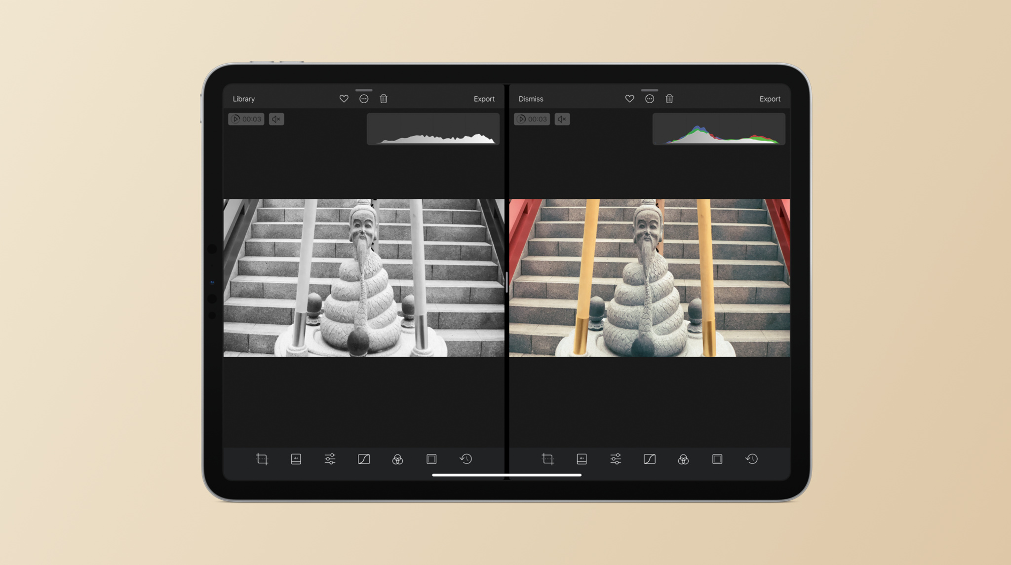
Darkroom takes that philosophy to heart: On launch, the app’s interface is geared toward the items a casual photographer might want to explore. Controls are represented with evergreen symbols and simple highlight colors so as to make the options clear without detracting from the photography. “The first question we ask ourselves is: ‘What is the most obvious implementation of this idea?’” Taby says. “Obvious design has a stigma of being dull, but to us, it means easy, and it means fast.”

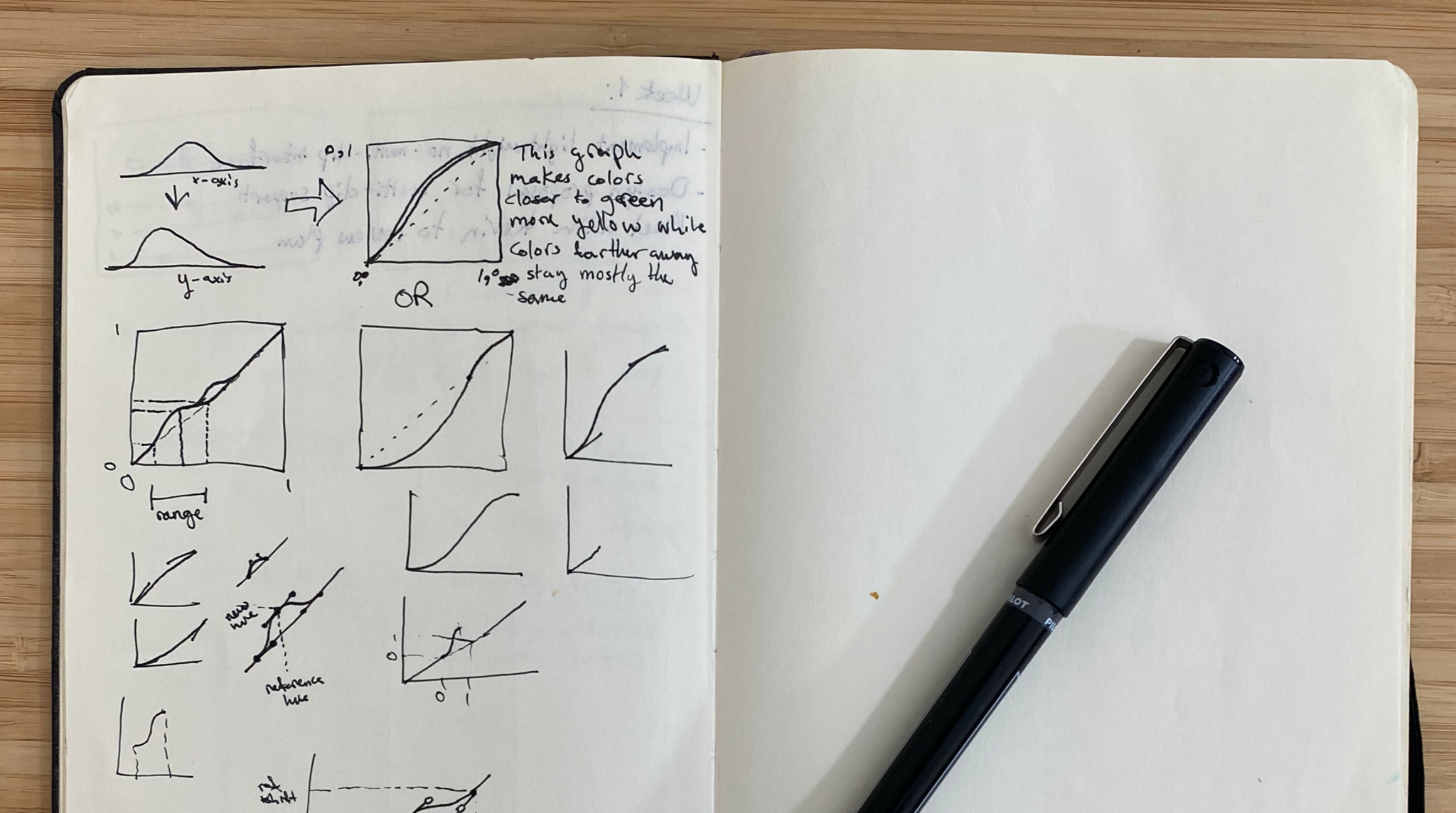
Taby experimented with ideas for Darkroom during his trip to Norway.
One of the challenges of obvious design, however, is that photographers may not grasp Darkroom’s full capabilities at first glance. “Where we can, we try to make advanced features so easy that they become accessible [to all],” Taby says. “Where that’s not possible, we keep advanced features behind an explicit action.”
The team has improved feature discovery through the onboarding experience and hint system, and they’ve also explored surfacing different controls on different devices. On iPad, for example, the larger screen allows Darkroom to surface more complex controls like batch processing and RAW editing without overloading the interface.

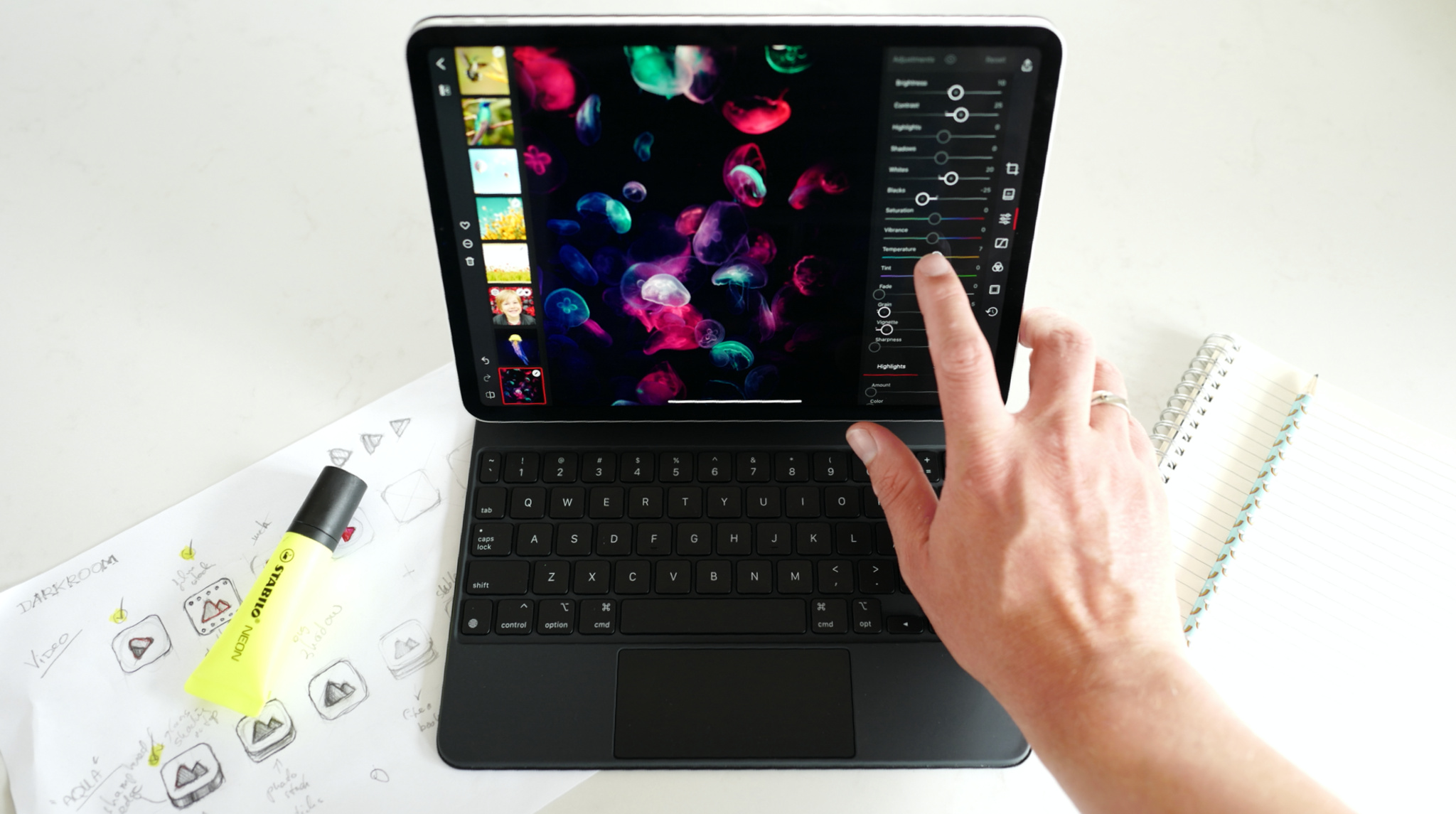
The team also deeply integrated Darkroom with iOS and iPadOS to support nearly every system feature, such as keyboard and trackpad navigation, Siri shortcuts, Files integration, extensions, and more. This allows photographers to optimize their editing workflow based on how they use their devices. And the team continues to look for novel ways to use new features and help photographers take full advantage of their hardware and iCloud services.
“Ultimately what we're trying to do is build things to make people's lives better,” Taby says. “We choose to adopt Apple's technologies and we choose to live in Apple's world because we believe that it's an example of the philosophies that we are trying to put into our products.”
We try not to over-design, and we try not to design for its own sake. Design for its own sake is wasteful. It's not in the service of something greater. Because design is not the end goal. The things that we design are the products that we share with the world.
Majd Taby, Darkroom founder
Darkroom turns five this year. After winning an Apple Design Award, Taby and the team at Bergen Co. are proud of what they’ve accomplished — and excited to keep moving forward. “As long as you know what you're doing and who you're doing it for, and as long as you have a personal conviction in what you're doing,” says Taby, “just focus on that and the rest will follow.”
Download Darkroom from the App Store
Behind the Design is a series that explores design practices and philosophies from each of the winners of the Apple Design Awards. In each story, we go behind the screens with the developers and designers of these award-winning apps and games to discover how they brought their remarkable creations to life.