-
Create rich documentation with Swift-DocC
Learn how you can take advantage of the latest features in Swift-DocC to create rich and detailed documentation for your app or framework. We'll show you how to use the Xcode 15 Documentation Preview editor to efficiently iterate on your existing project's documentation, and explore expanded authoring capabilities like grid-based layouts, video support, and custom themes.
To get the most out of this session, you should have a working knowledge of the basics of Swift-DocC documentation.Chapitres
- 0:00 - Introduction and overview of Swift-DocC
- 3:33 - Building and browsing documentation in Xcode
- 6:21 - Documenting Swift extensions
- 8:05 - Activating the Documentation Preview editor
- 9:44 - Adding an image to your documentation
- 12:06 - Organizing documentation pages into Topic Groups
- 13:53 - Using Swift-DocC directives to create rich documentation pages
- 25:12 - Theming the online version of your documentation
- 28:29 - Publishing and browsing documentation on the web
- 31:02 - Quick navigation
Ressources
Vidéos connexes
WWDC23
WWDC22
WWDC21
-
Rechercher dans cette vidéo…
-
-
8:52 - Documenting a Swift extension
import SwiftUI /// An extension that facilitates the display of sloths in user interfaces. public extension Image { /// Create an image from the given sloth. /// /// Use this initializer to display an image representation of a /// given sloth. /// /// ```swift /// let iceSloth = Sloth(name: "Super Sloth", color: .blue, power: .ice) /// /// var body: some View { /// Image(iceSloth) /// .resizable() /// .aspectRatio(contentMode: .fit) /// Text(iceSloth.name) /// } /// ``` /// ///  /// /// This initializer is useful for displaying static sloth images. /// To create an interactive view containing a sloth, use ``SlothView``. init(_ sloth: Sloth) { self.init("\(sloth.power)-sloth") } } -
16:31 - Creating a grid-based layout
@Row { @Column(size: 2) { First, you customize your sloth by picking its ``Sloth/power-swift.property``. The power of your sloth influences its abilities and how well they cope in their environment. The app displays a picker view that showcases the available powers and previews your sloth for the selected power. } @Column {  } } @Row { @Column {  } @Column(size: 2) { Once you've customized your sloth, it's ready to ready to thrive. You'll find that sloths will happily munch on a leaf, but may not be as receptive to working out. Use the activity picker to send some encouragement. } } -
18:16 - Creating a tab navigator
@TabNavigator { @Tab("English") {  } @Tab("Chinese") {  } @Tab("Spanish") {  } } -
19:07 - Adding a video
@Video(poster: "slothy-hero-poster", source: "slothy-hero", alt: "An animated video showing two screens in the Slothy app. The first screenshot shows a sloth map and the second screenshot shows a sloth power picker.") -
19:50 - Specifying a page's "Call to Action" link
@Metadata { @CallToAction(purpose: link, url: "https://example.com/slothy-repository") } -
20:29 - Specifying a page's kind as "Sample Code"
@Metadata { @CallToAction(purpose: link, url: "https://example.com/slothy-repository") @PageKind(sampleCode) } -
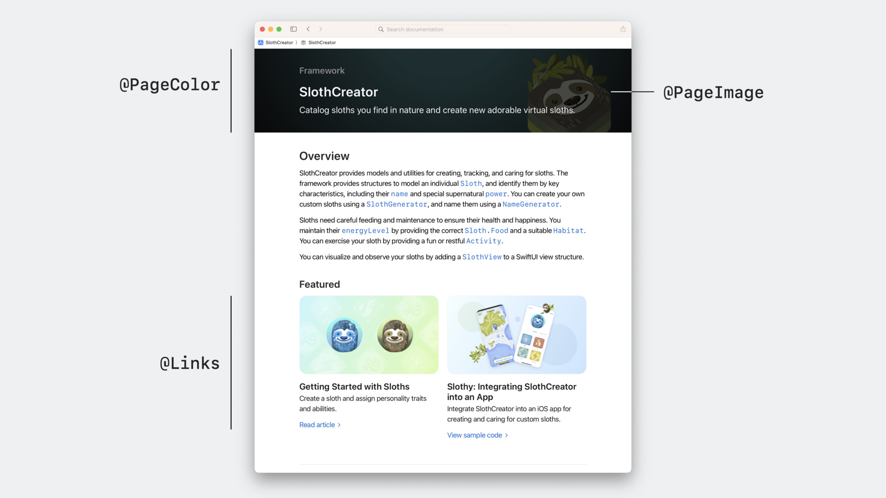
21:55 - Using the "Links" directive to feature content
@Links(visualStyle: detailedGrid) { - <doc:GettingStarted> - <doc:SlothySample> } -
22:55 - Specifying a page's card image
@Metadata { @PageImage( purpose: card, source: "slothy-card", alt: "Two screenshots showing the Slothy app. The first screenshot shows a sloth map and the second screenshot shows a sloth power picker.") } -
23:41 - Specifying a page's icon image
@Metadata { @PageImage( purpose: icon, source: "slothCreator-icon", alt: "A technology icon representing the SlothCreator framework.") } -
23:42 - Specifying a page's color
@Metadata { @PageColor(green) } -
27:04 - theme-settings.json
{
    "theme": {
        "color": {
            "standard-green": "#83ac38"
        },
        "typography": {
            "html-font": "serif"
        }
    }
}
-