-
Learn CSS Grid Lanes
Build adaptive web layouts that embrace content of all shapes and sizes. Explore how Grid Lanes lets you arrange differently-shaped elements into clean, flexible designs with simple CSS. And find out how flow-tolerance helps you refine accessibility while keeping your layouts malleable.
Chapters
- 0:00 - Introduction
- 1:35 - CSS Flexbox and Grid
- 2:45 - CSS Grid Lanes
- 3:55 - Build a Grid Lanes container
- 4:31 - Implement brick variation
- 4:49 - Experiment with different layouts
- 5:40 - Control individual items
- 7:05 - Flow Tolerance
- 8:46 - Web Inspector
- 9:20 - Next steps
Resources
- WebKit.org - CSS Grid Lanes Field Guide
- WebKit.org – Report issues to the WebKit open-source project
- Submit feedback
Related Videos
WWDC26
-
Search this video…
Hi, I'm Brandon, an engineer on the Safari team. Today, I'm excited to share CSS Grid Lanes, a new layout mode for the web. If you've ever wanted a design, where items of any size flow naturally into the space available, I'm going to show you how to build it — in just a few lines of CSS.
You may already know this pattern by another name: masonry layout. Think of a waterfall — content flows naturally down the page in columns, each item settling into place beneath the last. Flip the direction and it becomes a brick wall where items flow across the page in rows. And the best part: you don't have to wait for it. Grid Lanes is available today in Safari 26.4 and behind a flag in other browsers.
If you've ever tried to build this layout, you know it's not straightforward. You've probably reached for a JavaScript library, or improvised with floats or Flexbox that almost works — until it doesn't. CSS Grid Lanes is built for exactly this.
To understand Grid Lanes, it helps to zoom out and think about what a layout mode actually does. Every layout mode answers the same two questions: where do items go, and how much space do they get? Flexbox and Grid each answer those questions differently.
Grid Lanes is a new mode that fits somewhere in between. Here's what I mean by that: Flexbox, for example, gives you one axis and a single lane of items flowing along it. When items wrap, they continue flowing in the same direction. You choose that direction: row or column, and items are placed one after another.
Switch to column, and the same rule applies — items flow top to bottom, wrapping into the next column over.
Grid takes a different approach. Where Flexbox gives you one axis, Grid gives you two: columns and rows. Grid places items into cells at the intersection of those tracks. But when items have different aspect ratios, you end up with large empty areas where shorter items don't fill their cells.
Now, if these boxes were images, we've really only got three options, and none are great. We could stretch each image to fill its cell, but that distorts them. Or you could zoom in and fill the space, but now the image is overflowing the bounds of its container.
You may also crop the image, but you risk losing important information.
That's where Grid Lanes comes in. It sits between Grid and Flex. Instead of structuring across two dimensions like Grid, it structures just one, and leaves the other free. But unlike Flex, where content flows in a single lane and wraps down the page, Grid Lanes distributes content across multiple lanes.
The result is a tightly packed, staggered layout that preserves each item's natural proportions. Items are placed one by one, and each one lands in whichever column leaves it closest to the top.
That's why earlier items sit higher up, and later items fill in below.
So far, everything's been images. But Grid Lanes isn't picky, it works with any kind of content.
Try adding some text. Each block wraps to fit its column, and the browser sizes the heights for you. And if something needs to stand out, like a headline, you can span it across columns.
And it doesn't matter what you change - different shapes, different sizes, or a totally different design. Grid Lanes handles it.
So you've seen what Grid Lanes can do. Now, let's build one.
We start with a new display type — grid-lanes. Then we define the columns. grid-template-columns sets the number of tracks and how wide each track becomes.
You'll notice the fr unit here. fr stands for 'fractional unit'. It tells the browser to take the available space in the container and divide it up into fractions. So, this piece of code says to divide the space, into three equal fractions, creating three columns all equally sized.
And add a gap of 10px, just like you do with Grid.
Want to flip this into a brick wall instead? Just swap the columns for rows.
Replace the grid-template-columns property with grid-template-rows and watch the layout turn into a brick wall.
The only catch: you pick one direction - not both.
That's Grid Lanes in three lines of CSS. But those three lines give you more control than you might expect. Let me show you what I mean.
I start here with three equal columns.
But my columns don't have to be equal. Here, the center column takes up twice the space of the left and right columns. Now, instead of picking the number of columns yourself, let the browser decide. auto-fill creates as many columns as will fit. minmax() says each one should be at least 200 pixels, but can grow to fill the space. Take that same idea, but now with a repeating pattern of narrow and wide columns.
Honestly, what I love most is how much you can do with just a few lines of CSS. Once you start exploring, I think you'll be amazed too.
So that's the layout. But Grid Lanes also lets you shape individual items. Let's start again with a simple grid-lanes container with 3 equally sized columns. I'd love to give the orange colored item more space. With Grid Lanes, I can do that using properties that already exist in Grid.
With grid-column: span 2; the item stretches across two columns, and the rest of the layout adjusts around it.
Or, place it exactly where you want it. Here I set the item to start in column 2, spanning columns 2 and 3. Notice you can control column placement, but not row. Grid Lanes decides the row for you.
I've turned one of our items into a recipe card that spans two columns. Inside the card is an image and some text, neither of which participate in the Grid Lanes layout.
Add display: grid-lanes and grid-template-columns: subgrid to the card, and its contents join the parent layout as their own items. The image takes one column, the text takes the other, each sized to its content.
And you can nest them however you like. A regular grid inside a Grid Lanes container, or the other way around. The same tools and syntax you already know carry over, so Grid Lanes just fits right in.
Grid Lanes places each item in whichever column is the shortest. Most of the time, that looks great. But sometimes… it doesn't quite feel right.
That's where flow tolerance comes in. The browser normally picks the shortest column for the next item. Flow tolerance is the dial that loosens or tightens that rule. I'll break that down.
Looking at this layout, the two items in a row here are almost the same height, but not quite. That second item is a few pixels shorter than item 1.
That means the area under item 2 is closer to the top of my container, so the second column is where the browser will place my next item, and item 4 will fill in the first column.
This makes our item layout go from left-to-right on the first row, and right-to-left on our last row. The difference between tab order and how the content appears visually will impact accessibility for people and can create a confusing experience. Now turn flow-tolerance on. We're back to two items in two columns, but flow-tolerance changes the rules. For each new item, the browser asks the same question: is the taller column less than the shorter column plus flow-tolerance? For item 3, yes - the gap is within tolerance, so it fills column 1.
But now column 1 is even taller. For item 4, the gap is too big to ignore, so it drops into the shorter column: column 2.
By default, Grid Lanes uses a flow-tolerance of 1em.
Try different flow-tolerance values to find what works for your content.
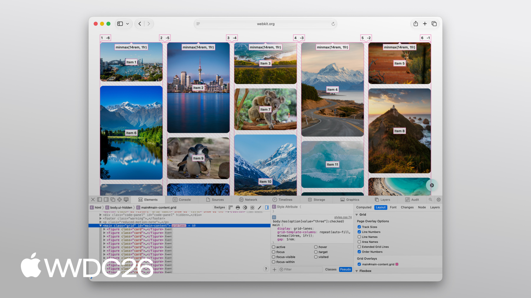
Flow-tolerance is great when it works for your content, but the flip side of giving the browser flexibility is that sometimes the result may surprise you. And when that happens, pop open Web Inspector to figure out what's going on.
The good news is, Web Inspector has full support for Grid Lanes.
You get lines showing your columns and rows.
You get order numbers projected right over each item, so you can see exactly how items are placed.
And it even draws in the gaps between items.
All of that, just by turning on the overlay.
CSS Grid Lanes gives you a layout that used to require JavaScript in just a few lines of CSS. It builds on what you already know from Grid, and it adapts to your content, not the other way around.
It's a great addition to the web platform, and I can't wait to see what you build with it.
Check out the Grid Lanes Field Guide the WebKit team created for you for detailed walkthroughs and interactive demos where you can experiment with every property we covered today.
Try grid-lanes in your own projects. It's been available since Safari 26.4, and we think it can genuinely change how you approach image-heavy layouts. And share your feedback. We'd love to hear how grid-lanes is working for you and what you'd like to see next.
To learn about all of the other features coming to Safari, be sure to check out "What's new in WebKit for Safari 27". Thanks for watching and have a great WWDC!
-
-
3:58 - Create a Grid Lanes Container
.container { display: grid-lanes; } -
4:02 - Create a Grid Lanes Container
.container { display: grid-lanes; grid-template-columns: repeat(3, 1fr); } -
4:26 - Create a Grid Lanes Container
.container { display: grid-lanes; grid-template-columns: repeat(3, 1fr); gap: 10px; } -
4:33 - Implement a Brick Variation
.container { display: grid-lanes; grid-template-columns: repeat(3, 1fr); gap: 10px; } -
4:36 - Implement a Brick Variation
.container { display: grid-lanes; grid-template-rows: repeat(3, 1fr); gap: 10px; } -
4:58 - Experiment with different layouts
.container { display: grid-lanes; grid-template-columns: 1fr 1fr 1fr; gap: 10px; } -
5:02 - Experiment with different layouts
.container { display: grid-lanes; grid-template-columns: 1fr 2fr 1fr; gap: 10px; } -
5:10 - Experiment with different layouts
.container { display: grid-lanes; grid-template-columns: repeat(auto-fill, minmax(200px, 1fr)); gap: 10px; } -
5:24 - Experiment with different layouts
.container { display: grid-lanes; grid-template-columns: repeat(auto-fill, minmax(8rem, 1fr) minmax(14rem, 2fr); gap: 10px; } -
5:45 - Control Individual Items
.container { display: grid-lanes; grid-template-columns: 1fr 1fr 1fr; gap: 10px; } -
5:59 - Control Individual Items
.container { display: grid-lanes; grid-template-columns: 1fr 1fr 1fr; gap: 10px; } .item { grid-column: span 2; } -
6:07 - Control Individual Items
.container { display: grid-lanes; grid-template-columns: 1fr 1fr 1fr; gap: 10px; } .item { grid-column: 2 / span 2; } -
6:22 - Integrate Subgrid
.container { display: grid-lanes; grid-template-columns: 1fr 1fr 1fr; gap: 10px; } .item { grid-column: span 2; } -
6:34 - Integrate Subgrid
.container { display: grid-lanes; grid-template-columns: 1fr 1fr 1fr; gap: 10px; } .item { display: grid-lanes; grid-template-columns: subgrid; grid-column: span 2; } -
6:48 - Integrate Subgrid
.container { display: grid-lanes; grid-template-columns: 1fr 1fr 1fr; gap: 10px; } .item { display: grid; grid-template-columns: subgrid; grid-column: span 2; } -
8:37 - Improve item positioning
.container { display: grid-lanes; grid-template-columns: 1fr 1fr; gap: 10px; flow-tolerance: normal; } -
8:41 - Improve item positioning
.container {
	display: grid-lanes;
  grid-template-columns: 1fr 1fr;
  gap: 10px;
  flow-tolerance: 2.1em;
}
-
-
- 0:00 - Introduction
Learn about CSS Grid Lanes, a new layout mode for masonry-style "waterfall" and "brick wall" design patterns in just a few lines of CSS, available now in Safari 26.4.
- 1:35 - CSS Flexbox and Grid
Understand what a layout mode actually does and see why Flexbox and Grid fall short for content with mixed aspect ratios, where stretching, zooming, and cropping all distort your design.
- 2:45 - CSS Grid Lanes
Learn how Grid Lanes fits between Grid and Flexbox, structuring one axis while leaving the other free so items pack tightly without distortion. Each item lands in whichever column leaves it closest to the top, and the same rules apply to images, text, or any other content.
- 3:55 - Build a Grid Lanes container
Build your first Grid Lanes layout in three lines of CSS: `display: grid-lanes`, `grid-template-columns` with `fr` units to divide available space into fractions, and `gap` to space items apart.
- 4:31 - Implement brick variation
Flip the layout 90 degrees by swapping `grid-template-columns` for `grid-template-rows` to flow items horizontally into a brick-wall layout. Grid Lanes structures one direction at a time — pick columns or rows, not both.
- 4:49 - Experiment with different layouts
Use the full power of CSS track sizing inside Grid Lanes: unequal column widths, `auto-fill` with `minmax()` to let the browser choose how many columns fit, and repeating patterns of narrow and wide columns.
- 5:40 - Control individual items
Shape individual items using familiar Grid properties — `grid-column: span 2` to stretch an item across columns, explicit column placement (rows are still chosen for you), and `grid-template-columns: subgrid` to align nested content with the parent layout.
- 7:05 - Flow Tolerance
Discover why the shortest-column rule can produce visually pleasing layouts that confuse keyboard users when DOM order and visual order diverge. The `flow-tolerance` property loosens the rule so items prefer to fill earlier columns when heights are similar, with a default of `1em` you can tune to your content.
- 8:46 - Web Inspector
Debug Grid Lanes layouts visually with Safari Web Inspector. Turn on the overlay to see column and row lines, gaps, and order numbers projected over each item — useful when tuning `flow-tolerance` or diagnosing surprising placements.
- 9:20 - Next steps
Explore the WebKit team's Grid Lanes Field Guide for interactive demos, try Grid Lanes in your own projects (available in Safari 26.4), and share feedback with the team. To see what else is coming to Safari, watch "What's new in WebKit for Safari 27."