

-
Design for iPhone Duo
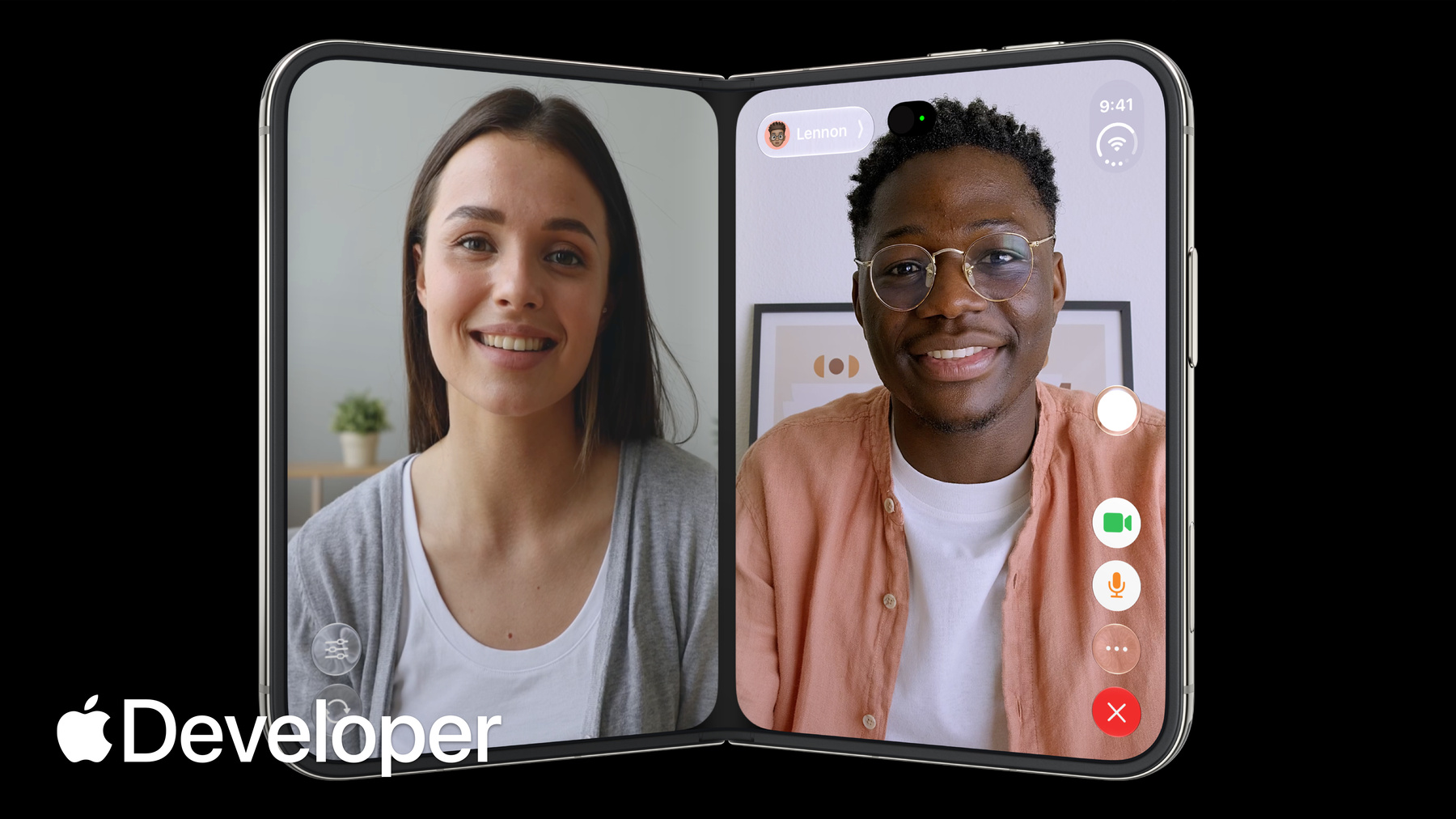
iPhone Duo is the first folding iPhone and comes with a reimagined iOS. Get to know the design principles behind the updated software, explore how controls move between different poses, and learn where your layout needs to adapt and why.
Chapitres
- 0:00 - Introduction
- 0:28 - Design principles
- 3:42 - Adapting your design
- 5:07 - Positioning controls
- 6:33 - Designing for the outer display
- 7:34 - Designing for the inner display
- 8:36 - Sheet behavior
- 9:28 - Fold avoidance
- 10:01 - Conclusion
Ressources
Vidéos connexes
Tech Talks
-
Rechercher dans cette vidéo…
-
-
- 0:00 - Introduction
Marcos and Vince from the Apple Design team introduce the design principles behind the device and how to design apps that look and feel great across all the various configurations of iPhone Duo.
- 0:28 - Design principles
iPhone Duo can be used, held and sat down in many different poses. Buttons and controls have been moved to the outer edge of the display to maximize vertical space. When folded, content automatically moves away from the center. Split View multitasking and video PiP mean that apps and their controls can appear at different aspect ratios and should support resizability.
- 3:42 - Adapting your design
Don't design a custom layout for each pose, instead focus on two sizes classes: compact and regular. Build your interface using layout margins and safe area insets to avoid having your UI obscured. If you're considering a bespoke layout for a specific pose, make sure functionality and general hierarchy is preserved.
- 5:07 - Positioning controls
On iPhone Duo, you should position your toolbars, tab bars and controls along the side of the device so they're easier to reach. Controls share this vertical space with dynamic elements like live activities and the status bar. If there's not enough room, controls will collapse into an overflow menu. Exceptions to this rule are controls that are too wide to fit in this vertical space.
- 6:33 - Designing for the outer display
On iPhone Duo, most content needs an offset so it isn't hidden behind controls. Safe area inserts provide this functionality automatically. However, Immersive, highly visual interfaces that don't scroll may still benefit from centering on the full display. You can also mix approaches, like using a full-width background image with written content that's inset.
- 7:34 - Designing for the inner display
Take advantage of the wide inner display to show more content. Split views are a great option to surface more of your app hierarchy. You can also rearrange your UI into a two column layout.
- 8:36 - Sheet behavior
On iPhone Duo, sheets adapt in different ways depending on the pose. On the outer display, they can be presented with vertical controls. On the inner display, they use horizontal bars. When the device is folded, sheets slide over to avoid resting in the fold.
- 9:28 - Fold avoidance
Built into system components is a behavior that nudges interactive elements away from the center when iPhone Duo is partially folded. Except for scrollable content, keep interactive elements away from the hinge as much as possible.
- 10:01 - Conclusion
Your app should feel like a single experience that adapts different display sizes and poses. By supporting resizability, your app will feel at home on iPhone Duo.