

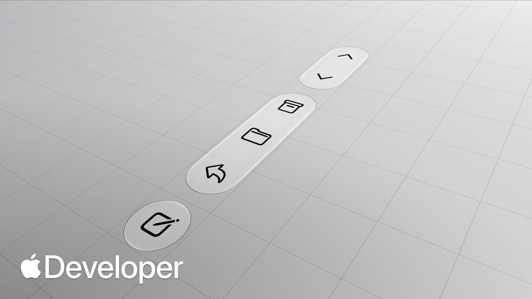
-
Raise the bar with iPhone Duo
Discover how to adapt your navigation, toolbars, and tab bars for the unique displays of iPhone Duo. Explore the design principles behind the new bar layout, and learn how to configure custom view representations and manage overflow to build powerful, responsive apps.
Chapters
- 0:00 - Introduction
- 0:28 - Why bars move to the side
- 1:29 - Agenda
- 2:00 - Opt in to vertical bars
- 3:09 - Understand the shared bar region
- 4:29 - Order items in a vertical bar
- 5:56 - Prepare toolbar content
- 8:00 - Control the axis of an item
- 9:00 - Prefer symbol-only items
- 10:07 - Adapt custom views
- 11:40 - Manage the overflow menu
- 13:10 - Prioritize item visibility
- 14:21 - When to opt out
- 14:53 - Next steps
Resources
Related Videos
Meet with Apple
Tech Talks
WWDC26
WWDC25
-
Search this video…
Hi, I'm Anna, and I'm an engineer on the UI Frameworks team. And I'm Maria, a Human Interface Designer working on Apple's design system.
Wait, why am I here? Every designer is an engineer, and every engineer is a designer. You need to understand both to build a great app.
Today, Anna and I are going to teach you how to raise the bar for your bars on iPhone Duo.
iPhone Duo is Apple's first multi-display iPhone, giving people the freedom to use it in the way that feels right for the moment.
And you'll notice right away, it's different, introducing a new, distinct silhouette.
And that shape matters. The wider aspect ratio gives your apps more horizontal space to work with.
To make the most out of that width and preserve vertical space for content, controls that normally sit at the top and bottom, move to the side, where they're also easier to reach.
This new design maximizes space for vertical content on the outer display.
And their position remains consistent when you open iPhone Duo to the inner display and landscape. But as you open the device in portrait, the larger display returns to a familiar iPhone layout with horizontal bars.
And remember, these are the same components, just adapted to a different layout.
Now that you understand the principles behind it, here are a few things to keep in mind when designing and implementing great bar experiences on iPhone Duo.
First, we'll help you orient to a new axis and take your bars vertical on iPhone Duo. Next, we'll discuss item ordering and how it interacts with different containers. After that, we'll share how you can tailor toolbar content for a vertical axis.
Finally, we'll highlight how to manage the overflow menu.
But Anna, before we get into that, can I show you the app that I've been working on? Totally. So I've already done the work to make it resizable. However, my bars are still horizontal. Am I missing something?
I got you, Maria. To opt your app into the new bar behavior, there are a few things you'll need to do. First, rebuild your app against the latest SDKs. Now Maria's app is ready for iPhone Duo. For more details on what other behaviors are enabled when you rebuild, check out "Prepare Your App for iPhone Duo." Next, make sure you're using the bars provided by navigation containers like TabView or NavigationStack.
In SwiftUI, pair the toolbar modifier with containers like NavigationStack or NavigationSplitView.
In UIKit, prefer using UINavigationController and UITabBarController, which manage their own bars. For example, set toolbar items on a view controller and place it into a navigation controller rather than creating a custom UIToolbar. When used to build custom bars, content from sub-components like UIToolbar, UINavigationBar, or UITabBar won't be considered. Now that you know how to allow bars to move vertically in your app, I'm going to dive deeper into how their content is placed.
iPhone Duo allows navigation, toolbar, and tab bar controls to coexist within a shared region.
A helpful way to think about it is to imagine rotating 90 degrees into a vertical stack. Depending on your layout, it may contain different combinations of these items. Here in Notes, the layout uses a toolbar, while in Clock, the layout includes a tab bar. And in Fitness, the layout uses both a toolbar and a tab bar.
In more complex layouts, toolbar itemscan only move vertically when their container is positioned along the display edge. In split views, only the detail column participates.
Items from other columns remain horizontal. And since detail columns already have a vertical bar, inspectors don't receive their own when expanded to avoid confusion.
On the outer display, if your sheets already have a toolbar, it's displayed vertically.
On the inner display, they're centered by default, and items remain horizontal.
When you use the preferredPlacement API to change their position, sheets placed on the left remain without a vertical bar, while sheets placed on the right receive one.
And because the bar is aligned with the hardware, it stays on the same side of the device in right-to-left languages. The content adapts around it while the bar itself remains fixed.
In summary, while it might be tempting to change the axis for all your controls, keep them associated with their container.
When displayed vertically, items retain a clear top-to-bottom hierarchy. Start by auditing your existing toolbar configuration, making sure that controls follow the recommended order. Reserve the top for primary navigation controls, like back or close, followed by prominent actions, such as done.
If you're using a navigation controller, the back button is added automatically. For custom back or close buttons, use cancellationAction placement in SwiftUI.
And in UIKit, use a leading item and make sure leftItemSupplementsBackButton is set to false, which is the default.
leftItemSupplementsBackButton? Who named that API? Wasn't me.
For prominent actions, place them using topBarPinnedTrailing placement in SwiftUI or pinnedTrailingGroup in UIKit.
Remaining items preserve their original grouping with a vertical spacer visually separating top and bottom placements even when unified into a single bar.
And remember, not every pose lays out bars vertically. Keep control placement consistent so people don't have to relearn where actions live as they use iPhone Duo.
Now that you know where items are placed, let's make sure your toolbar content is ready. You may be familiar with bars that lay out your items horizontally. Now, iPhone Duo turns that on its side.
Unlike horizontal bars, where items have a fixed height and allow flexible item width, vertical ones allow flexible item height and have a fixed width.
This makes vertical bars better suited for symbol-only item representations. Typically, your app specifies two pieces of data on your toolbar content, an icon and a title.
Depending on the context and what's specified on the item, the system then chooses what representation to show.
When items are visible in the existing top and bottom bars, they prefer showing the icon, like the share button here. If there's no icon, like the edit button, they show the text. When items move into the overflow menu, they show both the title and the icon.
None of this is changing with vertical bars.
You still specify the same content and place the same items into a horizontal bar. The difference is the system now also considers whether your content is better suited to be on a vertical or horizontal axis. Items with an icon, like the back and share buttons, change their axis to be vertical.
And text-only items, like the edit button, continue to stay on the horizontal axis. If you're already setting the title and image by using a SwiftUI label or the properties on UIBarButtonItem, you're well on your way to getting ready for vertical bars. In general, you want to provide all the information about your items up front and let the system pick the right representation for the context. This means that even if your content is an image, it's still important to provide a title. Just like for horizontal bars, the system uses it whenever an item moves into an overflow menu or an expanded form. By default, SwiftUI and UIKit infer where to place the item based on its content, like if it's an item that's text only or a symbol in text.
If you need to adjust this default behavior, there's a new AxisBehavior API.
You use it in a few different situations. Related items should stay on the same axis. One common instance is an item that transitions between a symbol and a text, like this edit button in Clock.
That item shouldn't be placed in a vertical bar, even though the symbol could theoretically be displayed vertically.
If you're using the system edit button, you're all set. It stays in the horizontal bar automatically.
If you're creating a custom item that transitions between a symbol and a text, use the horizontal-only axis behavior like this custom select button does. On the other hand, if your view is a custom view in UIKit or a complex view, the system keeps it horizontal. If your custom view does support a vertical representation, like the compass view in the top right, set the vertical-preferred axis behavior to allow it to go into a vertical bar.
Minimize title-only items or custom views that show both text and an image so more content can go vertical. In most situations, these are good candidates to use their symbol representation. For example, rather than keeping the count inline, I can use a badge on the inbox to turn an item that displays both text and a symbol into a symbol-only item that feels at home in a vertical bar.
If you aren't already using the badge API added in iOS 26, adopt it to get a system-standard badge appearance on all devices. A helpful way to evaluate whether a custom view needs text is to ask: is it simply reinforcing the symbol, or does it carry standalone information? If the text is just supplementary, the symbol alone will clearly communicate the action.
However, if the text does contain meaningful information, like a cart button displaying a dollar amount, it's better to keep the control in the horizontal bar.
Lastly, accessory bars should remain attached to keyboard rather than moving to the vertical axis.
Custom views require a bit more work to get them ready to be laid out vertically. When you opt items in, make sure they either fit the bar's fixed width or have a vertically adapted layout. Consider if any metric should be adjusted for the vertical representation. For example, this custom action panel hides its titles and becomes slightly shorter when vertical to allow more room for other content.
For custom views in particular, you might want to make changes when a vertical bar is present.
To know that, read the toolbarVerticalEdge environment property or trait. You can read it within content view or inside your item's custom view. The value is populated when items can be on vertical axis, and nil or unspecified when they can't.
Just like horizontal bars, a vertical bar doesn't have a scroll-edge effect by default.
However, it does have a background when the reduced transparency accessibility setting is enabled. Make sure your custom view content stays legible regardless.
By default, flexible spacers are zero size in the vertical axis. But fixed spacers continue to respect their minimum size.
Your app shouldn't be creating additional spacing, regardless of if a bar is horizontal or vertical.
Maria, didn't you talk about this in your video for WWDC25? Yes, I did. Thanks for watching.
If your app hasn't already updated its bars to the new design or grouped individual items along leading and trailing edges, now's the perfect time.
Lastly, let's talk about managing overflow. On the outer display in landscape, items overflow more often simply because there's less vertical space. The bar may also need to overflow as other competing UI appears, like the keyboard or when using Picture in Picture in open portrait. The first decision is which should stay visible longer, your toolbar items or your tab bar.
In navigation-focused experiences, like this Podcasts view, the toolbar compresses first, so primary destinations remain accessible.
This is the default behavior.
In task-oriented experiences, like this view from the Games app, the tab bar compresses first to preserve frequently accessed actions. Use the toolbarCompressionBehavior API to configure your app's preference for each view. From there, toolbars need a little more consideration. With more items to manage, you'll also need to prioritize what stays visible.
If your app already has its own overflow, consolidate its actions into a single system-managed menu. You can do that using ToolbarOverflowMenu in SwiftUI or additionalOverflowItems in UIKit.
And not every existing menu should become an overflow. The ellipsis is the standard overflow symbol on iPhone.
Reserve it for that purpose rather than introducing symbols from other platforms, and give other menus a distinct symbol. To keep the right content visible for longer, make sure to express your preferences to the system.
If you've prioritized the tab bar or your toolbar exceeds the available space, items will begin moving into the overflow menu. Toolbar visibility priority gives you fine-grained control over which ones remain visible.
By default, items overflow from bottom to top, but you can also assign each item a high, low, or custom priority to control the order in which they collapse.
Within your items, start giving priority by groups.
Then prioritize items within each one if you need to. Use visibilityPriority APIs in SwiftUI and UIKit to configure this priority.
And check out what's new in SwiftUI from WWDC26 to learn more.
When assigning visibility priorities, think about what items people need to access most often. Frequently used actions like Compose in Mail or New Note in Notes should be amongst the last to move into overflow. Likewise, controls that convey important status, such as items with badges, should remain visible for longer to preserve glanceability.
Maria, I get why bars are laid out vertically now, but should they be vertical everywhere?
Most apps are good candidates. However, there are a few cases where your app may want to disable this behavior.
If your app is a single-page app with a bottom-heavy layout like Calculator, consider if a horizontal layout might allow the content to fully expand.
Similarly, if a sheet is control-heavy with only one item, like the close button here, consider disabling a vertical bar so it doesn't reduce available space. Use the toolbarVerticalBehavior and preferredVerticalBarBehavior APIs to disable this.
It started with a pretty simple question. What if bars didn't have to be at the top and the bottom? Spoiler, they moved. To the side. Not that far. It keeps the content feeling spacious while keeping controls accessible. The same familiar experience made for an entirely new iPhone. To get your app ready, the first step is building your app with the latest SDKs.
Audit the bars in your app and ensure that they're ready for the new design. Update any custom items so they're ready to be placed vertically. And make sure to assign overflow priorities so the system can adapt.
Anything else? It's in the overflow menu. See you soon!
-
-
2:24 - Use system containers for vertical bar in SwiftUI
var body: some View { NavigationStack { ContentView() .toolbar { ToolbarItem(placement: .bottomBar) { ... } } } } -
2:39 - Use navigation containers for vertical bar in UIKit
// Content from a custom bars (UINavigationBar, UITabBar, UIToolbar) // won't be considered. Prefer UINavigationController // and UITabBarController, which manage their own bars. let toolbar = UIToolbar() toolbar.items = [...] -
5:00 - Place a back or close button
// SwiftUI .toolbar { ToolbarItem(placement: .cancellationAction) { ... } } // UIKit navigationItem.leftItemsSupplementBackButton = false navigationItem.leadingItemGroups = [UIBarButtonItemGroup(...)] -
5:24 - Place prominent actions
// SwiftUI .toolbar { ToolbarItem(placement: .topBarPinnedTrailing) { ... } } // UIKit navigationItem.pinnedTrailingGroup = UIBarButtonItemGroup(...) -
8:08 - Set a preferred axis for a custom view
// SwiftUI var body: some View { ContentView() .toolbar { ToolbarItem { ProfileView() } .axisBehavior(.verticalPreferred) } } // UIKit let item = UIBarButtonItem(customView: ProfileView()) item.axisBehavior = .verticalPreferred -
8:36 - Keep an item in the horizontal bar
// SwiftUI var body: some View { ContentView() .toolbar { ToolbarItem { SelectOrDoneButton() } .axisBehavior(.horizontalOnly) } } // UIKit item.axisBehavior = .horizontalOnly -
8:52 - Allow a custom view go in vertical bar
// SwiftUI var body: some View { ContentView() .toolbar { ToolbarItem { CompassView() } .axisBehavior(.verticalPreferred) } } // UIKit let item = UIBarButtonItem(customView: CompassView()) item.axisBehavior = .verticalPreferred -
9:27 - Use badges
// SwiftUI var body: some View { ContentView() .toolbar { ToolbarItem(...) { InboxButton() .badge(7) } } } // UIKit let item = UIBarButtonItem(...) item.badge = .count(7) -
10:36 - Read the vertical bar edge
// SwiftUI struct ContentView: View { @Environment(\.toolbarVerticalEdge) var edge var body: some View { switch edge { ... } } } // UIKit switch traitCollection.verticalBarEdge { ... } -
12:23 - Configure toolbar compression behavior
// SwiftUI var body: some View { TabView { Tab("Recents", systemImage: "clock") { ContentView() .toolbarVerticalCompressionBehavior(.prefersToolbarItems) } } } // UIKit navigationItem.verticalBarCompressionBehavior = .prefersBarItems -
12:43 - Use system overflow menu
// SwiftUI var body: some View { ContentView() .toolbar { ToolbarOverflowMenu { Button("Scan") { ... } Button("Connect") { ... } } } } // UIKit navigationItem.additionalOverflowItems = UIDeferredMenuElement({ provider in provider(self.persistentOverflowItems()) }) -
13:21 - Set item visibility priority
// SwiftUI var body: some View { ContentView() .toolbar { ToolbarItem { Button(...) { ... } } .visibilityPriority(.high) } } // UIKit let item = UIBarButtonItem(...) item.visibilityPriority = .high -
14:47 - Disable the vertical bar
// SwiftUI
var body: some View {
    NavigationStack {
        ContentView()
            .toolbarVerticalBehavior(.disabled)
    }
}

// UIKit
class MyViewController: UIViewController {
    override var preferredVerticalBarBehavior: UIVerticalBarBehavior {
        .disabled
    }
}
-
-
- 0:00 - Introduction
Anna from UI Frameworks and Maria, a Human Interface Designer on Apple's design system, introduce how to raise the bar for your app's bars on iPhone Duo.
- 0:28 - Why bars move to the side
iPhone Duo's wider aspect ratio gives apps more horizontal space. Controls that normally sit at the top and bottom move to the side, preserving vertical space for content and putting controls within easier reach. Their position stays consistent on the inner display in landscape, and returns to a familiar horizontal layout in portrait.
- 1:29 - Agenda
An overview of what's ahead: orienting bars to a vertical axis, item ordering and how it interacts with containers, tailoring toolbar content for a vertical axis, and managing the overflow menu.
- 2:00 - Opt in to vertical bars
Rebuild your app against the latest SDKs, then use bars provided by navigation containers. In SwiftUI, pair the toolbar modifier with NavigationStack or NavigationSplitView. In UIKit, prefer UINavigationController and UITabBarController over custom UIToolbar, UINavigationBar, or UITabBar instances, whose content isn't considered.
- 3:09 - Understand the shared bar region
Navigation, toolbar, and tab bar controls coexist in a shared region — imagine rotating them 90 degrees into a vertical stack. In split views, only the detail column participates and inspectors don't get their own bar. Sheets behave differently per display, and because the bar is aligned with the hardware it stays on the same side in right-to-left languages.
- 4:29 - Order items in a vertical bar
Keep controls associated with their container and audit your existing configuration. Reserve the top for primary navigation like back or close, followed by prominent actions such as done. Use the cancellation action placement in SwiftUI, or a leading item with leftItemSupplementsBackButton set to false in UIKit. Place prominent actions with topBarPinnedTrailing or pinnedTrailingGroup.
- 5:56 - Prepare toolbar content
Vertical bars have a fixed width and flexible item height, making them better suited to symbol-only items. You still specify the same icon and title, but the system now also considers whether content suits a vertical or horizontal axis: items with an icon go vertical, while text-only items stay horizontal. Always provide a title, since the system uses it in overflow menus and expanded forms.
- 8:00 - Control the axis of an item
The new AxisBehavior API adjusts the system's default placement. Keep related items on the same axis — an item that transitions between a symbol and text, like a custom select button, should use the horizontal-only behavior. Custom or complex views stay horizontal by default; set the vertical-preferred behavior when your view does support a vertical representation.
- 9:00 - Prefer symbol-only items
Minimize title-only items and custom views showing both text and an image so more content can go vertical. A badge can turn a text-and-symbol item into a symbol-only one — adopt the badge API added in iOS 26. Ask whether the text merely reinforces the symbol or carries standalone information; keep controls like a cart button showing a dollar amount in the horizontal bar.
- 10:07 - Adapt custom views
Custom views need to either fit the bar's fixed width or have a vertically adapted layout, and some metrics may need adjusting. Read the toolbarVerticalEdge environment property or trait to detect a vertical bar. Vertical bars have no scroll edge effect by default but do get a background when reduce transparency is enabled. Flexible spacers are zero size vertically, while fixed spacers respect their minimum.
- 11:40 - Manage the overflow menu
Items overflow more often on the outer display in landscape, or when competing UI like the keyboard appears. Decide whether your toolbar items or tab bar stay visible longer — toolbars compress first by default, suiting navigation-focused experiences, while task-oriented apps may compress the tab bar. Consolidate any custom overflow into the system menu with ToolbarOverflowMenu or additionalOverflowItems, and reserve the ellipsis for overflow only.
- 13:10 - Prioritize item visibility
Items overflow from bottom to top by default, but visibility priority gives fine-grained control. Assign high, low, or custom priorities using the visibilityPriority APIs, starting with groups and then items within them. Frequently used actions like Compose or New Note should be among the last to overflow, and controls conveying status such as badged items should remain visible to preserve glanceability.
- 14:21 - When to opt out
Most apps are good candidates for vertical bars, but a single-page app with a bottom-heavy layout like Calculator may let content expand better horizontally, and a sheet with only one control such as a close button may not warrant the reduced space. Use the toolbarVerticalBehavior and preferredVerticalBar behavior APIs to disable it.
- 14:53 - Next steps
Build your app with the latest SDKs, audit your bars for the new design, update custom items so they're ready to be placed vertically, and assign overflow priorities so the system can adapt.