Apple Design Resources
Design apps quickly and accurately by using Figma, Sketch, and Photoshop design kits, guides, and other resources.
Design apps quickly and accurately by using Figma, Sketch, and Photoshop design kits, guides, and other resources.
Note: Sketch must be installed to download
July 11, 2024
40 MB

System font for watchOS, optimized for small sizes and narrow columns.

Performs as a traditional reading face at small sizes and a graphic display face at larger sizes.

Designed with proportions that have been adjusted for a better visual balance in multilingual typesetting.
SF Symbols is a library of over 6,000 symbols that are designed to integrate seamlessly with San Francisco, the system font for Apple platforms. Symbols come in nine weights and three scales, automatically align with text, and can be exported and edited using vector graphics editing tools to create custom symbols with shared design characteristics and accessibility features. SF Symbols 6 brings new and enhanced animations, updated annotation tools, and over 800 new symbols.
Use Parallax Previewer and Parallax Exporter Plug-In for Adobe Photoshop to deliver parallax visual effects that transform static images into dynamic and immersive experiences on tvOS and visionOS.

Requires macOS 13.5 or later.
Requires macOS 10.10.5 or later.

Requires Adobe Photoshop 2023 (v24.1) or later and macOS 12.4.0 or later.
Requires Adobe Photoshop 2023 (v24.1) or later and Microsoft Windows 10 64-bit (version 22H2) or later.
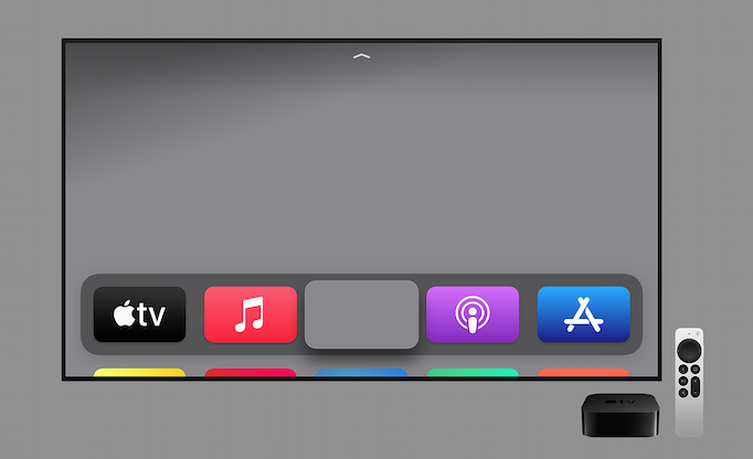
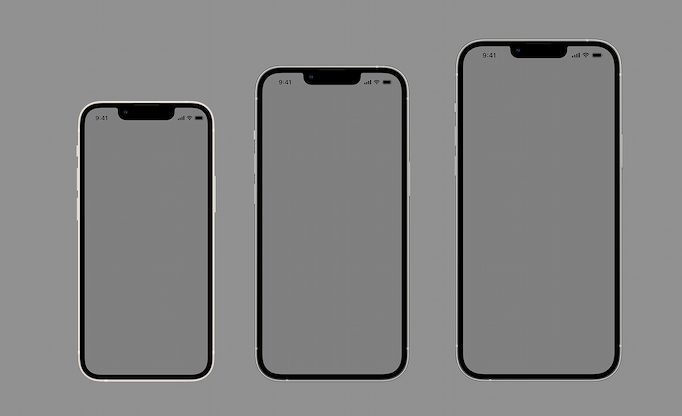
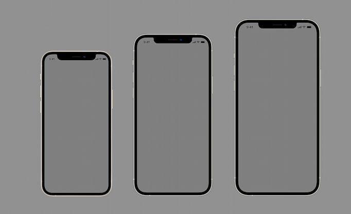
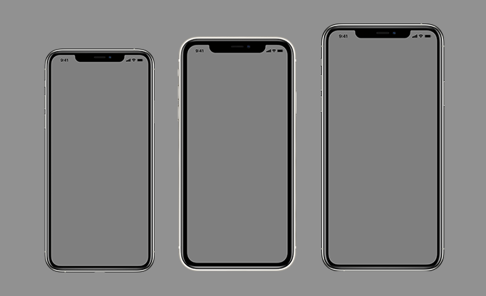
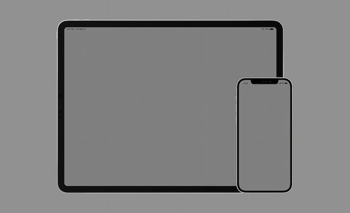
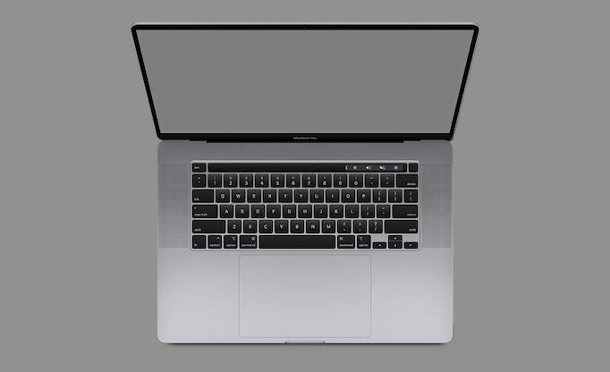
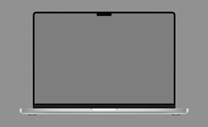
When using product bezels in your marketing materials, be sure to review these marketing and identity guidelines.
Find badges and logos for Apple technologies, such as Apple Health, Apple Wallet, Apple Music, and Apple Pay, that can be used in your app’s marketing material.
View Apple Badges and Logos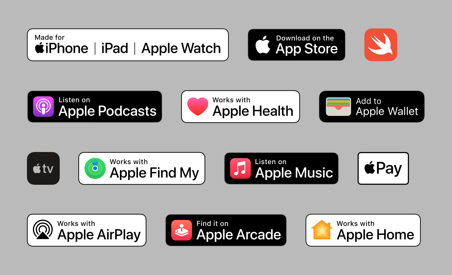


