-
 13:26
13:26 What’s new in Apple In-App Purchase
-
 15:58
15:58 Design immersive environments for visionOS apps and the spatial web
-
 24:20
24:20 Code-along: Make your app available to Siri
-
 15:21
15:21 Code-along: Build powerful drag and drop in SwiftUI
-
 16:44
16:44 Iterate your spatial scenes faster with Reality Composer Pro 3
-
 25:46
25:46 Meet the Evaluations framework
-
 14:11
14:11 Create high-quality images using Image Playground
-
 28:00
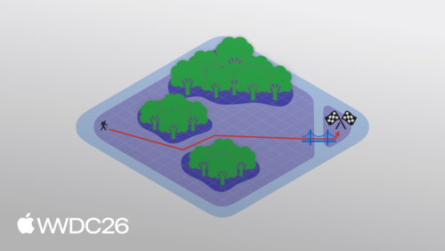
28:00 Speedrun your game port with agentic coding
WWDC26 Special Events


Explore WWDC26
-
 32:45
32:45 What’s new in Swift
-
 21:13
21:13 What’s new in the Foundation Models framework
-
 21:43
21:43 Build agentic app experiences with the Foundation Models framework
-
 24:03
24:03 Xcode, agents, and you
-
 18:11
18:11 Create UI prototypes using agents in Xcode
-
 12:53
12:53 What’s new in SwiftData
-
 23:51
23:51 Explore advances in RealityKit
-
 32:35
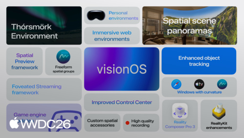
32:35 Build next-generation experiences with visionOS 27
-
 27:23
27:23 Build intelligent Siri experiences with App Schemas
-
 24:08
24:08 Explore advanced App Intents features for Siri and Apple Intelligence
-
13:26
What’s new in Apple In-App Purchase
-
 27:54
27:54 Bringing Cyberpunk 2077 to Mac
-
 13:37
13:37 Run local agentic AI on the Mac using MLX
-
 21:25
21:25 Migrate to Swift Testing
-
 26:43
26:43 Profile, fix, and verify: Improve app responsiveness with Instruments
-
 17:16
17:16 Principles of great design
-
 16:32
16:32 What’s new in WebKit for Safari 27
-
 18:01
18:01 Modernize your AppKit app
-
 17:45
17:45 Best practices for integrating visual intelligence in your app
-
 24:23
24:23 Make your game great with touch