-
CSSグリッドレーンについて
あらゆる形やサイズのコンテンツに対応する、適応性に優れた柔軟なWebレイアウトを構築しましょう。グリッドレーンを使って、さまざまな形の要素を、シンプルなCSSですっきりした柔軟なデザインに配置する方法を紹介します。レイアウトの柔軟性を保ちながらアクセシビリティを向上させるのに役立つ、フロートレランスについても取り上げます。
関連する章
- 0:00 - Introduction
- 1:35 - CSS Flexbox and Grid
- 2:45 - CSS Grid Lanes
- 3:55 - Build a Grid Lanes container
- 4:31 - Implement brick variation
- 4:49 - Experiment with different layouts
- 5:40 - Control individual items
- 7:05 - Flow Tolerance
- 8:46 - Web Inspector
- 9:20 - Next steps
リソース
- WebKit.org - CSS Grid Lanes Field Guide
- WebKit.org – Report issues to the WebKit open-source project
- Submit feedback
関連ビデオ
WWDC26
-
このビデオを検索
-
-
3:58 - Create a Grid Lanes Container
.container { display: grid-lanes; } -
4:02 - Create a Grid Lanes Container
.container { display: grid-lanes; grid-template-columns: repeat(3, 1fr); } -
4:26 - Create a Grid Lanes Container
.container { display: grid-lanes; grid-template-columns: repeat(3, 1fr); gap: 10px; } -
4:33 - Implement a Brick Variation
.container { display: grid-lanes; grid-template-columns: repeat(3, 1fr); gap: 10px; } -
4:36 - Implement a Brick Variation
.container { display: grid-lanes; grid-template-rows: repeat(3, 1fr); gap: 10px; } -
4:58 - Experiment with different layouts
.container { display: grid-lanes; grid-template-columns: 1fr 1fr 1fr; gap: 10px; } -
5:02 - Experiment with different layouts
.container { display: grid-lanes; grid-template-columns: 1fr 2fr 1fr; gap: 10px; } -
5:10 - Experiment with different layouts
.container { display: grid-lanes; grid-template-columns: repeat(auto-fill, minmax(200px, 1fr)); gap: 10px; } -
5:24 - Experiment with different layouts
.container { display: grid-lanes; grid-template-columns: repeat(auto-fill, minmax(8rem, 1fr) minmax(14rem, 2fr); gap: 10px; } -
5:45 - Control Individual Items
.container { display: grid-lanes; grid-template-columns: 1fr 1fr 1fr; gap: 10px; } -
5:59 - Control Individual Items
.container { display: grid-lanes; grid-template-columns: 1fr 1fr 1fr; gap: 10px; } .item { grid-column: span 2; } -
6:07 - Control Individual Items
.container { display: grid-lanes; grid-template-columns: 1fr 1fr 1fr; gap: 10px; } .item { grid-column: 2 / span 2; } -
6:22 - Integrate Subgrid
.container { display: grid-lanes; grid-template-columns: 1fr 1fr 1fr; gap: 10px; } .item { grid-column: span 2; } -
6:34 - Integrate Subgrid
.container { display: grid-lanes; grid-template-columns: 1fr 1fr 1fr; gap: 10px; } .item { display: grid-lanes; grid-template-columns: subgrid; grid-column: span 2; } -
6:48 - Integrate Subgrid
.container { display: grid-lanes; grid-template-columns: 1fr 1fr 1fr; gap: 10px; } .item { display: grid; grid-template-columns: subgrid; grid-column: span 2; } -
8:37 - Improve item positioning
.container { display: grid-lanes; grid-template-columns: 1fr 1fr; gap: 10px; flow-tolerance: normal; } -
8:41 - Improve item positioning
.container {
	display: grid-lanes;
  grid-template-columns: 1fr 1fr;
  gap: 10px;
  flow-tolerance: 2.1em;
}
-
-
- 0:00 - Introduction
Learn about CSS Grid Lanes, a new layout mode for masonry-style "waterfall" and "brick wall" design patterns in just a few lines of CSS, available now in Safari 26.4.
- 1:35 - CSS Flexbox and Grid
Understand what a layout mode actually does and see why Flexbox and Grid fall short for content with mixed aspect ratios, where stretching, zooming, and cropping all distort your design.
- 2:45 - CSS Grid Lanes
Learn how Grid Lanes fits between Grid and Flexbox, structuring one axis while leaving the other free so items pack tightly without distortion. Each item lands in whichever column leaves it closest to the top, and the same rules apply to images, text, or any other content.
- 3:55 - Build a Grid Lanes container
Build your first Grid Lanes layout in three lines of CSS: `display: grid-lanes`, `grid-template-columns` with `fr` units to divide available space into fractions, and `gap` to space items apart.
- 4:31 - Implement brick variation
Flip the layout 90 degrees by swapping `grid-template-columns` for `grid-template-rows` to flow items horizontally into a brick-wall layout. Grid Lanes structures one direction at a time — pick columns or rows, not both.
- 4:49 - Experiment with different layouts
Use the full power of CSS track sizing inside Grid Lanes: unequal column widths, `auto-fill` with `minmax()` to let the browser choose how many columns fit, and repeating patterns of narrow and wide columns.
- 5:40 - Control individual items
Shape individual items using familiar Grid properties — `grid-column: span 2` to stretch an item across columns, explicit column placement (rows are still chosen for you), and `grid-template-columns: subgrid` to align nested content with the parent layout.
- 7:05 - Flow Tolerance
Discover why the shortest-column rule can produce visually pleasing layouts that confuse keyboard users when DOM order and visual order diverge. The `flow-tolerance` property loosens the rule so items prefer to fill earlier columns when heights are similar, with a default of `1em` you can tune to your content.
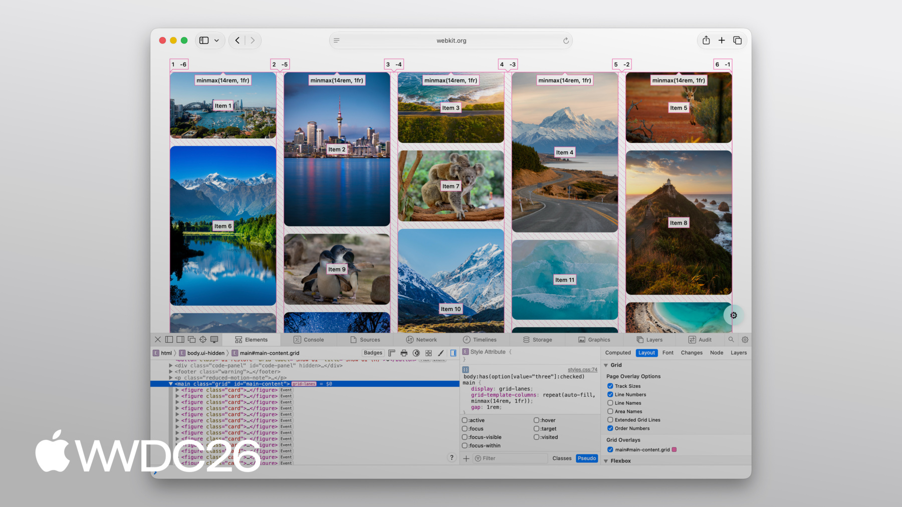
- 8:46 - Web Inspector
Debug Grid Lanes layouts visually with Safari Web Inspector. Turn on the overlay to see column and row lines, gaps, and order numbers projected over each item — useful when tuning `flow-tolerance` or diagnosing surprising placements.
- 9:20 - Next steps
Explore the WebKit team's Grid Lanes Field Guide for interactive demos, try Grid Lanes in your own projects (available in Safari 26.4), and share feedback with the team. To see what else is coming to Safari, watch "What's new in WebKit for Safari 27."