All Videos
-
WWDC23 -
 14:26
14:26
Explore the USD ecosystem
Discover the latest updates to Universal Scene Description (USD) on Apple platforms and learn how you can deliver great 3D content for your apps, games, and websites. Get to know USD for visionOS, explore MaterialX shaders and color management, and find out about some of the other improvements to...
WWDC23 English -
 28:15
28:15
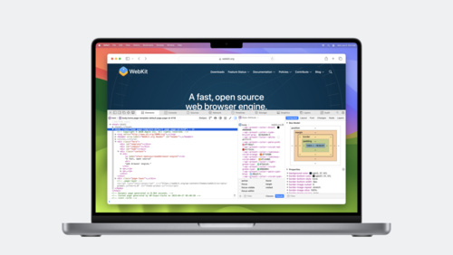
What’s new in Web Inspector
Web Inspector provides a powerful set of tools to debug and inspect web pages, web extensions, and WKWebViews on macOS, iOS and iPadOS. We'll share the latest updates, including improved typography inspection, editing tools for variable fonts, controls to emulate people's preferences, element...
WWDC23 English -
 8:09
8:09
Meet Assistive Access
Learn how Assistive Access can help people with cognitive disabilities more easily use iPhone and iPad. Discover the design principles that guide Assistive Access and find out how the system experience adapts to lighten cognitive load. We'll show you how Assistive Access works and what you can do...
WWDC23 English -
 15:10
15:10
Design considerations for vision and motion
Learn how to design engaging immersive experiences for visionOS that respect the limitations of human vision and motion perception. We'll show you how you can use depth cues, contrast, focus, and motion to keep people comfortable as they enjoy your apps and games.
WWDC23 English -
 12:12
12:12
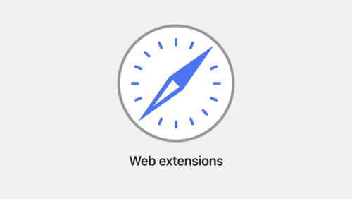
What’s new in Safari extensions
Learn about the latest improvements to Safari extensions. We'll take you through new APIs, explore per-site permissions for Safari app extensions, and share how you can make sure your extensions work great in both Private Browsing and Profiles.
WWDC23 English -
 23:17
23:17
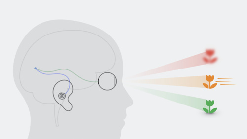
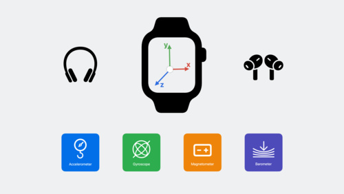
What’s new in Core Motion
Learn how you can use the latest Core Motion updates to expand how your app uses motion data. Discover how to stream higher-frequency sensor data when recording a HealthKit workout on Apple Watch. We'll show you how you can get submersion data — including water depth and temperature — during...
WWDC23 English -
 21:56
21:56
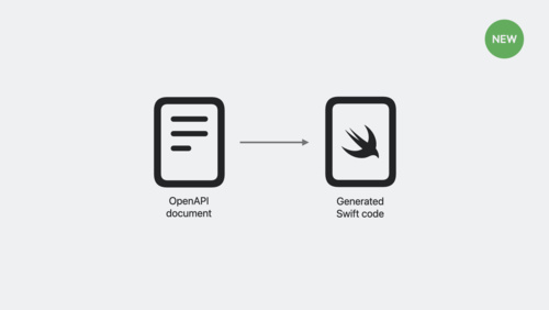
Meet Swift OpenAPI Generator
Discover how Swift OpenAPI Generator can help you work with HTTP server APIs whether you're extending an iOS app or writing a server in Swift. We'll show you how this package plugin can streamline your workflow and simplify your codebase by generating code from an OpenAPI document.
WWDC23 English -
 23:17
23:17
The SwiftUI cookbook for focus
The SwiftUI team is back in the coding "kitchen" with powerful tools to shape your app's focus experience. Join us and learn about the staple ingredients that support focus-driven interactions in your app. Discover focus interactions for custom views, find out about key-press handlers for...
WWDC23 English -
 20:51
20:51
Discover Metal for immersive apps
Find out how you can use Metal to render fully immersive experiences for visionOS. We'll show you how to set up a rendering session on the platform and create a basic render loop, and share how you can make your experience interactive by incorporating spatial input.
WWDC23 English -
 19:51
19:51
Explore AirPlay with interstitials
Learn how you can use HLS Interstitials with AirPlay to create seamless transitions for your video content between advertisements. We'll share best practices and tips for creating a great experience when sharing content from Apple devices to popular smart TVs.
WWDC23 English -
 17:32
17:32
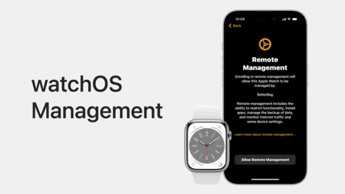
Meet device management for Apple Watch
Organizations can now deploy and configure Apple Watch in addition to other Apple devices. Learn how to implement device management for watchOS to help organizations improve productivity, support wellness, and provide additional support for their employees.
WWDC23 English -
 19:37
19:37
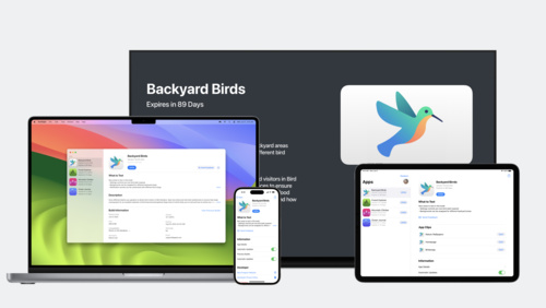
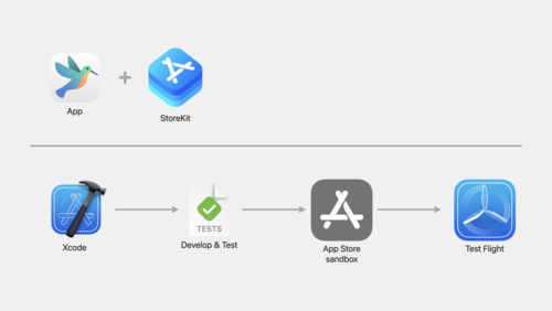
Explore testing in-app purchases
Learn how you can test in-app purchases throughout development with StoreKit Testing in Xcode, App Store sandbox, and TestFlight. Explore how each tool functions and how you can combine them to build the right workflow for testing your apps and games. We'll also share a sneak preview of how you...
WWDC23 English -
 15:37
15:37
Keep up with the keyboard
Each year, the keyboard evolves to support an increasing range of languages, sizes, and features. Discover how you can design your app to keep up with the keyboard, regardless of how it appears on a device. We'll show you how to create frictionless text entry and share important architectural...
WWDC23 English -
 15:23
15:23
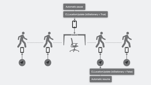
Discover streamlined location updates
Move into the future with Core Location! Meet the CLLocationUpdate class, designed for modern Swift concurrency, and learn how it simplifies getting location updates. We'll show you how this class works with your apps when they run in the foreground or background and share some best practices.
WWDC23 English -
 14:16
14:16
Embed the Photos Picker in your app
Discover how you can simply, safely, and securely access the Photos Library in your app. Learn how to get started with the embedded picker and explore the options menu and HDR still image support. We'll also show you how to take advantage of UI customization options to help the picker blend into...
WWDC23 English -
 7:52
7:52
Customize on-device speech recognition
Find out how you can improve on-device speech recognition in your app by customizing the underlying model with additional vocabulary. We'll share how speech recognition works on device and show you how to boost specific words and phrases for more predictable transcription. Learn how you can...
WWDC23 English -
 15:56
15:56
Elevate your windowed app for spatial computing
Discover how you can bring your multiplatform SwiftUI app to visionOS and the Shared Space. We'll show you how to add the visionOS destination to an existing app and view your app in the Simulator. Explore how your SwiftUI code automatically adapts to support the unique context and presentation...
WWDC23 English -
 15:35
15:35
Dive deeper into SwiftData
Learn how you can harness the power of SwiftData in your app. Find out how ModelContext and ModelContainer work together to persist your app's data. We'll show you how to track and make your changes manually and use SwiftData at scale with FetchDescriptor, SortDescriptor, and enumerate. To get...
WWDC23 English -
 22:52
22:52
Animate with springs
Discover how you can bring life to your app with animation! We'll show you how to create amazing animations when you take advantage of springs and help you learn how to use them in your app.
WWDC23 English -
 9:39
9:39
Share files with SharePlay
Discover how to work with files and attachments in a SharePlay activity. We'll explain how to use the GroupSessionJournal API to sync large amounts of data faster and show you how to adopt it in a demo of the sample app DrawTogether.
WWDC23 English -
 23:53
23:53
Go beyond the window with SwiftUI
Get ready to launch into space — a new SwiftUI scene type that can help you make great immersive experiences for visionOS. We'll show you how to create a new scene with ImmersiveSpace, place 3D content, and integrate RealityView. Explore how you can use the immersionStyle scene modifier to...
WWDC23 -
 22:40
22:40
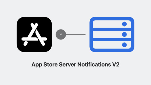
Meet the App Store Server Library
Discover the App Store Server Library and learn how you can take advantage of resources and configurations for your apps. We'll show you how to set up the library, call the App Store Server API, verify App Store Server Notifications, and use app receipts. Explore insights and best practices for...
WWDC23 English -
 21:15
21:15
Optimize machine learning for Metal apps
Discover the latest enhancements to accelerated ML training in Metal. Find out about updates to PyTorch and TensorFlow, and learn about Metal acceleration for JAX. We'll show you how MPS Graph can support faster ML inference when you use both the GPU and Apple Neural Engine, and share how the...
WWDC23 English -
 33:31
33:31
What’s new in Wallet and Apple Pay
Discover the latest updates to Wallet and Apple Pay. Learn how to take advantage of preauthorized payments, funds transfer, and Apple Pay Later merchandising to create great Apple Pay experiences in your app or for the web. Explore improved support for Mail, Messages, Safari, and third-party apps...
WWDC23 -
 13:57
13:57
Create a great spatial playback experience
Get ready to support video in your visionOS app! Take a tour of the frameworks and APIs that power video playback and learn how you can update your app to play 3D content. We'll also share tips for customizing playback to create a more immersive watching experience.
WWDC23 -
 12:43
12:43
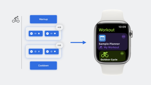
Build a multi-device workout app
Learn how you can get iPhone involved in your Apple Watch-based workout apps with HealthKit. We'll show you how to mirror workouts between devices and take a ride with cycling data types. Plus, get to know HealthKit for iPad.
WWDC23 -
 17:07
17:07
Animate symbols in your app
Bring delight to your app with animated symbols. Explore the new Symbols framework, which features a unified API to create and configure symbol effects. Learn how SwiftUI, AppKit, and UIKit make it easy to animate symbols in user interfaces. Discover tips and tricks to seamlessly integrate the...
WWDC23 -
 15:00
15:00
Design dynamic Live Activities
Live Activities allow your app to display live information in key system locations on iOS and iPadOS. Learn the best way to create graphically rich layouts that update seamlessly on the Lock Screen, in StandBy, and in the Dynamic Island. Incorporate interactivity and animation to help people stay...
WWDC23 -
 24:22
24:22
Beyond the basics of structured concurrency
It's all about the task tree: Find out how structured concurrency can help your apps manage automatic task cancellation, task priority propagation, and useful task-local value patterns. Learn how to manage resources in your app with useful patterns and the latest task group APIs. We'll show you...
WWDC23 -
 16:04
16:04
Meet Core Location Monitor
Discover how Core Location Monitor can help you better understand location and beacon events in your app. Learn how to use Core Location Conditions to describe and track the state of events in your app, and find out how you can better respond to transitions in your apps through Swift semantics...
WWDC23 -
 20:39
20:39
Build robust and resumable file transfers
Find out how URLSession can help your apps transfer large files and recover from network interruptions. Learn how to pause and resume HTTP file transfers and support resumable uploads, and explore best practices for using URLSession to transfer files even when your app is suspended in the...
WWDC23 -
 16:57
16:57
Optimize GPU renderers with Metal
Discover how to optimize your GPU renderer using the latest Metal features and best practices. We'll show you how to use function specialization and parallel shader compilation to maintain responsive authoring workflows and the fastest rendering speeds, and help you tune your compute shaders for...
WWDC23 -
 28:36
28:36
Create practical workflows in Xcode Cloud
Learn how Xcode Cloud can help teams of all shapes and sizes in their development process. We'll share different ways to configure actions to help you create simple yet powerful workflows, and show you how to extend Xcode Cloud when you integrate with additional tools.
WWDC23 -
 12:49
12:49
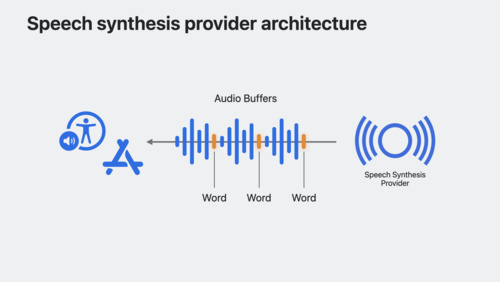
Extend Speech Synthesis with personal and custom voices
Bring the latest advancements in Speech Synthesis to your apps. Learn how you can integrate your custom speech synthesizer and voices into iOS and macOS. We'll show you how SSML is used to generate expressive speech synthesis, and explore how Personal Voice can enable your augmentative and...
WWDC23 -
 18:20
18:20
Update Live Activities with push notifications
Discover how you can remotely update Live Activities in your app when you push content through Apple Push Notification service (APNs). We'll show you how to configure your first Live Activity push locally so you can quickly iterate on your implementation. Learn best practices for determining your...
WWDC23 -
 33:59
33:59
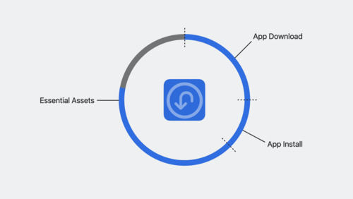
What’s new in Background Assets
Waiting is no fun! Discover how Background Assets can help your app download content before it even launches. We'll show you how to integrate Background Assets into an existing app, explore when to use essential or non-essential assets, and learn how to make debugging your extension a breeze.
WWDC23 -
 25:18
25:18
Use Core ML Tools for machine learning model compression
Discover how to reduce the footprint of machine learning models in your app with Core ML Tools. Learn how to use techniques like palettization, pruning, and quantization to dramatically reduce model size while still achieving great accuracy. Explore comparisons between compression during the...
WWDC23 -
 24:31
24:31
Build spatial SharePlay experiences
Discover how you can use the GroupActivities framework to build unique sharing and collaboration experiences for visionOS. We'll introduce you to SharePlay on this platform, learn how to create experiences that make people feel present as if they were in the same space, and explore how immersive...
WWDC23 English -
 22:05
22:05
Create 3D models for Quick Look spatial experiences
Discover best practices when creating 3D content for Quick Look on visionOS. We'll explore a few different ways to prepare your models for Quick Look, cover important considerations for 3D quality and performance, and show you how to use Reality Composer Pro and Reality Trace to inspect and...
WWDC23 -
 16:40
16:40
Protect your Mac app with environment constraints
Learn how to improve the security of your Mac app by adopting environment constraints. We'll show you how to set limits on how processes are launched, make sure your Launch Agents and Launch Daemons aren't tampered with, and prevent unwanted code from running in your address space.
WWDC23 -
 32:41
32:41
Support external cameras in your iPadOS app
Learn how you can discover and connect to external cameras in your iPadOS app using the AVFoundation capture classes. We'll show you how to rotate video from both external and built-in cameras, support external microphones with USB-C, and perform audio routing. Explore telephony support, tunings...
WWDC23 -
 7:38
7:38
What’s new in App Store pre-orders
Discover the latest enhancements to App Store pre-orders, including regional publishing. We'll show you how to use App Store Connect to set up pre-orders to simultaneously soft launch your app and offer it in different regions.
WWDC23 -
 16:59
16:59
Explore rendering for spatial computing
Find out how you can take control of RealityKit rendering to improve the look and feel of your apps and games on visionOS. Discover how you can customize lighting, add grounding shadows, and control tone mapping for your content. We'll also go over best practices for two key treatments on the...
WWDC23 -
 17:05
17:05
Reduce network delays with L4S
Streaming video, multiplayer games, and other real-time experiences depend on responsive, low latency networking. Learn how Low Latency, Low Loss, Scalable throughput (L4S) can reduce network delays and improve the overall experience in your app. We'll show you how to set up and test your app,...
WWDC23 -
 21:48
21:48
Demystify SwiftUI performance
Learn how you can build a mental model for performance in SwiftUI and write faster, more efficient code. We'll share some of the common causes behind performance issues and help you triage hangs and hitches in SwiftUI to create more responsive views in your app.
WWDC23 -
 13:43
13:43
What’s new in ScreenCaptureKit
Level up your screen sharing experience with the latest features in ScreenCaptureKit. Explore the built-in system picker, Presenter Overlay, and screenshot capabilities, and learn how to incorporate these features into your existing ScreenCaptureKit app or game.
WWDC23 -
 9:39
9:39
Design Shortcuts for Spotlight
Learn about the latest updates to the visual language of App Shortcuts and find out how to design your shortcut to appear as a top hit in Spotlight. We'll share how shortcuts can appear on iOS or iPadOS, and show you how to customize the visual appearance of a shortcut, personalize its order,...
WWDC23 -
 21:58
21:58
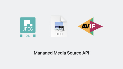
Explore media formats for the web
Learn about the latest image formats and video technologies supported in Safari 17. Discover how you can use JPEG XL, AVIF, and HEIC in your websites and experiences and learn how they differ from previous formats. We'll also show you how the Managed Media Source API draws less power than Media...
WWDC23 -
 17:35
17:35
Integrate with motorized iPhone stands using DockKit
Discover how you can create incredible photo and video experiences in your camera app when integrating with DockKit-compatible motorized stands. We'll show how your app can automatically track subjects in live video across a 360-degree field of view, take direct control of the stand to customize...
WWDC23 -
 13:56
13:56
Build better document-based apps
Discover how you can use the latest features in iPadOS to improve your document-based apps. We'll show you how to take advantage of UIDocument as well as existing desktop-class iPad and document-based APIs to add new features in your app. Find out how to convert data models to UIDocument, present...
WWDC23 -
 11:13
11:13
Migrate to SwiftData
Discover how you can start using SwiftData in your apps. We'll show you how to use Xcode to generate model classes from your existing Core Data object models, use SwiftData alongside your previous implementation, or even completely replace your existing solution. Before watching this session,...
WWDC23 -
 15:45
15:45
What’s new with text and text interactions
Text is an absolutely critical component of every app. Discover the latest features and enhancements for creating rich text experiences on Apple platforms. We'll show you how to take advantage of common text elements and create entirely custom interactions for your app. Learn about updates to...
WWDC23 English -
 23:21
23:21
Improve Core ML integration with async prediction
Learn how to speed up machine learning features in your app with the latest Core ML execution engine improvements and find out how aggressive asset caching can help with inference and faster model loads. We'll show you some of the latest options for async prediction and discuss considerations for...
WWDC23 English -
 19:42
19:42
Do more with Managed Apple IDs
Explore the latest updates to Managed Apple IDs and learn how you can use them in your organization. Take advantage of additional apps and services available to Managed Apple IDs, discover the Account-Driven Device Enrollment flow, and find out how to use access management controls to limit the...
WWDC23 -
 10:14
10:14
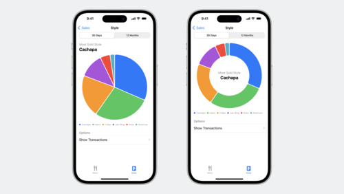
Explore pie charts and interactivity in Swift Charts
Swift Charts has come full circle: Get ready to bake up pie and donut charts in your app with the latest improvements to the framework. Learn how to make your charts scrollable, explore the chart selection API for revealing additional details in your data, and find out how enabling additional...
WWDC23 -
 11:24
11:24
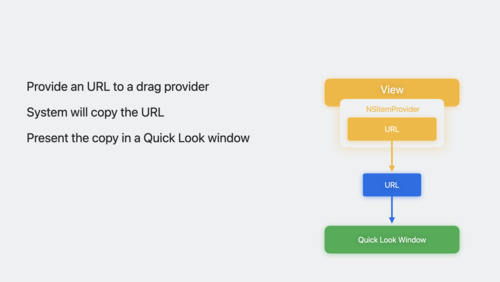
Discover Quick Look for spatial computing
Learn how to use Quick Look on visionOS to add powerful previews for 3D content, spatial images and videos, and much more. We'll show you the different ways that the system presents these experiences, demonstrate how someone can drag and drop Quick Look content from an app or website to create a...
WWDC23 -
 42:52
42:52
Analyze hangs with Instruments
User interface elements often mimic real-world interactions, including real-time responses. Apps with a noticeable delay in user interaction — a hang — can break that illusion and create frustration. We'll show you how to use Instruments to analyze, understand, and fix hangs in your apps on all...
WWDC23 -
 24:26
24:26
Prototype with Xcode Playgrounds
Speed up feature development by prototyping new code with Xcode Playgrounds, eliminating the need to keep rebuilding and relaunching your project to verify your changes. We'll show you how using a playground in your project or package can help you try out your code in various scenarios and take a...
WWDC23 English -
 23:23
23:23
What’s new in Core Data
Elevate your app's data persistence with improvements in Core Data. Learn how you can use composite attributes to create more intuitive data models. We'll also show you how to migrate your schema through disruptive changes, when to defer intense migrations, and how to avoid overhead on a person's...
WWDC23 -
 21:21
21:21
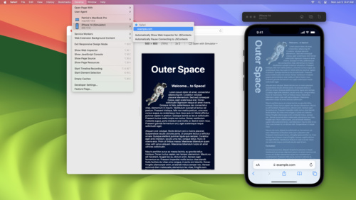
Rediscover Safari developer features
Get ready to explore Safari's rich set of tools for web developers and designers. Learn how you can inspect web content, find out about Responsive Design Mode and WebDriver, and get started with simulators and devices. We'll also show you how to pair with Vision Pro, make content inspectable in...
WWDC23 English -
 10:41
10:41
Meet Core Location for spatial computing
Discover how Core Location helps your app find its place in the world — literally. We'll share how you can build a spatial computing app that uses a person's location while respecting their privacy. You'll also learn how your app can request location access and how Core Location adapts requests...
WWDC23 English -
 15:39
15:39
Build accessible apps with SwiftUI and UIKit
Discover how advancements in UI frameworks make it easier to build rich, accessible experiences. Find out how technologies like VoiceOver can better interact with your app's interface through accessibility traits and actions. We'll share the latest updates to SwiftUI that help you refine your...
WWDC23 English -
 15:46
15:46
Create immersive Unity apps
Explore how you can use Unity to create engaging and immersive experiences for visionOS. We'll share how Unity integrates seamlessly with Apple frameworks, take you through the tools you can use to build natively for the platform, and show you how volume cameras can bring your existing scenes...
WWDC23 English -
 14:38
14:38
Explore 3D body pose and person segmentation in Vision
Discover how to build person-centric features with Vision. Learn how to detect human body poses and measure individual joint locations in 3D space. We'll also show you how to take advantage of person segmentation APIs to distinguish and segment up to four individuals in an image. To learn more...
WWDC23 English -
 13:03
13:03
Inspectors in SwiftUI: Discover the details
Meet Inspectors — a structural API that can help bring a new level of detail to your apps. We'll take you through the fundamentals of the API and show you how to adopt it. Learn about the latest updates to sheet presentation customizations and find out how you can combine the two to create...
WWDC23 English -
 19:30
19:30
Take SwiftUI to the next dimension
Get ready to add depth and dimension to your visionOS apps. Find out how to bring three-dimensional objects to your app using volumes, get to know the Model 3D API, and learn how to position and animate content. We'll also show you how to use UI attachments in RealityView and support gestures in...
WWDC23 English -
 27:18
27:18
What’s new in AppKit
Discover the latest advances in Mac app development. We'll share improvements to controls and menus and explore the tools that can help you break free from your (view) bounds. Learn how to add motion to your user interface, take advantage of improvements to text input, and integrate your existing...
WWDC23 English -
 14:46
14:46
Beyond scroll views
Find out how you can take your scroll views to the next level with the latest APIs in SwiftUI. We'll show you how to customize scroll views like never before. Explore the relationship between safe areas and a scroll view's margins, learn how to interact with the content offset of a scroll view,...
WWDC23 English -
 30:01
30:01
Explore SwiftUI animation
Explore SwiftUI's powerful animation capabilities and find out how these features work together to produce impressive visual effects. Learn how SwiftUI refreshes the rendering of a view, determines what to animate, interpolates values over time, and propagates context for the current transaction.
WWDC23 English -
 31:58
31:58
Your guide to Metal ray tracing
Discover how you can enhance the visual quality of your games and apps with Metal ray tracing. We'll take you through the fundamentals of the Metal ray tracing API. Explore the latest enhancements and techniques that will enable you to create larger and more complex scenes, reduce memory usage...
WWDC23 English -
 16:30
16:30
Deliver video content for spatial experiences
Learn how to prepare and deliver video content for visionOS using HTTP Live Streaming (HLS). Discover the current HLS delivery process for media and explore how you can expand your delivery pipeline to support 3D content. Get up to speed with tips and techniques for spatial media streaming and...
WWDC23 English -
 36:36
36:36
Explore advances in declarative device management
Learn how you can help IT administrators get the tools they need to manage their organization's devices. Discover the latest changes to declarative device management, including software update management, additional asset types, status reporting for FileVault, and more.
WWDC23 English -
 26:41
26:41
What’s new in App Store pricing
Discover the latest updates to App Store pricing capabilities and tools. Learn how you can manage pricing for your apps and in-app purchases within App Store Connect and the App Store Connect API, how to set pricing by region, and more.
WWDC23 English -
 20:41
20:41
Enhance your spatial computing app with RealityKit
Go beyond the window and learn how you can bring engaging and immersive 3D content to your apps with RealityKit. Discover how SwiftUI scenes work in tandem with RealityView and how you can embed your content into an entity hierarchy. We'll also explore how you can blend virtual content and the...
WWDC23 English -
 22:16
22:16
Discover Calendar and EventKit
Discover how you can bring Calendar into your app and help people better manage their time. Find out how to create new events from your app, fetch events, and implement a virtual conference extension. We'll also take you through some of the changes to calendar access levels that help your app...
WWDC23 English -
 20:57
20:57
Meet RealityKit Trace
Discover how you can use RealityKit Trace to improve the performance of your spatial computing apps. Explore performance profiling guidelines for this platform and learn how the RealityKit Trace template can help you optimize rendering for your apps. We'll also provide guidance on profiling...
WWDC23 English -
 15:54
15:54
What’s new in voice processing
Learn how to use the Apple voice processing APIs to achieve the best possible audio experience in your VoIP apps. We'll show you how to detect when someone is talking while muted, adjust ducking behavior of other audio, and more.
WWDC23 English -
 17:45
17:45
Mix Swift and C++
Learn how you can use Swift in your C++ and Objective-C++ projects to make your code safer, faster, and easier to develop. We'll show you how to use C++ and Swift APIs to incrementally incorporate Swift into your app.
WWDC23 English -
 16:26
16:26
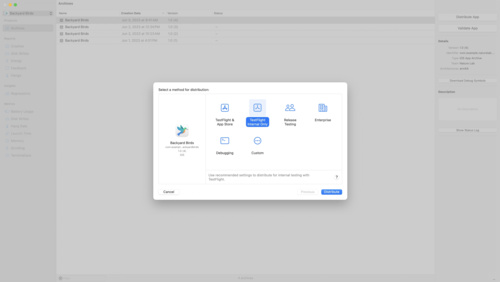
Simplify distribution in Xcode and Xcode Cloud
Discover how to share your app using Xcode's streamlined distribution, which allows you to submit your app to TestFlight or the App Store with one click. We'll also show you how to use Xcode Cloud to simplify your distribution process by automatically including notes for testers in TestFlight,...
WWDC23 English -
 9:25
9:25
Model your schema with SwiftData
Learn how to use schema macros and migration plans with SwiftData to build more complex features for your app. We'll show you how to fine-tune your persistence with @Attribute and @Relationship options. Learn how to exclude properties from your data model with @Transient and migrate from one...
WWDC23 -
 18:24
18:24
Optimize CarPlay for vehicle systems
Discover how you can integrate CarPlay into modern vehicle systems. We'll show you how to adjust CarPlay for any high-resolution display — regardless of configuration or size. Learn how you can use CarPlay-supplied metadata and video streams to show information on additional displays, and find...
WWDC23 English -
 18:54
18:54
Build an app with SwiftData
Discover how SwiftData can help you persist data in your app. Code along with us as we bring SwiftData to a multi-platform SwiftUI app. Learn how to convert existing model classes into SwiftData models, set up the environment, reflect model layer changes in UI, and build document-based...
WWDC23 English -
 14:33
14:33
Explore immersive sound design
Discover how you can use sound to enhance the experience of your visionOS apps and games. Learn how Apple designers select sounds and build soundscapes to create textural, immersive experiences. We'll share how you can enrich basic interactions in your app with sound when you place audio cues...
WWDC23 -
 20:14
20:14
Explore materials in Reality Composer Pro
Learn how Reality Composer Pro can help you alter the appearance of your 3D objects using RealityKit materials. We'll introduce you to MaterialX and physically-based (PBR) shaders, show you how to design dynamic materials using the shader graph editor, and explore adding custom inputs to a...
WWDC23 English -
 34:57
34:57
Create a more responsive camera experience
Discover how AVCapture and PhotoKit can help you create more responsive and delightful apps. Learn about the camera capture process and find out how deferred photo processing can help create the best quality photo. We'll show you how zero shutter lag uses time travel to capture the perfect action...
WWDC23 English -
 35:06
35:06
What’s new in CSS
Explore the latest advancements in CSS. Learn techniques and best practices for working with wide-gamut color, creating gorgeous typography, and writing simple and robust code. We'll also peer into the future and preview upcoming layout and typography features.
WWDC23 -
 26:15
26:15
Meet mergeable libraries
Discover how mergeable libraries combine the best parts of static and dynamic libraries to help improve your app's productivity and runtime performance. Learn how you can enable faster development while shipping the smallest app. We'll show you how to adopt mergeable libraries in Xcode 15 and...
WWDC23 English -
 27:41
27:41
Evolve your ARKit app for spatial experiences
Discover how you can bring your app's AR experience to visionOS. Learn how ARKit and RealityKit have evolved for spatial computing: We'll highlight conceptual and API changes for those coming from iPadOS and iOS and guide you to sessions with more details to help you bring your AR experience to...
WWDC23 English -
 29:12
29:12
Discover Continuity Camera for tvOS
Discover how you can bring AVFoundation, AVFAudio, and AudioToolbox to your apps on tvOS and create camera and microphone experiences for the living room. Find out how to support tvOS in your existing iOS camera experience with the Device Discovery API, build apps that use iPhone as a webcam or...
WWDC23 -
 14:25
14:25
Explore Natural Language multilingual models
Learn how to create custom Natural Language models for text classification and word tagging using multilingual, transformer-based embeddings. We'll show you how to train with less data and support up to 27 different languages across three scripts. Find out how to use these embeddings to fine-tune...
WWDC23 English -
 18:47
18:47
Bring widgets to life
Learn how to make animated and interactive widgets for your apps and games. We'll show you how to tweak animations for entry transitions and add interactivity using SwiftUI Button and Toggle so that you can create powerful moments right from the Home Screen and Lock Screen.
WWDC23 English -
 15:10
15:10
Bring your Unity VR app to a fully immersive space
Discover how you can bring your existing Unity VR apps and games to visionOS. We'll explore workflows that can help you get started and show you how to build for eyes and hands in your apps and games with the Unity Input System. Learn about Unity's XR Interaction Toolkit, tips for foveated...
WWDC23 English -
 24:08
24:08
Build widgets for the Smart Stack on Apple Watch
Follow along as we build a widget for the Smart Stack on watchOS 10 using the latest SwiftUI and WidgetKit APIs. Learn tips, techniques, and best practices for creating widgets that show relevant information on Apple Watch.
WWDC23 -
 20:05
20:05
Meet Object Capture for iOS
Discover how you can offer an end-to-end Object Capture experience directly in your iOS apps to help people turn their objects into ready-to-use 3D models. Learn how you can create a fully automated Object Capture scan flow with our sample app and how you can assist people in automatically...
WWDC23 -
 12:49
12:49
Get started with privacy manifests
Meet privacy manifests: a new tool that helps you accurately identify the privacy practices of your app's dependencies. Find out how third-party SDK developers can use these manifests to share privacy practices for their frameworks. We'll also share how Xcode can produce a full privacy report to...
WWDC23 English -
 13:02
13:02
What’s new in App Store Connect
Discover the latest updates to App Store Connect, the suite of tools used to manage and submit apps to the App Store. Explore how you can use the latest features to test, price, promote, and automate the management of your app more easily. We'll also share enhancements to tools like TestFlight...
WWDC23 English -
 13:01
13:01
Fix failures faster with Xcode test reports
Discover how you can find, debug, and fix test failures faster with the test report in Xcode and Xcode Cloud. Learn how Xcode identifies failure patterns to help you find the right place to start investigating. We'll also show you how to use the UI automation explorer and video recordings to...
WWDC23 English -
 13:35
13:35
Update your app for watchOS 10
Join us as we update an Apple Watch app to take advantage of the latest features in watchOS 10. In this code-along, we'll show you how to use the latest SwiftUI APIs to maximize glanceability and reorient app navigation around the Digital Crown.
WWDC23 English -
 6:21
6:21
What’s new in App Clips
Explore the latest updates to App Clips. We'll show you how to build App Clips more easily using default App Clip links. Learn how you can take advantage of the increased App Clip size limit to build richer and more engaging experiences, and find out how you can launch App Clips directly from...
WWDC23 English -
 29:43
29:43
Explore enhancements to App Intents
Bring your widgets to life with App Intents! Explore the latest updates and learn how you can take advantage of dynamic options and user interactivity to build better experiences for your App Shortcuts. We'll share how you can integrate with Apple Pay, structure your code more efficiently, and...
WWDC23 English -
 16:23
16:23
Deploy passkeys at work
Discover how you can take advantage of passkeys in managed environments at work. We'll explore how passkeys can work well in enterprise environments through Managed Apple ID support for iCloud Keychain. We'll also share how administrators can manage passkeys for specific devices using Access...
WWDC23 English -
 12:26
12:26
Design widgets for the Smart Stack on Apple Watch
Bring your widgets to watchOS with the new Smart Stack. We'll show you how to use standard design layouts, color and iconography, and signal-based relevancy to ensure your app's widgets are glanceable, distinctive and smart. When you're ready to make your own, watch this code-along: "Build...
WWDC23 English -
 21:06
21:06
What’s new in App Store server APIs
Discover the latest updates to the App Store Server API and App Store Server Notifications. Explore the current API offerings and learn how to track subscription status with notifications, work with transactions on your server, and efficiently recover missed notifications. We'll also show you how...
WWDC23 English -
 11:32
11:32
Meet Push Notifications Console
The Push Notifications Console is the best way to quickly test user notifications in your app. Learn how you can iterate on new ideas quickly by sending notifications directly from the console and analyze delivery logs to learn more about your pushes. We'll also show you how to generate and...
WWDC23 English -
 18:34
18:34
Design with SwiftUI
Discover how SwiftUI can help you quickly iterate and explore design ideas. Learn from Apple designers as they share how working with SwiftUI influenced the design of the Maps app in watchOS 10 and other elements of their work, and find out how you can incorporate these workflows in your own...
WWDC23 English -
 15:58
15:58
Create seamless experiences with Virtualization
Discover the latest updates to the Virtualization framework. We'll show you how to configure a virtual machine (VM) to automatically resize its display, take you through saving and restoring a running VM, and explore storage and performance options for Virtualization apps running on the desktop...
WWDC23 English -
 32:49
32:49
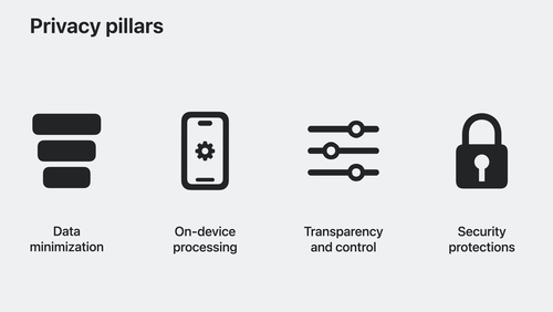
What’s new in privacy
At Apple, we believe that privacy is a fundamental human right. Learn about new technologies on Apple platforms that make it easier for you to implement essential privacy patterns that build customer trust in your app. Discover privacy improvements for Apple's platforms, as well as a study of how...
WWDC23 English -
 18:04
18:04
Create animated symbols
Discover animation presets and learn how to use them with SF Symbols and custom symbols. We'll show you how to experiment with different options and configurations to find the perfect animation for your app. Learn how to update custom symbols for animation using annotation features, find out how...
WWDC23 English -
 17:05
17:05
Verify app dependencies with digital signatures
Discover how you can help secure your app's dependencies. We'll show you how Xcode can automatically verify any signed XCFrameworks you include within a project. Learn how code signatures work, the benefits they provide to help protect your software supply chain, and how SDK developers can sign...
WWDC23 English -
 34:15
34:15
Work with Reality Composer Pro content in Xcode
Learn how to bring content from Reality Composer Pro to life in Xcode. We'll show you how to load 3D scenes into Xcode, integrate your content with your code, and add interactivity to your app. We'll also share best practices and tips for using these tools together in your development workflow...
WWDC23 English -
 27:02
27:02
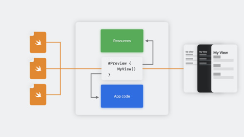
Build programmatic UI with Xcode Previews
Learn how you can use the #Preview macro on Xcode 15 to quickly iterate on your UI code written in SwiftUI, UIKit, or AppKit. Explore a collage of unique workflows for interacting with views right in the canvas, find out how to view multiple variations of UI simultaneously, and discover how you...
WWDC23 -
 29:16
29:16
Optimize app power and performance for spatial computing
Learn how you can create powerful apps and games for visionOS by optimizing for performance and efficiency. We'll cover the unique power characteristics of the platform, explore building a performance plan, and share some of the tools and strategies to test and optimize your apps.
WWDC23 English -
 15:06
15:06
Bring your game to Mac, Part 1: Make a game plan
Bring modern, high-end games to Mac and iPad with the powerful features of Metal and Apple silicon. Discover the game porting toolkit and learn how it can help you evaluate your existing Windows game for graphics feature compatibility and performance. We'll share best practices and technical...
WWDC23 English -
 21:12
21:12
Meet Reality Composer Pro
Discover how to easily compose, edit, and preview 3D content with Reality Composer Pro. Follow along as we explore this developer tool by setting up a new project, composing scenes, adding particle emitters and audio, and even previewing content on device. Once you're familiar with the basics of...
WWDC23 English -
 26:45
26:45
Bring your game to Mac, Part 3: Render with Metal
Discover how you can support Metal in your rendering code as we close out our three-part series on bringing your game to Mac. Once you've evaluated your existing Windows binary with the game porting toolkit and brought your HLSL shaders over to Metal, learn how you can optimally implement the...
WWDC23 English -
 43:07
43:07
What’s new in Swift
Join us for an update on Swift. We'll show you how APIs are becoming more extensible and expressive with features like parameter packs and macros. We'll also take you through improvements to interoperability and share how we're expanding Swift's performance and safety benefits everywhere from...
WWDC23 English -
 18:21
18:21
Unlock the power of grammatical agreement
Discover how you can use automatic grammatical agreement in your apps and games to create inclusive and more natural-sounding expressions. We'll share best practices for working with Foundation, showcase examples in multiple languages, and demonstrate how to use these APIs to enhance the user...
WWDC23 English -
 17:15
17:15
Meet ActivityKit
Live Activities are a glanceable way for someone to keep track of the progress of a task within your app. We'll teach you how you can create helpful experiences for the Lock Screen, the Dynamic Island, and StandBy. Learn how to update your app's Live Activities, monitor activity state, and take...
WWDC23 English -
 12:03
12:03
Enhance your iPad and iPhone apps for the Shared Space
Get ready to enhance your iPad and iPhone apps for the Shared Space! We'll show you how to optimize your experience to make it feel great on visionOS and explore Designed for iPad app interaction, visual treatments, and media.
WWDC23 English -
 13:37
13:37
Add SharePlay to your app
Discover how your app can take advantage of SharePlay to turn any activity into a shareable experience with friends! We'll share the latest updates to SharePlay, explore the benefits of creating shared activities, dive into some exciting use cases, and take you through best practices to create...
WWDC23 English -
 36:59
36:59
Meet StoreKit for SwiftUI
Discover how you can use App Store product metadata and Xcode Previews to add in-app purchases to your app with just a few lines of code. Explore a new collection of UI components in StoreKit and learn how you can easily merchandise your products, present subscriptions in a way that helps users...
WWDC23 English -
 21:35
21:35
Principles of spatial design
Discover the fundamentals of spatial design. Learn how to design with depth, scale, windows, and immersion, and apply best practices for creating comfortable, human-centered experiences that transform reality. Find out how you can use these spatial design principles to extend your existing app or...
WWDC23 English -
 31:08
31:08
Develop your first immersive app
Find out how you can build immersive apps for visionOS using Xcode and Reality Composer Pro. We'll show you how to get started with a new visionOS project, use Xcode Previews for your SwiftUI development, and take advantage of RealityKit and RealityView to render 3D content.
WWDC23 English -
 19:20
19:20
Design and build apps for watchOS 10
Dive into the details of watchOS design principles and learn how to apply them in your app using SwiftUI. We'll show you how to build an app for the redesigned user interface to surface timely information, communicate focused content at a glance, and make navigation consistent and predictable.
WWDC23 English -
 25:39
25:39
Meet UIKit for spatial computing
Learn how to bring your UIKit app to visionOS. We'll show you how to build for a new destination, explore APIs and best practices for spatial computing, and take your content into the third dimension when you use SwiftUI with UIKit in visionOS.
WWDC23 English -
 8:52
8:52
Meet SwiftData
SwiftData is a powerful and expressive persistence framework built for Swift. We'll show you how you can model your data directly from Swift code, use SwiftData to work with your models, and integrate with SwiftUI.
WWDC23 English -
 18:53
18:53
What’s new in SF Symbols 5
Explore the latest updates to SF Symbols, Apple's library of iconography designed to integrate seamlessly with San Francisco, the system font for Apple platforms. Learn about symbol animations: a collection of expressive, configurable animations that can make your interface feel more lively and...
WWDC23 English -
 29:50
29:50
Unleash the UIKit trait system
Discover powerful enhancements to the trait system in UIKit. Learn how you can define custom traits to add your own data to UITraitCollection, modify the data propagated to view controllers and views with trait override APIs, and adopt APIs to improve flexibility and performance. We'll also show...
WWDC23 English -
 13:42
13:42
Debug with structured logging
Discover the debug console in Xcode 15 and learn how you can improve your diagnostic experience through logging. Explore how you can navigate your logs easily and efficiently using advanced filtering and improved visualization. We'll also show you how to use the dwim-print command to evaluate...
WWDC23 English -
 39:43
39:43
Expand on Swift macros
Discover how Swift macros can help you reduce boilerplate in your codebase and adopt complex features more easily. Learn how macros can analyze code, emit rich compiler errors to guide developers towards correct usage, and generate new code that is automatically incorporated back into your...
WWDC23 English -
 31:55
31:55
Get started with building apps for spatial computing
Get ready to develop apps and games for visionOS! Discover the fundamental building blocks that make up spatial computing — windows, volumes, and spaces — and find out how you can use these elements to build engaging and immersive experiences.
WWDC23 English -
 7:18
7:18
Bring widgets to new places
The widget ecosystem is expanding: Discover how you can use the latest WidgetKit APIs to make your widget look great everywhere. We'll show you how to identify your widget's background, adjust layout dynamically, and prepare colors for vibrant rendering so that your widget can sit seamlessly in...
WWDC23 English -
 31:34
31:34
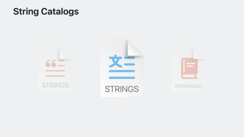
Discover String Catalogs
Discover how Xcode 15 makes it easy to localize your app by managing all of your strings in one place. We'll show you how to extract, edit, export, and build strings in your project using String Catalogs. We'll also share how you can adopt String Catalogs in existing projects at your own pace by...
WWDC23 English -
 15:55
15:55
What’s new in web apps
Discover web apps for Mac — a powerful way to experience your website from the Dock. Learn how you can customize your web app to give people the best experience when they add your site. We'll also share how to take advantage of push notifications and badging for web apps for Mac and Home Screen...
WWDC23 English -
 13:17
13:17
Integrate your media app with HomePod
Learn how people can interact with your media app directly from HomePod. We'll show you how to add a media intent to your iPhone or iPad app and help people stream your content to a HomePod speaker over AirPlay simply by using their voice. Explore implementation details and get tips and best...
WWDC23 English -
 24:53
24:53
Support Cinematic mode videos in your app
Discover how the Cinematic Camera API helps your app work with Cinematic mode videos captured in the Camera app. We'll share the fundamentals — including Decision layers — that make up Cinematic mode video, show you how to access and update Decisions in your app, and help you save and load those...
WWDC23 English -
 28:46
28:46
What’s new in managing Apple devices
Learn about the latest management capabilities for iOS, iPadOS, and macOS. Discover how you can streamline the setup experience with enhancements to automated device enrollment and a new return-to-service option for iOS and iPadOS devices. We'll share how to use your identity provider in even...
WWDC23 -
 12:22
12:22
Explore App Store Connect for spatial computing
App Store Connect provides the tools you need to test, submit, and manage your visionOS apps on the App Store. Explore basics and best practices for deploying your first spatial computing app, adding support for visionOS to an existing app, and managing compatibility. We'll also show you how...
WWDC23 English -
 23:02
23:02
Sync to iCloud with CKSyncEngine
Discover how CKSyncEngine can help you sync people's CloudKit data to iCloud. Learn how you can reduce the amount of code in your app when you let the system handle scheduling for your sync operations. We'll share how you can automatically benefit from enhanced performance as CloudKit evolves,...
WWDC23 English -
 16:26
16:26
Design spatial SharePlay experiences
Explore the types of shared activities you can create in your visionOS apps and find out how your apps can use Spatial Persona templates to support meaningful interactions between people. Discover how to design your UI around a shared context, handle immersive content in a shared activity, and more.
WWDC23 English -
 33:53
33:53
Create rich documentation with Swift-DocC
Learn how you can take advantage of the latest features in Swift-DocC to create rich and detailed documentation for your app or framework. We'll show you how to use the Xcode 15 Documentation Preview editor to efficiently iterate on your existing project's documentation, and explore expanded...
WWDC23 English -
 14:59
14:59
Enhance your app’s audio experience with AirPods
Discover how you can create transformative audio experiences in your app using AirPods. Learn how to incorporate AirPods Automatic Switching, use AVAudioApplication to support Mute Control, and take advantage of Spatial Audio to create immersive soundscapes in your app or game.
WWDC23 English -
 16:50
16:50
Discover machine learning enhancements in Create ML
Find out how Create ML can help you do even more with machine learning models. Learn about the latest updates to image understanding and text-based tasks with multilingual BERT embeddings. Discover how easy it is to train models that can understand the content of images using multi-label...
WWDC23 English -
 16:19
16:19
Meet Safari for spatial computing
Discover the web for visionOS and learn how people can experience your web content in a whole new way. Explore the unique input model powering this platform and learn how you can optimize your website for spatial computing. We'll also share how emerging standards are helping shape 3D experiences...
WWDC23 English -
 27:21
27:21
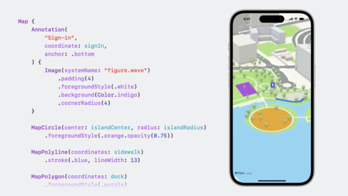
Meet MapKit for SwiftUI
Discover how expanded SwiftUI support for MapKit has made it easier than ever for you to integrate Maps into your app. We'll show you how to use SwiftUI to add annotations and overlays to a map, control the camera, and more.
WWDC23 English -
 34:02
34:02
What’s new in SwiftUI
Learn how you can use SwiftUI to build great apps for all Apple platforms. Explore the latest updates to SwiftUI and discover new scene types for visionOS. Simplify your data models with the latest data flow options and learn about the Inspector view. We'll also take you through enhanced...
WWDC23 English -
 22:32
22:32
What’s new in Xcode 15
Discover the latest productivity and performance improvements in Xcode 15. Explore enhancements to code completion and Xcode Previews, learn about the test navigator and test report, and find out more about the streamlined distribution process. We'll also highlight improved navigation, source...
WWDC23 English -
 10:33
10:33
Tune up your AirPlay audio experience
Learn how you can upgrade your app's AirPlay audio experience to be more robust and responsive. We'll show you how to adopt enhanced audio buffering with AVQueuePlayer, explore alternatives when building a custom player in your app, and share best practices.
WWDC23 English -
 27:32
27:32
Build spatial experiences with RealityKit
Discover how RealityKit can bring your apps into a new dimension. Get started with RealityKit entities, components, and systems, and learn how you can add 3D models and effects to your app on visionOS. We'll also take you through the RealityView API and demonstrate how to add 3D objects to...
WWDC23 English -
 31:18
31:18
What’s new in UIKit
Explore enhancements and updates to UIKit and learn how to build better iOS, iPadOS, and Mac Catalyst apps. We'll show you the latest features and improvements in UIKit and share API refinements, performance improvements, and much more.
WWDC23 English -
 25:51
25:51
Create accessible spatial experiences
Learn how you can make spatial computing apps that work well for everyone. Like all Apple platforms, visionOS is designed for accessibility: We'll share how we've reimagined assistive technologies like VoiceOver and Pointer Control and designed features like Dwell Control to help people interact...
WWDC23 English -
 28:58
28:58
Support HDR images in your app
Learn how to identify, load, display, and create High Dynamic Range (HDR) still images in your app. Explore common HDR concepts and find out about the latest updates to the ISO specification. Learn how to identify and display HDR images with SwiftUI and UIKit, create them from ProRAW and RAW...
WWDC23 English, Korean -
 25:59
25:59
Meet SwiftUI for spatial computing
Take a tour of the solar system with us and explore SwiftUI for visionOS! Discover how you can build an entirely new universe of apps with windows, volumes, and spaces. We'll show you how to get started with SwiftUI on this platform as we build an astronomy app, add 3D content, and create a fully...
WWDC23 English -
 9:55
9:55
Meet watchOS 10
Discover some of the most significant changes to Apple Watch since its introduction as we tour the redesigned user interface and the new Smart Stack. Learn how Apple designers approached the design of watchOS 10 as we explore layout, navigation, and visual style, and find out how you can apply...
WWDC23 English -
 22:30
22:30
Explore enhancements to RoomPlan
Join us for an exciting update to RoomPlan as we explore MultiRoom support and enhancements to room representations. Learn how you can scan areas with more detail, capture multiple rooms, and merge individual scans into one larger structure. We'll also share workflows and best practices when...
WWDC23 English -
 15:55
15:55
Perform accessibility audits for your app
Discover how you can test your app for accessibility with every build. Learn how to perform automated audits for accessibility using XCTest and find out how to interpret the results. We'll also share enhancements to the accessibility API that can help you improve UI test coverage.
WWDC23 English -
 12:51
12:51
Discover Observation in SwiftUI
Simplify your SwiftUI data models with Observation. We'll share how the Observable macro can help you simplify models and improve your app's performance. Get to know Observation, learn the fundamentals of the macro, and find out how to migrate from ObservableObject to Observable.
WWDC23 English -
 14:45
14:45
Make features discoverable with TipKit
Teach people how to use your app with TipKit! Learn how you can create effective educational moments through tips. We'll share how you can build eligibility rules to reach the ideal audience, control tip frequency, and strategies for testing to ensure successful interactions.
WWDC23 English -
 21:58
21:58
Create a great ShazamKit experience
Discover how your app can offer a great audio matching experience with the latest updates to ShazamKit. We'll take you through matching features, updates to audio recognition, and interactions with the Shazam library. Learn tips and best practices for using ShazamKit in your audio apps. For more...
WWDC23 English -
 12:19
12:19
Ready, set, relay: Protect app traffic with network relays
Learn how relays can make your app's network traffic more private and secure without the overhead of a VPN. We'll show you how to integrate relay servers in your own app and explore how enterprise networks can use relays to securely access internal resources.
WWDC23 English -
 25:02
25:02
Spotlight your app with App Shortcuts
Discover how to use App Shortcuts to surface frequently used features from your app in Spotlight or through Siri. Find out how to configure search results for your app and learn best practices for creating great App Shortcuts. We'll also show you how to build great visual and voice experiences...
WWDC23 English -
 18:26
18:26
Build great games for spatial computing
Find out how you can develop great gaming experiences for visionOS. We'll share some of the key building blocks that help you create games for this platform, explore how your experiences can fluidly move between levels of immersion, and provide a roadmap for exploring ARKit, RealityKit, Reality...
WWDC23 English -
 18:38
18:38
Lift subjects from images in your app
Discover how you can easily pull the subject of an image from its background in your apps. Learn how to lift the primary subject or to access the subject at a given point with VisionKit. We'll also share how you can lift subjects using Vision and combine that with lower-level frameworks like Core...
WWDC23 English -
 22:41
22:41
Design for spatial user interfaces
Learn how to design great interfaces for spatial computing apps. We'll share how your existing screen-based knowledge easily translates into creating great experiences for visionOS. Explore guidelines for UI components, materials, and typography and find out how you can design experiences that...
WWDC23 English -
 24:25
24:25
What’s new in StoreKit 2 and StoreKit Testing in Xcode
Get to know the latest enhancements to StoreKit 2 and StoreKit Testing in Xcode. Discover API updates for promoted in-app purchases, StoreKit messages, the Transaction model, the RenewalInfo model, and the App Store sheet for managing subscriptions. Learn how to upgrade to SHA-256 for on-device...
WWDC23 English -
 20:04
20:04
Design for spatial input
Learn how to design great interactions for eyes and hands. We'll share the design principles for spatial input, explore best practices around input methods, and help you create spatial experiences that are comfortable, intuitive, and satisfying.
WWDC23 English -
 13:47
13:47
Detect animal poses in Vision
Go beyond detecting cats and dogs in images. We'll show you how to use Vision to detect the individual joints and poses of these animals as well — all in real time — and share how you can enable exciting features like animal tracking for a camera app, creative embellishment on an animal photo,...
WWDC23 English -
 21:22
21:22
Build custom workouts with WorkoutKit
WorkoutKit makes it easy to create, preview, and schedule planned workouts for the Workout app on Apple Watch. Learn how to build custom intervals, create alerts, and use the built-in preview UI to send your own workout routines to Apple Watch.
WWDC23 English -
 18:24
18:24
Generalize APIs with parameter packs
Swift parameter packs are a powerful tool to expand what is possible in your generic code while also enabling you to simplify common generic patterns. We'll show you how to abstract over types as well as the number of arguments in generic code and simplify common generic patterns to avoid...
WWDC23 English -
 33:58
33:58
Write Swift macros
Discover how you can use Swift macros to make your codebase more expressive and easier to read. Code along as we explore how macros can help you avoid writing repetitive code and find out how to use them in your app. We'll share the building blocks of a macro, show you how to test it, and take...
WWDC23 English -
 19:56
19:56
What’s new in VisionKit
Discover how VisionKit can help people quickly lift subjects from images in your app and learn more about the content of an image with Visual Look Up. We'll also take a tour of the latest updates to VisionKit for Live Text interaction, data scanning, and expanded support for macOS apps. For more...
WWDC23 English -
 18:11
18:11
Wind your way through advanced animations in SwiftUI
Discover how you can take animation to the next level with the latest updates to SwiftUI. Join us as we wind our way through animation and build out multiple steps, use keyframes to add coordinated multi-track animated effects, and combine APIs in unique ways to make your app spring to life.
WWDC23 English -
 18:57
18:57
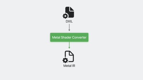
Bring your game to Mac, Part 2: Compile your shaders
Discover how the Metal shader converter streamlines the process of bringing your HLSL shaders to Metal as we continue our three-part series on bringing your game to Mac. Find out how to build a fast, end-to-end shader pipeline from DXIL that supports all shader stages and allows you to leverage...
WWDC23 English -
 24:11
24:11
Meet ARKit for spatial computing
Discover how you can use ARKit's tracking and scene understanding features to develop a whole new universe of immersive apps and games. Learn how visionOS and ARKit work together to help you create apps that understand a person's surroundings — all while preserving privacy. Explore the latest...
WWDC23 English -
 14:17
14:17
Run your iPad and iPhone apps in the Shared Space
Discover how you can run your existing iPad and iPhone apps on Vision Pro. Learn how iPadOS and iOS apps operate on this platform, find out about the Designed for iPad experience, and explore the paths available for enhancing your app experience on visionOS.
WWDC23 English -
 1:11
1:11
What Apple developers need to know at WWDC23
There's never been a better time to create for Apple platforms — including iOS, iPadOS, macOS, tvOS, and all-new visionOS. Get insights from Apple engineers and designers with over 175 brand-new instructional video sessions covering the latest in hardware and software. All to help bring your...
WWDC23 English -
 89:34
89:34
Platforms State of the Union (ASL)
Learn about the latest tools, technologies, and advancements to help you create even better apps across Apple platforms, including the all-new visionOS.
WWDC23 English, French, German, Korean, Simplified Chinese, Spanish -
 89:34
89:34
Platforms State of the Union
Learn about the latest tools, technologies, and advancements to help you create even better apps across Apple platforms, including the all-new visionOS.
WWDC23 English, French, German, Korean, Simplified Chinese, Spanish -
 2:15
2:15
17 big & little things at WWDC23
Here's your guide to some of the big (and little) things announced on the first day of WWDC.
WWDC23 -
 126:10
Keynote (ASL)
The Apple Worldwide Developers Conference kicks off with exciting news, inspiration, and new opportunities. Join the worldwide developer community for an in-depth look at the future of Apple platforms, directly from Apple Park.
WWDC23 English, French, German, Japanese, Korean, Simplified Chinese, Spanish -
 126:10
Keynote
The Apple Worldwide Developers Conference kicks off with exciting news, inspiration, and new opportunities. Join the worldwide developer community for an in-depth look at the future of Apple platforms, directly from Apple Park.
WWDC23 English, French, German, Japanese, Korean, Simplified Chinese, Spanish
-
-
Tech Talks -
 31:58
31:58
Improve your subscriber retention with App Store features
Learn how to minimize churn and win back subscribers on the App Store. Explore App Store data, review different types of subscriber churn, discover tools you can use to enhance your retention efforts, and learn implementation best practices.
Tech Talks -
 8:56
8:56
Adapt to changing network conditions
Apple devices can connect to multiple networks at the same time. Learn how your app can automatically select the best one for an optimal experience. Explore the different types of networks and review their characteristics. And discover how to use URLSession and Network framework to best describe...
Tech Talks -
 22:48
22:48
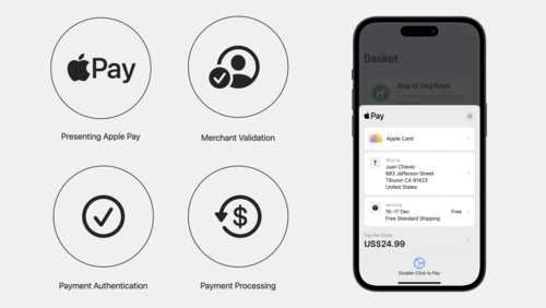
Get started with Apple Pay on the Web
Adding Apple Pay to your website elevates your customer experience. Learn how to present Apple Pay as a payment option, validate your merchant session, and authenticate and process payments. You'll also find out how to configure your environment, set up transactions using the Apple Pay demo site,...
Tech Talks -
 8:04
8:04
Connect your project to Xcode Cloud
Unlock the benefits of continuous integration and delivery in Xcode Cloud with source code management tools. Learn how to set up Xcode Cloud with a self-hosted source control management provider like GitHub Enterprise, troubleshoot common issues, and explore key project maintenance tips.
Tech Talks -
 11:56
11:56
Manage Game Center with the App Store Connect API
Discover how you can use the App Store Connect API to automate your Game Center configurations outside of App Store Connect on the web. Find out how the API can help you create achievements and leaderboards and share them between related games using groups. And learn how to enable and configure...
Tech Talks -
 14:05
14:05
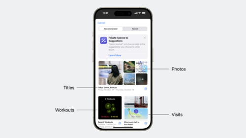
Discover the Journaling Suggestions API
Find out how the new Journaling Suggestions API can help people reflect on the small moments and big events in their lives though your app — all while protecting their privacy. Learn how to leverage the API to retrieve assets and metadata for journaling suggestions, invoke a picker on top of the...
Tech Talks -
 29:09
29:09
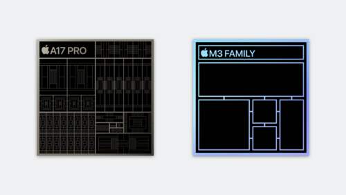
Explore GPU advancements in M3 and A17 Pro
Learn how Dynamic Caching, the next-generation shader core, hardware-accelerated ray tracing, and hardware-accelerated mesh shading of Apple family 9 GPUs can improve the performance of your Metal apps and games.
Tech Talks -
 26:00
26:00
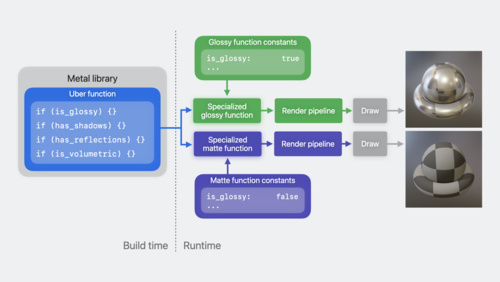
Learn performance best practices for Metal shaders
Discover how you can improve Metal shader performance using some of the latest advancements in Apple GPUs. Learn to reduce a shader's execution time by configuring function constants, and investigate ways to increase compiler optimization with function groups. Find out how to save run time by...
Tech Talks -
 33:56
33:56
Discover new Metal profiling tools for M3 and A17 Pro
Learn how the new profiling tools in Xcode 15 can help you achieve the best Metal performance on Apple family 9 GPUs. Discover how to use shader cost graphs, performance heat maps, and shader execution history tools to profile and optimize your Metal code. Find out how to use new GPU counters to...
Tech Talks -
 16:57
16:57
Bring your high-end game to iPhone 15 Pro
Discover how the power of A17 Pro can help you maximize your game on iPhone 15 Pro and iPhone 15 Pro Max. We'll share best practices and technical resources, and explore ways to optimize game performance, input, and asset management.
Tech Talks English -
 17:06
17:06
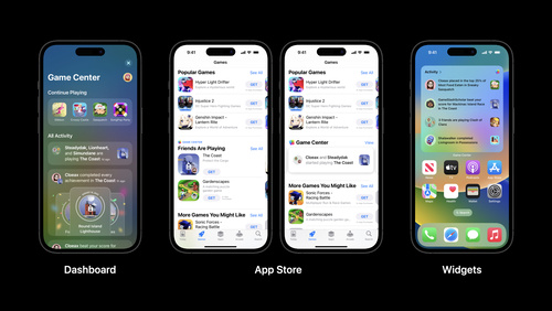
Meet rule-based matchmaking in Game Center
Learn how to incorporate the new rule-based matchmaking feature into your real-time multiplayer games. Discover how you can provide customized and flexible matchmaking to improve the quality of player matches and create a more fun and engaging experience for all players.
Tech Talks -
 20:11
20:11
Measure and improve acquisition with App Analytics
Learn how App Analytics can help you better understand user acquisition, so you can make data‑informed decisions. Explore ways to find out where your users are coming from and review definitions of key metrics. We'll also discuss how peer group benchmarks and other features can help improve your...
Tech Talks English -
 20:18
20:18
Use Game Center to boost discovery and engagement
Explore how Game Center, Apple's social gaming network, helps players discover and engage with your game. Learn about Game Center and App Store features that can help you connect with new players and keep them coming back, as well as Apple technologies designed to deliver powerful gameplay...
Tech Talks English -
 28:55
28:55
Explore App Store pricing upgrades
Learn about the newest pricing capabilities available on the App Store. We'll walk through enhanced global pricing, new tools to manage pricing by storefront, additional price points, and global equalization. We'll also share configuration examples.
Tech Talks English, Japanese, Simplified Chinese -
 16:53
16:53
Make the most of custom product pages
Discover how you can maximize the effectiveness of your custom product pages on the App Store. We'll cover best practices, provide data-based recommendations, and share success stories from developers who have used custom product pages to reach specific audiences.
Tech Talks English, Japanese, Korean, Simplified Chinese -
 22:23
22:23
Get started with app discovery and marketing
Learn how you can improve the discovery of your app on the App Store. We'll explore the different ways people find apps on the App Store and show you how to make your own app more discoverable. Discover the elements of a great product page, the role of search, referral traffic, and promotional...
Tech Talks English, Japanese, Korean, Simplified Chinese -
 18:46
18:46
Make the most of product page optimization
Learn how to get more from your product page optimization tests. We'll explore best practices, provide data-based recommendations, and share success stories from developers who have used product page optimization to make their App Store product pages even more relevant and effective.
Tech Talks English, Japanese, Korean, Simplified Chinese -
 35:11
35:11
What's new for enterprise developers
Discover how you can build compelling apps for your business on iOS, iPadOS, macOS, and watchOS. We'll take you through a curated overview of the latest updates to Apple platforms and explore relevant features that you can use to create engaging enterprise apps to transform workflows, inform...
Tech Talks English, Japanese, Korean, Simplified Chinese -
 17:20
17:20
Migrate custom intents to App Intents
Learn how you can easily convert your existing custom intents to App Intents. We'll take you through the conversion of your intents to Swift and discuss how you can improve discoverability of your app features when you create App Shortcuts. To learn more about App Intents, watch "Implement App...
Tech Talks English, Japanese, Korean, Simplified Chinese -
 6:44
6:44
Discover Metal Performance HUD
Get to know the new heads-up display panel built to help you analyze graphics performance in real time. Metal Performance HUD displays key graphics statistics so you can monitor, log, and identify tough-to-spot performance problems.
Tech Talks English, Japanese, Korean, Simplified Chinese -
 17:24
17:24
Implement Apple Pay and order management
Apple Pay provides an easy and secure way for people to make payments in your iOS, iPadOS, and watchOS apps as well as on the web. We'll take you through the entire Apple Pay implementation workflow – including how you can signal support for Apple Pay, request payment and handling updates, and...
Tech Talks English, Japanese, Korean, Simplified Chinese -
 4:37
4:37
Add SharePlay to your multiplayer game with Game Center
Learn how to let your players jump into games with friends they're on FaceTime calls with, using SharePlay. We'll show you how easy it is to turn on SharePlay support if you are already using the Game Center multiplayer UI. And if you've built a custom interface, we'll give you the few lines of...
Tech Talks English, Japanese, Korean, Simplified Chinese -
 9:03
9:03
Meet high-performance MapKit JS
MapKit JS provides a JavaScript API to embed interactive Apple Maps directly into your webpages or apps across different platforms and operating systems, including iOS and Android. Learn about the latest features to help improve load performance and make your web and native apps more responsive...
Tech Talks English, Japanese, Korean, Simplified Chinese -
 9:40
9:40
Do more with less data
Great apps do more for people while collecting less data. Learn how three simple tips from the App Review team can help you build great experiences while minimizing data collection.
Tech Talks English, Japanese, Korean, Simplified Chinese -
 23:05
23:05
Get started with in-app events
Discover how you can highlight your app or game's content on the App Store. We'll take you through the in-app events feature and provide recommendations, tips, and best practices for helping people discover content and events within your app.
Tech Talks English, Japanese, Korean, Simplified Chinese -
 24:00
24:00
Get started with TestFlight
Discover how you can use TestFlight to improve your app experience and ready it for release on the App Store. We'll take you through an overview of TestFlight, including how to invite testers and provide information to them about testing. We'll also provide best practices for receiving feedback...
Tech Talks English, Japanese, Korean, Simplified Chinese -
 10:37
10:37
Write clear purpose strings
Learn how to write clear and succinct purpose strings to help people understand why your app needs access to protected resources like their camera, location, and health data. We'll take you through best practices to help craft concise purpose strings and show you how you can improve wording in...
Tech Talks English, Japanese, Korean, Simplified Chinese -
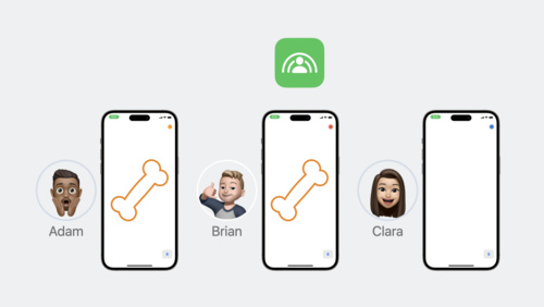
 22:04
22:04
Explore Family Sharing for in-app purchases
Family Sharing for in-app purchases lets people share their auto-renewable subscriptions and non-consumables with up to five additional family members, helping you attract new subscribers, increase user engagement, and improve retention. We'll review how you can enable this feature in App Store...
Tech Talks English, Japanese, Korean, Simplified Chinese -
 11:17
11:17
Manage auto-renewable subscription pricing in App Store Connect
Discover how you can use App Store Connect to manage prices for your auto-renewable subscriptions. We'll provide guidance to help you plan subscription price increases and decreases, show you how to remove preserved pricing, and explore how to edit upcoming price changes.
Tech Talks English -
 10:27
10:27
Bring desktop class sync to iOS with FileProvider
Discover how you can sync files faster and more efficiently within your iPhone and iPad apps when you create a File Provider extension. Sync up with the File Provider team and learn how to build a modern File Provider for iOS. We'll show you how to architect your app to support seamless file...
Tech Talks English -
 12:50
12:50
Discover Reference Mode
Learn how you can match color requirements in demanding pro workflows using Reference Mode on the 12.9-inch iPad Pro with Liquid Retina XDR display. We'll show you how Reference Mode enables you to represent color accurately and provide consistent image representation in workflows like review and...
Tech Talks English -
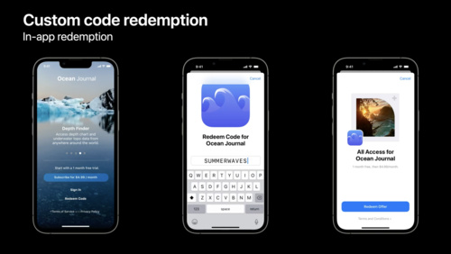 17:01
17:01
Get started with custom offer codes
Discover how you can complement existing offer codes campaigns with custom, repeatable codes to provide even more flexibility to acquire and retain subscribers. We'll take you through the latest enhancements to offer codes, provide engineering guidance, explore best practices, and show you how to...
Tech Talks English, Japanese, Simplified Chinese -
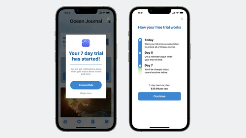 19:32
19:32
Optimize subscriptions for success: acquisition
Learn how you can acquire subscribers and grow your business using App Store features. We'll explore subscriber acquisition strategies, share implementation best practices, and show you how to integrate these processes into your app for success.
Tech Talks English -
 15:21
15:21
Explore unlisted app distribution
Discover a new way you can distribute apps to limited audiences on the App Store. We'll take you through the differences between using unlisted distribution and standard distribution on the App Store, show you how to share apps with a direct link, and more.
Tech Talks English -
 28:10
28:10
Get started with product page optimization
Help make your App Store product page even more relevant and effective with product page optimization. We'll explore details of the feature, take you through the setup process in App Store Connect including how to test different app icons, screenshots and app previews, and share testing...
Tech Talks English, Japanese, Simplified Chinese -
 29:01
29:01
Deploy iOS 15 in your organization
Discover the latest platform changes for deploying iOS 15 and iPadOS 15 in your business or education organization. Learn about deploying both organization-owned and personally-owned iPhone and iPad devices. Explore fundamentals and new updates for deployment workflows including enrollment,...
Tech Talks English, Japanese, Simplified Chinese -
 24:57
24:57
Build and deploy Safari Extensions for iOS
Safari web extensions for iOS use standard web technologies to provide powerful browser customizations. Learn how you can build an extension that works for iPhone and iPad, and discover how you can publish your extension on the App Store.
Tech Talks English, Japanese, Simplified Chinese -
 32:00
32:00
Prepare your organization for macOS Monterey
Discover the latest platform changes for deploying macOS Monterey in your business or education organization. Learn about changes to initial enrollment, ongoing management, and return to service including managing software updates and the new Erase All Content and Settings feature for macOS.
Tech Talks English, Japanese, Simplified Chinese -
 19:43
19:43
Get started with custom product pages
Learn how you can create additional versions of your App Store product page and showcase different features or content within your app. We'll explore how you can create pages for a specific aspect of your app or a specific audience, show you how to set it up in App Store Connect, and highlight...
Tech Talks English, Japanese, Simplified Chinese -
 35:07
35:07
Tune CPU job scheduling for Apple silicon games
Graphically-intensive games can be very demanding on hardware resources, requiring hundreds or even thousands of CPU jobs to be processed every frame. We'll show you how you can organize those jobs to maximize CPU efficiency and performance on the M1, M1 Pro, and M1 Max chips. Learn how you can...
Tech Talks English, Japanese, Simplified Chinese -
 23:44
23:44
Metal Compute on MacBook Pro
Discover how you can take advantage of Metal compute on the latest MacBook Pro. Learn the fundamental principles of high-performance Metal compute and find out how you can take advantage of the framework to create better workflows for your development process and even better apps for creative pros.
Tech Talks English -
 12:24
12:24
Get the most out of CloudKit Sharing
Discover how apps can use CloudKit to share records with others. We'll show you how to encourage collaboration between people using your app and support those interactions with Apple frameworks. Learn how to create and manage shares, explore sharing options like public permissions, and find out...
Tech Talks English -
 23:48
23:48
Explore and manipulate data in Swift with TabularData
Discover how you can use the TabularData framework to load, explore, and manipulate unstructured data in Swift — whether you need to pre-process data for a machine learning task or digest data on-the-fly in your app. Learn how this framework can help you handle large datasets, join multiple...
Tech Talks English -
 40:38
40:38
Support customers with StoreKit 2 and App Store Server API
Discover how you can use StoreKit 2, App Store Server API, and App Store Server Notifications to create great in-app purchase experiences for your customers and offer support and refunds. We'll explore implementation approaches, provide best practices and take you through customer management and...
Tech Talks English -
 12:34
12:34
Tips for preventing common review issues
Prepare your app for review with these tips from the App Review team. Learn how to prevent the most common issues and discover best practices for an easy and straightforward review experience.
Tech Talks English, Japanese, Simplified Chinese -
 15:11
15:11
Meet Apple Watch Series 7
Apple Watch Series 7 introduces new device sizes and a display that features a subtle wraparound effect. Learn how you can adapt your watchOS app design to look great on all screen sizes: We'll show you how to take advantage of a larger content area, create clearer hierarchy using color and...
Tech Talks English, Japanese, Simplified Chinese -
 23:31
23:31
Discover advances in Metal for A15 Bionic
Discover how you can elevate your apps and games with Metal and the A15 Bionic. We'll help you take advantage of Apple GPU family 8 with the latest Metal features: Learn how to save memory with Lossy Compression, dive into complex shadow mapping techniques with Sparse Depth and Stencil Textures,...
Tech Talks English -
 40:25
40:25
Deploy macOS Big Sur in your organization
Discover the latest on the platform changes in macOS Big Sur and Mac computers with the Apple M1 chip, including features available in macOS Big Sur 11.3. Learn about macOS Big Sur management capabilities and strategies for deploying in business and education. Hear about changes to deployment...
Tech Talks -
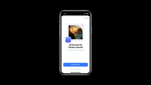 29:12
29:12
Subscription offer codes
Subscription offer codes can help you acquire, retain, and win back subscribers as you grow your business. Learn about configuration options, creating a great experience, and measuring redemptions. We'll explore how to set up customer eligibility, territory, price, and expiration in App Store...
Tech Talks -
 15:48
15:48
Improve Object Detection models in Create ML
When you train custom Core ML models for object detection in Create ML, you can bring image understanding to your app. Discover how transfer learning allows you to build smaller models with less training data. We'll also take you through some of the advanced parameters in Create ML that help you...
Tech Talks -
 25:18
25:18
Convert PyTorch models to Core ML
Bring your PyTorch models to Core ML and discover how you can leverage on-device machine learning in your apps. The PyTorch machine learning framework can help you create and train complex neural networks. After you build these models, you can convert them to Core ML and run them entirely...
Tech Talks -
 19:24
19:24
Demystify and eliminate hitches in the render phase
When you implement complex view hierarchies in your app, you may run into animation hitches. Demystify how your views are turned into pixels during the render phase, and learn how to use Instruments to uncover issues in this part of the render loop. Discover how to eliminate offscreen passes and...
Tech Talks -
 11:54
11:54
Explore UI animation hitches and the render loop
Explore how you can improve the performance of your app's user interface by identifying scrolling and animation hitches in your app. We'll take you through how hitches happen in the render loop, and explain how to measure hitch time ratio and fix the issues that most impact people using your app.
Tech Talks -
 11:22
11:22
Find and fix hitches in the commit phase
Discover how to render smoother animations in your app by troubleshooting the commit phase of your render loop. Dive into the mechanics of this phase, and learn how to use Instruments to uncover the source of hitches in your app, eliminate them, and avoid them outright.
Tech Talks -
 27:24
27:24
Support Apple Pro Display XDR in your apps
Apple Pro Display XDR is a high grade reference monitor designed for professional workflows such as video editing, photography, 3D animation and game development. Discover how you can use underlying technology and framework-level support to improve your professional workflows for content...
Tech Talks English, Japanese, Simplified Chinese -
 24:26
24:26
Uniform Type Identifiers — a reintroduction
Ever wonder how the system decides what app should open a given file? Explore the Uniform Type Identifiers framework, which helps you simplify the process for supporting standard or proprietary file formats in your app. You'll learn how to use the new framework and Xcode to declare the types your...
Tech Talks -
 2:34
2:34
What can you do on an Apple silicon Mac?
Learn how developers updated their apps for Apple silicon Macs and began taking advantage of the advanced capabilities of the Apple M1 chip.
Tech Talks English -
 28:57
28:57
Discover Metal enhancements for A14 Bionic
Explore how Metal is bringing sophisticated rendering and powerful compute features to A14 Bionic. We'll take you through the Metal capabilities delivered in the Apple GPU Family 7 feature set, including new texture addressing modes, fast SIMD reduction and matrix multiplication operations, and a...
Tech Talks -
 39:29
39:29
Integrate SiriKit Media Intents with HomePod
Bring your music service to HomePod and help users enjoy your content hands-free throughout their home. Discover how to build a great integration from start to finish. We'll take you through how Media Intents work, configuring your app as a preferred music service on HomePod and integrating...
Tech Talks -
 13:26
13:26
Explore Live GPU Profiling with Metal Counters
Take advantage of the Metal Counters API for GPU profiling in macOS Big Sur and iOS 14. This API provides access at runtime to low-level GPU profiling information, which was previously available only through offline tools in Xcode and Instruments. Metal Counters accelerate the optimization...
Tech Talks English -
 10:23
10:23
Advanced Scene Understanding in AR
ARKit 3.5 and RealityKit provide new capabilities that take full advantage of the LiDAR Scanner on the new iPad Pro. Check out ARKit 3.5 and learn about Scene Geometry, enhanced raycasting, instantaneous virtual object placement, and more. See how RealityKit takes advantage of these features to...
Tech Talks English -
 6:35
6:35
What's New in Sharing
The Share Sheet provides a convenient way to share information from your current context with other apps, people, and services. Discover the details on using the Link Presentation framework to present shared URLs in a rich and consistent way, how to create a Share Extension configured to...
Tech Talks English -
 18:33
18:33
Introducing Extensible Enterprise SSO
Single Sign-on ensures your enterprise can implement modern authentication methods without sacrificing ease of use. Learn how to use the Authentication Services framework to expose your redirect and credential SSO services in Safari and native apps on macOS Catalina, iPadOS 13, and iOS 13...
Tech Talks English -
 35:48
35:48
Metal Enhancements for A13 Bionic
Metal brings powerful API features and GPU-driven capabilities to A13 Bionic including sparse textures, vertex amplification, Tier 2 argument buffers, ASTC HDR, and more. Understand the architectural improvements of the Apple-designed A13 Bionic and learn how the latest Metal enhancements advance...
Tech Talks English -
 15:21
15:21
Apple TV App and Universal Search Video Integration - Part 1
This video provides a feature overview of the Apple TV App and Universal Search services, and introduces how 3rd party video services integrate with them through metadata feeds. Requirements for providing metadata about your movies, tv shows, and sporting events are detailed — in addition how to...
Tech Talks English -
 5:55
5:55
Apple TV App and Universal Search Video Integration - Part 2
Get an overview of the client-side integration required for 3rd party applications that are participating with the Apple TV App. Learn about onboarding and testing. See how to register subscriptions for your customers, report playback data as content is watched in your applications, and support...
Tech Talks English -
 2:01
2:01
Apple TV VSA Framework
Learn about the VideoSubscriberAccount framework, what it does, and how to integrate this framework with your app. Learn how this framework fits into the development for the Apple TV Distribution Program.
Tech Talks English -
 3:07
3:07
Apple TV Set Top Box APIs
Learn about the Set Top Box APIs, what they do, and how they help make the Apple TV setup easier for your customers. Learn how this framework fits into the development for the Apple TV Distribution Program.
Tech Talks English -
 5:27
5:27
Apple TV Authentication Context
Learn about the Apple TV authentication context, what it does, and how to start building this web service. Learn how the authentication context fits into the development for the Apple TV Distribution Program.
Tech Talks English -
 4:09
4:09
Apple TV Distribution Program Overview
Learn about the Apple TV Distribution Program and the engineering requirements and business benefits that come with enrollment. Familiarize yourself with the authentication context, VideoSubscriberAccount framework, and the Set Top Box APIs.
Tech Talks English -
 8:47
8:47
Bringing Your Apps to the New iPad Pro
Take advantage of the all-screen design of the new iPad Pro by building your app with the iOS 12.1 SDK and making sure it appears correctly with the display's rounded corners and home indicator. Learn about the new common inset compatibility mode and what it means for apps running in multitasking...
Tech Talks English, Simplified Chinese -
 13:32
13:32
GDPR & CloudKit
The General Data Protection Regulation (GDPR) is a European Union regulation that requires developers to give users visibility and control over the personal data you store on their behalf. Learn how to use new and existing CloudKit APIs to build privacy into your apps and make sure customers can...
Tech Talks English, Simplified Chinese -
 11:53
11:53
Developing Complications for Apple Watch Series 4
Complications allow people to quickly glance and stay connected with your app on the watch face throughout their day. The new Infograph and Infograph Modular watch faces on Apple Watch Series 4 allow all new ways to create engaging, full-color complications. Learn about the new complication...
Tech Talks English, Simplified Chinese -
 9:12
9:12
Designing for Subscription Success
Providing a great subscription experience within your app makes it easier to acquire new subscribers. Learn how to more clearly communicate the value of your subscriptions, streamline your sign up flow, and make subscriptions appealing and effortless.
Tech Talks English, Simplified Chinese -
 6:12
6:12
What's New in Core NFC
Background reading of NFC tags is a new feature for iPhone XS, iPhone XS Max, and iPhone XR. Learn how to associate your app with an NFC tag to make it even easier for people to benefit from the NFC capabilities of new iPhones.
Tech Talks English, Simplified Chinese -
 9:26
9:26
Designing for Apple Watch Series 4
Apple Watch Series 4 provides new opportunities for designers and developers to do more with their apps. Series 4 watches have new displays with larger dimensions, and other enhancements that allow developers to deliver richer and more immersive experiences.
Tech Talks English, Simplified Chinese -
 9:01
9:01
Building Apps for iPhone XS, iPhone XS Max, and iPhone XR
If your app has already adopted safe area insets, there's not much you will need to do to update your app for iPhone XS, iPhone XS Max, and iPhone XR. Learn how to set a collection view's section inset reference to the safe area with no code changes. Hear about an API change unique to iPhone XS...
Tech Talks English, Simplified Chinese -
 9:16
9:16
QR Code Recognition on iOS 11
iOS 11 provides built-in support to detect and handle QR codes. Discover the supported QR code types, how each type is handled by built-in Camera and Safari apps, and how Universal Links can seamlessly send users to your app when scanning your QR codes.
Tech Talks English -
 5:31
5:31
Ensuring Beautiful Rich Links
Website links received in Messages can be made vastly more inviting than a simple text URL. By providing small amounts of metadata in your web pages, links to your website can include rich content such as icons, images and even video. Learn how visitors to your website can share links that look...
Tech Talks English -
 4:01
4:01
Using Web Inspector with tvOS Apps
With Web Inspector, you can debug web content on several Apple platforms, including tvOS. This video introduces you to Web Inspector's powerful debugging capabilities, and takes you through the features designed to accelerate debugging of TVML content in your tvOS app.
Tech Talks English -
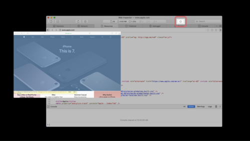 5:53
5:53
Web Inspector Walkthrough
Web Inspector is packed with features designed to make inspection, debugging and delivery of your web content a breeze. Get an overview of the latest features including major layouts, tabs, buttons, and other capabilities that make Web Inspector a powerful web development tool.
Tech Talks English -
 6:20
6:20
Introduction to AVDisplayManager
Starting with tvOS 11.2, Apple TV 4K can automatically switch video display modes to match the native frame rate and dynamic range of video content. With tvOS 11.3, Apple TV (4th generation) can also automatically switch video display modes to match native frame rate. Learn how to make sure your...
Tech Talks English -
 3:45
3:45
Authoring 4K and HDR HLS Streams
4K and HDR technologies enable the creation of amazing cinematic video experiences and stunning picture quality. Learn about how to support these new formats, and how to properly author your playlists to enable playback of these types of streams.
Tech Talks English, Simplified Chinese -
 9:44
9:44
Metal 2 on A11 - Tile Shading
Tile shading is a new Metal 2 pipeline stage allowing apps to combine rendering and compute operations into a single render pass while sharing imageblock data and threadgroup memory. Understand how to create a tile shading pipeline, and see how it leverages the high-bandwidth tile memory of the...
Tech Talks English, Simplified Chinese -
 16:10
16:10
Metal 2 on A11 - Overview
The seamless integration of Metal 2 with the A11 Bionic chip lets your apps and games realize entirely new levels of performance and capability. Get introduced to powerful new API features and GPU-driven capabilities of Metal 2 on A11, including imageblocks, tile shading, enhancements to raster...
Tech Talks English, Simplified Chinese -
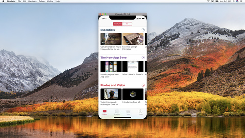 13:35
13:35
Building Apps for iPhone X
iPhone X has a beautiful new screen that will make your app look great. You may need to make some changes in your app to accommodate the new screen's size and rounded corners. Learn about some common pitfalls and see how you can take advantage of iOS 11's Safe Area and layout guides to make sure...
Tech Talks English, Simplified Chinese -
 10:56
10:56
Metal 2 on A11 - Raster Order Groups
Raster order groups allow Metal 2 apps to precisely control the order of parallel fragment shader threads accessing the same pixel coordinates. Learn how A11 extends raster order groups with support for multiple groups and adds new capabilities for accessing threadgroup memory. See how you can...
Tech Talks English, Simplified Chinese -
 12:22
12:22
Updating for Apple Watch Series 3
Apple Watch Series 3 makes it easier to stay connected, even when away from your phone. Learn how to keep your app responsive over cellular connections using URLSession. Find out how to optimize your Watch app networking code to ensure that your app is always up to date and ready for use...
Tech Talks English, Simplified Chinese -
 13:16
13:16
Metal 2 on A11 - Imageblock Sample Coverage Control
Imageblock sample coverage control provides access to multisample tracking data within a tile shader, enabling development of custom MSAA resolve algorithms and more. Understand how the A11 GPU tracks unique samples, then explore an example that optimizes rendering of dense geometry through...
Tech Talks English, Simplified Chinese -
 10:28
10:28
Metal 2 on A11 - Imageblocks
Imageblocks enable Metal 2 apps to define and manipulate custom per-pixel data structures in the high-bandwidth tile memory of the A11 GPU. Learn how imageblocks can pass data between the fragment and tile stages of a render pass and unlock sophisticated rendering techniques such as approximate...
Tech Talks English, Simplified Chinese -
 2:49
2:49
Updating Your App for Apple TV 4K
Learn how to update your app for Apple TV 4K, including how to take advantage of new capabilities such as retina image support, HDR video, and the new motion capabilities of the Siri Remote.
Tech Talks English, Simplified Chinese -
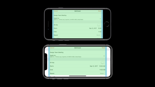 12:50
12:50
Designing for iPhone X
iPhone X features an all-screen Super Retina display, providing more space to display content and create deeply immersive experiences. Learn how to design your app or game to look and feel great on iPhone X, and all iOS devices.
Tech Talks English, Simplified Chinese -
 7:25
7:25
Face Tracking with ARKit
ARKit and iPhone X enable a revolutionary capability for robust face tracking in AR apps. See how your app can detect the position, topology, and expression of the user's face, all with high accuracy and in real time. Learn about applying live selfie effects and see how to use facial expressions...
Tech Talks English, Simplified Chinese -
 6:38
6:38
An Introduction to HDR Video
Dolby Vision and HDR10 enable amazing new video viewing experiences with a wider color gamut and deeper contrast. Learn how this new technology works, and what the differences are between Dolby Vision and HDR10.
Tech Talks English, Simplified Chinese -
 8:53
8:53
iOS Storage Best Practices
Learn tips for keeping your app's on-disk storage as organized and optimized as possible. See how to enable direct access to documents in your app using the new Files app in iOS 11. Gain insights into how to take inventory of your app's files and make the most of the storage capacity available to...
Tech Talks English, Simplified Chinese
-
-
WWDC22 -
 1:04
1:04
WWDC22 Day 5 recap
It's time to close out Day 5 of WWDC with one last report.
WWDC22 English, Japanese, Korean, Simplified Chinese -
 24:57
24:57
Scale compute workloads across Apple GPUs
Discover how you can create compute workloads that scale efficiently across Apple GPUs. Learn how to saturate the GPU by improving your work distribution, minimize GPU timeline gaps with effective pipelining and concurrent dispatches, and use atomic operations effectively. We'll also take you...
WWDC22 English, Japanese, Korean, Simplified Chinese -
 17:35
17:35
Use Xcode for server-side development
Discover how you can create, build, and deploy a Swift server app alongside your pre-existing Xcode projects within the same workspace. We'll show you how to create your own local app and test endpoints using Xcode, and explore how you can structure and share code between server and client apps...
WWDC22 English, Japanese, Korean, Simplified Chinese -
 11:56
11:56
Discover Benchmarks in App Analytics
Learn how App Store App Analytics can provide unique insights and help you measure your app's performance on the App Store. We'll show you how to use the new App Benchmarks tool to rank your app's performance beside similar products in a privacy-preserving way. We'll also share how you can use...
WWDC22 English, Japanese, Korean, Simplified Chinese -
 8:45
8:45
What's new in WKWebView
Explore the latest updates to WKWebView, our framework for incorporating web content into your app's interface. We'll show you how to use the JavaScript fullscreen API, explore CSS viewport units, and learn more about find interactions. We'll also take you through refinements to content blocking...
WWDC22 English, Japanese, Korean, Simplified Chinese -
 18:57
18:57
Power down: Improve battery consumption
Discover how you can limit your power usage and help people get even more out of your app. We'll show you how you can reduce battery drain from your app by making four key changes to your code. Learn how to add Dark Mode to your app and benefit from OLED displays, audit frame rates from secondary...
WWDC22 English, Japanese, Korean, Simplified Chinese -
 17:19
17:19
Explore the machine learning development experience
Learn how to bring great machine learning (ML) based experiences to your app. We'll take you through model discovery, conversion, and training and provide tips and best practices for ML. We'll share considerations to take into account as you begin your ML journey, demonstrate techniques for...
WWDC22 English, Japanese, Korean, Simplified Chinese -
 12:37
12:37
Explore SMS message filters
SMS message filter extensions can help people manage Messages by filtering SMS messages from unknown senders. Discover how to create apps with message filter extensions that automatically categorize SMS messages into folders and sub-folders based on message contents and other heuristics.
WWDC22 English, Japanese, Korean, Simplified Chinese -
 14:08
14:08
Create accessible Single App Mode experiences
Learn how you can provide more control and accessibility to people using your apps in Single App Mode. We'll share how you can use the UIAccessibility and Automatic Assessment Configuration frameworks to apply these restrictions when needed and enable these accessibility features without ever...
WWDC22 English, Japanese, Korean, Simplified Chinese -
 23:55
23:55
Discover Managed Device Attestation
Learn how to use Managed Device Attestation to ensure only legitimate devices can connect to your servers while attackers are thwarted. We'll take you through an overview of how attestations provide strong evidence about managed devices. We'll also explore how to use attestations and private keys...
WWDC22 English, Japanese, Korean, Simplified Chinese -
 13:41
13:41
What's new in PDFKit
Discover PDFKit — a full-featured framework that helps your app view, edit, and save PDF documents. We'll take you through the latest features in PDFKit, including support for live text and forms, creating PDFs from images, building interactive overlays, and saving annotations.
WWDC22 English, Japanese, Korean, Simplified Chinese -
 14:12
14:12
Explore media metadata publishing and playback interactions
Learn how you can highlight your app's Now Playing information on every platform. We'll take you through an overview of media metadata, learn how it gets represented in areas like the Lock Screen and Control Center, and show you how to write and publish effective media metadata for your content...
WWDC22 English, Japanese, Korean, Simplified Chinese -
 18:23
18:23
Improve DNS security for apps and servers
Discover the latest ways to ensure that DNS — the foundation of internet addressing — is secure within your app. Learn how to authenticate DNS responses in your app with DNSSEC and enable DNS encryption automatically with Discovery of Designated Resolvers (DDR).
WWDC22 English, Japanese, Korean, Simplified Chinese -
 9:34
9:34
What's new in Screen Time API
Find out how you can build apps that help people manage their relationship with their device — all while putting privacy first. We'll take you through the Screen Time API and share how you can use features like core restrictions and device activity reports to create great experiences while...
WWDC22 English, Japanese, Korean, Simplified Chinese -
 12:49
12:49
Efficiency awaits: Background tasks in SwiftUI
Background Tasks help apps respond to system events and keep time-sensitive data up to date. Learn how you can use the SwiftUI Background Tasks API to handle tasks succinctly. We'll show you how to use Swift Concurrency to handle network responses, background refresh, and more — all while...
WWDC22 English, Japanese, Korean, Simplified Chinese -
 21:25
21:25
Implement proactive in-app purchase restore
Learn how you can restore someone's in-app purchases access proactively when they first open your app. We'll show you how you can deliver instant access to existing subscriptions using StoreKit or StoreKit 2 and cover best practices for both your client and server implementations. Find out more...
WWDC22 English, Japanese, Korean, Simplified Chinese -
 12:43
12:43
Build device-to-device interactions with Network Framework
Learn how you can create integrated content experiences across multiple devices. We'll introduce you to DeviceDiscoveryUI, which makes it easy to set up communication pathways and connect Apple TV with other devices like iPhone, iPad and Apple Watch. We'll also explore common scenarios and...
WWDC22 English, Japanese, Korean, Simplified Chinese -
 19:44
19:44
Create custom catalogs at scale with ShazamKit
Learn how ShazamKit can help you build custom catalogs and support exact matching of any audio source within your app — all on-device. Find out how you can easily generate audio signatures and build catalogs at scale through the new ShazamKit CLI. We'll also show you how you can quickly update...
WWDC22 English, Japanese, Korean, Simplified Chinese -
 38:26
38:26
Profile and optimize your game's memory
Learn how Apple platforms calculate and allocate memory for your game. We'll show you how to use Instruments and the Game Memory template to profile your game, take a memory graph to monitor current memory use, and analyze it using Xcode Memory Debugger and command line tools. We'll also explore...
WWDC22 English, Japanese, Korean, Simplified Chinese -
 13:53
13:53
Bring multiple windows to your SwiftUI app
Discover the latest SwiftUI APIs to help you present windows within your app's scenes. We'll explore how scene types like MenuBarExtra can help you easily build more kinds of apps using SwiftUI. We'll also show you how to use modifiers that customize the presentation and behavior of your app...
WWDC22 English, Japanese, Korean, Simplified Chinese -
 29:51
29:51
Accelerate machine learning with Metal
Discover how you can use Metal to accelerate your PyTorch model training on macOS. We'll take you through updates to TensorFlow training support, explore the latest features and operations of MPS Graph, and share best practices to help you achieve great performance for all your machine learning...
WWDC22 English, Japanese, Korean, Simplified Chinese -
 21:40
21:40
Author fast and reliable tests for Xcode Cloud
Discover how you can create effective testing plans for Xcode Cloud, Apple's continuous integration and continuous delivery service. We'll show you how testing can be an essential tool to consistently verify your code works correctly. Learn how you can author fast, reliable, and efficient tests...
WWDC22 English, Japanese, Korean, Simplified Chinese -
 24:02
24:02
Create Swift Package plugins
Tailor your development workflow and learn how to write your own package plugins in Swift. We'll show you how you can extend Xcode's functionality by using the PackagePlugin API to generate source code or automate release tasks and share best practices for creating great plugins.
WWDC22 English, Japanese, Korean, Simplified Chinese -
 1:20
1:20
WWDC22 Day 4 recap
It's time to review Day 4. Check out the Thursday highlights and tune in for a quick preview of the last day of WWDC22.
WWDC22 English, Japanese, Korean, Simplified Chinese -
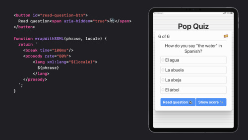 14:53
14:53
What's new in web accessibility
Discover techniques for building rich, accessible web apps with custom controls, SSML, and the dialog element. We'll discuss different assistive technologies and help you learn how to use them when testing the accessibility of your web apps.
WWDC22 English, Japanese, Korean, Simplified Chinese -
 9:15
9:15
What's new in App Store Connect
Discover the latest updates to App Store Connect, your suite of tools to create, manage, and submit apps on the App Store. Learn about enhancements to the submission experience — including the ability to manage submissions in App Store Connect on iOS and iPadOS — as well as the newest updates to...
WWDC22 English, Japanese, Korean, Simplified Chinese -
 24:07
24:07
Create a great video playback experience
Find out how you can use the latest iOS and iPadOS system media players to build amazing media apps. We'll share how we designed the updated player and give you best practices and tips to help you design media experiences of your own. We'll also explore Live Text for video and show you how to...
WWDC22 English, Japanese, Korean, Simplified Chinese -
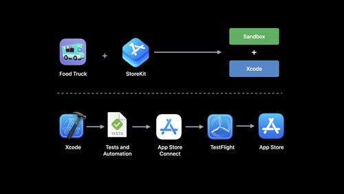 34:46
34:46
What's new in StoreKit testing
Discover the latest tools to help you test your in-app purchases and subscriptions. We'll show you how to bring your products from App Store Connect into StoreKit Testing in Xcode, learn about improvements to the transaction manager, and explore your in-app purchase flow in Xcode Previews. We'll...
WWDC22 English, Japanese, Korean, Simplified Chinese -
 25:15
25:15
Demystify parallelization in Xcode builds
Learn how the Xcode build system extracts maximum parallelism from your builds. We'll explore how you can structure your project to improve build efficiency, take you through the process for resolving relationships between targets' build phases in Xcode, and share how you can take full advantage...
WWDC22 English, Japanese, Korean, Simplified Chinese -
 13:42
13:42
Explore App Tracking Transparency
Learn more about App Tracking Transparency and how it helps people using your app have choice and control over tracking. App Store Policy now requires that all apps receive permission through the AppTrackingTransparency framework in order to track people's data. We'll explain how this policy...
WWDC22 English, Japanese, Korean, Simplified Chinese -
 23:23
23:23
Enhance your Sign in with Apple experience
Learn how you can provide safe and fast authentication in your app using Sign in with Apple. We'll show you how you can upgrade password-based accounts into secure, single-tap login credentials, and explore how you can seamlessly handle changes to user sessions in your app. We'll also help you...
WWDC22 English, Japanese, Korean, Simplified Chinese -
 18:20
18:20
SwiftUI on iPad: Organize your interface
It's time to supercharge the interface of your iPad app with SwiftUI lists and tables. We'll show how you can add selection interactions and context menus and help people who use your app be more productive. We'll also give you best practices on structuring your navigation and explore how you can...
WWDC22 English, Japanese, Korean, Simplified Chinese -
 23:30
23:30
Writing for interfaces
The words and phrases you choose for your app matter. Whether you're writing an alert, building an onboarding experience, or describing an image for accessibility, learn how you can design through the lens of language and help people get the most from your app. We'll show you how to create clear,...
WWDC22 English, Japanese, Korean, Simplified Chinese -
 34:14
34:14
Go bindless with Metal 3
Learn how you can unleash powerful rendering techniques like ray tracing when you go bindless with Metal 3. We'll show you how to make your app's bindless journey a joy by simplifying argument buffers, allocating acceleration structures from heaps, and benefitting from the improvements to the...
WWDC22 English, Japanese, Korean, Simplified Chinese -
 11:29
11:29
Design for Collaboration with Messages
Discover how you can design great collaboration experiences using Apple platforms. We'll show you how to combine the Share Sheet, live editing notifications, Messages, FaceTime, and your app's existing collaboration features to help people connect and collaborate effortlessly. (Note: API will be...
WWDC22 English, Japanese, Korean, Simplified Chinese -
 15:24
15:24
Deep dive into Xcode Cloud for teams
Learn how you can use Apple's continuous integration and continuous delivery (CI/CD) service with development teams of any size to help you deliver high-quality apps. We'll show you how to integrate Xcode Cloud into your team's existing app development process and efficiently use Xcode Cloud in...
WWDC22 English, Japanese, Korean, Simplified Chinese -
 19:27
19:27
Discover ARKit 6
Discover how you can build more refined and powerful augmented reality apps with ARKit 6. We'll explore how you can create AR experiences rendered in 4K HDR and take you through camera settings customizations for your app. We'll also share how you can export high-resolution still images from an...
WWDC22 English, Japanese, Korean, Simplified Chinese -
 17:13
17:13
Track down hangs with Xcode and on-device detection
Learn how you can increase responsiveness and eliminate hangs in your app and make even better experiences. Hang out with the Performance Tools team as we explore how you can track down these issues — and even stop them from occurring in the first place. We'll take you through the latest...
WWDC22 English, Japanese, Korean, Simplified Chinese -
 24:04
24:04
What's new in TextKit and text views
Discover the latest updates to TextKit and text views in UI frameworks. Explore layout refinements and API enhancements, learn how you can maintain compatibility across multiple OS versions, and find out how to modernize your app with TextKit 2. To get the most out of this session, watch “Meet...
WWDC22 English, Japanese, Korean, Simplified Chinese -
 41:31
41:31
What's new in MapKit
Come along with us as MapKit enters a new dimension. We'll show you how you can upgrade your app to use the latest map and support the highly-detailed 3D City Experience. Learn how you can visualize data using overlays while ensuring they integrate smoothly into the 3D map. We'll also cover how...
WWDC22 English, Japanese, Korean, Simplified Chinese -
 19:25
19:25
Discover Sign in with Apple at Work & School
Learn how you can support Sign In with Apple for Managed Apple IDs in organizational settings. We'll introduce you to Sign In with Apple at Work & School and explore how education apps can harness the power of this REST API to streamline the import process for student and class information. We'll...
WWDC22 English, Japanese, Korean, Simplified Chinese -
 22:04
22:04
Display HDR video in EDR with AVFoundation and Metal
Learn how you can take advantage of AVFoundation and Metal to build an efficient EDR pipeline. Follow along as we demonstrate how you can use AVPlayer to display HDR video as EDR, add playback into an app view, render it with Metal, and use Core Image or custom Metal shaders to add video effects...
WWDC22 English, Japanese, Korean, Simplified Chinese -
 25:33
25:33
Explore navigation design for iOS
Familiar navigation patterns can help people easily explore the information within your app — and save them from unnecessary confusion. We'll show you how to take advantage of existing navigation structures to simplify complex interactions in your app without compromising its personality. Learn...
WWDC22 English, Japanese, Korean, Simplified Chinese -
 18:38
18:38
Make a great SharePlay experience
Discover how you can design and build a great SharePlay experience. We'll show you how to identify activities in your app that can help bring everyone together — even while they're apart. Learn best practices to help you design for group activities, create intuitive interactions, and build...
WWDC22 English, Japanese, Korean, Simplified Chinese -
 20:04
20:04
Debug Swift debugging with LLDB
Learn how you can set up complex Swift projects for debugging. We'll take you on a deep dive into the internals of LLDB and debug info. We'll also share best practices for complex scenarios such as debugging code built on build servers or code from custom build systems.
WWDC22 English, Japanese, Korean, Simplified Chinese -
 13:12
13:12
Explore Apple Business Essentials
Learn more about Apple Business Essentials — a complete solution that brings together device management, 24/7 support, and cloud storage for your small business. We'll explore how you can use features like Collections to manage apps and settings for every iPhone, iPad, Mac, and Apple TV in your...
WWDC22 English, Japanese, Korean, Simplified Chinese -
 19:12
19:12
Use SwiftUI with AppKit
Discover how the Shortcuts app uses both SwiftUI and AppKit to create a top-tier experience on macOS. Follow along with the Shortcuts team as we explore how you can host SwiftUI views in AppKit code, handle layout and sizing, participate in the responder chain, enable navigational focus, and...
WWDC22 English, Japanese, Korean, Simplified Chinese -
 32:08
32:08
Create camera extensions with Core Media IO
Discover how you can use Core Media IO to easily create macOS system extensions for software cameras, hardware cameras, and creative cameras. We'll introduce you to our modern replacement for legacy DAL plug-ins — these extensions are secure, fast, and fully-compatible with any app that uses a...
WWDC22 English, Japanese, Korean, Simplified Chinese -
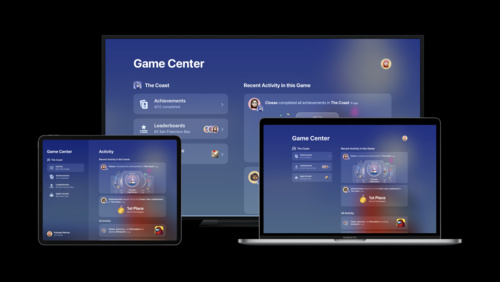 10:07
10:07
Reach new players with Game Center dashboard
Meet the Game Center activity dashboard and discover how it can help your game reach new players. We'll introduce you to the dashboard and profiles and explore how they can track player achievements, high scores, and leaderboard changes for your game. We'll also show you how to add Game Center to...
WWDC22 English, Japanese, Korean, Simplified Chinese -
 13:22
13:22
SwiftUI on iPad: Add toolbars, titles, and more
Get ready to tune up your iPad app's toolbars with SwiftUI. We'll show you how you can structure toolbars to take advantage of the space available on iPad and help people maximize their productivity. We'll also take you through customization, explore the latest ways you can represent documents,...
WWDC22 English, Japanese, Korean, Simplified Chinese -
 15:07
15:07
The craft of SwiftUI API design: Progressive disclosure
Explore progressive disclosure — one of SwiftUI's core principles — and learn how it influences the design of our APIs. We'll show you how we use progressive disclosure, discuss how it can support quick iteration and exploration, and help you take advantage of it in your own code.
WWDC22 English, Japanese, Korean, Simplified Chinese -
 25:31
25:31
Design protocol interfaces in Swift
Learn how you can use Swift 5.7 to design advanced abstractions using protocols. We'll show you how to use existential types, explore how you can separate implementation from interface with opaque result types, and share the same-type requirements that can help you identify and guarantee...
WWDC22 English, Japanese, Korean, Simplified Chinese -
 18:42
18:42
Reduce networking delays for a more responsive app
Find out how network latency can affect your apps when trying to get full benefit out of modern network throughput rates. Learn about changes you can make in your app and on your server to boost responsiveness, and prepare your app for improvements coming to the Internet that will offer even...
WWDC22 English, Japanese, Korean, Simplified Chinese -
 10:00
10:00
Discover PhotoKit change history
PhotoKit can help you build rich, photo-centric features. Learn how you can easily track changes to image assets with the latest APIs in PhotoKit. We'll introduce you to the PHPhotoLibrary change history API and demonstrate how you can persist change tokens across launches to help your app...
WWDC22 English, Japanese, Korean, Simplified Chinese -
 31:23
31:23
Maximize your Metal ray tracing performance
Learn how to simplify your ray tracing code and increase performance with the power of Metal 3. We'll explore the GPU debugging and profiling tools that can help you tune your ray tracing applications. We'll also show you how you can speed up intersection tests and reduce shader code memory...
WWDC22 English, Japanese, Korean, Simplified Chinese -
 19:48
19:48
What's new in Vision
Learn about the latest updates to Vision APIs that help your apps recognize text, detect faces and face landmarks, and implement optical flow. We'll take you through the capabilities of optical flow for video-based apps, show you how to update your apps with revisions to the machine learning...
WWDC22 English, Japanese, Korean, Simplified Chinese -
 17:41
17:41
Display EDR content with Core Image, Metal, and SwiftUI
Discover how you can add support for rendering in Extended Dynamic Range (EDR) from a Core Image based multi-platform SwiftUI application. We'll outline best practices for displaying CIImages to a MTKView using ViewRepresentable. We'll also share the simple steps to enable EDR rendering and...
WWDC22 English -
 14:30
14:30
What's new in the Photos picker
PHPicker provides simple and secure integration between your app and the system Photos library. Learn how SwiftUI and Transferable can help you offer integration across iOS, iPadOS, macOS, and watchOS. We'll also show you how you can use AppKit and NSOpenPanel to bring the Photos picker on Mac...
WWDC22 English, Japanese, Korean, Simplified Chinese -
 17:44
17:44
Transform your geometry with Metal mesh shaders
Meet Metal mesh shaders — a modern and flexible pipeline in Metal for GPU-driven geometry creation and processing. We'll explore how this API can improve and add flexibility to your render pipeline, and share some of the opportunities that GPU-driven work can create. Discover how you can create...
WWDC22 English, Japanese, Korean, Simplified Chinese -
 19:51
19:51
Evolve your Core Data schema
Learn how you can cleanly migrate Core Data schemas after updating your app, and breeze through data model changes. We'll show you how you can take advantage of built-in migration tools to keep your data storage up to date, and let Core Data analyze your schema to infer data model migrations...
WWDC22 English, Japanese, Korean, Simplified Chinese -
 14:28
14:28
Improve app size and runtime performance
Learn how we've optimized the Swift and Objective-C runtimes to help you make your app smaller, quicker, and launch faster. Discover how you can get access to efficient protocol checks, smaller message send calls, and optimized ARC simply when you build your app with Xcode 14 and update your...
WWDC22 English, Japanese, Korean, Simplified Chinese -
 10:38
10:38
Go further with Complications in WidgetKit
Discover how you can use WidgetKit to create beautiful complications on watch faces. We'll introduce you to the watchOS-specific features found in WidgetKit, and help you migrate from existing ClockKit complications. For more on WidgetKit, watch “Complications and Widgets: Reloaded” from WWDC22.
WWDC22 English, Japanese, Korean, Simplified Chinese -
 20:13
20:13
Design for Arabic
Find out how to design or optimize your app or game for Arabic. Whether you're planning a first release or improving an existing app or game, we'll help you learn best practices and tips for UI design for Arabic speakers. Learn how to create beautiful Right to Left layouts with UI components and...
WWDC22 English, Japanese, Korean, Simplified Chinese -
 19:30
19:30
Design for Arabic · صمّم بالعربي
تعرّف على المبادئ الأساسية لتصميم الواجهات الرقمية باللغة العربية. سواء كنت تود تصميم تطبيق أو لعبة خصيصًا للاستخدام العربي، أو تود ترجمة تطبيق من لغة أخرى إلى العربية، سنقدم لك أفضل الطرق للوصول إلى تصميم مثالي يخدم المحتوى العربي. تعلم أيضا تأثير اتجاه اللغة على اتجاه القوالب والأيقونات، وسمات...
WWDC22 Arabic, English, Japanese, Korean, Simplified Chinese -
 17:38
17:38
Create Safari Web Inspector Extensions
Learn how to add your own tools directly into Web Inspector using the latest Web Extensions APIs. We'll show you how to create your own tab in Web Inspector, evaluate JavaScript in the inspected page, and use the result to help you troubleshoot and identify potential problems.
WWDC22 English, Japanese, Korean, Simplified Chinese -
 27:06
27:06
Simplify C++ templates with concepts
Discover how C++20 features can take your C++ code to the next level. We'll introduce concepts and explore how you can use it to find errors faster in your generic C++ code. We'll also discuss the latest enhancements to the constexpr feature and show how you can leverage it to improve your app's...
WWDC22 English, Japanese, Korean, Simplified Chinese -
 15:27
15:27
Meet Swift Package plugins
Discover how you can perform actions on Swift packages and Xcode projects with Swift package plugins. We'll go over how these plugins work and explore how you can use them to generate source code and automate your development workflow.
WWDC22 English, Japanese, Korean, Simplified Chinese -
 26:09
26:09
Use SwiftUI with UIKit
Learn how to take advantage of the power of SwiftUI in your UIKit app. Build custom UICollectionView and UITableView cells seamlessly with SwiftUI using UIHostingConfiguration. We'll also show you how to manage data flow between UIKit and SwiftUI components within your app. To get the most out...
WWDC22 English, Japanese, Korean, Simplified Chinese -
 9:26
9:26
What’s new in HLS Interstitials
HLS Interstitials can help you create seamless transitions in video content between advertisements, other interstitials, and your HLS streams. Learn how you can optimize your ad inventory, fine-tune interstitial presentation with SNAP-IN/OUT when using HLS, and more.
WWDC22 English, Japanese, Korean, Simplified Chinese -
 33:46
33:46
Get it right (to left)
Discover how to develop your app so that it can be localized into "right-to-left" languages such as Arabic and Hebrew. We'll take you through important considerations for these languages, share solutions to challenges, and provide best practices for delivering a great right-to-left experience in...
WWDC22 English, Japanese, Korean, Simplified Chinese -
 1:21
1:21
WWDC22 Day 3 recap
Your Day 3 status report is here. Catch up on the latest from WWDC22 and discover what's coming to a Thursday near you.
WWDC22 English, Japanese, Korean, Simplified Chinese -
 24:02
24:02
Meet Background Assets
Discover how you can use the Background Assets framework to download large files directly from your CDN and improve the initial launch experience of your apps and games. We'll show you how to schedule background downloads during initial app install, app updates, and periodically as someone uses...
WWDC22 English, Japanese, Korean, Simplified Chinese -
 20:23
20:23
What’s new in privacy
At Apple, we believe that privacy is a fundamental human right, and protecting people's privacy is at the center of everything we do. Discover how our engineering teams build privacy into all of our products and developer frameworks, and learn about the technologies and patterns you can adopt in...
WWDC22 English, Japanese, Korean, Simplified Chinese -
 11:10
11:10
Display ads and interstitials in SharePlay
Find out how you can deliver a coordinated playback experience in SharePlay when your app delivers different ad schedules to each participant. We'll explore how to build playback experiences with stitched-in ads and scheduled HLS interstitials, and share tips and best practices.
WWDC22 English, Japanese, Korean, Simplified Chinese -
 9:38
9:38
What’s new in AVQT
Discover the latest updates and improvements to the Advanced Video Quality Tool (AVQT). We'll take you through the interactive reports feature and help you learn how to identify video quality-related issues. We'll also explore extended support for raw formats, show you how to evaluate specific...
WWDC22 English, Japanese, Korean, Simplified Chinese -
 18:22
18:22
Discover advancements in iOS camera capture: Depth, focus, and multitasking
Discover how you can take advantage of advanced camera capture features in your app. We'll show you how to use the LiDAR scanner to create photo and video effects and perform accurate depth measurement. Learn how your app can use the camera for picture-in-picture or multitasking, control...
WWDC22 English, Japanese, Korean, Simplified Chinese -
 13:25
13:25
Compose advanced models with Create ML Components
Take your custom machine learning models to the next level with Create ML Components. We'll show you how to work with temporal data like video or audio and compose models that can count repetitive human actions or provide advanced sound classification. We'll also share best practices on using...
WWDC22 English, Japanese, Korean, Simplified Chinese -
 23:30
23:30
Optimize your Core ML usage
Learn how Core ML works with the CPU, GPU, and Neural Engine to power on-device, privacy-preserving machine learning experiences for your apps. We'll explore the latest tools for understanding and maximizing the performance of your models. We'll also show you how to generate reports to easily...
WWDC22 English, Japanese, Korean, Simplified Chinese -
 10:14
10:14
What’s new in Endpoint Security
Learn how you can build reliable endpoint security products like anti-virus software, endpoint detection and response, and data leakage prevention solutions for macOS. We'll take you through the latest enhancements to Endpoint Security APIs: Learn how you can support more security events and use...
WWDC22 English, Japanese, Korean, Simplified Chinese -
 18:26
18:26
Meet Apple Music API and MusicKit
Explore the Apple Music API and MusicKit client frameworks. Learn how you can integrate Apple Music features into your web service or Android app, make requests to the Apple Music API to discover and fetch content, and personalize the experience for subscribers.
WWDC22 English, Japanese, Korean, Simplified Chinese -
 15:28
15:28
Meet ScreenCaptureKit
Learn how ScreenCaptureKit can deliver high-performance screen capture for your macOS screen sharing applications, video conferencing apps, game streaming services, and more. We'll explore the building blocks of this API, learn how to configure streams to capture on-screen video and audio...
WWDC22 English, Japanese, Korean, Simplified Chinese -
 12:38
12:38
Replace CAPTCHAs with Private Access Tokens
Don't be captured by CAPTCHAs! Private Access Tokens are a powerful alternative that help you identify HTTP requests from legitimate devices and people without compromising their identity or personal information. We'll show you how your app and server can take advantage of this tool to add...
WWDC22 English, Japanese, Korean, Simplified Chinese -
 23:07
23:07
What’s new in Safari Web Extensions
Learn how you can use the latest improvements to Safari Web Extensions to create even better experiences for people browsing the web. We'll show you how to upgrade to manifest version 3, adopt the latest APIs for Web Extensions, and sync extensions across devices.
WWDC22 English, Japanese, Korean, Simplified Chinese -
 31:09
31:09
Link fast: Improve build and launch times
Discover how to improve your app's build and runtime linking performance. We'll take you behind the scenes to learn more about linking, your options, and the latest updates that improve the link performance of your app.
WWDC22 English, Japanese, Korean, Simplified Chinese -
 27:29
27:29
Embrace Swift generics
Generics are a fundamental tool for writing abstract code in Swift. Learn how you can identify opportunities for abstraction as your code evolves, evaluate strategies for writing one piece of code with many behaviors, and discover language features in Swift 5.7 that can help you make generic code...
WWDC22 English, Japanese, Korean, Simplified Chinese -
 27:01
27:01
Compose custom layouts with SwiftUI
SwiftUI now offers powerful tools to level up your layouts and arrange views for your app's interface. We'll introduce you to the Grid container, which helps you create highly customizable, two-dimensional layouts, and show you how you can use the Layout protocol to build your own containers with...
WWDC22 English, Japanese, Korean, Simplified Chinese -
 11:09
11:09
Improve the discoverability of your Swift-DocC content
Explore the navigation experience for Swift-DocC on the web. We'll show you how you can organize and optimize your content to help guide developers through documentation about your frameworks and applications. We'll also share enhanced techniques to help readers browse your documentation with ease.
WWDC22 English, Japanese, Korean, Simplified Chinese -
 26:21
26:21
Optimize your use of Core Data and CloudKit
Join us as we explore the three parts of the development cycle that can help you optimize your Core Data and CloudKit implementation. We'll show you how you can analyze your app's architecture and feature set to verify assumptions, explore changes in behavior after ingesting large data sets, and...
WWDC22 English, Japanese, Korean, Simplified Chinese -
 15:43
15:43
Design app experiences with charts
Learn how you can enhance your app with charts to communicate data with more clarity and appeal. We'll show you when to use charts, how to use them and how they work together in a chart design system.
WWDC22 English, Japanese, Korean, Simplified Chinese -
 28:29
28:29
Integrate your custom collaboration app with Messages
Discover how the SharedWithYou framework can augment your app's collaboration infrastructure. We'll show you how to send secure invitations to collaborative content and synchronize participant changes. We'll also cover displaying content updates within the relevant conversation. For an...
WWDC22 English, Japanese, Simplified Chinese -
 37:19
37:19
Take ScreenCaptureKit to the next level
Discover how you can support complex screen capture experiences for people using your app with ScreenCaptureKit. We'll explore many of the advanced options you can incorporate including fine tuning content filters, frame metadata interpretation, window pickers, and more. We'll also show you how...
WWDC22 English, Japanese, Korean, Simplified Chinese -
 15:44
15:44
Meet CKTool JS
Discover how you can manage and automate your iCloud containers using CKTool JS. We'll show you how to configure CKTool JS to manage your containers' schemas, modify records with ease, and manipulate data on the fly. We'll also explore how you can integrate CKTool JS into your automation and...
WWDC22 English, Japanese, Korean, Simplified Chinese -
 20:36
20:36
Explore EDR on iOS
EDR is Apple's High Dynamic Range representation and rendering pipeline. Explore how you can render HDR content using EDR in your app and unleash the dynamic range capabilities of HDR displays on iPhone and iPad. We'll show how you can take advantage of the native EDR APIs on iOS, provide best...
WWDC22 English -
 21:47
21:47
Swift Charts: Raise the bar
Dive deep into data visualizations: Learn how Swift Charts and SwiftUI can help your apps represent complex datasets through a wide variety of chart options. We'll show you how to plot different kinds of data and compose marks to create more elaborate charts. We'll also take you through Swift...
WWDC22 English, Japanese, Korean, Simplified Chinese -
 20:13
20:13
Design App Shortcuts
Learn how you can surface great features from your app directly in Siri, Spotlight, and the Shortcuts app. We'll introduce you to App Shortcuts, provide best practices to help you evaluate features in your app that would work well as App Shortcuts, and take you through the process of creating one...
WWDC22 English, Japanese, Korean, Simplified Chinese -
 20:13
20:13
What's new with SKAdNetwork
SKAdNetwork helps advertisers measure the success of ad campaigns while maintaining user privacy. We'll explore the latest updates to ad attributions including hierarchical source IDs, hierarchical conversion values, multiple conversions, and SKAdNetwork attributions for web ads. We'll also take...
WWDC22 English, Japanese, Korean, Simplified Chinese -
 17:53
17:53
What's new in Swift-DocC
Join us for an exciting update on Swift-DocC and learn how you can write and share documentation for your own projects. We'll explore improvements to Swift-DocC navigation and share how you can compile documentation for application targets and Objective-C code. We'll also show you how to publish...
WWDC22 English, Japanese, Korean, Simplified Chinese -
 18:29
18:29
Add Shared with You to your app
Shared with You helps people easily find content in your app that someone has shared with them in Messages. Learn how you can support Shared with You in your app and continue the messaging experience right with the content. We'll show you how pinning can give implicit Shared with You permission...
WWDC22 English, Japanese, Korean, Simplified Chinese -
 12:14
12:14
Create your Privacy Nutrition Label
Privacy Nutrition Labels help people understand your app's privacy practices. Discover how you can take inventory of your current data habits and learn best practices for creating your app's Privacy Nutrition Label on your App Store product page.
WWDC22 English, Japanese, Korean, Simplified Chinese -
 15:56
15:56
Streamline local authorization flows
Discover how you can use the latest authorization-focused APIs in LocalAuthentication to protect the privacy and security of people's data. We'll show you how LocalAuthentication can authorize access to secrets, keys, and other sensitive resources in your app, all while reducing complexity and...
WWDC22 English, Japanese, Korean, Simplified Chinese -
 14:36
14:36
Support multiple users in tvOS apps
Discover how you can create personalized, individual experiences in your tvOS app. We'll show you how you can offer a single checkbox to store profile data, game save states, and more, providing each person with the same level of data separation they'd have on a personal device like iPhone. We'll...
WWDC22 English, Japanese, Korean, Simplified Chinese -
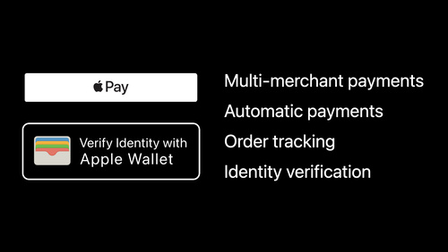 36:22
36:22
What’s new in Wallet and Apple Pay
Discover the latest updates to Wallet & Apple Pay. We'll show you how to support Orders in Wallet for your apps and websites and securely validate someone's age and identity with the Identity Verification API. We'll also explore PassKit support for SwiftUI, and discuss how you how you can improve...
WWDC22 English, Japanese, Korean, Simplified Chinese -
 20:26
20:26
Create engaging content for Swift Playgrounds
Learn how you can build guided instructional content designed for Swift Playgrounds. Follow along with us as we explore how you can add a guide to a completed sample code project. We'll demonstrate how to add tasks to your learning center to show off relevant code and optional experiment tasks...
WWDC22 English, Japanese, Korean, Simplified Chinese -
 14:26
14:26
Add Live Text interaction to your app
Learn how you can bring Live Text support for still photos or paused video frames to your app. We'll share how you can easily enable text interactions, translation, data detection, and QR code scanning within any image view on iOS, iPadOS, or macOS. We'll also go over how to control interaction...
WWDC22 English, Japanese, Korean, Simplified Chinese -
 24:25
24:25
What's new in HealthKit
Bring the latest HealthKit features to your health & fitness app. We'll show you how to capture more detailed sleep data through sleep stages, track swim-bike-run and interval workouts with the enhanced Workout API, and save vision prescriptions — including an image of the physical prescription —...
WWDC22 English, Japanese, Korean, Simplified Chinese -
 25:17
25:17
Meet distributed actors in Swift
Discover distributed actors — an extension of Swift's actor model that simplifies development of distributed systems. We'll explore how distributed actor isolation and location transparency can help you avoid the accidental complexity of networking, serialization, and other transport concerns...
WWDC22 English, Japanese, Korean, Simplified Chinese -
 16:03
16:03
Use Xcode to develop a multiplatform app
Learn how you can build apps for multiple Apple platforms using Xcode 14. We'll show you how to streamline app targets, maintain a common codebase, and share settings by default. We'll also explore how you can customize your app for each platform through conditionalizing your settings and code.
WWDC22 English, Japanese, Korean, Simplified Chinese -
 40:02
40:02
Explore in-app purchase integration and migration
Learn how you can migrate to the latest App Store Server APIs and incorporate App Store Server Notifications. We'll help you get started with these tools and provide best practices to make the most of managing in-app purchases on your server. Discover how you can sign JSON Web Tokens, verify...
WWDC22 English, Japanese, Korean, Simplified Chinese -
 22:17
22:17
Build global apps: Localization by example
Learn how you can run your apps on devices around the world and help everyone have a great experience — regardless of the language they speak. We'll explore how Apple APIs can provide a solid foundation when creating apps for diverse audiences, and we'll share examples, challenges, and best...
WWDC22 English, Japanese, Korean, Simplified Chinese -
 13:48
13:48
Target and optimize GPU binaries with Metal 3
Discover how you can reduce in-app stutters, first launch times, and new level load times when you generate your GPU binaries entirely at project build time with offline compilation. We'll also show you how to improve total compile time and binary size for larger GPU programs using the "Optimize...
WWDC22 English, Japanese, Korean, Simplified Chinese -
 18:29
18:29
Meet the expanded San Francisco font family
Discover the latest additions to San Francisco – the system font for Apple platforms – and find out how they can provide more control and versatility when designing interfaces. In addition to weights and optical sizes, San Francisco now supports three new width styles: Condensed, Compressed, and...
WWDC22 English, Japanese, Korean, Simplified Chinese -
 7:10
7:10
What’s new in CloudKit Console
We'll take you through the latest updates to CloudKit Console and discover how you can explore and debug your containers on the web like never before. Learn more about Act as iCloud, which helps you query records and view data from the perspective of another account. Discover how to share zones...
WWDC22 English, Japanese, Korean, Simplified Chinese -
 18:15
18:15
Understand USD fundamentals
Discover the fundamentals of Pixar's Universal Scene Description (USD) and learn how it can help you build great 3D assets and workflows. We'll introduce you to the core concepts behind USD and explore how you can integrate the format into your content creation pipeline. We'll also show you how...
WWDC22 English, Japanese, Korean, Simplified Chinese -
 22:21
22:21
Explore USD tools and rendering
Discover the latest advancements in tooling to help you generate, inspect, and convert Universal Scene Description (USD) assets. We'll learn about updates to these tools and help you integrate them into your content creation pipeline. We'll also explore the power of USD Hydra rendering, and show...
WWDC22 English, Japanese, Korean, Simplified Chinese -
 28:54
28:54
Eliminate data races using Swift Concurrency
Join us as we explore one of the core concepts in Swift concurrency: isolation of tasks and actors. We'll take you through Swift's approach to eliminating data races and its effect on app architecture. We'll also discuss the importance of atomicity in your code, share the nuances of Sendable...
WWDC22 English, Japanese, Korean, Simplified Chinese -
 14:02
14:02
Meet Transferable
Meet Transferable: a model-layer protocol that allows for effortless support for sharing, drag and drop, copy/paste, and other features in your app. We'll explore how you can use the API for common use cases, and take advantage of advanced features to customize the behavior. We'll also share how...
WWDC22 English, Japanese, Korean, Simplified Chinese -
 24:06
24:06
Build a productivity app for Apple Watch
Your wrist has never been more productive. Discover how you can use SwiftUI and system features to build a great productivity app for Apple Watch. We'll show you how you can design great work experiences for the wrist, and explore how you can get text input, display a basic chart, and share...
WWDC22 English, Japanese, Korean, Simplified Chinese -
 18:08
18:08
What’s new in iPad app design
Discover the latest updates in iPad app design. We'll take you through improvements to search, navigation bars, edit menus, multi-selection, and more. Learn how you can make your app both more powerful and easier to use when you incorporate customizable toolbars, multi-column tables, and find and...
WWDC22 English, Japanese, Korean, Simplified Chinese -
 25:01
25:01
Design an effective chart
Learn how to design focused, approachable, and accessible charts. We'll show you how to design great charts with clear marks, axes, descriptions, interaction, and color and help you create useful experiences for everyone.
WWDC22 English, Japanese, Korean, Simplified Chinese -
 31:47
31:47
Adopt declarative device management
Discover how you can simplify development of your device management solution with the declarative approach. We'll take you through the latest updates to platform support and explore protocol enhancements for status and predicates.
WWDC22 English, Japanese, Korean, Simplified Chinese -
 21:32
21:32
Swift Regex: Beyond the basics
Go beyond the basics of string processing with Swift Regex. We'll share an overview of Regex and how it works, explore Foundation's rich data parsers and discover how to integrate your own, and delve into captures. We'll also provide best practices for matching strings and wielding Regex-powered...
WWDC22 English, Japanese, Korean, Simplified Chinese -
 22:11
22:11
Boost performance with MetalFX Upscaling
Discover MetalFX, a new API that provides platform optimized graphics effects for Metal applications. With MetalFX Upscaling, your application can now render frames at a lower resolution, reducing rendering time, without compromising rendering quality. We'll also show you how and when to use its...
WWDC22 English, Japanese, Korean, Simplified Chinese -
 22:37
22:37
Bring your iOS app to the Mac
Discover all the different ways you can transform your iOS app into a great macOS experience. We'll explore best practices for bringing your app to the Mac, whether you ship an iPad app for M1 Macs or build something for all Macs using Mac Catalyst. Learn about the latest tools, options, and APIs...
WWDC22 English, Japanese, Korean, Simplified Chinese -
 20:18
20:18
Build a desktop-class iPad app
Discover how you can create iPad apps that take advantage of desktop class features. Join Mohammed from the UIKit team as we explore the latest navigation, collection view, menu, and editing APIs and learn best practices for building powerful iPad apps. Code along with this session in real time...
WWDC22 English, Japanese, Korean, Simplified Chinese -
 1:22
1:22
WWDC22 Day 2 recap
Ready for your Day 2 briefing? Catch up on all the great sessions from Tuesday and get a sneak peek at the day ahead.
WWDC22 English, Japanese, Korean, Simplified Chinese -
 13:18
13:18
Meet Apple Maps Server APIs
Simplify your app's mapping architecture by implementing the Apple Maps stack across MapKit, MapKit JS, and Apple Maps Server APIs. Learn how these APIs can reduce network calls and increase power efficiency, which can help improve the overall performance of your app. We'll show you how to use...
WWDC22 English, Japanese, Korean, Simplified Chinese -
 31:39
31:39
What's new in Safari and WebKit
Explore the latest features in Safari and WebKit and learn how you can make better and more powerful websites. We'll take you on a tour through the latest updates to HTML, CSS enhancements, Web Inspector tooling, Web APIs, and more.
WWDC22 English, Japanese, Korean, Simplified Chinese -
 33:45
33:45
What's new in SwiftUI
It's a SwiftUI party — and you're invited! Join us as we share the latest updates and a glimpse into the future of UI framework design. Discover deep levels of customization, advanced techniques for layout, elegant strategies for sharing, and rock-solid structural approaches for designing an app...
WWDC22 English, Japanese, Korean, Simplified Chinese -
 23:23
23:23
Implement App Shortcuts with App Intents
Discover how you can create Shortcuts in your app with zero user setup. We'll show you how App Intents can help you present custom Shortcuts views, and explore how you can add support for parameterized phrases to allow people to quickly express their intent. We'll also share how you can make your...
WWDC22 English, Japanese, Korean, Simplified Chinese -
 21:24
21:24
Enhance voice communication with Push to Talk
We're coming in loud and clear to help you bring walkie-talkie communication to your app — over! Discover how you can add prominent system UI to your Push to Talk app, enabling rapid communication with the tap of a button. We'll introduce you to the PushToTalk framework and show you how to...
WWDC22 English, Japanese, Korean, Simplified Chinese -
 10:27
10:27
Create a more responsive media app
Discover how you can use AVFoundation to keep people focused on your media app's content — not your loading spinner. We'll show you how to support a responsive and fluid interface in your app, all while you create rich audiovisual compositions, load audiovisual assets, and prepare media...
WWDC22 English, Japanese, Korean, Simplified Chinese -
 30:41
30:41
Dive into App Intents
Learn how you can make your app more discoverable and increase app engagement when you use the App Intents framework. We'll take you through the powerful capabilities of this Swift framework, explore the differences between App Intents and SiriKit Intents, and show you how you can expose your...
WWDC22 English, Japanese, Korean, Simplified Chinese -
 13:33
13:33
Get the most out of Xcode Cloud
Discover how you can get the most out of Xcode Cloud, Apple's continuous integration and continuous delivery (CI/CD) service. We'll take you through an overview of Xcode Cloud and how it connects with Xcode and App Store Connect. We'll also explore the Xcode Cloud Usage Dashboard in App Store...
WWDC22 English, Japanese, Korean, Simplified Chinese -
 14:54
14:54
What's new in SharePlay
Join us as we share the latest updates to SharePlay. We'll show you how you can start SharePlay sessions right from your app, take you through improvements to APIs to create richer experiences, and check out enhancements to GroupSessionMessenger. We'll also explore best practices for adding...
WWDC22 English, Japanese, Korean, Simplified Chinese -
 28:52
28:52
What's new in Nearby Interaction
Discover how the Nearby Interaction framework can help you easily integrate Ultra Wideband (UWB) into your apps and hardware accessories. Learn how you can combine the visual-spatial power of ARKit with the radio sensitivity of the U1 chip to locate nearby stationary objects with precision. We'll...
WWDC22 English, Japanese, Korean, Simplified Chinese -
 9:44
9:44
What's new in App Clips
Explore the latest updates to App Clips! Discover how we've made your App Clip even easier to build with improvements to the size limit as well as CloudKit and keychain usage. We'll also show you how to use our validation tool to verify your App Clip and automate workflows for your advanced App...
WWDC22 English, Japanese, Korean, Simplified Chinese -
 16:11
16:11
Meet desktop-class iPad
Learn how you can bring desktop-class features to your iPad app. Explore updates to UINavigationBar that bring more discoverability and customizability to your app's features. Find out how the latest updates to UIKit can help make it easier and faster for people to explore content in your app...
WWDC22 English, Japanese, Korean, Simplified Chinese -
 33:27
33:27
Meet passkeys
It's time for a security upgrade: Learn how to add support for passkeys to create a quick and easy sign in experience for people, all while offering a radical increase to account security. Passkeys are simple and strong credentials built to eliminate phishing attacks. We'll share how passkeys are...
WWDC22 English, Japanese, Korean, Simplified Chinese -
 15:44
15:44
Discover Metal 3
Harness the full potential of Apple silicon in your app with Metal 3. We'll introduce you to the latest features, improvements, and tooling. We'll also explore how you can use advanced features and compiler tools to load resources faster, compile shader binaries at build time, process complex...
WWDC22 English, Japanese, Korean, Simplified Chinese -
 12:11
12:11
Capture machine-readable codes and text with VisionKit
Meet the Data Scanner in VisionKit: This framework combines AVCapture and Vision to enable live capture of machine-readable codes and text through a simple Swift API. We'll show you how to control the types of content your app can capture by specifying barcode symbologies and language selection...
WWDC22 English, Japanese, Korean, Simplified Chinese -
 20:59
20:59
Adopt desktop-class editing interactions
Discover advanced desktop-class editing features that can help people accelerate their productivity in your app. Learn how you can provide more interactions inline with your UI to help people quickly access editing features and make your iPadOS app feel right at home on macOS with Mac Catalyst...
WWDC22 English, Japanese, Korean, Simplified Chinese -
 17:49
17:49
What's new in SF Symbols 4
Explore the latest updates to SF Symbols, Apple's extensive library of iconography designed to integrate seamlessly with San Francisco, the system font for all Apple platforms. Discover the latest additions to the SF Symbols library and new categories in the app. Learn about the new Automatic...
WWDC22 English, Japanese, Korean, Simplified Chinese -
 20:54
20:54
Get more mileage out of your app with CarPlay
CarPlay is a smarter, safer way to use your iPhone while you drive. Learn about the latest app types for CarPlay and discover how the CarPlay Simulator can help you develop and test apps without leaving your desk. We'll also explore how navigation apps can connect with digital instrument clusters...
WWDC22 English, Japanese, Korean, Simplified Chinese -
 12:09
12:09
Meet WeatherKit
WeatherKit offers valuable weather data for your apps and services to help people stay up to date on the latest conditions. Learn how to use Swift and REST APIs to access information about the current weather, 10-day hourly forecasts for temperature, expected precipitation, wind reports, the UV...
WWDC22 English, Japanese, Korean, Simplified Chinese -
 25:54
25:54
Explore more content with MusicKit
Discover how you can enhance and personalize your app using MusicKit. We'll take you through the latest additions to the MusicKit framework and explore how you can bring music content to your app through requests, metadata, and more.
WWDC22 English, Japanese, Korean, Simplified Chinese -
 24:38
24:38
Visualize and optimize Swift concurrency
Learn how you can optimize your app with the Swift Concurrency template in Instruments. We'll discuss common performance issues and show you how to use Instruments to find and resolve these problems. Learn how you can keep your UI responsive, maximize parallel performance, and analyze Swift...
WWDC22 English, Japanese, Korean, Simplified Chinese -
 17:35
17:35
Complications and widgets: Reloaded
Our widgets code-along returns as we adventure onto the watchOS and iOS Lock Screen. Learn about the latest improvements to WidgetKit that help power complex complications on watchOS and can help you create Lock Screen widgets for iPhone. We'll show you how to incorporate the latest SwiftUI views...
WWDC22 English, Japanese, Korean, Simplified Chinese -
 8:34
8:34
What’s new in notarization for Mac apps
Notarization works in tandem with macOS to help people safely download software for their Mac outside of the App Store. Learn about the required transition from altool to notarytool and how the Xcode GUI can help you achieve better overall performance when notarizing your app. We'll also share...
WWDC22 English, Japanese, Korean, Simplified Chinese -
 26:58
26:58
Program Metal in C++ with metal-cpp
Your C++ games and apps can now tap into the power of Metal. We'll show you how metal-cpp helps you bridge your C++ code to Metal, explore how each manages object lifecycles, and demonstrate utilities that can help these language cooperate in your app. We'll also share best practices for...
WWDC22 English, Japanese, Korean, Simplified Chinese -
 23:00
23:00
Create macOS or Linux virtual machines
Learn how you can use the Virtualization framework to quickly create virtual machines on your Mac. We'll show you how to create a virtual Mac and quickly test changes to your app in an isolated environment. We'll also explore how you can install and run full Linux distributions on Apple silicon,...
WWDC22 English, Japanese, Korean, Simplified Chinese -
 26:06
26:06
The SwiftUI cookbook for navigation
The recipe for a great app begins with a clear and robust navigation structure. Join the SwiftUI team in our proverbial coding kitchen and learn how you can cook up a great experience for your app. We'll introduce you to SwiftUI's navigation stack and split view features, show you how you can...
WWDC22 English, Japanese, Korean, Simplified Chinese -
 38:23
38:23
What's new in managing Apple devices
Explore enhancements to device management across Apple platforms. Improve device deployment workflows using the latest version of Apple Configurator for iPhone. Learn about identity technologies and MDM protocol updates for macOS, iOS and iPadOS. We'll also share an exciting change in how we...
WWDC22 English, Japanese, Korean, Simplified Chinese -
 17:13
17:13
Adopt Variable Color in SF Symbols
Explore how you can use Variable Color to make SF Symbols even more expressive. We'll show you how system-provided symbols use variable color and provide best practices and guidance for using it effectively. We'll also help you learn how to incorporate variable color into custom symbols using the...
WWDC22 English, Japanese, Korean, Simplified Chinese -
 47:35
47:35
What's new with in-app purchase
Learn how you can make your in-app purchase experience even better on iPhone, iPad, Mac, and Apple Watch. We'll take you through enhancements to StoreKit 2 and App Store Server API, and explore improvements to App Store Server Notifications. Discover how you can verify app purchases with App...
WWDC22 English, Japanese, Korean, Simplified Chinese -
 18:02
18:02
Bring your driver to iPad with DriverKit
Discover how you can easily connect Thunderbolt and USB accessories to iPad with DriverKit. We'll show you how to convert your existing Mac drivers without any code changes, learn how to add real-time audio support with AudioDriverKit, and provide best practices and tips for developing drivers...
WWDC22 English, Japanese, Korean, Simplified Chinese -
 16:46
16:46
What's new in Create ML
Discover the latest updates to Create ML. We'll share improvements to Create ML's evaluation tools that can help you understand how your custom models will perform on real-world data. Learn how you can check model performance on each type of image in your test data and identify problems within...
WWDC22 English, Japanese, Korean, Simplified Chinese -
 16:08
16:08
Add accessibility to your Unity games
Learn how you can make your Unity games accessible on Apple platforms using our open source Accessibility plug-in. Follow along as we add support for assistive technologies like VoiceOver and Switch Control to a sample Unity game project. We'll show you how you can automatically scale text with...
WWDC22 English, Japanese, Korean, Simplified Chinese -
 24:07
24:07
Enhance collaboration experiences with Messages
Discover how you can help improve communication and collaboration in your app with Collaboration in Messages. Learn how to tie a document to Messages conversations for simple sharing and discussion. Explore how you can keep everyone in the conversation up to date on the latest activity in the...
WWDC22 English, Japanese, Korean, Simplified Chinese -
 21:01
21:01
What's new in Xcode
Discover the latest productivity and performance advancements in Xcode 14. We'll introduce you to the fully redesigned SwiftUI canvas experience, explore enhancements to code completion and navigation, and take you through performance improvements we've made throughout the entire development...
WWDC22 English, Japanese, Korean, Simplified Chinese -
 22:24
22:24
Deliver reliable streams with HLS Content Steering
HLS Content Steering dynamically steers clients to different servers based on load and redundancy. We'll take you through the latest updates to this framework and explore how you can introduce dynamically spawned CDNs to existing HLS clients with Pathway Cloning. We'll also share how you can...
WWDC22 English, Japanese, Korean, Simplified Chinese -
 15:00
15:00
Meet Web Push for Safari
Bring better notifications to your websites and web apps in Safari on macOS with Web Push. We'll show you how you can remotely send notifications to people through the web standards-based combination of Push API, Notifications API, and Service Workers.
WWDC22 English, Japanese, Korean, Simplified Chinese -
 25:31
25:31
Get to know Create ML Components
Create ML makes it easy to build custom machine learning models for image classification, object detection, sound classification, hand pose classification, action classification, tabular data regression, and more. And with the Create ML Components framework, you can further customize underlying...
WWDC22 English, Japanese, Korean, Simplified Chinese -
 24:14
24:14
What's new in UIKit
Discover the latest updates and improvements to UIKit and learn how to build better iPadOS, iOS, and Mac Catalyst apps. We'll take you through UI refinements, productivity updates, API enhancements, and more. We'll also help you explore improvements to performance, security, and privacy.
WWDC22 English, Japanese, Korean, Simplified Chinese -
 15:48
15:48
Meet Focus filters
Discover how you can customize app behaviors based on someone's currently enabled Focus. We'll show you how to use App Intents to define your app's Focus filters, act on changes from the system, and present your app's views in different ways. We'll also explore how you can filter notifications...
WWDC22 English, Japanese, Korean, Simplified Chinese -
 22:24
22:24
Load resources faster with Metal 3
Discover how you can use fast resource streaming in Metal 3 to quickly load assets. We'll show you how to use an asynchronous set-it-and-forget-it workflow in your app to take advantage of the speed of SSD storage and the throughput of Apple silicon's unified memory architecture. We'll also...
WWDC22 English, Japanese, Korean, Simplified Chinese -
 19:41
19:41
Bring Continuity Camera to your macOS app
Discover how you can use iPhone as an external camera in any Mac app with Continuity Camera. Whether you're building video conferencing software or an experience that makes creative use of cameras, we'll show you how you can enhance your app with automatic camera switching. We'll also explore how...
WWDC22 English, Japanese, Korean, Simplified Chinese -
 38:16
38:16
What's new in Swift
Join us for an update on Swift. We'll take you through performance improvements, explore more secure and extensible Swift packages, and share advancements in Swift concurrency. We'll also introduce you to Swift Regex, better generics, and other tools built into the language to help you write more...
WWDC22 English, Japanese, Korean, Simplified Chinese -
 26:00
26:00
Bring your world into augmented reality
Follow along as we demonstrate how you can use Object Capture and RealityKit to bring real-world objects into an augmented reality game. We'll show you how to capture detailed items using the Object Capture framework, add them to a RealityKit project in Xcode, apply stylized shaders and...
WWDC22 English, Japanese, Korean, Simplified Chinese -
 22:56
22:56
What's new in AppKit
Discover the latest advances in Mac app development using AppKit. We'll take you through the latest updates to SF Symbols, show you how you can elevate your interface with enhanced controls, and help you learn to coordinate your windows with Stage Manager. We'll also explore the latest sharing...
WWDC22 English, Japanese, Korean, Simplified Chinese -
 13:01
13:01
Meet Swift Async Algorithms
Discover the latest open source Swift package from Apple: Swift Async Algorithms. We'll explore algorithms from this package that you can use with AsyncSequence, including zip, merge, and throttle. Follow along with us as we use these algorithms to build a great messaging app. We'll also share...
WWDC22 English, Japanese, Korean, Simplified Chinese -
 26:41
26:41
Plug-in and play: Add Apple frameworks to your Unity game projects
Help make your Unity app or game an even better experience on Apple platforms. Learn how you can add Apple technologies directly to your projects with six plug-ins: Apple.Core, Game Center, Game Controller, Accessibility, Core Haptics, and PHASE. We'll show you how you can add new gameplay...
WWDC22 English, Japanese, Korean, Simplified Chinese -
 15:48
15:48
Build your first app in Swift Playgrounds
Learn how you can easily prototype and build apps with Swift Playgrounds. We'll show you how to create an app from a blank project, build its interface with SwiftUI, and use Swift Package Manager to add extra functionality from an open source package. We'll also explore how you can debug issues...
WWDC22 English, Japanese, Korean, Simplified Chinese -
 13:20
13:20
Qualities of great AR experiences
Discover best practices and techniques to help craft magical AR experiences for iPhone and iPad. We'll provide guidance to help you determine if AR is a good fit for your experience, explore examples of great AR apps, and take you through key considerations when designing for augmented reality.
WWDC22 English, Japanese, Korean, Simplified Chinese -
 16:29
16:29
Create parametric 3D room scans with RoomPlan
RoomPlan can help your app quickly create simplified parametric 3D scans of a room. Learn how you can use this API to easily add a room scanning experience. We'll show you how to adopt this API, explore the 3D parametric output, and share best practices to help your app get great results with...
WWDC22 English, Japanese, Korean, Simplified Chinese -
 13:53
13:53
Get timely alerts from Bluetooth devices on watchOS
Find out how Bluetooth devices can send timely and relevant alerts to Apple Watch. We'll show you how to take advantage of periodic data in complications, explore background peripheral discovery, and help you learn how to use characteristic monitoring in watchOS. We'll also share best practices...
WWDC22 English, Japanese, Korean, Simplified Chinese -
 5:43
5:43
Get to know Developer Mode
Meet Developer Mode — required on iOS 16, iPadOS 16, and watchOS 9 to install, run, and debug your apps during development. We'll show you how you to opt in to Developer Mode on your devices, and how to enable Developer Mode in your automation workflows.
WWDC22 English, Japanese, Korean, Simplified Chinese -
 22:58
22:58
Meet Swift Regex
Learn how you can process strings more effectively when you take advantage of Swift Regex. Come for concise literals but stay for Regex builders — a new, declarative approach to string processing. We'll also explore the Unicode models in String and share how Swift Regex can make Unicode-correct...
WWDC22 English, Japanese, Korean, Simplified Chinese -
 17:22
17:22
Hello Swift Charts
Say hello to Swift Charts — a flexible framework that helps you create charts entirely in SwiftUI that look and feel right at home on all Apple platforms. Discover how you can use compositional syntax to make informative, delightful, and accessible charts with less code. We'll share the building...
WWDC22 English, Japanese, Korean, Simplified Chinese -
 3:00
3:00
WWDC22 Day 1 recap
It's time for your Day 1 report from Apple HQ. Check out all the exciting announcements and new technologies unveiled at WWDC22 — and learn more about what's coming tomorrow.
WWDC22 English, Japanese, Korean, Simplified Chinese -
 70:10
70:10
Platforms State of the Union
Take a deeper dive into the latest tools, technologies, and advances across Apple platforms to help you create even better apps.
WWDC22 English, Japanese, Korean, Simplified Chinese -
 70:10
70:10
Platforms State of the Union (ASL)
Take a deeper dive into the latest tools, technologies, and advances across Apple platforms to help you create even better apps.
WWDC22 English, Japanese, Korean, Simplified Chinese -
 18:37
18:37
Apple Design Awards (ASL)
The Apple Design Awards honors excellence in innovation, ingenuity, and technical achievement in app and game design. Watch along as we reveal and celebrate the 2022 winners.
WWDC22 English, Japanese, Korean, Simplified Chinese -
 18:37
18:37
Apple Design Awards
The Apple Design Awards honors excellence in innovation, ingenuity, and technical achievement in app and game design. Watch along as we reveal and celebrate the 2022 winners.
WWDC22 English, Japanese, Korean, Simplified Chinese -
 108:53
Keynote (ASL)
The Apple Worldwide Developers Conference kicks off with exciting reveals, inspiration, and new opportunities. Join the worldwide developer community for an in-depth look at the future of Apple platforms, directly from Apple Park.
WWDC22 English, French, German, Japanese, Korean, Simplified Chinese, Spanish -
 108:53
Keynote
The Apple Worldwide Developers Conference kicks off with exciting reveals, inspiration, and new opportunities. Join the worldwide developer community for an in-depth look at the future of Apple platforms, directly from Apple Park.
WWDC22 English, French, German, Japanese, Korean, Simplified Chinese, Spanish
-
-
WWDC21 -
 1:14
1:14
Friday@WWDC21
It's time to say adieu to the week, and what a week it was! Tune in as we recap Friday and close out WWDC21.
WWDC21 English, Japanese, Simplified Chinese -
 6:20
6:20
Developer spotlight: Accessibility
How do you approach creating apps for everyone? Learn from developers who are blind or deaf themselves as they discuss the process of making technology accessible. Discover how their unique perspectives have sparked innovation at their companies and helped make their apps even more inclusive.
WWDC21 English -
 14:16
14:16
Build a research and care app, part 3: Visualize progress
Learn how ResearchKit and CareKit can work together to take the tedium out of paper surveys. Join us for the last part of our code along as we put the finishing touches on our care pilot app. Explore how you can use advanced CareKit APIs to customize the appearance and behavior of task cards,...
WWDC21 English, Japanese, Simplified Chinese -
 7:22
7:22
Meet CloudKit Console
Discover how CloudKit Console can help you better interact with your containers. We'll show you how to put the database app to work and define, modify, and deploy schema changes with confidence. You'll learn how to craft queries in the query builder and filter your records with ease. And we'll...
WWDC21 English, Japanese, Simplified Chinese -
 24:35
24:35
Build apps that share data through CloudKit and Core Data
Learn how to easily build apps that share data between multiple iCloud users with NSPersistentCloudKitContainer. Discover how to create informative experiences around shared data and learn about the CloudKit technologies that support these features in Core Data. To get the most out of this...
WWDC21 English, Japanese, Simplified Chinese -
 10:26
10:26
Tailor the VoiceOver experience in your data-rich apps
Learn how to present complex data through VoiceOver with the Accessibility Custom Content API. Discover how you can deliver accessibility information in a concise form, and only when someone wants it. We'll show you how you can integrate AXCustomContent and help people who want VoiceOver enabled...
WWDC21 English, Japanese -
 17:29
17:29
SwiftUI on the Mac: Build the fundamentals
Code along with us as we use SwiftUI to build a Mac app from start to finish. Discover four principles all great Mac apps have in common, and learn how to apply those principles in practice using SwiftUI. We'll show you how to create a powerful, flexible sidebar experience and transform lists to...
WWDC21 English, Japanese, Simplified Chinese -
 16:00
16:00
Practice audio haptic design
Discover how you can deliver rich app experiences that include animation, sound, and haptics on iPhone. Learn key concepts for designing multimodal experiences within the Core Haptics framework. We'll take you through our sample HapticRicochet app — where haptic and sound feedback is designed in...
WWDC21 English, Japanese, Simplified Chinese -
 33:32
33:32
Design for Safari 15
Meet Safari 15: redesigned and ready to help people explore the web. Discover how you can approach designing websites and apps for Safari, and learn how to incorporate the tab bar in your designs. We'll also take you through features like Live Text and accessibility best practices, explore the...
WWDC21 English, Japanese, Simplified Chinese -
 9:13
9:13
Detect bugs early with the static analyzer
Discover how Xcode can automatically track down infinite loops, unused code, and other issues before you even run your app. Learn how, with a single click, Xcode can analyze your project to discover security issues, logical bugs, and other hard-to-spot errors in Objective-C, C, and C++. We'll...
WWDC21 English, Japanese, Simplified Chinese -
 22:51
22:51
Reduce network delays for your app
CPU performance and network throughput rates keep improving, but the speed of light is one limit that isn't going any higher. Learn the APIs and best practices to maximize your app's responsiveness and efficiency by keeping network round-trip times low and minimizing the number of round trips...
WWDC21 English, Japanese, Simplified Chinese -
 24:30
24:30
Tune your Core ML models
Bring the power of machine learning directly to your apps with Core ML. Discover how you can take advantage of the CPU, GPU, and Neural Engine to provide maximum performance while remaining on device and protecting privacy. Explore MLShapedArray, which makes it easy to work with multi-dimensional...
WWDC21 English, Japanese, Simplified Chinese -
 12:02
12:02
Coordinate media playback in Safari with Group Activities
Create SharePlay experiences that people can enjoy on the web and in your companion app. Learn how you can use the Group Activities framework in combination with a companion website to bring SharePlay to Safari, letting people connect with each other for enjoyable group interactions — even if...
WWDC21 English, Japanese, Simplified Chinese -
 14:22
14:22
Use Accelerate to improve performance and incorporate encrypted archives
The Accelerate framework helps you make large-scale mathematical computations and image calculations that are optimized for high-performance, low-energy consumption. Explore the latest updates to Accelerate and its Basic Neural Network Subroutines library, including additional layers, activation...
WWDC21 English, Simplified Chinese -
 23:20
23:20
Optimize for variable refresh rate displays
Discover how to achieve smooth screen updates on all Apple platforms that support dynamic display timing. Learn techniques for pacing full-screen game updates on Adaptive Sync displays in macOS, and find out how Low Power Mode and other system states affect frame rate availability on ProMotion...
WWDC21 English, Japanese, Simplified Chinese -
 20:42
20:42
ARC in Swift: Basics and beyond
Learn about the basics of object lifetimes and ARC in Swift. Dive deep into what language features make object lifetimes observable, consequences of relying on observed object lifetimes and some safe techniques to fix them.
WWDC21 English, Japanese, Simplified Chinese -
 27:04
27:04
Streamline your localized strings
When you localize the text within your app, you can help make your app more accessible to a worldwide audience. Discover best practices for building your localization workflow, including how to write and format strings accurately, and learn how to prepare strings for localization in different...
WWDC21 English, Japanese, Simplified Chinese -
 15:55
15:55
Build a research and care app, part 2: Schedule tasks
Learn how ResearchKit and CareKit can work together to take the tedium out of paper surveys. Continue coding along with us and explore how you can make it easier than ever to schedule surveys for your study participants. You'll also learn advanced techniques for crafting evolving regiments in...
WWDC21 English, Japanese, Simplified Chinese -
 19:51
19:51
Accelerate networking with HTTP/3 and QUIC
The web is changing, and the next major version of HTTP is here. Learn how HTTP/3 reduces latency and improves reliability for your app and discover how its underlying transport, QUIC, unlocks new innovations in your own custom protocols using new transport functionality and multi-streaming...
WWDC21 English, Japanese, Simplified Chinese -
 25:55
25:55
Bring Recurring Leaderboards to your game
Recurring leaderboards are a great way to encourage players to keep coming back to your game. Code along with us as we take you through how to set up a recurring leaderboard, both within App Store Connect and in your game itself. For a refresher on the differences between recurring and classic...
WWDC21 English, Japanese, Simplified Chinese -
 19:15
19:15
Mitigate fraud with App Attest and DeviceCheck
Discover how to use App Attest and DeviceCheck, Apple's powerful anti-fraud tools, created to safeguard your apps and content. Unlock the secrets of deploying App Attest by incorporating it into your app to block unauthorized modifications of your app and content. We'll also show you how to use...
WWDC21 English, Japanese, Simplified Chinese -
 17:28
17:28
SwiftUI on the Mac: The finishing touches
Join us for part two of our Code-Along series as we use SwiftUI to build a Mac app from start to finish. The journey continues as we explore how our sample gardening app can adapt to a person's preferences and specific workflows. Learn how SwiftUI apps can automatically react to system settings,...
WWDC21 English, Japanese, Simplified Chinese -
 13:39
13:39
Optimize for 5G networks
5G enables new opportunities for your app or game through better performance for data transfer, higher bandwidth, lower latency, and much more. Discover how you can take advantage of the latest networking technology and Apple hardware to create adaptive experiences for your content that best suit...
WWDC21 English, Japanese, Simplified Chinese -
 15:19
15:19
Build a research and care app, part 1: Setup onboarding
Learn how ResearchKit and CareKit can work together to take the tedium out of paper surveys. Code along with us and build a working care pilot app. Explore best practices for onboarding and consent with ResearchKit, and find out how your app can require participants to sign consent documents by...
WWDC21 English, Japanese, Simplified Chinese -
 14:51
14:51
Create 3D workflows with USD
Discover the flexibility, versatility and power of Pixar's Universal Scene Description (USD) for your 3D workflows. Learn how you can use the USD file format in your professional workflows for macOS: Scan 3D models of your real-world objects using Object Capture, utilize the potential of...
WWDC21 English, Japanese -
 25:37
25:37
Explore advanced project configuration in Xcode
Working with more complex Xcode projects? You've come to the right place. Discover how you can configure your project to build for multiple Apple platforms, filter content per-platform, create custom build rules and file dependencies, and more. We'll take you through multi-platform framework...
WWDC21 English, Japanese, Simplified Chinese -
 12:34
12:34
Discover breakpoint improvements
Breakpoints can help you debug issues by allowing you to pause and inspect problems in the middle of a process. Discover the latest improvements to breakpoints in Xcode including column and unresolved breakpoints. We'll also go over best practices for general breakpoints and LLDB tips and tricks.
WWDC21 English, Japanese, Simplified Chinese -
 46:56
46:56
Write a DSL in Swift using result builders
Some problems are easier to solve by creating a customized programming language, or “domain-specific language.” While creating a DSL traditionally requires writing your own compiler, you can instead use result builders with Swift 5.4 to make your code both easier to read and maintain. We'll take...
WWDC21 English, Japanese, Simplified Chinese -
 11:56
11:56
Safeguard your accounts, promotions, and content
Discover how to keep your accounts, apps, and content protected. We'll explore the tools Apple has built to help developers keep their apps and systems safe and secure, and show you how to safeguard against attackers, bad actors and nefarious activity to help protect your ecosystem.
WWDC21 English, Japanese -
 29:12
29:12
Accelerate machine learning with Metal Performance Shaders Graph
Metal Performance Shaders Graph is a compute engine that helps you build, compile, and execute customized multidimensional graphs for linear algebra, machine learning, computer vision, and image processing. Discover how MPSGraph can accelerate the popular TensorFlow platform through a Metal...
WWDC21 English, Japanese, Simplified Chinese -
 1:16
1:16
Thursday@WWDC21
Where did the WWDC week go? We'll tell you: Check out everything you missed on Thursday and tune in for a quick preview of our final day at Dub Dub.
WWDC21 English, Japanese, Simplified Chinese -
 19:41
19:41
WWDC21 Apple Design Awards (ASL)
The Apple Design Awards honors excellence in innovation, ingenuity, and technical achievement in app and game design. Watch along as we reveal and celebrate the 2021 winners. This version includes American Sign Language (ASL) interpretation.
WWDC21 English, Japanese, Simplified Chinese -
 19:41
19:41
WWDC21 Apple Design Awards
The Apple Design Awards honors excellence in innovation, ingenuity, and technical achievement in app and game design. Watch along as we reveal and celebrate the 2021 winners.
WWDC21 English, Japanese, Simplified Chinese -
 29:26
29:26
Meditation for fidgety skeptics
Dan Harris is an Emmy Award-winning journalist and the co-anchor of ABC's weekend editions of Good Morning America. After having a nationally-televised panic attack in 2004, he found himself on a long and often bizarre journey that ended with him discovering mindfulness meditation. Dan will share...
WWDC21 English -
 18:25
18:25
Design for spatial interaction
Discover the principles for creating intuitive physical interactions between two or more devices, as demonstrated by Apple designers who worked on features for iPhone, HomePod mini, and AirTag. Explore how you can apply these patterns to your own app when designing features for Apple platforms,...
WWDC21 English, Japanese, Simplified Chinese -
 16:50
16:50
Support Full Keyboard Access in your iOS app
iPhone and iPad support numerous input modes for those with motor impairments, including touch interaction modification, Switch Control, and Full Keyboard Access. We'll explore how people can interact with their devices solely through keyboard input, working through a real-life example to...
WWDC21 English, Japanese, Simplified Chinese -
 8:40
8:40
Discover rolling clips with ReplayKit
Never again miss anyone's great moment in your game or app. Learn about ReplayKit's latest update — clips screen recording — which provides your app with a rolling buffer of past video and audio samples. When memorable moments happen, discover how you can record and save it for people, and find...
WWDC21 English, Japanese, Simplified Chinese -
 31:49
31:49
There and back again: Data transfer on Apple Watch
Advances in Apple Watch give you more ways to communicate to and from your app, and new audiences to consider. Learn what strategies are available for data communication and how to choose the right tool for the job. Compare and contrast the benefits of using technologies such as iCloud Keychain,...
WWDC21 English, Japanese, Simplified Chinese -
 20:28
20:28
Explore ARKit 5
Build the next generation of augmented reality apps with ARKit 5. Explore how you can use Location Anchors in additional regions and more easily onboard people into your location-based AR experience. Learn more about Face Tracking and Motion Capture. And discover best practices for placing your...
WWDC21 English, Japanese, Simplified Chinese -
 32:27
32:27
Optimize high-end games for Apple GPUs
Optimize your high-end games for Apple GPUs: We'll show you how you can use our rendering and debugging tools to eliminate performance issues and make your games great on Apple platforms. Learn from our experiences working with developers at Larian Studios and 4A Games as we help them optimize...
WWDC21 English, Japanese, Simplified Chinese -
 14:39
14:39
Capture high-quality photos using video formats
Your app can take full advantage of the powerful camera systems on iPhone by using the AVCapture APIs. Learn how to choose the most appropriate photo or video formats for your use cases while balancing the trade-offs between photo quality and delivery speed. Discover some powerful new algorithms...
WWDC21 English, Japanese, Simplified Chinese -
 34:16
34:16
Explore HDR rendering with EDR
EDR is Apple's High Dynamic Range representation and rendering pipeline. Explore how you can render HDR content using EDR in your app and unleash the dynamic range capabilities of your HDR display including Apple's internal displays and Pro Display XDR. We'll show you how game and pro app...
WWDC21 English, Japanese, Simplified Chinese -
 10:35
10:35
Deliver a great playback experience on tvOS
Find out how you can use Apple TV's redesigned playback interface to build great media experiences in your apps. Learn how the latest interface helps people access relevant controls and information while maintaining focus on content. We'll show you how you can adopt AVPlayerViewController and...
WWDC21 English, Japanese, Simplified Chinese -
 29:34
29:34
Create image processing apps powered by Apple silicon
Discover how to optimize your image processing app for Apple silicon. Explore how to take advantage of Metal render command encoders, tile shading, unified memory architecture, and memoryless attachments. We'll show you how to use Apple's unique tile based deferred renderer architecture to create...
WWDC21 English, Japanese, Simplified Chinese -
 15:31
15:31
Improve MDM assignment of Apps and Books
Discover the Apps and Books Management API and explore how you can assign an organization's owned apps and books to managed users and devices. Learn about the latest API improvements and find out how you can subscribe to and receive notifications around asset counts, assignments, and registered...
WWDC21 English, Japanese, Simplified Chinese -
 19:12
19:12
Extract document data using Vision
Discover how Vision can provide expert image recognition and analysis in your app to extract information from documents, recognize text in multiple languages, and identify barcodes. We'll explore the latest updates to Text Recognition and Barcode Detection, show you how to bring all these tools...
WWDC21 English, Japanese, Simplified Chinese -
 22:31
22:31
Meet privacy-preserving ad attribution
Discover how you can measure your ad campaigns in apps and on the web without compromising privacy. We'll introduce you to Private Click Measurement and explore SKAdNetwork, which provides you with a more secure, private, and useful way to measure your app installs.
WWDC21 English, Japanese, Simplified Chinese -
 29:26
29:26
Detect and diagnose memory issues
Discover how you can understand and diagnose memory performance problems with Xcode. We'll take you through the latest updates to Xcode's tools, explore Metrics, check out the memgraph collection feature in XCTest, and learn how to catch regressions using a Performance XCTest.
WWDC21 English, Japanese, Simplified Chinese -
 24:24
24:24
Understand and eliminate hangs from your app
Discover how you can track down hangs and delays in your app. We'll show you tools and methods to discover hangs and their causes, learn about anti-patterns that can lead to hangs, explore best practices for eliminating hangs like GCD, and provide guidance on when you should consider asynchronous...
WWDC21 English, Japanese, Simplified Chinese -
 11:10
11:10
Direct and reflect focus in SwiftUI
With device input — as with all things in life — where you put focus matters. Discover how you can move focus in your app with SwiftUI, programmatically dismiss the keyboard, and build large navigation targets from small views. Together, these APIs can help you simplify your app's interface and...
WWDC21 English, Japanese, Simplified Chinese -
 24:52
24:52
Discover compilation workflows in Metal
The Metal shading language is a powerful C++ based language that allows apps to render stunning effects while maintaining a flexible shader development pipeline. Discover how to more easily build and extend your render pipelines using Dynamic Libraries and Function Pointers. We'll also show you...
WWDC21 English, Japanese, Simplified Chinese -
 25:09
25:09
Build custom experiences with Group Activities
Go beyond basic streaming and interaction and discover how you can build advanced SharePlay experiences using the full power of the Group Activities framework. We'll show you how to adapt a simple drawing app into a real-time shared canvas, explore APIs like GroupSessionMessenger — which helps...
WWDC21 English, Japanese, Simplified Chinese -
 14:26
14:26
Discover and curate Swift Packages using Collections
Whether you're curating packages for your team, for education purposes, or to share with other developers, Swift Package Collections can help you discover, explore and import new packages into your project. Discover improvements in the Swift Package workflow using Collections, and learn how you...
WWDC21 English, Japanese, Simplified Chinese -
 22:13
22:13
Build interactive tutorials using DocC
Discover how you can author immersive tutorials from scratch with DocC. We'll demonstrate how you can bring together rich instructions, example code, and images through the DocC syntax to showcase your Swift framework in action. And we'll go over how to create progressive training that can...
WWDC21 English, Japanese -
 11:49
11:49
Embrace Expected Failures in XCTest
Testing is a crucial part of building a great app: Great tests can help you track down important issues before release, improve your workflow, and provide a quality experience upon release. For issues that can't be immediately resolved, however, XCTest can help provide better context around those...
WWDC21 English, Japanese -
 17:42
17:42
Add support for Matter in your smart home app
The enhanced and new APIs in HomeKit enable smart home developers to integrate with the new Matter protocol in the most convenient way. Tour the Matter protocol, and discover how to set up and manage Matter accessories on our platforms and within your smart home apps.
WWDC21 English, Japanese, Simplified Chinese -
 27:04
27:04
Bring Core Data concurrency to Swift and SwiftUI
Discover how Core Data is adopting the new concurrency capabilities of Swift 5.5, leading to more concise, efficient, and safe asynchronous code. We'll show you how to update Core Data in your apps to work with concurrency, and detail the many other improvements throughout the framework that make...
WWDC21 English, Japanese, Simplified Chinese -
 36:32
36:32
Develop advanced web content
Develop in JavaScript, WebGL, or WebAssembly? Learn how the latest updates to Safari and WebKit — including language changes to class syntax — can help simplify your development process, enhance performance, and improve security. We'll explore several web APIs that can help provide better...
WWDC21 English, Japanese, Simplified Chinese -
 17:49
17:49
Sync files to the cloud with FileProvider on macOS
Find out how you can use the FileProvider framework to build a comprehensive cloud sync solution. We'll show you how to approach building a file provider extension, and explore how you can effortlessly integrate your extension with file system features such as safe save, disk space management,...
WWDC21 English, Japanese, Simplified Chinese -
 13:25
13:25
What's new in App Analytics
App Analytics helps you maximize your opportunity on the App Store by providing privacy-friendly insights about your app. Learn about four new ways to grow your business, including information about custom product pages, in-app events, product page optimization, and new metrics about transactions...
WWDC21 English, Japanese, Simplified Chinese -
 24:55
24:55
Support customers and handle refunds
Great customer support is critical to running a successful business on the App Store. Discover how you can provide a frictionless support experience to customers who make in-app purchases, including APIs that make it easy for customers to manage or cancel their auto-renewable subscription, or...
WWDC21 English, Japanese, Simplified Chinese -
 18:21
18:21
Manage software updates in your organization
In a managed device environment, you often need to control the pace of software updates while you test the latest operating systems within your company or education institution. Discover the tools you have at your disposal to defer, deploy, and enforce software updates.
WWDC21 English, Japanese, Simplified Chinese -
 20:09
20:09
Donate intents and expand your app’s presence
Discover how you can make key parts of your app available for someone at exactly the right moment — without them ever needing to open it. Learn how to craft and donate intents to the system, helping you surface relevant and contextual information about your app in Siri, Focus, Shortcuts, the...
WWDC21 English, Japanese, Simplified Chinese -
 17:36
17:36
Localize your SwiftUI app
Learn how to localize your SwiftUI app and make it available to a global audience. Explore how you can localize strings in SwiftUI, including those with styles and formatting. We'll demonstrate how you can save time by having SwiftUI automatically handle tasks such as layout and keyboard...
WWDC21 English, Japanese, Simplified Chinese -
 14:10
14:10
Meet ClassKit for file-based apps
The ClassKit framework can help surface educational activities within your app to teachers using the Schoolwork app. Discover how you can provide teachers with greater insights into student learning by adopting the latest file-based API to report student progress data within your app. We'll also...
WWDC21 English, Japanese, Simplified Chinese -
 9:34
9:34
Automate CloudKit tests with cktool and declarative schema
It's never been easier to test your CloudKit containers. We'll introduce you to cktool, a command-line utility that makes quick work of CloudKit configuration, and learn about the new schema language that allows you to rapidly prototype and evolve containers. We'll also show you how to combine...
WWDC21 English, Japanese, Simplified Chinese -
 28:40
28:40
Discover Web Inspector improvements
Web Inspector provides the tools for you to understand and debug your web pages on macOS, iOS, and iPadOS. We'll take you through the latest features and improvements to Web Inspector, including a new overlay for inspecting CSS Grid containers on your pages, even more configurable breakpoints to...
WWDC21 English, Japanese, Simplified Chinese -
 17:58
17:58
Improve access to Photos in your app
PHPicker is the simplest and most secure way to integrate the Photos library into your app — and it's getting even better. Learn how to handle ordered selection of images in your app, as well as pre-selecting assets any time the picker is shown. And for apps that need to integrate more deeply...
WWDC21 English, Japanese -
 9:16
9:16
Explore Digital Crown, Trackpad, and iPad pointer automation
Learn how you can interact with devices in UI Tests in Xcode 13. Discover newly-automatable input methods including iPadOS pointer, watchOS Digital Crown, and enhanced macOS trackpad scrolling APIs.
WWDC21 English, Japanese, Simplified Chinese -
 26:52
26:52
Principles of great widgets
Explore the foundations of great widgets by keeping them relevant and customizable. Learn how to keep widgets up to date with timeline entries and TimelineReloadPolicies. Discover how to adapt your widget to different presentation environments and physical location. And lastly, find out how to...
WWDC21 English, Japanese, Simplified Chinese -
 21:50
21:50
Distribute apps in Xcode with cloud signing
Discover how to distribute your apps directly to App Store Connect and all the distribution methods supported in Xcode. Explore how to automate distribution for your apps, and learn about improvements to the distribution workflow like cloud signing, app record creation, and build number management.
WWDC21 English, Japanese, Simplified Chinese -
 39:18
39:18
Swift concurrency: Behind the scenes
Dive into the details of Swift concurrency and discover how Swift provides greater safety from data races and thread explosion while simultaneously improving performance. We'll explore how Swift tasks differ from Grand Central Dispatch, how the new cooperative threading model works, and how to...
WWDC21 English, Japanese, Simplified Chinese -
 16:51
16:51
What’s new in AVFoundation
Discover the latest updates to AVFoundation, Apple's framework for inspecting, playing, and authoring audiovisual presentations. We'll explore how you can use AVFoundation to query attributes of audiovisual assets, further customize your custom video compositions with timed metadata, and author...
WWDC21 English, Japanese, Simplified Chinese -
 18:21
18:21
Build Mail app extensions
Meet MailKit: the best way to build amazing experiences on top of Mail. MailKit enables apps to easily and securely interact with the Mail app for macOS. We'll deep dive into the MailKit API, and show you how to create extensions for composing messages, message actions, secure email, and content...
WWDC21 English, Japanese, Simplified Chinese -
 8:54
8:54
Design for Group Activities
Learn how you can design your app to support SharePlay experiences. We'll show you how you can bring people together in your app using the Group Activities framework, and adapt your design to focus on group-first content sharing. And we'll explore ideas and iteration around apps and functions you...
WWDC21 English, Japanese, Simplified Chinese -
 9:01
9:01
Diagnose unreliable code with test repetitions
Test repetitions can help you debug even the most unreliable code. Discover how you can use the maximum repetitions, until failure, and retry on failure testing modes within test plans, Xcode, and xcodebuild to track down bugs and crashers and make your app more stable for everyone. To get the...
WWDC21 English, Japanese -
 1:46
1:46
Wednesday@WWDC21
Well hello, Wednesday! Time to catch up on Day 3 at WWDC and find out what's coming to a Thursday near you.
WWDC21 English, Japanese, Simplified Chinese -
 10:12
10:12
Accessibility by design: An Apple Watch for everyone (ASL)
Discover how Apple creates products that work well for everyone. Learn from a few of the engineers and designers who helped build Apple Watch as they share stories that highlight our approach to accessible design, constant iteration, and community engagement. This version includes American Sign...
WWDC21 English -
 10:12
10:12
Accessibility by design: An Apple Watch for everyone
Discover how Apple creates products that work well for everyone. Learn from a few of the engineers and designers who helped build Apple Watch as they share stories that highlight our approach to accessible design, constant iteration, and community engagement.
WWDC21 English -
 16:49
16:49
Build dynamic iOS apps with the Create ML framework
Discover how your app can train Core ML models fully on device with the Create ML framework, enabling adaptive and customized app experiences, all while preserving data privacy. We'll explore the types of models that can be created on-the-fly for image-based tasks like Style Transfer and Image...
WWDC21 English, Japanese, Simplified Chinese -
 22:30
22:30
Make blazing fast lists and collection views
Build consistently smooth scrolling list and collection views: Explore the lifecycle of a cell and learn how to apply that knowledge to eliminate rough scrolling and missed frames. We'll also show you how to improve your overall scrolling experience and avoid costly hitches, with optimized image...
WWDC21 English, Japanese, Simplified Chinese -
 13:22
13:22
Meet the Location Button
Meet CLLocationButton: a secure interface element that provides an easy, low-friction way to grant your app location access only when and where it is needed. Learn how you can add CLLocationButton to new or existing code, how to customize it within interface legibility guidelines, how to...
WWDC21 English, Japanese, Simplified Chinese -
 7:50
7:50
Explore the catalog with the Apple Music API
Discover how you can use the Apple Music API to fetch music catalog metadata for your app. Explore the latest updates to the API as well as some advanced techniques for shaping your requests and highlighting the right metadata for a project. To get the most out of this session, we recommend some...
WWDC21 English, Japanese, Simplified Chinese -
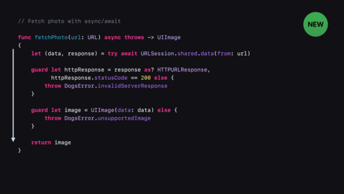 13:40
13:40
Use async/await with URLSession
Discover how you can adopt Swift concurrency in URLSession using async/await and AsyncSequence, and how you can apply Swift concurrency concepts to improve your networking code.
WWDC21 English, Japanese, Simplified Chinese -
 13:02
13:02
Improve global streaming availability with HLS Content Steering
Discover how you can use HLS playlist tags and the Steering Manifest format with your content to help dynamically update CDN redundancy policies tuned for each viewer. Learn how to load balance, set failover, and more.
WWDC21 English, Japanese, Simplified Chinese -
 25:21
25:21
Move beyond passwords
Despite their prevalence, passwords inherently come with challenges that make them poorly suited to securing someone's online accounts. Learn more about the challenges passwords pose to modern security and how to move beyond them. Explore the next frontier in account security with...
WWDC21 English, Japanese, Simplified Chinese -
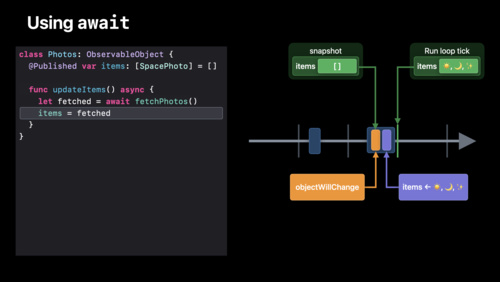 22:54
22:54
Discover concurrency in SwiftUI
Discover how you can use Swift's concurrency features to build even better SwiftUI apps. We'll show you how concurrent workflows interact with your ObservableObjects, and explore how you can use them directly in your SwiftUI views and models. Find out how to use await to make your app run...
WWDC21 English, Japanese, Simplified Chinese -
 28:10
28:10
SwiftUI Accessibility: Beyond the basics
Go beyond the basics to deliver an exceptional accessibility experience. Learn how to use the new SwiftUI Previews in Xcode to explore the latest accessibility APIs and create fantastic, accessible apps for everyone. Find out how you can customize the automatic accessibility built into SwiftUI to...
WWDC21 English, Japanese -
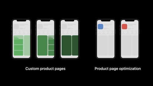 8:21
8:21
Get ready to optimize your App Store product page
Discover new ways to make your product page more relevant. Learn how you can use custom product pages to highlight different features and content in your app for different users. Explore how you can optimize your product page by comparing the effectiveness of different visual assets to see what...
WWDC21 English, Japanese, Simplified Chinese -
 26:31
26:31
Capture and process ProRAW images
When you support ProRAW in your app, you can help photographers easily capture and edit images by combining standard RAW information with Apple's advanced computational photography techniques. We'll take you through an overview of the format, including the look and feel of ProRAW images, quality...
WWDC21 English, Japanese, Simplified Chinese -
 20:31
20:31
What’s new in SF Symbols
Explore the latest updates to SF Symbols, Apple's iconography library. Designed to integrate seamlessly with San Francisco — the system font for Apple platforms — SF Symbols can help you create beautiful and consistent iconography for your app while supporting accessibility features like Dynamic...
WWDC21 English, Japanese, Simplified Chinese -
 18:38
18:38
Create audio drivers with DriverKit
Discover how to use the AudioDriverKit API to consolidate your Audio Server plug-in and DriverKit extension into a single package. Learn how you can simplify audio driver installation with an app instead of an installer package and distribute your driver through the Mac App Store. And we'll take...
WWDC21 English, Japanese, Simplified Chinese -
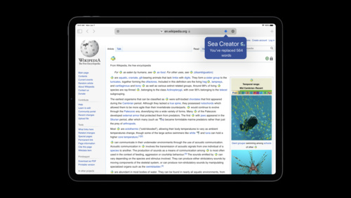 16:55
16:55
Explore Safari Web Extension improvements
Learn how you can extend Safari's functionality with Safari Web Extensions. We'll introduce you to the latest WebExtension APIs, explore non-persistent background page support — a particularly relevant topic if you're developing for iOS — and discover how you can use the Declarative Net Request...
WWDC21 English, Japanese -
 21:06
21:06
Discover account-driven User Enrollment
Learn how User Enrollment helps you support “bring your own device” deployments in your business or enterprise environment. We'll explore data separation, enhancements to Managed Apple IDs and how you can use the new account-based onboarding in your organization.
WWDC21 English, Japanese, Simplified Chinese -
 37:20
37:20
Symbolication: Beyond the basics
Discover how you can achieve maximum performance and insightful debugging with your app. Symbolication is at the center of tools such as Instruments and LLDB to help bridge the layers between your application's runtime and your source code. Learn how this process works and the steps you can take...
WWDC21 English, Japanese, Simplified Chinese -
 20:49
20:49
Measure health with motion
Discover how you can take your app's health monitoring to the next level with motion data. Meet Walking Steadiness for iPhone and the six-minute-walk metric for Apple Watch: Walking Steadiness can help your app interpret someone's quality of walking and risk of falling, while the six-minute-walk...
WWDC21 English, Japanese, Simplified Chinese -
 39:53
39:53
Discover Metal debugging, profiling, and asset creation tools
Explore how Xcode can help you take your Metal debugging, profiling and asset creation workflows to the next level. Discover the latest tools for ray tracing and GPU profiling, and learn about Metal Debugger workflows. We'll also show you how to use the Texture Converter tool, which supports all...
WWDC21 English, Japanese, Simplified Chinese -
 14:26
14:26
AR Quick Look, meet Object Capture
Discover simple ways to bring your Object Capture assets to AR Quick Look while optimizing for visual quality and file size. Explore ways you can integrate AR Quick Look and Object Capture to help create entirely new experiences. To get the most out of this session, we recommend first watching...
WWDC21 English, Japanese, Simplified Chinese -
 19:15
19:15
Build interfaces with style
Discover how you can iterate upon your interfaces even more quickly when building your apps. Learn how you can modernize your UI with the latest button styles and table view cell content configurations, both of which give you greater control directly inside of Interface Builder. We'll show you...
WWDC21 English, Japanese, Simplified Chinese -
 12:12
12:12
Customize and resize sheets in UIKit
Discover how you can create a layered and customized sheet experience in UIKit. We'll explore how you can build a non-modal experience in your app to allow interaction with content both in a sheet and behind the sheet at the same time. We'll also take you through sheet size customization,...
WWDC21 English, Japanese, Simplified Chinese -
 37:58
37:58
Coordinate media experiences with Group Activities
Discover how you can help people watch or listen to content all in sync with SharePlay and the Group Activities framework. We'll show you how to adapt a media app into a synchronized, SharePlay-enabled experience for multiple people. Learn how to add Group Activities to your app, explore the...
WWDC21 English, Japanese, Simplified Chinese -
 14:21
14:21
Meet AsyncSequence
Iterating over a sequence of values over time is now as easy as writing a “for” loop. Find out how the new AsyncSequence protocol enables a natural, simple syntax for iterating over anything from notifications to bytes being streamed from a server. We'll also show you how to adapt existing code...
WWDC21 English, Japanese, Simplified Chinese -
 16:33
16:33
Showcase app data in Spotlight
Discover how Core Data can surface data from your app in Spotlight with as little as two lines of code. Learn how to make that data discoverable in Spotlight search and to customize how it is presented to people on device. Lastly, we'll show you how to implement full-text search within your app,...
WWDC21 English, Japanese, Simplified Chinese -
 26:33
26:33
What's new in Mac Catalyst
Discover the latest updates to Mac Catalyst and find out how you can make your app feel even more at home on macOS. Learn about a variety of new and enhanced UIKit APIs that let you customize your Mac Catalyst app to take advantage of behaviors unique to macOS. To get the most out of this...
WWDC21 English, Japanese, Simplified Chinese -
 54:09
54:09
Build a workout app for Apple Watch
Build a workout app from scratch using SwiftUI and HealthKit during this code along. Learn how to support the Always On state using timelines to update workout metrics. Follow best design practices for workout apps.
WWDC21 English, Japanese, Simplified Chinese -
 20:59
20:59
Send communication and Time Sensitive notifications
Learn more about the evolution of notifications on Apple platforms. We'll explore how you can help people manage notifications within your app, including how you can craft meaningful moments with interruption levels and Time Sensitive notifications. And we'll introduce you to communication...
WWDC21 English, Japanese, Simplified Chinese -
 9:52
9:52
Manage devices with Apple Configurator
Apple Configurator is now more capable than ever. Whether you're provisioning iOS, iPadOS, and tvOS devices in your organization or servicing existing macOS devices, learn how Apple Configurator can help with key workflows. And, coming to iPhone in iOS 15, discover how you can bring Automated...
WWDC21 English, Japanese, Simplified Chinese -
 22:38
22:38
Qualities of great iPad and iPhone apps on Macs with M1
It's easier than ever to offer your existing iPad and iPhone apps on Macs with M1. We'll show you how to bring your app to macOS, and explore how the system automatically bridges various features of your app to work on the Mac. We'll also provide guidance on best practices in your iPad app,...
WWDC21 English, Japanese, Simplified Chinese -
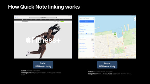 14:46
14:46
Adopt Quick Note
Learn how you can link your app to Quick Note and help people quickly connect your content to their notes — and their notes to your content. Discover how Quick Note recognizes and links to app content through NSUserActivity, and find out how you can adopt this API in your app. We'll take you...
WWDC21 English, Japanese, Simplified Chinese -
 10:57
10:57
SF Symbols in SwiftUI
Discover how you can incorporate SF Symbols into your SwiftUI app. We'll explore basic techniques for presenting symbols, customizing their size, and showing different variants. We'll also take you through the latest updates to symbol colorization and help you pick the right tool for your app's...
WWDC21 English, Japanese, Simplified Chinese -
 29:53
29:53
Explore advanced rendering with RealityKit 2
Create stunning visuals for your augmented reality experiences with cutting-edge rendering advancements in RealityKit. Learn the art of writing custom shaders, draw real-time dynamic meshes, and explore creative post-processing effects to help you stylize your AR scene.
WWDC21 English, Japanese, Simplified Chinese -
 11:16
11:16
Review code and collaborate in Xcode
Explore the latest enhancements to code review and pull requests in Xcode. Learn more about diff display preferences, commit selectors, changes navigator, and pull request workflows. We'll show you how you can collaborate with your team and find regressions by connecting your code review and PR...
WWDC21 English, Japanese, Simplified Chinese -
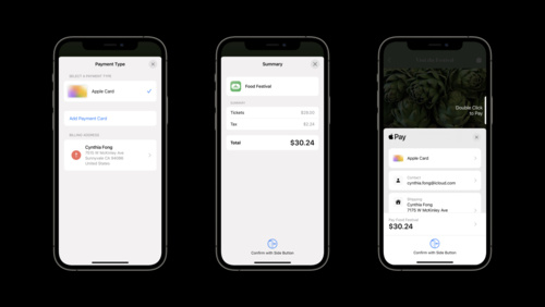 18:41
18:41
What's new in Wallet and Apple Pay
Discover the redesigned Apple Pay for in-app and web payments and learn how you can incorporate the latest APIs into your app or website. Learn how to add features to your app like coupon codes, improved shipping information, and improvements to the payment detail display screen. And explore...
WWDC21 English, Japanese, Simplified Chinese -
 17:46
17:46
Elevate your DocC documentation in Xcode
Great documentation can help people effectively and easily adopt your Swift framework. Discover how you can create rich, conceptual articles to accompany your API. You'll learn best practices for writing articles, including how to structure your documentation, and find out how to create...
WWDC21 English, Japanese, Simplified Chinese -
 30:30
30:30
Meet the Swift Algorithms and Collections packages
Discover two of the latest additions to the list of open-source Swift packages from Apple: Swift Algorithms and Swift Collections. Not only can you use these packages immediately, they also incubate new algorithms and data structures for eventual inclusion in the Swift Standard Library. We'll...
WWDC21 English, Japanese, Simplified Chinese -
 15:19
15:19
Explore dynamic pre-rolls and mid-rolls in HLS
Learn how you can create seamless transitions between advertisements and your HLS streams. We'll show you how to incorporate HLS tags and AVFoundation APIs to create media experiences that move easily between your primary content and mid-rolls, and provide best practices for playing these streams...
WWDC21 English, Japanese, Simplified Chinese -
 9:03
9:03
Explore Core Image kernel improvements
Discover how you can add Core Image kernels written in the Metal Shading Language into your app. We'll explore how you can use Xcode rules and naming conventions for Core Image kernels written in the Metal Shading Language, and help you make sense of Metal's Stitchable functions and dynamic...
WWDC21 English, Japanese, Simplified Chinese -
 36:02
36:02
What’s new in camera capture
Learn how you can interact with Video Effects in Control Center including Center Stage, Portrait mode, and Mic modes. We'll show you how to detect when these features have been enabled for your app and explore ways to adopt custom interfaces to make them controllable from within your app...
WWDC21 English, Simplified Chinese -
 23:26
23:26
Create accessible experiences for watchOS
Discover how you can build a top-notch accessibility experience for watchOS when you support features like larger text sizes, VoiceOver, and AssistiveTouch. We'll take you through adding visual and motor accessibility support to a SwiftUI app built for watchOS, including best practices around API...
WWDC21 English, Japanese, Simplified Chinese -
 26:49
26:49
Classify hand poses and actions with Create ML
With Create ML, your app's ability to understand the expressiveness of the human hand has never been easier. Discover how you can build off the support for Hand Pose Detection in Vision and train custom Hand Pose and Hand Action classifiers using the Create ML app and framework. Learn how simple...
WWDC21 English, Japanese, Simplified Chinese -
 22:13
22:13
Design great actions for Shortcuts, Siri, and Suggestions
Actions are the building blocks of shortcuts. They allow people to take advantage of your app's functionality even when they're not looking at your app's interface. We'll show you how to design actions that are useful, easy-to-use, and can be incorporated into powerful multi-step shortcuts...
WWDC21 English, Japanese, Simplified Chinese -
 21:48
21:48
Customize your advanced Xcode Cloud workflows
Xcode Cloud integrates with Apple Developer tools and services, all major source control management services, and even social collaboration tools like Slack. If your development process relies on additional tools and external services, however, you can fine-tune your workflows and the behavior of...
WWDC21 English, Japanese, Simplified Chinese -
 19:57
19:57
Explore low-latency video encoding with VideoToolbox
Supporting low latency encoders has become an important aspect of video application development process. Discover how VideoToolbox supports low-delay H.264 hardware encoding to minimize end-to-end latency and achieve new levels of performance for optimal real-time communication and high-quality...
WWDC21 English, Japanese, Simplified Chinese -
 12:47
12:47
Explore the SF Symbols 3 app
Tour the latest updates to the SF Symbols app — our interactive library for iconography. Learn how you can use the library to design accessible and inclusive apps that look incredible: We'll take you through changes to the app and symbols search, explore previewing and custom symbol management,...
WWDC21 English, Japanese, Simplified Chinese -
 33:57
33:57
Analyze HTTP traffic in Instruments
Learn to use the Instruments Network template to record and analyze your app's HTTP traffic. We'll show you how to explore and visualize the behavior of sessions, tasks, and individual HTTP requests to ensure data is transmitted efficiently and respects people's privacy.
WWDC21 English, Japanese, Simplified Chinese -
 25:47
25:47
Create custom symbols
Discover how you can create custom iconography with the latest rendering modes in SF Symbols 3. We'll help you learn how to draw, edit, and annotate symbols, as well as explore more advanced techniques to improve the design process. For a primer on working with custom symbol templates, we...
WWDC21 English, Japanese, Simplified Chinese -
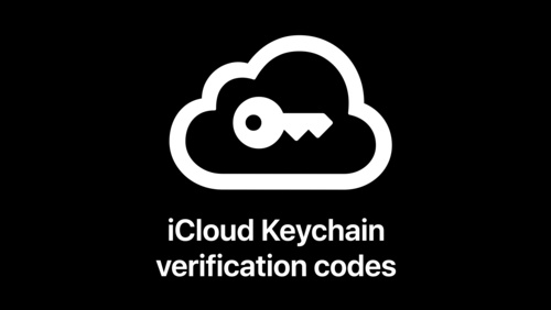 14:32
14:32
Secure login with iCloud Keychain verification codes
Learn how you can support on-device verification codes in your app or website for a more secure sign-in experience. We'll explore the latest updates to the iCloud Keychain password manager and discover how verification codes, AutoFill, iCloud Keychain sync, and two-tap setup simplify the...
WWDC21 English, Japanese, Simplified Chinese -
 24:20
24:20
Qualities of a great Mac Catalyst app
Discover best practices, tools, and techniques to help craft the best possible Mac Catalyst app. We'll take you through key considerations when you bring your iPad app to macOS, explore detailed code examples for refining your interface and experience, and show you how to distribute your Mac app...
WWDC21 English, Japanese, Simplified Chinese -
 15:27
15:27
Triage TestFlight crashes in Xcode Organizer
Learn how Xcode Organizer makes it easier and faster to triage and fix crashes. We'll explore how you can get access to crash information and feedback from your TestFlight testers just moments after they occur. And we'll show you how to analyze crashes, view metrics, and even share crash...
WWDC21 English, Japanese, Simplified Chinese -
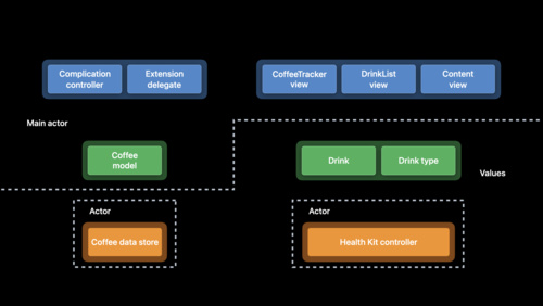 61:00
61:00
Swift concurrency: Update a sample app
Discover Swift concurrency in action: Follow along as we update an existing sample app. Get real-world experience with async/await, actors, and continuations. We'll also explore techniques for migrating existing code to Swift concurrency over time. To get the most out of this code-along, we...
WWDC21 English, Japanese -
 33:43
33:43
Manage in-app purchases on your server
Discover the latest updates to managing in-app purchases on your server. Explore how you can use servers to track status changes, handle refunds, and manage subscriber status. Learn about App Store server APIs around status and in-app purchase transactions, and find out how App Store server...
WWDC21 English, Japanese, Simplified Chinese -
 15:30
15:30
Diagnose Power and Performance regressions in your app
Quickly discover how to identify priorities when viewing power and performance regressions. Learn how to track metrics that have regressed with device-and percentile-specific information, so you can focus your efforts on optimization and save valuable development time. We'll also show you how to...
WWDC21 English, Japanese, Simplified Chinese -
 32:44
32:44
Discoverable design
Discover how you can create interactive, memorable experiences to onboard people into your app. We'll take you through discoverable design practices and learn how you can craft explorable, fun interfaces that help people grasp the possibilities of your app at a glance. We'll also show you how to...
WWDC21 English, Japanese, Simplified Chinese -
 17:58
17:58
Detect people, faces, and poses using Vision
Discover the latest updates to the Vision framework to help your apps detect people, faces, and poses. Meet the Person Segmentation API, which helps your app separate people in images from their surroundings, and explore the latest contiguous metrics for tracking pitch, yaw, and the roll of the...
WWDC21 English, Japanese, Simplified Chinese -
 41:04
41:04
Meet TextKit 2
Meet TextKit 2: Apple's next-generation text engine, redesigned for improved correctness, safety, and performance. Discover how TextKit 2 can help you provide a better text experience for international audiences, create more diverse layouts by mixing text content with visual content, and ensure...
WWDC21 English, Japanese, Simplified Chinese -
 15:06
15:06
SF Symbols in UIKit and AppKit
Learn how you can create colorized symbols with SF Symbols 3 and customize them to match the visual design of your app's interface. We'll take you through the latest UIKit and AppKit APIs for integrating colorized symbols, as well as best practices for implementation. To get the most out of this...
WWDC21 English, Japanese, Simplified Chinese -
 40:17
40:17
Demystify SwiftUI
Peek behind the curtain into the core tenets of SwiftUI philosophy: Identity, Lifetime, and Dependencies. Find out about common patterns, learn the principles that drive the framework, and discover how you can use them to guarantee correctness and performance for your app.
WWDC21 English, Japanese, Simplified Chinese -
 16:35
16:35
Evaluate videos with the Advanced Video Quality Tool
Learn how the Advanced Video Quality Tool (AVQT) can help you accurately assess the perceptual quality of your compressed video files. Utilizing the AVFoundation framework, AVQT supports a wide range of video formats, codecs, resolutions and frame-rates in both the SDR and HDR domains, which...
WWDC21 English, Japanese, Simplified Chinese -
 21:44
21:44
Explore WKWebView additions
Explore the latest updates to WKWebView. We'll show you how to use APIs to manipulate web content without JavaScript, explore delegates that can help with WebRTC and Downloads, and share how you can easily create a richer web experience within your app.
WWDC21 English, Japanese -
 16:14
16:14
Explore UWB-based car keys
Discover how to create digital car keys that support Ultra Wideband (UWB), allowing people to unlock and start their car while leaving iPhone in their bag or pocket or Apple Watch on their wrist. We'll show you how to integrate UWB, add proximity actions and distance unlock features, and help...
WWDC21 English, Japanese, Simplified Chinese -
 37:28
37:28
Discover geometry-aware audio with the Physical Audio Spatialization Engine (PHASE)
Explore how geometry-aware audio can help you build complex, interactive, and immersive audio scenes for your apps and games. Meet PHASE, Apple's spatial audio API, and learn how the Physical Audio Spatialization Engine (PHASE) keeps the sound aligned with your experience at all times — helping...
WWDC21 English, Japanese, Simplified Chinese -
 29:36
29:36
Build light and fast App Clips
App Clips give people the power to discover and download a small part of your app at a moment's notice to complete tasks and transactions. Explore tips and best practices to help you create compact App Clips that emphasize modern features and elegant design. Learn how you can build reliable and...
WWDC21 English, Japanese, Simplified Chinese -
 1:40
1:40
Tuesday@WWDC21
The day's almost over, but there's still so much to explore: Catch up on the best of Day 2 at WWDC and check out a few of the great sessions and activities still to come.
WWDC21 English, Japanese, Simplified Chinese -
 16:32
16:32
Out of this world... on to Mars
Fascinated by aerospace engineering and fighter jets from the age of 11, MIT graduate Tiera Fletcher followed her passion. At 22, she landed her dream job working on NASA's Space Launch System, the most powerful rocket created in history. Learn what it's like to design components of a...
WWDC21 English -
 11:42
11:42
Craft search experiences in SwiftUI
Discover how you can help people quickly find specific content within your apps. Learn how to use SwiftUI's .searchable modifier in conjunction with other views to best incorporate search for your app. And we'll show you how to elevate your implementation by providing search suggestions to help...
WWDC21 English, Japanese, Simplified Chinese -
 10:31
10:31
Connect Bluetooth devices to Apple Watch
Discover how you can integrate data from Bluetooth accessories into Apple Watch apps and complications. Bluetooth devices can provide medical data, sports stats, and more to Apple Watch, and help people get more out of your software in the process. We'll show you how to connect to these devices...
WWDC21 English, Simplified Chinese -
 32:45
32:45
What‘s new in Swift
Join us for an update on Swift. Discover the latest language advancements that make your code easier to read and write. Explore the growing number of APIs available as Swift packages. And we'll introduce you to Swift's async/await syntax, structured concurrency, and actors.
WWDC21 English, Japanese, Simplified Chinese -
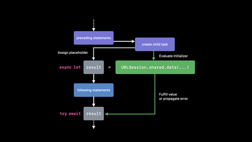 27:54
27:54
Explore structured concurrency in Swift
When you have code that needs to run at the same time as other code, it's important to choose the right tool for the job. We'll take you through the different kinds of concurrent tasks you can create in Swift, show you how to create groups of tasks, and find out how to cancel tasks in progress...
WWDC21 English, Japanese, Simplified Chinese -
 23:49
23:49
Explore Xcode Cloud workflows
Learn how Xcode Cloud workflows can help you and your team automate building, analyzing, testing, archiving, and distributing your apps and frameworks. They are flexible, extensible, and can be configured around your team's development and distribution process. Find out the basics of Xcode Cloud...
WWDC21 English, Japanese, Simplified Chinese -
 18:17
18:17
Immerse your app in Spatial Audio
Discover how spatial audio can help you provide a theater-like experience for media in your apps and on the web. We'll show you how you can easily bring immersive audio to those listening with compatible hardware, and how to automatically deliver different listening experiences depending on...
WWDC21 English, Japanese, Simplified Chinese -
 10:30
10:30
Meet TestFlight on Mac
TestFlight has come to Mac. Learn how you can manage builds and testers, collect feedback, and deploy your macOS app. Discover enhancements for internal testing and new features that integrate with Xcode Cloud to make testing even easier on all platforms.
WWDC21 English, Japanese, Simplified Chinese -
 13:51
13:51
Host and automate your DocC documentation
Find out how you can easily host your Swift package and framework DocC documentation online. We'll take you through configuring your web server to host your generated DocC archives, and help you learn to use the xcodebuild tool to automate documentation generation and keep your web content...
WWDC21 English, Japanese, Simplified Chinese -
 37:30
37:30
Meet StoreKit 2
StoreKit 2 delivers powerful, Swift-native APIs for in-app purchases and auto-renewable subscriptions. Learn how you can easily implement in-app purchases and subscriptions, and discover APIs for retrieving product information, handling transactions, determining product entitlements and customer...
WWDC21 English, Japanese, Simplified Chinese -
 14:14
14:14
Meet in-app events on the App Store
Discover how you can promote timely events happening in your apps and games — like a game competition, a movie premiere, and more — directly on the App Store. We'll show you how in-app events now appear on the App Store and how to create, schedule, and manage them in App Store Connect.
WWDC21 English, Japanese, Simplified Chinese -
 25:07
25:07
Dive into RealityKit 2
Creating engaging AR experiences has never been easier with RealityKit 2. Explore the latest enhancements to the RealityKit framework and take a deep dive into this underwater sample project. We'll take you through the improved Entity Component System, streamlined animation pipeline, and the...
WWDC21 English, Japanese, Simplified Chinese -
 24:00
24:00
Ultimate application performance survival guide
Performance optimization can seem like a daunting task — with many metrics to track and tools to use. Fear not: Our survival guide to app performance is here to help you understand tooling, metrics, and paradigms that can help smooth your development process and contribute to a great experience...
WWDC21 English, Japanese -
 36:34
36:34
The process of inclusive design
Discover how you can deliver inclusive apps that can foster amazing experiences for everyone who uses your software. We'll take you through best practices for creating and empowering diverse teams and explore how inclusivity influences every stage of the design and development process.
WWDC21 English, Japanese, Simplified Chinese -
 19:24
19:24
Add intelligence to your widgets
Discover how to you can add intelligence to your widgets in Smart Stacks. We'll show you how to use the new Widget Suggestions API in tandem with Smart Rotate to create more valuable widget experiences for people throughout the day. Whether you inform the system of new, timely information or...
WWDC21 English, Japanese, Simplified Chinese -
 20:23
20:23
Focus on iPad keyboard navigation
Improve the keyboard experience in your iPad and Mac Catalyst app. Discover how you can accelerate access to key features with the hardware keyboard, and navigate through your views and view controllers. Learn how to customize which elements are keyboard navigable, as well as how to customize the...
WWDC21 English, Japanese -
 26:49
26:49
What's new in CloudKit
CloudKit provides a secure, convenient, and reliable cloud database for your apps — and it's only getting better. Discover how you can unravel your threads with support for async/await and convenience API additions. We'll also show you how to encourage collaboration between people using your app...
WWDC21 English, Japanese, Simplified Chinese -
 40:13
40:13
What's new in SwiftUI
There's never been a better time to develop your apps with SwiftUI. Discover the latest updates to the UI framework — including lists, buttons, and text fields — and learn how these features can help you more fully adopt SwiftUI in your app. Find out how to create beautiful, visually-rich...
WWDC21 English, Japanese, Simplified Chinese -
 15:08
15:08
Get ready for iCloud Private Relay
iCloud Private Relay is an iCloud+ service that prevents networks and servers from monitoring a person's activity across the internet. Discover how your app can participate in this transition to a more secure and private internet: We'll show you how to prepare your apps, servers, and networks to...
WWDC21 English, Japanese, Simplified Chinese -
 29:48
29:48
Explore hybrid rendering with Metal ray tracing
Discover how you can combine ray tracing with your rasterization engine to implement simplified graphics techniques and elevate visuals in your app or game. We'll explore how you can use natural algorithms to accurately simulate the interplays of light, and learn how to take advantage of the...
WWDC21 English, Japanese, Simplified Chinese -
 36:16
36:16
Take your iPad apps to the next level
Make even better iPad apps: Learn how you can adopt prominent scenes for uninterrupted, focused interactions. Help people stay engaged and fast with keyboard shortcuts and the keyboard shortcut interface. Explore how the latest in pointer enhancements can help your app boost productivity.
WWDC21 English, Japanese, Simplified Chinese -
 6:24
6:24
Faster and simpler notarization for Mac apps
Notarization works in tandem with macOS to help people safely download software for their Mac outside of the App Store. Discover how notarytool can help you quickly and easily notarize your Mac app for distribution. We'll show you how you can now notarize your apps with just a single command, and...
WWDC21 English, Japanese, Simplified Chinese -
 26:51
26:51
Meet Shortcuts for macOS
Shortcuts is coming to macOS, and your apps are a key part of that process. Discover how you can elevate the capabilities of your app by exposing those features as Shortcuts actions. We'll show you how to build actions for your macOS apps built with Catalyst or AppKit, deploy actions across...
WWDC21 English, Japanese, Simplified Chinese -
 14:40
14:40
Your guide to keyboard layout
Discover how you can use the Keyboard Layout Guide to manage how keyboards work within your iOS or iPadOS app. Learn how you can avoid writing lengthy code blocks when you use UIKeyboardLayoutGuide and UITrackingLayoutGuide to integrate the keyboard into your interface, helping people have a...
WWDC21 English, Japanese, Simplified Chinese -
 22:51
22:51
Meet DocC documentation in Xcode
Discover how you can use DocC to build and share documentation for Swift packages and frameworks. We'll show you how to begin generating documentation from your own code — or from third-party code you depend upon — and write and format it using Markdown. And we'll also take you through the export...
WWDC21 English, Japanese, Simplified Chinese -
 11:34
11:34
Use the camera for keyboard input in your app
Learn how you can support Live Text and intelligently pull information from the camera to fill out forms and text fields in your app. We'll show you how to apply content filtering to capture the correct information when someone uses the camera as keyboard input and apply it to a relevant...
WWDC21 English, Japanese, Simplified Chinese -
 19:09
19:09
Meet the Screen Time API
Explore the Screen Time API and learn how you can build apps that support customized parental controls — all while putting privacy first. Learn how you can use key features like core restrictions and device activity monitoring to create safe, secure experiences in your app while providing...
WWDC21 English, Japanese, Simplified Chinese -
 15:48
15:48
What's new in App Clips
Discover how App Clips can elevate quick and focused experiences for specific tasks, the moment your customer needs them. We'll take you through some of the latest improvements to App Clips, including launching an experience directly from an app, testing your App Clip locally, and creating App...
WWDC21 English, Japanese, Simplified Chinese -
 16:32
16:32
Meet Xcode Cloud
Get to know Xcode Cloud, Apple's continuous integration and continuous delivery (CI/CD) service for building apps and frameworks for all Apple platforms. Find out how Xcode Cloud can improve both the productivity of your team and the quality of your products. We'll show you how to start your...
WWDC21 English, Japanese, Simplified Chinese -
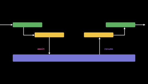 33:39
33:39
Meet async/await in Swift
Swift now supports asynchronous functions — a pattern commonly known as async/await. Discover how the new syntax can make your code easier to read and understand. Learn what happens when a function suspends, and find out how to adapt existing completion handlers to asynchronous functions.
WWDC21 English, Japanese -
 34:06
34:06
The practice of inclusive design
An inclusive app or game is not only usable by different people, but also welcomes people from diverse backgrounds and perspectives. Discover how you can design inclusive content for your interface, language, imagery, and marketing materials and support the broadest possible range of people with...
WWDC21 English, Japanese, Simplified Chinese -
 33:50
33:50
Apple’s privacy pillars in focus
At Apple, we believe that privacy is a fundamental human right. Learn about our four pillars of privacy, how we brought these principles together to design iCloud Private Relay, and how you can approach building privacy in your app in line with those fundamentals. Explore how you can build data...
WWDC21 English, Japanese, Simplified Chinese -
 19:43
19:43
Bring accessibility to charts in your app
Charts are an essential tool for understanding data, and critical to understanding ourselves, our health, our finances, and our world. Find out how you can make charts accessible in your apps to people with vision impairments through audio graphs and sonified data. And we'll show you how to...
WWDC21 English, Japanese, Simplified Chinese -
 17:46
17:46
Meet MusicKit for Swift
MusicKit makes it easy to integrate Apple Music into your app. Explore the Swift-based framework: We'll take you through the basic process of using MusicKit — including how to find, request, and play content — and show you how you can incorporate music subscription workflows into your app if...
WWDC21 English, Japanese, Simplified Chinese -
 17:08
17:08
Meet Group Activities
Learn more about the framework powering SharePlay, and discover the different types of shared experiences you can implement for people who use your app. Explore a high-level overview of the framework's architecture and concepts, including how Group Activities and AVFoundation work in tandem, and...
WWDC21 English, Japanese, Simplified Chinese -
 22:18
22:18
Meet declarative device management
The future of device management is here: Learn how you can support mobile device management while allowing individual devices to be autonomous and proactive, bringing both increased performance and scalability. We'll show you how you can incorporate this declarative model in your MDM solution.
WWDC21 English, Japanese, Simplified Chinese -
 26:52
26:52
What's new in UIKit
Discover the latest updates and improvements to UIKit and learn how to build better iPadOS, iOS, and Mac Catalyst apps. We'll take you through UI refinements, productivity updates, and API enhancements, and help you explore performance improvements and security & privacy features.
WWDC21 English, Japanese, Simplified Chinese -
 29:50
29:50
Enhance your app with Metal ray tracing
Achieve photorealistic 3D scenes in your apps and games through ray tracing, a core part of the Metal graphics framework and Shading Language. We'll explore the latest improvements in implementing ray tracing and take you through upgrades to the production rendering process. Discover Metal APIs...
WWDC21 English, Japanese, Simplified Chinese -
 18:24
18:24
Explore Verifiable Health Records
Find out how you can securely request access to someone's verifiable health records and incorporate that data safely into your app. The Health app helps people download, view, and share their health records, including their COVID-19 immunization and test results — and iOS 15 brings support for...
WWDC21 English, Japanese, Simplified Chinese -
 23:56
23:56
Add rich graphics to your SwiftUI app
Learn how you can bring your graphics to life with SwiftUI. We'll begin by working with safe areas, including the keyboard safe area, and learn how to design beautiful, edge-to-edge graphics that won't underlap the on-screen keyboard. We'll also explore the materials and vibrancy you can use in...
WWDC21 English, Japanese, Simplified Chinese -
 22:09
22:09
What’s new in Game Center: Widgets, friends, and multiplayer improvements
Power up your online gaming experience with GameKit and adopt features like multiplayer, leaderboards, and achievements in your game. We'll take you through the latest improvements to Game Center, including player matching and multiplayer APIs, and explore how you can boost discovery of your game.
WWDC21 English, Japanese, Simplified Chinese -
 8:05
8:05
What's new in AVKit
Learn about enhancements to Picture in Picture and full screen improvements on macOS. Explore the new content source API, and learn how AVPictureInPictureController supports AVSampleBufferDisplayLayer, as well as recommended steps for an app to provide a seamless full screen experience on macOS...
WWDC21 English, Japanese, Simplified Chinese -
 38:11
38:11
Meet Safari Web Extensions on iOS
Safari Web Extensions use HTML, CSS, and JavaScript to offer people powerful browser customizations — and you can now create them for every device that supports Safari. Learn how to build a Safari Web Extension that works for all devices, and discover how you can convert an existing extension to...
WWDC21 English, Japanese, Simplified Chinese -
 7:56
7:56
Simplify sign in for your tvOS apps
Find out how people can use Face ID or Touch ID on their iOS or iPadOS device to authorize purchases and sign into your tvOS app. Discover how you can simplify sign in for people using your app and help them get to the content they want to enjoy, faster. We'll show you how to set up a simplified...
WWDC21 English, Japanese, Simplified Chinese -
 14:26
14:26
What’s new in managing Apple devices
Discover the latest advancements in key device management capabilities for your organization or MDM solution. Explore the refreshed device management Settings on iOS and iPadOS, an all-new return to service functionality for macOS, and other updates to device management across Apple platforms.
WWDC21 English, Japanese, Simplified Chinese -
 19:16
19:16
Discover built-in sound classification in SoundAnalysis
Explore how you can use the Sound Analysis framework in your app to detect and classify discrete sounds from any audio source — including live sounds from a microphone or from a video or audio file — and identify precisely in a moment where that sound occurs. Learn how the built-in sound...
WWDC21 English, Japanese, Simplified Chinese -
 21:12
21:12
Explore bindless rendering in Metal
Unleash the full potential of your shaders and implement modern rendering techniques by adding Argument Buffers to adopt bindless rendering. Learn how to make your entire scene and resources available to the GPU to make the most out of raytracing and rasterization pipelines.
WWDC21 English, Japanese, Simplified Chinese -
 15:00
15:00
Tap into virtual and physical game controllers
It's time to up your input game: Learn about the latest improvements to virtual and physical game controllers for iPhone, iPad, Mac, and Apple TV. Meet the virtual on-screen controller, which turns touch input into game controller input, and find out how to add controller sharing features to your...
WWDC21 English, Simplified Chinese -
 27:56
27:56
Create 3D models with Object Capture
Object Capture provides a quick and easy way to create lifelike 3D models of real-world objects using just a few images. Learn how you can get started and bring your assets to life with Photogrammetry for macOS. And discover best practices with object selection and image capture to help you...
WWDC21 English, Japanese, Simplified Chinese -
 23:01
23:01
Explore Nearby Interaction with third-party accessories
Discover how your app can interact with Ultra Wideband (UWB) third-party accessories when running on a U1-equipped device. We'll show you how to use the Nearby Interaction framework's standards-based technology to implement precise and directionally-aware experiences with accessories. Learn about...
WWDC21 English, Japanese, Simplified Chinese -
 21:32
21:32
What's new in AppKit
Explore the latest advancements in Mac app development with AppKit. We'll show how you can enhance your app's design with new control features and SF Symbols 3, build powerful text experiences using TextKit 2, and harness the latest Swift features in your app.
WWDC21 English, Japanese, Simplified Chinese -
 28:32
28:32
Protect mutable state with Swift actors
Data races occur when two separate threads concurrently access the same mutable state. They are trivial to construct, but are notoriously hard to debug. Discover how you can stop these data races in their tracks with Swift actors, which help synchronize access to data in your code. Discover how...
WWDC21 English, Japanese, Simplified Chinese -
 19:46
19:46
What's new in watchOS 8
watchOS 8 brings all-new opportunities to keep people up to date on their watch face. With new APIs for the Always-On Retina display and updating complications from Bluetooth devices and background delivery of HealthKit data, it's never been easier to keep your app up to date. Learn about...
WWDC21 English, Japanese, Simplified Chinese -
 15:07
15:07
Explore ShazamKit
Take advantage of Shazam's exact audio matching capabilities within your app when you use ShazamKit. Learn how you can harness the immense Shazam catalog to create all sorts of experiences, including quickly recognizing the exact song playing in the background of a video captured by your app,...
WWDC21 English, Japanese, Simplified Chinese -
 10:33
10:33
Transition media gaplessly with HLS
Discover how you can create streaming media content that seamlessly transitions between episodes, songs, scenes, and individual resources. With gapless HLS playback, you can stitch together multiple pieces of content on the fly to create customized workouts, design interactive content, tell...
WWDC21 English, Japanese, Simplified Chinese -
 15:53
15:53
Create custom audio experiences with ShazamKit
Bring custom audio matching to your app with ShazamKit. Discover how you can use Shazam's exact audio matching to recognize audio against any source when you use custom catalogs on device. Download our starter project and code along with the presenter as we guide you through the process of...
WWDC21 English, Japanese, Simplified Chinese -
 20:08
20:08
Meet the UIKit button system
Every app uses Buttons. With iOS 15, you can adopt updated styles to create gorgeous buttons that fit effortlessly into your interface. We'll explore features that make it easier to create different types of buttons, learn how to provide richer interactions, and discover how you can get great...
WWDC21 English, Simplified Chinese -
 37:35
37:35
What's new in Foundation
Discover how the latest updates to Foundation can help you improve your app's localization and internationalization support. Find out about the new AttributedString, designed specifically for Swift, and learn how you can use Markdown to apply style to your localized strings. Explore the grammar...
WWDC21 English, Japanese, Simplified Chinese -
 2:30
2:30
Monday@WWDC21
Trying to make sense of all the exciting announcements, new technologies, and Fall previews at WWDC this year? Let's break it down for you. Check out a recap of everything that happened on Day 1 of WWDC — and get a sneak peek at all the great stuff coming tomorrow.
WWDC21 English, Japanese -
 73:26
73:26
Platforms State of the Union (ASL)
Take a deeper dive into the new tools, technologies, and advances across Apple platforms that will help you create even better apps. This version includes American Sign Language (ASL) interpretation.
WWDC21 English, Japanese, Korean, Simplified Chinese -
 73:26
73:26
Platforms State of the Union
Take a deeper dive into the new tools, technologies, and advances across Apple platforms that will help you create even better apps.
WWDC21 English, Japanese, Korean, Simplified Chinese -
 106:49
Keynote (ASL)
The Apple Worldwide Developers Conference kicks off with exciting reveals, inspiration, and new opportunities. Join the worldwide developer community for an in-depth look at the future of Apple platforms, directly from Apple Park. This version includes American Sign Language (ASL) interpretation.
WWDC21 English, French, German, Japanese, Korean, Russian, Simplified Chinese, Spanish -
 106:49
Keynote
The Apple Worldwide Developers Conference kicks off with exciting reveals, inspiration, and new opportunities. Join the worldwide developer community for an in-depth look at the future of Apple platforms, directly from Apple Park.
WWDC21 English, French, German, Japanese, Korean, Russian, Simplified Chinese, Spanish
-
-
WWDC 2020 -
 2:46
2:46
The winners of the 2020 Apple Design Awards
Join us as we surprise the 2020 winners of the Apple Design Awards. The Apple Design Awards recognize excellence in design and innovation for apps and games across all of Apple's platforms.
WWDC 2020 English -
 18:54
18:54
SF Symbols 2
SF Symbols make it easy to adopt high-quality, Apple-designed symbols created to look great with San Francisco, the system font for all Apple platforms. Discover how you can use SF Symbols in AppKit, UIKit, and SwiftUI. Learn how to work with SF Symbols in common design tools and how to use them...
WWDC 2020 English, Japanese, Simplified Chinese -
 27:32
27:32
Add configuration and intelligence to your widgets
Widgets are at their best when they show up on someone's Home screen or in the Today View at the right time and provide actionable, relevant information. We'll show you how to build configurable widgets to let people create a personalized Home screen experience, and that take advantage of system...
WWDC 2020 English, Japanese, Simplified Chinese -
 22:22
22:22
Synchronize health data with HealthKit
HealthKit provides you the tools to smartly manage health data anywhere, whether across multiple HealthKit-enabled devices such as iPhone and Apple Watch or with an external server to share data across a care team. In this session, we'll dive into managing data versions via HealthKit's built-in...
WWDC 2020 English, Japanese, Simplified Chinese -
 39:35
39:35
Build customized ML models with the Metal Performance Shaders Graph
Discover the Metal Performance Shaders (MPS) Graph, which extends Metal's Compute capabilities to multi-dimensional Tensors. MPS Graph builds on the highly tuned library of data parallel primitives that are vital to machine learning and leverages the tremendous power of the GPU. Explore how MPS...
WWDC 2020 English, Japanese, Simplified Chinese -
 10:52
10:52
VoiceOver efficiency with custom rotors
Discover how you can integrate custom rotors and help people who use VoiceOver navigate complex situations within your app. Learn how custom rotors can help people explore even the most intricate interfaces, explore how to implement a custom rotor, and find out how rotors can improve navigation...
WWDC 2020 English, Japanese, Simplified Chinese -
 10:13
10:13
AutoFill everywhere
Discover how to implement AutoFill in your app and help people enter their information into fields easily, privately, and securely. Learn how to help the system to give better suggestions that tailor to your app's functionality: offer smart location suggestions within a navigation app, for...
WWDC 2020 English, Japanese, Simplified Chinese -
 17:27
17:27
Core Data: Sundries and maxims
Core Data is the central way to durably and persistently store information from your app — and we're going to show you how to refine that implementation for even faster data ingest and fetching. Discover how you can improve data capture with batch insert, tailor fetch requests to your data needs,...
WWDC 2020 English, Japanese, Simplified Chinese -
 13:45
13:45
What's new in MetricKit
Quickly detect power and performance regressions and troubleshoot app issues when you adopt MetricKit. Discover the latest trackable metrics for your app, including CPU instructions, animation hitches, and exit reasons. And learn about diagnostics in MetricKit that can help you troubleshoot...
WWDC 2020 English, Japanese, Simplified Chinese -
 21:05
21:05
Beyond counting steps
Move beyond step counting in your app and give people a much richer understanding of their mobility. We'll detail how you can take advantage of mobility metrics in iOS and watchOS to measure movement in more distinct and actionable ways. Learn about the latest HealthKit APIs for accessing...
WWDC 2020 English, Japanese, Simplified Chinese -
 20:31
20:31
Get to know Metal function pointers
Metal is a low-level, low-overhead hardware-accelerated graphics framework and shader application programming interface for producing stunning visual effects in applications. Discover how to make your shaders written in Metal Shading Language more programmable and extensible by using function...
WWDC 2020 English, Japanese, Simplified Chinese -
 14:25
14:25
Meet Watch Face Sharing
Show off your watchOS app's complications and create a watch face worth sharing. Learn how to share watch faces inside your watchOS and iOS apps or host them on the web for anyone to find and download. We'll also explore best practices for using watch face preview images, and show you how to...
WWDC 2020 English, Japanese, Simplified Chinese -
 23:04
23:04
What's new in Universal Links
Universal Links help people access your content, whether or not they have your app installed. Get the details on the latest updates for the Universal Links API, including support for Apple Watch and SwiftUI. Learn how you can reduce the size and complexity of your app-site-association file with...
WWDC 2020 English, Japanese, Simplified Chinese -
 14:50
14:50
Create custom apps for employees
Build enterprise apps for your employees to help them solve problems and streamline everyday tasks. See how to build custom apps designed for your workforce. Learn how to identify great mobile use cases, have your employees drive the design process, use key Apple frameworks, and rapidly iterate...
WWDC 2020 English, Japanese, Simplified Chinese -
 11:07
11:07
Diagnose performance issues with the Xcode Organizer
Analyze aggregated power and performance data from multiple versions of your app with just a few clicks. We'll introduce you to the latest version of the Xcode Organizer and its interactive interface, where you can easily compare and contrast app metrics across releases. Explore disk write...
WWDC 2020 English, Japanese, Simplified Chinese -
 33:42
33:42
Structure your app for SwiftUI previews
When you use SwiftUI previews during development, you can quickly create apps that are more flexible and maintainable. Discover ways to improve the preview experience by making small tweaks to your project. Find out how to preview multiple files at once, how to manage data flow for previews, and...
WWDC 2020 English, Japanese, Simplified Chinese -
 20:19
20:19
Empower your intents
When you create an intent for your app, you can help people accomplish tasks quickly by using it as part of a shortcut or when asking Siri. Learn how to adopt Siri more easily than ever when you use SiriKit's in-app intent handling, and how to improve Siri performance with existing Intents app...
WWDC 2020 English, Japanese, Simplified Chinese -
 2:09
2:09
Decipher and deal with common Siri errors
“Sorry, there was a problem with the app..." Don't let Siri errors get you down: Learn how to debug your Siri intents and create great integrations people can use through voice or the Shortcuts app. We'll look at common intent errors, how to test for them, and the path to a seamless Siri...
WWDC 2020 English, Japanese, Simplified Chinese -
 23:05
23:05
Advancements in the Objective-C runtime
Dive into the microscopic world of low-level bits and bytes that underlie every Objective-C and Swift class. Find out how recent changes to internal data structures, method lists, and tagged pointers provide better performance and lower memory usage. We'll demonstrate how to recognize and fix...
WWDC 2020 English, Japanese, Simplified Chinese -
 27:31
27:31
Safely manage pointers in Swift
Come with us as we delve into unsafe pointer types in Swift. Discover the requirements for each type and how to use it correctly. We'll discuss typed pointers, drop down to raw pointers, and finally circumvent pointer type safety entirely by binding memory. This session is a follow-up to "Unsafe...
WWDC 2020 English, Japanese, Simplified Chinese -
 10:59
10:59
Integrate your app with Wind Down
Discover how you can help people get ready for a good night's sleep by surfacing your app's actions for Wind Down Shortcuts, part of the new Sleep experience. Learn more about how Wind Down works. Find out how you can build intents that expose features in your app like guided meditations,...
WWDC 2020 English, Japanese, Simplified Chinese -
 21:30
21:30
Accessibility design for Mac Catalyst
Make your Mac Catalyst app accessible to all — and bring those improvements back to your iPad app. Discover how a great accessible iPad app automatically becomes a great accessible Mac app when adding support for Mac Catalyst. Learn how to further augment your experience with support...
WWDC 2020 English, Japanese, Simplified Chinese -
 15:16
15:16
Build scalable enterprise app suites
Learn how to build focused enterprise apps that work well together. In this session, we'll introduce you to Apple Retail's suite of enterprise apps, which help employees interact with customers, track operations, manage stores, and stay connected. Discover how Apple Retail created a unified set...
WWDC 2020 English, Japanese, Simplified Chinese -
 23:13
23:13
Discover AppleSeed for IT and Managed Software Updates
With AppleSeed for IT, you can help your school or business test pre-release versions of Apple software and provide valuable feedback directly to Apple. We'll guide you through getting started in AppleSeed for IT and provide insight on how to file great feedback collaboratively within your...
WWDC 2020 English, Japanese, Simplified Chinese -
 10:09
10:09
Feature your actions in the Shortcuts app
Learn foolproof ways to surface your app's actions in the Shortcuts app — and help people quickly set up powerful, personalized shortcuts using system intelligence. We'll detail how to configure your intents to appear in the new Automation Suggestions, explore how the system surfaces your app's...
WWDC 2020 English, Japanese, Simplified Chinese -
 13:42
13:42
Boost performance and security with modern networking
Speed up your app and make it more nimble, private and secure with modern networking APIs. Learn about networking protocols like IPv6, HTTP/2, TLS 1.3 and Encrypted DNS, and how incorporating these within your app and server can provide faster performance and reduce both your power consumption...
WWDC 2020 English, Japanese, Simplified Chinese -
 19:57
19:57
Deliver a better HLS audio experience
Discover techniques for streaming high-quality audio to bandwidth-limited networks and new audio codec support. We'll share some best practices for supporting the xHE-AAC, FLAC, and Apple Lossless Audio audio codecs, including limited support for multichannel AAC.
WWDC 2020 English, Japanese, Simplified Chinese -
 20:14
20:14
Become a Simulator expert
Simulator runs your iOS, iPadOS, tvOS, or watchOS apps directly on your Mac — no separate device required. We'll give you a tour of the app's latest tools and features and show you how to sharpen your Simulator skills. Discover how to test pointer and trackpad support, adjust Simulator...
WWDC 2020 English, Japanese, Simplified Chinese -
 11:36
11:36
Create quick interactions with Shortcuts on watchOS
Shortcuts are a natural fit on Apple Watch, allowing people to get things done with just a tap — even from a complication. Bring your app's intents to the wrist: We'll help you optimize your shortcuts performance, understand how intents can be routed from watchOS to iOS, explore the latest...
WWDC 2020 English, Japanese, Simplified Chinese -
 36:15
36:15
Data Essentials in SwiftUI
Data is a complex part of any app, but SwiftUI makes it easy to ensure a smooth, data-driven experience from prototyping to production. Discover @State and @Binding, two powerful tools that can preserve and seamlessly update your Source of Truth. We'll also show you how ObservableObject lets you...
WWDC 2020 English, Japanese, Simplified Chinese -
 15:00
15:00
Build localization-friendly layouts using Xcode
Localizing your app is a wonderful way to share your work with a worldwide audience and make it relevant to more cultures and languages. We'll show you how you can prepare for localization before ever translating a word by building thoughtful layouts for your app. Learn how to structure your UI...
WWDC 2020 English, Japanese, Simplified Chinese -
 18:39
18:39
Control training in Create ML with Swift
With the Create ML framework you have more power than ever to easily develop models and automate workflows. We'll show you how to explore and interact with your machine learning models while you train them, helping you get a better model quickly. Discover how training control in Create ML can...
WWDC 2020 English, Japanese, Simplified Chinese -
 12:23
12:23
Use Swift on AWS Lambda with Xcode
Serverless functions are increasingly becoming popular for running event-driven or otherwise ad-hoc compute tasks in the cloud, allowing developers to more easily scale and control compute costs. Discover how to use the new Swift AWS Lambda Runtime package to build serverless functions in Swift,...
WWDC 2020 English, Japanese, Simplified Chinese -
 42:42
42:42
Refine Objective-C frameworks for Swift
Fine-tune your Objective-C headers to work beautifully in Swift. We'll show you how to take an unwieldy Objective-C framework and transform it into an API that feels right at home. Learn about the suite of annotations you can use to provide richer type information, more idiomatic names, and...
WWDC 2020 English, Japanese, Simplified Chinese -
 11:18
11:18
Discover search suggestions for Apple TV
Searching your tvOS app just got even better. Get ready to explore the new simplified search interface and learn how to integrate it into your app with UISearchController. Support your global audience with the addition of new international keyboards and languages. Discover how to add search...
WWDC 2020 English, Japanese, Simplified Chinese -
 20:22
20:22
Build SwiftUI views for widgets
Widgets are bite-sized pieces of information from your app that someone can choose to place on their home screen or Today view. Discover the process of building the views for a widget from scratch using SwiftUI. Brush up on the syntax that you'll need for widget-specific construction and learn...
WWDC 2020 English, Japanese, Simplified Chinese -
 21:05
21:05
Discover ray tracing with Metal
Achieve photorealistic 3D scenes in your apps and games through ray tracing — a core part of the Metal graphics framework and Shading Language. Discover the fundamentals of the Metal ray tracing API and Shading Language extensions for ray tracing, find out how to use them in your graphics apps...
WWDC 2020 English, Japanese, Simplified Chinese -
 31:16
31:16
Get models on device using Core ML Converters
With Core ML you can bring incredible machine learning models to your app and run them entirely on-device. And when you use Core ML Converters, you can incorporate almost any trained model from TensorFlow or PyTorch and take full advantage of the GPU, CPU, and Neural Engine. Discover everything...
WWDC 2020 English, Japanese, Simplified Chinese -
 8:07
8:07
Handling FHIR without getting burned
Learn how FHIRModels creates native data models for all FHIR resources, provides data validation to enforce resource integrity, and prevents the creation of structurally invalid resources — across multiple versions of the FHIR specification. Whether you're working with clinical data obtained from...
WWDC 2020 English, Japanese, Simplified Chinese -
 8:08
8:08
Swan's Quest, Chapter 4: The sequence completes
Swift Playgrounds presents "Swan's Quest,” an interactive adventure in four chapters for all ages. It's time for the grand finale: You've honed your skills with tones, but in this chapter our Hero needs to sequence multi-part harmony. Discover how to play pitched instruments with MIDI codes, and...
WWDC 2020 English, Japanese, Simplified Chinese -
 15:12
15:12
Identify trends with the Power and Performance API
Track your app's performance metrics in custom team dashboards, bug reporting systems, and other custom workflows with the Power and Performance Metrics and Diagnostics API. Explore how you can access the same data that drives the Power and Performance analysis tools in Xcode to quickly identify...
WWDC 2020 English, Japanese, Simplified Chinese -
 28:18
28:18
The artist’s AR toolkit
Reality Converter and Reality Composer make preparing augmented reality assets for your iOS or iPadOS app easier than ever. Discover how you can convert existing 3D assets into USDZ, bring them into Reality Composer to create AR experiences, and integrate with an existing Xcode project or export...
WWDC 2020 English, Japanese, Simplified Chinese -
 13:45
13:45
Eliminate animation hitches with XCTest
Animations can dramatically enhance the user experience of your app, provide a sense of direct manipulation, and help people to better understand the results of their actions. Animation hitches can break that experience. Discover how to use XCTest to detect interruptions to smooth scrolling and...
WWDC 2020 English, Japanese, Simplified Chinese -
 16:04
16:04
Design great widgets
Widgets elevate timely information from your app to primary locations on iPhone, iPad and Mac. Discover the keys to designing glanceable widgets, developing a strong widget idea, and clearly communicating with content, color, sizing, layout, and typography. If you'd like to learn more about the...
WWDC 2020 English, Japanese, Simplified Chinese -
 15:18
15:18
Formatters: Make data human-friendly
Save yourself time and frustration: When you display data in your app — including dates, times, measurements, names, lists, numbers, or strings — learn how to format it correctly and provide a great experience. We'll walk you through the Formatter APIs as well as how SwiftUI works with...
WWDC 2020 English, Japanese, Simplified Chinese -
 7:30
7:30
Design for location privacy
When someone uses iPhone or iPad, they have control over how their location is shared with the apps they use — including sharing an approximate location rather than precise coordinates. This creates a more private experience across their device, and it impacts all apps that rely on location data...
WWDC 2020 English, Japanese, Simplified Chinese -
 17:08
17:08
Discover how to download and play HLS offline
Discover how to play HLS audio or video without an internet connection in your app by downloading HLS content for offline consumption using AVFoundation. Explore best practices for working with your HLS content while offline, learn how to use FairPlay Streaming to protect your offline audio and...
WWDC 2020 English, Japanese, Simplified Chinese -
 30:33
30:33
The details of UI typography
Learn how to achieve exceptional typography in your app's user interface that enhances legibility, accessibility, and consistency across Apple platforms. Get up to speed on the latest advancements to the San Francisco font family including the move to variable fonts for accommodating optical...
WWDC 2020 English, Japanese, Simplified Chinese -
 23:58
23:58
Capture and stream apps on the Mac with ReplayKit
Learn how you can integrate ReplayKit into your Mac apps and games to easily share screen recordings or broadcast live audio and visuals online. We'll show you how to capture screen content, audio, and microphone input inside your Mac apps, and even broadcast your video to a live audience. For...
WWDC 2020 English, Japanese, Simplified Chinese -
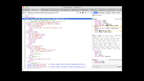 28:09
28:09
What's new in Web Inspector
The Web Inspector makes introspection and debugging simpler than ever. Discover how you can use debugger stepping, editing cookies, and overriding network loaded resources to provide you with powerful development capabilities and help you create faster, more efficient websites.
WWDC 2020 English, Japanese, Simplified Chinese -
 26:00
26:00
A conversation with the cast and creators of Mythic Quest: Raven’s Banquet
Ever wondered which is more fun — filming in a hot tub or filming in a VR suit? The cast and creators of the Apple TV+ hit show Mythic Quest: Raven's Banquet answer questions from the Apple developer community. Join Rob McElhenney (executive producer/co-creator and Ian Grimm), Charlotte Nicdao...
WWDC 2020 English -
 30:47
30:47
Get the most out of Sign in with Apple
Sign in with Apple makes it easy for people to sign in to your apps and websites with the Apple ID they already have. Fully integrate Sign in with Apple into your app using secure requests, and by handling state changes and server notifications. We'll also introduce new APIs that allow you to let...
WWDC 2020 English, Japanese, Simplified Chinese -
 24:41
24:41
What's new in USD
Discover proposed schema and structure updates to the Universal Scene Description (USD) standard. Learn how you can use Reality Composer to build AR content with interactive properties like anchoring, physics, behaviors, 3D text, and spatial audio that exports to USDZ. And, discover streamlined...
WWDC 2020 English, Japanese, Simplified Chinese -
 41:04
41:04
Make apps smarter with Natural Language
Explore how you can leverage the Natural Language framework to better analyze and understand text. Learn how to draw meaning from text using the framework's built-in word and sentence embeddings, and how to create your own custom embeddings for specific needs. We'll show you how to use samples...
WWDC 2020 English, Japanese, Simplified Chinese -
 7:12
7:12
What's new in streaming audio for Apple Watch
Deliver a smooth streaming audio experience straight to the wrist. We'll talk about some of the new things for building great streaming apps unique to Apple Watch. Learn how to integrate more audio formats, deliver streams more efficiently through new codecs, and add encrypted content to expand...
WWDC 2020 English, Japanese, Simplified Chinese -
 11:48
11:48
Build Image and Video Style Transfer models in Create ML
Bring stylized effects to your photos and videos with Style Transfer in Create ML. Discover how you can train models in minutes that make it easy to bring creative visual features to your app. Learn about the training process and the options you have for controlling the results. And we'll explore...
WWDC 2020 English, Japanese, Simplified Chinese -
 14:17
14:17
Gain insights into your Metal app with Xcode 12
Learn how to locate graphics issues in minutes with Metal's debugging and performance optimization tools in Xcode 12. We'll show you how to diagnose problems quickly using Metal Debugger. Discover the new summary view, which suggests ways to improve memory usage, bandwidth, performance, and...
WWDC 2020 English, Japanese, Simplified Chinese -
 9:39
9:39
Adapt ad insertion to Low-Latency HLS
Find out how to integrate advertising into your Low-Latency HLS streams through server-side ad insertion. We'll show you how to segment your ad content, and examine how ad insertion works with LL-HLS features such as Blocking Playlist Reload and Blocking Preload Hints. For more information about...
WWDC 2020 English, Japanese, Simplified Chinese -
 5:51
5:51
What's new in Core NFC
Core NFC helps you scan and write to NFC tags in your apps, helping people get more from objects like parking meters, scooter rentals, car charging stations, and more. Learn about Core NFC's support for the ISO15693 protocol and new tag capabilities, and find out more about syntax improvements...
WWDC 2020 English, Japanese, Simplified Chinese -
 32:12
32:12
Getting started with HealthKit
HealthKit helps you build world-class health and fitness apps by centralizing health data from third-party apps, iPhone, Apple Watch, and external health devices. Discover how you can manage authorization and privacy around Health data, read and write data to the shared Health Store, and use...
WWDC 2020 English, Japanese, Simplified Chinese -
 10:52
10:52
Meet Audio Workgroups
Fine-tune your audio app or plug-in for Apple silicon Macs: We'll show you how to register your realtime threads using Audio Workgroups and make your app sing. Learn more about the power efficiency of System on a Chip (SoC) and how you can take advantage of new APIs to improve the speed and sound...
WWDC 2020 English, Japanese, Simplified Chinese -
 8:40
8:40
Reduce latency with HLS Blocking Playlist Reload
Blocking Playlist Reload is a required component of Low-Latency HLS that improves segment discovery time in live streams and addresses the common problem of stale playlists when delivering through an HTTP cache. Learn how to use Blocking Playlist Reload to reduce streaming latency and improve CDN...
WWDC 2020 English, Japanese, Simplified Chinese -
 11:46
11:46
The Push Notifications primer
Help people get the most out of your app with push notifications for important events and updates — and by delivering up-to-date data in the background, so that it is ready when they open your app. Discover how you can use notifications and alert people to timely and relevant information. Learn...
WWDC 2020 English, Japanese, Simplified Chinese -
 23:40
23:40
Decode ProRes with AVFoundation and VideoToolbox
Make decoding and displaying ProRes content easier in your Mac app: Learn how to implement an optimal graphics pipeline by leveraging AVFoundation and VideoToolbox's decoding capabilities. We'll share best practices and performance considerations for your app, show you how to integrate...
WWDC 2020 English, Japanese, Simplified Chinese -
 13:46
13:46
Build local push connectivity for restricted networks
Leverage local push connectivity and deliver notifications from your application server to devices on networks without an internet connection. Learn how to construct notifications for apps running in restricted network environments, helping people communicate with the same reliability and...
WWDC 2020 English, Japanese, Simplified Chinese -
 14:04
14:04
Bring keyboard and mouse gaming to iPad
Level up your iPad games and add in keyboard, mouse, and trackpad controls. Discover how to use the Game Controller framework to augment your existing titles, bring over games from other platforms, or dream up entirely new interaction experiences. Learn how to integrate keyboard and “delta” mouse...
WWDC 2020 English, Japanese, Simplified Chinese -
 30:09
30:09
Discover WKWebView enhancements
WKWebView is the best way to present rich, interactive web content right within your app. Explore new APIs that help you convert apps using WebViews or UIWebViews while adding entirely new capabilities. Learn about better ways to handle JavaScript, fine tune the rendering process, export web...
WWDC 2020 English, Japanese, Simplified Chinese -
 18:18
18:18
Sync a Core Data store with the CloudKit public database
Discover how Core Data can help you adopt the CloudKit public database in your app with as little as one line of code. Learn how to easily manage the flow of data through your app and in and out of CloudKit. We'll show you how to combine the complementary power of Core Data and the CloudKit...
WWDC 2020 English, Japanese, Simplified Chinese -
 11:26
11:26
Expand your SiriKit Media Intents to more platforms
Discover how you can enable Siri summoning for your music or audio app using SiriKit Media Intents. We'll walk you through how to add Siri support to your music, podcast, or other audio service on more of our platforms, including HomePod and Apple TV, so people can start listening by just asking...
WWDC 2020 English, Japanese, Simplified Chinese -
 12:38
12:38
Triage test failures with XCTIssue
Put your test failures to work: Learn how to triage and diagnose uncaught issues in your app using the latest testing APIs in Xcode. We'll show you how to help ease your testing workflow and put failures into context to help you deliver the best quality product. For more information on designing...
WWDC 2020 English, Japanese, Simplified Chinese -
 25:40
25:40
Expanding automation with the App Store Connect API
Make routine tasks in App Store Connect a thing of the past when you automate your workflow with the App Store Connect API. Learn how you can manage more about your presence on the App Store with the App Metadata API, or use the new Power and Performance Metrics and Diagnostics API to access the...
WWDC 2020 English, Japanese, Simplified Chinese -
 14:16
14:16
Build location-aware enterprise apps
Develop location-aware enterprise apps for your business and personalize your employee's everyday experience. Learn how Apple built the Caffe Macs app for its on-campus cafeterias using iBeacons and Location Services and how you can apply these tools and frameworks to your own apps, while...
WWDC 2020 English, Japanese, Simplified Chinese -
 30:49
30:49
What's new in ResearchKit
ResearchKit continues to simplify how developers build research and care apps. Explore how the latest ResearchKit updates expand the boundaries of data researchers can collect. Learn about features like enhanced onboarding, extended options for surveys, and new active tasks. Discover how Apple...
WWDC 2020 English, Japanese, Simplified Chinese -
 15:24
15:24
Explore numerical computing in Swift
Meet Swift Numerics: a new Swift package for computational mathematics. Take a tour of the protocols and types available in the package and find out how you can use them to write generic code. We'll also show you how and when to use the new Float16 type to improve performance and reduce memory...
WWDC 2020 English, Japanese, Simplified Chinese -
 14:43
14:43
App accessibility for Switch Control
Switch Control is a powerful accessibility technology for anyone with very limited mobility. The feature is available natively on iOS, and you can create an even better Switch Control experience in your app with tips, tricks, and a few APIs. We'll walk you through how people use Switch Control,...
WWDC 2020 English, Japanese, Simplified Chinese -
 17:55
17:55
Write tests to fail
Plan for failure: Design great tests to help you find and diagnose even the toughest bugs. Learn how to improve your automated tests with XCTest to find hidden issues in even the best code. We'll explain how to prepare your tests for failure to make triaging issues easier, letting you solve...
WWDC 2020 English, Japanese, Simplified Chinese -
 5:42
5:42
Support performance-intensive apps and games
iOS and iPadOS provide powerful capabilities to help developers deliver breakthrough apps and games across all device generations. In certain instances, however, demanding apps with exceptional performance requirements may only be able to provide the best experience on devices with an A12 Bionic...
WWDC 2020 English, Japanese, Simplified Chinese -
 12:02
12:02
Build document-based apps in SwiftUI
Learn how to build a document-based app entirely in SwiftUI! We'll walk you through the DocumentGroup API and how it composes with your App and Scenes, allowing you to add out-of-the-box support for document management — such as document browsing and standard commands — no heavy lifting required...
WWDC 2020 English, Japanese, Simplified Chinese -
 6:35
6:35
XCTSkip your tests
Get the test results that matter — and skip the ones that don't. Discover how you can implement XCTSkip to conditionally avoid tests at runtime. We'll take you through how to return this new test result and better document tests beyond pass and fail within your test bundle. To get the most out...
WWDC 2020 English, Japanese, Simplified Chinese -
 21:50
21:50
Keep your complications up to date
Time is of the essence: Discover how your Apple Watch complications can provide relevant information throughout the day and help people get the information they need, when they need it. Learn best practices for capitalizing on your app's runtime opportunities, incorporating APIs like background...
WWDC 2020 English, Japanese, Simplified Chinese -
 24:48
24:48
What's new in ClassKit
The ClassKit framework helps you surface educational activities within your app to teachers through the Schoolwork app. Discover how to provide a richer assignment experience for students and teachers through enhanced metadata properties and progress reporting. We'll also show you how the new...
WWDC 2020 English, Japanese, Simplified Chinese -
 5:59
5:59
Swan's Quest, Chapter 3: The notable scroll
Swift Playgrounds presents "Swan's Quest,” an interactive adventure in four chapters for all ages. Calling all musicians! In this chapter, our Hero has found a mysterious scroll of music, and only you can help decode it. (Don't worry if you can't read music, our clever Lizard is standing by to...
WWDC 2020 English, Japanese, Simplified Chinese -
 10:41
10:41
Improve stream authoring with HLS Tools
Deliver live and on-demand audio and video to iPhone, iPad, Apple Watch, Mac, PC, and Apple TV with HTTP Live Streaming (HLS). Learn about tools and features to help improve the authoring of your HLS streams and provide low-latency delivery and better audio performance to people watching or...
WWDC 2020 English -
 20:56
20:56
Debug GPU-side errors in Metal
Track down even the trickiest GPU-side programming errors with enhanced reporting in Xcode 12. While Metal's API validation layer can catch most problems in a project, GPU errors can cause a host of difficult-to-debug issues. Get an introduction to GPU-side errors and learn how to find and...
WWDC 2020 English, Japanese, Simplified Chinese -
 17:07
17:07
Deploy Apple devices using zero-touch
Discover how Apple's system administrators remotely deploy Apple devices to their teams, ensuring a zero-touch deployment. Learn how to configure the setup experience, control and manage devices effectively, and discover practices around security and management.
WWDC 2020 English, Japanese, Simplified Chinese -
 19:08
19:08
Stacks, Grids, and Outlines in SwiftUI
Display detailed data in your SwiftUI apps more quickly and efficiently with improved stacks and new list and outline views. Now available on iOS and iPadOS for the first time, outlines are a new multi-platform tool for expressing hierarchical data that work alongside stacks and lists. Learn how...
WWDC 2020 English, Japanese, Simplified Chinese -
 20:53
20:53
Embrace Swift type inference
Swift uses type inference to help you write clean, concise code without compromising type safety. We'll show you how the compiler seeks out clues in your code to solve the type inference puzzle. Discover what happens when the compiler can't come to a solution, and find out how Xcode 12 integrates...
WWDC 2020 English, Japanese, Simplified Chinese -
 14:14
14:14
Build a SwiftUI view in Swift Playgrounds
Easily prototype and play around with SwiftUI views when you use them with Swift Playgrounds. We'll show you how to build a SwiftUI view in a Xcode-compatible playground, and explore tools to help you easily edit and preview your code. For more on Swift Playgrounds, check out our interactive...
WWDC 2020 English, Japanese, Simplified Chinese -
 22:11
22:11
Author fragmented MPEG-4 content with AVAssetWriter
Transform your audio and video content into fragmented MPEG-4 files for a faster and smoother HLS streaming experience. Learn how to work with the fragmented MPEG-4 format, generate fragmented content from a movie, and set up AVAssetWriter to create fragments for HLS output.
WWDC 2020 English, Japanese, Simplified Chinese -
 22:50
22:50
Unsafe Swift
What exactly makes code “unsafe”? Join the Swift team as we take a look at the programming language's safety precautions — and when you might need to reach for unsafe operations. We'll take a look at APIs that can cause unexpected states if not used correctly, and how you can write code more...
WWDC 2020 English, Japanese, Simplified Chinese -
 41:34
41:34
Design for the iPadOS pointer
Bring the power of the pointer to your iPad app: We'll show you how Apple's design team approached designing the iPadOS pointer to complement touch input, and how you can customize and refine pointer interactions in your app to make workflows more efficient and gratifying. Discover how the...
WWDC 2020 English, Japanese, Simplified Chinese -
 8:29
8:29
Create Swift Playgrounds content for iPad and Mac
Learn how to create Swift Playgrounds books that work fluidly across both Mac and iPad and help people of all ages explore the fun of coding in Swift. We'll walk you through how to customize content for each platform while considering platform settings, and help you take advantage of them in your...
WWDC 2020 English, Japanese, Simplified Chinese -
 23:21
23:21
Architecting for subscriptions
Learn how you can build simple entitlement logic to enhance the customer experience. We'll dive deep into key concepts and provide guidance for architecting your systems to accurately entitle service. You'll learn best practices for subscription features and how to craft the best customer...
WWDC 2020 English, Japanese, Simplified Chinese -
 32:50
32:50
Optimize Metal apps and games with GPU counters
GPU counters can help you precisely measure GPU utilization to pinpoint bottlenecks and optimize workloads for your Metal apps and games. We'll walk you through the tools available in the Metal System Trace instrument and Metal Debugger in Xcode 12 to profile your graphics workload, and show you...
WWDC 2020 English, Japanese, Simplified Chinese -
 22:44
22:44
Design high quality Siri media interactions
Demystify the art of designing Siri experiences for your music and audio apps: We'll show you how to think about crafting great interactions and how you can provide custom vocabulary so that Siri can respond with more accuracy and personality. We'll also explain how you can debug common errors...
WWDC 2020 English, Japanese, Simplified Chinese -
 18:38
18:38
Shop online with AR Quick Look
AR Quick Look adds a new dimension to online shopping: We'll show you how to easily showcase your products in augmented reality for a "try before you buy" experience. Discover how to display a product banner in AR Quick Look, integrate Apple Pay, or display custom actions like "add to cart". To...
WWDC 2020 English, Japanese, Simplified Chinese -
 37:32
37:32
Optimize the interface of your Mac Catalyst app
Discover how to tailor your Mac Catalyst app so that it looks and feels even more at home on the Mac by using the new “Optimize Interface for Mac” option in Xcode. Explore new layout and appearance options for Catalyst apps, and learn how they can provide you with graphical performance gains,...
WWDC 2020 English, Japanese, Simplified Chinese -
 36:27
36:27
Explore the Action & Vision app
It's now easy to create an app for fitness or sports coaching that takes advantage of machine learning — and to prove it, we built our own. Learn how we designed the Action & Vision app using Object Detection and Action Classification in Create ML along with the new Body Pose...
WWDC 2020 English, Japanese, Simplified Chinese -
 22:48
22:48
A conversation with Lisa Jackson and former Attorney General Eric Holder
Eric Holder was the 82nd Attorney General of the United States, having served from 2009 to 2015. The first Black American to hold the position, Holder's six-year tenure also makes him one of the longest-serving occupants of the office. Currently a partner in Covington & Burling, he's served in...
WWDC 2020 English -
 13:11
13:11
Add custom views and modifiers to the Xcode Library
The Xcode Library is an easy way for you to discover available SwiftUI views and drag and drop them to the Xcode Previews canvas, enabling rich visual editing of your app. We'll show you how to extend the content of the Xcode Library with your own views and modifiers, optimizing for reusability...
WWDC 2020 English, Japanese, Simplified Chinese -
 14:17
14:17
Handle the Limited Photos Library in your app
Access the photos and videos you need for your app while preserving privacy. With the new Limited Photos Library feature, people can directly control which photos and videos an app can access to protect their private content. We'll explore how this feature may affect your app, and take you...
WWDC 2020 English, Japanese, Simplified Chinese -
 5:06
5:06
Visually edit SwiftUI views
Help your apps be the best versions of themselves: Discover how you can leverage Xcode Previews and SwiftUI to quickly iterate upon and improve your app. Find out how you can use the Previews canvas to build your app from the ground up, and view your interface in different environments like Light...
WWDC 2020 English, Japanese, Simplified Chinese -
 24:05
24:05
Handle trackpad and mouse input
Provide a more versatile experience when you optimize your iPad or Mac Catalyst app for indirect input from trackpads and mice. Discover how to make your app responsive to new events from these devices. Learn how to work with pointer movement, enable pointer locking, handle scroll input and...
WWDC 2020 English, Japanese, Simplified Chinese -
 20:21
20:21
Build with iOS pickers, menus and actions
Build iPhone and iPad apps with fluid interfaces and easily-accessible contextual information. We'll show you how to integrate the latest UIKit controls into your app to best take advantage of menus, date pickers, page controls, and segmented controllers. Learn how to adopt Menus throughly your...
WWDC 2020 English, Japanese, Simplified Chinese -
 24:23
24:23
Harness Apple GPUs with Metal
Create visually stunning, high-performance apps and games when you combine the power of Apple GPUs with Metal, the modern foundation for GPU-accelerated graphics on Apple platforms. Discover the architecture and capabilities of the Apple GPU and how Metal harnesses its tile-based deferred...
WWDC 2020 English, Japanese, Simplified Chinese -
 16:24
16:24
Get your test results faster
Improve your testing suite to speed up your feedback loop and get fixes in faster. Learn more about the latest improvements to testing in Xcode, including how to leverage test plans, Xcodebuild updates, and APIs to eliminate never-ending and badly-behaved tests. We'll explore Test Timeouts and...
WWDC 2020 English, Japanese, Simplified Chinese -
 14:51
14:51
Explore Packages and Projects with Xcode Playgrounds
Xcode Playgrounds helps developers explore Swift and framework APIs and provides a scratchpad for rapid experimentation. Learn how Xcode Playgrounds utilizes Xcode's modern build system, provides improved support for resources, and integrates into your projects, frameworks, and Swift packages to...
WWDC 2020 English, Japanese, Simplified Chinese -
 7:16
7:16
Discover Core Image debugging techniques
Find and fix rendering and optimization issues in your Core Image pipeline with Xcode environment variable. Discover how you can set the environment variable for visualizing your Core Image graphs. You'll learn how to generate Core Image graphs and how to interpret them to discover memory, color,...
WWDC 2020 English, Japanese, Simplified Chinese -
 24:35
24:35
Explore Computer Vision APIs
Learn how to bring Computer Vision intelligence to your app when you combine the power of Core Image, Vision, and Core ML. Go beyond machine learning alone and gain a deeper understanding of images and video. Discover new APIs in Core Image and Vision to bring Computer Vision to your application...
WWDC 2020 English, Japanese, Simplified Chinese -
 21:01
21:01
Custom app distribution with Apple Business Manager
Apple Business Manager is the best way to manage and deploy business apps to your employees and customers. Whether you're a developer, business owner, or IT administrator, we'll showcase the benefits of Custom apps for each role and provide guidance on each step in the process — from app creation...
WWDC 2020 English, Japanese, Simplified Chinese -
 14:57
14:57
What's new in Wallet and Apple Pay
Apple Pay makes it simple to pay for goods and services in your app and on your website. Discover how you can integrate API updates like context-specific button types, contact data formatting, and cross-platform support to make the service more effective for you and people using it. And, if...
WWDC 2020 English, Japanese, Simplified Chinese -
 17:23
17:23
Explore logging in Swift
Meet the latest generation of Swift unified logging APIs. Learn how to log events and errors in your app while preserving privacy. Take advantage of powerful yet readable options for formatting data — all without sacrificing performance. And we'll show you how you can gather and process log...
WWDC 2020 English, Japanese, Simplified Chinese -
 38:09
38:09
Secure your app: threat modeling and anti-patterns
It's more important than ever to consider vulnerabilities and potential threats and recognize where you should apply safeguards in your app. Understand how to identify potential risks through threat modeling and how to avoid common anti-patterns. Learn coding techniques and how to take advantage...
WWDC 2020 English, Japanese, Simplified Chinese -
 18:07
18:07
Design for Game Center
Get your game's interface ready for Game Center. We'll show you how to deliver personalized touches to the GameKit interface that provide a rich experience for players, with features like achievements, leaderboards, and multiplayer gaming. Learn how to customize your game's access point, design...
WWDC 2020 English, Japanese, Simplified Chinese -
 15:29
15:29
App essentials in SwiftUI
Thanks to the new App protocol, SwiftUI now supports building entire apps! See how Apps, Scenes, and Views fit together. Learn how easy it is to implement the features people expect from a best-in-class product while saving time and reducing complexity. Easily add expected functionality to your...
WWDC 2020 English, Japanese, Simplified Chinese -
 20:08
20:08
Create complications for Apple Watch
When you add complications to a Watch app, people can access glanceable and up to date information directly from their watch face. We'll show you how to create and build complications from the ground up and introduce you to Multiple Complications. Learn how to construct timelines, use families...
WWDC 2020 English, Japanese, Simplified Chinese -
 15:18
15:18
Widgets Code-along, part 2: Alternate timelines
Our code-along continues as we help our widget rewrite the future and travel into an alternate timeline. Continue where you left off from Part 1, or traverse time and space and begin with the Part 2 starter project to jump right into the action. Find out how you can integrate system intelligence...
WWDC 2020 English, Japanese, Simplified Chinese -
 41:35
41:35
Build an Endpoint Security app
System Extensions improve the reliability and security of macOS. Learn about the modern replacement for Kernel Authorization KPIs and discover tips for making a great security product with the Endpoint Security framework.
WWDC 2020 English, Japanese, Simplified Chinese -
 16:38
16:38
What's new in watchOS design
Great watchOS apps are simple and direct. Actions should be discoverable, predictable and relevant. This session covers effective strategies for displaying actions in your watchOS app, whether they are primary buttons that begin core tasks, or contextual actions that might be less commonly used...
WWDC 2020 English, Japanese, Simplified Chinese -
 23:15
23:15
Export HDR media in your app with AVFoundation
Discover how to author and export high dynamic range (HDR) content in your app using AVFoundation. Learn about high dynamic range and how you can take advantage of it in your app. We'll show you how to implement feature sets that allow people to export HDR content, go over supported HDR formats,...
WWDC 2020 English, Japanese, Simplified Chinese -
 23:46
23:46
Build for iPad
Learn how to improve iPad apps to leverage the increased screen size and additional features of iPadOS, and help people accomplish more with their devices. Discover how you can build detailed multi-column layouts and integrate lists into your app with little adjustment to your existing code...
WWDC 2020 English, Japanese, Simplified Chinese -
 23:16
23:16
Explore the new system architecture of Apple silicon Macs
Discover how Macs with Apple silicon will deliver modern advantages using Apple's System-on-Chip (SoC) architecture. Leveraging a unified memory architecture for CPU and GPU tasks, Mac apps will see amazing performance benefits from Apple silicon tuned frameworks such as Metal and Accelerate...
WWDC 2020 English, Japanese, Simplified Chinese -
 9:06
9:06
Widgets Code-along, part 3: Advancing timelines
Take your widget to the next level as we embark upon the third and final stage of the widgets code-along. Pick up where you left off in Part 2 or start with the Part 3 starter project to go warp speed ahead. We'll explore advanced concepts for widgets, timelines, and configuration. Learn how to...
WWDC 2020 English, Japanese, Simplified Chinese -
 12:47
12:47
What's new in assessment
It's now easier than ever to deliver academic tests on the Mac. Learn how education developers can leverage the Automatic Assessment Configuration framework for iPhone, iPad, and Mac to deliver tests and assess students across all devices. And discover how developers can enable restricted...
WWDC 2020 English, Japanese, Simplified Chinese -
 24:59
24:59
Advancements in Game Controllers
Let's rumble! Discover how you can bring third-party game controllers and custom haptics into your games on iPhone, iPad, Mac, and Apple TV. We'll show you how to add support for the latest controllers — including Xbox's Elite Wireless Controller Series 2 and Adaptive Controller — and map your...
WWDC 2020 English, Japanese, Simplified Chinese -
 11:34
11:34
Support hardware keyboards in your app
When people use hardware keyboards with your app, they're not only getting a more tactile and familiar typing experience — they can quickly navigate or use keyboard shortcuts, too. Discover how you can best support hardware keyboards for your iPadOS and Mac Catalyst apps: We'll demystify the...
WWDC 2020 English, Japanese, Simplified Chinese -
 24:54
24:54
Tap into Game Center: Leaderboards, Achievements, and Multiplayer
Level up your Game Center integration and enable players to compare scores on leaderboards, earn valuable achievements, and engage with other players. Organize special events like weekly championships, daily showdowns, or 1-hour competitions using recurring leaderboards. Create up to 100 unique...
WWDC 2020 English, Japanese, Simplified Chinese -
 29:30
29:30
Broaden your reach with Siri Event Suggestions
Whether you're hosting event information in your app, on the web, or in an email, Siri Event Suggestions can help people keep track of their commitments — without compromising their privacy. We'll show you how to set up your reservations so that they automatically show up in the Calendar app and...
WWDC 2020 English, Japanese, Simplified Chinese -
 5:53
5:53
Design for intelligence: Meet people where they are
Understand what motivates people to use your app — and how you can use system intelligence to help them and achieve your own goals as a developer. We'll take a look at a typical person's journey to better understand how an app can become a key part of their routine — and why some apps just don't...
WWDC 2020 English, Japanese, Simplified Chinese -
 9:27
9:27
Discover HLS Blocking Preload Hints
Learn how to implement Blocking Preload Hints for Low-Latency HLS to reduce delivery latency and improve the reliability of your video and audio streams. Discover how to integrate LL-HLS with CMAF Chunk delivery and unify your delivery across streaming formats.
WWDC 2020 English, Japanese, Simplified Chinese -
 13:16
13:16
Enable encrypted DNS
When people access the web within your app, their privacy is paramount. Safeguard that information by leveraging encrypted DNS across our platforms to deliver private and secure connectivity within your app. Discover how you can use system DNS settings to connect to encrypted servers or enable...
WWDC 2020 English, Japanese, Simplified Chinese -
 35:06
35:06
Leverage enterprise identity and authentication
Empower your organization with the right tools while protecting privacy and security. Discover Apple's identity management tools for enterprise, and how they can help you create a smoother experience for users when signing in to devices, apps and websites. We'll show you how to take advantage of...
WWDC 2020 English, Japanese, Simplified Chinese -
 33:52
33:52
Bring your Metal app to Apple silicon Macs
Meet the Tile Based Deferred Rendering (TBDR) GPU architecture for Apple silicon Macs — the heart of your Metal app or game's graphics performance. Learn how you can translate or port your graphics-intensive app over to Apple silicon, and how to take advantage of TBDR and Metal when building...
WWDC 2020 English, Japanese, Simplified Chinese -
 15:41
15:41
Meet Face ID and Touch ID for the web
Face ID and Touch ID provide a frictionless experience when logging in — and now you can use them on your websites in Safari with the Web Authentication API. Discover how to add this convenient and secure login alternative to your website.
WWDC 2020 English, Japanese, Simplified Chinese -
 18:33
18:33
Master Picture in Picture on tvOS
Picture in Picture is coming to Apple TV: With simultaneous video playback and the ability to swap between full screen content and Picture in Picture, you've never had more multitasking flexibility within your tvOS app. Discover how you can add AVPictureInPictureController to your project,...
WWDC 2020 English, Japanese, Simplified Chinese -
 36:53
36:53
Modernize PCI and SCSI drivers with DriverKit
Keep code out of the kernel and give your customers a more secure and reliable experience with accessories using DriverKit. Discover how to create low-level drivers that support PCI devices or SCSI controllers. And find out how you can achieve great performance with DriverKit on macOS Big Sur.
WWDC 2020 English, Japanese, Simplified Chinese -
 5:18
5:18
Swan's Quest, Chapter 2: A time for tones
Swift Playgrounds presents "Swan's Quest,” an interactive adventure in four chapters for all ages. In this chapter, our Hero needs your help decoding the Swan's scroll. Call forth the best of your audio abilities on this one — you're going to need them. Discover how to convert Swift Playgrounds...
WWDC 2020 English, Japanese, Simplified Chinese -
 10:07
10:07
Evaluate and optimize voice interaction for your app
Optimize your app for Siri and give people a more natural way to interact with the features of your app. We'll compare the different Siri technologies and help you identify the right one for you and your needs, show you how to get started with building for conversational interactions, and explore...
WWDC 2020 English, Japanese, Simplified Chinese -
 9:05
9:05
Widgets Code-along, part 1: The adventure begins
Take your app on a most wondrous adventure to the home and Today screens of iPhone, iPad, and Mac. Grab the starter project and code along with us! We will guide you through the process of creating a widget for your app from start to finish so that you can provide people with beautiful views and...
WWDC 2020 English, Japanese, Simplified Chinese -
 14:54
14:54
Design with iOS pickers, menus and actions
Create iPhone and iPad apps that look great and help people move quickly and directly to the information they need. Discover how you can integrate menus into your app for quick access to actions and settings, and learn where and when you should use them in your app. We'll also walk you through...
WWDC 2020 English, Japanese, Simplified Chinese -
 7:04
7:04
Design for intelligence: Apps, evolved
Intelligence is a core part of building a great modern app. App extensions, Siri suggestions, voice, widgets, App Clips — we've designed all of these features to help make everyday tasks easier for people who use our platforms. Learn about the origins of the intelligent system experience, and...
WWDC 2020 English, Japanese, Simplified Chinese -
 24:02
24:02
Edit and play back HDR video with AVFoundation
Find out how you can support HDR editing and playback in your macOS app, and how you can determine if a specific hardware configuration is eligible for HDR playback. We'll show you how to use AVMutableVideoComposition with the built-in compositor and easily edit HDR content, explain how you can...
WWDC 2020 English, Japanese, Simplified Chinese -
 22:50
22:50
Build for the iPadOS pointer
Help people who use iPad with a Magic Keyboard, mouse, trackpad or other input device get the most out of your app. We'll show you how to add customizations to the pointer on iPad using pointer interaction APIs, create pointer effects for your buttons and custom views, and change the pointer...
WWDC 2020 English, Japanese, Simplified Chinese -
 7:34
7:34
Optimize live streams with HLS Playlist Delta Updates
Discover Playlist Delta Updates, an HLS feature that optimizes the delivery of live streams with large playback windows and lots of metadata. We'll show you how Playlist Delta Updates can reduce overheard when producing live streams, provide higher-quality variants for people with slower...
WWDC 2020 English, Japanese, Simplified Chinese -
 8:39
8:39
Create a seamless speech experience in your apps
Augment your app's accessibility experience with speech synthesis: Discover the best times and places to add speech APIs so that everyone who uses your app can benefit. Learn how to use AVSpeechSynthesizer to complement assistive technologies like VoiceOver, and when to implement alternative...
WWDC 2020 English, Japanese, Simplified Chinese -
 21:43
21:43
Design great App Clips
App Clips offer fast, convenient ways for people to perform everyday tasks without needing to download or navigate your full app. We'll show you how to identify key elements from your iOS app that make up a great App Clip, design a smooth flow, work with notifications, and provide messaging...
WWDC 2020 English, Japanese, Simplified Chinese -
 19:02
19:02
Create App Clips for other businesses
Create App Clips for table reservations, food ordering, and more on behalf of brands, businesses, or services that appear within your app. We'll show you how you can deliver customized experiences for each business, offering them a unique look, invocation card, and icon — all within a single App...
WWDC 2020 English, Japanese, Simplified Chinese -
 35:37
35:37
What's new in CareKit
Build feature-rich research and care apps with CareKit: Learn about the latest advancements to our health framework, including new views for its modular architecture, improvements to the data store, and tighter integration with other frameworks on iOS. And discover how the open-source community...
WWDC 2020 English, Japanese, Simplified Chinese -
 11:43
11:43
Handle interruptions and alerts in UI tests
Learn how to anticipate potential interruptions to your app's interface and build smart tests to identify them. UI interruptions often appear indeterminately, typically during onboarding or first launch, which can make them hard to track down. Learn how to understand interruptions, write stronger...
WWDC 2020 English, Japanese, Simplified Chinese -
 45:53
45:53
What’s new with in-app purchase
Create a great in-app purchase experience for your iPhone, iPad, Mac, and Apple Watch apps. Discover how to handle refunds, integrate new App Store server notifications, and find out how to use receipts and server notifications to manage subscriber status. We'll also walk you through the latest...
WWDC 2020 English, Japanese, Simplified Chinese -
 21:32
21:32
Introducing Car Keys
You can now store car keys on iPhone or Apple Watch. You no longer have to bring your key fob to unlock and start your car. And with digital keys, it's easy to share them with family or friends, and manage keys remotely. This session is intended for automakers who want to adopt digital car keys...
WWDC 2020 English, Japanese, Simplified Chinese -
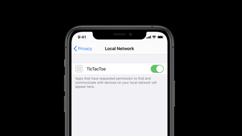 12:16
12:16
Support local network privacy in your app
Local network privacy provides added transparency when apps connect to devices on a person's home network. If your app interacts with devices using Bonjour or other local networking protocols, you must add support for local network privacy permissions in iOS 14. Learn more about the new...
WWDC 2020 English, Japanese, Simplified Chinese -
 45:22
45:22
Optimize Metal Performance for Apple silicon Macs
Apple silicon Macs are a transformative new platform for graphics-intensive apps — and we're going to show you how to fire up the GPU to create blazingly fast apps and games. Discover how to take advantage of Apple's unique Tile-Based Deferred Rendering (TBDR) GPU architecture within Apple...
WWDC 2020 English, Japanese, Simplified Chinese -
 26:19
26:19
Accelerate your app with CarPlay
CarPlay is the smarter, safer way for people to use iPhone in the car. We'll show you how to build great apps for the car screen, and introduce you to developing CarPlay apps in categories like EV charging, parking, and quick food ordering. We'll also share how existing audio and communication...
WWDC 2020 English, Japanese, Simplified Chinese -
 20:15
20:15
Streamline your App Clip
App Clips are best when they provide an “in the moment” experience for people using them, like ordering your favorite refreshing beverage or paying for parking. We'll share guidelines and best practices for building focused and consistent App Clips, show you how to streamline transaction...
WWDC 2020 English, Japanese, Simplified Chinese -
 36:05
36:05
What's new for web developers
Explore the latest features and improvements for Safari and WebKit. We'll walk you through updated web APIs, CSS and media features, JavaScript syntax, and more to help you build great experiences for people when they use your website, home screen web apps, or embedded WebKit views.
WWDC 2020 English, Japanese, Simplified Chinese -
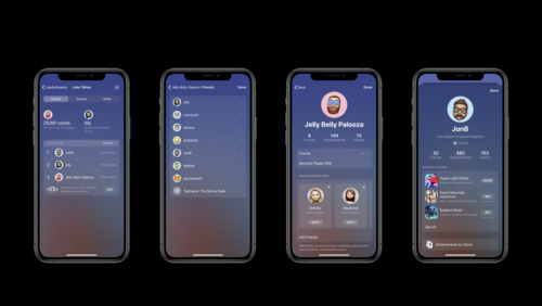 23:32
23:32
Tap into Game Center: Dashboard, Access Point, and Profile
Apple's social gaming network is ready to play. We'll walk you through the latest updates to Game Center, starting with its in-game interface and all-new player experience. Learn how to integrate GameKit into your app and authenticate players effectively, and discover the Access Point, which...
WWDC 2020 English, Japanese, Simplified Chinese -
 36:16
36:16
Build GPU binaries with Metal
Power up your shader pipeline with enhancements to the Metal shader compilation model — all leading to a dramatic reduction in Pipeline State Object (PSO) loading time, especially upon first launch. Learn about explicit PSO caching and sharing of GPU binaries using Metal binary archives and...
WWDC 2020 English, Japanese, Simplified Chinese -
 14:33
14:33
Meet the new Photos picker
Let people select photos and videos to use in your app without requiring full Photo Library access. Discover how the PHPicker API for iOS and Mac Catalyst ensures privacy while providing your app the features you need. PHPicker is the modern replacement for UIImagePickerController. In addition...
WWDC 2020 English, Japanese, Simplified Chinese -
 19:36
19:36
Design for intelligence: Make friends with "The System"
The building blocks of the intelligent system are simple: Define, learn, execute. Discover how you can use intents to define your app's key features, create donations to help the system learn and make predictions about the future, and implement extensibility to ensure your app is ready to execute...
WWDC 2020 English, Japanese, Simplified Chinese -
 5:11
5:11
Design for intelligence: Discover new opportunities
Learn how extensibility is key to surfacing the most important features of your app into new entry points of the operating system. And discover how — by breaking out of the constraints of a monolithic container — your app can see increased engagement through suggestions on the lock screen, in...
WWDC 2020 English, Japanese, Simplified Chinese -
 27:38
27:38
Explore ARKit 4
ARKit 4 enables you to build the next generation of augmented reality apps to transform how people connect with the world around them. We'll walk you through the latest improvements to Apple's augmented reality platform, including how to use Location Anchors to connect virtual objects with a...
WWDC 2020 English, Japanese, Simplified Chinese -
 14:13
14:13
Meet Scribble for iPad
Scribble offers a lightweight, ergonomic, and enjoyable way of entering text on iPad with Apple Pencil. Discover how people can take advantage of Scribble and handwritten text in apps that use standard text input controls or that implement a custom text editing experience. You'll learn how it...
WWDC 2020 English, Japanese, Simplified Chinese -
 6:12
6:12
Build Metal-based Core Image kernels with Xcode
Learn how to integrate and load Core Image kernels written in the Metal Shading Language into your application, and discover how you can apply these image filters to create unique effects. Explore how to use Xcode rules and naming conventions for Core Image kernels written in Metal Shading...
WWDC 2020 English, Japanese, Simplified Chinese -
 28:43
28:43
Adopt the new look of macOS
Make over your Mac apps: Discover how you can embrace the new design of macOS Big Sur and adopt its visual hierarchy, design patterns, and behaviors. We'll explore the latest updates to AppKit around structural items and common controls, and show you how you can adapt more customized interfaces...
WWDC 2020 English, Japanese, Simplified Chinese -
 14:30
14:30
Build SwiftUI apps for tvOS
Add a new dimension to your tvOS app with SwiftUI. We'll show you how to build layouts powered by SwiftUI and customize your interface with custom buttons, provide more functionality in your app with a context menu, check if views are focused, and manage default focus. To get the most out of...
WWDC 2020 English, Japanese, Simplified Chinese -
 10:26
10:26
What's new in PencilKit
PencilKit helps power creativity, writing, drawing, and animation in your iPad apps. Explore the latest improvements to our drawing and annotation framework, and discover how you can take advantage of APIs like PKToolPicker, PKCanvasView, and PKStroke to support new features in illustration and...
WWDC 2020 English, Japanese, Simplified Chinese -
 23:38
23:38
What's new in managing Apple devices
We've made significant strides in bringing crucial device management features to macOS. Discover how these features can help you manage your all your devices using the same tools and technologies. Get details on changes coming this year and how they will impact your deployment workflows, as well...
WWDC 2020 English, Japanese, Simplified Chinese -
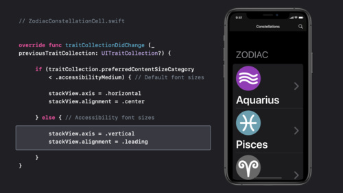 16:04
16:04
Make your app visually accessible
When you design with accessibility in mind, you empower everyone to use your app. Discover how to create an adaptive interface for your app that takes a thoughtful approach to color, provides readable text, and accommodates other visual settings to maintain a great experience throughout. We've...
WWDC 2020 English, Japanese, Simplified Chinese -
 36:04
36:04
Build trust through better privacy
Privacy is a more important issue than ever. Learn about Apple's privacy pillars, our approach to privacy, and how to adopt the latest features on our platforms that can help you earn customer trust, create more personal experiences, and improve engagement. Explore the transparency iOS provides...
WWDC 2020 English, Japanese, Simplified Chinese -
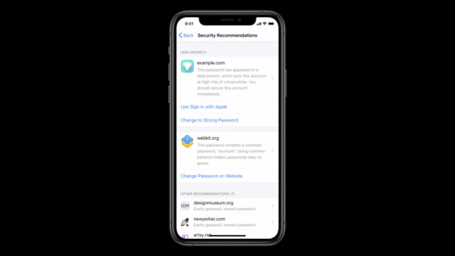 24:06
24:06
One-tap account security upgrades
When you adopt the Account Authentication Modification Extension, you can provide people with fast, easy account security upgrades to use Sign in with Apple and strong passwords in the iCloud Keychain Password Manager. We'll show you how to add these upgrade flows to your app with the Account...
WWDC 2020 English, Japanese, Simplified Chinese -
 29:40
29:40
Modern cell configuration
Discover new techniques for configuring collection view and table view cells to quickly build dynamic interfaces in your app. Explore configuration types you can use to easily populate cells with content and apply common styles. Take advantage of powerful APIs to customize the appearance of cells...
WWDC 2020 English, Japanese, Simplified Chinese -
 6:09
6:09
What's new in HealthKit
HealthKit is an essential framework that integrates first- and third-party health and fitness data to help people manage their personal health information. Learn about HealthKit's latest updates, which provide read access to electrocardiograms on Apple Watch and log and track over a dozen new...
WWDC 2020 English, Japanese, Simplified Chinese -
 54:38
54:38
Introduction to SwiftUI
Explore the world of declarative-style programming: Discover how to build a fully-functioning SwiftUI app from scratch as we explain the benefits of writing declarative code and how SwiftUI and Xcode can combine forces to help you build great apps, faster.
WWDC 2020 English, Japanese, Simplified Chinese -
 14:43
14:43
Swan's Quest, Chapter 1: Voices in the dark
Swift Playgrounds presents "Swan's Quest,” an interactive adventure in four chapters for all ages. In this chapter, our Hero must navigate a dark cave — and the only way to light the torches is to make them accessible. Learn about VoiceOver and write interesting audio descriptions. You just...
WWDC 2020 English, Japanese, Simplified Chinese -
 17:29
17:29
iPad and iPhone apps on Apple silicon Macs
Apple silicon Macs can run many iPad and iPhone apps as-is, and these apps will be made available to users on the Mac through the Mac App Store. Discover how iPad and iPhone apps run on Apple silicon Macs, and the factors that make your apps come across better. Learn how to test your app for the...
WWDC 2020 English, Japanese, Simplified Chinese -
 27:44
27:44
What's new in SwiftUI
SwiftUI can help you build better and more powerful apps for iPhone, iPad, Mac, Apple Watch, and Apple TV. Learn more about the latest refinements to SwiftUI, including interface improvements like outlines, grids, and toolbars. Take advantage of SwiftUI's enhanced support across Apple frameworks...
WWDC 2020 English, Japanese, Simplified Chinese -
 12:15
12:15
What's new in SiriKit and Shortcuts
Get a quick overview of everything new in Siri and Shortcuts to help people get more out of your app: We'll demonstrate how you can design visually rich conversations, feel at home with the operating system by designing for the new compact Siri UI, and provide an overview of all the ways we've...
WWDC 2020 English, Japanese, Simplified Chinese -
 25:15
25:15
What's new in RealityKit
RealityKit is Apple's rendering, animation, physics, and audio engine built from the ground up for augmented reality: It reimagines the traditional 3D renderer to make it easy for developers to prototype and produce high-quality AR experiences. Learn how to effectively implement each of the...
WWDC 2020 English, Japanese, Simplified Chinese -
 32:19
32:19
What's new in Swift
Join us for an update on Swift. Discover the latest advancements in runtime performance, along with improvements to the developer experience that make your code faster to read, edit, and debug. Find out how to take advantage of new language features like multiple trailing closures. Learn about...
WWDC 2020 English, Japanese, Simplified Chinese -
 8:46
8:46
Support multiple users in your tvOS app
Share your living room — not your Apple TV apps. When you support profiles within your app, you can customize your experience for each person who uses Apple TV within the same house. Discover how the “Runs as Current User” feature lets someone interact with your app, download local content,...
WWDC 2020 English, Japanese, Simplified Chinese -
 11:01
11:01
What's new in education
For over 40 years, Apple has been working with educators to create technologies for students, teachers, and school administrators and help them share in a rich and meaningful learning experience. Explore the breadth of Apple's education technologies, including classroom management apps and tools...
WWDC 2020 English, Japanese, Simplified Chinese -
 23:12
23:12
Meet WidgetKit
Meet WidgetKit: the best way to bring your app's most useful information directly to the home screen. We'll show you what makes a great widget and take a look at WidgetKit's features and functionality. Learn how to get started creating a widget, and find out how WidgetKit leverages the power of...
WWDC 2020 English, Japanese, Simplified Chinese -
 21:27
21:27
Create great enterprise apps: A chat with Box's Aaron Levie
Discover how organizations like Box are adapting to changing conditions in the business world and remote work. Listen to Apple's Vice President of Cloud Services Mike Abbott and Box CEO and co-founder Aaron Levie chat about the modern working environment, how cloud-based apps are helping people...
WWDC 2020 English, Japanese, Simplified Chinese -
 19:46
19:46
Explore App Clips
Help people experience the right parts of your app at the exact moment they need them. We'll explain how to design and build an App Clip — a small part of your app that focuses on a specific task — and make it easily discoverable. Learn how to focus your App Clip on short and fast interactions...
WWDC 2020 English, Japanese, Simplified Chinese -
 27:47
27:47
Meet Safari Web Extensions
When you create a Safari Web Extension, you can help people get common online tasks done more quickly and efficiently. We'll show you how to build a new Safari Web Extension and host it on the App Store, as well as how to use the safari-web-extension-converter tool to migrate existing extensions...
WWDC 2020 English, Japanese, Simplified Chinese -
 24:21
24:21
Detect Body and Hand Pose with Vision
Explore how the Vision framework can help your app detect body and hand poses in photos and video. With pose detection, your app can analyze the poses, movements, and gestures of people to offer new video editing possibilities, or to perform action classification when paired with an action...
WWDC 2020 English, Japanese, Simplified Chinese -
 8:37
8:37
Optimize the Core Image pipeline for your video app
Explore how you can harness the processing power of Core Image and optimize video performance within your app. We'll show you how to build your Core Image pipeline for applying effects to your video in your apps: Discover how to reduce your app's memory footprint when using CIContext, and learn...
WWDC 2020 English, Japanese, Simplified Chinese -
 40:44
40:44
Port your Mac app to Apple silicon
Your porting questions, answered: Learn how to recompile your macOS app for Apple silicon Macs and build universal apps that launch faster, have better performance, and support the future of the platform. We'll show you how Xcode makes it simple to build a universal macOS binary and go through...
WWDC 2020 English, Japanese, Simplified Chinese -
 9:37
9:37
Record stereo audio with AVAudioSession
Stereo recording is a powerful way to deliver immersive sound to listeners, fans, and family — and your app can use the built-in microphones on iPhone or iPad to record it. Discover how AVAudioSession can help you capture stereo audio from a mobile device, address the new special consideration...
WWDC 2020 English, Japanese, Simplified Chinese -
 15:43
15:43
Swift packages: Resources and localization
Bring your resources along for the ride when you organize and share code using Swift packages. Discover how to include assets like images and storyboards in a package and how to access them from code. And learn how to add localized strings to make your code accessible to people around the world...
WWDC 2020 English, Japanese, Simplified Chinese -
 22:12
22:12
What's new in App Store Connect
Discover the latest improvements to App Store Connect, your suite of tools to upload, submit, and manage apps on the App Store. Learn about enhancements to the App Store Connect API, in-app purchase and subscriptions, Game Center, and more.
WWDC 2020 English, Japanese, Simplified Chinese -
 11:55
11:55
Advances in diffable data sources
Diffable data sources dramatically simplify the work involved in managing and updating collection and table views to create dynamic and responsive experiences in your apps. Discover how you can use section snapshots to efficiently build lists and outline collection views for iOS and iPadOS and...
WWDC 2020 English, Japanese, Simplified Chinese -
 24:52
24:52
Introducing StoreKit Testing in Xcode
Discover StoreKit Testing in Xcode — a local environment for testing your in-app purchases without needing to connect to App Store servers. We'll show you how to set up a test environment, create a StoreKit configuration file, and prepare to validate receipts locally. We'll also explain how to...
WWDC 2020 English, Japanese, Simplified Chinese -
 15:27
15:27
What's new in Mac Catalyst
Discover the latest updates to Mac Catalyst and find out how you can bring your iPadOS app to the Mac. Explore enhancements to the application lifecycle, integrate new extensions into your apps, and learn how the new look and feel of macOS impacts Mac Catalyst apps. Get a taste of the new...
WWDC 2020 English, Japanese, Simplified Chinese -
 29:06
29:06
Designed for iPad
Discover the building blocks for designing a great iPad app: Learn how to minimize use of modal interfaces and leverage the new sidebar to increase efficiency by streamlining navigation and facilitating powerful drag and drop interactions. See how to take advantage of iPad's versatile interaction...
WWDC 2020 English, Japanese, Simplified Chinese -
 5:54
5:54
What's new in Low-Latency HLS
Apple has added Low-Latency extensions to the HTTP Live Streaming protocol that combine the quality and scalability of HLS with a stream delay of two seconds or less. Learn about the most recent developments in LL-HLS and how it allows you to make your video delivery competitive with broadcast...
WWDC 2020 English, Japanese, Simplified Chinese -
 26:34
26:34
What's new in location
Location technologies are core to delivering context-based services within your app. Discover how the latest privacy controls in Core Location add a whole new dimension to determining position and what that means for your app. We'll walk you through best practices for implementing these latest...
WWDC 2020 English, Japanese, Simplified Chinese -
 16:54
16:54
Lists in UICollectionView
Learn how to build lists and sidebars in your app with UICollectionView. Replace table view appearance while taking advantage of the full flexibility of compositional layout. Explore modular layout options and find out how they can unlock more design options for your apps than ever before. Find...
WWDC 2020 English, Japanese, Simplified Chinese -
 26:06
26:06
Build an Action Classifier with Create ML
Discover how to build Action Classification models in Create ML. With a custom action classifier, your app can recognize and understand body movements in real-time from videos or through a camera. We'll show you how to use samples to easily train a Core ML model to identify human actions like...
WWDC 2020 English, Japanese, Simplified Chinese -
 22:57
22:57
Configure and link your App Clips
App Clips are small parts of an app that offer a streamlined, direct experience and help people get what they need at the right time. Learn how you can invoke an App Clip through real-world experiences like App Clip Codes, NFC, and QR codes, or have them appear digitally through apps like Maps or...
WWDC 2020 English, Japanese, Simplified Chinese -
 7:47
7:47
Distribute binary frameworks as Swift packages
Discover how you can add third-party frameworks to your app and keep them up to date using Swift packages in Xcode. We'll show you how to author packages that reference frameworks, explain binary targets and how to specify them in your package manifest file, and demonstrate how to compute...
WWDC 2020 English, Japanese, Simplified Chinese -
 9:55
9:55
Advances in UICollectionView
Learn about new features of UICollectionView that make it easier to use and unlock powerful new functionality. We'll show you how to use section snapshots with your diffable data source to create outlines that can expand and collapse, and introduce you to building lists with compositional layout...
WWDC 2020 English, Japanese, Simplified Chinese -
 22:52
22:52
Build complications in SwiftUI
Spice up your graphic complications on Apple Watch using SwiftUI. We'll teach you how to use custom SwiftUI views in complications on watch faces like Meridian and Infograph, look at some best practices when creating your complications, and show you how to preview your work in Xcode 12. To get...
WWDC 2020 English, Japanese, Simplified Chinese -
 16:04
16:04
Inspect, modify, and construct PencilKit drawings
Make Apple Pencil an even more useful tool for drawing and writing within your app. With PencilKit, you can delve into the strokes, inks, paths, and points that comprise a drawing, use these to build features that use recognition, and modify drawings in response to input. Discover how you can...
WWDC 2020 English, Japanese, Simplified Chinese -
 24:42
24:42
Use model deployment and security with Core ML
Discover how to deploy Core ML models outside of your app binary, giving you greater flexibility and control when bringing machine learning features to your app. And learn how Core ML Model Deployment enables you to deliver revised models to your app without requiring an app update. We'll also...
WWDC 2020 English, Japanese, Simplified Chinese -
 15:32
15:32
Meet Nearby Interaction
The Nearby Interaction framework streams distance and direction between opted-in Apple devices containing the U1 chip. Discover how this powerful combination of hardware and software allow you to create intuitive spatial interactions based on the relative position of two or more devices. We'll...
WWDC 2020 English, Japanese, Simplified Chinese -
 108:51
Keynote
The Apple Worldwide Developers Conference kicks off with exciting reveals, inspiration, and new opportunities to continue creating the most innovative apps in the world. Join the worldwide developer community for an in-depth look at the future of Apple platforms, directly from Apple Park.
WWDC 2020 English, Japanese, Korean, Russian, Simplified Chinese, Spanish
-
-
WWDC 2019 -
 20:41
20:41
Designing Great Shortcuts
Shortcuts allow people to access information and actions on the go or in the Shortcuts app. The best shortcuts take careful design planning to hone in on what can help expedite a person's workflow with your app. Gain insights as to what makes a great shortcut and how to design the experience to...
WWDC 2019 English, Japanese, Simplified Chinese -
 11:51
11:51
Building Great Shortcuts
Shortcuts enable people to quickly and easily accomplish actions or get things done hands-free using Siri and the Shortcuts app. Join us for a tour of where shortcuts can appear, how you can customize the experience, and how your app's shortcuts can be used with variables and actions from other...
WWDC 2019 English, Japanese, Simplified Chinese -
 36:09
36:09
Designing for Adverse Network and Temperature Conditions
World-class apps deliver a great user experience, even in the most strenuous environments. Learn how to use Xcode to simulate adverse network and temperature conditions. Put your app through its paces and get a firsthand view of how it performs. Hear about best practices that you can adopt to...
WWDC 2019 English, Japanese, Simplified Chinese -
 28:39
28:39
Integrating with Siri Event Suggestions
Siri is the intelligence behind displaying what someone needs to know about at just the right moment. In iOS 13, we're extending this capability to allow your apps to let Siri know when a reservation has been made and Siri can elevate checking in at the right time. Siri can also provide...
WWDC 2019 English, Japanese, Simplified Chinese -
 43:18
43:18
Optimizing App Launch
Slow app launches are frustrating. Learn about the new app launch instrument and discover how to make your app launch fast. Gain insights into what happens during app launch and how to minimize, prioritize, and optimize work at this critical time. Hear tips and tricks from the engineers making...
WWDC 2019 English, Japanese, Simplified Chinese -
 30:43
30:43
Core NFC Enhancements
Learn how easy it is to add support for NFC in your app and take advantage of the newest capabilities such as NDEF writing and support for widely adopted native tag protocols.
WWDC 2019 English, Japanese, Simplified Chinese -
 13:38
13:38
Window Management in Your Multitasking App
Dive into the details of window management in your Multitasking app, including how to properly handle creating, refreshing, and closing windows. Hear about best practices for when to refresh the content in your window and learn how to ensure your app's visual state is up-to-date in the switcher.
WWDC 2019 English, Japanese, Simplified Chinese -
 41:25
41:25
Metal for Machine Learning
Metal Performance Shaders (MPS) includes a highly tuned library of data parallel primitives vital to machine learning and leveraging the tremendous power of the GPU. With iOS 13 and macOS Catalina, MPS improves performance, enables more neural networks, and is now even easier to use. Learn more...
WWDC 2019 English, Japanese, Simplified Chinese -
 11:11
11:11
Targeting Content with Multiple Windows
Learn how to target content for a specific window in your app. Find out how to identify which scene the system should open from a notification, a shortcut item, and other user activities.
WWDC 2019 English, Japanese, Simplified Chinese -
 37:42
37:42
Modeling in Custom Instruments
Custom instruments make it possible to profile your app your way, telling the story of what your app is doing at runtime. At the center of each custom instrument is a modeler. Find out how to build your own modelers that translate from signpost output to the data you want to show in your...
WWDC 2019 English, Japanese, Simplified Chinese -
 15:29
15:29
Architecting Your App for Multiple Windows
Dive into the details about what it means to support multitasking in iOS 13. Understand how previous best practices fit together with new ideas. Learn the nuances of structuring your application to support multiple windows, and how to instantiate your UI, handle windows coming and going, and...
WWDC 2019 English, Japanese, Simplified Chinese -
 31:15
31:15
What's New in Core Bluetooth
Learn how to adopt privacy-enhancing changes in Core Bluetooth. Discover new possibilities with LE 2Mbps, advertising extensions, BR/EDR, and dual-mode devices. Understand how to debug your Core Bluetooth communication with the improvements to PacketLogger.
WWDC 2019 English, Japanese, Simplified Chinese -
 45:05
45:05
SwiftUI On All Devices
Once you've learned the basics of SwiftUI, you've learned what you need to know to use SwiftUI anywhere. You can use the same SwiftUI skills for making an iOS app as you would for making an app on watchOS, tvOS or macOS. We'll cover the basics, and then dig into more detail about how SwiftUI can...
WWDC 2019 English, Japanese, Simplified Chinese -
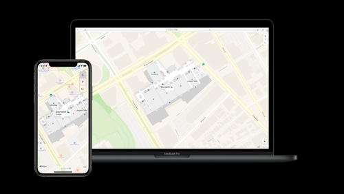 52:46
52:46
Adding Indoor Maps to your App and Website
The Indoor Maps Program enables organizations with large public or private spaces to deliver user experiences that provide precise indoor location information and present stunning indoor maps. Discover the overall process in the indoor map enablement workflow then take deep dive into the...
WWDC 2019 English, Japanese, Simplified Chinese -
 39:04
39:04
Developing a Great Profiling Experience
Learn how to add useful tracing to your reusable classes, subsystems, or frameworks. By making it easy to trace your code, you provide adopters with valuable insight and confidence. We'll show you best practices for tracing your Swift and Objective-C code, building custom instruments, and...
WWDC 2019 English, Japanese, Simplified Chinese -
 45:03
45:03
Subscription Offers Best Practices
Dive into implementation best practices for Subscription Offers using StoreKit and server-side logic. Learn how to generate signatures, determine customer eligibility, and reduce churn, plus gain insights into strategies for distributing offers to your customers and utilizing Subscription Offers...
WWDC 2019 English, Japanese, Simplified Chinese -
 50:17
50:17
In-App Purchases and Using Server-to-Server Notifications
Learn about the latest updates in StoreKit and dive deep into best practices for using server-to-server notifications to manage your subscribers.
WWDC 2019 English, Japanese, Simplified Chinese -
 57:45
57:45
Designing Great ML Experiences
Machine learning enables new experiences that understand what we say, suggest things that we may love, and allow us to express ourselves in new, rich ways. Machine learning can make existing experiences better by automating mundane tasks and improving the accuracy and speed of interactions. Learn...
WWDC 2019 English, Japanese, Simplified Chinese -
 58:38
58:38
Ray Tracing with Metal
Metal Performance Shaders (MPS) harness the massive parallelism of the GPU to dramatically accelerate calculations at the heart of modern ray tracing and ray casting techniques. Understand how MPS accelerates calculations for dynamic scenes, and dive into practical examples for implementing soft...
WWDC 2019 English, Japanese, Simplified Chinese -
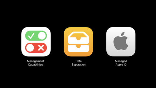 58:49
58:49
What’s New in Managing Apple Devices
Learn about the latest management enhancements for iOS, macOS, and tvOS and the evolution of management tools over the past year. You'll discover how new MDM features help administrators manage devices more effectively, how new technologies deliver support for centrally managed authorization, and...
WWDC 2019 English, Japanese, Simplified Chinese -
 38:06
38:06
Accessibility in SwiftUI
Making your app accessible is critical, but just as important is designing a fantastic accessibility experience. Learn what makes a great experience and how to make your app understandable, navigable, and interactable. SwiftUI builds accessibility into your app for you! Discover how much you get...
WWDC 2019 English, Japanese, Simplified Chinese -
 37:49
37:49
Optimizing Storage in Your App
How you store data in your app affects not only disk footprint, but also the performance of your app and the battery life of the device. Learn techniques for optimizing data serialization, working with images, and syncing to disk. Find out how to take advantage of features in SQLite to improve...
WWDC 2019 English, Japanese, Simplified Chinese -
 34:34
34:34
Great Developer Habits
Successful app development requires mastering a lot of different things. Discover practices you can incorporate into your development workflow to enhance your productivity, and improve your app's performance and stability. Learn how to improve the quality of code you write with Xcode. Gain a...
WWDC 2019 English, Japanese, Simplified Chinese -
 39:19
39:19
Network Extensions for the Modern Mac
Learn about powerful new APIs in macOS that you can use to create apps that extend and customize the networking capabilities of macOS without using kernel extensions.
WWDC 2019 English, Japanese, Simplified Chinese -
 40:11
40:11
Building Custom Views with SwiftUI
Learn how to build custom views and controls in SwiftUI with advanced composition, layout, graphics, and animation. See a demo of a high performance, animatable control and watch it made step by step in code. Gain a deeper understanding of the layout system of SwiftUI.
WWDC 2019 English, Japanese, Simplified Chinese -
 43:06
43:06
Getting the Most Out of Simulator
Join us for a deep dive into the world of Simulator. Find out how Simulator works, discover features you might not know exist, and get a tour of the command-line interface to Simulator for automation. Learn about native GPU acceleration in Simulator via Metal, and how to optimize your Metal code...
WWDC 2019 English, Japanese, Simplified Chinese -
 43:57
43:57
Advances in AR Quick Look
AR Quick Look is a built-in viewer for experiencing high-quality content in 3D and AR. See how integration with Reality Composer enables rich, interactive experiences to be displayed and shared more easily than ever before. Explore rendering improvements and multiple object viewing, then dive...
WWDC 2019 English, Japanese, Simplified Chinese -
 51:08
51:08
What’s New in MapKit and MapKit JS
MapKit and MapKit JS bring fully featured Apple Maps to your app and website. See how the latest features give you more control over the base map presentation, finer-grained search and result filtering of points of interest and address information, and integration with standard data formats for...
WWDC 2019 English, Japanese, Simplified Chinese -
 57:13
57:13
Bringing OpenGL Apps to Metal
Metal is the modern foundation for GPU-accelerated graphics and compute on Apple platforms, superseding OpenGL, OpenGL ES, and OpenCL. Get introduced to the architecture and feature set of Metal and learn a step-by-step approach for transitioning OpenGL-based apps to the Metal API.
WWDC 2019 English, Japanese, Simplified Chinese -
 61:25
61:25
Advances in Networking, Part 2
Take your networking apps to the next level with advances in Bonjour, custom message framing handlers, and the latest in security. You'll also learn how to understand your networking performance by collecting metrics, and how best to use the modern networking frameworks on Apple platforms.
WWDC 2019 English, Japanese, Simplified Chinese -
 54:08
54:08
Taking iPad Apps for Mac to the Next Level
macOS Catalina provides an easy way to bring your iPad app to the Mac while maintaining your single code-base. Hear about ways in which you can take your app beyond the default behaviors to optimize its interface for the Mac. Get an overview of APIs you can use and macOS design guidelines that...
WWDC 2019 English, Japanese, Simplified Chinese -
 39:33
39:33
Improving Battery Life and Performance
Learn about new ways to find and fix performance issues during daily development, beta testing, and public release on the App Store. Learn how to catch performance issues during daily development by measuring CPU, memory, and more in your XCTests. Discover how to find issues in the field during...
WWDC 2019 English, Japanese, Simplified Chinese -
 38:15
38:15
Text Recognition in Vision Framework
Document Camera and Text Recognition features in Vision Framework enable you to extract text data from images. Learn how to leverage this built-in machine learning technology in your app. Gain a deeper understanding of the differences between fast versus accurate processing as well as...
WWDC 2019 English, Japanese, Simplified Chinese -
 30:34
30:34
What's New in App Store Connect
App Store Connect continues to improve its role in each step of your app's lifecycle with new features that make your app submission, management, and distribution experience better than ever. Learn about the latest enhancements and discover new ways to ensure each release of your app is better...
WWDC 2019 English, Japanese, Simplified Chinese -
 44:09
44:09
Mastering Xcode Previews
Xcode 11 displays previews of your user interface right in the editor, streamlining the edit-debug-run cycle into a seamless workflow. Learn how previews work, how to optimize the structure of your SwiftUI app for previews, and how to add preview support to your existing views and view controllers.
WWDC 2019 English, Japanese, Simplified Chinese -
 38:22
38:22
Integrating SwiftUI
SwiftUI is designed to integrate with your existing code base on any of Apple's platforms. Learn how to adopt SwiftUI on any Apple platform by adding SwiftUI views into your app's hierarchy, leveraging your existing data model and more.
WWDC 2019 English, Japanese, Simplified Chinese -
 40:32
40:32
Binary Frameworks in Swift
Xcode 11 now fully supports using and creating binary frameworks in Swift. Find out how to simultaneously support devices and Simulator with the new XCFramework bundle type, how Swift module interfaces work, and how to manage changes to your framework over time.
WWDC 2019 English, Japanese, Simplified Chinese -
 33:11
33:11
Making Apps with Core Data
Core Data helps manage the flow of data throughout your app. Hear about new features in Core Data that make your code simpler and more powerful, including derived attributes, history tracking, change notifications and batch operations. Learn more about using these facilities and the new diffing...
WWDC 2019 English, Japanese, Simplified Chinese -
 39:19
39:19
Advances in Natural Language Framework
Natural Language is a framework designed to provide high-performance, on-device APIs for natural language processing tasks across all Apple platforms. Learn about the addition of Sentiment Analysis and Text Catalog support in the framework. Gain a deeper understanding of transfer learning for...
WWDC 2019 English, Japanese, Simplified Chinese -
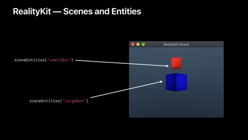 41:06
41:06
Modern Swift API Design
Every programming language has a set of conventions that people come to expect. Learn about the patterns that are common to Swift API design, with examples from new APIs like SwiftUI, Combine, and RealityKit. Whether you're developing an app as part of a team, or you're publishing a library for...
WWDC 2019 English, Japanese, Simplified Chinese -
 34:41
34:41
Combine in Practice
Expand your knowledge of Combine, Apple's new unified, declarative framework for processing values over time. Learn about how to correctly handle errors, schedule work and integrate Combine into your app today.
WWDC 2019 English, Japanese, Simplified Chinese -
 35:17
35:17
Building Collaborative AR Experiences
With iOS 13, ARKit and RealityKit enable apps to establish shared AR experiences faster and easier than ever. Understand how collaborative sessions allow multiple devices to build a combined world map and share AR anchors and updates in real-time. Learn how to incorporate collaborative sessions...
WWDC 2019 English, Japanese, Simplified Chinese -
 12:05
12:05
Training Text Classifiers in Create ML
Create ML now enables you to create models for Natural Language that are built on state-of-the-art techniques. Learn how these models can be easily trained and tested with the Create ML app. Gain insight into the powerful new options for transfer learning, word embeddings, and text catalogs.
WWDC 2019 English, Japanese, Simplified Chinese -
 10:31
10:31
Training Recommendation Models in Create ML
Recommendation models for Core ML can enable a very personal experience for the customers using your app. They power suggestions for what music to play or what movie to see in the apps you use every day. Learn how you can easily create a custom Recommendation model from all sorts of data sources...
WWDC 2019 English, Japanese, Simplified Chinese -
 15:01
15:01
Building Activity Classification Models in Create ML
Your iPhone and Apple Watch are loaded with a number of powerful sensors including an accelerometer and gyroscope. Activity Classifiers can be trained on data from these sensors to bring some magic to your app, such as knowing when someone is running or swinging a bat. Learn how the Create ML app...
WWDC 2019 English, Japanese, Simplified Chinese -
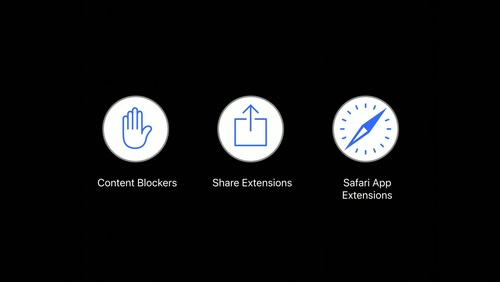 8:34
8:34
What's New in Safari
The latest version of Safari on macOS and iOS is packed with new capabilities that both web developers and their customers will love. Discover how to take advantage of new features including powerful new Safari Extensions APIs for window, tab, and popover management, content blocking...
WWDC 2019 English, Japanese, Simplified Chinese -
 53:30
53:30
Testing in Xcode
Unit testing is an essential tool to consistently verify your code works correctly. Learn about the built-in testing features in Xcode, using XCTest. Find out how to organize your tests and run them under different configurations using test plans, new in Xcode 11. Discover how to automate testing...
WWDC 2019 English, Japanese, Simplified Chinese -
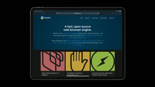 12:28
12:28
What's New for Web Developers
WebKit provides a rich set of classes designed to load, display, and manage web content in your app. Discover how to integrate your web content into powerful platform features including Dark Mode, new presentation features in Share Sheet, JavaScript payment APIs for Apple Pay, and more.
WWDC 2019 English, Japanese, Simplified Chinese -
 19:12
19:12
What's New in Authentication
Secure sign-in and authentication is a key feature of a secure account-based app design. Learn how you can improve your app's login experiences through an overview of the available authentications services and details on specific technologies such as Sign In with Apple ID, Password AutoFill for...
WWDC 2019 English, Japanese, Simplified Chinese -
 56:58
56:58
Advances in Networking, Part 1
Keep up with new and evolving networking protocols and standards by leveraging the modern networking frameworks on all Apple platforms and following best practices for efficiency and performance. In this session, learn about Low Data Mode, Combine in URLSession, WebSocket, and improvements to...
WWDC 2019 English, Japanese, Simplified Chinese -
 59:05
59:05
Building AR Experiences with Reality Composer
Reality Composer is a tool that lets anyone quickly prototype and build AR scenes ready to integrate into apps or experience with AR Quick Look. Walk through the powerful and intuitive capabilities of Reality Composer and discover hundreds of ready-to-use virtual objects in its built-in AR...
WWDC 2019 English, Japanese, Simplified Chinese -
 18:52
18:52
Introducing Combine
Combine is a unified declarative framework for processing values over time. Learn how it can simplify asynchronous code like networking, key value observing, notifications and callbacks.
WWDC 2019 English, Japanese, Simplified Chinese -
 29:43
29:43
Creating Great Apps Using Core ML and ARKit
Take a journey through the creation of an educational game that brings together Core ML, ARKit, and other app frameworks. Discover opportunities for magical interactions in your app through the power of machine learning. Gain a deeper understanding of approaches to solving challenging computer...
WWDC 2019 English, Japanese, Simplified Chinese -
 40:05
40:05
Delivering Intuitive Media Playback with AVKit
AVKit is a high-level framework for building media user interfaces, complete with playback controls, chapter navigation, Picture-in-Picture, audio routing, support for subtitles and closed captioning, Siri and Now Playing integration, and support for keyboard, Touch Bar, and remote control. Learn...
WWDC 2019 English, Japanese, Simplified Chinese -
 37:09
37:09
Debugging in Xcode 11
Xcode 11 introduces new features for finding and fixing bugs fast. Discover how to simulate network conditions and thermal states, and how to override your app's runtime environment while debugging. See how the debugging features work with Xcode previews to identify issues before Build & Run...
WWDC 2019 English, Japanese, Simplified Chinese -
 15:54
15:54
Advances in Foundation
The Foundation framework provides a base layer of functionality for apps and frameworks that's used throughout the macOS, iOS, watchOS, and tvOS SDKs. Hear about valuable enhancements to Foundation collections, performance, internationalization features, and Swift integration.
WWDC 2019 English, Japanese, Simplified Chinese -
 39:45
39:45
Font Management and Text Scaling
Starting with iOS 13, your iOS app can contribute fonts for systemwide use. Understand how fonts are managed on iOS, and learn how to install and access fonts. Get details on the font picker interface that allows users to choose fonts, and the System UI fonts that are now available for use in...
WWDC 2019 English, Japanese, Simplified Chinese -
 34:54
34:54
Getting Started with Instruments
The Instruments app in Xcode provides a rich set of tools and templates for profiling your app performance. Learn all about Instruments and gain strategies for identifying bottlenecks in your code. See just how to leverage the power of time profiling and points of interest tracking to make...
WWDC 2019 English, Japanese, Simplified Chinese -
 31:05
31:05
Creating Swift Packages
Whether you want to publish code to share with the community, or you just want a convenient way to organize the code in your apps, Swift packages are here to help. Learn how to create local packages for your own development, how to customize your package via the manifest file, and how to go about...
WWDC 2019 English, Japanese, Simplified Chinese -
 37:20
37:20
Data Flow Through SwiftUI
SwiftUI was built from the ground up to let you write beautiful and correct user interfaces free of inconsistencies. Learn how to connect your data as dependencies while keeping the UI fully predictable and error free. Familiarize yourself with SwiftUI's powerful data flow tools and understand...
WWDC 2019 English, Japanese, Simplified Chinese -
 15:33
15:33
Introducing Photo Segmentation Mattes
Photos captured in Portrait Mode on iOS 12 contain an embedded person segmentation matte that made it easy to create creative visual effects like background replacement. iOS 13 leverages on-device machine learning to provide new segmentation mattes for any captured photo. Learn about the new...
WWDC 2019 English, Japanese, Simplified Chinese -
 44:40
44:40
Introducing Multi-Camera Capture for iOS
In AVCapture on iOS 13 it is now possible to simultaneously capture photos and video from multiple cameras on iPhone XS, iPhone XS Max, iPhone XR, and the latest iPad Pro. It is also possible to configure the multiple microphones on the device to shape the sound that is captured. Learn how to...
WWDC 2019 English, Japanese, Simplified Chinese -
 60:34
60:34
Advances in Camera Capture & Photo Segmentation
Powerful new features in the AVCapture API let you capture photos and video from multiple cameras simultaneously. Photos now benefit from semantic segmentation that allows you to isolate hair, skin, and teeth in a photo. Learn how these advances enable you to create great camera apps and easily...
WWDC 2019 English, Japanese, Simplified Chinese -
 26:02
26:02
Designing Audio-Haptic Experiences
Learn essential sound and haptic design principles and concepts for creating meaningful and delightful experiences that engage a wider range of human senses. Discover how to combine audio and haptics, using the Taptic Engine, to add a new level of realism and improve feedback in your app or game.
WWDC 2019 English, Japanese, Simplified Chinese -
 56:04
56:04
Expanding the Sensory Experience with Core Haptics
Core Haptics lets you design your own haptics with synchronized audio on iPhone. In this two part session, learn essential sound and haptic design principles and concepts for creating meaningful and delightful experiences that engage a wider range of human senses. Discover how to combine visuals,...
WWDC 2019 English, Japanese, Simplified Chinese -
 50:21
50:21
Modernizing Your UI for iOS 13
iOS 13 combines powerful new multitasking and productivity technologies with a refreshed look and feel for all applications. Familiarize yourself with new requirements to keep your app ready for upcoming versions of iOS. Discover improvements to search fields and a totally new way to present UI...
WWDC 2019 English, Japanese, Simplified Chinese -
 58:56
58:56
Metal for Pro Apps
Metal is the platform-optimized graphics and compute framework at the heart of GPU acceleration on Apple platforms. Learn key aspects of the Metal architecture that support the techniques for modern high-performance pro applications and workflows. Learn how to leverage Metal capabilities to...
WWDC 2019 English, Japanese, Simplified Chinese -
 29:03
29:03
Introducing Core Haptics
Core Haptics lets you design fully customized haptic patterns with synchronized audio. See examples of how haptics and audio enables you to create a greater sense of immersion in your app or game. Learn how to create, play back, and share content, and where Core Haptics fits in with other audio...
WWDC 2019 English, Japanese, Simplified Chinese -
 46:43
46:43
Designing Award Winning Apps and Games
Through stories, interviews, and artifacts we will uncover valuable design processes, techniques, and best practices of Apple Design Award winning apps and games.
WWDC 2019 English, Japanese, Simplified Chinese -
 39:26
39:26
Bringing People into AR
ARKit 3 enables a revolutionary capability for robust integration of real people into AR scenes. Learn how apps can use live motion capture to animate virtual characters or be applied to 2D and 3D simulation. See how People Occlusion enables even more immersive AR experiences by enabling virtual...
WWDC 2019 English, Japanese, Simplified Chinese -
 41:03
41:03
What's New in Clang and LLVM
Keep up with the latest enhancements to C, Objective-C, and C++ made possible by advancements in the Clang compiler and LLVM. Find out about new static analyzer features and how to use them to improve your code. Learn how to take advantage of new optimizations for code size.
WWDC 2019 English, Japanese, Simplified Chinese -
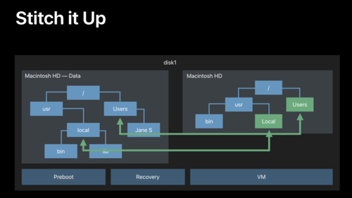 34:07
34:07
What's New in Apple File Systems
Learn about what's new in file system technology, including changes to file system layout and imaging technologies. If you are affected by the new Read Only System Volume, this is a session you will not want to miss.
WWDC 2019 English, Japanese, Simplified Chinese -
 34:51
34:51
App Distribution – From Ad-hoc to Enterprise
Whether you want to share your app with a few colleagues, deliver it to employees within an organization, or release it to the world, there's a distribution mechanism designed to fit your needs. Familiarize yourself with each app deployment model, learn how to choose the one that's best for you,...
WWDC 2019 English, Japanese, Simplified Chinese -
 33:24
33:24
Adopting Swift Packages in Xcode
Swift packages are a great way to organize and share code, and are now supported while building apps for all Apple platforms in Xcode 11. Find out how to use community-developed packages in your project, how Swift packages are structured, and how package versioning and dependencies work.
WWDC 2019 English, Japanese, Simplified Chinese -
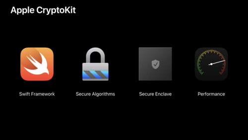 38:52
38:52
Cryptography and Your Apps
System frameworks encrypt both data at rest and data in transit in a transparent way for you. This functionality is available by simply setting an attribute. However you may want to do more to protect your users' data. CryptoKit is a new Swift framework that makes it easier and safer than ever to...
WWDC 2019 English, Japanese, Simplified Chinese -
 34:51
34:51
Introducing PencilKit
Meet PencilKit, Apple's feature-rich drawing and annotation framework. With just a few lines of code, you can add a full drawing experience to your app — with access to a canvas, responsive inks, rich tool palette and drawing model. Hear the technical details that make a great Apple Pencil...
WWDC 2019 English, Japanese, Simplified Chinese -
 34:07
34:07
Exploring New Data Representations in HealthKit
Discover how HealthKit is enriching and expanding the health data types available to the users of your app. Learn about modern storage for high-frequency health data types, accessing beat-to-beat heart rate data, and how to bring an entire new dimension of health to your users with new support...
WWDC 2019 English, Japanese, Simplified Chinese -
 36:15
36:15
Advances in UI Data Sources
Use UI Data Sources to simplify updating your table view and collection view items using automatic diffing. High fidelity, quality animations of set changes are automatic and require no extra code! This improved data source mechanism completely avoids synchronization bugs, exceptions, and...
WWDC 2019 English, Japanese, Simplified Chinese -
 38:19
38:19
Designing for Privacy
Privacy is a more important issue than ever for your users. Learn about new features and privacy engineering techniques that can help you earn customer trust, create more personal experiences, and improve user engagement.
WWDC 2019 English, Japanese, Simplified Chinese -
 30:53
30:53
SwiftUI on watchOS
SwiftUI allows a whole new world of possibilities when developing watchOS apps and notifications. From custom animations to providing an intuitive feel with Digital Crown haptics, SwiftUI helps you build exciting and immersive experiences for Apple Watch. See how easy it is to create custom...
WWDC 2019 English, Japanese, Simplified Chinese -
 58:28
58:28
SwiftUI Essentials
Take your first deep-dive into building an app with SwiftUI. Learn about Views and how they work. From basic controls to sophisticated containers like lists and navigation stacks, SwiftUI enables the creation of great user interfaces, faster and more easily. See how basic controls like Button are...
WWDC 2019 English, Japanese, Simplified Chinese -
 49:24
49:24
Delivering Optimized Metal Apps and Games
Optimizing performance, memory, and bandwidth are important considerations for resource-intensive Metal apps and games. Learn key best practices to streamline your rendering and attain high frame rates. Understand powerful tools that can help you pinpoint expensive or unexpected GPU work. Dive...
WWDC 2019 English, Japanese, Simplified Chinese -
 50:39
50:39
ResearchKit and CareKit Reimagined
The ResearchKit and CareKit frameworks are the fastest route to delivering powerful native iOS apps for the research and patient care field. Learn about the newest audio and speech active-tasks, a completely redesigned user experience, and modular architecture designed to make it a breeze to...
WWDC 2019 English, Japanese, Simplified Chinese -
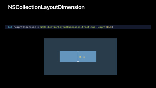 50:13
50:13
Advances in Collection View Layout
Collection View Layouts make it easy to build rich interactive collections. Learn how to make dynamic and responsive layouts that range in complexity from basic lists to an advanced, multi-dimensional browsing experience.
WWDC 2019 English, Japanese, Simplified Chinese -
 39:50
39:50
Understanding Images in Vision Framework
Learn all about the many advances in the Vision Framework including effortless image classification, image saliency, determining image similarity, and improvements in facial feature detection, and face capture quality scoring. This packed session will show you how easy it is to bring powerful...
WWDC 2019 English, Japanese, Simplified Chinese -
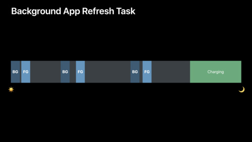 39:07
39:07
Advances in App Background Execution
Background execution is a powerful tool your app can leverage to provide a great user experience. Learn about best practices to follow when running in the background, especially if you use VoIP or silent pushes, and an all-new scheduling API that enables long running processing and maintenance...
WWDC 2019 English, Japanese, Simplified Chinese -
 39:47
39:47
Building Apps with RealityKit
Gain a practical understanding of RealityKit capabilities by developing a game using its easy-to-learn API. Learn the recommended approach for loading assets, building a scene, applying animations, and handling game input. See how entities and components express the powerful elements of...
WWDC 2019 English, Japanese, Simplified Chinese -
 38:58
38:58
Implementing Dark Mode on iOS
Hear from the UIKit engineering team about the principles and concepts that anchor Dark Mode on iOS. Get introduced to the principles of enhancing your app with this new appearance using dynamic colors and images, and add an experience that people are sure to love.
WWDC 2019 English, Japanese, Simplified Chinese -
 35:45
35:45
What's New in Core Location
Location technologies are core to delivering context-based services within your app. Discover how the latest features in the Core Location Framework lay the groundwork for advanced ranging capabilities and delivers more options for you to clearly communicate your location needs to your users, and...
WWDC 2019 English, Japanese, Simplified Chinese -
 31:59
31:59
Introducing Parameters for Shortcuts
Parameters take Siri Shortcuts to the next level, enabling an interactive voice experience in Siri with follow-up questions, and allowing people to customize shortcuts in the Shortcuts app, now built into iOS. Walk through setting up your shortcuts to take advantage of parameters and learn how...
WWDC 2019 English, Japanese, Simplified Chinese -
 20:11
20:11
Training Sound Classification Models in Create ML
Learn how to quickly and easily create Core ML models capable of classifying the sounds heard in audio files and live audio streams. In addition to providing you the ability to train and evaluate these models, the Create ML app allows you to test the model performance in real-time using the...
WWDC 2019 English, Japanese, Simplified Chinese -
 35:19
35:19
Introducing Sign In with Apple
Sign In with Apple is the fast, easy way for people to sign in to apps using the Apple IDs they already have. Learn how easy it is to add a Sign In with Apple button to your app or website to acquire new customers and benefit from the built-in security, antifraud, and privacy that Sign In with...
WWDC 2019 English, Japanese, Simplified Chinese -
 15:41
15:41
Training Object Detection Models in Create ML
Custom Core ML models for Object Detection offer you an opportunity to add some real magic to your app. Learn how the Create ML app in Xcode makes it easy to train and evaluate these models. See how you can test the model performance directly within the app by taking advantage of Continuity...
WWDC 2019 English, Japanese, Simplified Chinese -
 20:44
20:44
LLDB: Beyond "po"
LLDB is a powerful tool for exploring and debugging your app at runtime. Discover the various ways to display values in your app, how to format custom data types, and how to extend LLDB using your own Python 3 scripts.
WWDC 2019 English, Japanese, Simplified Chinese -
 10:23
10:23
Writing Great Accessibility Labels
Great accessibility labels are the difference between someone using and loving your app or someone deleting your app. Experience VoiceOver as demonstrated by an Apple Accessibility engineer as she navigates complex UI and demonstrates how descriptive labels are an easy way to ensure your app is...
WWDC 2019 English, Japanese, Simplified Chinese -
 8:54
8:54
Streaming Audio on watchOS 6
Streaming audio on Apple Watch allows customers to enjoy your content wherever they go without their iPhone. Learn about the streaming APIs brought over from iOS to allow watchOS apps to create independent audio consumption experiences. Find out how to set up your audio session for streaming and...
WWDC 2019 English, Japanese, Simplified Chinese -
 13:23
13:23
Understanding CPU Usage with Web Inspector
As a developer of web content, you play an important role in fulfilling customer expectations for a high performance web experience while minimizing power use across all their devices. Discover new insights on how you can improve the power efficiency of your webpages in Safari, or embedded web...
WWDC 2019 English, Japanese, Simplified Chinese -
 8:53
8:53
What's New in AVAudioEngine
AVAudioEngine enables the realtime capture, processing, and playback of audio. Learn how to take advantage of enhancements to this powerful API, such as support for voice processing and spatial rendering mode selection, in your own audio app.
WWDC 2019 English, Japanese, Simplified Chinese -
 20:59
20:59
Introducing Accelerate for Swift
Accelerate framework provides hundreds of computational functions that are highly optimized to the system architecture your device is running on. Learn how to access all of these powerful functions directly in Swift. Understand how the power of vector programming can deliver incredible...
WWDC 2019 English, Japanese, Simplified Chinese -
 28:02
28:02
What’s New in ClassKit
The ClassKit framework helps you surface your app's valuable educational content for inclusion in a teacher's classroom curriculum. Get an overview of the ClassKit integration workflow, debugging instructor and student roles with the Schoolwork app, and new features designed to make publishing to...
WWDC 2019 English, Japanese, Simplified Chinese -
 1:46
1:46
Modernizing Your Audio App
Apple platforms provide a comprehensive set of audio frameworks and technologies that are essential to creating a rich app experience. Learn about which frameworks and APIs are recommended to ensure that your app is well positioned for the future.
WWDC 2019 English, Japanese, Simplified Chinese -
 10:14
10:14
Accessibility Inspector
The Accessibility Inspector enables you to identify parts of your app that are not accessible. It provides feedback on how you can make them accessible, as well as simulating voice-over to help you identify what a Voice Over user would experience. Watch a live-demo of an app being fully debugged...
WWDC 2019 English, Japanese, Simplified Chinese -
 8:47
8:47
Creating an Accessible Reading Experience
The styling and layout of text is a hallmark feature of an outstanding reading experience. Technologies such as CoreText and TextKit give you the tools you need to create a great text layout. Learn how to make an equally great accessible experience for VoiceOver by adopting the accessibility...
WWDC 2019 English, Japanese, Simplified Chinese -
 8:15
8:15
Auditing Web Content with Web Inspector
Discover a new way to ensure your web content meets team coding standards and that you can deliver better code even without reliance on automated test systems. Find out how to use the Audit tool in Web Inspector to quickly and easily audit your web content during development so important...
WWDC 2019 English, Japanese, Simplified Chinese -
 16:00
16:00
Advances in CarPlay Systems
CarPlay is a smarter, safer way to use your iPhone in the car. Learn how to update your vehicle system to take advantage of new features in iOS 13. Add support for dynamically changing screen sizes, second screens such as instrument clusters, and even irregularly shaped displays. Learn how to...
WWDC 2019 English, Japanese, Simplified Chinese -
 7:08
7:08
Exploring Tinted Graphic Complications
Many Watch faces in watchOS 6 allow for customizing the tint color of content, allowing for even more personalization of Apple's most personal device. Discover how you can use ClockKit data providers to offer full color and tint-ready options for each complication family type. This gives...
WWDC 2019 English, Japanese, Simplified Chinese -
 10:13
10:13
Visual Design and Accessibility
Learn about the importance of supporting Large Text. Hear about Differentiate Without Color, a new API on iOS which can enable people with vision disorders such as color-blindness to easily use your app. Learn how to use it and how it can bring inclusivity to your app. Find out how to enable new...
WWDC 2019 English, Japanese, Simplified Chinese -
 9:25
9:25
Making Apps More Accessible With Custom Actions
Custom Actions simplify the experience for people using assistive technologies with your app and they can help you reduce the number of swipes and taps that are required to navigate through your interface and perform interactions. Learn how to leverage custom actions for use in VoiceOver and...
WWDC 2019 English, Japanese, Simplified Chinese -
 23:55
23:55
What’s New in File Management and Quick Look
Your iOS app can now access files stored on external devices via USB and SMB. Understand best practices for creating a document-based app that reads, writes, and manages files on physical media or networked storage. Learn about enhancements to Quick Look on iOS and macOS that help you access and...
WWDC 2019 English, Japanese, Simplified Chinese -
 19:53
19:53
What's New in Safari Extensions
Safari Extensions surface your app's unique capabilities within Safari. Discover how the latest features such as content blocking notifications and user interface management and control innovations for pages, tabs, and popovers make your Safari App Extensions and Content Blockers even more...
WWDC 2019 English, Japanese, Simplified Chinese -
 14:50
14:50
HEVC Video with Alpha
With the addition of alpha channel support for HEVC video, you can now composite video over custom backgrounds in both your apps and on the web. Learn how to author compatible media, and the best practices for playback.
WWDC 2019 English, Japanese, Simplified Chinese -
 5:32
5:32
AUv3 Extensions User Presets
Audio Unit app extensions gives users a convenient way to create or modify audio in any iOS or macOS app that uses sound, including music production apps such as GarageBand or Logic Pro X. And now, with iOS 13, you can store user presets for your extensions that are accessible across applications.
WWDC 2019 English, Japanese, Simplified Chinese -
 17:09
17:09
What's New in Universal Links
Universal Links allow your users to intelligently follow links to content inside your app or to your website. Learn how the latest enhancements in Universal Links give your users the most integrated mobile and desktop experience, even when your app isn't installed on their device.
WWDC 2019 English, Japanese, Simplified Chinese -
 6:43
6:43
Embedding and Sharing Visually Rich Links
The new Link Presentation framework enables app developers to easily present URLs in a rich, beautiful, and consistent way. Learn how to use Link Presentation to retrieve metadata from a URL, present the rich link content inside your app, and provide link metadata to the new share sheet...
WWDC 2019 English, Japanese, Simplified Chinese -
 17:00
17:00
Supporting New Game Controllers
With iOS 13, macOS Catalina, and tvOS 13, the Game Controller framework adds support for several well-known console game controllers. Get briefed about the newly-added controllers and understand how their inputs are delivered. Learn recommended best practices for handling optional buttons, and...
WWDC 2019 English, Japanese, Simplified Chinese -
 13:08
13:08
Large Content Viewer - Ensuring Readability for Everyone
Tab Bars can't grow with dynamic text, but the Large Content Viewer helps them to be seen by people with low vision. iOS 13 brings this feature to custom tab bars. Learn how to enable Large Content Viewer on your custom tab bars and ensure the right vector image is featured in the heads-up display.
WWDC 2019 English, Japanese, Simplified Chinese -
 10:39
10:39
Supporting Dark Mode in Your Web Content
With system-wide Dark Mode support in iOS and macOS, you'll want to make sure your web content is appropriately styled to reflect your users' preference. Learn techniques to ensure your content looks its best when presented in Safari, embedded in other apps such as Mail, or when used in your...
WWDC 2019 English, Japanese, Simplified Chinese -
 10:18
10:18
Game Center Player Identifiers
Game Center now supports persistent player identifiers scoped to individual games or to a developer team ID. Understand how scoped identifiers enhance player privacy and see how to transition your apps and games onto the recommended API.
WWDC 2019 English, Japanese, Simplified Chinese -
 26:17
26:17
Introducing the Indoor Maps Program
The Indoor Maps Program enables organizations with large public or private spaces to deliver user experiences that leverage precise location information and present stunning indoor maps. Learn the entire enablement workflow including, creation of a standards-based map definition, map validation,...
WWDC 2019 English, Japanese, Simplified Chinese -
 48:34
48:34
Mastering the Living Room With tvOS
tvOS apps can deliver amazing experiences with stunning picture quality through 4K resolution, Dolby Vision and HDR10, and immersive sound through Dolby Atmos. Discover how to design beautiful, engaging, content-first experiences for your media applications. Learn about the new Top Shelf...
WWDC 2019 English, Japanese, Simplified Chinese -
 30:18
30:18
Designing iPad Apps for Mac
Discover how you can create a great Mac experience with your iPad app. Learn about essential techniques for adapting your iPad app's layout and architecture for Mac, considerations for type and color, and how you can take advantage of macOS interfaces such as the menu bar, sidebar and window...
WWDC 2019 English, Japanese, Simplified Chinese -
 51:27
51:27
Introducing ARKit 3
ARKit is the groundbreaking augmented reality (AR) platform for iOS that can transform how people connect with the world around them. Explore the state-of-the-art capabilities of ARKit 3 and discover the innovative foundation it provides for RealityKit. Learn how ARKit makes AR even more...
WWDC 2019 English, Japanese, Simplified Chinese -
 42:12
42:12
Introducing Multiple Windows on iPad
Multitasking is an exciting way to add power to your iPad app. It is easy to enable your app to run two instances of your interface side-by-side, and your customers will love it. Learn how to take your existing features like drag and drop and use them to easily create a second window. Find out...
WWDC 2019 English, Japanese, Simplified Chinese -
 6:56
6:56
HLS Authoring for AirPlay 2 Video
AirPlay 2 Video lets you share video from Apple devices to popular smart TVs. Learn about the special considerations for seamless delivery of high quality video to these TVs, and how to utilize the validation tools to ensure your content is ready for primetime.
WWDC 2019 English, Japanese, Simplified Chinese -
 27:28
27:28
What's New in iOS Design
Discover how to update your app's interface for Dark Mode to create beautiful and accessible apps. And learn how refinements to modal sheets and the new contextual menu UI can help improve usability and lead to more powerful and efficient workflows.
WWDC 2019 English, Japanese, Simplified Chinese -
 37:02
37:02
What’s New in AppKit for macOS
Learn about the latest APIs in AppKit and associated frameworks. Get an overview of the enhancements coming in macOS Catalina to help you save time, take advantage of the latest hardware, and add polish to your application.
WWDC 2019 English, Japanese, Simplified Chinese -
 37:13
37:13
Introducing RealityKit and Reality Composer
Architected for AR, RealityKit provides developers access to world-class capabilities for rendering, animation, physics, and spatial audio. See how RealityKit reimagines the traditional 3D engine to make AR development faster and easier for developers than ever before. Understand the building...
WWDC 2019 English, Japanese, Simplified Chinese -
 41:19
41:19
Swift Playgrounds 3
Introducing Swift Playgrounds 3: the latest iteration of the revolutionary app for iPad that makes coding in Swift interactive and fun. Discover how you can use your own playgrounds to rapidly iterate on code that uses device features. Find out how the new modules feature both helps organize your...
WWDC 2019 English, Japanese, Simplified Chinese -
 40:38
40:38
Core ML 3 Framework
Core ML 3 now enables support for advanced model types that were never before available in on-device machine learning. Learn how model personalization brings amazing personalization opportunities to your app. Gain a deeper understanding of strategies for linking models and improvements to Core ML...
WWDC 2019 English, Japanese, Simplified Chinese -
 28:03
28:03
Creating Independent Watch Apps
watchOS 6 enables a whole new level of watchOS experiences by allowing fully independent apps and apps built just for Apple Watch, and by bringing the App Store to Apple Watch. Discover how to leverage the power of many iOS frameworks and technologies, now on watchOS, to create fully independent...
WWDC 2019 English, Japanese, Simplified Chinese -
 14:34
14:34
Introducing the Create ML App
Bringing the power of Core ML to your app begins with one challenge. How do you create your model? The new Create ML app provides an intuitive workflow for model creation. See how to train, evaluate, test, and preview your models quickly in this easy-to-use tool. Get started with one of the many...
WWDC 2019 English, Japanese, Simplified Chinese -
 39:32
39:32
Introducing SF Symbols
SF Symbols introduces a comprehensive library of vector-based symbols that you can incorporate into your app to simplify the layout of user interface elements through automatic alignment with surrounding text, and support for multiple weights and sizes. Learn how easy it is to adapt to different...
WWDC 2019 English, Japanese, Simplified Chinese -
 14:49
14:49
What's New in Machine Learning
Core ML 3 has been greatly expanded to enable even more amazing, on-device machine learning capabilities in your app. Learn about the new Create ML app which makes it easy to build Core ML models for many tasks. Get an overview of model personalization; exciting updates in Vision, Natural...
WWDC 2019 English, Japanese, Simplified Chinese -
 33:40
33:40
All About Notarization
Notarization is all about identifying and blocking malicious Mac software prior to distribution, without requiring App Review or the Mac App Store. Introduced last year and already widely adopted by Mac app developers, this is your opportunity to take an in depth tour of Notarization workflows...
WWDC 2019 English, Japanese, Simplified Chinese -
 41:27
41:27
Introducing iPad Apps for Mac
iPad Apps for Mac is an easy way to bring your iPad app to the Mac while maintaining your single code-base. Learn about common Mac features that are automatically implemented for you. Find out how to work with iOS-only frameworks and what using them could mean for your app. Hear about some common...
WWDC 2019 English, Japanese, Simplified Chinese -
 42:06
42:06
Introducing Low-Latency HLS
Since its introduction in 2009, HTTP Live Streaming (HLS) has enabled the delivery of countless live and on‐demand audio and video streams globally. With the introduction of a new Low-Latency mode, latencies of less than two seconds are now achievable over public networks at scale, while still...
WWDC 2019 English, Japanese, Simplified Chinese -
 28:17
28:17
Introducing SiriKit Media Intents
iOS 13 enhances SiriKit by bringing all new support for audio content playback. See how to provide an excellent, hands-free experience for playing your music, audiobooks, podcasts, radio, and more. Dive into best practices for handling search terms, discover how to provide a complete experience...
WWDC 2019 English, Japanese, Simplified Chinese -
 31:55
31:55
Working with USD
Universal Scene Description (USD) enables the robust description of 3D scenes and empowers engineers and artists to seamlessly collaborate across the creative workflow. Get introduced to the powerful capabilities of USD and explore its incredible scalability. Gain a deeper understanding of how...
WWDC 2019 English, Japanese, Simplified Chinese -
 54:16
54:16
Introducing SwiftUI: Building Your First App
See SwiftUI in action! Watch as engineers from the SwiftUI team build a fully-functioning app from scratch. Understand the philosophy driving this new framework and learn about the benefits of declarative-style programming. Take a look under the hood to understand how SwiftUI operates and learn...
WWDC 2019 English, Japanese, Simplified Chinese -
 55:28
55:28
Modern Rendering with Metal
Metal is the GPU-accelerated graphics and compute framework that helps developers build everything from pro apps to console-style games. Learn how to apply Metal features to implement modern graphics techniques including deferred and tiled-forward rendering. See how GPU-driven capabilities enable...
WWDC 2019 English, Japanese, Simplified Chinese -
 54:25
54:25
Getting Started with Xcode
Xcode is the development environment for creating great apps for Apple platforms. Find out how to take advantage of Xcode features to go all the way from a new project to App Store distribution. Along the way, you'll learn how to navigate the Xcode user interface, how to take advantage of the...
WWDC 2019 English, Japanese, Simplified Chinese -
 49:44
49:44
Introducing Desktop-class Browsing on iPad
iOS 13 brings desktop-class browsing to iPad. With blazing-fast performance, industry-leading security, and modern desktop features, Safari on iPad supports the latest web standards designed and automatically adapts desktop sites and web apps to touch in order to deliver a rich browsing...
WWDC 2019 English, Japanese, Simplified Chinese -
 34:58
34:58
Creating Great Localized Experiences with Xcode 11
Learn how your app can support per-app language settings in iOS 13. Get the details on localizing assets with asset catalogs and simplifying your localization workflow with Xcode 11. Understand how to generate screenshots in multiple languages for localization and testing.
WWDC 2019 English, Japanese, Simplified Chinese -
 6:10
6:10
Advances in Speech Recognition
Speech Recognizer can now be used locally on iOS or macOS devices with no network connection. Learn how you can bring text-to-speech support to your app while maintaining privacy and eliminating the limitations of server-based processing. Speech recognition API has also been enhanced to provide...
WWDC 2019 English, Japanese, Simplified Chinese -
 37:01
37:01
System Extensions and DriverKit
One of the next steps in modernizing and improving the security and reliability of macOS is to provide a better architecture for kernel extensions and drivers. Learn how to make this transition with System Extensions and DriverKit.
WWDC 2019 English, Japanese, Simplified Chinese -
 36:44
36:44
What's New in Swift
Swift is now the language of choice for a number of major frameworks across all of Apple's platforms, including SwiftUI, RealityKit and Create ML. Join us for a review of Swift 5.0 and an exploration of Swift 5.1, new in Xcode 11. Find out about the latest advancements in performance and safety...
WWDC 2019 English, Japanese, Simplified Chinese -
 31:49
31:49
Using Core Data With CloudKit
CloudKit offers powerful, cloud-syncing technology while Core Data provides extensive data modeling and persistence APIs. Learn about combining these complementary technologies to easily build cloud-backed applications. See how new Core Data APIs make it easy to manage the flow of data through...
WWDC 2019 English, Japanese, Simplified Chinese -
 33:02
33:02
What's New in Xcode 11
Start the week with a tour of new features in Xcode 11, designed to help you get from idea to product faster than ever. Discover new ways to edit and organize your source code, new capabilities for designing and previewing user interfaces, and great improvements for debugging and testing. Get an...
WWDC 2019 English, Japanese, Simplified Chinese -
 40:46
40:46
Advances in macOS Security
We are on a journey to continuously improve macOS security, with a particular focus on preventing malware and protecting user data. Join us on the next step and learn more about what's new in Gatekeeper—for keeping malware out of macOS—as well as new protections that help keep users' data and...
WWDC 2019 English, Japanese, Simplified Chinese -
 35:49
35:49
Reaching the Big Screen with AirPlay 2
AirPlay lets you share videos, photos, music, and more from Apple devices to your Apple TV, favorite speakers, and popular smart TVs. Learn how to deliver the best possible experience for AirPlay video, including automatic route selection for long form content, remote control, now playing...
WWDC 2019 English, Japanese, Simplified Chinese -
 49:15
49:15
Apple Design Awards
Join us for an unforgettable award ceremony celebrating developers and their outstanding work. The 2019 Apple Design Awards recognize state of the art iOS, macOS, watchOS, and tvOS apps that reflect excellence in design and innovation.
WWDC 2019 English, Japanese, Simplified Chinese -
 117:19
Platforms State of the Union
WWDC 2019 Platforms State of the Union
WWDC 2019 English, Japanese, Simplified Chinese -
 137:33
Keynote
WWDC 2019 Keynote
WWDC 2019 English, Japanese, Korean, Simplified Chinese, Spanish
-
-
WWDC 2018 -
 37:27
37:27
Testing Tips & Tricks
Testing is an essential tool to consistently verify your code works correctly, but often your code has dependencies that are out of your control. Discover techniques for making hard-to-test code testable on Apple platforms using XCTest. Learn a variety of tips for writing higher-quality tests...
WWDC 2018 English, Japanese, Simplified Chinese -
 51:28
51:28
iOS Memory Deep Dive
Discover how memory graphs can be used to get a close up look at what is contributing to an app's memory footprint. Understand the true memory cost of an image. Learn some tips and tricks for reducing the memory footprint of an app.
WWDC 2018 English, Japanese, Simplified Chinese -
 57:17
57:17
Understanding Crashes and Crash Logs
Sudden app crashes are a source of bad user experience and app review rejections. Learn how crash logs can be analyzed, what information they contain and how to diagnose the causes of crashes, including hard-to-reproduce memory corruptions and multithreading issues.
WWDC 2018 English, Japanese, Simplified Chinese -
 40:30
40:30
Deliver an Exceptional Accessibility Experience
Go beyond the basics and create apps with an exceptional accessibility experience. Learn how to design elements that appear in your app for maximum clarity and accessibility. Discover how to enhance the way users interact with your app even when presenting custom views, or drawing complex UI.
WWDC 2018 English, Japanese, Simplified Chinese -
 33:35
33:35
Metal Game Performance Optimization
Realize the full potential of your Metal-based games by tackling common issues that cause frame rate slowdowns, stutters, and stalls. Discover how to clear up jitter and maintain a silky-smooth frame rate with simple changes in frame pacing. Get introduced to new tools for analyzing rendering...
WWDC 2018 English, Japanese, Simplified Chinese -
 46:45
46:45
Optimizing App Assets
Learn how to use assets to bring visually compelling and data efficient artwork to your apps, leveraging new features in iOS 12. Gain insight into organizing, optimizing, and authoring artwork assets by using asset catalogs to their fullest. Learn techniques to better streamline workflows between...
WWDC 2018 English, Japanese, Simplified Chinese -
 36:38
36:38
Getting to Know Swift Package Manager
The Swift Package Manager makes it possible to easily develop and distribute source code in the Swift ecosystem. Learn about its goals, design, unique features, and the opportunities it has for continued evolution.
WWDC 2018 English, Japanese, Simplified Chinese -
 61:43
61:43
Introducing Network.framework: A modern alternative to Sockets
The new Network.framework API gives you direct access to the same high-performance user-space networking stack used by URLSession. If you're considering using Berkeley Sockets in your app or library, learn what better options are available to you.
WWDC 2018 English, Japanese, Simplified Chinese -
 55:40
55:40
Creating Custom Instruments
Understand how custom instruments are useful and when they should be used. Get an in-depth view of the architecture of custom instruments and how to create them. Understand the attributes of a good instrument. Dive into advanced modeling and how to use the CLIPS language.
WWDC 2018 English, Japanese, Simplified Chinese -
 39:48
39:48
Building Faster in Xcode
Build your apps faster in Xcode 10. Learn how to structure your projects and tweak your code to take full advantage of all processor cores. Whether you've made a few small code changes you want to give a try, or you're building your full app for release, these techniques will cut the time it...
WWDC 2018 English, Japanese, Simplified Chinese -
 64:41
64:41
Designing Fluid Interfaces
Discover the techniques used to create the fluid gestural interface of iPhone X. Learn how to design with gestures and motion that feel intuitive and natural, making your app a delight to use.
WWDC 2018 English, Japanese, Simplified Chinese -
 40:04
40:04
Intentional Design
Great app experiences leap off the screen. They are dynamic, immersive, personal, and, above all else, the result of a strong and clear intent. Learn key techniques for being intentional with your design by choosing appropriate metaphors, making extreme choices, and making every interaction feel...
WWDC 2018 English, Japanese, Simplified Chinese -
 35:25
35:25
Measuring Performance Using Logging
Learn how to use signposts and logging to measure performance. Understand how the Points of Interest instrument can be used to examine logged data. Get an introduction into creating and using custom instruments.
WWDC 2018 English, Japanese, Simplified Chinese -
 53:22
53:22
The Qualities of Great Design
Great Design isn't magic, it is crafted with care by real people. Explore the characteristics of great design through the voices of designers from Apple and our developer community. Learn how they take inspiration from everyday life, conceive and refine ideas, and push themselves to design apps...
WWDC 2018 English, Japanese, Simplified Chinese -
 38:33
38:33
CarPlay Audio and Navigation Apps
Learn how to update your audio or navigation app to support CarPlay. Apps in CarPlay are optimized for use in the car, and automatically adapt to available vehicle screens and input controls. Audio apps can deliver music, news, podcasts, and more. With the new CarPlay framework, Navigation apps...
WWDC 2018 English, Japanese, Simplified Chinese -
 48:46
48:46
Introduction to Siri Shortcuts
Siri Shortcuts are a powerful new feature in iOS 12 that allow your app to expose its functionality to Siri. This enables Siri to suggest your shortcut at relevant times based on various context. Shortcuts can also be added to Siri to run with a voice phrase on iOS, HomePod and watchOS. Learn how...
WWDC 2018 English, Japanese, Simplified Chinese
-
-
WWDC 2017 -
 35:48
35:48
iOS Configuration and APIs for Kiosk and Assessment Apps
iOS provides several techniques for keeping your app front and center. Whether you're building a kiosk, hospitality check-in, or educational assessment app, choosing the right app-lock technique is critical. From Guided Access to Automatic Assessment Configuration you'll learn which approach...
WWDC 2017 English, Simplified Chinese -
 32:17
32:17
Going Beyond 2D with SpriteKit
SpriteKit makes it easy to create high-performance, power-efficient 2D games and more. See how to take SpriteKit objects into Augmented Reality through seamless integration with ARKit. Learn about mixing 2D and 3D content and applying realistic transformations. Take direct control over SpriteKit...
WWDC 2017 English, Simplified Chinese -
 40:09
40:09
SceneKit in Swift Playgrounds
Discover tips and tricks gleaned by the Swift Playgrounds Content team for working more effectively with SceneKit on a visually rich app. Learn how to integrate animation, optimize rendering performance, design for accessibility, add visual polish, and understand strategies for creating an...
WWDC 2017 English, Simplified Chinese -
 58:39
58:39
Capturing Depth in iPhone Photography
Portrait mode on iPhone 7 Plus showcases the power of depth in photography. In iOS 11, the depth data that drives this feature is now available to your apps. Learn how to use depth to open up new possibilities for creative imaging. Gain a broader understanding of high-level depth concepts and...
WWDC 2017 English, Simplified Chinese -
 34:48
34:48
Designing Sound
Design is not just about what people see, it's also about what they hear. Learn about how sound design can help you create a more immersive, usable and meaningful user experience in your app or game, and get a glimpse of how the sounds in Apple products are created.
WWDC 2017 English, Simplified Chinese -
 59:56
59:56
Essential Design Principles
Design principles are the key to understanding how design serves human needs for safety, meaning, achievement and beauty. Learn what these principles are and how they can help you design more welcoming, understandable, empowering and gratifying user experiences.
WWDC 2017 English, Simplified Chinese -
 53:52
53:52
SceneKit: What's New
SceneKit is a fast and fully featured high-level 3D graphics framework that enables your apps and games to create immersive scenes and effects. See the latest advances in camera control and effects for simulating real camera optics including bokeh and motion blur. Learn about surface subdivision...
WWDC 2017 English, Simplified Chinese -
 54:37
54:37
Modernizing Grand Central Dispatch Usage
macOS 10.13 and iOS 11 have reinvented how Grand Central Dispatch and the Darwin kernel collaborate, enabling your applications to run concurrent workloads more efficiently. Learn how to modernize your code to take advantage of these improvements and make optimal use of hardware resources.
WWDC 2017 English, Simplified Chinese -
 8:41
8:41
Size Classes and Core Components
Designing for multiple screen sizes can seem complicated, difficult, and time-consuming. Learn how size classes, dynamic type, and UIKit elements help your app to scale elegantly, save you time, and make your app look amazing on whatever device people are using.
WWDC 2017 English, Simplified Chinese -
 34:37
34:37
Developing Wireless CarPlay Systems
Wireless CarPlay is perfect for any trip. Get in your car without taking your iPhone out of your bag or pocket, and start experiencing CarPlay effortlessly. Learn how to design your CarPlay system to connect wirelessly to iPhone. Understand hardware requirements, best practices for a great user...
WWDC 2017 English, Simplified Chinese -
 17:34
17:34
Filtering Unwanted Messages with Identity Lookup
Unwanted SMS and MMS messages are a persistent, frustrating nuisance. Identity Lookup is a new framework that allows you to participate in the process of filtering incoming messages. Get the details of how to identify and prevent these unsolicited messages. Understand the options for on-device...
WWDC 2017 English, Simplified Chinese -
 10:09
10:09
Rich Notifications
Discover the keys to creating informative, useful and beautiful rich notifications in iOS. Get practical and detailed guidance about how to design short looks, long looks, and quick actions that will make your app's notifications something people look forward to receiving.
WWDC 2017 English, Simplified Chinese -
 10:55
10:55
Love at First Launch
Engage people from the first moment they open your app, and keep them coming back for more. Learn tips on how to make a compelling first impression, methods for teaching new users about your app, and best practices when asking users for more information.
WWDC 2017 English, Simplified Chinese -
 11:09
11:09
Writing Great Alerts
Learn how to create clear, informative, and helpful alerts that will make your app easy and enjoyable to use. Get valuable insights about the proper role for alerts, actionable guidance about writing effective alerts, and techniques for avoiding common pitfalls.
WWDC 2017 English, Simplified Chinese -
 27:33
27:33
Enabling Your App for CarPlay
Understand how to enable your audio, messaging, VoIP calling or automaker app for CarPlay. Audio, messaging and VoIP calling apps use a consistent design that's optimized for use in the car. Automaker apps provide vehicle specific controls and displays to keep drivers connected without leaving...
WWDC 2017 English, Simplified Chinese -
 13:53
13:53
Design Tips for Great Games
Great games transport us into another world where we can reign over a kingdom, fight epic battles, or become a pinball wizard. Learn on-boarding and UI design best practices that will enable everyone to lose themselves in your game and have fun.
WWDC 2017 English, Simplified Chinese -
 14:41
14:41
Now Playing and Remote Commands on tvOS
Consistent and intuitive control of media playback is key to many apps on tvOS, and proper use and configuration of MPNowPlayingInfoCenter and MPRemoteCommandCenter are critical to delivering a great user experience. Dive deeper into these frameworks and learn how to ensure a seamless experience...
WWDC 2017 English, Simplified Chinese -
 8:37
8:37
Express Yourself!
iMessage Apps help people easily create and share content, play games, and collaborate with friends without needing to leave the conversation. Explore how you can design iMessage apps and sticker packs that are perfectly suited for a deeply social context.
WWDC 2017 English, Simplified Chinese -
 7:18
7:18
Deep Linking on tvOS
Design features such as the tvOS Top Shelf and Universal Links help customers immerse themselves in your content more quickly and easily. Learn how to create seamless app launch experiences when deep linking into content of UIKit or TVMLKit apps.
WWDC 2017 English, Simplified Chinese -
 9:52
9:52
Communication Between Designers and Engineers
Good communication between designers and engineers is the key to building great products. Discover how production and specification techniques can improve communication, build trust, and help design and development teams work together to build better apps.
WWDC 2017 English, Simplified Chinese -
 29:05
29:05
High Efficiency Image File Format
Learn the essential details of the new High Efficiency Image File Format (HEIF) and discover which capabilities are used by Apple platforms. Gain deep insights into the container structure, the types of media and metadata it can handle, and the many other advantages that this new standard affords.
WWDC 2017 English, Simplified Chinese -
 13:57
13:57
Localization Best Practices on tvOS
Expand the reach of your apps by building them for a worldwide audience. Learn how to create localized tvOS apps that perform seamlessly regardless of country and language. Gain insights into such topics as handling server-side content, matching preferred languages, and localizing images and text...
WWDC 2017 English, Simplified Chinese -
 8:47
8:47
What’s New in iOS 11
See how the updates to UIKit controls and text styles in iOS 11 can help you design an app with a stronger visual hierarchy, clearer navigation, and a simpler interface that's easier to use.
WWDC 2017 English, Simplified Chinese -
 10:31
10:31
App Icon Design
An app icon is the face of your app on the home screen. Learn key design principles for creating simple, unique, meaningful and beautiful app icons. Gain simple but effective techniques for testing your app icon for clarity and immediate recognizability.
WWDC 2017 English, Simplified Chinese -
 3:46
3:46
Extend Your App’s Presence with Deep Linking
Learn about deep linking and how universal links can be used to make your app's content and functionality accessible throughout iOS.
WWDC 2017 English, Simplified Chinese -
 10:41
10:41
60-Second Prototyping
Learn how to quickly build interactive prototypes! See how you can test new ideas and improve upon existing ones with minimal time investment and using tools you are already familiar with.
WWDC 2017 English, Simplified Chinese -
 14:50
14:50
How to Pick a Custom Font
Choosing a custom font for your app can be a daunting task involving both functional and stylistic decisions. Gain a solid understanding of fundamental font design characteristics such as proportion and contrast. Learn how to apply this knowledge when deciding which font is right for your app.
WWDC 2017 English, Simplified Chinese -
 4:40
4:40
Extend Your App's Presence With Sharing
Help your users share the great content in your app by using the built-in iOS sharing functionality. Learn how timing, placement and context of sharing can drive engagement and acquire new users.
WWDC 2017 English, Simplified Chinese -
 10:06
10:06
Get Started with Display P3
Wide color displays allow your app to display richer, more vibrant and lifelike colors than ever before. Get a primer on color management, the Display P3 color space, and practical workflow techniques for producing more colorful images and icons.
WWDC 2017 English, Simplified Chinese -
 18:41
18:41
Error Handling Best Practices for HTTP Live Streaming
HTTP Live Streaming (HLS) reliably delivers media content across a variety of network and bandwidth conditions. However, there are many factors that can impact stream delivery, such as server or encoder failures, caching issues, or network dropouts. Learn the best-practice behaviors that your...
WWDC 2017 English, Simplified Chinese -
 11:15
11:15
Introducing Core NFC
Core NFC is an exciting new framework that enables you to read NFC tags in your apps on iPhone 7 and iPhone 7 Plus. Learn how to integrate Core NFC into your apps, key requirements for using this feature, and start thinking about the new kinds of apps that are enabled with NFC capabilities.
WWDC 2017 English, Simplified Chinese -
 9:31
9:31
Designing for a Global Audience
The worldwide reach of the App Store means that your app can be enjoyed by people from around the globe. Explore ways to make your app useful and appealing to as many people as possible. And pick up simple techniques for avoiding common issues when reaching a global audience.
WWDC 2017 English, Simplified Chinese -
 11:22
11:22
Designing Glyphs
Glyphs are a powerful communication tool and a fundamental element of your app's design language. Learn about important considerations when conceptualizing glyphs and key design principles of crafting effective glyph sets for spaces inside and outside of your app.
WWDC 2017 English, Simplified Chinese -
 9:07
9:07
HLS Authoring Update
HTTP Live Streaming (HLS) reliably delivers video to audiences around the world. Key to this reliability is a comprehensive set of tools to help you author, deliver, and validate the HLS streams you create. See what's new in these tools, learn the latest authoring recommendations, and how they...
WWDC 2017 English, Simplified Chinese
-
-
WWDC 2016 -
 39:51
39:51
Protocol and Value Oriented Programming in UIKit Apps
Building on last year's Protocol-Oriented Programming and Building Better Apps with Value Types sessions, this year's session will highlight tips and tricks for building better Swift apps. See how you can incorporate these design approaches into a real MVC-based Cocoa Touch app, especially in the...
WWDC 2016 English, Simplified Chinese -
 35:41
35:41
Concurrent Programming With GCD in Swift 3
Swift 3 provides new interfaces that make it easier than ever to write applications with Grand Central Dispatch. Learn the basics of GCD and best practices on how to use it to architect your Swift application. You'll also hear about new APIs and other GCD improvements.
WWDC 2016 English, Simplified Chinese -
 58:22
58:22
Understanding Swift Performance
In this advanced session, find out how structs, classes, protocols, and generics are implemented in Swift. Learn about their relative costs in different dimensions of performance. See how to apply this information to speed up your code.
WWDC 2016 English, Simplified Chinese -
 37:18
37:18
System Trace in Depth
Join engineers from the Instruments team for another focused look at the System Trace Instruments profiling template and how to get the most out of it. Discover how threads, virtual memory, and locking interact to affect performance. Dive deep for a practical look at how you can improve your...
WWDC 2016 English, Simplified Chinese -
 35:42
35:42
What's New in UICollectionView in iOS 10
UICollectionView is a powerful class allowing your app to manage and customize the layout of views. iOS 10 brings enhancements for better performance, easier layout and brings features you've been looking for. Learn how to make your apps richer and faster by using new features in UICollectionView...
WWDC 2016 English, Simplified Chinese -
 41:15
41:15
Advanced Metal Shader Optimization
The Metal shading language is an easy-to-use programming language for writing graphics and compute functions which execute on the GPU. Dive deeper into understanding the design patterns, memory access models, and detailed shader coding best practices which reduce bottlenecks and hide latency...
WWDC 2016 English, Simplified Chinese -
 59:42
59:42
Advances in iOS Photography
People love to take pictures with iPhone. In fact, it's the most popular camera in the world, and photography apps empower this experience. Explore new AVFoundation Capture APIs which allow for the capture of Live Photos, RAW image data from the camera, and wide color photos.
WWDC 2016 English, Simplified Chinese -
 16:02
16:02
Deploying AirPrint in Enterprise
AirPrint works everywhere, including Enterprise environments. Learn how to deploy AirPrint in the Enterprise, how to set up an AirPrint Bluetooth Beacon which is new in iOS 10, and how to make sure your users take full advantage of AirPrint features.
WWDC 2016 English, Simplified Chinese -
 20:44
20:44
AVCapturePhotoOutput - Beyond the Basics
Continue your learning from Session 501: Advances in iOS Photography, with some additional details on scene monitoring and resource management in AVFoundation's powerful new AVCapturePhotoOutput API.
WWDC 2016 English, Simplified Chinese -
 22:21
22:21
Validating HTTP Live Streams
HTTP Live Streaming enables the reliable delivery of media content over a wide variety of network conditions. Learn best practices in HLS authoring, see how to verify your streams using the HTTP Live Streaming tools, and apply the results to improve the performance of your streams.
WWDC 2016 English, Simplified Chinese -
 11:19
11:19
Public Transit in Apple Maps
Launched last year with iOS 9 and macOS El Capitan, the new Transit feature in Apple Maps is customized for each city where it's available. Hear about how the Apple Maps team ensures a great customer experience through a combination of transit agency data, field survey, and close attention to the...
WWDC 2016 English, Simplified Chinese -
 14:45
14:45
What's New in the Apple Push Notification Service
Starting with a review of the HTTP/2 based provider API, you will learn about an important new feature: Token Based Authentication. Learn to connect to APNs using authentication tokens for sending pushes via the HTTP/2 API, relieving you of the overhead associated with maintaining valid...
WWDC 2016 English, Simplified Chinese -
 11:37
11:37
Speech Recognition API
iOS 10 brings a brand new Speech Recognition API that allows you to perform rapid and contextually informed speech recognition in both file-based and realtime scenarios. In this video, you will learn all about the new API and how to bring advanced speech recognition services into your apps.
WWDC 2016 English, Simplified Chinese -
 30:02
30:02
Developing CarPlay Systems, Part 1
CarPlay is a smarter, safer way to use your iPhone in the car. Learn how CarPlay works and how to design your car's infotainment system to work seamlessly with iPhone. Understand best practices for a great user experience that integrates CarPlay with the car's native system.
WWDC 2016 English, Simplified Chinese -
 26:13
26:13
Developing CarPlay Systems, Part 2
Learn how CarPlay integrates with your car's infotainment system. Understand how CarPlay is designed to work with your car's resources including the display, speakers, microphone, user inputs, steering wheel controls, instrument cluster and sensors.
WWDC 2016 English, Simplified Chinese
-
-
WWDC 2015 -
 35:51
35:51
Editing Movies in AV Foundation
Learn how to use the new AVMutableMovie class to modify media files and simplify your editing workflows. See how to support segment-based editing and discover the power of sample reference movies.
WWDC 2015 English, Simplified Chinese -
 40:27
40:27
App Thinning in Xcode
The app distribution pipeline is becoming more powerful and flexible. Learn to create full featured apps that are delivered to users devices with new App Thinning features such as slicing and ODR. See how to integrate these new features into your continuous integration and testing processes, and...
WWDC 2015 English, Simplified Chinese -
 34:32
34:32
What's New in MapKit
See what's new in MapKit. Learn about improvements to existing APIs and new ways of incorporating transit ETAs and Flyover map views in your app.
WWDC 2015 English, Simplified Chinese -
 39:48
39:48
What's New in Core Motion
See what's new in Core Motion. Learn how your application can take advantage of the motion sensors on iOS devices. Walk through new features of the pedometer and learn how to use the altimeter to take your app to the next level. Get personal with motion APIs and sensor data on the Apple Watch...
WWDC 2015 English, Simplified Chinese -
 38:37
38:37
What's New in LLDB
Enhancements to LLDB simplify life for Swift and Objective-C developers alike. Experienced developers will find new powers within the debugging console, and learn more about the connection between the debugger and Swift REPL. Newcomers will get insight into the range of possibilities hidden...
WWDC 2015 English, Simplified Chinese -
 42:46
42:46
Managing 3D Assets with Model I/O
Model I/O provides a seamless infrastructure for accessing and managing 3D models. Its high-performance architecture supports reading and writing popular mesh and model formats, textures, and materials. Get introduced to the Model I/O framework and learn key details about its integration with...
WWDC 2015 English, Simplified Chinese -
 41:20
41:20
Privacy and Your App
Learn about new developments in Privacy in iOS, OS X, and watchOS that impact your apps. Hear about best practices for delivering great features and respecting your customers' privacy.
WWDC 2015 English, Simplified Chinese -
 31:24
31:24
Introducing Safari View Controller
The new SFSafariViewController class enables you to deliver interactive web content in your app just like Safari, including the key Safari UI elements already familiar to your users. See how to easily bring Safari features like Reader and AutoFill into your app, and provide a great web viewing...
WWDC 2015 English, Simplified Chinese -
 35:40
35:40
Swift and Objective-C Interoperability
Discover new features that make it easier than ever to craft Objective-C APIs that work beautifully in Swift, as well as new Swift language features that provide even better interoperability. Apple engineers will also discuss enhancements to Apple's SDKs that improve the Swift experience.
WWDC 2015 English, Simplified Chinese
-
-
WWDC 2014 -
 52:43
52:43
Direct Access to Video Encoding and Decoding
Discover how to use AV Foundation and Video Toolbox to access hardware accelerated encoding and decoding services. Gain best practices for when it is appropriate to use a high-level or low-level API for encoding or decoding. Learn about multi-pass export for improved H.264 encoding and see how...
WWDC 2014 -
 57:50
57:50
Prototyping: Fake It Till You Make It
Make better apps by trying things out first, before you write any code. Get a glimpse of Apple's prototyping process and the range of tools and techniques we use, some of which might surprise you.
WWDC 2014 -
 51:04
51:04
Adopting Handoff on iOS and OS X
Handoff allows people to seamlessly move activities between devices and pick up right where they left off. Learn how to save, transfer, and restore user activities in apps of all architectures. See how easy it is to add Handoff support to your iOS and OS X apps to make your user experience even...
WWDC 2014 -
 53:18
53:18
Working with Metal: Advanced
Building on the fundamentals, learn how to create advanced games and graphics applications with Metal. See how to construct your rendering pipeline, understand how to use compute and graphics together, and discover how to optimize your Metal-based app.
WWDC 2014 -
 53:43
53:43
Working with Metal: Fundamentals
Start learning how to code with Metal in this step-by-step walkthrough of basic scene rendering. See the code you need to get your first Metal-based application up and running. Explore how to create graphics and compute shaders and efficiently animate scenes.
WWDC 2014 -
 46:23
46:23
Working with Metal: Overview
Metal provides extremely efficient access to the graphics and compute power of the A7 chip. Get introduced to the essential concepts behind Metal, its low-overhead architecture, streamlined API, and unified shading language. See how Metal lets you take your iOS game or app to the next level of...
WWDC 2014 -
 56:33
56:33
Ingredients of Great Games
Kick off the game development sessions of WWDC 2014 by gaining insight into the key ingredients needed to create a great game for iOS. Understand the importance of harnessing the full capabilities of the platform to create a richer gameplay experience. Get practical guidance about game production...
WWDC 2014
-